How to choose the right metrics and KPIs for A/B testing

Metrics as a key to A/B testing success
Metrics, often referred to as KPIs (Key Performance Indicators) in A/B testing, are the foundation of any successful experiment. They determine what you observe, how you evaluate performance, and ultimately what decisions you make. Without the right metrics in place, even the most promising idea cannot generate meaningful impact, because you won’t be measuring the outcomes it actually affects.
In this post, we take a comprehensive look at experimentation metrics: the phenomena they capture, how to select the right ones, and how to analyze and interpret them to drive clear, business-aligned decisions.
Understanding experimentation KPI types: binary, continuous, and ratio metrics
When running an A/B test, the impact of an intervention can be reflected in multiple aspects of user behavior, such as conversion rates or spending. In this section, we review the different types of KPIs based on the outcomes they measure. Broadly, KPIs can be classified into three categories: binary, continuous, and ratio metrics. Let’s take a closer look at each one.
Binary metrics
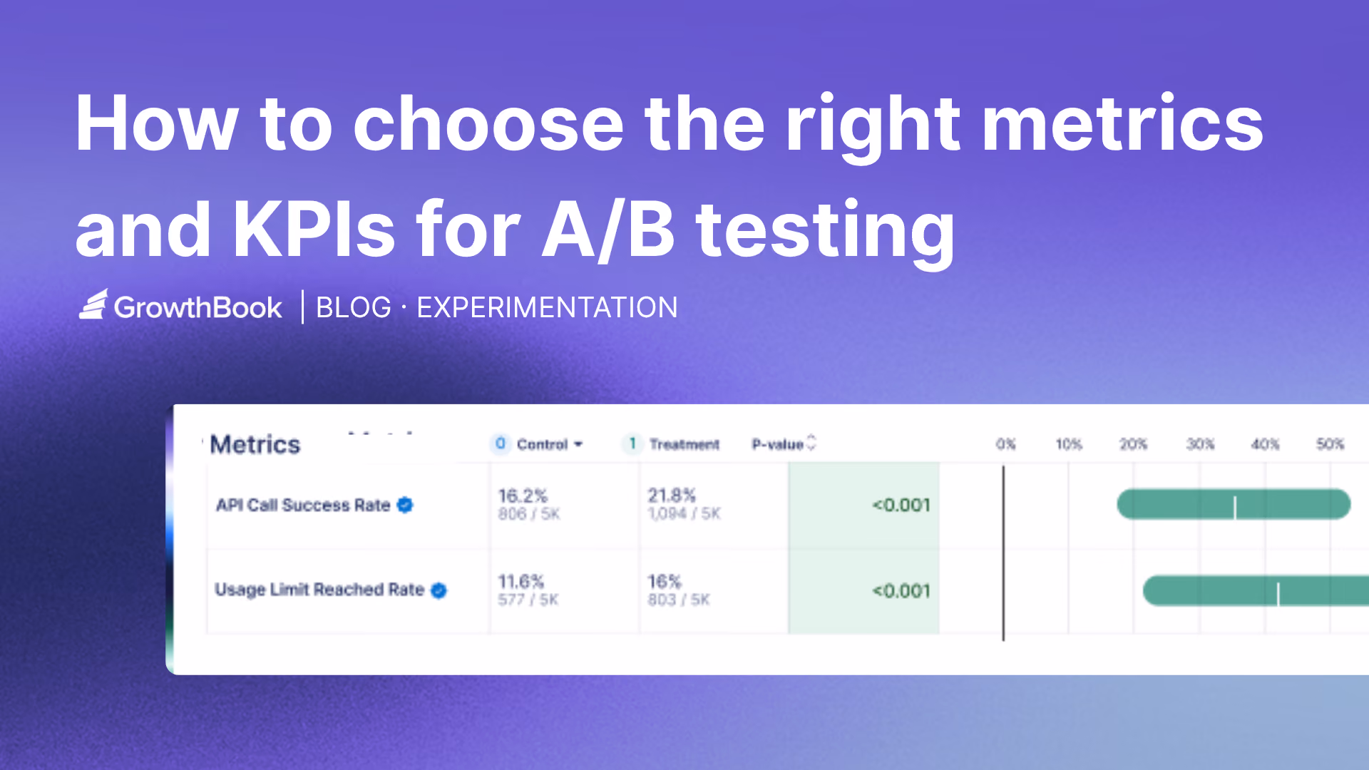
A metric may reduce user behavior to a simple yes-or-no outcome: retained or not, converted or not, clicked or didn’t click. These metrics capture whether a specific action occurred at least once, without reflecting how often it happened or how intense the behavior was. In some cases, the outcome is evaluated at a specific point in time, for example, whether a user is retained after 7 days or 30 days. When that’s the case, the measurement window is usually encoded in the metric name, such as Retention Day 7 or D30 retention.
Binary metrics are widely used because they are easy to interpret and closely aligned with key business questions (e.g., “Did the user convert?”). However, they intentionally compress behavior into a single bit of information, which makes them robust but sometimes less sensitive to subtle changes.
Continuous metrics
These metrics capture nuanced aspects of user behavior and can take a wide range of values. Examples include revenue, time spent on a page, or session duration. Unlike binary metrics, continuous metrics provide richer information about how much or how intensely users engage, rather than just whether they performed a specific action.
The most common approach for analyzing continuous KPIs is to compare group means. However, because the mean aggregates the actual values of the KPI, it is highly sensitive to extreme observations, which can distort results.
To address this concern, in highly skewed distributions, an alternative approach is to analyze quantiles, which rely on the ranking of values rather than their absolute magnitudes. This makes them substantially more robust to outliers. For example, when extreme values are present, focusing on the 50th percentile (the median) can provide a more reliable representation of the typical user.
Quantile-based analysis is also useful when effects are concentrated in specific parts of the distribution. In many cases, changes do not impact the entire population uniformly. For instance, if only a small fraction of users (e.g., ~10%) make purchases in a game, a new feature may primarily affect this subgroup. In such cases, examining upper quantiles (e.g., the 90th percentile) can better capture the true effect than comparing means.
Although this type of analysis is more complex, modern experimentation platforms such as GrowthBook provide robust methods for estimating and comparing a range of quantiles.
Continuous metrics are often more closely aligned with key business goals, such as increasing revenue or user engagement. By offering detailed observations of user behavior, they can be a double-edged sword: on one hand, they are more sensitive to subtle changes, enabling the detection of small effects; on the other hand, they often exhibit higher variance, which can make statistical inference more challenging.
Ratio metrics
In some experiments, the focus is not on a single metric but rather on the ratio between two variables. A common example is average revenue per paying user (ARPPU), where total revenue is divided by the number of paying users rather than by the entire user base. Similarly, average revenue per transaction (ARPT) is calculated as total revenue divided by the number of transactions, capturing the monetary value of each purchase event. In these cases, both the numerator and the denominator may vary across experimental groups and should therefore be treated as random variables.
This matters in practice because it affects how you analyze experiment results. When both the numerator (e.g., total revenue) and the denominator (e.g., number of transactions or paying users) can be influenced by the treatment, you should not treat the metric as if it were a simple average. Doing so can lead to incorrect variance estimates and, in turn, misleading statistical significance. Instead, ratio metrics require special handling in the analysis stage. A common and recommended approach is to use methods based on the delta method, which properly accounts for the variability in both components and produces more reliable standard errors and inference.
Matching KPI types with statistical tests
While the specific calculations used to analyze KPIs vary by metric type, the underlying logic is largely the same. In this section, we explain how different KPIs are analyzed and present the key formulas used in each case, providing a practical guide for working with common experimental metrics.
The first step is deciding how to compare the treatment and control groups. In practice, there are two common ways to express an effect:
- Absolute difference between group means
- Relative difference (experimentation lift) between group means
To understand the difference between these approaches, consider a simple example. Suppose we observe a 2% absolute increase in conversion rate. This change has very different implications depending on the baseline level: if the baseline is 50%, the increase corresponds to a modest 4% relative lift, whereas if the baseline is only 2%, the same absolute increase represents a massive 100% lift.
This example illustrates why relative change is often more informative. By normalizing the effect to the baseline, lift provides a scale-independent measure, making it easier to compare results across KPIs with different magnitudes and aligning more closely with how business performance is typically communicated. That said, absolute differences remain useful because they are expressed in the KPI’s natural units, making them more intuitive and directly interpretable.
When working with relative effects (lift), it is important to note that they are computed differently than absolute differences. Analysts often apply a logarithmic transformation to the ratio, which helps linearize the metric and stabilize its variance, ultimately making statistical inference more reliable.
Regardless of whether you compute absolute or relative difference, the next step is to compute the test statistic, which measures how extreme the observed result is under the assumption of no effect. The logic is straightforward: take the observed effect (whether difference or lift) and divide it by its standard error.
If you are interested in the details behind these calculations, Table 1 summarizes each KPI type and illustrates how the corresponding formulas are applied in practice.

The role of KPIs in decision-making: primary, secondary, and guardrail metrics
Understanding KPIs goes beyond knowing what they measure or how to analyze them; it also involves recognizing how they guide experimental decisions. From this perspective, KPIs are typically grouped into three main categories.
Primary (goal) metrics
The primary metric is the main measure of success in an experiment, typically one per test. It captures the outcome that matters most for the business, such as conversion rate, revenue, or retention, and ultimately determines whether a change should be launched or rolled back. Statistical testing focuses on this metric, assessing whether the difference between treatment and control is significantly different from zero.
Secondary metrics
Secondary metrics provide context and explanation. They help reveal why a change worked (or didn’t), highlight broader effects, and identify potential trade-offs. Their role is to support interpretation rather than determine the final decision.
Because analyzing many secondary metrics increases the risk of false positives, their results should be interpreted cautiously and, when needed, adjusted using multiple-comparison corrections.
The purpose of these corrections is to keep the overall error rate under control. In stricter approaches, they ensure that the probability of getting even a single false positive remains below a predefined threshold. A common example is the Holm–Bonferroni method, which controls this risk while being less conservative than the standard Bonferroni correction.
Another approach focuses on controlling the proportion of false discoveries among all significant results. Methods such as Benjamini–Hochberg ensure that, on average, the fraction of false positives among the detected effects stays below a chosen level.
Guardrail metrics
Guardrail metrics monitor for unintended harm. They ensure that a change does not negatively affect critical aspects such as user experience, system performance, or long-term business health (e.g., churn, error rates, latency). These metrics are often evaluated using non-inferiority tests, where the goal is to confirm that performance does not fall below an acceptable threshold. Guardrail metrics are most effective when standardized across all experiments in an organization, as they help capture common pitfalls that can harm the product across different tests.
Clearly defining these KPI types during experiment setup helps maintain focus and transparency. Experimentation platforms such as GrowthBook allow teams to designate primary, secondary, and guardrail metrics when configuring a test, making objectives and evaluation criteria explicit.
How do you choose a primary KPI for experimentation?
While it may be tempting to track many metrics, decisions should be anchored around a single primary KPI. Beyond practical concerns, such as conflicting metrics, there is also a statistical reason: the more metrics analyzed, the greater the chance of observing a “significant” result that is actually random noise.
Choosing a primary KPI requires balancing business relevance with statistical considerations. From a statistical perspective, we prefer metrics that enable powerful tests, those with a high probability of detecting real effects. Power depends mainly on effect size and variance: metrics with larger expected impact and lower variance produce more sensitive tests. Binary metrics often have lower variance, which can make them statistically efficient.
From a business perspective, the KPI should reflect the outcome that truly matters, such as revenue, retention, or meaningful engagement. It should be sensitive to the experimental change, measurable within the experiment timeframe, and easily understood by stakeholders so results can translate into decisions.
Although these principles sound straightforward, choosing the right KPI in practice can be challenging. Two common dilemmas illustrate this.
Case 1: Which KPI best represents the goal of the test?
Many experiments influence multiple outcomes. For example, a pricing experiment might measure success as a binary outcome (“did the user purchase?”) or as a continuous metric such as average revenue per user (ARPU). How should you choose between them?
The primary KPI should reflect the experiment’s objective: are you trying to increase the likelihood of purchase, or the amount spent? A clear, well-defined hypothesis is therefore central to selecting the right KPI.
Statistical considerations also matter. Binary KPIs typically have lower variance and require smaller sample sizes, while continuous KPIs capture richer behavior and may reveal larger effects when the intervention changes magnitude rather than just occurrence.
Ultimately, business relevance should come first, but it does not always align with statistical efficiency. For example, the most meaningful KPI may also be the noisiest. When this trade-off arises, techniques such as CUPED or Winsorization (to limit the influence of outliers) can improve efficiency and help preserve metrics that best reflect the true goal of the experiment.
However, these methods should be applied cautiously. For instance, while Winsorization reduces variance, it may also introduce bias by altering the true distribution of the data. Therefore, understanding these tools, their advantages and limitations, is a prerequisite before applying them, and they should always be used with careful judgment.
Case 2: Using a proxy KPI
Sometimes the ideal KPI cannot be measured within the duration of an experiment. For example, if a feature aims to increase annual pass purchases or long-term retention, the true outcome may take months or years to observe.
In such cases, analysts rely on a proxy KPI: a metric that can be measured during the experiment and is strongly correlated with the long-term goal. Examples might include starting the annual pass purchase process, completing a trial membership, or remaining active after the first month. The proxy must be both predictive of the ultimate outcome and responsive to the experimental change.
Importantly, analysts should keep in mind that even if a proxy metric is predictive and responsive, there is no guarantee that the long-term metric will improve, even when the proxy does. Therefore, a good practice is to validate results in the long run, once the true target metric becomes available, to ensure it is also positively affected.
In today’s data-rich environment, the concept of a proxy KPI can be extended to derived metrics, more sophisticated measures constructed by processing raw signals rather than directly observing an outcome. While proxy KPIs typically aim to approximate a target that is only observable in the long term, derived metrics often go a step further by capturing complex or latent signals that may not be directly measurable at all.
To achieve this, AI and machine learning techniques are used to synthesize multiple data points into a single, actionable metric. This can include predictive models that estimate a user’s likelihood to renew, or automated data labeling approaches that infer higher-level constructs such as user engagement. By transforming qualitative interactions into structured data, organizations can build high-sensitivity metrics that surface meaningful behavioral insights that would otherwise remain hidden.
Bottom line on experimentation KPIs
Metrics are more than just measurement tools; the KPI you choose defines what success looks like, which trade-offs you accept, and ultimately, the decisions you make. By understanding different metric types, assigning clear roles (primary, secondary, guardrails), and selecting a primary KPI that balances statistical power with business relevance, you transform experimentation from guesswork into a reliable decision-making process.
Learn more about experimentation best practices, designing A/B testing experiments for long term growth, and practical checklist for running A/B tests you can trust.
Related articles

.webp)
Ready to ship faster?
No credit card required. Start with feature flags, experimentation, and product analytics — free.