A practitioner's guide to treatment effects in experimentation: ATE, CATE, ITT, LATE & ATT explained

.png)
A practitioner's guide to the treatment effects hiding behind your experiment’s number — ATE, CATE, ITT, LATE, ATT — with the vocabulary for telling them apart.
What treatment effect is your experiment actually measuring?
Your junior data analyst reports from the free trial experiment: customers who activated the trial ordered +2.0 more times per month than those who didn't.
Your senior data scientist investigates the same data and reports: the Average Treatment Effect of the trial offer is +0.9 orders per month per customer.
Same experiment, two numbers. Which one goes in the deck?
Both sound reasonable on the surface. Only one of them is a fair answer to a well-defined question. The other conflates the effect of the offer with the pre-existing differences between customers who engage with offers and customers who don't.
Every experiment looks like a single number on a dashboard, but the same data can be summarized in more than one way. The number you see depends on who you're averaging across, what you actually randomized, and whether you count the customers who ignored the treatment. This piece walks through those choices using a framework called potential outcomes, and gives you the vocabulary for asking which number actually answers your business question.
Two customers, two treatment effects
You run a food delivery platform. There's a subscription: pay a monthly fee, get free delivery on every order. It pays for itself at around two orders per month, but take-up is poor. Most customers don't find it, or they just don't want yet another subscription to manage. To enlist them, you run a 30-day free trial. The outcome you care about is each customer's monthly order frequency: the number of deliveries they place in a month.
Think about two customers in your sample. Adiya orders four or five times a month. She's a high-frequency customer who knows the app inside out; she'd probably try the subscription on her own eventually. Marco orders once or twice a month. He doesn't explore features beyond what he needs.
If the free trial landed in front of them, what would happen?
Adiya is already ordering a lot, and free delivery wouldn't meaningfully change her habits. Her frequency goes up by about +0.5. Marco is different. He'd never bother with the subscription on his own, but if the trial shows up in the app, he tries it, and discovers that free delivery feels better than he expected. He starts ordering more often. His frequency goes up by +1.5.
Same offer, very different effects.
Two potential outcomes per customer
Look carefully at what we just said about Adiya. Her frequency goes up by +0.5 "if the trial lands in her app." That's a statement about a hypothetical. It implies there are two versions of Adiya's purchasing behavior: one where she receives the trial offer, and one where she doesn't. Each version produces a different order frequency.
Adiya's two versions: about 4.5 orders per month without the offer, about 5 with it. Marco's two versions: about 1.5 without, about 3 with. The difference between the two versions is the effect of the trial on that customer.
These two versions are called potential outcomes. We label them Y(0) for "without the offer" and Y(1) for "with the offer." For each customer, Y(1) − Y(0) is the effect of the offer on them.
In the real world, each customer only lives one of their two versions. If Adiya is offered the trial, we observe her Y(1); her Y(0), the world where she wasn't offered, never happens. We can never compute her individual Y(1) − Y(0). This is the fundamental problem of causal inference (Holland, 1986): you never see both potential outcomes for the same customer, so you can never measure directly a causal effect for any individual.
What you can do, and what the rest of this post is about, is measure averages across many customers. Randomization is what makes those averages fair to compare.
Picturing potential outcomes
Now let's visualize Adiya and Marco alongside 18 other customers.
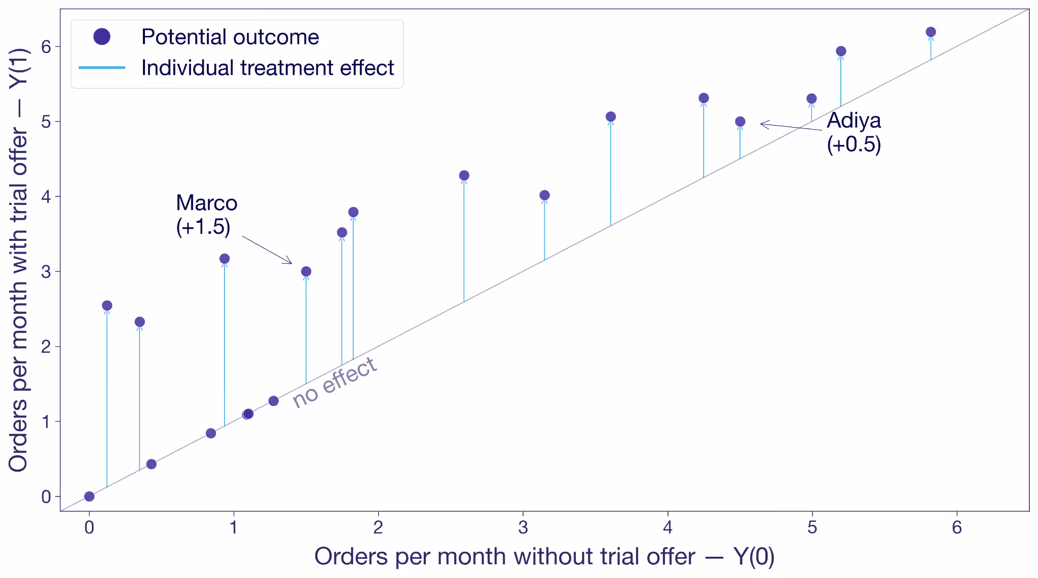
Each dot is a customer. The x-axis is their Y(0), their frequency without the trial offer. The y-axis is Y(1), their frequency with the offer. A dot on the 45-degree line means the offer changes nothing for that customer. A dot above the line means the offer moves them to order more. The vertical distance from the line is that customer's treatment effect.
Adiya sits a little above the diagonal, +0.5. Marco sits noticeably higher, +1.5. Most other customers are in the same ballpark. A few sit right on the line because the offer did nothing for them.
This is the hypothetical view from the previous section: both potential outcomes for every customer, side by side. In the real world, you only ever see one outcome per customer.
What could this look like with a larger sample? The next figure shows the same hypothetical pairs of potential outcomes for 10,000 customers. The cloud tells you something the 20-customer version couldn't. Most customers sit above the 45-degree line, so the offer works for most of them. But the vertical distance varies wildly from customer to customer. Some customers float more than two orders above the diagonal, others sit right on it. The free trial's effect isn't a single number. It's almost as many different numbers as there are customers.

The dashed gray lines mark the averages. Without the offer, this population would order about two times per month. With it, almost three. That's the level we'll come back to.
Selection bias: mistaking intent for treatment effect
Before we get to randomization, look at what happens when you try to measure the effect the obvious way, without randomization.
A junior analyst looks at customers who were offered the trial and splits them into two groups: activators who took it up, and non-activators who didn't. He compares their orders. Activators averaged +2.0 orders per month more than non-activators.
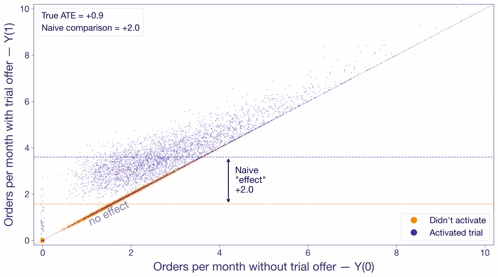
Activators are in purple; non-activators are in orange. The non-activators cluster along the 45-degree line because the offer didn't change their behavior; they never engaged with it. Many activators float above the diagonal, most of them noticeably higher.
But look at where each group sits on the x-axis. Non-activators are concentrated on the low end. These are the customers who would not order much regardless. Activators skew toward higher no-trial order rates. They are more engaged anyway.
The junior analyst's +2.0 isn't the effect of the trial offer. It's the effect of the offer on activators plus the baseline difference in order intent. He's conflating two things at once: the effect of the offer, and the fundamental difference in intent between customers who engage with offers and customers who don't. This is called selection bias, and in this analysis it's inflating the estimate by more than a factor of two.
Why randomization fixes the bias
Random assignment breaks the selection bias. Instead of splitting customers by a decision they made in response to the experiment, you split them before they've decided anything.
Offer the trial to a random half of your customers and hold it back from the other half. Now you can expect the groups to have the exact same baseline intent, because the only thing that made them different was chance. By chance alone, you now observe Y(0)'s in the control group, and Y(1)'s in the treatment group.
Now the comparison is fair. Any difference in outcomes between the groups has to come from the offer itself, because the offer is the only thing the groups differ on.
The fundamental problem still applies to individuals: you'll never see both of Adiya's potential outcomes. Randomization solves the group version of it: treatment and control are balanced on everything except the offer, which means you can fairly attribute the difference in their averages to the trial offer.
The Average Treatment Effect (ATE)
Let's take a small slice to see the magic of randomization concretely. Here are ten customers from the experiment. For each we've drawn both potential outcomes and noted which variation they were randomly assigned to. In reality you only see the outcome under their assignment. The rest are "?".
The true average effect across these ten, if you could see everything, is +0.9 orders per month. In the experiment you only see one outcome per customer, but you can take the mean of what you do see in each variation. The observed treatment-group mean is 3.0; the observed control-group mean is 2.0. The difference is +1.0, close to the true effect. With such a small sample, luck can drive the estimate in either direction. But in expectation, they're the same.
Under random assignment, the difference in observed means is an estimate of the average of those individual effects. Therefore, it is called an estimate of the Average Treatment Effect (ATE).
What is the Average Treatment Effect (ATE)?
The ATE is the average of Y(1) − Y(0) across all customers in your experiment. You can never compute it directly because you never have both potential outcomes for any one customer. But under random assignment, the difference in observed group means is an unbiased estimator of the ATE.
The ATE is what a standard A/B test is designed to estimate. Multiply it by your customer base and you have the business case to deploy.
Why the ATE isn't the full story
The ATE is by definition an average. Like any average, it hides the shape of the distribution behind it.
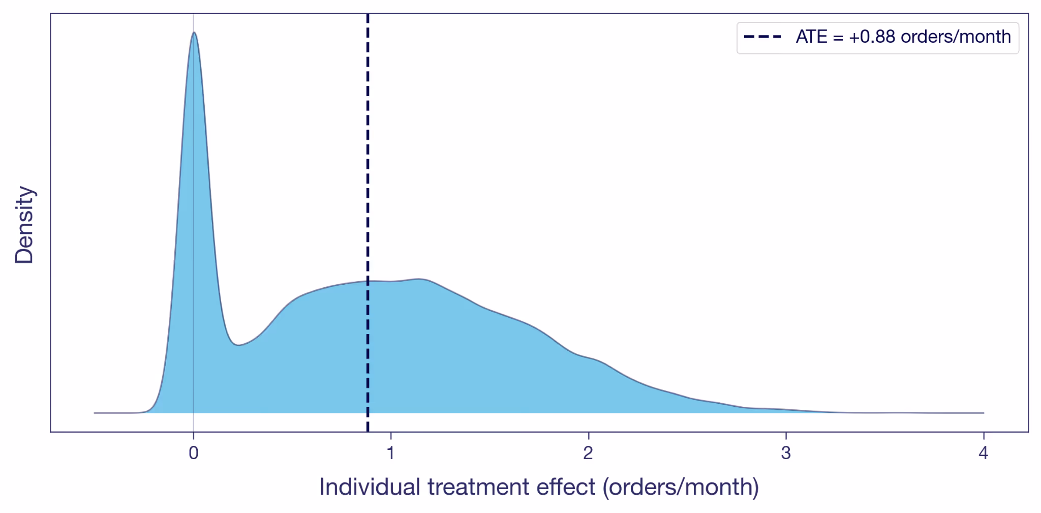
Here's the distribution of the individual treatment effects illustrated in the scatter plot above. A visible chunk of customers sit at exactly zero: the offer did nothing for them, the dots that sat on the diagonal earlier. Many others have a positive effect. A few gain more than two orders a month. The ATE of +0.9, marked as the dashed line, is the mean of this whole distribution.
Two customers at the same Y(0) can have very different individual effects, and two customers with the same individual effect can be at very different Y(0)s. The ATE collapses all of that variation into one number.
The Conditional Average Treatment Effect (CATE)
A nice average. Is that really all there is? Nothing more to say about the offer?
Back to Adiya and Marco. Her effect is +0.5, his is +1.5. The ATE of +0.9 falls between them, but it doesn't really describe either of them. It's an artifact of mixing two very different customer types into a single number.
Figure 4 shows the spread, but nothing about who sits where on it. To dig further, we can split the sample into subgroups we believe respond differently. For example, take the same 10,000 customers from Figure 2 and split them by their order frequency in the three months before the experiment. Split at the median, and you get two groups: low-frequency customers (the Marcos) and high-frequency customers (the Adiyas).
The average effect within each subgroup has a name of its own: the Conditional Average Treatment Effect, or CATE. Every dimension split in your experiment scorecard is a CATE.
What is the Conditional Average Treatment Effect (CATE)?
A CATE is the ATE conditional on one or more characteristics. It's the answer to "what's the treatment effect for customers who look like this?", where "this" can range from a broad subgroup to a specific individual.

The orange cloud floats higher above the diagonal than the purple. Low-frequency customers' CATE is +1.0 orders per month. High-frequency customers come in at +0.7. The overall ATE of +0.9 is the weighted average of the two.
In this experiment, low-frequency customers benefit most from the offer, yet Figure 3 shows many of them never activate. The hint here is that there could be potential in these low-frequency non-activators that never gets unlocked. Combining the pre-experiment split with activation gives you four informal segments (high/low frequency × activated/didn't) and a richer targeting picture — though note activation is only observable after the fact, while frequency is targetable upfront. Capturing the low-frequency potential probably requires upgrading the offer for that group: more visible placement, a longer trial window, messaging that emphasizes no commitment. When CATEs vary like this, the treatment has heterogeneous (different) treatment effects on different types of customers; for more on surfacing and acting on them, see Your experiment lift is an average — which users actually benefited?
The Intention-to-Treat effect (ITT)
Something keeps nagging from Figure 3. The experiment offered the trial to a random half of customers. About 40% of them activated; the other 60% didn't bother. The ATE estimation uses all of them, while most of them obviously aren't affected. Is this really all we can muster?
The experiment randomized the offer, not the trial experience itself. Customers decided on their own whether to activate. The +0.9 is therefore the effect of being offered the trial, averaged across everyone who received the offer, activators and non-activators alike.
The question the junior analyst is trying to answer is: what's the effect of actually trialing? The +0.9 doesn't answer that question. It's the Intention-to-Treat effect, or ITT: the effect of the assignment, regardless of whether the assigned customer actually took up the treatment. When only some of the assigned take it up — partial compliance — the ITT dilutes toward zero as the non-takers pull the average down. When everyone assigned takes it up, ITT equals the effect of the treatment itself on everyone.
What is the Intention-to-Treat effect (ITT)?
The ITT is the effect of assignment, not of actually receiving the treatment. It includes customers assigned to treatment who never took it up — in our case, the 60% who dismissed it. When everyone assigned complies, ITT equals the effect of the treatment itself; when compliance is partial, the ITT dilutes. In experiments, this is relevant when what you consider treatment is not what you can assign directly, and take-up is thus voluntary.
The ITT is an honest number for the thing the experiment actually varied. But it isn't always the number the business needs. They might want the effect of the trial on customers who actually used it: the Marcos who changed their habits, not the ones who didn't bother.
The Local Average Treatment Effect (LATE)
Under some assumptions¹, you can get at it without running anything new. Divide the ITT by the activation rate, and the ratio estimates the Local Average Treatment Effect (LATE): the effect on compliers, customers who activated because the offer moved them to. In our experiment, LATE ≈ 0.9 / 0.4 ≈ +2.3 orders per month. Much bigger than the ITT, because the ITT averaged in zeros from everyone the offer didn't move. That could be part of the story too.
What is the Local Average Treatment Effect (LATE)?
The LATE is the average treatment effect on compliers: customers who took up the treatment because of their assignment, but wouldn't have on their own. It excludes always-takers (who'd take it regardless) and never-takers (who'd never take it). LATE is identified from experimental data using instrumental variables, when assignment is random and only affects outcomes through take-up.
Proper LATE estimation uses instrumental variables, which most experimentation platforms don't provide out of the box. The ratio formula above gives you a point estimate; IV gives you confidence intervals too.
For most practitioners, the takeaway is simpler. Your A/B test gives you an ATE of the thing you randomized. That's often the most actionable number for a ship decision, because it bakes in the drop-off: no matter how persuasive the prompt, some customers won't bother. If what you really care about is something downstream — the effect of actually trialling, not just being offered the trial — your ATE is an ITT of that downstream thing. LATE strips out the dilution and tells you the effect on the customers the offer actually moved. That is useful when you're decomposing the mechanism, less so for sizing the launch.
Five estimands at a glance
We've covered four estimands rooted in randomization — ATE, CATE, ITT, LATE. The table below adds a fifth, ATT, that you'll meet when randomization isn't on the table.
ATT, the Average Treatment Effect on the Treated, is the version you'll meet the moment you can't randomize — observational studies, geo experiments, marketing campaigns deployed without a control. The randomization that gives the ATE its meaning is unavailable, and analysts fall back on identifying the effect specifically on the units that ended up treated.
What is the Average Treatment Effect on the Treated (ATT)?
The ATT is the average of Y(1) − Y(0) restricted to units that actually received the treatment. Under random assignment, ATT and ATE coincide because the treated and control groups look alike in expectation. Outside randomization — matching, difference-in-differences, synthetic control, GeoLift — that equivalence breaks, and the ATT is what those methods are designed to estimate.
Which treatment effect goes in the deck?
Your junior analyst had +2.0. Your senior data scientist had +0.9. We now have a vocabulary for what each one is, and what each one isn't.
The junior analyst's +2.0 isn't on the list. He compared the orders of customers who activated the trial with those who didn't, inside the treatment group, and reported the difference as the trial's effect. That's a biased comparison of two subpopulations with different baselines. Easy to compute, easy to misinterpret, and more common than it should be.
The senior data scientist's +0.9 is an ATE in the offer framing, and at the same time an ITT in the trial-experience framing. It's the effect of the thing the experiment actually varied. It isn't the effect of the trial itself on customers who used it, and if the launch discussion treats it that way, that's when you come in.
The point isn't to use more jargon with your stakeholders. It's to think more clearly yourself about what a number represents, and to frame the discussion around that.
When you absolutely, positively need to know exactly what your experiment measured — accept no substitutes.
References
Holland, P. W. (1986). "Statistics and Causal Inference." Journal of the American Statistical Association, 81(396), 945–960.
Imbens, G. W., & Angrist, J. D. (1994). "Identification and Estimation of Local Average Treatment Effects." Econometrica, 62(2), 467–475.
¹ Formally, the Wald estimator (ITT ÷ activation rate) identifies LATE under two key assumptions. Monotonicity: assignment (offer) doesn't make anyone less likely to take up treatment (trial). In our setup this is automatic because the trial is only available through the offer. Exclusion restriction: the offer affects orders only via activation, not directly; seeing the offer doesn't itself motivate orders. These sit on top of the usual random-assignment setup.
Related articles


Ready to ship faster?
No credit card required. Start with feature flags, experimentation, and product analytics — free.