Safer rollouts, conversational analytics, and a programmable experiment lifecycle
Jeremy Dorn
May 27, 2026
x
min read
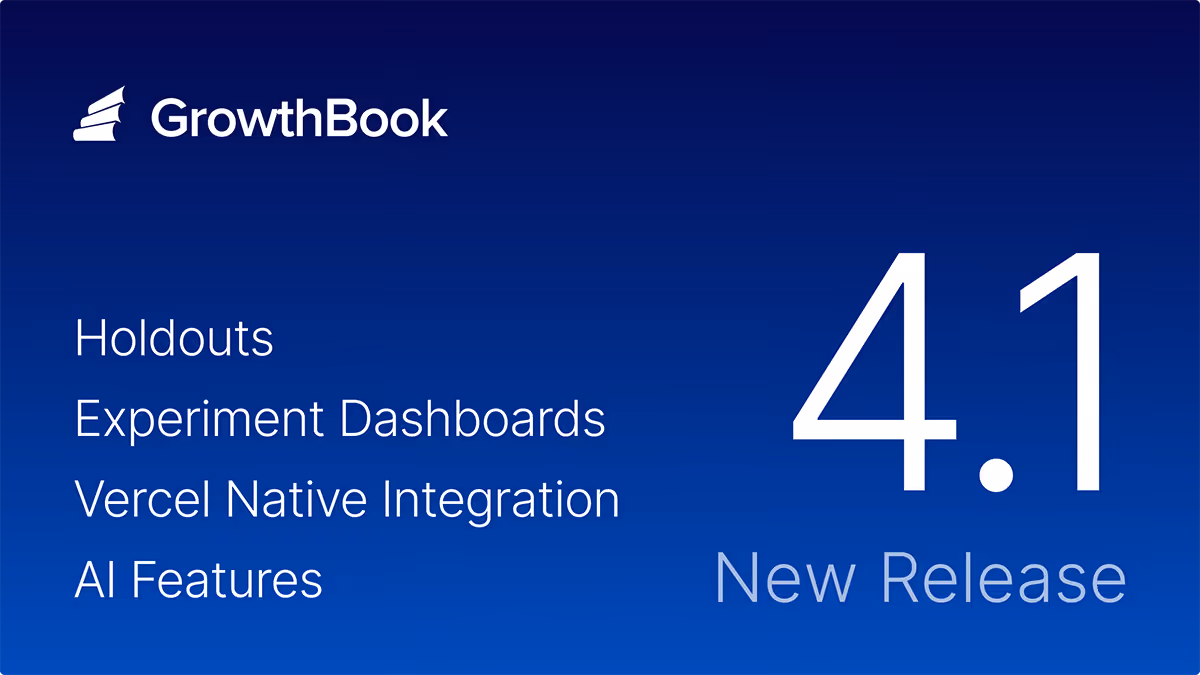
We got a little carried away. 426 pull requests and 351,114 lines later, GrowthBook 4.4 delivers a rebuilt API with broad coverage to support programmatic use of GrowthBook, a conversational AI Data Analyst for self-serve product analytics, and ramp schedules that make targeted, time-based rollouts repeatable and safe.
Writing software with AI agents is the new standard, and this release fully positions teams to take advantage of new approaches to developing and shipping products with AI. We’ve rebuilt the foundations of our API and extended its coverage so that teams can work with GrowthBook however they choose, whether through the UI or agentic tools. We work with the leading AI companies, and we’re excited to keep building out features that make it easier to ship faster, more confidently.
Version 4.4 is available immediately to both our cloud and self-hosted users.
Experimentation: An API-first lifecycle
Experimentation has assumed a human is in the loop at every step:
Writing the hypothesis
Configuring the test
Reading the results
Deciding what to ship.
That assumption is breaking down.
Teams are pushing experimentation into agent-assisted and automated workflows. With GrowthBook 4.4, you can work programmatically at any stage of the lifecycle you choose to, from setup and operation to decision.
In 4.4, the REST API surface was rebuilt on Zod-driven endpoints. Zod is a schema library: define the shape of an API once, and the TypeScript types, runtime validation, and OpenAPI docs all generate from the same definition. They can't drift apart. That makes the experiment lifecycle a real programmable workflow instead of a collection of endpoints with a spec that lags behind reality.
Set up and launch experiments from a template
Templates encode your organization's standards: statistical methods, metric selection, guardrails, and the defaults a practitioner would otherwise select manually. Agents create experiments against those templates over REST. You get consistent experiment design at agent speed, with your rigor baked in.
In 4.4, an agent can pull the pre-launch checklist, see what passes and fails, and mark manual items complete. That covers automated checks for metrics defined, variations configured, and targeting set, plus any manual checks your team has added.
Observe experiments at the scale of your program
Instead of clicking through the UI to view every running experiment, your agents make a single endpoint round-trip. That call returns estimated completion times, metric direction, and any guardrail issues for every experiment at once. Snapshots, status, and results work the same way: one call across the program, not one per experiment.
Analyze, decide, and ship
Reports are a new first-class API resource in 4.4. An agent can build a persistent analysis from an experiment, customizing metric overrides, analysis settings, or dimension breakdowns. The report stays put, and doesn't get overwritten by the next snapshot. An agent can hand a report URL to a stakeholder, refresh it on demand, and link back to it from a write-up.
From the report, the agent reads results against your team's decision criteria and concludes the experiment programmatically, setting the winner, results, and analysis summary in one call.
Watch our Head of Experimentation, Luke Sonnet, set up and launch an experiment with Claude Code.
Bandits without sticky bucketing
Multi-armed bandits fit when you want continuous learning and traffic reallocation without the time cost of a full A/B test. That profile shows up frequently in AI application work: model selection, prompt comparison, response ranking. Until now, adopting bandits in GrowthBook meant setting up sticky bucketing first. Now, bandits are easier to set up, and we expect that teams building AI-powered products will use them extensively.
Product Analytics: Structured exploration with an AI-native interface
Analytics has three different bottlenecks, and traditional tools built around SQL and a dashboarding UI don't address any of them well.
Non-data teams need to self-serve analysis on product metrics without queuing behind the data team.
Repetitive review workflows run the same explorations over and over.
Agents in the loop need programmatic access to metric data data, fact tables, and experiment results.
All three converge at the same place: the data team becomes a bottleneck for work that structured, repeatable tooling should handle. GrowthBook 4.4 introduces a new AI Data Analyst to improve self-serve analysis, and makes it explore data without SQL.
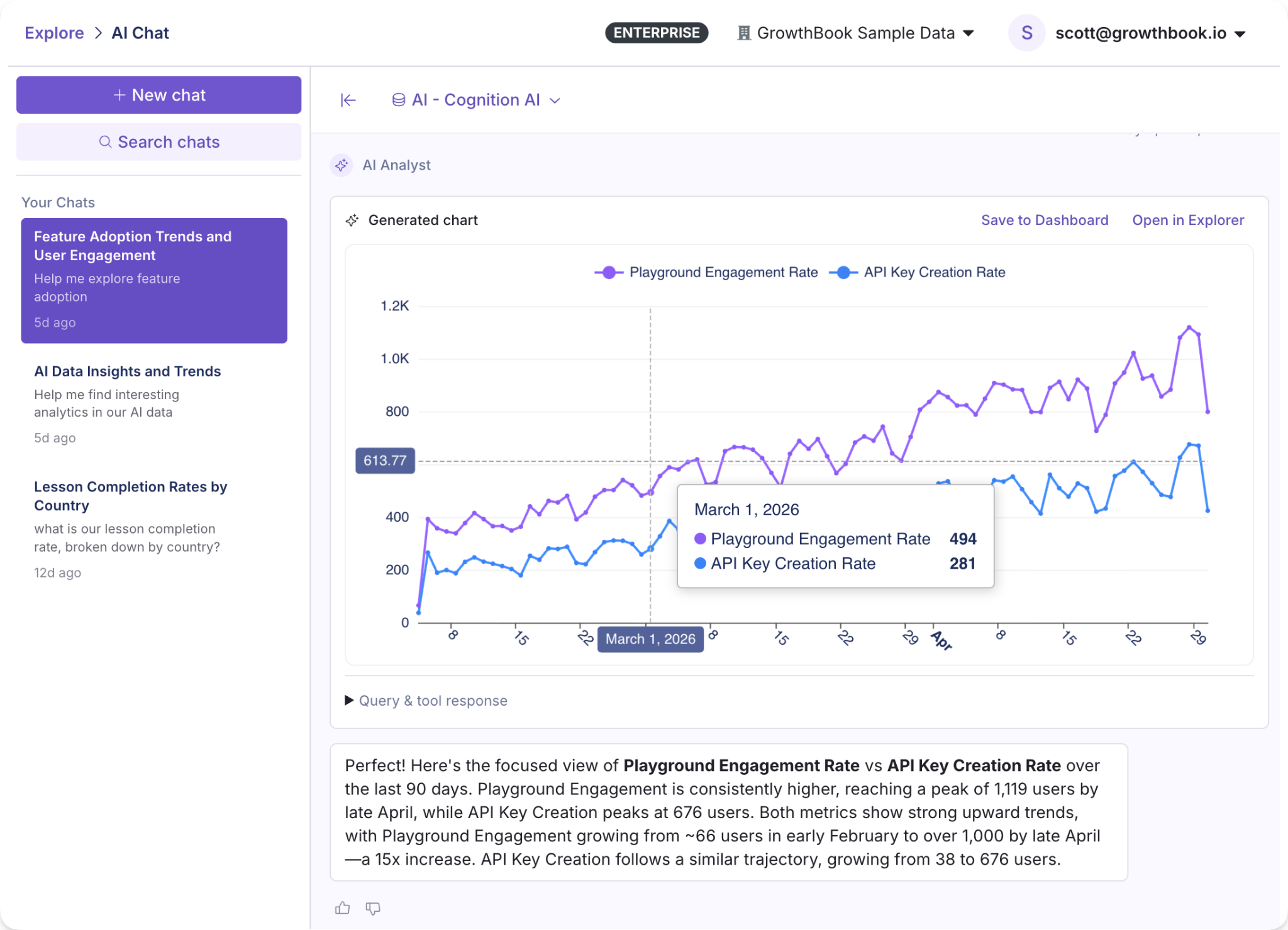
AI Data Analyst (beta)
The AI Data Analyst is a conversational AI assistant for Product Analytics. Ask a question in plain language, like “What’s our DAU trend by country” or “How is our model playground engagement rate compared to API key creation,” and get back charts and insights built with tooling specific to GrowthBook’s metrics, fact tables, and data sources. Product managers, marketers, and others can self-serve their questions without writing SQL or filing tickets with the data team.
It's in beta, and we want to hear how you're using it. Ask it real questions, try out your actual workflows, and let us know what we can improve.
Explorations
Suppose you want to understand the change in daily active users of a new search feature, broken out by plan tier. GrowthBook’s Explorer lets you create charts (Explorations) from your warehouse data through a visual interface. Select your metric, dimensions, and date range to generate a chart that you can share or save. Or run the same exploration over the API and get the chart data back, plus a deep link to open it in GrowthBook.
Product Analytics over MCP and API
Every exploration is now addressable through the MCP server and REST API. Queries run the same way whether they come from a person clicking through the UI or an automated workflow calling the endpoint.
Feature flagging: Safer flags, for whoever's shipping them
AI-assisted software development has rapidly increased the amount of code written and features deployed. Teams need flag infrastructure and governance that scale with the automation, so that problems like premature rollouts and flag sprawl don’t scale right alongside feature development.
GrowthBook 4.4 includes safety and governance features to prevent these failure types, and automated stale flag cleanup to mitigate flag sprawl in existing codebases.
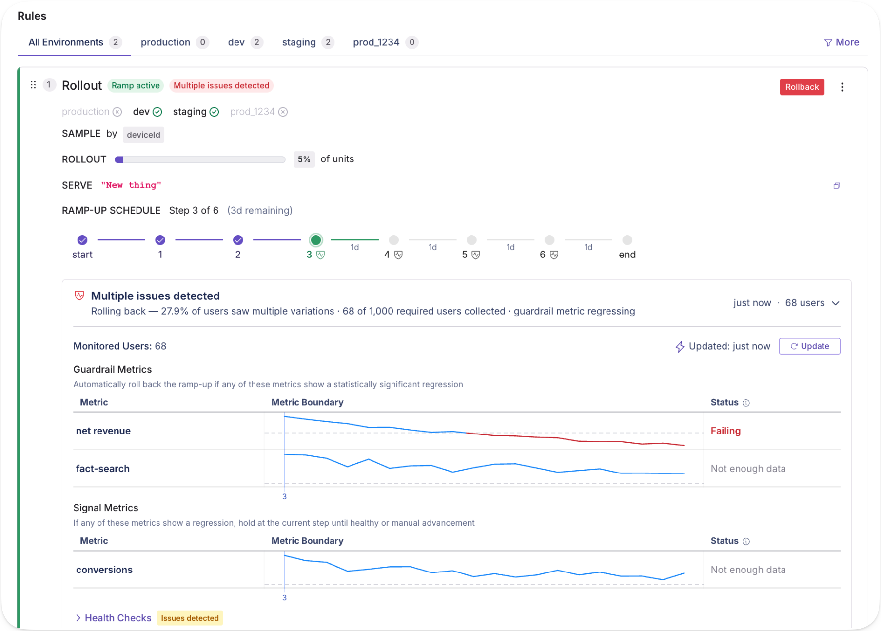
Ramp schedules
Targeted releases now include automated, time-based rollouts with fine-grained controls and optional approval steps. Each step supports its own targeting in addition to a traffic percentage, so a canonical rollout might look like:
Internal employees for 24 hours
Free tier at 25%
Free tier at 100%
Paid tier at 25%
Paid tier at 100%,
This is particularly useful for AI model and prompt deployments, where you want time between each exposure before widening the blast radius. With monitored ramp schedules, you can attach guardrail metrics and automatically hold, advance, or roll back releases. With reusable templates, teams codify standard rollout shapes they want to apply to new features quickly.
Revisions and approval controls
Approval flows are built directly into the flag change lifecycle, with REST coverage (in beta) for revisions, reviews, and approvals. When a change comes in, it goes through the same review gate regardless of origin. The same guardrails apply whether the change comes from a teammate or an automated process.
Fully automated stale flag cleanup
Engineering teams often find their codebases bloated with quietly accumulated stale flags, which drive significant technical debt. Cleanup is handled in occasional tech debt sprints or just perpetually deferred.
This release adds an endpoint for stale flag detection, which lets an AI agent run an entire cleanup process. An agent or tool can pull stale flags by API, provide a reviewable list, then find and clean up flag references in your codebase as you decide what to remove. Automating the cleanup process removes a major source of compounding debt, especially for large enterprise teams.
Read more on what's changed, including feature flag change comparisons, audit logs, and approval workflows in our feature flag deep dive.
Ship, test, measure, and decide at a new pace
GrowthBook was built for teams that ship product with discipline: engineering teams with release processes, data teams defining metrics and guardrails, and product teams trying to move fast without losing rigor. Our 4.4 release extends the same principles to the agents now working alongside all of them.
The changes across experimentation, feature flags, and product analytics connect. A programmable experiment lifecycle, analytics you can query by agent, and flag infrastructure with real approval controls form one continuous workflow: ship, test, measure, decide. Whether a product team runs it manually or an automated pipeline runs it continuously, the underlying system works the same way.