GrowthBook launch month - Week 2

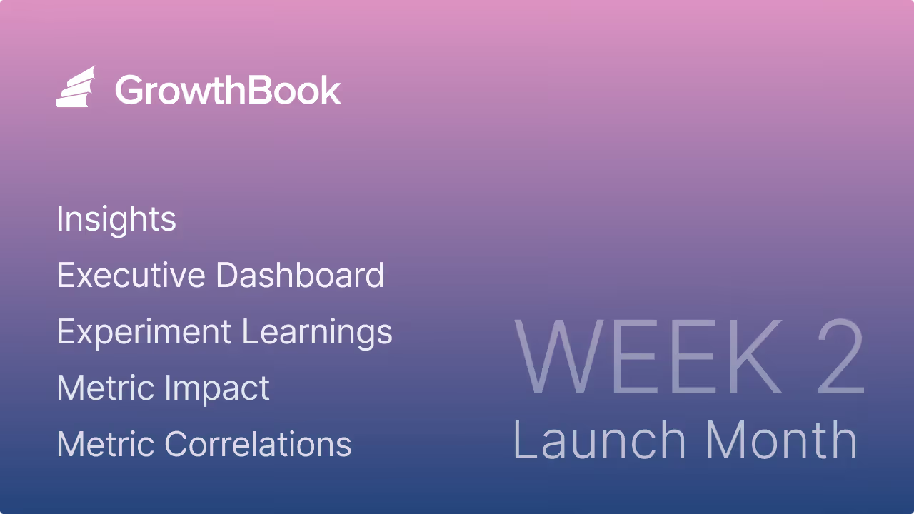
This week is all about insights, the brand-new section in our sidebar. In there, you’ll find a revamped Executive Dashboard, new Learnings and Timeline pages, plus some powerful metric analyses to help you get the most out of your experimentation program. This section becomes more useful the more experiments you run, so if you need an excuse to run more tests, this is it!
Executive dashboard

The brand new dashboard gives you a 10,000-foot view of your organization’s experimentation program. Quickly see your team’s velocity, win rate, and impact. Enterprise users can also select a metric to see the cumulative effect of all experiments run. Everything can be filtered by project and date range.
Learnings

The Learnings page is a searchable knowledge base of every experiment your team has completed. For each experiment, see the winning variation, a summary of results, and other key details. This page is a great place for new team members to learn about what has been tried and what has and hasn’t worked.
Fun fact: This was the original reason we started GrowthBook and how we got our name. We envisioned a digital book of everything you’ve learned about growth.
Experiment timeline

The Timeline page lets you visualize when experiments were running relative to one another. Experiments are color-coded by status (running, won, lost, etc.) and split up by phases. This is a valuable tool for managing your experimentation workflow, identifying bottlenecks in your process, and planning future tests.
Metric effects

Do a deep-dive for a given metric and see the range of effect sizes from all the experiments that included it. Use this to learn how easy/hard it is to move your metric in general and see which specific experiments had the biggest impact (both good and bad).
Metric correlations
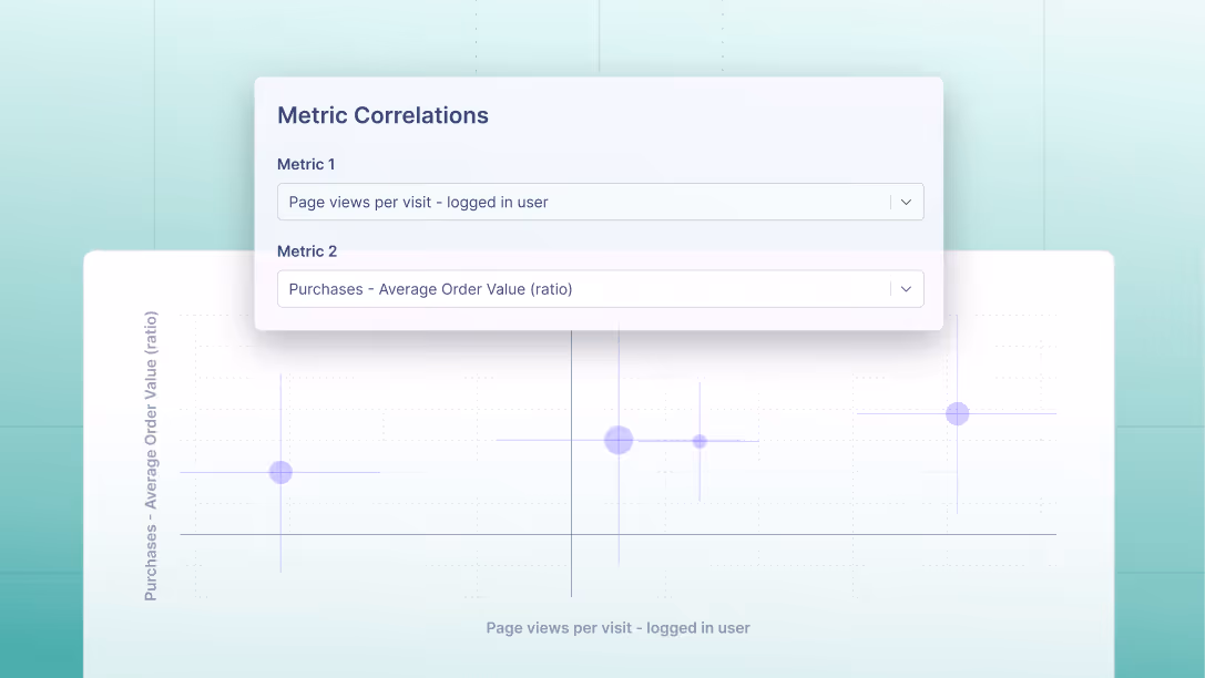
See how any 2 metrics tend to move in relation to each other within experiments. This is especially useful for identifying proxy metrics that are highly correlated with your long-term goals, but can get you results much faster.
We hope you find these new pages useful, and we look forward to hearing your feedback. See you again soon for our Week 3 launches!
Related articles
Ready to ship faster?
No credit card required. Start with feature flags, experimentation, and product analytics — free.