Bad controls: why splitting your experiment on a post-treatment variable backfires
.avif)
You ran a solid experiment. Good sample size, clean randomization. The overall effect is clearly positive, and you're ready to write it up.
Then you break it down by the new customer segmentation, and something is off. Every segment sits well below the overall number. Not one or two. All of them. How can the whole be bigger than every single one of its parts? Is this the famous Simpson's paradox?
Or maybe you toggled variance reduction on and off and the estimate moved a lot. Either way, you may have walked into one of the worst traps there is: splitting or adjusting your sample on a variable that is itself an outcome. The tell is that it is defined after users entered the experiment, which means the treatment could have moved it. This post is about how that happens, how it poisons your estimate, and the one simple rule that keeps you out of it.
Where bad controls sneak into experiments
Three analysis errors do this, and we will work through each below.
The first is splitting by a segment, the everyday analysis of who the feature helped (there is a whole piece on segment analysis without fooling yourself that guides you past other traps). You break the results down by a dimension computed over the experiment window, like a revenue tier or an engagement segment. It looks like a fair comparison, but the feature itself pushed users between tiers.
The second is conditioning on a funnel step. You restrict to the people who reached it, or you divide by them, and either way the group you compare across is one the treatment helped select.
The third is variance reduction. You tighten your estimate by adjusting for a covariate, except the covariate was measured during the experiment instead of before it, so adjusting for it strips out part of the very effect you are trying to measure.
All three share a red flag. The variable got its value after users were assigned, so the treatment had a chance to change it. That is what makes it a bad control.
What is a bad control? A bad control is a variable you split on, adjust for, or filter on that the treatment affected. Anything that is measured after the experiment starts risks biasing your results.
Why does every segment look worse?
Let's imagine a reading app that ships a new recommendation feature. It increases reading by two extra articles for every user, on top of a base of about ten articles a month. The effect is identical in every segment, so there is no real heterogeneity for a breakdown to find.
You run the experiment for 30 days and collect the data. You want to know who the feature helped most, so you split the results by engagement. There is no ready-made segment for it. So you reuse the definition from the dashboards. The Engagement segment is based on days active in the last 30 days, cut into four tiers from At-risk up to Power. It is a different quantity from the metric you are measuring, which is what makes it feel safe.
You run the split, and the tiers come back with effects at 1.8, 1.4, 1.4 and 1.1 articles. Every one of them sits below the overall estimate of 1.95, and the gap widens as engagement rises. It reads like a real finding: the feature helps your at-risk readers most and does little for power users. Might be worth targeting. How did that happen?
The error is hiding in the segment definition. "The last 30 days" counts backward from the day you run the analysis. That is exactly the experiment window. Better recommendations bring people back a little more often, so the feature moved some users up a tier. You sorted people on something the feature had already changed, then measured the effect inside the resulting groups.
The data here is simulated, so we know the true answer. That also lets us run the split correctly. Set the tiers using the 30 days before the experiment started, so the groupings cannot depend on the feature. Now every tier returns an estimate close to two articles. Not exactly two, because assignment is random and each tier holds a limited number of users, but every confidence interval covers the true effect. The targeting story disappears with it. Same data, same experiment. The only thing that changed was the timing of the segmenting variable.
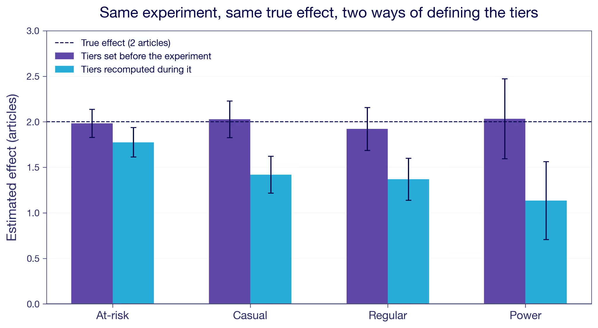
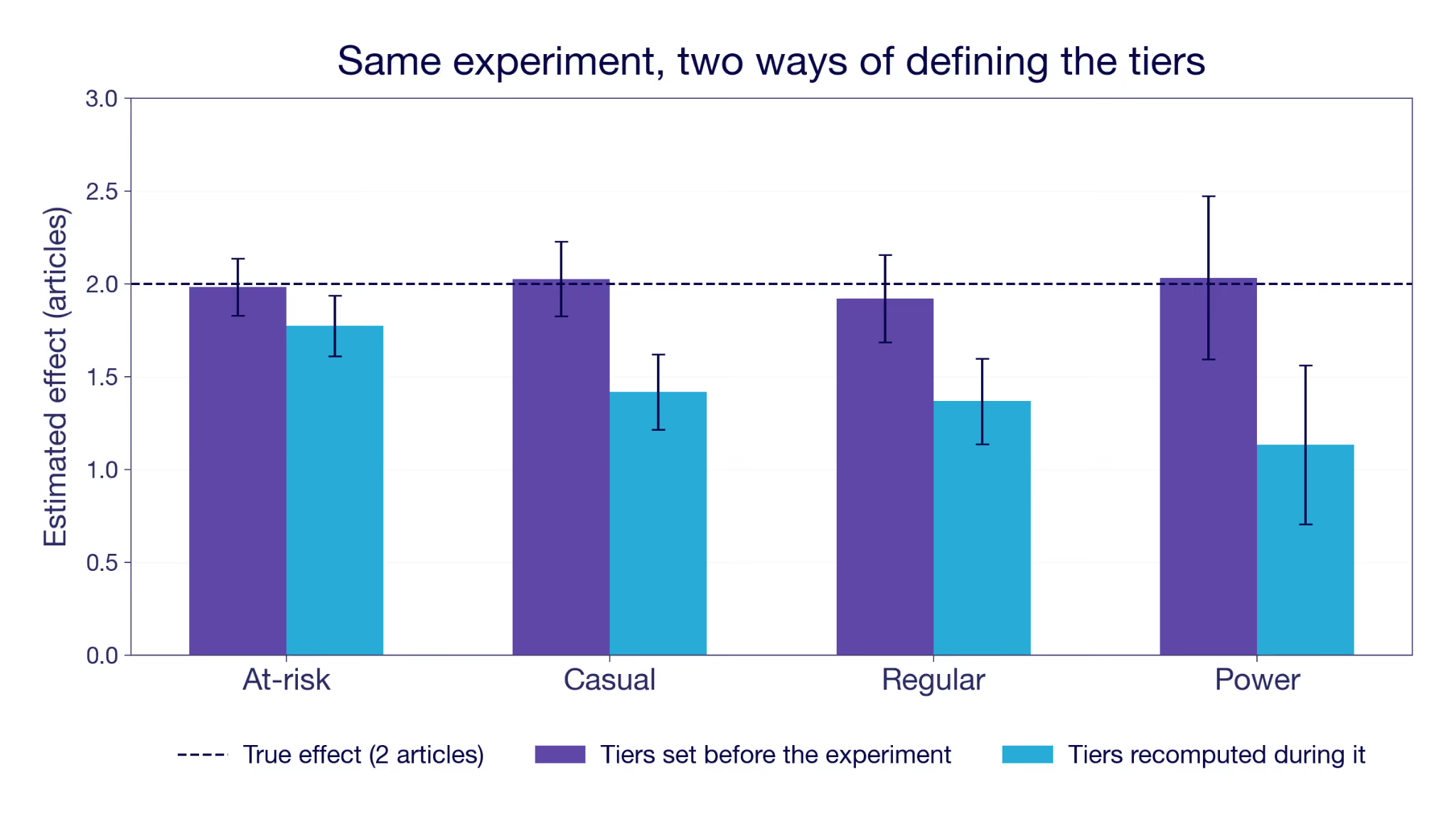
Figure 1: The same simulated experiment, split two ways. Tiers fixed before the experiment (purple) recover the true effect. Tiers recomputed from days active during the experiment (blue) fall short in every tier, and fall furthest for the most engaged.
The arithmetic looks like Simpson's paradox, and the diagnosis is the opposite. In Simpson's the subgroups are real and conditioning on them is what repairs the picture. Here the subgroups are the damage, because the treatment helped define them. The overall number is the trustworthy one, and the breakdown is what introduces the bias.
When you group by engagement measured during the experiment, you are grouping by something the treatment itself moved. It does not have to be your intended goal metric. It can be any variable the feature affected, perhaps unintentionally. The treated users in a tier got there partly because the feature pushed them up, so you compare them against control users with a higher baseline intent. You silently get the treatment effect plus a bias term.
What the within-tier split actually estimates when defined post-treatment
Inside a tier you do not get the effect for that tier. You get the effect for the users who would have been there anyway, plus a selection gap: the difference in articles read under treatment between the users you actually observe in the tier and the users who would have been there without the feature. The feature reshuffles who ends up where, so those two groups are not the same people. The gap is zero only when the treatment doesn't move the tier, which is exactly what a pre-experiment definition buys you.
The reshuffle runs both ways, which is easy to miss. Every tier except the lowest gains users the feature pushed up. Every tier except the highest loses users the feature pushed out. At-risk gains nobody at all, so its bias comes purely from departures: the users most able to climb out do, and the treated group left behind is less active on average than the control group it gets compared with. The notation in the next section covers both cases without comment, because X(1) and X(0) differ whichever direction someone moved.
Why you end up comparing different people
Before talking about the two other failure modes, it is worth seeing why this happens in general, and where that bias term comes from.
Randomization buys you one thing: on average, the treatment and control groups are comparable on everything apart from the treatment feature. Write each user's potential outcomes as Y(0) and Y(1), the result you would see without and with the feature. If that notation is new, the guide to treatment effects walks through it. A clean experiment compares the average Y(1) among the treated against the average Y(0) among the control, and because the groups are otherwise alike, the difference is the real effect.
Segment analysis is to estimate conditional average treatment effects (CATEs). It is the effect inside each subgroup rather than across everyone. Take a characteristic X, like the engagement tier. The CATE at X = x is the average of Y(1) − Y(0) among the users in a given tier, x.
This is well defined when the treatment cannot move X. Usually that means fixing it before launch, but a variable recorded later is fine too, as long as the feature could not have touched it. The users with X = x are the same set whether or not they were treated. Within them you compare Y(1) against Y(0), and the difference is the CATE you were after.
It breaks when the treatment can move X, which is what typically happens when the tier is recomputed from activity during the experiment. Now each user has two versions of it, X(0) without the feature and X(1) with it. The treated users you see at X = x are the ones with X(1) = x. The control users you see there are the ones with X(0) = x. So the comparison you run is
A real effect would hold the group fixed across both terms. This one conditions on X(1) = x on the left and X(0) = x on the right. Those are different groups of people, so the difference in Y is meaningless.¹
How big is the error? The bias is
the reading gap between two sets of treated users. One set is the users the feature lifted into the tier, with X(1) = x. The other is the users who would have been under control, with X(0) = x. The first set arrived from a lower baseline, so even treated they read less than the already-heavy readers. That gap is selection, not a treatment effect. Define the tiers with pre-experiment data so X(1) = X(0), and the bias is zero. More notation details in the appendix.
This is a known failure mode called post-treatment bias, and it is not bounded by the size of the real effect. It can exceed it and flip the sign.² It is also common, well documented in research. A review of published experiments in political science found that nearly half had conditioned on a variable measured after treatment.³ If it slips past peer review that often, it slips into a rushed product readout even more easily. I've seen it many times.
What about funnel steps and conversion rates?
Back to the failure modes now. There is a second way in, and it may be the most common of all. Say the reading app tracks a funnel: saw the recommendations carousel, opened something from it, finished the article.
The direct version is the one we just derived. Someone proposes cutting the analysis down to users who opened something from the carousel, to buy back some power. Most people scroll straight past it whatever is in it, so dropping them looks like dropping noise, and the estimate should tighten.
But that is a bold bet on how the feature works. Better recommendations can make the people already browsing the carousel open something more relevant, which leaves the set of openers untouched. They can also make someone who would have scrolled past stop and open something instead, which does not.⁴ A recommendation feature is usually built to do both. You would be assuming half the effect away in order to measure the other half. The openers left in the treatment arm are partly the ones the feature pulled in, and they have no counterpart on the control side. It is the segment split again, with a filter instead of a tier.
You might do the same thing in a subtler way, simply because that's how some important metrics are defined. A funnel conversion rate divides each step by the step before it. Of the people who opened something, what share finished it? Nobody was dropped and both arms are whole, so it feels safe. But when finishing implies opening, finishes divided by opens is exactly the finish rate among openers. It is the same quantity the filter gave you, reached by a different route. The denominator does the conditioning for you.
E-commerce teams meet this constantly, because almost every rate they care about has a moving denominator. Click-through rate divides by impressions. Conversion rate divides by sessions. Any feature that changes how often people show up, or how many of them reach the step before, moves the denominator. This changes the ratio but not necessarily the final step, which is the one you actually care about.
The fix is not a pre-experiment version of the step, because there isn't one. It is to put the randomized group in the denominator. Finishes per assigned user, purchases per assigned user. That is what funnel metrics in GrowthBook do, measuring every step against everyone who was exposed, and why they deliberately do not hand you the step-to-step rate as a decision metric with a confidence interval.
Can variance reduction backfire?
Splitting and dividing are the visible ways in. Adjustment is the quiet one. Most variance reduction methods, whether CUPED, post-stratification, or plain regression with covariates, work by feeding in a variable that predicts the outcome. The PE in CUPED is for Pre-Experiment, so standard CUPED is by definition safe. But the hunger for power has made it common for tools to offer more extensive variance reduction, by including more covariates that predict the outcome. Post-stratification is one approach.
Take retention as the outcome, whether a subscriber renews next month. The experiment runs on existing subscribers only, everyone who was already paying when it started. Standard CUPED would adjust using last month's retention, the same metric one period back. But that is one for every user in the sample. If it were zero they would have churned and never entered. So the covariate is constant, and there is nothing to adjust with. You grasp for another variable that predicts next month's retention. Reading volume seems like a natural one. Heavy readers renew more often, so reading predicts retention. But the feature raises reading too. Adjust on the during-experiment count and you subtract a difference the feature created, not one that was there to begin with.
But reading volume comes in two snapshots, and the choice matters. Reading from before the experiment is clean. Reading during the experiment is not, because the feature itself raised it. Adjust on that during-experiment number and the estimate collapses, from around four percentage points on retention to roughly zero.
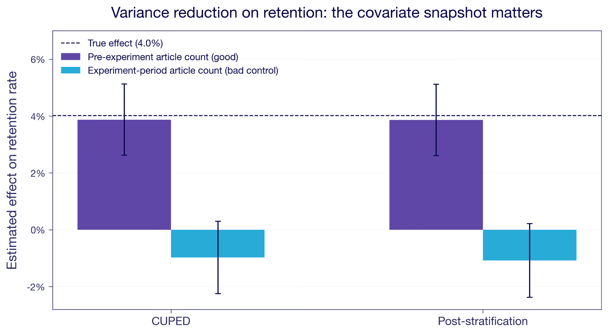
Figure 2: Reducing variance on retention. A pre-experiment covariate (purple) tightens the estimate around the truth. The same signal measured during the experiment (blue) drags it to zero and slightly past.
An imbalanced sample would produce the same gap, but then the adjustment would be repairing the estimate rather than wrecking it, and the pre-exposure balance check would have said so. When balance passes and the estimate still moves this much, suspect the timing of the covariate.
How do you avoid bad controls?
The rule is simple. Check the definition of every variable you split or adjust on, and ask when it was measured. If any part of its window falls after the experiment started, it's a hazard. Condition on pre-experiment data only.
One check is the SRM inside each segment, which GrowthBook runs on the experiment health page. It helps, but it's not bullet proof. In our simulation it fires for the top and bottom tiers but not for the two in the middle. An SRM test spots the net count across a boundary, while the bias comes from who crossed rather than how many.
The most relevant check is pre-exposure balance inside each segment. Randomization guarantees the groups are comparable on anything measured before assignment, so a gap inside a segment could be because you let the segmentation use post-assignment data.
The reading example is fairly simple, as the example segmentation is based only on one metric only that you would think twice about after reading this. But often segmentation is more complex, where a model determines the segments based on many different input variables. In such cases it is easy to think of segments as stable over time, when in fact they depend a lot on recent user activity. Make sure to fetch the segment assignment from before the user entered the experiment.
A striking result in a single segment should raise suspicion. Before you build a story on it, check the timing of the variable underneath. You ran a clean experiment. Keep it clean by splitting and adjusting only on what was already known before it started.
Appendix
The simulated experiment in numbers
Here is that simulated experiment tier by tier, with the users in each arm and their average articles read over the window. The overall estimate across all 20,000 users is +1.95, very close to the simulated +2. The setup details of the simulation are at the bottom of the appendix.
Tiers defined before the experiment
Tiers recomputed from days active during the experiment
First, look at the counts. With pre-experiment tiers the two arms are balanced inside every tier, which is what randomization should give you. With experiment-period tiers they are not. At-risk holds 1,775 treated against 2,111 control, and Power holds 3,200 against 2,859. The feature brought people back a little more often, which pushed treated users upward through the tiers.
Tier switching in itself is not the problem. Nearly 40% of users switch tiers across the time periods, resembling normal segment behavior when based on recent activity. What breaks the analysis is that the switching has a direction correlated with the treatment. Net upward moves run +1,131 in the treated arm against +111 in control. That is the kind of imbalance a per-segment sample ratio check is meant to catch, though as the main text notes it doesn't necessarily in every segment.
Take the Power tier, for example, where the estimate came back at +1.13 instead of +2. The treated users counted there are of two types.
The first type entered the segment only because of the treatment. These users had on average been less active in the pre-experiment period. They got pushed over the tier boundary, and they are also less active during the experiment than the Power-anyway users who would have been there even without the treatment. Pooling both groups drags the treated Power average down compared to the Power-anyway type.
The other tiers behave similarly but also have the highest-propensity users in each tier pushed up to the next tier.
Where the bias comes from
First, the notation. Let D be the assignment, with D = 1 for treated and D = 0 for control. Each user has potential outcomes Y(0) and Y(1), and potential tiers X(0) and X(1). We observe Y = Y(D) and X = X(D), and random assignment makes D independent of all four.
We compute the within-tier estimate at tier x, the treated mean minus the control mean among the users observed there. By randomization, conditioning on the observed tier is the same as conditioning on the potential tier in each group, so
A real conditional effect compares Y(1) and Y(0) within one fixed group. This compares them across two. The treated term conditions on X(1) = x, the control term on X(0) = x. The only way those are the same type of people is if the treatment leaves the tier memberships alone, X(1) = X(0). The real requirement is to condition on a tier the treatment did not set, and a pre-experiment tier meets it by construction. It is the same idea as principal stratification, where the legitimate conditioning is on a treatment-independent quantity.
To size the gap when X(1) ≠ X(0), add and subtract the treated mean on the control stratum, E[Y(1) | X(0) = x].
The first bracket is the ATE for that group, the actual effect among the users who would have been in tier x without the feature. The second is the selection gap from the main text. When X(1) = X(0) it is zero, and the estimate is exactly that ATE. Otherwise it is the difference in treated outcome between the users the feature moves into tier x and the ones who would have been there anyway.
How the simulation works
Here is the setup behind the simulation. The exact constants are in the script.
I generate 20,000 users. Each has a baseline reading count, the articles they read in the 30 days before launch, drawn from a right-skewed negative binomial. The mean is 9.8 articles with a standard deviation of 7.6, the median is 8, and the 90th percentile is 20. That spread is the point: a realistic engagement distribution has a mass of near-dormant users and a long tail of heavy ones, which is what gives the tiers something to separate. Each also has a habitual visit propensity that rises with that reading count, with normal noise of 0.05 on top. Days active is a binomial draw over 30 days at that propensity, averaging about eleven. I sort users into four engagement tiers by the quartiles of days active in that pre-experiment window, from At-risk up to Power. The cut points are set once and never change, the way a real segmentation would be. What moves later is which side of them a user falls on.
I simulate the potential outcomes directly. Y(0) is what a user reads over the experiment window with no feature, a Poisson draw whose mean is that user's own pre-experiment article count. Y(1) is Y(0) + 2, for every user, with no variation. I assign treatment at random to 50%, and observe whichever of the two applies.
The feature also makes people come back slightly more often, enough to add about 0.8 days on a base of eleven. That is deliberately modest next to the 20% effect on reading, because most of the extra reading is more articles per visit rather than more visits. Days active during the experiment is a second binomial draw at the raised propensity, plus month-to-month drift with a standard deviation of 0.04, same for both treatment groups. The biased results in Figure 1 come from re-sorting users into the same four quartile cut points using this experiment-period day count.
About 40% of users end up in a different tier than they started in. Most of that is drift and affects both arms equally. The part that matters is the direction: net upward moves run +1,131 among the treated against +111 among control. Driven by the treatment effect on days active.
Figure 1 reports the within-tier effect on articles read, once for tiers fixed before the experiment and once for tiers recomputed during it. The true effect is two articles in every tier, as simulated.
Figure 2 uses a second outcome, retention. Every user in the experiment is already a subscriber, so pre-period retention is one for everyone. That makes it a covariate with no variance and no use for variance reduction. The natural fallback is reading volume. I model retention as a logistic function of pre-period reading and treatment, tuned to about a four percentage point effect. Then I reduce variance two ways, with CUPED and with post-stratification. Each time I use either the pre-experiment reading count, which is safe, or the experiment-period count, which is the bad-control case. The safe version tightens the estimate around the truth. The bad control drags both downwards. The strata for the post-stratification run are quartiles of that same reading count, so the two methods condition on the same variable, one continuously and one in four bins.
¹ Conditioning on the joint pair {X(0), X(1)} rather than the observed X does define a valid effect, the idea behind principal stratification (Frangakis and Rubin, 2002). The subgroups are latent, though, so they are hard to use in practice.
² Two formal treatments of bad controls. Wooldridge, "A Formal Investigation of 'Bad' Controls" (SSRN working paper 4688295), works in potential outcomes. Cinelli, Forney, and Pearl, "A Crash Course in Good and Bad Controls," Sociological Methods & Research 53, no. 3 (2024): 1071–1104, give the causal-diagram (collider) version.
³ Montgomery, Nyhan, and Torres, "How Conditioning on Posttreatment Variables Can Ruin Your Experiment and What to Do about It," American Journal of Political Science 62, no. 3 (2018): 760–775. They found 46.7% of the studies they reviewed, 35 of 75, conditioned on a post-treatment variable.
⁴ Economists call these the extensive and intensive margins: whether someone acts at all, versus how much or how well they act if they act at all. The filter here is safe against movement on the intensive margin and broken by movement on the extensive one.
Related articles
.png)
.png)
Ready to ship faster?
No credit card required. Start with feature flags, experimentation, and product analytics — free.