The Uplift Blog
GrowthBook 5.1: Learn faster with a new MCP server, Slack app, and contextual bandits
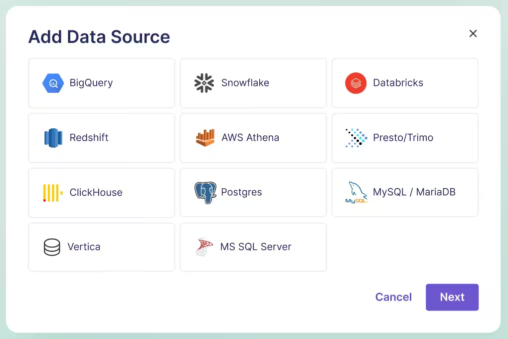
MCP server, Slack app, and contextual bandits
Filter results

Engagement with safety: Headspace's guardrails for AI tests
Most consumer subscription businesses share a simple instinct: more engagement is better. More minutes watched, more books read, more sessions started. Mary Alfheim spent years inside that instinct, leading product analytics at Prime Video, working at HBO when HBO Max launched and leading data and analytics at Scribd.
At Headspace, where she is now VP Data and Analytics, the instinct breaks.
When more is not always better
Headspace is best known for meditation and mindfulness, with sleep content, wake-up content and stress management tools. It has also expanded into clinical care, coaching, therapy and psychiatry, sold through employers and health plans as well as directly to consumers.
That mix creates what Mary calls a dual mandate. "More is not always better," she told host Ashley Stirrup. "We want people to get better if they are coming to us with actual symptoms."
So the optimization target is health outcomes, not time in the app. Engagement still matters, but it sits alongside self-reported measures of anxiety and depression, tracked as snapshots over time and correlated with the content and care a member used.
That creates a measurement problem most product teams never face. Headspace does not have 200 million users filling a sample overnight, and annual resubscription or a change in self-reported health can take a long time to read. Mary's team works backwards with clinical researchers and actuarial scientists to establish which patterns of engagement are associated with improvement, then builds composite and surrogate metrics that product managers can use to self-serve day to day.
Engagement with safety
The clearest example is Ebb, Headspace's AI companion, an empathetic conversational chatbot built into the app that helps members reflect and process their emotions.
Experimentation has been fundamental to growing engagement with Ebb. But the operative phrase is engagement with safety. "People can jailbreak chatbots," Mary said. "They could be having moments of crisis that don't call for AI, that you absolutely need humans in the loop."
That is existential for a mental health company. Headspace is not going to keep optimizing to push people toward a chatbot when what they need is human care.
So the team organized every Ebb experiment around three layers:
- Inputs: what is being changed. A new prompt, a new safety rule, a change to the infrastructure or architecture the agent runs on.
- Outputs: the success measures. More sessions, longer sessions, more messages per session, user feedback such as NPS.
- Guardrails: the protections. Clinicians are in the loop on every experiment, doing clinical QA and monitoring for interactions that need more action or a different level of care.
A year ago Headspace was not running much experimentation at all, and for one-way doors like a huge redesign that can be fine. Ebb was different. The safety standards, the rules, the prompts and even the infrastructure were going to keep evolving, which made it exactly the place to test.
Stop rules make self-serve possible
Defining those layers forced another decision: where the stop rules sit. Mary sees this as the most portable idea in the whole program.
Her everyday example has nothing to do with AI. Say a team wants to drive engagement but not at the expense of cost. Write the cost guardrail down before the test. "If you get positive lift on engagement, and there's no harm to your cost guardrail, feel free to roll it out," she said. "If you have harm to your guardrail, then there can be clear rules put into place to roll it back or go to some other sort of review mechanism."
Once the rules exist, teams do not need the data team to make every call. The guardrails are what make self-serve experimentation safe.
Mary is equally clear that the data team should not write those definitions alone. Product teams know the intention and the roadmap and are deeply empathetic to their users. Inputs, outputs and guardrails should come out of a conversation about what the team is truly trying to drive, whether it can be measured, and how to start collecting the data if it can't. And as the product evolves, the metrics need to evolve with it.
Test as you go
Some of Mary's strongest views come from experiments that did not go to plan.
At a previous media subscription business, a product team spent about a year and a half building an entirely new way to navigate and find something to watch. The measurement plan was aligned ahead of time: metrics, read dates, what success looked like. The team even planned a long monitoring window for the dip in engagement that comes when existing users dislike change.
It still did not work the way anyone planned. By the time the test ran, the business objectives had shifted, so the success criteria no longer matched where the company wanted to go over the next 18 months. And when results disappointed, it was nearly impossible to tell which part of the experience was underperforming, because the "redesign" was really many changes packed together. The team had to go back and test the pieces one at a time.
"Faster is better, more discrete changes is better, and don't wait for some big grand reveal," she said. "Truly test as you go."
Know your treatment
A second lesson came from payments. Mary's team partnered on a test that split traffic between the incumbent payment processor and a challenger, with guardrails on chargebacks and fraud.
The challenger underperformed so badly that the team wanted to roll it back. Only after peeling back the layers did they see the cause. The incumbent had years of payment history on the customer base and was better at predicting fraud and risky transactions. The challenger was learning the audience from scratch. The traffic split looked random. The treatment was not.
The fix turned one experiment into a portfolio: stratified samples, separate experiments for new customers and people resubscribing, and repeated runs over time to see whether the gap held or closed.
"You have really got to know what your treatment is and question and question again if you're getting your randomization right," Mary said. It was engineering and product partners, asking whether the result held for a given cohort or tenure, who uncovered it. That is why she insists experimentation is never just the data team's job, a point Ashley extended to AI features, where nobody fully knows how the system works.
A third bucket for learning
Looking ahead, Mary expects Headspace to test faster and with bolder treatments, with AI on both ends of the loop: helping build new experiences and speeding up the interpretation of results. The team is at a couple of dozen tests a quarter, and she watches for the plateau in effect size that says the program is running the right amount of tests. By her read, Headspace is still on the ascent.
Scale is not the goal on its own. "Don't test just so you can say you had a win and put it in your quarterly business review," she said. "Make it worth it."
Many practitioners describe a portfolio of experiments: small loop tests always on, plus a few big bets. Mary adds a third bucket, a learning bucket, where tests never have to show up in a business review and the team does not even need expectations. That, she argues, is what feeds curiosity and the next generation of big loop tests.
It fits a broader pattern Ashley sees across the best programs: leaders who demonstrate humility, ask what can be learned, and do not expect a high win rate. The most successful companies run at 10 to 20% win rates. Stacking those wins still has a massive impact.
The pattern
Headspace's approach comes down to a few habits any team can borrow:
- Decide what "good" means for the user, not just for engagement, and measure it even when it takes science to connect short term signals to long term outcomes.
- Structure every experiment as inputs, outputs and guardrails, with stop rules written before launch.
- Build those definitions with the product team, and let them evolve with the product.
- Test early and in small pieces, and know exactly how your treatment works before you trust the split.
- Keep a learning bucket, and celebrate the tests that don't move the needle.
Full conversation with Mary Alfheim, VP Data and Analytics at Headspace, on The Experimentation Edge.

From Cross-Sell to Shopper Intent: What Experimentation Taught Us
Search for banana on Walmart and look at the ads. There are almost none. Hardly any advertiser sells bananas, or fresh food of any kind, so the pages that shoppers visit most for groceries are some of the emptiest for sponsored products.
For a retail media team, that looks like an open field. Arv Ramchandani's team at Walmart Connect set out to increase ad coverage on exactly those pages, and the first idea felt like a sure thing: cross-sell. If someone searches for banana, show them something that goes with banana. Chocolate. The makings of a smoothie.
"We were pretty sure that, okay, this is bound to work," Arv said.
The results prompted the team to rethink how closely the recommendations aligned with shopper intent. What the team learned offers a useful lesson in running experiments in an advertising business.
The thesis: an experiment is most valuable when it is designed to teach you something, and the lesson is usually about the customer, not the feature.
Three scoreboards on one page
Before the banana story makes sense, it helps to understand where Arv sits. Walmart Connect is Walmart's retail media business. Arv works on experimentation and analytics for sponsored products across pages that other teams own.
That means every test he runs lives on someone else's scoreboard. The search team is trying to drive customers to purchase more. The conversational AI team, which builds the shopping agents, weights trust and relevance. The ads side has advertiser returns and revenue to think about.
"Every team would have their own primary metrics," Arv said. "We have to work around that."
In practice, working around it has three parts. The ads team coordinates with page owners so experiments run in sequence and do not conflict. Both teams agree up front on the objective. And they negotiate a degradation threshold: how much of the page owner's metric can drop, and how much ad revenue the business earns in return. The equation is defined per page, and the ads team's job is to stay inside it.
Revenue is only one guardrail. Relevance of the ads and latency are the long-term metrics, the ones that do not show up in a two-week window. "We are building a product not for tomorrow, but maybe for the next few years," Arv said.
To put a number on the long-term cost, the team runs holdouts that last months. A very small slice of traffic sees no ads at all, and the team compares the customer experience for that slice against everyone else. It is a direct answer to a question most ad businesses would rather leave vague: how much trust are we spending?
The lesson from this beat: when you run experiments on shared real estate, agree on what you are allowed to break before you start.
What the first test revealed
Back to the banana. The cross-sell experiment went live with the confidence of a team that had already decided the answer.
While customers engaged with complementary recommendations, that engagement did not always translate into purchases. This prompted the team to rethink how closely the recommendations aligned with shoppers' original intent.
He put it plainly. "They are here to buy something. We are distracting them."
While the experience encouraged exploration, that engagement did not consistently translate into the conversion outcomes we had hoped for. This highlighted an opportunity to better align advertising experiences with shopper intent.
At this point a lot of teams would have filed the idea under "tried it, didn't work." Arv's team did the opposite. It was still a good idea, and shoppers clearly liked to explore. The question was why exploring did not end in a purchase.
The lesson: an unexpected result is data about the customer, and it deserves as much analysis as a win.
Building around the mission
The team went back to first principles and found the problem in the diversity of what they were showing.
"If you search for bacon and I'm showing you a frying pan, it makes sense," Arv said. "But not everyone is trying to come and buy a frying pan."
A complementary product is relevant in the abstract. For a specific shopper on a specific visit, it is often a detour. The fix was to stop guessing at complements and start from what the customer was trying to accomplish.
Customers do not type their mission into a search box. Someone searching for cocoa powder may be baking for the holidays, but they do not write "I'm baking." So the team identified those missions, built themes around them, and cut down the variety of items shown inside each theme. Search for taco and you see a Taco Tuesday night theme, the handful of things you actually need, instead of a scattered set of loosely related products.
That changed the job the ad was doing. It stopped competing for the shopper's attention and started shortening their trip. People could buy what they needed faster instead of searching for each item separately.
The rebuilt version delivered better CTR and better conversion, and the team submitted a white paper on the work to the AAAI 2027 Innovative Applications of AI conference for consideration.
The lesson: fewer, better-grouped options can beat more options, as long as the grouping follows what the customer came to do.
Designing for learnings, not launches
For Arv, the banana test is not interesting because it eventually shipped. It is interesting because of what it taught.
"It's not only about finding if we will launch or not, but what's the learning we will get?" he said. The insights that surprise people, the ones that become a stepping stone for the next product, are what motivate him and the product managers he works with.
That starts with the question at the top of the test plan. Arv's first question, to himself and to anyone who brings him an experiment, is not how to launch. "We should not think about how to launch this product. We should think about how to make this product more usable."
Change the question and the hypothesis follows. It stops being about ad revenue and starts being about what you are trying to improve, such as diversity or conversion, even when that improvement does not show up as ad revenue at the end.
The team backed that thinking with a written process that spans the whole life of a test. Before launch, a test plan. During the test, no p-hacking and no peeking at results too early. At the end, a defined set of checks. The payoff has been faster experiments and bugs caught early rather than discovered when the test is over. The team also trusts experimentation more, and has a shared definition of a successful test: one whose result ties back to its hypothesis.
Where does it go next? Self-serve. Arv's team already built self-serve tools that help analysts see results faster. The next step is to get that capability to people beyond the analyst, like PMs, the way AI is helping people outside engineering write code. An analyst still guides the work, but most of it is done by the person closest to the product. That is how a team runs many experiments at once without waiting in line.
The pattern
Four moves from the way Arv's team runs experiments on shared, revenue-bearing pages.
- Negotiate the degradation threshold first. Agree with the page owner on what can drop and what the business gets in return, then stay inside it.
- Track the guardrails that move slowly. Relevance and latency matter over years, and a months-long ad-free holdout is the honest way to measure what ads cost in trust.
- Treat an unexpected result as research. When results differ from expectations, look for the customer behavior behind them; for Walmart Connect that meant building around the shopper's mission instead of the ad.
- Ask how to make it usable, not how to launch it. Then write the process (test plan, no early peeking, end-of-test checks) that lets the whole team trust the answer, and open it up so people beyond the analyst can run tests too.
Full conversation with Arv Ramchandani, Senior Product Manager - Experimentation & Analytics at Walmart Connect, on The Experimentation Edge.

Why more info lifted VidaXL's account creation nearly 40%
The registration page was leaking. VidaXL's B2B buyers were getting to the signup step and leaving before they created an account, and the analytics could show exactly where it happened. What the analytics could not show was why.
Sapna Kashyap, CRO Lead at VidaXL, did not start by cutting fields. She started by asking. A survey of the users who dropped off came back with a clear pattern: before the final signup, buyers wanted to understand what they were getting. The benefits, the service, the technicalities of the subscription. Many of them had never seen that information at all.
The test that followed became the biggest winner of her career, and it ran directly against one of the most common instincts in conversion work.
VidaXL is an e-commerce company operating in more than 30 countries, with a B2B segment alongside its consumer business. Sapna runs its experimentation program, has handled more than 155 experiments and an annual roadmap, and owns the quality and governance of everything that goes live. Her story on The Experimentation Edge covers a surprising win, a humbling loss, and the unglamorous design work that makes both of them trustworthy.
The thesis: good experiments are decided long before launch, by the questions a team asks and the evidence it gathers first.
A company that tests every decision
At VidaXL, experimentation is not a CRO side project. Product teams, development teams and business stakeholders all route their ideas through it.
"If they have some kind of idea, any different business decision they wanted to take, they just first want to validate from the experiment and the A/B test," Sapna said.
That culture has an executive sponsor. The webshop manager is data driven and invested in the program, and wants to see the company keep growing toward experimentation maturity. Sapna now leads a maturity program built around three things: the mindset, the process and the tools. Part of it is teaching. Part of it is improving communication with stakeholders so that new people understand why the company tests before it implements.
The lesson from this beat: an experimentation culture becomes real when the business, not only the CRO team, asks for the test.
The 38.7% winner
The B2B flow worked like this. A buyer lands on the site, checks the pricing section for service details and what the subscription includes, then moves to registration. That was the intended path. The data showed that a lot of buyers skipped it and arrived directly on the registration page, without ever seeing the subscription information.
The objective was to increase account creation. The survey pointed to the missing context. So the hypothesis was specific: if the registration flow featured more subscription information, more accounts would be created.
"It led to 38.7% of the uplift," Sapna said. "The learning was that users wanted to be confident for the last time."
That number is worth pausing on. Most conversion playbooks treat every extra line on a signup page as a cost. The team shared that worry going in. Sapna said the assumption itself was that it would add cognitive overload. The design answer was to add the information in a way that was not too much, but still served the purpose.
For a B2B buyer about to commit a business to a subscription, the missing details were not decoration. They were the reason to say yes. Removing uncertainty mattered more than removing words.
The lesson: when users leave a page, find out what question they could not answer before deciding what to cut.
The payment method everyone was sure about
Not every test at VidaXL confirms what people expect, and Sapna is candid about the one that did the opposite.
The company's history said that localizing country by country worked. So when the team tested a localized payment method across its markets, product, business and CRO all believed it would win. The historical data seemed to say so.
It did not. The experiment went negative. Buyers kept choosing credit cards and PayPal over the local option.
The difficult part came next. A loss against that much conviction does not read as a result. It reads as a broken dashboard. Helping stakeholders accept that the payment method should not ship was, in Sapna's words, a really difficult nut to crack.
The team cross-verified every source it could: Stripe data, other sources of truth, all of it reconciled before the result was shared. Then they walked the business through the evidence until it held.
"Whatever we have learned is that not every time something we localize is going to win," Sapna said.
In the end the loss did something a win could not. Sapna called it an awakening moment for everyone, a reminder of why the company validates before it implements.
The lesson: the tests that challenge your strongest priors are the ones that protect the business, and the ones that build trust in the program.
The 70% that happens before launch
Both stories depend on what happens before an experiment ever goes live, and that is where Sapna's team has changed the most.
It starts with research. Even when an idea comes from a product manager, the data and the evidence have to be there. Then comes the objective, the problem statement and the intent behind the hypothesis, all agreed with the stakeholder.
Guardrails are part of that conversation. If a change lifts conversion, there is a chance it lifts the return rate too. The team decides up front which metrics must not move in the wrong direction, so the primary metric can be pursued without hurting the business somewhere else.
Segmentation is planned rather than discovered. VidaXL segments by traffic source, such as Google Ads versus direct traffic, and by device. A change that wins on desktop is not assumed to win on mobile. If it only works for one, it ships for one. If it works for neither, it ships for none.
Data quality gets checked too, because the analysis depends on it. When the preparation is right, Sapna says, the analysis at the end is the smaller part. "It's like 70% of the work for an experiment is going to be done before it goes live."
When a test does lose, the process keeps going. The team looks at more data points and behavioral analysis to understand why users did not respond, then iterates and tests it a different way. In a lot of cases, the next version is the one that wins.
After five to seven years of testing, the biggest shift she describes is cultural. Most experiments are not going to win, she said, but each one is a learning, and that is the reason to test.
The lesson: a program matures when it stops measuring itself by wins and starts measuring the quality of what it learns.
The pattern
Four moves from VidaXL's program that any team can borrow.
- Ask why before you cut. Pair the analytics that show where users leave with a survey that shows why, then write the hypothesis against the real objection.
- Treat friction and reassurance differently. Extra information that answers the buyer's last question can lift conversion, as it did by 38.7% here.
- Test your strongest priors and verify the surprises. When a sure win loses, reconcile the data across sources before you share it, then let the evidence carry the argument.
- Do 70% of the work before launch. Research, objectives, guardrail metrics, device and traffic segments and data quality are decided up front, so the analysis at the end is short and trusted.
Full conversation with Sapna Kashyap, CRO Lead at VidaXL, on The Experimentation Edge.
Introducing the official GrowthBook Slack app
Great tools and data are critical to an experimentation program, but they’re not enough on their own. A strong program also needs a culture where teams experiment with rigor, share ideas, learn from results, and make decisions based on evidence.
For a lot of organizations, much of that culture lives in Slack. That’s where teams discuss what to build and decide what’s next. But experiment updates don’t always make it into those conversations, which makes it harder to act on what teams learn.
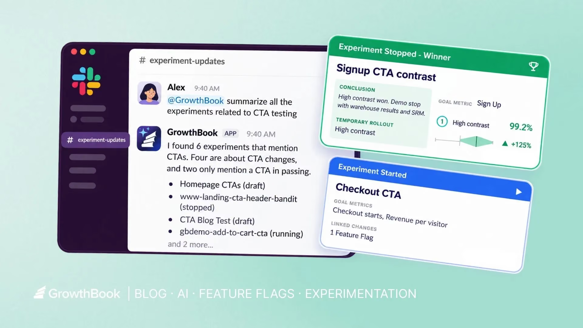
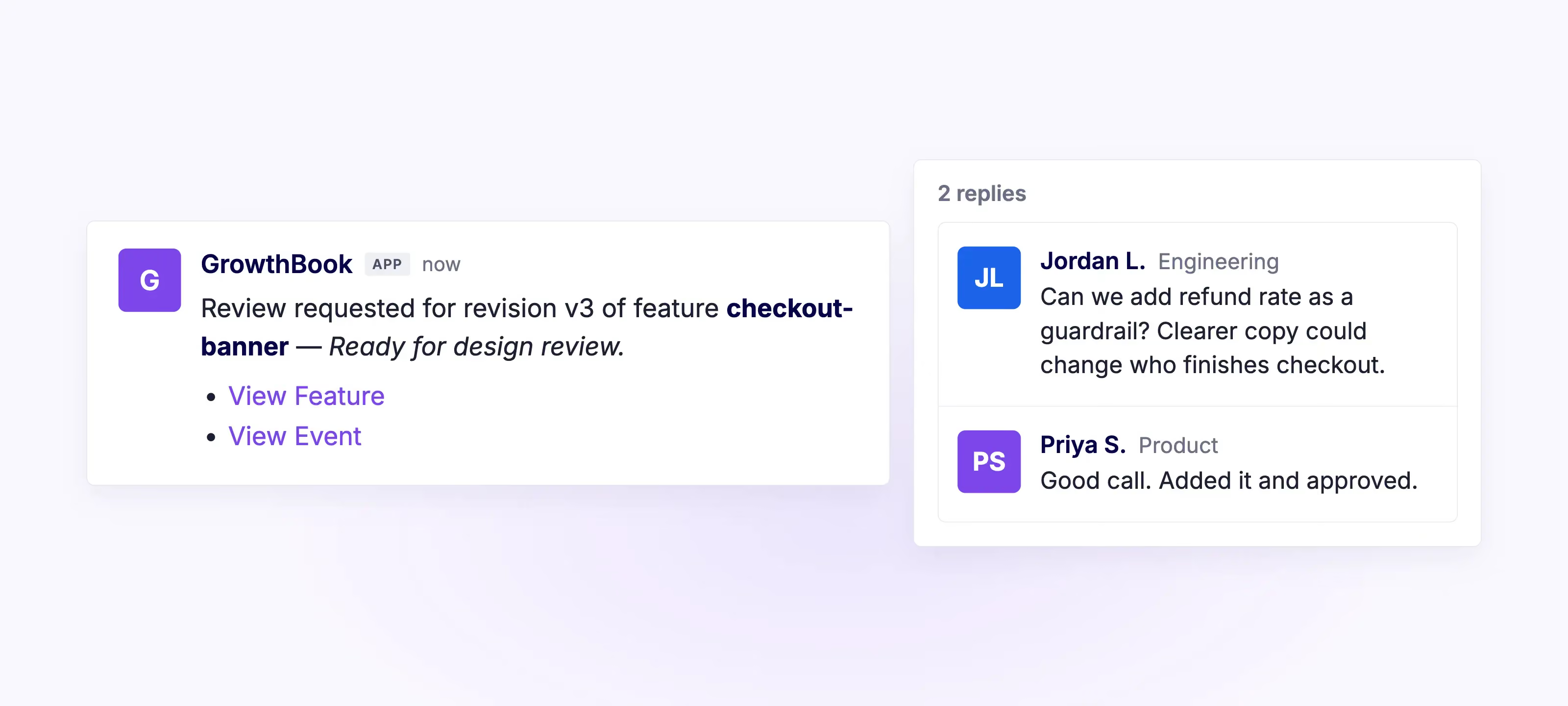
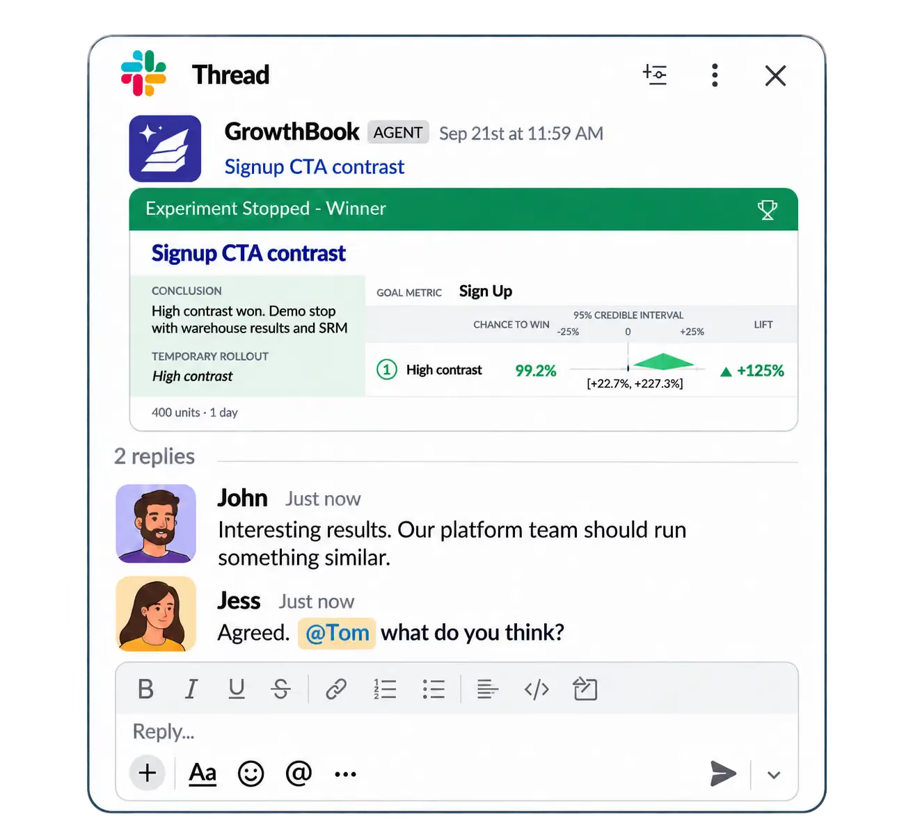
That’s why we’re so excited about the GrowthBook Slack app released in GrowthBook 5.1. About to launch an experiment? The right people see it in Slack and can weigh in before it goes live. Had a big win (or a loss worth learning from)? The results are automatically shared in your team’s channel.
By bringing experiments, feature flags, and AI-powered answers about your data into the conversations where teams already collaborate, the Slack app encourages broader participation and makes experimentation a more natural part of how your organization operates.
What the Slack app does
Chat with GrowthBook’s AI assistant directly from Slack
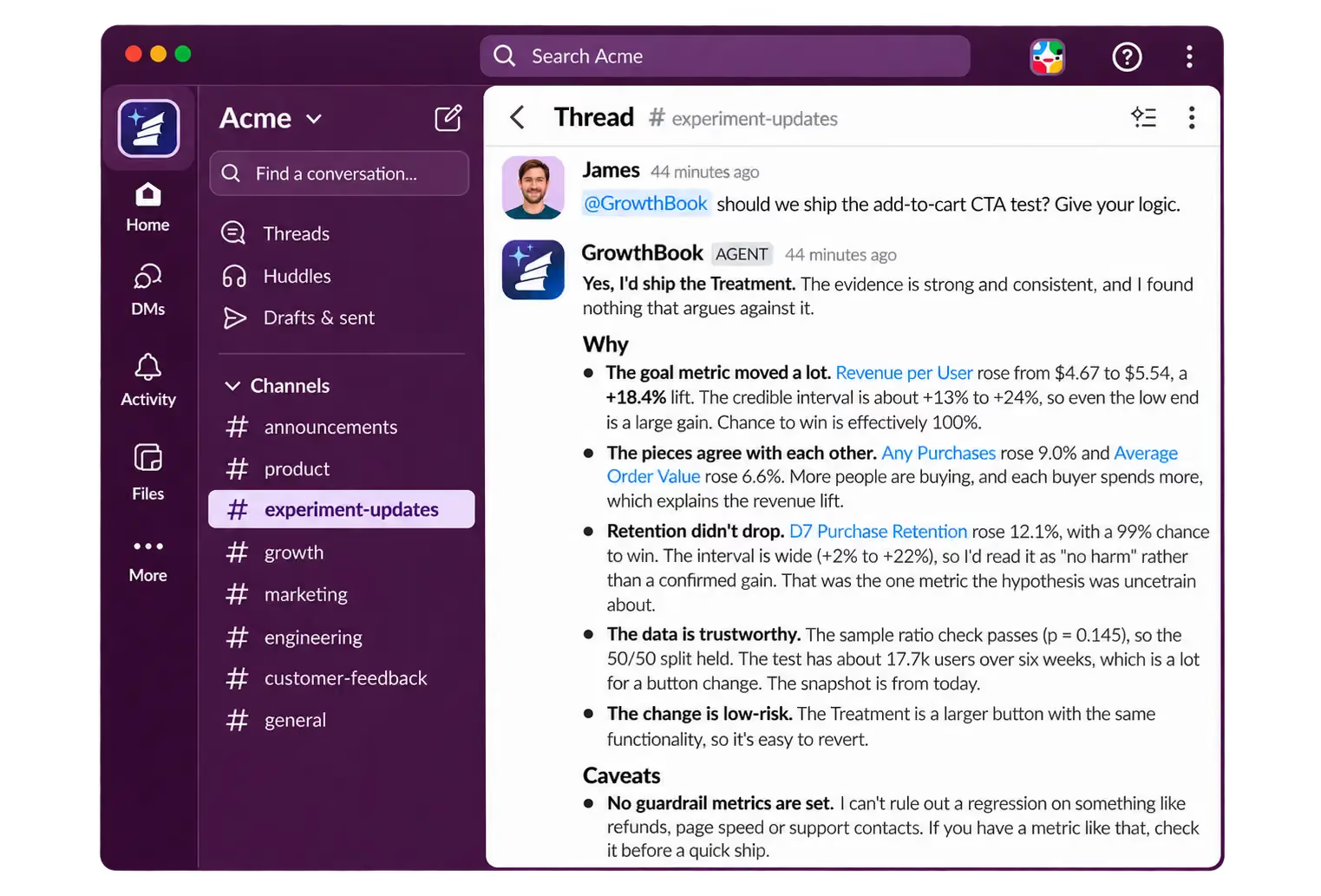
Tag @GrowthBook in any channel to ask about your experiments and get answers without opening GrowthBook. It's the same AI assistant you use in the app, now available in Slack.
Ask for a quick status check like “@GrowthBook how is the homepage hero test doing?" Or explore past experiments with “@GrowthBook give me a list of all the experiments that tested our checkout flow.” You can even ask broader questions like “@GrowthBook what are the key Learnings we have so far this year?”
Get real-time, granular notifications from GrowthBook
Stay on top of experiments and flags without constantly checking GrowthBook. Get immediate alerts for important events, including SRM issues, significance results, and pending approvals. Filters by project, environment, or tag keep each channel focused on what’s relevant.
What changed: Activity and change tracking
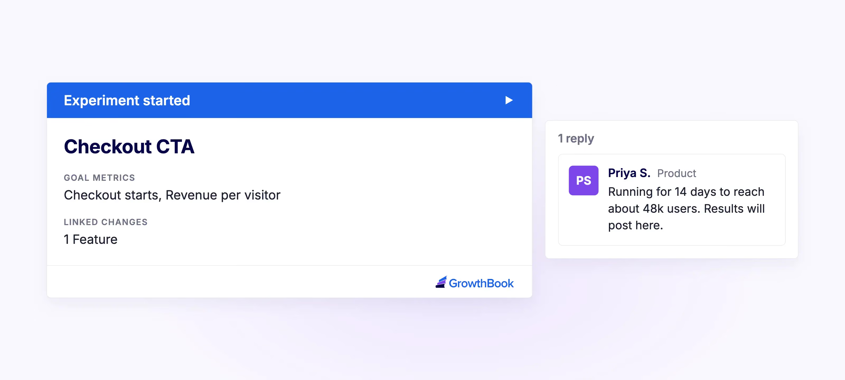
Keep teams informed as experiments and flags evolve, from experiment launches and edits to flag revisions and ramp schedule changes.
Potential issues: Health and data quality
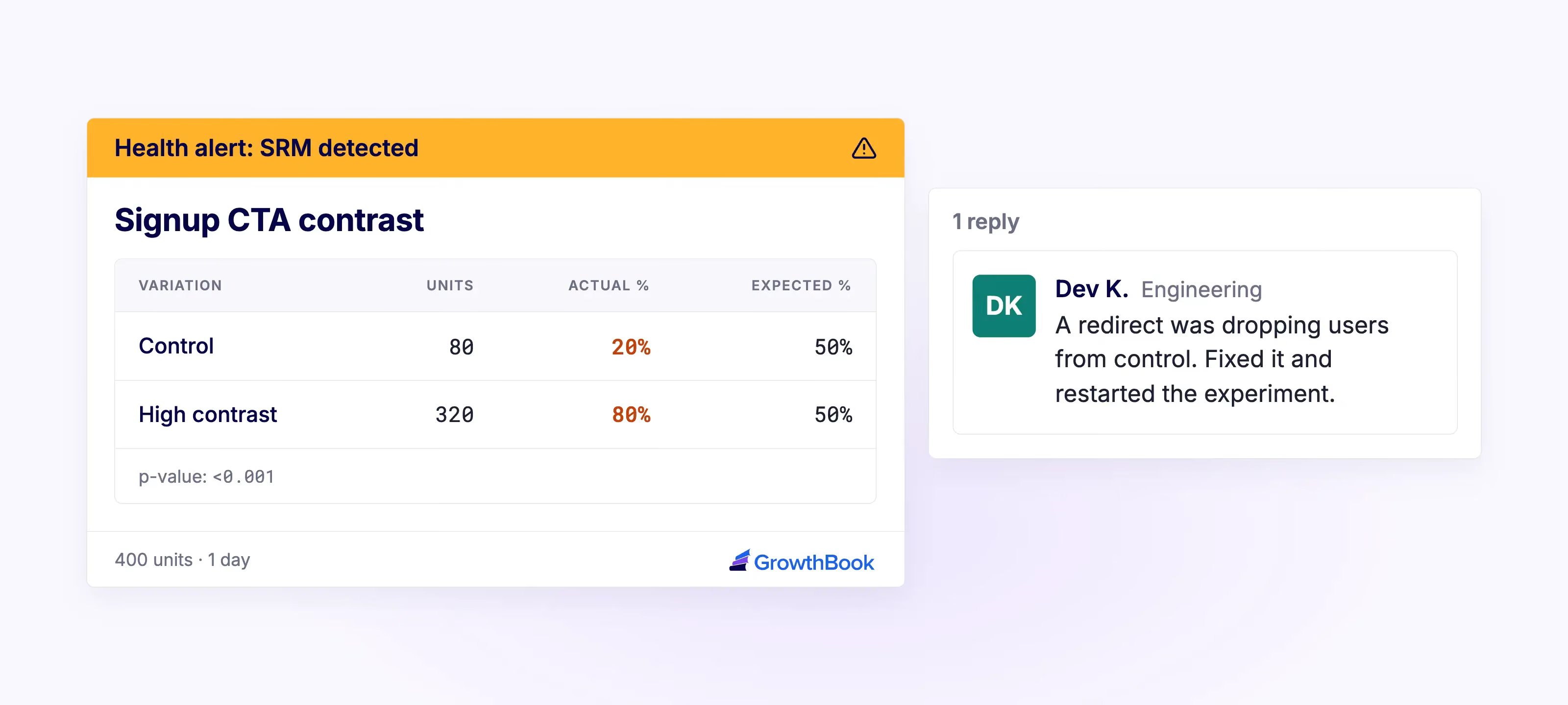
Surface issues that need attention, including sample ratio mismatch (SRM), multiple exposures, missing data, underpowered results, failed updates or publishes, and failing guardrails.
What we learned: Results and decisions
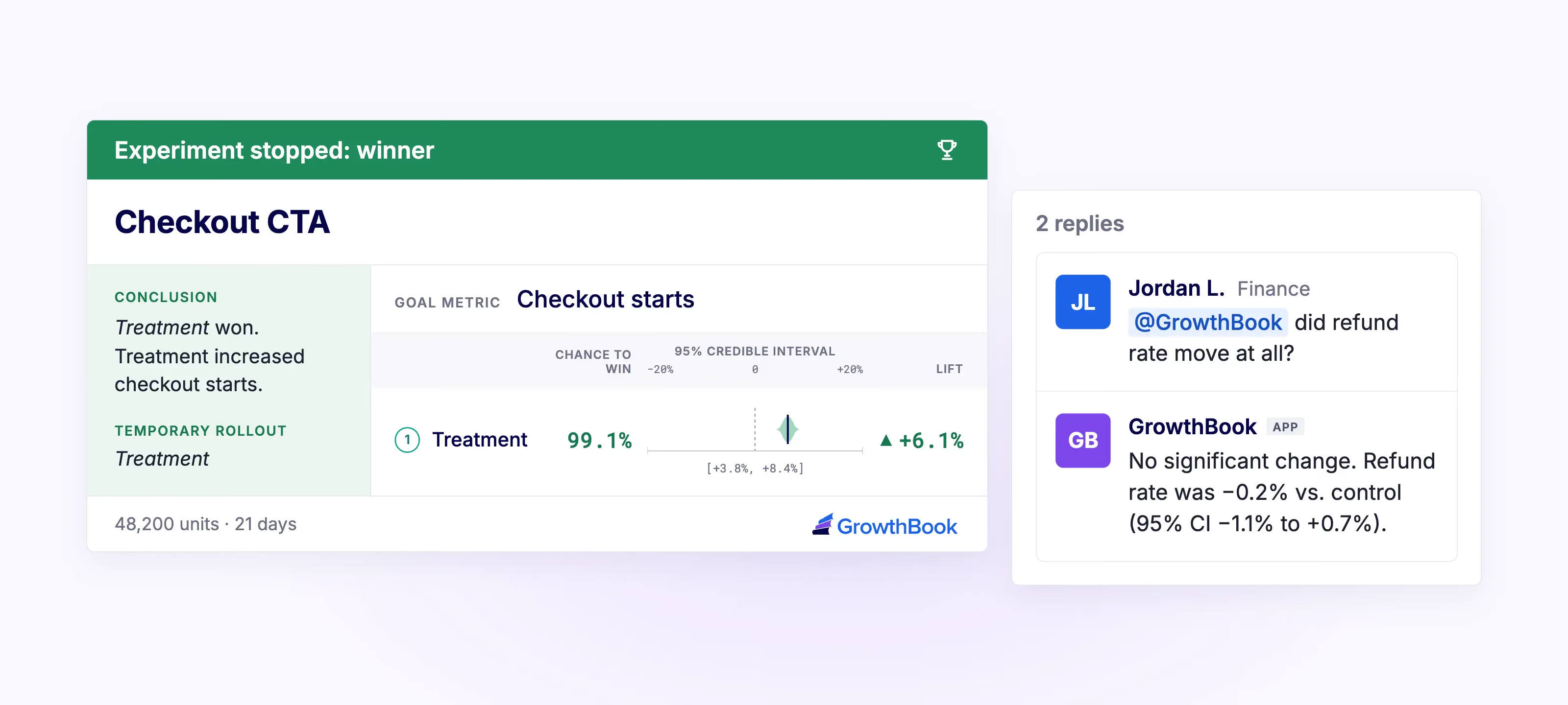
Bring significance results, decision points, and bandit variation weight changes into the conversation so teams can triage and decide what to do next.
Someone needs to act: Reviews and follow-ups
Keep approval requests for flags and experiments visible so they are more quickly actioned. Get updates when experiments are ready for approval, ready to launch, or have been running longer than 90 days.
Building a culture of experimentation
A strong culture of experimentation is one where teams challenge assumptions, test ideas, and let evidence guide decisions. It requires getting the right people involved, designing experiments that maximize learning, making insights accessible so teams can make decisions collaboratively in the moment, and ensuring those insights guide future decisions to shape the longer-term strategy. It also means giving evidence more weight than the most senior opinion in the room.
Bringing experimentation into the Slack channels where teams already collaborate helps make these practices part of everyday decision-making across the organization
Bring more people into experimentation
Experimentation works best when it extends beyond just the teams running tests. Product, engineering, design, growth, marketing, and leadership all have a role in identifying opportunities, challenging assumptions, and deciding what to do next.
But involving those teams at the end of an experiment, if at all, limits their ability to contribute. Bringing relevant updates into Slack gives stakeholders visibility while there's still time to offer context, raise concerns, or influence a decision. This helps keep people involved throughout the process, rather than bringing them in only when results are ready.
Make data-driven decisions together
Experiments often reveal trade-offs that aren't obvious from a single metric. A change that lifts conversions might also increase cancellations a month later. Weighing that trade-off well takes input from across the business. For example, customer success can share what they're hearing about churn and finance can speak to what a cancellation costs.
The GrowthBook Slack app gives teams a natural place to discuss and work through those trade-offs. When results are posted to a shared channel, people can share their perspectives in the moment, add context, and weigh in on conversations, helping teams make informed decisions together.
Turn experiment insights into better business decisions
Experiments can inform broader business decisions. For example, an online grocery store might test different ways of featuring products and find that one approach drives fewer sales but shifts customers toward higher-margin items. That insight could influence everything from inventory choices to how much to spend on marketing.
Sharing those findings across the organization helps teams build on what they've learned and identify new opportunities to test. The GrowthBook Slack app helps drive collaboration by making results and insights accessible in the channels where teams already work. Combined with GrowthBook's Learnings, it helps teams use those insights in future experiments and strategy.
What's next
The GrowthBook Slack app is currently in beta and we’re continuing to improve it. Future enhancements will include more proactive AI capabilities, like regularly summarizing your top experiments and new learnings, surfacing what needs your attention, and flagging issues before you have to go looking for them.
We’d love to hear what's working well for you and what you'd like to see next. Join our Slack App GitHub discussion to share your feedback and help shape what’s ahead.
Bring experimentation into the conversation
Experimentation has the greatest impact when insights reach the people who can act on them. The GrowthBook Slack app brings launches, results, and AI-powered answers into the conversations where teams make decisions.

How Grubhub tests big product bets before they ship
Most conversations about experimentation start at the A/B test. Michal Lenik's starts much earlier.
Michal leads the design teams behind Grubhub's B2B2C experiences: the three-sided campus marketplace, the corporate consumer and corporate enterprise experiences, corporate partnerships, and all of the tooling merchants use. Before that she led design for Grubhub's post-purchase experience, which covers everything after an order is placed, from customer care to the fulfillment app drivers use.
Her admission early in the conversation will surprise anyone who assumes a consumer marketplace runs a constant stream of split tests. Grubhub does not do much classic A/B testing. What it does instead is test earlier, test smaller, and put real options in front of real users before a big bet reaches millions of people.
Design as a business lever, not a screen factory
Michal's teams experiment with products, but they also experiment with process. The question they have been testing is where design belongs.
In her model, design sits far upstream in product development as a strong business lever. It does not wait for a finished requirement and then produce screens. It helps define the solution in the first place. The experiment is whether that way of working brings business value, and whether the team can see it through.
She connects the shift to AI. As tools take on more of the production work, the role moves toward defining the human experience rather than designing screens. She expects designers to split in two directions: toward design engineering, where they build products directly, or toward deep specialization in craft, because in a world where everything looks the same, elevated craft becomes a real differentiator. Alongside that, she sees product and design roles merging, with design thinking about go-to-market and solution design from the start.
Small cohorts instead of classic A/B tests
For its big bets, Grubhub experiments by releasing features internally or to small cohorts and watching whether they win or lose. The goal is to act against business metrics without disrupting core revenue and order metrics while the answer comes in.
Michal's example comes from her post-purchase work. Grubhub saw a lot of customer care contacts, canceled orders and changed orders after checkout, driven by anxiety about whether the order was right. The team designed a review screen that appears right after an order is placed: is this the order you wanted, and is it going to the right place?
A screen like that could reduce care costs. It could also cost orders. So the team released it to a very small cohort and monitored both closely, confirming that care contacts fell and orders held before going further. Less A/B, as Michal put it, and more slow rollout to see whether an experiment wins.
The merchant concept test that changed direction
Asked for an experiment the team learned the most from, Michal described a recent one in Grubhub's merchant promotions space.
The team did the research first. They spoke with around fifteen merchants about how they use the product and what would help, and came away with a clear view of where merchants wanted to go: more metrics and more information.
Then they turned the concepts into something merchants could react to and put them in front of the people who would use them. Merchants preferred the much simpler experience.
"I'm glad we did it because I think we would have otherwise launched a very different product that probably wouldn't have won or wouldn't have been as successful," Michal said. The team pivoted and is now designing a different kind of dashboard.
Ashley recognized the pattern from his own product work. You spend months on something, it becomes your baby, and then a customer who is doing twenty other things at once shows you they have forgotten how it worked the last time they used it. Michal's response has become one of her working principles: product design is a master class in removing your ego from the experience. Users will always find ways to use a product differently than you expected, and the job is to build for what is best for the business and the user.
Prototypes in front of users, early and often
The concept test is not a one-off. Grubhub hosts a regular round table with merchants where the team brings products and features forward, gives merchants testing environments, and watches them work through a task. Can you get through this? Is it valuable?
AI has made that loop much faster. Michal's teams can throw prototypes together quickly and put real, clickable experiences in front of users early, running what she calls micro experiments throughout the process. The payoff is directional confidence before engineering commits, which is the whole point of de-risking upstream.
AI speeds up the other end of research too. Synthesis used to mean days of sticky notes. Now the team can run interview notes through NotebookLM or Claude and get a fast synthesis to work from.
Success metrics for every team in the room
When Grubhub does set up a formal experiment, Michal starts with success metrics, and she pushes teams to define them per discipline. How does product know it won? How does design know it won? How does engineering know it won?
For design, the metrics are about engagement and time on task, signals that the experience itself hit the mark. For the business and product side, the questions are whether the feature brings in more revenue, drives more orders and moves things forward for the business. Whatever the set is, it is agreed early and tracked through the experiment.
Why the numbers need a conversation
Ashley raised the case every experimenter knows. The research says there is a need, the feature ships, and engagement does not show up. Did users not see it? Did they see it and get confused? Was it simply not what they wanted?
Michal's answer is qualitative research after the experiment. Grubhub has the emails and user connections to reach people who went through a test, and the team incentivizes five or ten of them to talk through what happened and why they chose one option over another.
Even an unhelpful sounding answer is useful. A user who says they never noticed the button because they were dealing with a whiny kid and putting laundry away is telling you the feature is either arriving at the wrong point in the process or is not visible enough for someone half looking at their screen. That context is what turns a flat result into a variant that can win. Michal calls it the marriage of qual and quant, and she thinks too few teams build it into their post-experiment process.
Choosing where to de-risk
The conversation closed on a contrast. GrowthBook builds a technical product used across mobile, web, data warehouses and a long list of other tools, so Ashley's team ships a V1 quickly and innovates around the feedback, sometimes going from feedback in the morning to a fix in the afternoon. Grubhub, with millions of users, invests upstream so that it releases with confidence. A mistake there means a lot of hangry customers.
Michal does not think one approach is right. Both work, and the deciding factor is how fast engineering can move. If a team can release a product, see it underperform and change it within a sprint, iterating in production is a fine model. If not, the de-risking has to happen earlier.
What matters is choosing. At some point every team has to de-risk, either in a fast follow or upstream in the process. Her advice for any company setting up an experimentation program is to decide on that path intentionally and make it part of the product development process from end to end.

B2B product discovery: what MilliporeSigma learned rebuilding on-site search
Most experimentation stories start with a bold redesign. This one starts with a search box.
Dorothy Crepin is the Senior A/B Testing Analyst at MilliporeSigma, the name Merck KGaA's life sciences business goes by in North America. She joined in 2022, a few months after the A/B testing program started, and she describes her job the way a dispatcher would: air traffic coordinator for the testing program, moving experiments from inception through execution to analysis across product managers, designers, engineers and analysts.
Three audiences, one catalog
Personas get treated as a marketing exercise at a lot of companies. At MilliporeSigma they decide whether the site works at all.
The traffic splits three ways. Scientists arrive looking for a specific instrument or material for an experiment. Procurement buyers arrive with a list somebody else wrote and no interest in alternatives. And a large education population arrives from universities, learning rather than buying, with no purchasing power at all.
Layer a regulated industry on top of that. What MilliporeSigma can sell changes country by country, and so does the way the company presents its own name. The same catalog has to behave differently depending on who is looking at it and where they are standing.
The change that beat the obvious answer
Dorothy's team noticed that customers were reaching the site through Google rather than using the site's own search, and that the on-site search was underused once they arrived.
The original type ahead did what most e-commerce type ahead does. Start typing, and it recommends a product that matches the query. The team changed it to suggest a search term instead, and stopped forcing the customer into a single product the system might have guessed wrong.
The result was a double digit increase in feature usage and a double digit increase in add to cart from those searches.
What makes it a good experimentation story is that the winning variant is the less commercial one. Pushing the product is the instinct. Letting the customer describe what they are looking for is what worked, and it opened a question the team is still pulling on: how quickly to show options, how literally to take a query, and whether a wider set of products now gets discovered and bought.
Revenue is an outcome
Dorothy traces a change in how her team measures back to a webinar she watched about 18 months ago.
Everyone focuses on revenue, and stakeholders are measured on it, so it is never going away. But revenue is an outcome. The useful question is which metric leads to it, page by page.
Her example is a product detail page. The cart is what converts. The product detail page's job is getting the product into the cart, and before that it is product discovery. Measuring a PDP test on revenue measures somebody else's work.
That framing also shapes how her team sequences tests. When four or five experiments are ready at once and all of them touch the same area of the site, the questions become whether they can be made mutually exclusive, whether there is enough audience to split, and whether the change is big enough to measure at all.
Where A/B testing stops and user testing starts
A/B testing tells you what happened. It does not tell you why somebody did not click the button.
MilliporeSigma's user testing group built an ambassador panel for exactly that gap: people with real domain expertise rather than the general public, which matters when your customers are scientists. Dorothy calls the combination of the two a powerful tool the company is still working on unlocking, which is a more honest description than most programs give.
Start with the problem, not the hypothesis
When a product manager arrives certain that a feature will win, Dorothy does not start with the hypothesis. She has found that a hypothesis is already too far down the funnel.
The first question is what problem are you solving for the customer, followed by what the solution looks like when it is finished. Then, before the test is built: is this customer problem grounded in data, or is it a gut feeling? Her team has data scientists building dashboards and self service tools precisely so the answer can be the former, and she is candid that a gut feeling is not disqualifying. It just should not arrive alone.
What Dorothy is watching next
Two things.
The first is agentic testing. MilliporeSigma has relatively few people going through the purchase process and a great many browsing. Dorothy wants to build personas into agents to get a directional preview of an experiment and to test the browsing majority in a way that still connects to the outcome.
The second is how tests get evaluated. Her team is looking at multiple models and methodologies rather than one Bayesian approach across the whole program, and she is seeing vendors move the same way. She also expects analysis to go beyond primary and secondary metrics, to something that surfaces the one standard deviation anomalies nobody thought to look for.
For a program aiming at twelve experiments a quarter, that is a lot of ambition. It is also what happens when leadership treats testing as part of the product development lifecycle rather than a check at the end.

Beyond evals: A/B test AI features with LLM traces and business metrics
Every new AI model brings its own response style, its own strengths, its own sharp edges when it meets your application.
You’ve probably written offline eval specs to capture the most important response qualities for your users. As you consider switching from Sonnet 5 to Sonnet 5.5 or updating your prompts to work with the new models (or your changing users), you run these evals to make sure the new model's sharp edges don't show up as regressions in quality or performance.
Until you ship to prod, though, you don’t really know how your customers, with all their edge cases, will respond. Or what impact your changes will have on your revenue, daily active users, and token costs.
Before your release to everyone, everywhere, all at once, you can figure out that potential cost. You can run an online, controlled experiment, using the trace data you already collect.
GrowthBook can now use your LLM trace data as experiment metrics, so you can connect your changes with your observed LLM behaviors and the business metrics that matter.
Experiments are stronger with traces and business metrics
Trace data on its own is valuable, whether it’s observed data like latency or cost, or data generated through offline evals or LLM-as-a-judge setups. Experiments that leverage just trace data can help you determine, with experimental validity rather than gut feel or quick comparison, which model, prompt, or parameter configuration actually improves your scores without degrading other metrics.
But experiments on your AI features are stronger when tied in with business data. GrowthBook analyzes your data where it lives. When your trace data rests in the same warehouse as your product and business data, a single experiment can measure both: token cost, latency, tool calls alongside revenue, clicks, and daily active users. Your trace metrics could be goals or guardrails or both, and integrating them with other experiment metrics enables you to answer more complex questions. You can answer not just “which prompt scores better,” but “which prompt leads to higher feature adoption rates and revenue growth.”
What you can A/B test: Prompts, models, and agents
Some changes affect just what can be measured in your traces. Others matter most if they affect your conversions, revenue, or customer satisfaction. GrowthBook handles both.
When the answer is in your traces and evals
Managing costs without sacrificing quality: Shift your summarization feature to a cheaper model to bring down LLM costs per user, and switch only if the eval score for summary quality and error rate stay steady or improve.
Improve prompt quality to improve helpfulness: Rewrite the system prompt for your support assistant, and test whether its helpfulness score improves. Guard against token usage ballooning and latency increases, since more thorough answers could easily get longer and slower.
Dynamically adjust traffic to multiple prompts: Suppose you have several prompts that all seem viable. You can run a multi-armed bandit with helpfulness (as defined by an LLM judge) as your primary metric, and GrowthBook will allocate more users to the most helpful prompt as evidence comes in.
When the answer rests in your business
Ensure that larger models actually sell more: Using a larger model for your shopping assistant costs more for every request and response. Does it actually sell more? Test with revenue per user as your primary goal, and evaluate revenue lift alongside token spend.
Find sharp edges before your entire user base does: Release your new onboarding agent to internal users first, then ramp up from 2 to 5 to higher percentages of users. Measure their activation or retention rate after a set period, like 7 days, with error rates and latency as guardrail metrics. If your agent negatively impacts these metrics, turn it off via flag.
Turn LLM traces into experiment metrics
Here’s how a single trace tag turns your observability data into experiment data:
When someone runs an experiment, GrowthBook decides which version of a model, prompt, or parameter each user should see, then tags that user’s trace with the assignment. Your tracing tool, like Langfuse or Arize Phoenix, records that tag right alongside the normal trace data it already collects, such as latency, cost, and errors.
GrowthBook then reads those tagged traces back out of your tracing tool and groups them by which version each user saw. That lets it compare how each version performed on the metrics you care about, so you can see which one actually wins before rolling it out to everyone.

Langfuse and Arize Phoenix are our first two integrations. More are on the way.
Setting up an experiment with trace data
1. Tag each trace with the version the user saw. The GrowthBook JavaScript SDK 1.8 includes a tracing plugin that records each assignment as a tag, such as gb.exp:support-model=small. Pass the tags to your tracing SDK at the start of each request. With Python and other SDKs, you add the tag yourself.
import { GrowthBook } from '@growthbook/growthbook';
import { tracingPlugin, getTracingTags } from '@growthbook/growthbook/plugins';
import { context, getTracer, setTags, setUser } from '@arizeai/phoenix-otel';

const gb = new GrowthBook({
  clientKey: 'sdk-abc123',
  attributes: { user_id: userId },
  plugins: [tracingPlugin()],
});
await gb.init();

const model = gb.getFeatureValue('support-model', 'large');

// Put the user and the experiment tags on the trace, then start it
const ctx = setTags(setUser(context.active(), { userId }), getTracingTags(gb));
await context.with(ctx, () =>
  getTracer('support-bot').startActiveSpan('support-reply', async (span) => {
    await answerQuestion(model);
    span.end();
  }),
);
2. Connect GrowthBook to your trace data. Add Langfuse or Arize Phoenix as a new data source, or add it to one you already use with Add Event Tracker. Either way, GrowthBook sets up six metrics for you: LLM cost per user, p95 LLM latency, LLM error rate, tokens per LLM call, LLM calls per user, and traces per user. Add metrics for the eval scores and user feedback you already record.
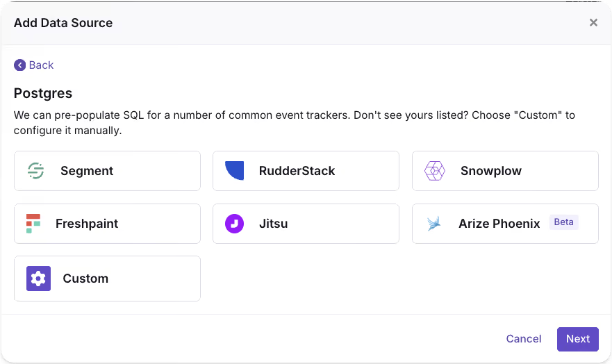
3. Run the experiment. Choose who's included, how much traffic each version gets, and your goal and guardrail metrics. You can assign versions per user, per session, or per request. Frequentist or Bayesian statistics tell you when a difference is real.
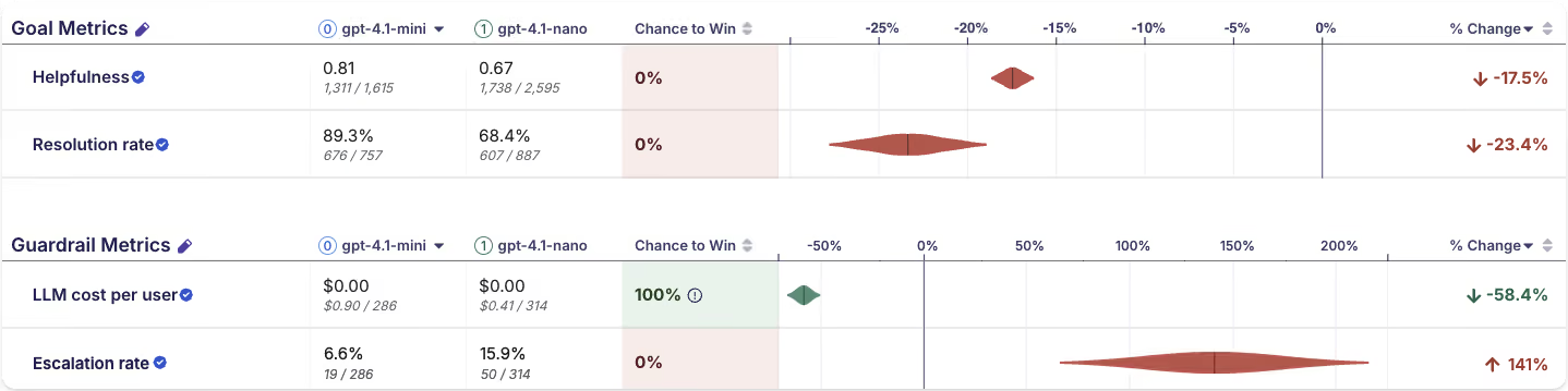
4. Analyze the results. GrowthBook shows how each version performed on every metric and whether the difference is real. Check your goal metric first, then your guardrails: a cheaper model that hurts quality isn't a win. When the answer is clear, roll out the winner or roll it back, and take what you learned into the next test.
Get started with LLM experiments in GrowthBook
LLM trace experiments are available now in beta on GrowthBook Cloud for Langfuse and Arize Phoenix.
To learn more, check out our docs:
- Experimenting on LLM features: how it works, and how to plan your first test
- Setup reference for Langfuse and Arize Phoenix
Pick the model or prompt change you’ve been hesitant to ship, and test it safely with real users.
.avif)
How to run multiple experiments at once and keep results trustworthy
Running experiments one at a time is safe. Every test enrolls the whole user base and nothing overlaps. It’s also slow. Any test using the whole user base blocks everything behind it. Even with access to the entire user base, many experiments need to run for at least 2 weeks to balance out day-of-week and novelty effects. This means a program that only runs one test at a time can’t complete more than 26 experiments in a year.
But Microsoft, Amazon, Booking.com, Facebook, and Google were each running more than 10,000 experiments a year as far back as 2017. Even at their scale, this is only possible when tests overlap. Meta has since described running about 20,000 concurrent experiments.
This is possible because, in practice, two overlapping tests rarely distort each other’s results. To scale an experimentation program to thousands or even tens of thousands of tests, most companies need to default to simultaneous experimentation. This guide will explain when overlapping experiments conflict and how to keep your results trustworthy as you scale.
Can you run multiple experiments at the same time?
Yes, you can run many experiments on the same users at the same time, as long as each experiment randomizes its assignment independently. Independent randomization spreads the effect of every other experiment evenly across your variations, so overlapping tests don't distort each other's results. The largest experimentation programs depend on this independence. Microsoft runs hundreds of A/B tests daily with each user in several simultaneously, and DoorDash runs thousands of experiments in parallel every month.
Independent randomization comes from how experiments assign their units. GrowthBook assigns with a hash function, a fixed calculation that turns the user's identifier and the experiment’s seed into a number between 0 and 1. The outputs are spread evenly and unpredictably, so across many users they behave like random draws, and each user’s number determines their variation. The same inputs produce the same number every time, so a user who returns tomorrow gets the same variation they got today (often called sticky bucketing). Because every experiment uses its own seed, a user’s assigned variation in one experiment is independent of their variation in any other.
Because of that independence, the comparison between your treatment and control groups stays valid even while other experiments are running. Users in another experiment’s treatment split evenly between your control and treatment groups, so any effect on those users applies equally to both and cancels out. A holiday campaign or a service outage works the same way, affecting both groups equally.
Whether you run 5 or 500 independent experiments on the same population, you have, essentially, a full factorial design, where every combination of variations runs at the same time. Users spread across those combinations in predictable proportions, and each experiment measures its own effect averaged over all the others.
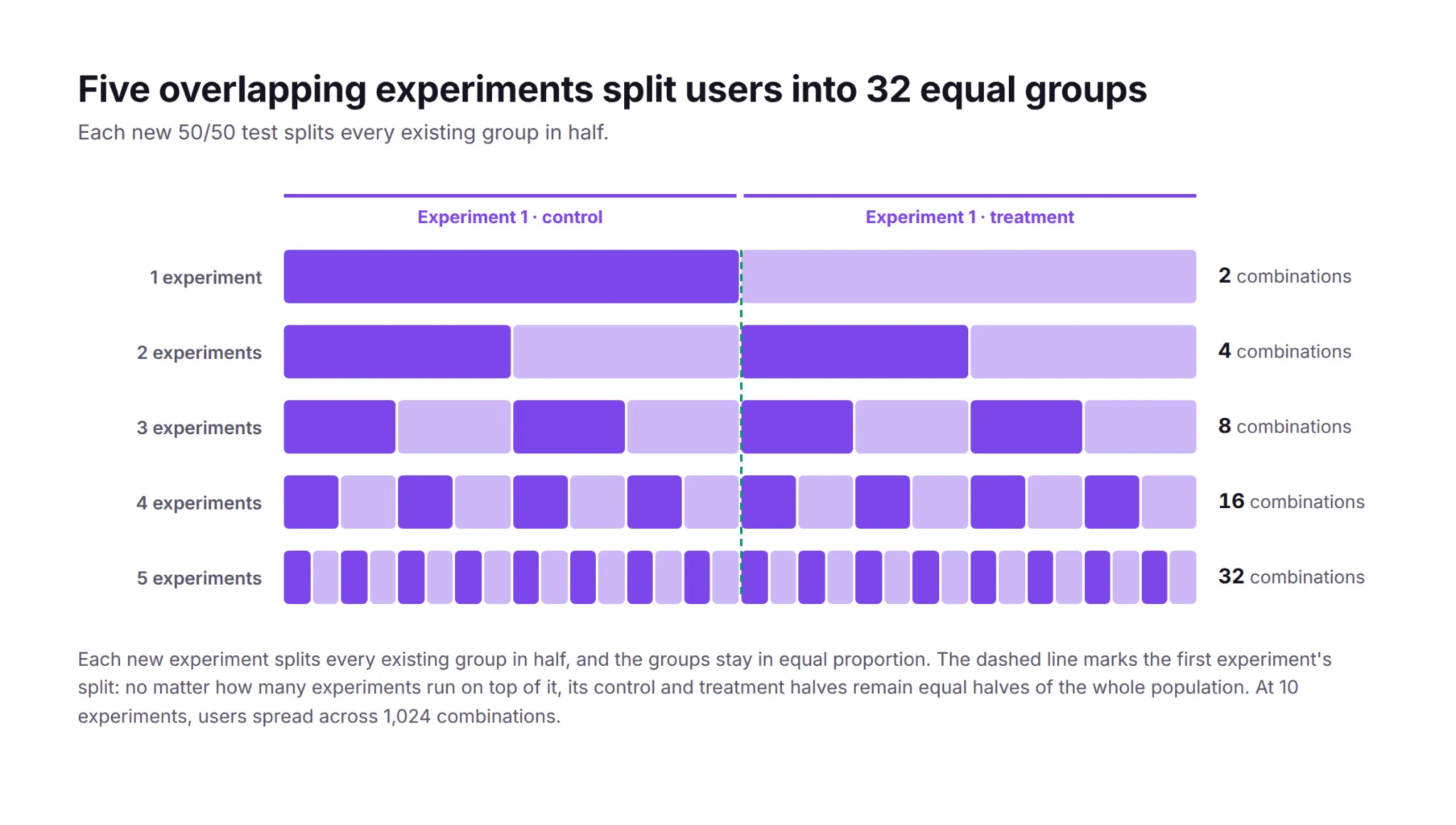
In the real world, users never experience one change at a time anyway. Releases, marketing campaigns, seasonal traffic patterns, and other experiments are always running, so a result measured while everything else changes reflects the conditions after rollout better than a result measured in artificial isolation.
When do concurrent experiments conflict?
If one experiment adds 1% to conversion on its own and another adds 1%, users in both treatments should see close to 2%. An interaction effect is any departure from that sum, in either direction. For example, two page-speed improvements can produce a combined gain smaller than the sum of their separate gains, because performance improvements have diminishing returns. Conversely, cart-reminder emails combined with a smoother checkout can add more than the sum because the emails bring users back to their carts, and the improved checkout converts more of the users who return.
Strong interaction effects are rare. Practitioners running the largest programs report that two interacting experiments rarely distort results enough to change a ship decision. Part of the reason is the base rate. At Microsoft, roughly a third of experiments improve their key metric, a third hurt it, and a third show no effect, and a treatment with no effect has nothing to interact with.
Although rare, two experiments can distort each other’s results when their changes collide in the product itself. In one documented case, two experiments each added an element to a retail page that pushed the buy button lower. Neither change moved the button below the fold on its own, but a user in both treatments got both elements at once. That combination pushed the buy button below the fold, and add-to-cart rates dropped.
The collision doesn’t have to be visual. If one experiment tests a 15% welcome discount and another lowers the free-shipping threshold, each offer may pay for itself on its own while users in both treatments can stack offers into unprofitable orders.
Experiments can also collide by trying to change the same parameter. If one experiment sets a search page’s default sort order to newest-first while another personalizes the ranking, a user in both treatments can only be exposed to one. Which sort change they actually see is determined by an implementation detail (such as the order the rules evaluate in), and the overridden experiment measures a treatment that part of its assigned group was never exposed to.
In practice, the most common collision is an unintentional bug. Both teams develop and test against the page's default experience, so the combination of their two treatments only exists once both tests are live, for the users assigned to both. Neither team tested that combination, and when the two changes are incompatible, part of the page stops working for those users. The second experiment then records a negative effect that reflects a bug rather than the change being tested.
Teams can predict most of these conflicts before launch. Two tests that modify the same element, the same page, or adjacent steps in the same funnel should be reviewed together. They usually belong to a single team that can see the collision coming, but if multiple teams work on related tests, shared rituals like a weekly experiment review can surface collisions. Tests on different surfaces with different metrics can overlap freely.
How to isolate the experiments that conflict
Teams that expect two tests to conflict can make them mutually exclusive, so users are only enrolled in one experiment. GrowthBook implements mutual exclusion with namespaces. Overlapping experiments stay independent because each one hashes users separately. A namespace removes that independence for a chosen group of experiments. The namespace hashes each user once to a number between 0 and 1, and each experiment in the group claims its own slice of that range. Each user’s number falls in at most one slice, so each user is enrolled in at most one of the experiments.
Google's infrastructure uses the same design at a larger scale. Its experiment system partitions system parameters into layers and hashes users separately per layer, so experiments in different layers overlap freely while experiments inside a layer stay mutually exclusive. The partitions exist because letting every parameter vary freely would serve combinations like “pink text color on a pink background,” but “Google has to always serve a readable, working web page.”
Exclusion costs power, so use it sparingly. Every experiment in a namespace runs on a slice of the population, which lowers its statistical power. Detecting the same effect takes longer because the population is smaller. Isolating experiments also creates a queue, because a new test waits for an old one to release its users. A program focused on experimentation at scale should reserve exclusion for conflicts a team can identify in advance.
How to detect the conflicts you didn’t predict
Mutual exclusion only covers the conflicts a team predicted in advance. The conflicts that go unpredicted usually disrupt assignment or event logging, and those issues appear in an experiment's health checks.
A sample ratio mismatch (SRM) is a statistically significant gap between the assignment ratio you configured (like 50/50) and the ratio you actually observed. SRMs can have many causes, including other experiments. For example, on platforms that reuse the same hash or user buckets across experiments, assignment in one experiment can becorrelated with assignment in another (either one running alongside it or one that ran before it). When two experiments split users with the same hash, each user gets the same number in both, so the users in one experiment's treatment are largely the same people as in the other’s. Users are only counted in your experiment when they show up and trigger an assignment. If the other experiment’s treatment makes its users return more often, and the correlation places those users mostly in one of your variations, that variation enrolls more users than the ratio you configured. GrowthBook's per-experiment hashing prevents this correlation, so overlapping GrowthBook experiments don't produce it.
A conflict that stops the page from working for one combination of users can produce an SRM too. For example, if the combination of your treatment and another experiment's treatment crashes the page before the exposure event is logged, the missing users will be concentrated in one variation, and the observed split won’t match the configured one.
GrowthBook runs an SRM test on every experiment along with a multiple-exposures warning. A multiple exposure means the same user was exposed to more than one variation of the same experiment, such as both its control and its treatment. That usually signals an identifier or assignment problem, and those users can’t be counted toward either variation. An overlapping experiment can also trigger it. For example, if another test’s treatment changes the identifier your experiment hashes, such as by prompting users to sign in, the re-assigned users can appear in both of your variations.
The largest programs also test for interaction effects directly. A daily job checks every overlapping pair of experiments for combined effects that depart from the sum of the pair's separate effects, and Google runs the same kind of check inside its layers. An interaction only shows up among the users who received both treatments, and that group is small, so only strong interactions surface. Most days the job finds nothing.
Strong interactions are rare, and reviewing adjacent tests before launch along with routine health checks prevents most conflicts.
How to maintain statistical rigor across overlapping experiments
Overlapping experiments make it possible to run hundreds of tests at once, but as experiment volume grows, so does the need for statistical rigor, as issues like false positives and peeking have more opportunities to surface.
More experiments produce more false positives in absolute terms. At a 5% significance level, 100 experiments whose treatments have no effect will produce about 5 statistically significant results by chance alone, so a program that ships every significant winner will inevitably ship some false positives along with the real ones.
The same risk repeats inside each experiment. An experiment with 5 goal metrics and 2 treatment variations runs 10 significance tests for a single ship decision, and each one is another chance at a false positive, a problem known as multiple comparisons. GrowthBook applies Holm-Bonferroni or Benjamini-Hochberg corrections, which hold each individual test to a stricter significance threshold so the experiment’s overall false positive risk stays controlled.
You might think you could apply the same corrections at the program level, but the cost is prohibitive. Holding 100 concurrent experiments to one shared 5% false positive budget would demand p < 0.0005 from every test. Reaching significance at that threshold requires roughly 2.4 times as much sample per test. With the same sample size, each test’s chance of detecting a true effect falls from 80% to about 25%. And since the experiments that are running change often, one experiment’s verdict shouldn’t depend on how many tests other teams have launched.
More experiments also mean more results to look at while tests are still running. Every early look at a running test is another opportunity for a chance fluctuation to cross the significance threshold, which inflates the false positive rate. Sequential testing keeps that rate under control regardless of how many times you look.
A real improvement in the primary metric should also appear in the metrics downstream of it. More signups should mean more activations and, eventually, more revenue. A significant lift that doesn't flow downstream may be a false positive, and teams should investigate before shipping it.
What limits how many experiments you can run
In most organizations, the limit on experiment volume is operational rather than statistical. As long as each experiment hashes users separately, far more tests can overlap than most programs run. The capacity to set up, monitor, and analyze each experiment is exhausted first. Practitioners from 13 companies at the first Practical Online Controlled Experiments Summit tied scale directly to automation. With hundreds of experiments running simultaneously on millions of users each, a program sustains routine experimentation only when the platform computes every experiment’s metrics automatically and reliably.
Booking.com is designed around the same constraint. Its platform doubles as a searchable repository of every past experiment, with its results and failures, so a team can find out whether an idea was already tested before testing it again, and its safeguards let any team run its own experiments from setup through decision. Pre-launch checks and a lightweight review step maintain the quality of each test while the number of tests grows, so a program can add volume without trading away learning.
Chess.com treats experiment volume as a direct measure of that setup-and-analysis capacity. The team ran about 400 tests in a year and then set a goal of 1,000. Nafis Shaikh, Chess.com’s director of product management, explained the goal on The Experimentation Edge: “Part of that goal is actually to determine how effective we are at just getting through work.”
Mature programs also monitor the portfolio itself, tracking velocity and win rates across teams to find the bottlenecks. Programs that want to scale should focus on operational improvements like automated analysis, shared documentation, and a standardized launch process, and worry less about interaction effects.
How DoorDash runs 12,000 experiments a year
DoorDash runs about 12,000 experiments a year, with thousands in parallel every month across 42 million monthly active users.
Analyzing that many experiments became a bottleneck. Experiment analysis at DoorDash had no standard and struggled to keep up with the rate of experiments, so the team built a shared statistics engine and an automated analysis platform around it. DoorDash’s logistics group alone grew from about 10 experiments a month to more than 100 in 3 years with standardized processes and automated analysis. Ilya Izrailevsky, the senior engineering manager who leads the platform, outlined the team’s next investment on The Experimentation Edge: agentic tooling to set up experiments, debug imbalance issues, and generate readouts quickly.
How Microsoft keeps hundreds of daily tests from colliding
By 2013, Bing was running more than 200 concurrent experiments on any given day, with 90% of eligible users in more than 15 experiments at once, and about 80% of proposed changes run first as a controlled experiment. Bing prevents known collisions with declared constraints. An experimenter marks the surface a test touches, ad layout for example, and the platform keeps two experiments carrying the same constraint from running at the same time. The daily pairwise job catches whatever the constraints miss.
Microsoft checked every pair of A/B tests running on the same day across 4 of its products. In 3 of the 4, no interactions were detectable at all. In the fourth, they appeared in 0.002% of test-pair metrics, which is 1 pair in 50,000, and no pair produced two significant effects moving in opposite directions. The team titled its write-up of those results “A Call to Relax.”
How GrowthBook helps you run more experiments at once
GrowthBook is built to handle overlapping experiments. The SDKs assign variations with deterministic per-experiment hashing, so any number of experiments can overlap with independent assignment, and teams use namespaces for the exceptions that must stay mutually exclusive. Every experiment gets an automatic balance check, multiple-exposure warnings, and a health tab, and the stats engine applies multiple-testing corrections within each experiment. On the operational side, GrowthBook 5.0 adds agent-created experiments that launch as drafts a human can review, under the same approval policies and audit trails as manual changes.
If your program is ready to start running overlapping experiments, now is the time to choose a platform that can scale with you. Get started free or join a live demo.

PayPal's $180 million experimentation win
Show: The Experimentation Edge with Ashley Stirrup. Guest: Gaurav Sethi, Group Product Manager, PayPal. Publishing: September 30, 2026. Length: 00:31:21
When Gaurav Sethi inherited PayPal's experimentation team in early 2023, he was handed a number that looked like a trophy. The data scientists were reporting a win rate of 55% to 60%. More than half of everything the company tested was apparently a winner.
The industry average is 11% to 14%.
"So 55% win rate was something that did not really sit well with me," Gaurav said.
Two years later the same program ran 2,587 experiments in a single year and produced roughly $180 million in measured impact. The distance between those two facts is the whole story, and it is not a story about having better ideas. It is a story about making the results worth believing, and then making them arrive fast enough to act on.
On The Experimentation Edge, Ashley Stirrup sat down with Gaurav to walk through the platform his team built and the decisions that turned a program nobody could fully defend into one that could put a dollar figure next to every test.
The fastest way to grow an experimentation program is to make its output credible.
A win rate that was too good to be true
PayPal runs a homegrown platform called Elmo, short for Experiment Lifecycle Management and Optimization. When Gaurav took it over it was carrying 700 to 800 experiments a year and two structural problems. Insights could take up to four weeks, because the data collection underneath was broken badly enough that data scientists and data engineers had to clean it by hand before anyone could read a result. And there were no financial metrics attached to an experiment at all. Nobody could marry transactional data to behavioral data, so nobody could say what a test was worth.
The inflated win rate turned out to be a symptom of the first problem.
Most experiments were using default tracking, which meant assignment data. Gaurav explained the distinction plainly. You go to paypal.com, and the instant you land you are assigned to control or treatment. That is intent. It records that the system planned to show you something. It does not record that you saw it. You may never have scrolled to the section under test. You may never have opened the mobile page where it was running.
Measured that way, the experiments were carrying 25% to 30% dilution.
Ashley pushed on the mechanism: why would dilution produce more wins rather than fewer? Because diluted data reaches significance faster.
"If the data is diluted, then you will reach stat sig very quickly, even if some of the users did not even participate in that experiment," Gaurav said. The sample fills up with people the test never touched, the confidence interval tightens, and a flat result gets declared a winner. The 55% was not measuring wins. It was measuring noise with enough volume behind it to look like signal.
A win rate far above the industry average is a data question before it is a success story.
The exposure event that fixed the data
The fix had a name and a cost. Gaurav introduced an exposure event: as close as you are to rendering the experiment to a user, fire an event that says from this moment forward, this person is in the test. Do not log anything when the page loads.
Technically it is a small idea. Organizationally it was the hardest thing he did.
PayPal's UI is largely server driven, so the server decides what gets rendered and the client has to confirm what was actually shown. That connective tissue did not exist, and building it meant asking three different groups to absorb work they had not planned for. Data scientists had already built dashboards on assignment data. Engineers liked assignment precisely because the platform did the logging and they did not have to touch their features. Product managers were the hardest sell, because instrumenting exposure adds time to a launch, and shipping the feature is what they are measured on.
The same alignment problem showed up in instrumentation more broadly. Checkout tracked its own metrics. The digital wallet tracked different ones. Every team had internal metrics their own leaders cared about, and none of the specifications matched. Since the platform was trying to automate analysis end to end, every mismatched specification meant a pipeline that could not run without a human in it, which is exactly why insights took four weeks.
Then there was the transactional side. PayPal had acquired roughly ten brands, each arriving with its own data structures, and there was no canonical metric definition anywhere. Gaurav searched the catalog for total payment volume and found eleven different versions of it.
His team normalized the structures, settled the definitions, aligned transactional grain with customer grain and behavioral grain, and put the whole thing on a schedule mapped to exposure events. That is what made financial impact computable per experiment. He had an advantage going in: before taking the experimentation team he had led PayPal's data organization, so he already knew where everything lived.
By the time he left, experiment readouts were available within 24 hours.
Standardizing the measurement is what makes automation possible, and automation is what makes speed possible.
700 days, or 51
The best illustration of what the rebuilt platform bought them was a carousel.
PayPal's marketing team wanted to test the home page carousel with new images and new copy, which produced six or seven variants. The projection for reaching significance across all of them as a standard A/B test came back at about 700 days.
Ashley's reaction was the obvious one: PayPal.com gets enormous traffic, so how is that possible? Gaurav's answer is worth sitting with. Most PayPal volume arrives through pay with PayPal, which drops the user directly onto a login page. They never see the home page or the hero banner. More users had moved to mobile. The traffic actually available to that test was a small fraction of what the brand implies.
So they ran a multi armed bandit.
"It's an A/B experiment on steroids," Gaurav said. When an arm underperforms, the bandit pulls traffic off it and redistributes it to the rest, exploring and exploiting at once instead of spending equal sample on options already known to be losing.
Within roughly 40 days, two variants had separated clearly from control and the others. His team eliminated the rest, ran a straight head to head A/B test between the final two, and by day 51 had a significant result. The winner delivered almost five basis points of improvement.
When the math says a test is impossible, that is a signal about the method, not the idea.
Every result is a return
The $180 million number that came out of 2025 has two halves, and Gaurav is deliberate about both.
One half is revenue from winning experiments. The other half is cost avoidance: the features that tested badly and never shipped, along with the build time, maintenance, rollbacks and customer damage that never happened.
"There are no winning or losing experiments," he said. A winner gives you direct revenue or a direct move in your primary KPI. A loser tells you not to ship something that was never going to scale. One is impact, one is avoided cost, and both belong in the number you report upward.
Believing that changes how experiments get designed. Gaurav's guidelines for product managers are unglamorous. Write a hypothesis that states something testable, not a one liner about turning a button red to see if people click more. Design the target segment deliberately and check it for bias. Name a primary KPI before launch, with a secondary and a guardrail where the test warrants it, so the criteria cannot be relitigated once results are in.
And the platform is only half the job. Six good engineers can build a decent experimentation platform in six months, Gaurav said. The effort that actually consumed his time was education: biweekly sessions that regularly drew more than 100 attendees, standing office hours, and an LMS course so a new product manager or engineer could learn the basics on day one.
What comes next: Experimenting on AI agents
Asked where experimentation goes from here, Gaurav split it in two.
The first direction is AI applied to experimentation: agents that summarize a readout so a product manager does not wait on a data scientist, hypothesis checks against the existing repository to catch tests that have already been run, recommendations on primary metrics and target segments.
The second is harder. Traditional A/B testing assumes determinism. The button rendered or it did not, and the user clicked or did not. Agents offer none of that. An agent might finish the job and burn $100 of tokens doing it. It might finish the job using the wrong tool. It might not behave the same way twice. Measuring one means asking several questions at once: did it complete the task, does it do so consistently, did it read the user's intent, and what did it cost.
Ashley agreed that this is where the discipline has to level up, since evaluations can do quality assurance but cannot tell you the effect on a human user. Gaurav's comparison: measuring ROI on an AI feature is about to become what web analytics was in 2010.
His default recommendation is the one experimentation people will recognize. Every agent that goes to production should go behind a feature flag, because an agent with broad data access and no governance is a risk the business has not priced.
The moves
- Track exposure, not assignment. Fire the event as close to render as you can, and treat any win rate far above 11% to 14% as a data question first.
- Standardize instrumentation and metric definitions so the analysis pipeline can run without a human in it. That is what takes readouts from four weeks to 24 hours.
- Match the method to the traffic you actually have. A bandit turned a 700 day test into a 51 day answer.
- Count cost avoidance as impact. Half of $180 million came from features that never shipped.
- Budget more for education than for the platform. The build is six months. The teaching never ends.
- Put every production agent behind a feature flag.
Full conversation with Gaurav Sethi, Group Product Manager at PayPal, on The Experimentation Edge.

ServiceNow's Customer Zero approach to AI experimentation
Guest: Ashraf Karim, Sr VP, Connected Customer Experiences & Technology, ServiceNow. Host: Ashley Stirrup. Show: The Experimentation Edge. Publishing: September 29, 2026
Most companies test new software on customers. ServiceNow tests it on itself first.
Ashraf Karim is Senior Vice President of Connected Customer Experiences and Technology at ServiceNow, and her remit is everything that happens after a customer buys: fulfillment, servicing, support, ServiceNow University, the developer portal and the developer ecosystem. Her team runs all of it on the ServiceNow platform, and it runs the newest features before anyone outside the company can. "We are also Customer Zero," she told Ashley Stirrup on The Experimentation Edge. "And what that means is that we test the products, the features, the capabilities before they become available to customers."
That vantage point has given her an unusually clear view of what breaks when you put AI agents in front of real users. The lessons are less about models than about people.
A data foundation is not a given
Before ServiceNow, Ashraf spent time at Verizon, Google and PayPal, and the contrast between them shaped how she thinks about experimentation. At Verizon in the mid-2000s, big data was just arriving and teams were still working out how to get value from high-volume, high-variety data. Google, a few years later, was the opposite: "you had data at your fingertips, it was an amazing culture." PayPal was somewhere in between, and part of her work there was building the foundations for a data-driven organization from the ground up.
The lesson she carried forward is blunt. "Not every company has a really strong data foundation," she said, and the post-sale experience she has typically led "is more of an underinvestment area." It is also, in her experience, "tremendously valuable once you actually start to invest in it." That matters for anyone trying to run experiments on customer support, onboarding or adoption: the instrumentation usually has to be built before the first test can be read.
What customers actually care about
Ashraf frames every decision around a short list. "They care about time to value, time to adopt. They want to get their support questions answered as quickly as possible." With ServiceNow University, developer instances, AI learning paths and simulation studios all in her portfolio, the opportunity she describes is the same one every experimentation program chases: use the data to learn how customers actually use the platform, find the gaps, and deliver "a really great, personalized, effortless and efficient experience."
Those metrics, time to value and time to adopt, turn out to be the ones that exposed the biggest surprise in her AI work.
The agentic skills that worked, and that users abandoned anyway
Asked for an experiment with a lot of learning, Ashraf went to the early days of building ServiceNow's agentic workforce for support. Her team was decomposing what human support engineers did into agentic skills. One skill would read through thousands of records in a Splunk log to find why a customer instance was failing. Another would search the company's full case history for how a similar problem had been solved before. Each one took a real, tedious task off a human's plate.
Then usage data came in. "We were finding initially that folks would just abandon or they didn't like using the skill that we launched," she said. The team's first instinct was to look for a bug. There was none. "It's not that technology is not working, technology is doing its job, but it's really around the performance and latency."
The skills were doing complex, high-touch investigations that took five, ten, fifteen minutes to complete. A human might once have spent hours on the same task, but asking that person to sit and watch a screen for fifteen minutes broke every expectation they had about how software behaves. "The customer expectation, the user expectation is different," Ashraf said.
The fix was not a faster model. It was a feedback loop. "We tell the customer that this work is happening, and we're constantly sharing what the AI is doing in the background so that they have the patience to continue to wait and know that there is work that's taking place."
Ashley drew the general lesson: a good capability at the wrong step of the journey, or without the right expectations set, reads as a failure. It is exactly the kind of thing an A/B test can surface, whether the variable is a faster model, a smarter one, or simply a progress indicator.
Users wanted the outcome, not the process
A second discovery came from the same project. When the team took the human troubleshooting process, agentified it step for step, and handed it to users, the users pushed back. "Our users didn't want us to use that process and they just wanted to know what was the outcome of it," Ashraf said. "Just do the work that you're supposed to do and just tell me what I should do next and what's my next best action."
Ashley pointed out the tension underneath that: early on, users may want to see every step so they can trust the system, and only later want it hidden. Ashraf agreed it is a moving target, and one she does not mind. "This is what it takes to build trust. And it also makes great products too, because in that journey of that validation, you're also refining and improving the technology as you go along."
There are no bad ideas, only learnings
Asked how she coaches people new to experimentation, who tend to design tests as if they will win, Ashraf described a mindset rather than a template. "There is no bad ideas, there's just ideas. And if you were to look at every single idea from the vantage point of feedback and learning, then you have not lost. You have only to gain."
That is how ServiceNow became an early adopter of its own Autonomous Case Resolution platform. "It's a lot of trial and learning," she said. Try an agent, find it needs better latency, build the next skill, discover that a recommendation which sounds identical to what a human would say gets less trust because a human did not say it, learn from that too. Each round was instrumented against lift, usage, sentiment and CSAT. Her one structural piece of advice: decouple the technology layer from the experience layer in your test design, because "they're very related" and you need to know which one moved.
Judging a nondeterministic system
The hardest measurement problem in the conversation is one every team shipping LLM features now faces. Traditional software was deterministic; you always knew what the next answer would be. Frontier models are not, and a conversational experience is supposed to be fluid. So how do you evaluate the output?
ServiceNow's answer is an internal LLM judge. It takes the output of the nondeterministic model, compares it against a golden data set of known-good answers, and scores how confident it is that the intent was understood and the response will serve the customer. Above a threshold the team is comfortable with, 70, 80 or 90 percent depending on the use case, the proposal goes to the customer.
Two guardrails sit around it. The customer always keeps control: they can accept the proposal, come back with more questions, or be routed to a live agent. And Ashley noted where the judge's authority ends. LLM-as-judge and evals are strong at the QA question of whether a new prompt beats an old one; they cannot tell you whether a customer left satisfied or frustrated. That still takes experimentation on real users, with metrics designed for the job.
Customer effort score as the guardrail
That is where Ashraf's team added a metric most experimentation programs do not have. Consumer teams live on click-through, conversion and time on site. In agentic support, the feedback is often binary, a hit or a miss, and she believes there is a gray area worth measuring. So the team introduced a customer effort score, CES, tied to the specific job the customer came to do.
"I think of CSAT as a lagging indicator, and CES is more specific to that particular job, an intent that we expect that the customer was here for," she said. Alongside it sit completion rate through the conversation funnel and a return check: did the same customer come back within 24 to 48 hours, or within a week, for the same issue?
None of these are the primary metrics leadership reads first. Those are revenue, operational savings, and time saved when an agent handles a case instead of a person. Ashraf calls the rest platform and product metrics, and argues they are what tell you whether the technology is actually good. "You'd say guardrail metrics or secondary metrics. But they're super important, informative."
Where it goes next
Ashraf expects the pace to increase, not settle. "We have to live and breathe experimentation," she said, describing a future of more frequent launches, more variants tested at once, and experimentation used as a permanent feedback loop rather than a launch gate. Ashley underlined the scale of that: building a support agent for thousands of customers with thousands of different use cases means a result that holds for one segment may not hold for another.
The through line of the conversation is that the AI worked in almost every story Ashraf told. What decided adoption was latency, expectations, trust and effort. Those are experimentation questions, and Customer Zero is where ServiceNow answers them first.

Why Twilio ships on signals instead of significance
Guest: Wanli Lau, Sr Director, Data Science & Analytics, Twilio. Host: Ashley Stirrup. Show: The Experimentation Edge. Publishing: September 24, 2026
Wanli Lau has run experimentation programs on both sides of a divide most practitioners only ever see one side of. She spent eleven years at Expedia Group, the last five running consumer product analytics on a program that shipped more than 1,500 A/B tests a year across acquisition, landing pages, app experiences, personalization, loyalty and cross-sell. Five months ago she moved to Twilio to lead global R&D analytics, where the customers are developers and enterprises wiring APIs into their own products, and where the sample sizes are a fraction of what a travel marketplace produces in a week.
The interesting part of the conversation is not the contrast itself. It is which lessons survived the move and which ones had to be rebuilt from scratch.
The test that won and lost at the same time
Ashley asked for an experiment that produced a lot of learning. Wanli went back six or seven years, to Expedia's storefront.
The goal was ordinary: get more customers signed in, so more of them would enrol in One Key, the loyalty program. The context is what made it go wrong. "There were a lot of focus on conversions and less focus on the long-term journey and customer engagement," she said. "Given conversion was the primary metric and pretty much the North Star for every implementation, at that time the very first version of the A/B test was the account sign up takeover in the front page."
A takeover is exactly what it sounds like. The sign-up prompt took the homepage.
It worked. "We drove really, really high conversion rate because of so." Then the rest of the picture arrived. The takeover was intrusive enough to damage the metrics nobody had designated as the ones that mattered: return rate, and engagement with other modules on the site and in the app. The effect varied by geography and global site, but the direction did not. "Consistently it was all pretty negative."
Ashley summarised it in the plainest possible terms: "You were able to get more signups, but that didn't necessarily lead to more business over time." Wanli agreed, and named the thing that had been missing. "It was harming the guardrail metrics, and that's why we needed to do more UX research and iterative design."
What makes the story useful is the delay. The damage did not show up in the readout. "It was not immediately detected that it was harming for more long-term metric, so it was not the immediate action." What surfaced it was customer complaints: people were no longer discovering trips and destinations, no longer dreaming. Product, engineering and then analytics were pulled in to fix a test that had already been filed as a win. "In the beginning it was a successful story. Because this conversion was really successful."
Her framing of the outcome is worth stealing wholesale: "So that is a profound learning, but it does not mean that it was a failure. It was a learning."
What came out of it was not a rule against takeovers. It was infrastructure. Guardrail metrics became part of test design rather than a post-mortem tool. And the team built an escalation path for trade-off decisions, because once you admit that two metrics can move in opposite directions, somebody has to decide which one wins. Wanli's examples are the ones every marketplace runs into: sponsored ads in search results that drive revenue while suppressing conversion, and sign-up designs that trade immediate conversion for content engagement. "The trade-off decision framework was set up during that time as well."
One piece of that framework deserves its own line. Not every team at Expedia was measured on conversion. But "conversion rate should always be do no harm as a guardrail." A metric you do not own can still be one you are not allowed to break.
Mapping the journey so the metrics stop fighting
The other durable artifact from that period was a customer journey map, built end to end: discovery and user acquisition, engagement, conversion, in-trip, post-trip, and customer support folded into the same funnel.
The point was not the diagram. It was that with more than a thousand A/B tests running in a year, subteams each optimising their own key metric, the only way to know whether the North Star was actually moving was to see where each team's work sat in one shared picture. "From there, we can really create that thread needle across all the teams."
She is equally practical about how an individual contributor learns any of this. At Expedia the team wrote an experimentation playbook covering the whole workflow, design to build to capture to analyze to read out, with a checklist at every step and a review every two weeks where new tests were proposed and the last fortnight's learnings were walked through. The playbook also carried an explicit warning about cherry-picking and p-hacking, "because that is quite common among product managers who are really enthusiastic about what is the outcome of their test."
And it addressed the failure mode that arrives the moment your platform can track more than three metrics: a product manager asks for ten. "If the product managers didn't decide in the very beginning what are the number one, number two primary metrics, when the test readout time comes, then you might debate, okay, there's a little engagement uplift, or can we call this test as a winner?" The fix is unglamorous and total. Primary, secondary and guardrail metrics get named before the test runs.
What B2B breaks
At Twilio, the hard problems are different, and they start before a single metric is chosen.
The first is the randomization unit. Twilio's customers are companies; its users are the developers inside them. So a test can bucket at the user level or the account level, and Wanli is emphatic that this is a decision to be made deliberately, "to call out when to use which method and what will be the randomization key and what will be the risk."
User-level randomization is the natural fit for UI and UX work: different buttons to lift adoption of API keys, changes to an individual onboarding flow. But it carries an interference risk that does not exist in consumer testing. "A user only representing one company, I come into one console, I see one price tag. But next time when my colleague also coming from the same company sees a different price tag, but for the same purpose." Two people at one customer, looking at two different prices for the same product. That is not a noisy measurement. That is a customer conversation.
The second problem has no B2C analogue at all. "One developer can belong to multiple different accounts." A single person might have a personal side project and an enterprise employer in the same login. Meanwhile an account, Nike in her example, contains many developer employees. The relationship is many-to-many in both directions, and interference risk has to be reasoned about across both.
Then there is the constraint that shapes everything downstream: Twilio simply has fewer customers than a consumer business. Which brings the conversation to the line that gives this episode its title.
"In many implementations we are not necessarily driving for the significance. We are learning from the signals. And if it's good enough and the team has a really strong conviction, then we would ship the test design."
It is worth being precise about what that is and is not. It is not a licence to skip rigor. The same person saying it built the playbook that bans p-hacking and insists primary metrics get named up front. It is an acknowledgement that in a population where significance is frequently unreachable, waiting for it is not caution. It is paralysis with extra steps. The discipline moves from the threshold to everything around it: a clear hypothesis, named metrics, honest guardrails, and a team willing to say out loud that it is shipping on a signal.
Where the leverage is now
Asked how experimentation evolves at Twilio, Wanli named two things, and neither was a new statistical method.
The first is velocity, specifically doubling down on Amplitude, which Twilio's product organization already uses to run tests and read out engagement and click-through themselves. She is notably generous about this. Her function's job there is "more enablement and also providing the consultation," and she went out of her way to credit "the product managers who can really self-serve and really having that flywheel running a lot more faster." A lot of analytics leaders describe self-service as a risk to be managed. She describes it as the flywheel.
The second is joining data that currently sits apart: web analytics streams alongside financial data and customer account data, which is why her team is taking on the data platform as well as analytics. More joined data means more that can be learned from the same test.
And the purpose underneath both is unchanged from the Expedia storefront. "At the end, it's trying to understand the customer journey and how do we reduce the frictions. If we can find that there's a specific step down of the funnels, then we can have the corresponding reactions and product design to address the customer's pain point."
The tooling changed. The sample sizes changed. The question did not.

GoPro's case for treating losing tests as jet fuel
Most experimentation programs keep score the obvious way. Count the wins, divide by the tests, report the win rate. Will Guyeskey thinks that is the wrong scoreboard.
Will leads digital product at GoPro, where his team owns the e-commerce side of gopro.com. Before that he ran personalization across Gap, Banana Republic, Old Navy and Athleta, and before that he learned the craft at Brooks Bell, a consultancy focused entirely on A/B testing, experimentation and personalization. His clients there included Under Armour, Barnes & Noble, Ralph Lauren, Fidelity and IHG.
Across all of it, he says, one idea holds. "The through line for me is you've got to know your customer," he told Ashley Stirrup. "And that's so much of what the experimentation is about."
A humbling education in consulting
Consulting gave Will a fast, wide view of what works. It also taught him how often the expert is wrong.
"It's a very humbling experience to be on the consulting side and to be the expert," he said, "and then thinking that a big win on Under Armour might be translatable to Ralph Lauren and finding out that's not the case."
That lesson shaped how he approaches every program since. A result is a fact about one audience. It is not a rule for all of them.
The page nobody had tested
The clearest example came from Barnes & Noble. The retailer had a strong testing program, and Brooks Bell worked with it for years. The team tested every page type, many times: the homepage, product listing pages, product detail pages, landing pages, cart, checkout and search results.
One page had never been tested. The order confirmation page.
The team did what it always did before a test. It pulled the data on who visited that page, where they clicked, how long they stayed and whether they scrolled. It met in what Will calls "our little war room." The idea that came out was a recommendation module on the confirmation page.
Will did not expect much. "I was certain that it would be at best dead flat, probably a loser," he said. "And so we ran the test, and, of course, it was a big winner."
Why it worked for readers
The reason the test won says as much about the customer as about the page.
Barnes & Noble shoppers are voracious readers. Their purchases are small, a $15 or $20 book rather than a $600 camera. By the time a shopper reached the confirmation page, the site knew what they had browsed and where they had lingered. That meant the recommendations could be very good.
"Because they're a reader, they didn't want to lose that recommendation," Will said. "They wanted to purchase right then. And because the AOV wasn't super high, they felt like they could pull the trigger without too much hesitation."
The team measured the effect at the level of the visit. Often the shopper clicked the recommendation, went back and bought again in the same session. That visit ended with a higher average order value.
The same idea, everywhere else
Naturally, the team tried the idea with other clients. It did not work. "I don't remember it working on a single other client that we had," Will said.
At Ralph Lauren, the items were more expensive, and a shopper who had just bought something might not want more from that season. The recommendation that felt like a gift to a reader felt like noise to a clothing buyer.
Will does not see that as a disappointment. He sees it as the point. "It was unique to Barnes & Noble, which makes the insight all that much more powerful," he said. "This is a unique thing for your audience visiting your site. That's gold for them."
Testing friction on the GoPro Mission page
At GoPro, the same principle showed up in a recent launch. For the new Mission series of cameras, Will's team built a new kind of product page with a configurator. Shoppers choose a camera, then step through a series of decisions. Do they want a subscription, which automatically uploads footage and creates highlight reels? Do they want an SD card, which every GoPro needs? Do they want an accessory bundle?
Each step requires a choice. Shoppers must pick an option or say no thanks before they can add to cart.
That design drew some concern inside the company. Was it too much friction?
Will's team did not think so. "These are high price point items, high consideration purchases," he said. "We want to honor that by walking them through these pretty important decisions along the way." Still, he called it "a fair question to ask," and the team set out to answer it with a test.
In the variant, every option after the camera defaulted to no thanks, so shoppers could add to cart right away. In the control, a shopper who skipped the questions could not add to cart. The other side of the debate worried that auto-selecting no thanks would lower average order value.
The result was flat.
What a flat result revealed
For Will, flat is not the same as empty. "That is fantastic insight for us into the customer," he said. "Our customers, because it is a high consideration purchase, they're comfortable with a little bit of friction. They're comfortable having to make a few extra choices as long as there's value in those choices."
Ashley offered a picture of that buyer. Someone buying a GoPro may have a vacation coming up and a flight in a few days. They want to be sure they did not forget the battery or the SD card. The extra steps are a checklist, not a hurdle.
The team filed the learning away, and it now informs the next product page GoPro builds.
Sharing results before they are final
Learning only helps if people hear about it. GoPro runs a biweekly call that brings together engineering, product, program operations, merchandising, IT and marketing. That is where the digital product team shares its priorities and its A/B test learnings.
Recently the team started sharing interim readouts too. For a long time it held them back, worried people would see a result that was up one week and assume it would stay up. "We frequently will share out results that are way down one week, and they'll be way up the next week," Will said.
The team decided that seeing the volatility was itself useful. "That's precisely why we believe in rigorous experimentation design and not calling something until it reaches statistical significance," he said.
Why win rate is the wrong North Star
That brings Will back to the scoreboard. When someone new to experimentation arrives with an exciting feature, he steers the conversation away from whether it will win.
"You should not be worried about a losing test. You should not be worried about a flat test," he said. "You should absolutely be worried about designing a test in such a way that you will have impactful learnings regardless of the outcome."
His view of win rate is direct. "I really believe that programs that run an A/B testing program and choose win rate as their North Star are missing the boat," he said. "At GoPro, losing tests for us are jet fuel. That is what helps us get to the right experience way faster than we would have otherwise."
Part of designing for learning is the gap between control and variant. Will's team talks about that distance often. Sometimes the variant needs to be further from the control to produce a clear read.
AI, velocity and the intern
Will expects AI to change experimentation in significant ways, at GoPro and everywhere else. It already helps his team build test assets and experiments faster.
His concern is what that speed can do to learning. "The thing that I'm going to watch really carefully for is making sure that we're not running so many tests that we start running tests without taking time to understand and implement, crucially, the learnings," he said.
GoPro will keep monitoring win rate and trying to improve it. But more tests only help if the team understands what each one says about the customer.
Ashley sees AI opening experimentation to more people, acting like a data scientist that helps them set tests up correctly, while agreeing that AI is far from running tests and drawing conclusions on its own.
Will's team has a name for that balance. Someone on his team calls Claude "the intern." "This is a really potentially capable and powerful assistant to have," Will said, "but it still very much needs your guidance and your direction."
The takeaway
Will's career runs from Brooks Bell to Gap to GoPro, and the lesson has stayed the same. Winning ideas rarely travel between audiences. Flat results still carry answers. Losing tests are worth running when they are built to teach.
The win rate will take care of itself. The job is to know your customer, and every test is a chance to know them better.

How to Make Your Feature Flags SOC 2 compliant
If you have a fairly robust deployment pipeline, it’s probably tightly controlled. For instance, you have pull requests, CI checks, and production approvals. But it’s still possible that a change can reach production without going through any of these steps. It happens when you flip a feature flag.
Feature flags aren’t necessarily a problem because they help companies deploy faster without risk. But they can introduce new types of risk if your change management controls stop at deployment.
If an engineer can change a production control without the necessary governance controls, you have a serious gap, and that, in turn, becomes a SOC 2 problem.
In a Type II audit, you’re required to show that production changes were properly managed. An auditor will want to see concrete evidence. This doesn’t mean you can’t use feature flags, but you do need an approach or tool that closes this gap.
In this article, we’ll explain how feature flags tie in with SOC 2 requirements and how to document how you’re staying compliant.
What is SOC 2 compliance?
SOC 2 is an audit framework developed by the AICPA (American Institute of Certified Public Accountants). It’s how organizations prove to their customers that they handle data securely.
During the audit, a CPA firm or external auditor examines your organization’s internal controls. They look at things like how you manage access to systems, how you track changes, and how you respond if/when something goes wrong. In the end, you’ll get a detailed report, describing your controls and how they work. SOC II audits include two reports:
- Type I evaluates whether your controls are properly designed at a point in time.
- Type II evaluates whether they held up over an observation window, usually 12 months, and it’s the one relevant to feature flags.
It’s important to note that Type I and II apply to feature flags but Type II is the one that tests if your flag controls actually worked across every change in the window. This is the report engineering teams typically need. Type I just confirms whether your flag controls exist and that’s not enough to be compliant.
The SOC 2 framework covers five Trust Services Criteria:
- Security (mandatory): Covers logical access controls (who can access what), change management (how changes are authorized and tracked), and system monitoring (how you detect and respond to issues).
- Availability: Whether your systems are up and running as agreed in your SLAs.
- Processing integrity: Whether your system processes data accurately and completely, without unauthorized modification.
- Confidentiality: How you protect data that’s designated as confidential, like intellectual property or financial records.
- Privacy: How you collect, use, retain, and dispose of personal information.
Note: SOC 2 audits are conducted multiple times a year. In fact, a 2025 survey of more than 1,000 organizations found that 92% of them conduct two or more audits a year. So using a platform that’s compliant from the get-go helps you stay prepared at all times.
Why do feature flags matter for your SOC 2 audit?
Engineering teams spend a lot of time building controls around code changes. They’re always tinkering to optimize these controls by improving code reviews and automated testing while implementing approval gates. However, when they start using feature flags, it becomes easy to bypass these controls.
For example, somebody starts using simple Boolean toggles in the console. At first, these on/off toggles are meant to change production behavior, and your existing controls don’t see it.
In fact, DORA’s 2025 survey found that 37.9% of engineers reported a change failure rate above 16%. A flag toggle is one more change on top of an already high change failure rate and if you don’t have the necessary controls in place, it’ll only get worse with time.
As you keep using feature flags, your use cases get more complex, and flags control more complex branching and have more dependencies. That’s why you also need to document everything for review and make sure someone reviews the change before it goes live. If you do, you’re already compliant with one of SOC 2’s change management criteria (CC8.1). It requires your organization to authorize, document, test, approve, and track changes to your software and underlying infrastructure.
A 2025 study found that when you replace static deployments and plain on/off feature flags with a governed flag system, rolling back a bad change saw a 96% reduction in mean time to resolution (MTTR). These rollbacks are faster because companies no longer have to rebuild and deploy via CI/CD. They just have to flip the necessary flag. The structured logs generated also provide auditors with audit-grade traceability. Because every flag decision is logged at the session level, an auditor can reconstruct which user saw which version, when, and why.
Which SOC2 criteria apply to feature flags?
SOC 2’s security criteria break down further into a set of Common Criteria (CC controls). All of them don’t touch feature flags specifically, but they fall into three buckets:
- Who can change a flag
- Whether the change was authorized and recorded
- Whether you can detect and reverse the change
Here’s a list of the criteria that apply and how GrowthBook’s feature flagging platform solves for it:
10 capabilities your feature flagging platform should have for SOC 2
These are the capabilities your feature flagging platform should have built-in to be SOC 2 compliant:
1. An immutable audit log
During the audit, the first question an auditor will have is who made a flag change and when. The second is what the value was before and after. If your log doesn’t answer both of these questions, it won’t hold up as evidence.
You need an audit log that captures:
- The actor (human or agent)
- The timestamp
- The environment
- The values (old and new)
- The flag name
It has to be tamper-resistant, so you shouldn’t be able to edit it in any way and export it as-is. For instance, GrowthBook’s audit log records every flag-related event such as create, publish, revert, toggle, archive, and delete along with the approval/review chain.
You can even view before-and-after snapshots to pinpoint the exact changes you’ve made. It can even tell you whether a human or agent made a change so the auditor has all the information they need.
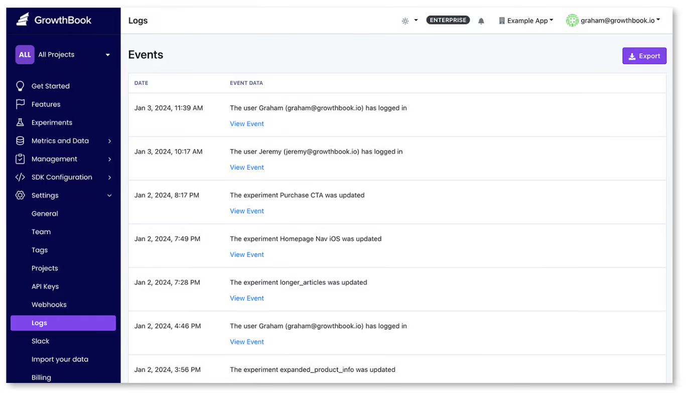
2. Environment-scoped RBAC with custom roles
Let’s say an engineer has full access to your flag console. They can flip flags in dev, staging, and production with the same permissions. That also means anyone who can change a dev flag can change a production flag. That’s why you need role-based access (RBAC) to scope permissions down to the environment and user level.
In GrowthBook, roles work across three tiers: global, project, and environment. It offers 7 permission types based on roles, ranging from no access to full admin access.
3. Approval workflows
Your pipeline should have an approval workflow so that no one authors a change, reviews it, and approves it. If they do, the review step is a pointless stopgap and won’t be considered actual evidence of compliance. Simply put, you need an approval workflow that enables the four-eyes principle.
In GrowthBook, every edit you make to a flag becomes a draft. You can submit it for review, and your senior or peer can review and approve or reject it. As a result, you always get two sets of eyes on a decision, reducing the chance of an incident.
You can configure these approval gates by environment and project to keep production moving. That said, for smaller changes, you can set the review process so the same person can review and accept the change.
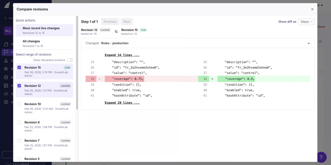
4. SSO plus SCIM
If you don’t have proper security protocols in place, you may end up allowing access to members who no longer work with you or have left the organization. That’s a vulnerability, and bad actors can exploit it in the future.
To avoid this, enable single sign-on routes through your identity provider. For example, GrowthBook supports SSO over OpenID Connect (OIDC) and System for Cross-Domain Identity Management (SCIM) provisioning through Okta and Entra ID. So if a user is provisioned through SCIM, only the identity provider can deprovision them.
Here’s what it looks like through Okta:
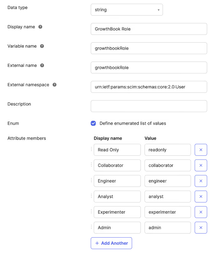
5. Scoped API keys with least privilege
Every part of your infrastructure that touches a feature flag needs credentials so that you know how and through what a change was made.
The admin API key should have its own role and access levels, but the records should remain immutable even if you remove the key. That’s why it’s best to use short-lived tokens for specific purposes that expire on their own so that it can’t be misused later on.
In GrowthBook, API keys have their own roles and can be limited to certain environments and projects. If it’s a personal access token, it inherits the permissions of the user who created it. The key gets deprovisioned if the user is deleted, or you can even disable it to prevent further use.
Every key’s actions are recorded in the audit log so that you can show that data to an auditor during an audit.
6. Log export to your SIEM or warehouse
Typically, your security team has their own tooling so they aren’t necessarily logging into your feature flagging platform. So your platform should be able to push those changes out into the monitoring tool, and they can decide how long to retain that data.
Since AICPA doesn’t require a specific retention period, you can maintain a 15-month window so you can present data for at least 12 months plus the audit fieldwork.
Note: GrowthBook offers a webhook capability to stream every change in the flag lifecycle to your SIEM or data warehouse.
7. Change context
Every change you make needs reasoning attached. Instead of reconstructing it from memory on the spot, make sure your feature flagging platform records this context.
Platforms like GrowthBook require a commit message to publish a revision. It lives in the revision record and the audit log. On the self-hosted version, you can also use Custom Hooks to validate that commit message before publishing the change.
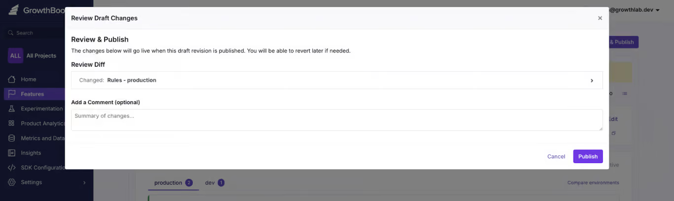
When you consider that 33% of feature toggles interact with each other, it’s even more important that all changes be documented.
8. Pre-deployment validation and guardrails
If a flag’s value is invalid, causes a merge conflict, or is about to break something in a rollout, it should be blocked before it reaches users. SOC 2’s CC8.1 clause requires you to test these changes before pushing them live.
You need two layers here:
- Validation should reject bad values before being saved.
- The guardrails monitor the rollout and pause or revert if it fails.
Within GrowthBook, you can do both. It offers schema validation checks, so it cross-checks JSON, string, and number flag values before saving. You can even create your own server-side validation rule using Custom Hooks and enforce your internal policies.
You can also use features like Safe Rollouts and percentage rollouts to test a flag’s behavior or a feature’s impact before rolling it out to 100% of your user base.
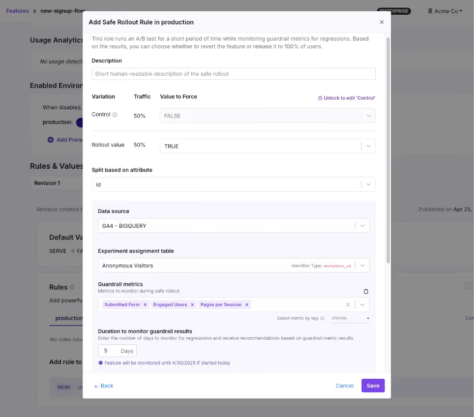
9. Infrastructure-as-code management of flags
If you’re working in git, it’s common to want your flag configuration to live alongside your application code. The goal is usually to make sure it goes through the same pull request review as any other changes, and that the evidence lives in the commit history.
It works well when your platform exposes a full API to run the full workflow. But the tradeoff is that git-based workflows are slower, and you need to configure them to ensure they go through the same review process. That’s because a git-based change has to go through a commit, a pull request, a review, a merge, and a CI run before it takes effect. It can work for planned changes but when you need to use a kill switch, it’s too slow and you’ll end up flipping the flag outside of git anyway.
Instead, use a feature flagging platform that exposes a full REST API for feature management (just as GrowthBook does). You can configure it to make sure API changes require review and it follows the same process as it would in git. Planned changes can live in git while any emergency changes you make can go through the API and everything still gets logged in GrowthBook. And if you need to review or remove old flags, you can use GrowthBook Code References to show you where it’s referenced in the code.
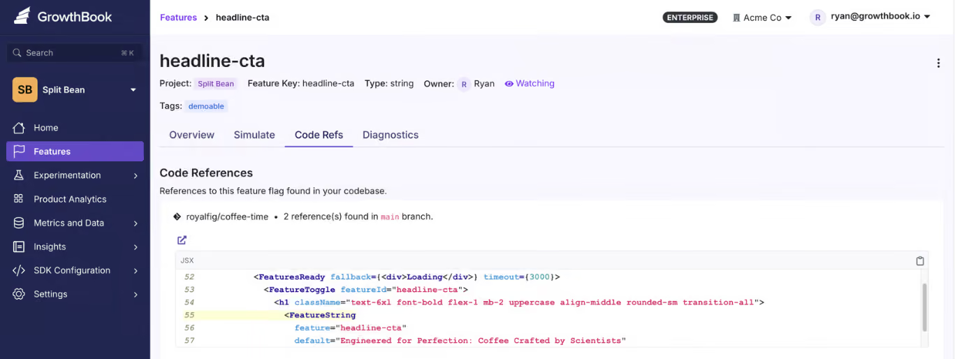
10. Governed emergency changes
You also need to think about controls around emergency change.
For example, a kill switch doesn’t always require an approval process. But the auditor will need to see evidence that you allowed the change and logged it properly by documenting the reason for any exceptions you’ve made. It should include a retroactive approval process within a set window so it’s clear someone on your team reviewed it. If you fail to show this information, you could get fined.
In May 2025, BayCare, a Florida healthcare provider, was fined $800,000 by the HHS for a HIPAA violation. The main reasons were its failure to use proper access authorization protocols and review information activity logs.
Within platforms like GrowthBook, an admin can bypass the approval workflow, but the records will show which gates were skipped and who approved it.
What will your auditors ask for during a SOC 2 audit?
When an auditor reviews your controls, they usually start by pulling a sample of changes from the observation window and asking you to provide evidence for it. That’s where most of the preparation time goes.
A Thoropass report found that 72% of security and compliance professionals spend between 251 and 2,000+ hours a year on audits. And 76% dedicate six or more team members to this task. Yet 88% of completed SOC 2 examinations require at least one additional round of evidence, and 71% have at least one exception.
To avoid this hassle, here’s what you need to give your auditor:
- The full population of the flag changes in a strict observation window.
- A sample pulled from that population, with the approval record for each change.
- An access review showing who could publish to production, and evidence that someone reviewed that list.
- Deprovisioning proof for anyone who left during the window, including their API keys.
- The exception log, including changes that skipped the normal path and the reasons for doing so.
- Your data retention policy for all of the above.
Let’s say they pick one production flag change and you need to reconstruct it. Here’s how you can do it:
Does a vendor’s SOC 2 certification actually cover you?
When you’re evaluating feature flag vendors, make sure they’re actually SOC 2 Type II certified. It covers their entire infrastructure and change-management access controls.
All of this information should be available before you sign up. Ideally, you should look for these three things in a vendor’s report:
- Complementary User Entity Controls (CUECs): The controls the vendor assumes you’ve implemented on your side. This is usually where the “customer is responsible for access administration” part of the agreement lives, so review it.
- Subservice organizations: This includes your vendor’s vendors. The report either carves them out for separate review or includes them in scope.
- Bridge letters: These letters cover the gap between when the vendor’s observation window ends and your audit date. Ask for one if the dates don’t line up.
Note: You can review GrowthBook’s trust and compliance information in its Trust Center. We’re SOC 2 Type II certified.
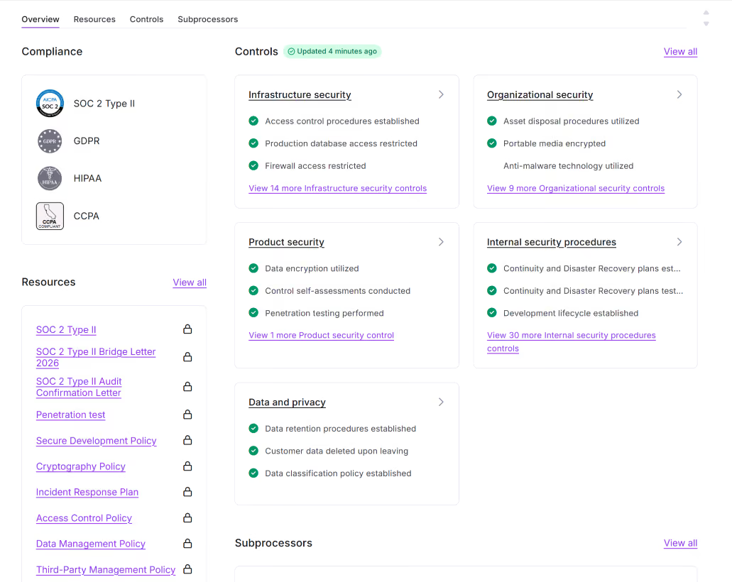
How GrowthBook supports SOC 2 for feature flags
Your change management controls stop at deployment, but a feature flag platform should extend them to the flag layer to keep you compliant. GrowthBook does that by treating every flag change the same way your pipeline treats every code change.
Each edit becomes a draft that requires approval, and only then can you publish it. Each change is locked in an audit log that can be reviewed and exported as needed. So the evidence packet gets built on the go.
For the SOC 2 controls an auditor will test, GrowthBook gives you:
- An audit log that records actor, timestamp, environment, and before/after values, and can’t be edited by any user.
- Approval workflows that block every contributor from approving their own change, so segregation of duties holds up under review.
- Three-tier RBAC with custom roles built from around 50 permissions, so publishing and editing are separate rights.
- SSO and SCIM through Okta and Entra ID, so deprovisioning happens in your identity provider and flows through automatically.
- Event webhooks that stream the full flag lifecycle into your SIEM with retention policies you control.
- Safe Rollouts that monitor guardrail metrics during a ramp-up and roll back automatically when they regress.
- Bypass records on every emergency change, so break-glass flips are logged as exceptions with the authority that approved them.
That’s why companies like Dropbox, Khan Academy, and Upstart use it despite operating in heavily regulated sectors.
GrowthBook is SOC 2 Type II attested and compliant with regulations like GDPR, COPPA, CCPA, and HIPAA (for self-hosted deployments). If you want to:
- Review the evidence packet, visit our Trust Center.
- See how the platform works, watch this 5-minute intro video or join a live demo.
GrowthBook 5.1: Learn faster with a new MCP server, Slack app, and contextual bandits
Helping product teams build, ship, and improve at scale, with AI built into every step.
Every company is trying to do the same thing: build a better product and move faster than their competitors. The way to do that is to learn faster, so more decisions are made from evidence instead of guesses.
But learning faster takes more than the ability to run an A/B test.
Your experimentation platform should help you run experiments quickly and rigorously, capture what you learn, and identify opportunities to apply those learnings to the next decision.
GrowthBook 5.1 brings the entire learning loop together, with AI across every step. It’s now available to all cloud and self-hosted users. Check out the full release notes for everything that shipped.
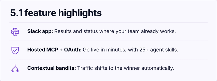
Scale testing without sacrificing rigor
GrowthBook 5.1 helps teams scale experimentation, both in volume and in what you can test, like measuring funnel completion or optimizing with contextual bandits. AI-powered workflows remove friction and built-in rigor ensures you can move faster without sacrificing confidence in your results.
Contextual bandits personalize which variation a user sees at the individual user level, learning which variant performs best based on their context and automatically shifts traffic accordingly. They’re especially useful for time-sensitive campaigns, high-variant tests, or personalization where the best experience varies by user.
Funnel metrics let you measure funnel completion in your experiments and see where users are dropping off. They are especially useful for testing marketing funnels, onboarding flows, and other multi-step experiences.
AI lets you scale experimentation by turning the workflow into something fully programmable, giving agents the ability to publish flags, create experiments, and more. Our new Hosted MCP + OAuth server, and an expanding AI skills library of 30+ skills make it faster and easier for teams to build and run experiments.
See GrowthBook 5.1 in action
Join a live demo to see the MCP server, Slack app, and contextual bandits working together in a real experiment workflow.
Pick a Demo DateNothing you learn gets lost
Every experiment creates knowledge, even the losses. The challenge is making sure that knowledge doesn’t disappear into static documents, Slack threads, or the heads of the people who ran the experiment.
GrowthBook 5.1 helps capture what you learn and makes it easier to analyze more data with AI, uncover deeper insights, and share them across your organization.
Learnings gives you a living knowledge library to document everything you’ve discovered through experimentation, so your entire organization can access and build on it. GrowthBook’s agent can automatically scan your past tests to get you started or you can use our new API endpoints and agent skills.
The Slack App (Beta) brings your GrowthBook data into the conversations where your team is already working. Tag @growthbook to ask questions about your data or interact with the GrowthBook AI assistant directly from Slack. You can also send rich, customizable notifications and daily or weekly digests to keep your team informed about what’s happening across your projects and organization.
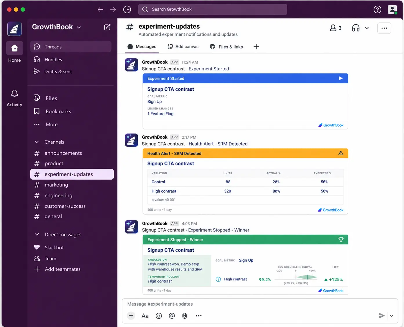
Product Analytics closes the loop
GrowthBook’s Product Analytics became generally available in 5.0, and 5.1 builds on this foundation making it easier to understand how users move through your product, where they encounter friction, and identify opportunities to test. This gives a clearer view of where to focus your experimentation efforts next.
User Journeys help to understand what happens before and after key moments in the user experience. Pick a starting or ending step so you can see the actions users take immediately before and after. Follow users deeper into your product or switch over to Funnel Explorer to do a deeper dive.
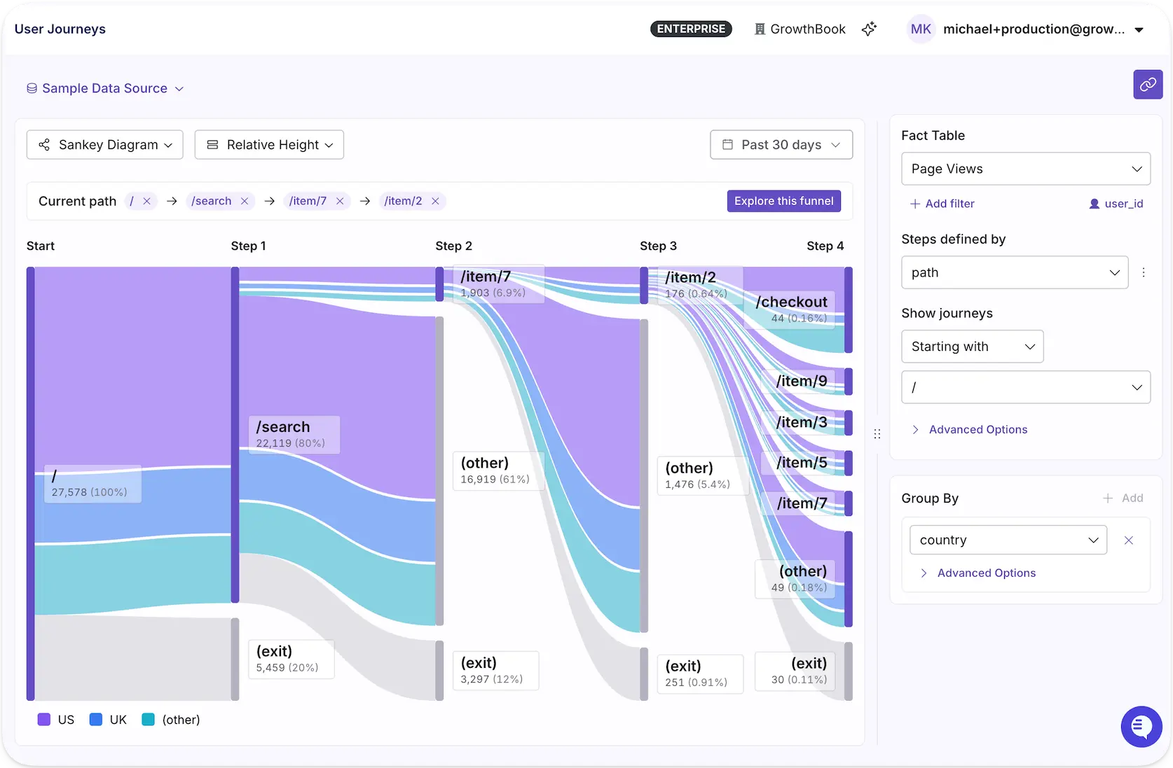
With a clearer view of how users navigate your product, you can spot friction, uncover opportunities, and make more informed decisions about what to test next.
AI-powered dashboards leverage AI skills to turn plain-language prompts into shareable product analytics or experiment dashboards. Describe the views you need through GrowthBook’s in-app assistant, MCP server, or wherever your agents live, and get the dashboard you need in moments, ready to share org-wide.
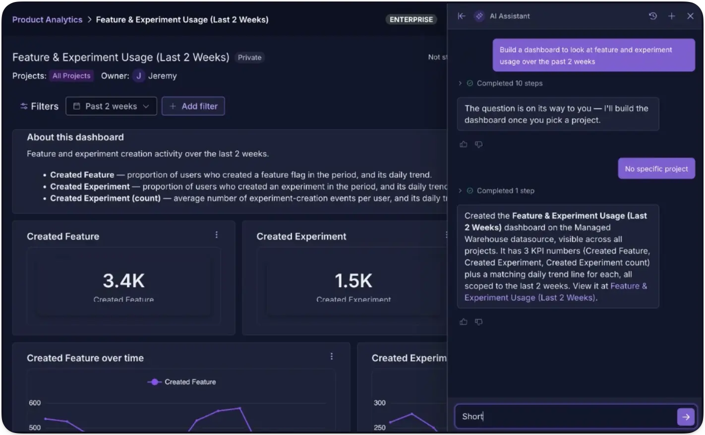
We rebuilt SQL Explorer to be easier to use for both humans and agents, so you can do richer explorations across your entire data warehouse without needing to predefine metrics. Use GrowthBook’s AI assistant or your preferred agent to query your data directly and ask questions that don’t map to existing metrics. It's another tool in the agent's kit for deeper, more flexible data exploration.
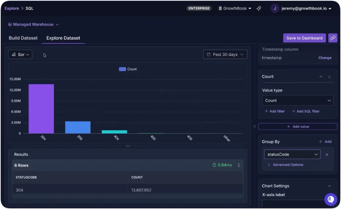
The full loop with GrowthBook 5.1
Together, these capabilities turn experimentation from a testing function into a continuous learning loop for the entire company.
Understand your product. Run more experiments. Learn from every result. Use what you learn to make better decisions. Then do it again.
See the full 5.1 release notes for everything else that shipped, or get started with GrowthBook today.
Run your next test on 5.1
Create a free account and bring feature flags, experiments, and product analytics together on your own warehouse data.
Start Building Free
The engineering leader's guide to feature flags for regulated industries
Feature flagging platforms were built to help engineering teams ship faster while reducing risk. But in regulated industries like fintech or healthtech, every change you make with a flag is also a production change, and auditors will always ask about it.
It’s a predictable exercise really. They’ll want to know who toggled the flag, who approved it, what the previous state was, and why it was done in the first place.
At first, they may seem like standard questions, but what they really want to know is whether the changes were made in line with local regulations on data privacy and security, and whether you already have the right governance and controls in place to do that. If your platform of choice can’t answer those questions with a solid evidence trail, you could deal with potential fines and loss of reputation.
In this article, we’ll explain why the use of feature flags in regulated industries is a nuanced use case, and what you need to stay compliant.
Why feature flags are a compliance concern in regulated industries
At its core, a feature flag can change what your users see and how your app behaves without a full-blown code deployment. That’s the whole point of flags, but it’s also where the risk comes in.
Engineering teams usually have change management controls for their deployment pipeline. Code gets reviewed and tested before it reaches production. In some cases, there are clear approval gates at each step, but a feature flag bypasses that pipeline entirely if you haven’t configured approvals for it. You can change production behavior with a simple toggle or API call, and unless your feature flagging platform has its own governance layer, users can make changes that don’t leave an audit trail.
Case in point. In May 2025, a Common Vulnerabilities and Exposure (CVE) was issued against a popular open-source feature flags SDK after researchers found that its discovery endpoint exposed the full list of flag names, descriptions, and default values to unauthenticated requests. It was rated a “medium severity” problem but the issue is that most engineering teams don’t realize how much information these flags contain.
Without the right audit controls and data handling policies, sensitive information leaked through a system that is publicly queryable by design.
That’s why auditors treat flag-related changes as any other production change. For instance, frameworks like SOC 2 require configuration changes to be authorized and documented with evidence of approval.
Governance is not a choice anymore, so your feature flagging platform needs to help you stay compliant.
What are the 5 pillars of compliance for feature flags?
There are five areas that cover what auditors and security reviewers want to know while evaluating changes in your infrastructure. Here’s what they are:
1. Immutable audit trails and evidence
Every flag change in a regulated environment needs a record that captures:
- Who made the change
- When it was made
- What the previous value was
- What value did it change to
- Which environment it affected
That record needs to be immutable, which means that nobody can edit it after the fact. It should also be exportable so you can hand it to an auditor without manually reconstructing it from memory.
The log should also differentiate between different types of actors. For example, it should flag whether a human or a service account made the change by calling the API. Automated actions should be attributed to the platform itself instead of the individual user.
Note: In GrowthBook, the audit log works exactly like this. It records every change and whether a logged-in user, API token, or the app made it. You can export logs as JSON or stream them continuously to tools like Splunk or Datadog via event webhooks, so your flag evidence lands alongside the rest of your change-management data.
2. RBAC and least privilege
Every engineer doesn’t need access to write and deploy to production. A compliant feature flagging platform accounts for this and lets you separate who can propose a change and who can push it live. That’s where role-based access (RBAC) comes in.
At minimum, your platform should support:
- Environment-based access: For example, engineers can toggle freely in staging, but only designated roles publish to production.
- Access based on project level: Sensitive projects (PHI, financial data) get their own access boundary, while a No Access role hides a project entirely from users who shouldn’t see it.
- Identity lifecycle integration: SSO and SCIM tie permissions to your identity provider, so when someone is offboarded, their access is revoked through the same process.
- Token scoping: API tokens and personal access tokens should inherit permissions from the same RBAC model as human users. It shouldn’t allow any shadow permission workflows to override it.
Platforms like GrowthBook draw a hard line here. Role-based access is scoped to the environment, so you can gate it based on the authorization specific team members have. Also, project-level roles can reduce access below a user’s global role, which is how you ring-fence a regulated project without restructuring your entire permission model.
How roles work within GrowthBook:
3. Separation of duties and approval workflows
While RBAC gates access based on role, the roles you designate also help in the approval process. It’s based on the four-eyes principle where the underlying belief is that a single person shouldn’t be able to make huge changes unilaterally. It’s a clear requirement as per SOC 2’s change-control clauses and SOX’s segregation-of-duties rules.
If you’re making major changes to production, one requester and one reviewer should approve them to avoid unnecessary incidents. That said, scope these approvals so you’re not slowing your team down for minor changes.
The goal is to demarcate high-risk projects from low-risk ones and ship fast without breaking things.
In GrowthBook, the “blockSelfApproval” setting blocks every contributor on a revision from approving it, including the author. Each of these requirements is scoped based on the environment and project. In case you use a “break-glass” publish to bypass the gate, it’ll record which control was skipped and who did it.
4. Data residency and PII/PHI handling
The most important question about any feature flag vendor is their platform’s architecture. You need to ask them, “What user data does the system actually receive?”
Typically, feature flagging platforms need access to targeting attributes like user IDs and account data, especially if they evaluate the flag in their own servers. As a result, you have a data-processing relationship which can trigger compliance requirements like GDPR and HIPAA BAA obligations.
Here, there are two layers to consider:
- Evaluation data: When your SDK checks whether a user should see a feature, where does that check happen? Locally or on the vendor’s servers?
- Analytics data: Where do flag evaluation events live? Who controls retention? And if a user exercises their GDPR right to erasure, can you run that deletion against your own database, or do you need to file a request with the vendor and wait?
For instance, GrowthBook’s SDK downloads flag definitions and evaluates them locally, in-process against attributes held in your app’s memory. None of these values are sent to the platform, whether in cloud or self-hosted environments. Plus, its warehouse-native approach keeps event data in your warehouse so the retention policies are yours and you can handle your data as you’d like.
5. Automation and AI agent governance
As you integrate AI coding agents into your development process, that’s another layer to consider. In regulated environments, your change management controls should still apply when an AI agent is involved.
For example, if there’s an approval required for a production-related change, the agent should get the same treatment as a human-led deployment would. And every change it makes should be logged and traceable to the exact platform or token that made it.
Platforms like GrowthBook enforce this at the API layers so agents get treated the same way. The audit log differentiates between human sessions and API tokens, so nothing gets misattributed. You can even use Custom Hooks to set up approval gates.
What compliance requirements do you need to meet for feature flags?
The above five pillars are framework-agnostic. But if you’re looking for specific controls under common regulatory frameworks, here’s what they require:
SOC 2
SOC 2 Type II evaluates how your organization protects customer data and whether your internal controls around security and confidentiality work over time. Here are a few clauses your feature flagging platform needs to satisfy:
- CC8.1 (change management): Your production changes must be authorized, documented, and approved, and the platform needs to produce immutable audit records for every change. The approval workflows should prevent self-approval and should include a commit message or reason field at the time of publishing.
- CC6.1 / CC6.3 (logical access): Access should follow least privilege, with periodic review. It should also have environment-scoped RBAC, project-level isolation, and SSO/SCIM provisioning and deprovisioning.
- CC7.2 (monitoring): You need to detect anomalous or unauthorized changes within the platform. Usually, event webhooks that stream flag changes to your SIEM satisfy this, especially when they’re paired with break-glass evidence like GrowthBook’s bypassedGates field.
HIPAA
HIPAA applies to covered entities and business associates that handle electronic protected health information (ePHI). These areas are critical when you’re using feature flags:
- 164.312 (access and audit controls): Every user needs a unique identity, and every action affecting ePHI needs an audit trail. This means you need SSO-backed authentication, per-user actor attribution in audit logs, and environment-scoped publishing permissions maps.
- PHI minimization: If your flag platform evaluates locally and never receives targeting attributes, the vendor sits outside the PHI data flow entirely. That said, if you’re using self-hosted infrastructure or a warehouse-native architecture for cloud deployments, data never leaves your app.
GDPR
GDPR governs the processing of personal data for European Union (EU) residents. These articles are the most relevant if you’re using a feature flagging platform:
- Data residency and transfers: Where is personal data processed and stored? Ideally, the platform uses local SDK evaluation so that attribute values don’t get transmitted to the vendor. Also, self-hosting in your own region keeps the control plane local.
- Article 17 (right to erasure): Can you delete a subject’s data on request? If your event data lives in your own warehouse, you can request erasure yourself instead of relying on the vendor.
- Article 7 (consent): Are there persisting identifiers before the user consents? Look for opt-in mechanisms where identifiers aren’t stored until consent is granted.
What you need to build an auditor-ready evidence packet for feature flags
When an auditor selects a production flag change from your sample, they’ll ask you to reconstruct the full chain of evidence around it. Here’s what you need to show:
EvidenceWhat to look forWhat changed because of the flag?A full diff showing the previous value and the new value, including targeting rules, rollout percentages, and any conditional logic. There should be an immutable log with the publishing time.Who proposed the change?The identity of the person or service account that created the change, along with the details of every contributor who edited the draft before publication. It should also include a commit message or reason for the change request.Who approved the change?Each reviewer’s identity, their verdict (approved, requested changes, or commented), the timestamp of each verdict, and whether the reviewer was a human session or an API token. Retain stale approvals (where the draft changed after the verdict was given).Where was the log stored?The approval chain should be available in two independent places to corroborate its validity. For example, the revision record stores the review verdicts, while the append-only audit log records the same approvals as separate events with their own timestamps.Was any control bypassed?If an admin used break-glass authority to publish without approval, the log should show which gate was bypassed and under whose authority.Which environment did it affect?The change should be tagged to a specific environment (production, staging, dev) through the SDK connection that served it.Is there an exportable artifact?A timestamped JSON export of the full event stream, which can include a per-flag history API endpoint for programmatic access, or continuous webhook streaming into your SIEM.
What compliance requirements should a feature flagging vendor have?
Here’s what you need to look for to ensure your platform of choice protects you:
Security posture and certifications
- SOC 2 Type II report. Ask for the audit window and any noted exceptions.
- ISO 27001 certificate with the scope statement.
- Most recent penetration test report and remediation status of findings.
- Incident response plan and access control policy.
- Active bug bounty program or responsible disclosure policy.
Data architecture
- Data flow diagram showing what user data the vendor’s system actually receives, where it’s processed, and where it’s stored.
- Whether flag evaluation happens locally inside your application or on the vendor’s servers.
- Where analytics and event data lives, who controls retention, and whether you can execute data deletion requests against your own infrastructure.
- Encryption at rest and in transit for flag payloads and stored credentials.
Access controls and change management
- RBAC with environment-level and project-level scoping.
- SSO and SCIM integration for identity lifecycle management (provisioning and deprovisioning).
- Clear approval workflows with separation of duties.
- Immutable audit logs with actor attribution (human vs. service account vs. system).
- Evidence export via JSON, API, or continuous webhook streaming to your SIEM.
Deployment model
- Self-hosted deployment option and what it requires (infrastructure, database, licensing).
- Support for VPC, VPN, or air-gapped network topologies.
- Whether the self-hosted version and the cloud version share the same codebase and feature set.
Industry-specific requirements (where applicable)
- Healthcare (HIPAA): Will the vendor sign a BAA, and under which deployment model?
- Financial services (SOX): Does the platform enforce segregation of duties over changes that could affect financial reporting? Can you produce evidence of who approved what and whether any controls were bypassed?
- GDPR-regulated organizations: DPA availability, sub-processor list, data transfer mechanism (SCCs), and whether a self-hosted option removes the transfer question entirely.
Note: As of September 2026, GrowthBook holds SOC 2 Type II and adheres to HIPAA, GDPR, and CCPA. Self-hosted deployments are also HIPAA-compliant. You can find more information in our Trust Center.
Why open-source and self-hosted feature flags matter for regulated organizations
We’ve established that you can make sure your feature flagging platform is compliant if it has the five pillars of governance. However, it also raises the question: How much of that architecture can you actually verify?
For a closed-source platform, you’ll have to rely on the vendor’s docs and their word. But with an open-source platform, your engineering and security team can read the source code themselves and decide whether it fits your compliance requirements. It also helps when auditors ask how something was recorded and you can pinpoint the exact path.
That’s one reason GrowthBook was built to be open source and to offer self-hosted deployments if needed. It’s MIT-licensed so you can audit the evaluation logic and governance layers before using it.
Also, if you have strict data residency requirements, the warehouse-native architecture and self-hosted option ensure data never leaves your infrastructure.
Interested in seeing how your organization can stay compliant with GrowthBook? Book a demo, and we’ll show you how the Enterprise version can support you.
.avif)
How to Build a Culture of Experimentation
Companies that run successful experimentation programs understand their business better, improve the product and customer experience faster, and drive smarter decision-making company-wide.
But it’s hard for a program to get there without a strong experimentation culture, and the more a program scales, the more the culture matters. Successful programs rely on sustained investment, highly aligned teams that are able to ship quickly and feel safe taking risks, and leaders that are open to being proven wrong. A strong experimentation culture is what makes that possible.
What is a culture of experimentation?
A culture of experimentation is one where a company tests its assumptions before acting on them. In practice that means teams run tests to answer open questions, learn from every result, and let evidence carry more weight than the most senior opinion in the room.
Teams cannot reliably predict which changes will improve a metric. Even in mature experimentation programs like those at Booking.com, Google Ads, and Netflix, only about 10% of experiments move the metric they were designed to improve. Companies that accept that limitation are more likely to test by default rather than reserving experimentation for their largest bets. But testing by default also creates more opportunities for poorly designed tests, so a strong culture is crucial for teaching people how to design experiments that produce trustworthy results.
A strong experimentation culture is visible when a director whose hypothesis was disproven asks what the result implies for the next iteration. It’s visible when a product manager proposing to remove a field from the signup form can clearly articulate which metrics they expect to move and why, or when someone on another team can look up what signup tests have been run before and what the results were without asking the data team.
Building a culture of experimentation requires a change in how a company establishes confidence in a decision. An experimentation platform lowers the cost of producing measured results, but adopting them as the basis for decisions is an organizational change, and that change is generally the harder part of building a successful experimentation program.
Build trust in every result
Read Ronny Kohavi and Luke Sonnet's lessons on the practices that make experiment results credible across a team.
Read the Webinar Takeaways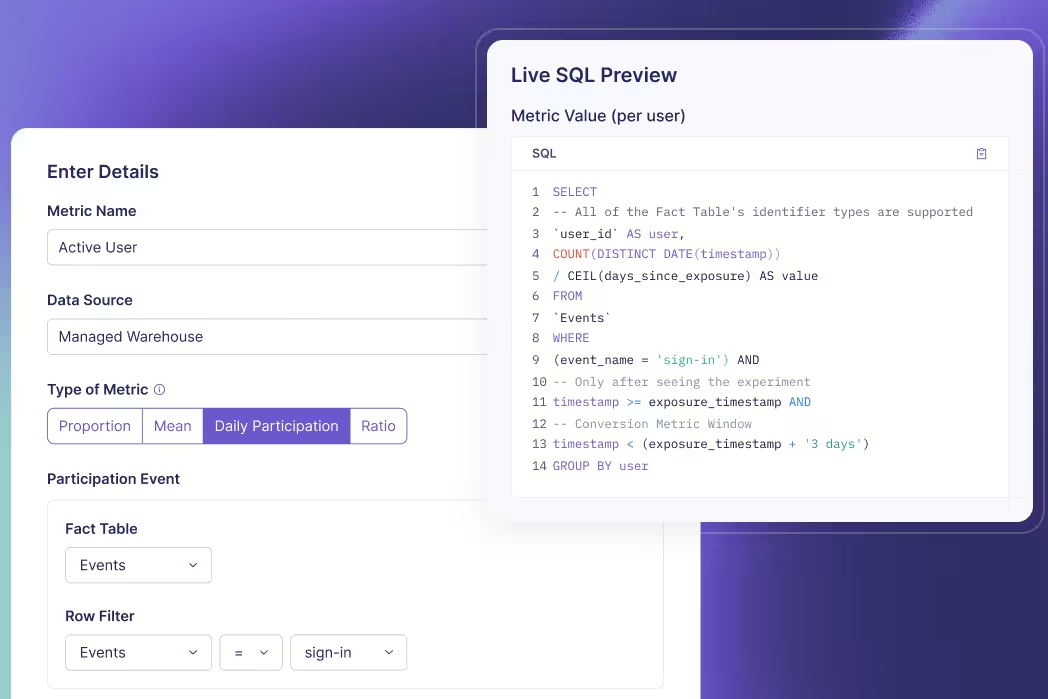
7 practices that build a strong experimentation culture
Each of these 7 practices removes a reason someone would avoid running an experiment, whether the obstacle is the support and access needed to run one, the fear of being wrong, or doubt that the answer will be trusted and acted on.
1. Secure and sustain leadership buy-in
A sponsor in a leadership position is crucial to building a strong experimentation culture. That person champions the program, speaks for it in planning conversations, and brings experiment results into the decisions being made there. Their support is often what gets it funded. That person might be an executive who decides from the outset that the company will work this way, or a leader who is won over after one team starts running experiments and sharing the results.
Teams optimize for whatever executives pay attention to. When leadership rewards confident answers, no one is comfortable saying they don’t know yet. When they ask about assumptions and what’s being learned instead, teams run the tests that produce those insights. Asking those questions in public also sets an example. When a senior leader is openly uncertain and curious, everyone else can be too.
At DoorDash, which runs 12,000 experiments a year, results go out across the whole company whether or not the change ships, and leadership responds to them. Ilya Izrailevsky, the senior engineering manager who leads DoorDash’s experimentation platform, explained the practice on The Experimentation Edge:
“Our leadership, including our CEO, Tony, would read and reply to those experiment emails and would congratulate folks, but also encourage them to try some alternative ways or approaches to the same problem. This really builds a culture that experimentation is encouraged and everything we do should be through experiment.”
Leadership sponsorship also requires resource allocation. Executives fund the platform, the data work behind the metrics, the engineering hours that go into instrumentation, and the time teams spend building losing variations. Learning that an assumption is wrong before a team builds on it costs less than learning it after release.
2. Create psychological safety
Most experiments that are well designed and well executed do not improve the metric they were built to improve. Across Microsoft’s experimentation platform, only about 1 in 3 succeeded at improving the key metric they targeted. When a team treats a losing result as a mistake, most of its experiments reflect poorly on whoever ran them, and the rational response is to run fewer experiments, or take less risk. The tests that carry the least risk also offer the smallest potential gain, so the program returns less even when they win.
A program with psychological safety removes the fear of failure because learning and taking risks are valued over being right all the time. A team decides how an experiment is designed but not what it finds, so feedback belongs on the process. A review can ask whether the hypothesis was well informed, whether the design produces a trustworthy answer, and whether the question is one the business needs answered.
James Falzone, director of product management at Kargo, put the distinction plainly on The Experimentation Edge:
“There’s a difference between a bad result and a bad experiment, because to some extent, if you’re not getting those bad results, if you’re not failing, are you really trying anything new?”
A team that is rewarded for shipping will protect the launch at the cost of learning. Makram Mansour, head of a marketplace at ID.me, described the habit on The Experimentation Edge: “Our old habits are about I launch it, we do a major celebration, I put it in my performance review, I get promoted because of it.” When shipping is what earns the promotion, an experiment that could stop a launch is a threat to the person running it. Mansour worked with HR to revise the OKRs and KPIs teams were measured against, framing goals around learning quickly rather than launching.
3. Frame work as testable hypotheses
When work is framed as testable hypotheses, the assumption behind it is stated in advance, where the rest of the team can review it and the result can be measured against it. A roadmap item and a hypothesis describe the same change, but only the hypothesis describes what would have to be true for that change to work. A hypothesis template can be as simple as, “For [audience], changing [specific product behavior] will [expected behavior change] because [reason].” Filled in, that becomes something like “For new workspace admins, moving teammate invitations to after project setup will increase seven-day activation because users can complete the first meaningful task before being asked to collaborate.” Hypothesis-driven teams use a format like that because it forces 4 things into the open: who the change is for, the change itself, the outcome you expect, and the reason you think the change will produce that outcome.
At JPMorgan Chase, the hypothesis is recorded when a team registers the experiment, before it runs. Kevin Yang, executive director and head of experimentation there, described the setup on The Experimentation Edge:
“We have a platform where the teams will first come and register their experiment. And what we focus there on is making sure that we capture the hypothesis and what they’re trying to do, what they’re trying to measure. And that goes into our knowledge repository.”
When a feature ships without a stated hypothesis and the metric does not move, the team has no written expectation to compare the result against. An invalidated hypothesis shows that the assumption was wrong. Either the change does not affect the metric at all, or it affects it by less than the team expected, and the next experiment design can account for that.
4. Move decisions from HiPPO to evidence (and why trust matters)
Evidence can only outrank opinion if decision-makers trust it. When only the data team can see how a result was calculated, anyone who dislikes it can challenge the data quality. The decision then reverts to the HiPPO, the highest-paid person’s opinion.
Andrew Willingham, head of legal and people products at Atlassian, said what a trusted number does for a product manager on The Experimentation Edge:
“I can just say, well, here’s what the data shows. It’s not my opinion or your opinion. This is the data. And that helps short-circuit a lot of these political or opinion-based comments that I think can slow us down.”
Arun Bodapati, director of data science at Twitch, showed how quickly that credibility can be lost in his episode of The Experimentation Edge:
“There’s a lot of earned trust in that process. It’s one thing to say we do experiments, and then all you need is one misconfigured experiment to say, ‘You guys don’t know what you’re talking about.’”
How metrics are defined and computed determines how trustworthy they are:
- A single source of truth for metrics: Activation means the same thing in the experiment readout and in the weekly business review, because both read from the same definition.
- Visible computation: Anyone can read the SQL behind a result, so someone who doubts a number can verify the query that produced it.
- Warehouse-native analysis: The analysis runs in the data warehouse itself, on the same tables the rest of the business reports from, so experiment numbers reconcile with everything else.
A readable query can still run on top of a broken assignment, so data-quality checks should run alongside the analysis. For example, many data issues can be caught by a sample ratio mismatch (SRM) test, which verifies that users were divided between the variations as configured.
5. Open testing beyond engineering (without creating chaos)
Ideas on how to improve the product can come from across the company. But building an experiment to test those ideas usually requires technical work, most often from engineering. Those ideas then enter the engineering backlog, where they are prioritized against committed roadmap work.
Extending access to testing tools beyond engineering, often called democratization, lets the people closest to a problem test their own ideas without waiting on another team’s capacity, whether that is engineering, design, or data. Because those experiments run in production and affect real customers, broader access needs guardrails, such as limits on who can launch what and an approval step before anything goes live.
Self-serve access works better when there is somewhere to bring questions. Makram Mansour, head of a marketplace at ID.me, named 2 bottlenecks in experimentation programs on The Experimentation Edge. The first is engineering capacity. The second is access to data scientists. Teams with their own data scientist run a lot of experiments, while teams without one stay with simpler tests because they aren’t sure how to design a more involved one. His answer is a central team of data scientists anyone can go to: “If you have any questions, here’s a team or dedicated resources to help you.”
A no-code visual editor reduces engineering and design dependencies. For example, GrowthBook’s Visual Editor (Available on Pro and Enterprise) works on a live web page. The experiment owner can describe a change in plain language and let the editor propose the edits, or click an element directly to change its text, image, spacing, or styling. A Figma frame or mockup can also be imported as a variation.
Permissions, checklists, and approval steps keep broader access from producing overlapping tests, missing hypotheses, and results no one can interpret. In GrowthBook, this includes:
- Roles and projects: Everyone gets a role, from read-only up to admin, and roles can be scoped per project (Available on Pro and Enterprise), so a team’s access can be limited to the projects it works on.
- Pre-launch checklists: Every experiment goes through the same checklist (Available on Enterprise) before it launches, and the list can include a written hypothesis, a screenshot of each variation, a project, and a tag.
- Namespaces: Splitting the population into namespaces keeps overlapping experiments from assigning the same unit and interfering with each other.
- Approval flows: Changes to a feature flag or a saved group can require review before publishing (Available on Enterprise), and the person who wrote the change can’t be the one to approve it.
The same guardrails now cover AI agents. In GrowthBook 5.0, agents create their changes as drafts that someone has to approve before they go live, under the same policies that apply to humans.
6. Make learnings visible and shared
Results are useful well beyond the team that ran the experiment. Someone working on similar problems can see which questions have already been answered, a result from one part of the product can point to a hypothesis in another, and seeing how other teams designed their tests helps people learn what good experiment design looks like. For either of those to happen, experiments have to be documented and revisited regularly.
A searchable repository of past experiments is a great starting point, but there are many ways to distribute those results to extend their reach, including incorporating them into relevant dashboards, sharing individual readouts directly with the teams most likely to benefit, submitting them to internal newsletters, or even sending out an experimentation-focused newsletter that covers recent learnings and upcoming tests.
These communications should also include losing experiments in addition to winners. Subtractive learning, finding out what didn’t work, can be just as insightful as knowing what did work.
Crystal Ammari, digital product optimization strategist at Disney, described what she wants from a testing repository on The Experimentation Edge:
“Something where folks can just go in. It’s almost like a Google for our test results. And you go in there, and you can search for the site or the element you wanna change or the KPI you wanna move, right? And it would just pull up all those results.”
The Home Depot invites everyone interested in a test to the same session. Kim Ting Li, senior manager of online experimentation there, outlined what happens next on The Experimentation Edge: “They will all be invited to this public readout for about 30 minutes. And at the end of it, we send out a blast email with the final results to share across the stakeholders. But those results are also all stored in a centralized place, so anybody can go back into tests that ran maybe in 2020 to get the learnings and see if something has been done already.”
GrowthBook’s Learnings feature captures conclusions drawn from many experiments, such as shorter signup forms reliably increasing completion rates, or discount banners never improving revenue. Each learning lists the experiments that support it and the ones that contradict it. Product Analytics provides dashboards built on the same metric definitions used by the experiments, so the readout and the business review show the same numbers. Event webhooks push results out as they land, posting to Slack or Discord when a metric reaches significance or an experiment is ready to ship or roll back.
7. Build the rituals and cadence
Rituals support an experimentation culture by aligning teams and keeping people engaged with the program. The right set of rituals will look different for each organization, but these are a great starting point if you’re still building out your program.
- A weekly experiment review: Cover what’s planned, what’s in flight, and recent results, and keep the discussion on what the program is learning rather than how many tests it ran. A large program, or one spread across several product areas, can run more than one review so each one stays efficient and relevant for the people attending.
- A monthly prioritization session: Review the backlog, decide what to test next, and plan the roadmap. This can be done within teams or with cross-functional working groups of relevant stakeholders.
- A retrospective on bigger experiments: After a complex or high-stakes test, bring stakeholders together to assess what went well and how things could be done better next time. Kargo’s retros include a standing item called “Where did you fail?”
- Weekly office hours: Hold a recurring session where anyone can bring an experiment they are designing or a result they are trying to interpret. The questions that come up repeatedly show where the program needs clearer documentation, more training, or better tooling.
- A cross-team readout: Share recent results with the teams working on related problems. Focus on actionable insights and where help is needed with implementing the results.
- An executive readout: A high-signal summary of recent results and a review of what’s upcoming and in flight, geared toward the leadership team.
- A guess the winner game: Post experiment details in a Slack channel or other internal forum and ask participants to guess which variation won. Turning results into a game encourages people to challenge their assumptions and engage with new experiment insights.
Nick Beyler, data science manager at Stitch Fix, described the review his team runs each week on The Experimentation Edge:
“We have an experimentation review group. So this is a weekly forum where all the expert experimenters, data scientists, product managers, we meet weekly and talk about the upcoming launches. And it’s just a great venue that everyone can say ‘Oh, I tried that experiment or that kind of experiment a couple months ago or a year ago. Here’s what I learned there that this may be helpful for you.’”
Kevin Yang, executive director and head of experimentation at JPMorgan Chase, described the mix on The Experimentation Edge:
“We have champions across different teams that will hold their own experimentation forum. My own broader org does have an experimentation forum that we also host. We actually host a couple of them, and some of them are more executive-focused audience, and another one is more like general audience.” He also sends a written roundup to the whole firm, which he called an “experimentation wrapped newsletter.”
Danielle Olean, director of e-commerce at Box, described the executive readouts she runs there on The Experimentation Edge:
“I actually have a template for an impact report, and on a biweekly cadence, we meet with the COO. On a monthly cadence, we meet with the CEO, and we share, ‘This is what won, this is what lost. Based on the loss, this is what we learned, and this is what we’re going to do next.’”
What a culture of experimentation looks like in practice
In a company with a strong experimentation culture, testing is part of how the organization operates rather than a service one team provides.
The Philadelphia Inquirer runs one centralized testing program covering marketing, advertising, the newsroom, and product, with a shared set of standards and governance rules for all 4. Those departments have competing goals. For example, advertising wants to sell more ads, but the newsroom wants an uncluttered reading experience. A shared definition of success balances this tension. An intervention that increases ad revenue can only ship if engagement doesn’t decline.
DoorDash sends every experiment result to the whole company, where the CEO reads and replies. Izrailevsky, who leads DoorDash’s experimentation platform, named the mindset that goes with it:
“There’s no such thing as a failed experiment. Every experiment is a learning opportunity, no matter how it goes.”
At Lingokids, around 40 people across engineering, product, and data use GrowthBook inside a company of 150+. Filipa Batista, product manager for billing, pricing, and monetization, is one of the people launching those tests: “We don’t need any code changes, we don’t need an app release. We just configure the new tests and launch right away.” The team runs about 15 experiments a month, roughly double what it could run in parallel before, and has recorded a 58% increase in activation rate.
An experimentation platform can’t build a strong culture on its own, but it can support the practices that do by making experiments easier to run and trust. GrowthBook is an open-source, warehouse-native experimentation platform where new variations can be launched quickly with the no-code Visual Editor, every team reads from the same metric definitions, and changes can be switched on or rolled back without a new release. Try GrowthBook for free.
See a testing culture at work
Read how Fyxer's four-person growth team ran 541 A/B tests in a year and grew from $1M to $35M ARR.
Read the Fyxer Story

What Samsung learned bringing B2C experimentation rigor to B2B
Guest: Anuradha Tempe, Lead Product Manager, Samsung Electronics America. Host: Ashley Stirrup, CMO, GrowthBook. Show: The Experimentation Edge.
Running an A/B test on a consumer storefront is the easy part. The hard part is running one on a B2B platform where a single bulk order can rewrite your results, the buyer's decision happens on a different device than the purchase, and the feature you were certain would win turns out to confuse the exact customer you built it for.
Anuradha Tempe has lived all three. A former hardware engineer who worked on chip design before pivoting to software, she is now lead product manager at Samsung Electronics America, where she manages both the B2C and B2B e-commerce platforms behind Samsung.com. On this episode of The Experimentation Edge, she walked host Ashley Stirrup through what happened when she carried a mature consumer experimentation practice into a young, fast-moving B2B business, and what the B2B side taught her in return.
B2B is not a sidekick
Samsung's consumer storefront is young but stable, with a rigorous testing practice. The B2B platform is newer and, in Anuradha's words, "a lot of interesting things" are still happening there. When she joined as one of the first product managers on the B2B side, she brought her B2C learnings with her, and the reaction was immediate: "Whoa, whoa, okay, what are we trying to do here? We don't want multiple meetings and want to introduce new processes."
Her first lesson was that the two businesses are not versions of each other. "Most of the times people mistake B2B as like a sidekick to B2C," she said. "It has a completely different consumer base, and that's something that's very important to keep in mind when designing specifically features for B2B customers."
The difference shows up in the statistics before it shows up in the features. On a consumer site, order values cluster tightly and traffic is high, so the statistical engine has plenty to work with. On a B2B site, one procurement order on one day can be worth what hundreds of consumer orders are worth. "A particular order on a one particular day can skew your results and inflate it towards a false positive," Anuradha explained. Her team now normalizes order data before reading any test, so that one customer's timing doesn't masquerade as a winning variant. "It needs a certain level of understanding to also understand how to lead A/B tests on B2B side."
That understanding extends to knowing when not to test at all. "Not everything needs to be A/B tested," she said. Experiments consume engineering, design, and stakeholder time. Lower-risk changes go to Samsung's UAT team for feedback. Some launches get a pre/post comparison instead of a randomized test. Full experiments are reserved for the features where being wrong is expensive, and where the team has the expertise to read the results correctly.
Bringing rigor without breaking the culture
Samsung is a conglomerate with counterparts in Korea and teams spread across geographies and cultures. Anuradha describes it as a huge company that works like a startup: fast-paced, chaotic, and resource-rich enough that you can build and test things. Spreading experimentation practice across that organization is a communication problem as much as a technical one.
Her approach is deliberately unforceful. "The goal is not to shove things down other people's throats and be like, 'You have to do things this way only because this is the best way,'" she said. When she shares what she has learned with other PMs, whether in the Americas or in Korea, she goes in expecting to learn something back. "If you share your knowledge with that open-ended mindset that I'm here to learn something from you as well, it goes down better always, and teams end up aligning much faster."
On the B2B platform specifically, that meant pairing the case for structure with humility toward the people who had been running the business. The pitch was practical: this is how systems scale, and for B2B to reach the next level it needs practices borrowed from the more mature consumer side. The question she kept asking was, "What can we learn from B2C without losing the soul or essence of our fast-paced B2B way of doing things?"
The add-on experiment that nearly doubled attach sales
The early win that earned buy-in came from Samsung's buying flow for hardware. Samsung.com is organized by category, subcategory, and product, each with its own buy page, which can make the experience fragmented. During flagship launches, a business customer buying a new phone might also need a security package, a software bundle, or a tool like WebEx for hosting meetings. Those add-ons were not visible where the buying decision was happening.
Anuradha's initiative was a unified add-on experience across those buy pages, with software solutions surfaced on the same screen as the hardware. But the more important insight was about which screen. "Most of the times people assume that B2B customers will only buy devices on desktop or they won't really scroll on mobile platforms," she said. "But we have a huge traffic on mobile devices as well."
The data came from daily traffic reports, and the interpretation came from conversations with sales and customer support. Business stakeholders rarely complete a purchase on a phone, because they need approvals and a procurement code. "But they will still browse the options on mobile platforms, and they'll make a decision on mobile device before deciding to go ahead with generating the code." The decision and the transaction were happening on different devices, and the mobile half was being ignored.
Her team broke the work into phases, shipped a version one, and A/B tested the add-on experience. Conversion went up. Average order value went up. Add-on sales nearly doubled. "It solved the problem of visibility," she said. Reduced scroll time meant customers saw all their options in one go, which led to follow-up questions about bundling, higher engagement, and more sales.
The decision lived on mobile and the checkout lived on desktop, and designing for that split is what moved the numbers.
The Buy Now test that lost
Ashley asked how Anuradha would coach a new product manager who was so sure their feature would win that they hadn't considered why it might lose. Her answer: "I would say I was that product manager."
The feature came from Samsung's sales and business teams. On the consumer site, customers could buy faster and earlier in the flow. The idea was to bring that to B2B. Anuradha admits she was biased toward shipping it. "I thought it's a great idea."
The A/B test disagreed. "Customers are actually getting confused by seeing the Buy Now option earlier in the journey," she said. "If you're buying, say, 100 laptops, you don't necessarily want to just buy it at the click of one button. You want to be able to see what are the specs and what color and all the different software packages."
The principle she drew from it has become a design rule for the platform: "B2B consumers value clarity over faster conversions." That is not a claim that business buyers dislike speed. They want to buy quickly, but only once they are certain of what they are buying, because returns and cancellations on bulk orders are painful. In hindsight, she thinks an engagement feature at that point in the flow would have served the customer better than a purchase button.
The test did its job. "That's where the A/B testing and experimentation leads you in the right direction," she said. Working with the data teams to normalize orders also mattered here; a million-dollar day from one customer would have made the feature look like it was working.
What she wants other PMs to take from it is less about the feature and more about the posture. "I love to make mistakes and learn from them, and that's the best way you learn. You humble yourself in the process." Sharing losing results openly with the team, she found, produced more leadership support rather than less. "The right leaders do understand where you're coming from, and you do get the support because you're not trying to withhold any information from anyone."
North Star first, guardrails second
Underneath both stories is a discipline about why a feature is being launched at all. Marketing might propose something for engagement. Sales might push for revenue. Anuradha's rule is to align on the goal before anything gets built. "If the goal is high engagement but not high revenue, then as long as we are aligned on the goal, we can proceed with that."
She gave an example where the North Star was neither. Samsung's employee partner program customers always receive a discount, and when a platform migration left certain products excluded, those customers reached cart and checkout expecting a price cut that wasn't there. Support tickets rose exponentially. The fix was messaging earlier in the flow that the product wasn't eligible for the discount. It wasn't A/B tested; a pre/post comparison of ticket volume showed the drop. The North Star was fewer support tickets, and the metric was chosen before the feature was built.
Guardrails follow from the same logic. An engagement feature isn't expected to lift sales, but it must not lower them. For B2C, that means watching conversion, NPS, and CSAT dashboards. For B2B, where there is no daily NPS view, it means keeping a direct channel open with sales stakeholders and listening for "our customer is not liking this input" or "they're not able to buy these many phones."
What comes next at Samsung
Anuradha is now experimenting on her own process. Frustrated by the time spent writing specs, she built an A/B testing copilot: feed it the roadmap and it generates hypotheses and an initial test plan she would otherwise spend 45 minutes drafting. It also triages features by confidence level, low, medium, or high, to decide which need a full experiment and which can ship through lighter channels.
She is clear about the limits. "Automating processes is obviously important, but also having that factor of trust is important," she said. A human checkpoint stays in the loop to catch hallucination and keep the model honest. "We may not need as many humans as we do today, but we still need a human touchpoint to make sure that we are not steering away from the result we actually intended to have from the get-go." Next on her reading list: sequential testing, and how AI-driven experiments might reduce manual intervention without removing judgment.
For product managers, engineers, data scientists, and growth leaders running experimentation across more than one customer type, the Samsung story is a useful check. The tooling can be shared. The rigor should be shared. The assumptions about who is buying, how, and on what device should not.
.avif)
How Feature Flags Help With Progressive Delivery
The traditional CI/CD pipeline treated deployment and release as the same event. You merge to main, and the code hits production while every user experiences the changes at once. If something goes wrong, you find out the hard way.
That’s what happened to OpenAI in December 2024. Its engineering team pushed a new telemetry service to every production cluster at once without a staged rollout.
Eventually, the service overwhelmed their Kubernetes API servers and took down apps like ChatGPT and Sora for over four hours. In their post-mortem analysis, they committed to using “robust phased rollouts with better monitoring.”
In short: progressive delivery.
In this article, we’ll explain what progressive delivery is and why modern engineering teams should make it the default way of releasing software.
What is progressive delivery?
Progressive delivery is a software delivery mechanism in which you deploy code continuously, but instead of exposing every user to changes at once, you increase the percentage of users over time.
James Governor, co-founder of RedMonk, coined the term in 2018 to describe practices like feature flags and canarying backed by observability. His framing focused on controlling the blast radius for change (and negative consequences), and it still holds today.
In fact, Google’s 2024 DORA report found that “elite DevOps teams” recover from failed deployments 2,293x faster than low performers. They’re more likely to use continuous delivery practices that control exposure at each stage, so a failed rollout affects only a fraction of users. As a result, recovery becomes a simple flag change rather than a full code redeployment.
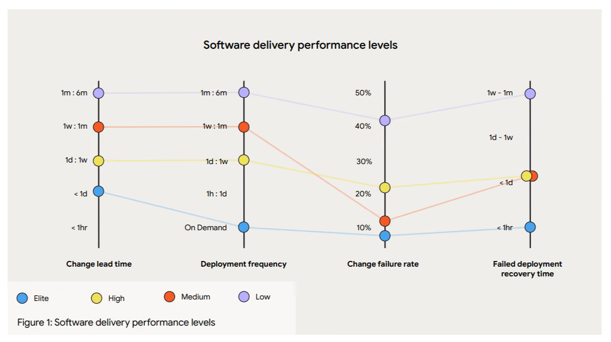
The lack of an intermediary layer like feature flags is one reason most engineering teams don’t become elite players. They know deployment is a technical event and release is a business decision, but sticking to traditional practices also means treating them as a single step, turning it into an all-or-nothing bet every time.
Feature flags fill that gap and create the missing layer between those two events.
You can deploy code wrapped in a feature flag, but keep it turned off until you’re ready to release. As a result, you can slowly release features to an increasing group of users and test performance at each stage.
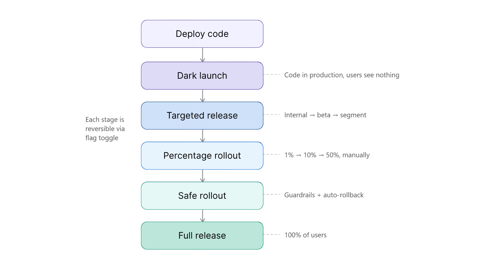
3 progressive delivery strategies to use with feature flags
Here are a few types of progressive delivery strategies you can take advantage of:
1. Targeted releases
This is one of the simplest ways to start with progressive delivery. You start by serving the feature to a defined group of users before opening it up to everyone. For example, roll it out first to internal employees for testing, then to a small beta group.
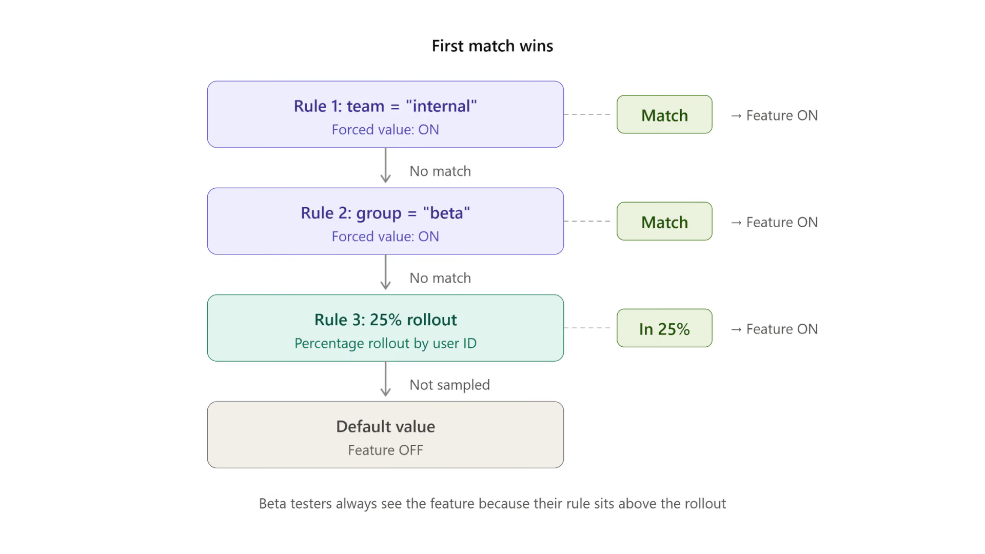
In feature flagging platforms like GrowthBook, you can do this by setting up a Force Value targeting rule with conditions. Every user that matches the conditions you’ve set will see the new experience, while everyone else sees the default.
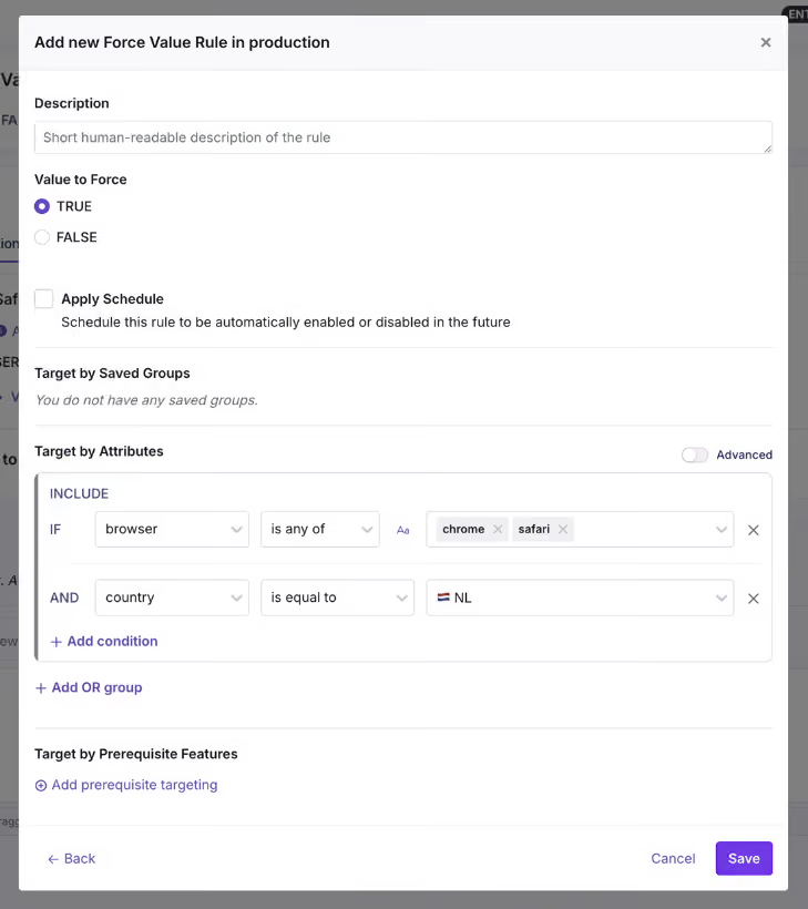
You can target attributes you already track, from user role and geography to specific app versions. Since these rules evaluate in order and with first-match-wins logic, you layer them as well. For example, add a beta segment and target them further based on geography or browser type.
2. Percentage rollouts and canary releases
When you need broader validation, that’s when you can start rolling it out to a bigger group. The question here changes from “Who are we serving the feature to?” to “How many users need to see it during this test?”
A percentage rollout randomly exposes the feature to a share of your users based on the value you set. You start with a small segment of 5–10% of users and then gradually expand. It becomes a canary release when you monitor the rollout at each stage and make a go/no-go decision before proceeding to the next stage.
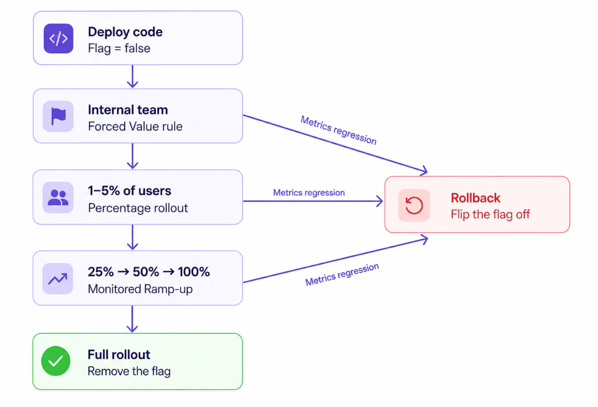
If you use a feature flag for the canary release, it works at the application layer. So if you expose individual users hashed on any attribute you choose, the same user gets a consistent experience across all requests. Granularity is per feature, which means even ten flags can sit at different rollout percentages, and you can test features simultaneously.
Within GrowthBook, you can use a Percentage Rollout Rule to put this into effect and even layer in specific groups, attributes, or prerequisite features for the rollout.
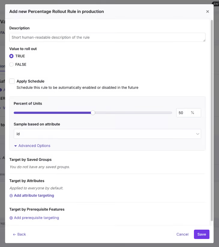
That said, a manual percentage rollout still requires you to bump the percentage by hand after deciding when it’s safe to expand. If you want to automate it, Safe Rollouts are a better bet.
3. Safe Rollouts
A Safe Rollout in GrowthBook is a Ramp Schedule with monitoring turned on. It works like a canary release, but the rollout is fully automated and advances through timed steps while the platform evaluates your guardrail metrics at each stage using sequential testing.
The default monitored ramp starts at 1% and works its way up through 5%, 10%, 25%, and 50% before releasing to 100% when the schedule completes. If a guardrail metric regresses at any stage, the rollout automatically rolls back and disables the rule.
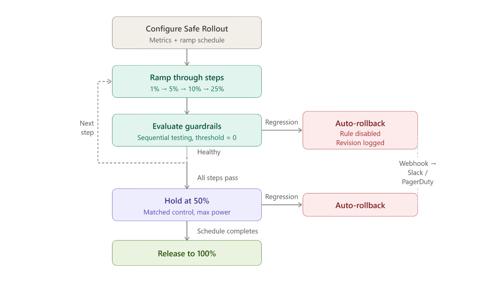
Also, if you do need human approval at each stage, you can configure that within GrowthBook.
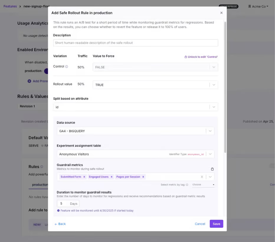
The ramp-up happens quickly for the first 25% of the total duration, and then the rollout holds at 50% for the remaining time. At 50%, half your users get the new value and half get the control, so the platform can compare the two groups with statistical confidence. And because these guardrail metrics are warehouse native, the same metric definitions can power an experiment on the same flag with the same SDK. Progressive delivery becomes the on-ramp to experimentation over time.
Depending on the metrics, you can expect the following actions:
How can you instantly roll back changes with progressive delivery methods?
The best part about using feature flags for progressive delivery is that you can roll back changes almost instantly if something goes wrong. In a traditional rollback process, you have to redeploy code, which can take minutes to hours, depending on the change. That happens because it goes back through the same path that caused the failure, as we saw in OpenAI’s outage incident.
A feature flag-based kill switch doesn’t have that problem. You simply change the value, and the SDK evaluates the updated rule or fallback path.
In fact, companies like Shopify have reduced their average rollback time from 18 minutes to 43 seconds by adopting progressive delivery methods. And it does it across 200,000 production deployments every month.
In GrowthBook, kill switches work at different levels of granularity:
- Per rule: You can pause or revert a single targeting rule. If a Safe Rollout detects that the guardrail metrics are regressing then GrowthBook surfaces a Revert Now button on the feature's detail page so you can manually roll back before the automatic rollback kicks in.
- Per feature, per environment: You can toggle the feature off entirely in production. GrowthBook removes it from the SDK payload, so the flag evaluates to null.
- Across features: You can use a boolean prerequisite flag to gate a group of related features. If you flip the prerequisite off, you block every dependent feature with one switch.
That said, how fast your users see the previous/fallback version depends on your setup. If you use GrowthBook's streaming (SSE), flag changes propagate in real time but you have to enable it. If your SDK polls through a CDN, the update arrives on the next cache refresh, which is roughly 30 to 60 seconds with default settings.
Which metrics should you measure during a progressive rollout?
There are three categories of metrics you should consider measuring:
- Guardrail metrics
- Signal metrics
- Health metrics
Let’s understand why they matter:
Guardrail metrics
Guardrail metrics decide whether a rollout is actually making a positive difference for your users. If they regress, they trigger an automatic rollback, so they need to prove the negative effect statistically. That’s also why you should choose two to three metrics only, or else you’ll create too many false positives.
For example:
- Error rates,
- p95 or p99 latency
- Business metrics (checkout completion or signup rates)
Signal metrics
Signal metrics pause the rollout but don’t revert it. You should use them to monitor second-order effects during the rollout. For example:
- Secondary conversion metrics
- Support ticket volume
- Adjacent page load time
Health check metrics
While you can define guardrail and signal metrics, health check metrics come as an automatic default in GrowthBook. The platform runs them without any configuration from you and flags issues with the rollout itself, not the feature necessarily.
For example:
- Sample ratio mismatch (SRM)
- No traffic
- Multiple exposures
Note: Within GrowthBook, the failing threshold is fixed at zero, so the rollout rolls back where there’s evidence that a metric is degrading significantly. Because the platform is warehouse native, you query the metrics you monitor against your own data warehouse so that you can trust the data.
Companies like Breeze Airways use a “do no-harm” testing approach to make sure new features don’t degrade critical metrics like bookings or revenue. That’s also where a Safe Rollout can help you roll out with confidence.
“People only see the wins, but there’s actually greater value in avoiding losses. We’ve stopped changes that could have cost millions.”
— Merritt Aho, Digital Analytics Lead, Breeze Airways
How to choose a feature flagging platform for progressive delivery?
When you’re evaluating feature flagging platforms, you’ll see baseline features like targeting and kill switches. But the difference comes down to how these platforms handle automation, measurement, and governance.
For instance, AI-led or agent-led software development is becoming the norm now. AI coding agents can create full release plans with concrete targeting rules and guardrail metrics. But the difference is that it can do it at scale and draft hundreds of release plans in minutes. If you don’t have the right guardrails in place, these changes can reach production before a human reviews them and could cause incidents. So your platform of choice needs to offer the same governance capabilities for agent-led changes too.
For instance, GrowthBook integrates with agents like Claude Code or Cursor via its MCP. So you can make changes via the MCP that land as a draft revision a human has to approve. Each change is logged as an agent- or human-made change so that your audit logs attribute it to the right actor. So, look for a platform that supports similar workflows.
AI-Native Feature Flags with GrowthBook Skills
If you’re evaluating platforms for progressive delivery, these are the questions worth asking:
- Can rollouts advance through stages automatically, or does someone have to bump the percentage by hand?
- Can you define custom ramp schedules with timed steps?
- Can individual stages require human approval before advancing?
- Does rollback trigger on a metric, or does it depend on someone noticing a problem?
- How does the platform decide a metric has “regressed”? Is it a fixed threshold you define, or statistical significance evaluated continuously?
- How fast does a rollback propagate to your users?
- Are rollout metrics defined in your own data warehouse, or in a third-party platform?
- Does the platform support the metric types you care about (event-based, revenue, latency percentiles)?
- Can the same metric definitions power both rollout safety and experimentation?
- Does every rollout decision (including automated rollbacks) land in an audit log as a diffable revision?
- Can you enforce approval workflows before a rollout reaches 100%?
- Are agent-initiated changes attributed separately in the audit trail?
- Can you self-host the platform on your own infrastructure?
- How many SDKs does the platform support, and do they cover your tech stack?
- Can an AI coding agent configure and drive a rollout safely through the same API?
Ship continuously but release deliberately
OpenAI’s outage started because deployment and release were the same event. This process is still the default for most engineering teams even though it doesn’t need to be.
Feature flags give you the missing layer between shipping code and exposing it to users. Progressive delivery is what happens when you use that layer deliberately: start small and widen the rollout only when your metrics tell you to.
Over time, your team will deliver more stable software faster, helping you become a high-performing engineering organization.
If you’re ready to build that control layer, try GrowthBook for free or join a live demo.
.avif)
A/B Testing with Feature Flags: Turning Every Rollout into an Experiment
You can put 50% of your users on a new checkout flow in about thirty seconds using a feature flag. But that doesn’t mean you’ve run an A/B test.
Feature flags only control who sees the change, but A/B tests measure whether that change actually worked. A flag can split users into groups, making it easy to assume you’re experimenting. However, controlling exposure and actually measuring impact are two different things.
In this article, we’ll explain how you can use feature flags to roll out features and, in turn, turn those rollouts into concrete experiments.
What’s the difference between feature flags and A/B testing?
A feature flag is an if/else conditional in your code that decides which version of a behavior a user gets. You wrap new code in a conditional check so you can control who sees it and shut it off in seconds if something breaks. So it acts as the delivery infrastructure.
An A/B test is an experimentation method. You split users into groups at random, show each group a different version, and compare outcomes to work out whether the difference came from your change or not. It randomly assigns users to two versions of an experience and measures whether one actually performs better on a metric you care about.
It’s easy to confuse them because, from the outside, they involve splitting users between experiences. The difference is that a flag asks who should see this, but an experiment asks whether it actually worked.
| Feature flag | A/B test | |
| Purpose | Control who sees a change | Measure whether a change caused an effect |
| Assignment | Can be targeted, percentage-based, or randomized | Randomized and tracked |
| Control group | No concurrent control required | Concurrent control maintained throughout |
| What you learn | Who received the change | Whether the change improved a metric |
The roots of A/B testing go all the way back to R.A. Fisher’s agricultural experiments in the 1920s. Software just made it cheap enough to do it on every release because feature flags give you the baseline infrastructure to make that happen.
Why a percentage rollout is not an A/B test
Let’s say you roll out a new feature to 50% of your users and conversion rates go up by 3.5%. You might be tempted to credit the feature, but how do you really know it was responsible for this?
Without a concurrent control group, you can’t prove it caused the lift. That’s because several things can change during a rollout window:
- Timing: If you ramped it over 5 days and there was a seasonal promotion, that could’ve influenced the results. You would have no way to isolate the variables.
- User mix: The first 10% and the next 20% of users might not be the same type of users. Percentage rollouts are random by nature, so if the rollout picked up more mobile traffic or regional users, you can’t compare them.
- Additional changes in the pipeline: Your team might’ve made two backend changes or a landing page tweak in the same week. So there’s no way to know which change made a difference.
- No concurrent control: If you’re comparing before and after, it means you’re comparing two different weeks. But to draw a conclusion, you need two equivalent groups seeing different things at the same time.
In fact, engineering teams have seen this play out early on. Back in 2004, an intern built behavior-based search at Amazon, a prototype that put product recommendations in a user’s shopping cart.
At the time, its senior VP blocked the development because they believed it would distract customers from checking out. But the engineer ran a controlled experiment anyway, and the feature won by a huge margin, increasing revenue by 3% and resulting in hundreds of millions of dollars in incremental sales. If they never tested the feature, they would’ve never known its real impact.
In short: a rollout tells you what happened while the feature was live. An experiment gives you a real shot at knowing what happened because of it. Given that studies say that more than half of tested ideas don’t move the metric, treating every rollout as an experiment and a success is the wrong approach.
Run your first flag experiment
Create a free account and turn your next feature flag rollout into an A/B test with metrics attached.
Start Building FreeWhat are the building blocks of feature flag-based experimentation?
You need to have four components in place before you start experimenting:
1. A hypothesis
An experiment starts with a claim, i.e., a hypothesis. For example, “The new checkout flow will increase completed purchases by <2%.”
You’re describing what you expect to happen, but it doesn’t have to come true. This process lets you define the metrics you’ll use to analyze the results down the line.
It also forces product and data science teams to align on what the change should accomplish and how you’ll measure it before the flag goes live.
2. Variations and a control
Your experiment will need two states to compare the results:
- Control: what users see without the change (the existing experience)
- Treatment: what users see with the change (the new experience)
Your feature flag already handles this. The flag’s default value is your control, and the value you’re testing is the treatment. Both have to run at the same time under the same conditions so you can isolate whether the change made a difference.
3. Randomized, sticky assignment
Now, you randomize assignment of values to both groups so they look alike in every setting except the change you’re testing. This makes sure your results are truly statistically significant.
If your treatment skews toward specific segments, like enterprise accounts or behavior, unintentionally, the results will be biased because you didn’t control the variables.
Also, the assignment has to be “sticky.” By that, we mean that every user has to see the same version every time they visit to prevent inaccurate data collection.
In feature flagging and experimentation platforms like GrowthBook, the platform handles this via deterministic hashing. The experiment seeds with the user’s value for the assignment attribute, and maps the result to a number between 0 and 1. The variation is assigned a number, and wherever the user’s value hash falls, that’s what they get.
Note: The attribute you hash on defines what a “user” is for the test. Hash on user ID and you’re measuring people. Hash on a company ID or tier type, and everyone on that segment will land on the same side.
4. Metrics and statistical analysis
You need to choose your metrics before the experiment starts. You’ll want one primary metric tied to the hypothesis, along with a few guardrail metrics to make sure nothing degrades. For instance, metrics like error rates or p99 latency.
If you need to understand whether there’s a real difference between two groups, you’ll need a statistical engine or method to test it. The method you choose depends on the test, but here are a few common ones:
- Bayesian or frequentist analysis to determine whether your result is statistically significant.
- CUPED for variance reduction so that you can reach significance faster with smaller samples.
- Sequential testing for valid interim checks without inflating your false positive rate.
- Automatic SRM detection to catch assignment problems before they corrupt your results.
Most feature flagging platforms don’t come with built-in statistical analysis capabilities. They hand it off to a separate analytics tool, but platforms like GrowthBook run this natively. If experimentation is a core use case for you, keep that in mind when choosing the right platform for your team.
How to turn a flag rollout into an experiment
Let’s say you have a feature sitting behind a flag and you want to know whether it works. Here’s how you can do that:
- Write the hypothesis: Write down what you expect the feature to change and by how much. For example: “The new onboarding flow will increase activation by at least 3% within the next 7 days.”
- Define control and treatment on the flag: The existing experience is your control and the new one is your treatment. If you’re testing more than two options, define each value on the same flag.
- Use an experiment rule instead of a percentage rollout: Instead of using a percentage rollout, configure the flag to run a randomized experiment. As the users are assigned and those assignments are recorded, the control group will be maintained throughout. In GrowthBook, you can use an “Experiment Rule” to run a feature flag-based experiment.
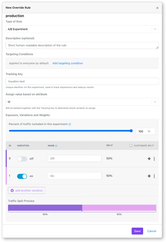
- Attach your metrics: Pick the primary metric tied to your hypothesis and the guardrails that must hold. Platforms like GrowthBook read these from fact tables defined against your warehouse, so you’re using the definitions your data team already maintains.
- Set coverage and traffic split, then start it: An even split between control and treatment gives you the most statistical power for a given number of users. If you’d like to limit your risk, start at 90/10 or 80/20 (control/treatment) and adjust it as you build confidence in the results.
- Run the experiment: Don’t check partial results and declare a winner early. It’ll inflate your false positive rate because you’re making a decision based on incomplete data. Run sequential testing if you’re willing to trade some statistical confidence for the ability to decide a winner after early peaks at the data.
- Check the data quality before analysis: Look for sample ratio mismatch (SRM). If the ratio of users in treatment vs. control doesn’t match what you set, something in your assignment logic is broken, and you can’t trust the results.
- Decide if it’s a go/no-go: If the treatment wins and your guardrail metrics also hold, roll out the feature to 100% of your users. A no-go or null decision is also a decision because it saves you from scaling something that doesn’t work.
- Remove the flag: Once you have a clear winner and have rolled it out, the feature flag is essentially dead code. Clean it up before it becomes part of the permanent codebase.
When to use a percentage rollout, experiment, or safe rollout
Not every release needs an experiment. There are three ways to roll out a feature using a feature flag:
- A percentage rollout for controlled exposure when you want to limit blast radius and will monitor metrics yourself.
- A safe rollout when the change is shipping regardless and you want automated guardrail monitoring with auto-rollback.
- An experiment when you need to measure whether the change actually caused an effect.
All three run on the same feature flag, and the difference between them comes down to whether assignment gets recorded and what you’re comparing it against.
| Percentage rollout | Experiment | Safe rollout | |
| What it does | Exposes the change to a portion of users via a manual ramp-up process | Splits users and measures the difference | Ramps exposure automatically on a schedule with guardrail monitoring and auto-rollback |
| Assignment | Randomized by hashing, not recorded | Randomized and recorded | Randomized and recorded during monitored steps |
| Control group | None held back for comparison | Runs alongside the treatment throughout | Runs alongside the rollout group at each monitored step |
| Metrics | Whatever you happen to watch on your own dashboards | Primary and guardrail metrics, analyzed statistically | Guardrail metrics only, checked with sequential testing |
| Use it when | You want to limit blast radius if there's a negative effect and want to control who sees the feature first and when manually | You need to know whether the change caused an effect | The change is shipping regardless, and you want the platform to catch negative effects early on and auto-revert if a guardrail metric degrades |
| What you learn | Who received it | What receiving it caused | Whether it broke anything on the way up |
Percentage rollout
Use a percentage rollout when your goal is controlled exposure, and you’re limiting how many users are affected if something goes wrong.
Let’s say your team rebuilt their authentication service. You need to know if the new one holds up in production without any issues. Roll it out to 5% of your users and manually ramp it up as your guardrail metrics hold.
In GrowthBook, you can use the “Percentage Rollout” feature on the feature flag. The ramp-up is manual, but if you want to automate it, you can use the Ramp Up Schedule feature.
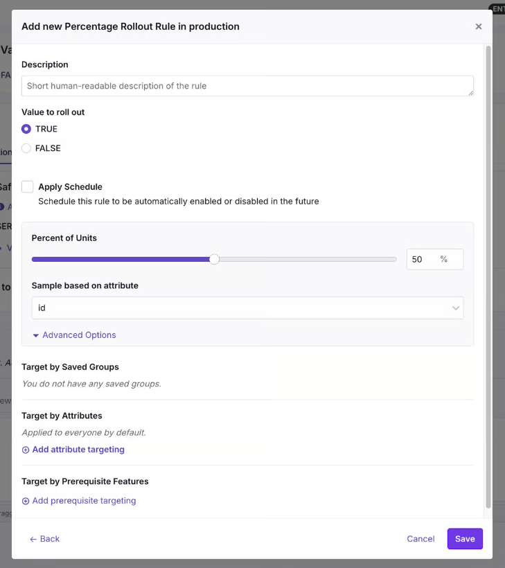
Safe Rollouts
Use a Safe Rollout when your goal is to understand how the feature performs against different guardrail metrics. You can gradually release a feature with automated ramp-up and guardrail monitoring.
Let’s say your team is shipping a new pricing display across your ecommerce platform. The change will go live because it reflects updated pricing, but you want to catch any issues before it hits the entire user base. You can configure a Safe Rollout and monitor metrics like revenue per session and error rates to build confidence in your release plan.
GrowthBook attaches a ramp schedule to a targeting rule and monitors the ramp-up at every stage. If a guardrail metric degrades, it’ll automatically roll back the feature.
Since the platform runs sequential testing against the guardrail metrics, you can trust the results and make go/no-go decisions based on it.
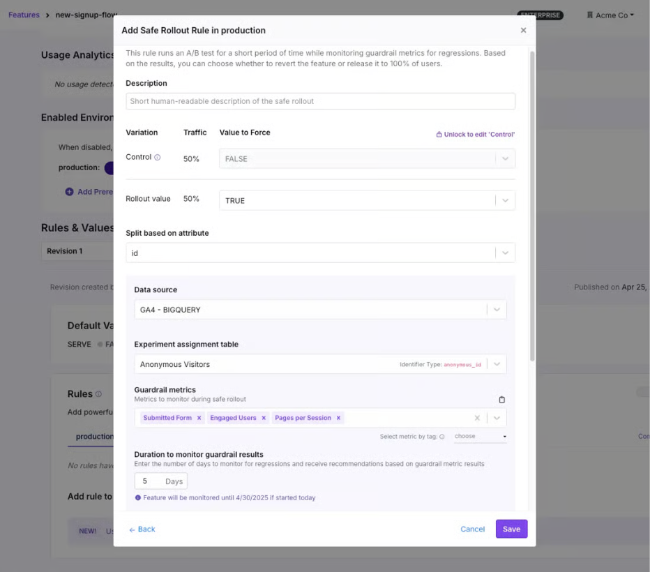
Experiment
Use an experiment when you need to know whether a change makes a measurable difference.
Let’s say you redesigned your onboarding to improve activation rates. If 50% of users experience the new flow and 50% see the old one, you can monitor activation rates after a defined period to see whether they increased.
In GrowthBook, you can add an experiment rule to the same flag, and it’ll handle everything from assignment to data collection. The metrics come from fact tables defined against your data warehouse so the results are in a standard format your team understands. Since it has a warehouse-native architecture, there’s no data duplication either and data stays within your infrastructure.
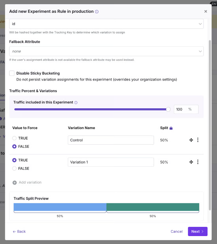
When is it not necessary to experiment?
Avoid running an experiment in the following scenarios:
- You already know the outcome, and the upgrade doesn’t need a control group.
- If your sample is too small because of traffic volumes and it’ll take too long to build the sample size.
- Suppose a feature has to be universally on at all times. This is common for regulatory requirements or contractual obligations.
Do you need a separate A/B testing tool?
When your feature flags and experiments live in two different platforms, you could end up with:
- Duplicated metric definitions
- Data duplication
- Separate assignment systems
- Multiple dashboards for the same purpose
- Reconciliation issues
As it is, 50% of developers say they’re duplicating work already done by another team, and 50% lose more than 10 hours a week to organizational inefficiency. If you add using separate tools for something that can be handled in one, you’re contributing to the problem.
And building the platform internally doesn’t solve the problem either.
Companies like Upstart did the math and realized they would need four engineers to build a platform in-house and two engineers to maintain it later. By choosing GrowthBook, they consolidated three platforms into one, avoided unnecessary development costs, and saw a 6X improvement in experimentation time.
“We had to be familiar with these different tools and rely too heavily on our analytics team for data analysis rather than having software that could handle some of that for us. […] We had to rally our teams for this project and get our old tools cleaned up. Still, the process is significantly improving the quality of our systems and reinforcing best practices around experiments and feature-flagging hygiene. […] We’ve been able to see underperforming experiments quickly and react immediately, empowering our engineers to make decisions independently.”
— Diego Accame, Director of Engineering, Growth, Upstart
4 best practices for feature flag-based A/B testing
Here are a few tips to consider when you’re using feature flags for A/B testing:
1. Fire the exposure event server-side
If you log exposure on the frontend, you’ll only count users whose browser ran your JavaScript. Bots and crawlers usually get assigned server-side and never run it, and depending on your site, they could very well be half the traffic. Plus, ad blockers stop analytics scripts for a large portion of users.
Since your losses are rarely even across variations, you’re better off logging the assignment from the backend the minute it happens.
If you also need to know who saw the change, fire a separate frontend event and use it as an activation metric, so the health checks still run against the reliable data.
2. Run an A/A test before you trust the pipeline
An A/A test splits users into two groups and shows them the same thing. Any difference it reports can be considered noise, so it tells you whether assignment and logging are working properly before you run the test.
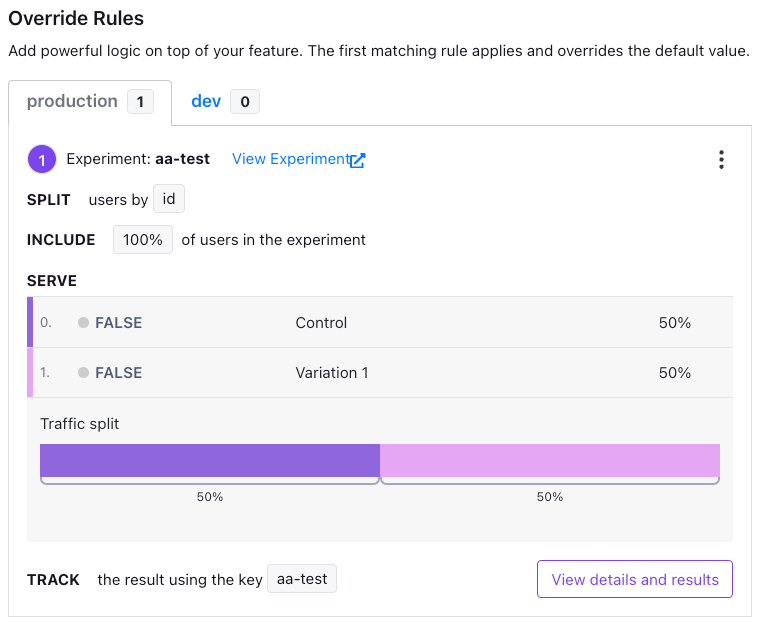
It’s best to run one before your first experiment and again after any changes you make to your warehouse or tracking code. That said, you should expect false positives roughly 10% of the time.
3. Widen a running experiment instead of reshuffling it
Once an experiment is live, it’s safe to increase the share of users in it. New users get bucketed on arrival anyway, and everyone in the test continues to see the values they were seeing.
But changing the traffic split between variations isn’t. Users move from one variation to another, so that’ll contaminate the data you’ve collected and can’t be considered valid.
4. Know what else is running at the same time
If you’re running two different experiments, they could interfere with each other. As a result, the effect you’re measuring could belong to the combination of the changes, instead of a single one.
That’s why you need to either know what’s running simultaneously, which is unrealistic in a large organization. Or use namespaces to handle conflicts. If you do, each experiment will claim a slice of the traffic, and they won’t overlap. Every experiment sharing a namespace has to use the same assignment attribute.
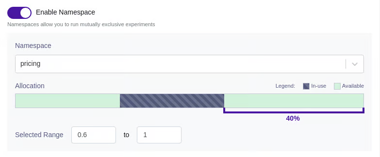
How GrowthBook consolidates feature flagging and A/B testing
It still takes 30 seconds to put 50% of your users on a new checkout flow. But what you learn from that 30 seconds depends on whether the assignment was recorded and compared against a control at the same time.
Controlling exposure and measuring impact are two different things, but they don’t need two different systems. The feature flag decides who sees the change, but when you attach a hypothesis and related metrics, it turns into an experiment.
GrowthBook does both. It makes feature flag-based experiments a reality by giving you the infrastructure to do it. You can add experiments to existing flags, or vice versa, and get the full rollout, advanced statistical analysis, and reporting in one platform. Plus, you can run experiments easily by filling out just five fields and getting started.
In fact, companies like Breeze Airways have doubled experimentation throughput and avoided $1 million in losses with GrowthBook.
If you’re ready to turn your next rollout into a concrete experiment, try GrowthBook for free or book a demo.
Flags and tests in one place
Watch a live walkthrough of running a feature flag rollout as an experiment, from targeting to results.
Watch the Live Demo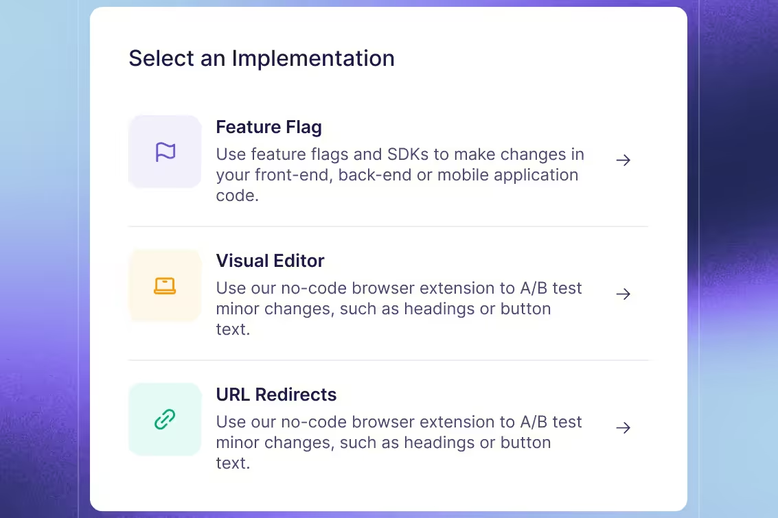

Even a loss is a win: Charlie Health's approach to failed experiments
Guest: Joe Yevoli, Director of Growth, Charlie Health. Host: Ashley Stirrup, CMO, GrowthBook. Show: The Experimentation Edge.
Running an experiment is the easy part. The hard part is knowing what to do when the result comes back, especially when the result is a win.
Joe Yevoli learned that again this year. As Director of Growth at Charlie Health, a virtual intensive outpatient program that sits between once-a-week therapy and hospitalization, he owns performance marketing, lifecycle marketing, and on-site and in-product experimentation. Every test on the landing pages and the intake form runs through his team. When he joined Ashley Stirrup on The Experimentation Edge, he brought three stories that share a single thread: the experiments that teach you the most are the ones that refuse to behave the way you expected.
🎧 Listen to the full episode →
The win that created a bottleneck
Charlie Health's intake form used to open with a page that, in Yevoli's words, "essentially functioned as almost a second landing page." A prospective client would click Get Started, land on the form, and be greeted with more information rather than the first question.
"Most people, when they click Get Started, is not expecting to get further information," he said. So the team removed the page and ran the test for about three months. The results were strong. More people entered the funnel, and the variant looked like an obvious ship.
Then the team looked further down. "What we also saw was that we were unnecessarily inflating the top of the funnel," Yevoli said. That first page had been quietly doing a job: it gave people information they needed before they committed. Without it, more people started the form, but a larger share of them were not the right fit, and conversion downstream dipped.
"Even though the test ended up positive, what we saw was, okay, there is another bottleneck being created here. We are letting too many people through."
The response was not to reverse the change. The removed page was still the wrong place for that information. Instead, the win produced the next hypothesis: an FAQ-style chatbot on the landing pages that surfaces the same information to anyone who wants it, before they ever enter the funnel. Inform people early, remove friction once they are inside.
Yevoli is candid that the dip surprised him even though it should not have. "You increase people in the top of the funnel, by definition, conversion is gonna get worse even if you are getting more people at the bottom of the funnel," he said. "It's almost like a law of thermodynamics." He had seen it play out many times before. "I had totally forgot that this was gonna happen. And another reminder of you don't know anything."
That phrase, "I don't know anything," comes up repeatedly in the conversation. It is not false modesty. It is the operating posture that makes the rest of his approach work.
Build it for everyone, build it for nobody
The second story comes from Yevoli's time at Teachers Pay Teachers, the marketplace where teachers sell supplemental resources to other teachers. During the pandemic, the company launched a digital-first product called Easel. The instinct, Yevoli admits, was the one most product teams have: "Let's see if we can build something for everyone, because we wanna make sure that the most amount of people use it."
So Easel shipped as a PDF overlay that could, in theory, work with every resource on the platform. Teachers tried it in large numbers. Then they stopped. In the middle of a pandemic, with instruction happening on screens, a digital teaching tool was not retaining.
The interviews explained why. "We built something way too wide, and teachers were almost putting their own meaning into what they were experiencing," Yevoli said. One teacher would call it a PDF overlay tool. Another would call it an iPad teaching tool. Each invented a definition, and none of them matched what the company was trying to do.
What teachers actually needed at that moment was narrower and more specific: a way to assign homework, confirm students did it, and track progress. So the team ran a lightweight test that repositioned Easel as exactly that, with a minimum set of features built to support the new promise.
"I think we cut out probably about 80% of the teacher market for that one feature," Yevoli said. "Retention probably quadrupled."
He credits the reframe to Crossing the Chasm and its beachhead strategy: pick a narrow niche, make the product as good as possible for that group, then use those early users as the reference point for where to expand next. The team never got to the expansion phase at Teachers Pay Teachers, but Yevoli knows what he would have looked for. Were teachers using the homework tool in class? For tests? Those signals would have shaped the next iteration and grown the market in the right direction rather than all directions at once.
The counterargument he heard internally is the one every growth leader hears. "We're cutting out so much of the market." Yevoli understands the instinct and still rejects it. "Going to everybody at first, you build something for everyone, you actually build it for nobody, and you burn that first impression that is so important."
The same logic now governs how his team reads results at Charlie Health. Some segments refer clients at high frequency; others refer rarely. "The solves for both of those segments are entirely different," he said. "If we approached the whole thing in the same way, we would get a very muddled view of what is actually working." An average hides the experiment. Segments reveal it.
Assume it failed, then launch
The third practice is the one Stirrup singled out during the interview, and it is the most transferable. For large, risky experiments, ones that touch a big share of the user experience and could do real damage if they go wrong, Charlie Health runs a premortem.
The mechanics are simple. Before launch, everyone involved gathers in a room. Then someone says: "Okay, we launched this experiment. The experiment wrapped. It was a massive failure. What went wrong?"
"And then the room goes silent," Yevoli said. "Everybody writes down everything that they can think of that could possibly go wrong on the day of launch or at the end of the experiment. And then we just go around the room and everybody reads what they wrote down."
The exercise does two things. The first is cultural. Everyone has sat in a meeting thinking a plan has a flaw and said nothing because the team seemed confident and the project was too far along. "And then sure enough, the thing happens and you were like, 'Oh my God, that was exactly what I was worried about.'" The premortem gives that person a floor to stand on. It matters most when the idea belongs to someone senior. "When the experiment is proposed by, say, the CPO or the CEO, who's the associate in the room that's gonna be like, 'I don't think so'?"
The second is practical. Naming the failure modes in advance gives the team time to build mitigations. "It's always led to some implementation of a safeguard that previously wouldn't have been there that has helped us avoid catastrophe," Yevoli said. Sometimes the brainstorm goes further and produces an idea worth testing on its own, a variant C or D added to the original design.
He is careful not to oversell it. "That doesn't mean that every test is a winner. Quite frequently they are not. But it does make sure that we're not missing stuff."
Designing for the loss before it happens
Underneath all three stories is a discipline Yevoli applies to every experiment proposal that crosses his desk. He starts with two questions. What is the quantitative data behind the hypothesis? And what is the qualitative data? "You may see that a certain subset of people are behaving a certain way with data, but you'd be surprised about what you hear once you actually talk to them."
If both hold up, the next question is the full-funnel user experience for the feature, and whether every step of it is being measured toward the outcome the business actually needs. "It's one thing if you build a feature that increases opportunities, but it doesn't matter if it's not producing the end result, which is more sales."
Only then does he talk about the likelihood of losing. He rarely launches anything he does not feel good about, and he still tells new teammates that most of what they ship will not win. If the test was launched for the right reasons, tracked to the right end goal, and measured at every step, a loss is not wasted. "We're gonna look at the data, and we're gonna say, 'Huh, that's interesting. What's going on here? Let's talk to some users here. Let's figure out something different that we can do.' And eventually, more often than not, you get to that win that way."
That is the sense in which even a loss is a win. Not because losing feels good, but because an experiment designed to teach you something will do so regardless of which direction the number moves. The form page test won and taught the team about a downstream bottleneck. Easel lost and taught the team what teachers actually needed. The premortem exists so the lesson arrives before the launch instead of after it.
Yevoli's closing thought on AI applies to all of it. Tools that let one person act as engineer, designer, and PM at once make it possible to move fast and to do damage fast. His antidote is the same one he brings to experimentation: write down what you think before you ask, think through the answer before you report it, and keep asking what you are not seeing. "What AI is leading to is this habit of thinking you have the answer when you don't fully understand it, and that is super dangerous."
The teams that compound learning are not the ones with the highest win rate. They are the ones who treat every result, including the wins, as the start of the next question.
Listen to the full conversation with Joe Yevoli on The Experimentation Edge, and learn more about running experiments that teach you something either way at growthbook.io.
Introducing EU data residency for GrowthBook Cloud
GrowthBook Cloud now supports an EU data region. When you set up a Managed Warehouse, choose AWS eu-west-1 (Ireland) and your event data is ingested and stored in the EU.
GrowthBook’s warehouse-native architecture has always let you keep your event data in the EU, whether you bring an EU-based warehouse or fully self-host the platform.
Now, you have a new option. Choose a GrowthBook Managed Warehouse and keep your event data in the EU while getting the easy setup and low maintenance of a managed data warehouse. What crosses the border is configuration metadata and aggregate results.
What stays in the EU and what doesn’t
- In the EU: event ingestion and event storage in your managed ClickHouse warehouse.
- Still in the US: the GrowthBook application itself: login, the UI, your configuration, and computed experiment results.
- Already covered: if you connect your own warehouse, GrowthBook never receives your event data in the first place. This release is for teams that want us to host it.
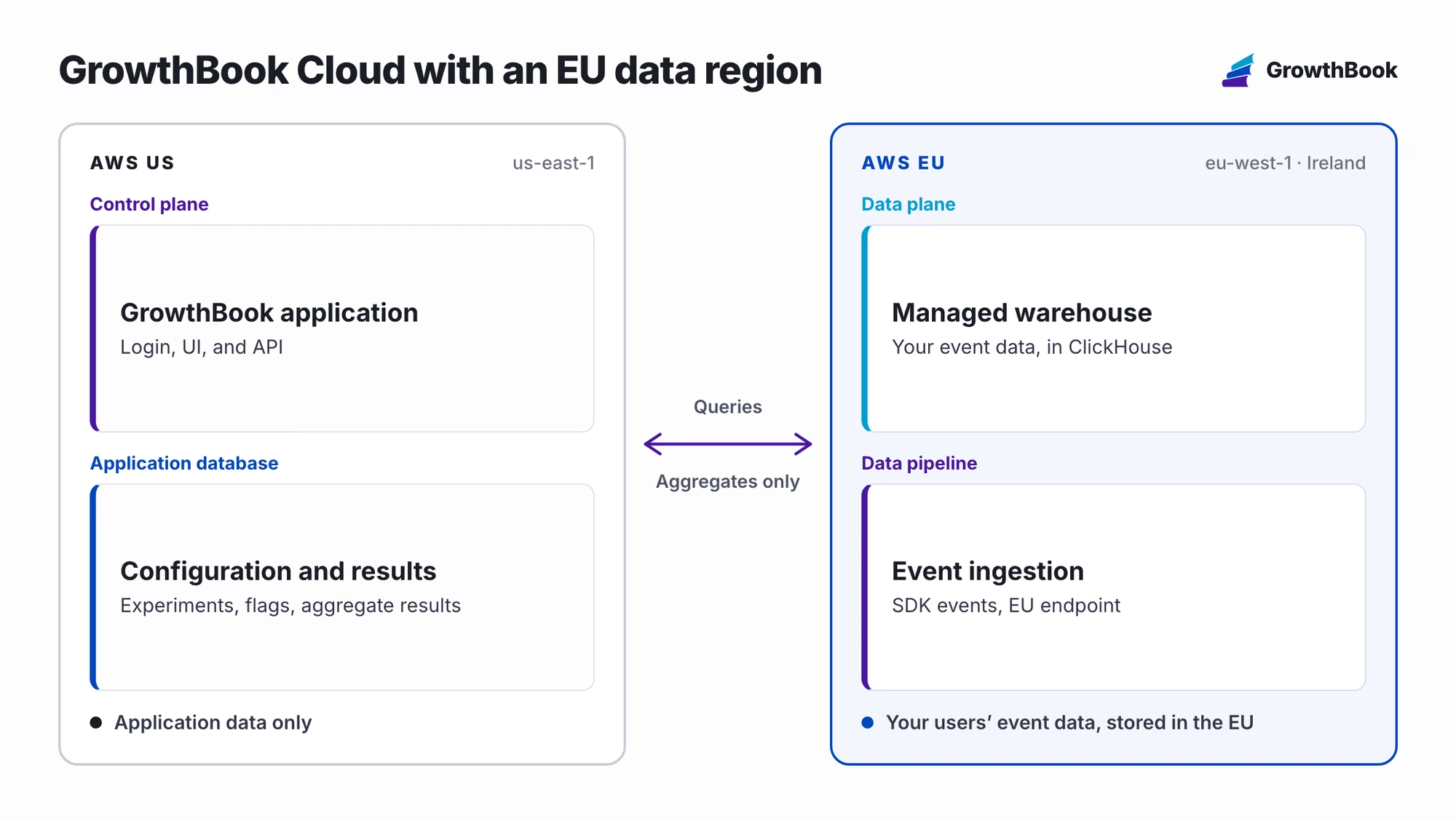
What you get with a Managed Warehouse
- One click to provision. There is no warehouse to procure, no cluster to size, and no pipeline to build before your first experiment.
- Configured for experimentation on arrival. You get tables for events, experiment exposures, and feature flag usage, a pre-built Events fact table, three starter metrics, and default identifiers and dimensions for country, browser, OS, device type, and UTM parameters.
- Tracking built into the SDKs. Tracking plugins ship with the JavaScript, React, Node.js, Python, Java, PHP, Go, and Flutter SDKs, or you can post to the ingestion API directly. Events are enriched with geoIP and user agent data and are queryable within seconds.
- Raw SQL access. Query your event data in SQL Explorer and write your own metrics with SQL, the same as you would against a warehouse you run yourself.
How to get started
When you create a Managed Warehouse or set up an Event Forwarder, pick the EU data region. The setup snippets in the app will point your SDK at the EU ingestion endpoint.

Your Data Protection Addendum and Standard Contractual Clauses remain unchanged. The EU region is available for every GrowthBook Cloud plan.
If you’ve been waiting on data residency to move forward with GrowthBook, talk to us. We’d love to help you out.
Talk to us about EU hosting
Book a demo to review data residency, Managed Warehouse, and security requirements with the GrowthBook team.
Book a Demo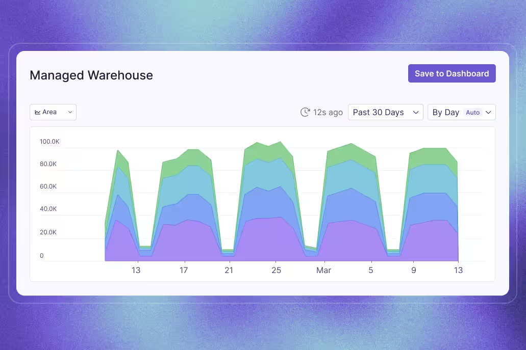

How Zalando connects every experiment to its North Star
Guest: Mi Tian, Head of Applied Science, Zalando. Show: The Experimentation Edge with Ashley Stirrup. Company: Zalando, the Berlin-based e-commerce platform operating in around 30 European markets with over 60 million monthly active users.
Zalando runs more than 1,000 experiments a year. User randomization tests, geo experiments, marketing experiments, personalization, recommendations, size and fit. The whole customer funnel is under continuous optimization, across many teams with different needs, velocities, and challenges.
At that scale, the hard problem isn't running experiments. It's making sure every one of them is worth running. On The Experimentation Edge, Mi Tian, Head of Applied Science at Zalando, explained how her team keeps 1,000 experiments pointed at the same destination: the company's North Star goal.
🎧 Listen to the full episode →
An experimentation org that reports to the CFO
Mi's team sits in an unusual place. She leads applied science within Zalando's economics and experimentation org, a central decision-making group directly under the chief economist and CFO.
The setup is deliberate. The org combines economists with experimentation-focused data scientists, and the shared mandate is decision-making, not any single method. "We try to use the right approach to address fitting questions," Mi explained. When online experiments are an option, they run them. When they aren't, the team leans on causal inference and other economics approaches to measure incremental impact.
That executive positioning matters culturally too. Zalando's CFO is an active champion of experimentation, regularly asking the team what she can do to better support the effort. As Ashley noted, when someone senior is paying attention to results and asking questions, it signals to the whole organization that this work matters, and buy-in follows.
The KPI tree: working backwards from the North Star
The core of Zalando's design discipline is a simple rule: any product goal needs to contribute to Zalando's North Star goal.
The obvious problem is that a North Star metric is nearly impossible to move, or even read, inside a single A/B test. Zalando's answer is a process Mi calls growing a KPI tree, or cascading outputs to controllable inputs. It works backwards in three steps.
First, start with clear goals and hypotheses. What product change is the team creating, and how is it expected to impact users or the business? Is it meant to improve short-term transactions? Drive engagement? A good experiment starts here, not in a testing tool.
Second, map the goal down to a primary success metric. The team selects proxy metrics that are sensitive enough to be effectively measured in the team's own A/B tests, while still connecting upward to the North Star. This is the critical middle layer. Without it, teams either chase metrics that are measurable but meaningless, or meaningful but immovable.
Third, map the metric down to controllable inputs. These are the day-to-day product changes the team is actually working on. If the chain holds, a shipped change is expected to move the proxy metric, and the proxy metric is expected to move the North Star.
From there, the team defines supporting observational metrics to help interpret results, sets standards like minimum detectable effect, and assesses feasibility before the experiment enters the roadmap or backlog. Goals first, then metrics, then configuration. On the platform side, Zalando's engineering team built a self-service experimentation platform, so any team can launch an experiment and analyze results end to end through a self-service dashboard.
Ashley summarized the practical payoff neatly: identify the first metric you'd expect a new feature to change. If you don't move that first metric, you're never going to move the North Star. The KPI tree turns that intuition into a repeatable design step.
A portfolio, not a queue
Design rigor alone can push a program toward timidity. If every experiment must justify itself against the North Star, teams may retreat into safe, incremental tests. Zalando counters this with deliberate portfolio balance.
Some experiments help the business stay in the game: standard confirmatory tests aimed at improving existing features, where confidence is high. Others are game-changing bets. "Those are riskier," Mi said. "They could give us negative results, but it could also change the game and help us win big."
The mechanism that makes room for both is risk tiering. When defining the experiment roadmap, the team assesses each experiment's risk tier and assigns a matching measurement strategy. High-risk experiments, such as disruptive feature designs that could move financial metrics, or long-duration holdouts that burden both users and the engineering stack, get heavier rigor. Lower-risk experiments move fast. The goal, as Mi put it, is to make rigorous decisions without slowing down the decision-making process too much.
The discovery feeds: a game changer, measured properly
The clearest test of this philosophy came with one of Zalando's biggest recent launches. Last year, the company introduced discovery feeds, a major reinvention of the homepage. The traditional experience, sorted by categories like men's, women's, and kids' fashion, evolved into a rich, entertaining experience with personalized feeds, video streams, boards, and curated content.
Here's the striking admission: at launch, the team didn't know how to measure success. They knew they wanted to scale the product, drive engagement, and drive conversion once it matured. But an experience this new had no established success metric.
Rather than guessing at one, the data scientists and product teams designed a comprehensive measurement plan that ran from day one of the launch. Short-term A/B tests measured the impact of small product changes quickly, feeding the iteration cycle. Long-term holdouts measured the incremental impact of the feeds product as a whole, from the first day.
After a few months of iteration, the results came in: strong engagement metrics, no damage to short-term transaction metrics, and positive impact on gross merchandise value. A genuinely risky bet, and the measurement system was strong enough to prove it paid off.
Where it goes next: agents, simulation, and a changing shopper
Experimentation at Zalando keeps evolving because the product space keeps evolving. Customers arrive with expectations shaped by TikTok-style experiences. Curated boards blend B2B and B2C into a single surface, with brands and fashion influencers publishing content inside the shopping experience. Each new surface raises the same question: how are you going to test for it?
One frontier Mi's team has started exploring is LLM-based agents that simulate real customer behavior. She is careful about the claim: "We're far from replacing real A/B tests with agents." The nearer-term opportunity is a cheaper, faster simulation layer for screening hypotheses, so teams can prioritize the high-impact ones before spending real traffic. Simulation could also help where live testing isn't feasible at all, such as Cyber Week, Black Friday, or specific locations and product types that can't carry experiments.
The hypothesis space is bigger than ever, and for Mi, that makes culture the real flywheel: continuously feeding experiment insights back into the product development cycle.
She closed with an analogy that stuck. She misses the old Saturday afternoons at the mall: checking familiar brand shops, wandering into unfamiliar ones, trying on jeans, stopping for dinner, catching a movie. E-commerce platforms, she argued, are now responsible for making shopping that engaging, convenient, and entertaining. "It is a longstanding business, but we have new missions, we have new challenges."
For a mature industry, that's the point worth remembering. The checkout flow being 1% better was never the ceiling. The teams that will win are the ones with an experimentation practice strong enough to measure the game changers, and a KPI tree that keeps every bet, safe or bold, connected to the goal that matters.
Realtor.com on guardrail metrics, the 30/30/30 rule, and AI as your junior data scientist
Guest: Whitney Perez, Director of Product Management, Realtor.com. Host: Ashley Stirrup, CMO, GrowthBook. Show: The Experimentation Edge.
Running an experiment is the easy part. The hard part is knowing whether the result you're looking at is actually telling you the truth.
Whitney Perez has spent her career finding that out the hard way. She started as what she calls a growth hacker at a digital agency, ran A/B testing for the GoToMeeting, GoToWebinar, and GoToTraining sites at Citrix, and helped GoDaddy stand up its first multi-armed bandit for front-of-site promotions and personalization. Today she is Director of Product Management at Realtor.com, where she leads experimentation for the side of the business that serves agents, teams, and other real estate professionals. That team is early in its experimentation program, and Whitney's job is to help it mature.
On this episode of The Experimentation Edge, she walked host Ashley Stirrup through the foundations she's putting in place, the recent test that reminded her why guardrail metrics matter, the 30/30/30 rule she uses to set expectations, and why she believes an English major with a shaky stats record can be a strong experimenter, especially with AI in the loop.
Three foundations before you run anything
Whitney's advice for a nascent team starts with getting everyone comfortable with the basics. "What does it take to run a clean and good test? What does a clean and good test look like? What is the value of an A/A test? How do we get instrumented?" Those questions have to be answered before anything more ambitious happens, so that everyone on the team feels empowered by the same shared foundation.
The second foundation is restraint. Not every surface and not every idea belongs in an A/B test. "I am often tempted to, 'I wanna test everything,' and you can't and you shouldn't," she said. Figuring out where the guardrails are, which surfaces are testable and which are not, is a core part of setting up the program.
The third is something she picked up at GoDaddy: a peer review, or bar raiser, program. Every experiment was reviewed by a set of peers. For more complex work, those peers partnered with the data science team. The effect was compounding. People learned from each other, built confidence, and graduated to more complex roles within the experimentation framework. Ashley called it a great example of building culture by getting everyone to help each other, and it doubles as a way to keep the rigor high without bottlenecking every test on one specialist.
The 30/30/30 rule
Part of building that culture is being honest about what the results will look like. Whitney is, in her words, a big believer in the 30/30/30 rule: roughly 30% of experiments win, 30% are inconclusive or insignificant, and 30% lose.
"The math is the math," she said. "That means that the vast majority of your tests are going to be nothing burgers, and that's okay, and that's part of the learnings."
The point of stating the rule out loud is to reset expectations before the first flat result lands. Everyone wants the big splash. But a team that expects every test to win will stop running the tests that teach it the most, and it will be tempted to read significance into noise. Ashley added that the learnings so often come from the losers, and that even a winner is really just a new hill to climb.
The 300% winner that lost money
Whitney's most instructive recent example came from Realtor.com's own checkout flow. The team set up an A/B test introducing a new step for bundling. There were revenue goals attached to bundling, it was a new capability, and, as she put it, there were "all these shiny new squirrels that we wanna chase."
The test appeared to knock it out of the park. A 300% attach rate. Bundling revenue well past target.
Then the team dug in. On the variant with the extra step, attach rate and bundle revenue were high, but the friction of that additional step pushed a meaningful number of people out of the funnel entirely. When they forecast the impact of that fallout against the impact of the attach, the result flipped. "It was actually a loser. The revenue was actually a loser."
Her takeaway is the one experienced practitioners keep relearning: "Yes, your winning metric is really important, but knowing what other impacting metrics and secondary metrics are in the mix and where the thresholds for success around those lies is so important, especially before you're ready to do your victory lap."
Ashley connected the story back to infrastructure. A test like that, read carelessly, could have led the team to believe the exact opposite of what was true. That is the argument for investing in instrumentation and trustworthy data early: the cost of a wrong conclusion is not just a bad feature, it's a bad mental model that shapes the next ten decisions.
Anyone can run a good experiment
Whitney is candid about her own background. "I was an English major, I was a French major. I'm not a stat major. I'm not a math major." Her view is that everyone can be an experimentation champion, and that the path to feeling comfortable in the discipline is shorter than most people think.
Her approach for new experimenters is to strip the definition of a good test down to its simplest form. Understand what makes a good hypothesis. Know what a decision metric looks like. Learn how to avoid confounding variables. Cover the basics of test design: how much traffic you need, what your confidence interval is. Then stop. "Keep it at the simplest definition of a good test and then let them try. You learn by doing in some cases too."
Ashley framed it as the shallow end of the pool being very shallow and the deep end being very deep. Whitney agreed there's something for everyone. Her first experiment was not a multi-armed bandit proof of concept. It was whether a button worked better here or there, and whether the copy looked good. That kind of test can still be impactful, as long as someone on the team brings enough rigor to avoid getting fooled by a result like the bundling test.
Cascading the North Star
Asked how Realtor.com keeps people aligned around North Star metrics, Whitney pointed to something the organization does well independent of experimentation: clarity on the key metrics at the top. The harder work is cascading them down. What lever does an individual surface or team have that moves the North Star? Building that out, whether through an opportunity solution tree or another form of mapping, shows where a movable metric is getting stuck and where the true opportunity lies.
She also emphasized doing the homework before the experiment. Journey maps, usability testing, qualitative research, rage-click data. "Not making the experiment do all the work either. Go do the homework first." Running a test well is a real investment, and pre-experiment design work is how you make sure that investment lands at the right point in the user journey.
AI as an aspirational data scientist
The conversation closed on AI, and Whitney's enthusiasm was specific rather than vague. What she values most is that AI can "turn everyone into, if not a perfect, at least an aspirational data scientist."
She described plugging real data into AI, using the chatbot functionality on the Amplitude dashboard, and asking it to help her think differently about the numbers in front of her, either to analyze results or to surface opportunities she hadn't spotted. The next step is overlaying cross-functional insights, qualitative and quantitative, on top of experiment data to get a richer picture of how one data source relates to the others.
Ashley shared where GrowthBook is focused: giving AI enough context and guardrails that it can help anyone experiment like the best data scientist on the team. He also raised the caution that AI can be very confident while giving the wrong answer, citing Khan Academy teams that used an LLM as a judge and had to be pulled back when the foundations turned out to be wrong.
Whitney's answer was the human in the loop. AI is not going to replace the data scientist or the person reviewing results any time soon, because you still need a sanity check and a smoke test. She drew the parallel to experimentation itself: "You peek in at your experiment after you launch it to make sure it's running the way you expect it to and collecting data the way it's supposed to, and it's the same idea. You can't trust right out of the gate."
Ashley's summary: it's a turbocharger, not autopilot.
What's next for Realtor.com
Whitney's wishlist for her team is three items long. First, perfect instrumentation, because confidence in the data has to come before any experimentation and it's a step you cannot skip no matter how tempting. Second, knowledge embedded on every team, so experimentation is not something only data science or one engineering team knows how to do. Third, a culture where everyone at every level of the organization is excited to hear results, good, bad, and insignificant, because that is what keeps the discipline moving forward.
It's a program built on foundations, honest expectations, guardrails, and a willingness to let people learn by doing. The 300% winner that lost money is the reminder of why each of those pieces matters.

Learneo on testing the opposite of every hypothesis
Guest: Rich Liebling, Senior Director of Engineering at Learneo. Host: Ashley Stirrup. Show: The Experimentation Edge, presented by GrowthBook.
Writing a hypothesis is the easy part. The hard part is accepting that the version you are most confident about might be exactly backwards.
Rich Liebling has the receipts. He is senior director of engineering at Learneo, the company behind Course Hero, and six years into that role. Before it, he was the first engineering hire at Shop It To Me, an email subscription service that sent people apparel matching their brand, size, and store preferences. He joined as VP of engineering when the founder had built the product in business school and grown it to roughly 50,000 subscribers. The goal for Rich's first year was one million. They got there in nine months.
On The Experimentation Edge, Ashley Stirrup asked Rich how that happened, what practice came out of it, and what changes when experimentation is not an organization's core value.
🎧 Listen to the full episode →
The test that lost, and its inverse that won
The story Rich returns to is small enough to sound trivial and consequential enough that it changed how his team worked.
Someone had a hypothesis about a particular page. Too much text. Too busy. Shorten it, simplify it, conversion goes up. They built it and ran it.
"The version with less text did worse," Rich said. "Not just didn't improve things, but it actually did worse."
At most companies that is where the test ends. The hypothesis was wrong, the change gets reverted, the team moves on to the next idea in the backlog. Instead, somebody proposed the inverse: what if the page needs more text, more explanation? They ran that. It won.
From then on it was standing practice. "Someone has a hypothesis and you wanna test it, great, but also test the opposite of that hypothesis," Rich said.
Two things came out of running it that way. The first surprised everyone: the opposite direction won often. Not occasionally, often. The second is the more useful one, because it holds even when the inverse loses. A result in either direction proves the variable has an effect on the metric you care about. "It tells you that this thing, this knob matters," Rich said. "It affects what you care about. And so you should use that as an indication to figure out how you can turn it in the right direction."
The failure mode this protects against is quiet and expensive: a team spends a quarter on a variable that does not move anything, because a single flat result was never distinguished from a signal pointing the wrong way.
New hires found the practice strange at first. They would bring an idea to a brainstorm, the team would agree to test it, and then add that they would also be testing its opposite. "Everybody felt a little weird about that," Rich said, "but it just became like, oh, yeah, okay, that makes sense. Let's do that."
Small tests are what make the opposite meaningful
There is a constraint on this that Rich is direct about, and it is the reason the practice does not scale to every test in a program.
"When you do very small focused tests, you can say what the opposite would be," he said. "But if you're completely redesigning a page and it does worse, you learn, okay, that version of the page doesn't work, but it's not clear what you do to try to make things better."
A wholesale redesign bundles a dozen good ideas with a few bad ones and returns a single number. There is no coherent inverse to run, and no way to separate what helped from what hurt. Ashley described a webinar earlier that day with the Philadelphia Inquirer, where a sign-up flow changed so much between A and B that the data scientist on the project could barely interpret the result. Rich's read: "They probably had a bunch of good ideas, but then some bad ideas mixed in, and where does it balance out and how do you tell the good from the bad? Very hard to say."
The rule he lands on is short. "The more focused your tests are, I think the more clear your learnings."
That does not mean only running small tests. Shop It To Me ran a portfolio: many small, low-investment tests changing a button's text or color, medium tests altering behavior and requiring back-end work, and larger bets on new product ideas. What the portfolio required was conviction. When a bigger bet did not win outright, the team's default was to keep iterating rather than declare the direction dead. "We wanna get onto a bigger hill," Rich said. "We recognize that it's gonna take some iteration to decide whether we actually made it to a bigger hill or not. And not just one guess and then say, oh no, that didn't work, we're not trying that again."
The same discipline applies to winners, and it is the one most teams skip. "When you find a winning variation, you do an experiment and you get a winner, is not to just move on to something else, but to say, hey, this has promise. Can we make it even better?" Rich said. "There's no reason to believe you're now at the optimal point."
A goal of 300 tests, not a goal of one million subscribers
The reason Shop It To Me had enough tests to learn any of this is a piece of goal-setting worth stealing.
One million subscribers is not something an individual contributor can act on. So the team decomposed it. The strategy was virality through a refer-a-friend program. The execution goal, the number everyone in the company could see and influence, was 300 A/B tests by the end of the year. Run enough tests, get enough winners, and the loop compounds.
"That's a good example of how at a strategic level you can translate a high-level business goal down to something that's purely execution-oriented," Rich said. "Everybody that we hired knew our goal and knew how we were gonna get there, and there was something that they had control over."
It worked. Nine months to a million, with a peak of 30,000 new subscribers in a single day.
The compounding did not stop at the subscriber count. As traffic grew, tests resolved faster, which meant the team learned faster than the copycat sites that started appearing. "Our big advantage was we have a headstart in our user base and our traffic, and that lets us move quicker," Rich said. "As you get bigger, the A/B tests can be resolved more quickly, and that gives you an ongoing advantage over someone starting smaller."
The second merge request
Engineering is not usually where an experimentation program finds its champion. Engineers want to ship the thing and move to the next problem. Ashley named that directly, and Rich agreed, which makes what happened at Shop It To Me more interesting.
A/B testing was a stated core value, discussed in interviews and used as a recruiting argument. Candidates did not have to care about fashion to matter here. "You're a part of driving the product and your ideas will matter," was the pitch.
Then the company backed it with a mechanic. A new engineer's first merge request was housekeeping, updating the onboarding documentation they had just used. Their second merge request was very often their own A/B test idea. Within two weeks, a new hire had shipped an experiment and read its result.
The brainstorms were open to everyone. That mattered because the engineering team was, in Rich's words, very disjoint from a user base of young women deeply into fashion. Nobody got dismissed with "what do you know about fashionistas?" Ideas were evaluated on the merits, and engineers' ideas won frequently enough to keep the whole company invested. Everyone watched the metrics as the growth curve steepened. "It was like just constant excitement," Rich said.
What it looks like when testing is not the core value
Course Hero is the contrast case, and Rich is candid that the practice looks different there.
Course Hero is a platform for sharing study materials, mostly for college students. Some content is free, some is gated, and there are two ways past the gate: pay for a subscription, or upload content to earn access. That created two teams with opposing incentives, one chasing uploads and one chasing subscribers, each able to win at the other's expense. The fix was a model that estimates a customer's lifetime value early, roughly at sign-up, so both teams optimize the same number. The dynamic stays messy, since paying subscribers also upload and their content tends to be better quality.
The larger difference is friction. There was no standard analysis process, so a data analyst would write ad hoc SQL and sometimes spend three days interpreting a single test. That cost alone suppressed how many tests got run. "Just that level of friction tended to discourage a lot of AB tests," Rich said. His conclusion covers both halves of the pipeline: lowering the friction to run a test matters, and lowering the friction to analyze one matters just as much.
Two other constraints shape the program. Concurrent tests on the same surface interact, multiplying code paths and edge cases, particularly when tests change behavior rather than copy. And traffic is seasonal, tied to the school year, with demand spiking around exams. The team's answer to the second is a multi-armed bandit framework that continuously shifts traffic toward the leading variation to minimize regret, balancing exploration against exploitation. It reduces the cost of a losing variation and makes it practical to let a test run across different parts of the calendar.
Steps to take from Learneo's playbook
- Run the inverse of your hypothesis alongside the hypothesis. Budget for it in your test plan rather than treating it as a consolation experiment after a loss.
- Keep tests focused enough that the opposite is a coherent thing to build. If you cannot state the inverse in one sentence, the test is too broad to teach you much.
- Translate the growth goal into a count your team controls. A subscriber target is a scoreboard. A test target is a job.
- Put a test in a new engineer's second merge request. Onboarding is where a testing culture is either established or lost.
- Measure your analysis friction, not just your shipping friction. If interpreting one test takes three days of ad hoc SQL, that number is your real ceiling on testing velocity.
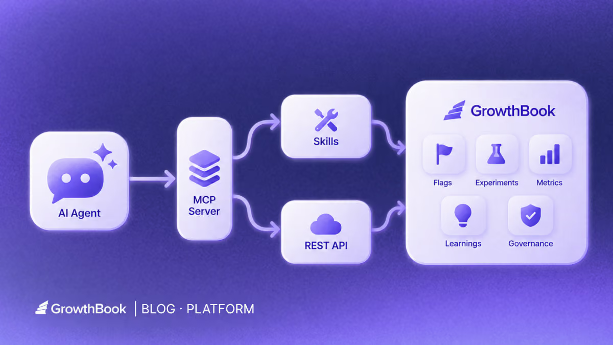
Why GrowthBook’s MCP server is just the interface
What GrowthBook learned by rebuilding its agent layer around APIs, skills, and human judgment.
The easiest way to misunderstand GrowthBook’s MCP server is to treat it as the headline.
An MCP server built on the Model Context Protocol can make for a neat launch story: take a product API, expose a set of tools, add a configuration snippet, and let an AI agent do something that used to require a dashboard.
Useful, yes. But increasingly ordinary.
The more important question is what the product has to know, expose, validate, and remember for any of those tool calls to be useful.
In a conversation with Alyssa Nicoll and Scott Bailey, the story kept pulling in two directions. Alyssa kept widening the frame beyond MCP toward GrowthBook’s larger AI strategy. Scott kept tracing the system downward, from skills to the CLI to a deep API. Those directions meet at the same conclusion: MCP is not the product. It is one way into the product.
GrowthBook’s server matters because the company decided the protocol layer should get thinner while the system behind it got deeper.
The first server solved an interface problem
When GrowthBook introduced its first MCP server, the immediate problem was obvious.
Software development was moving into agent surfaces such as code editors and terminal-based assistants, while feature flagging still lived partly in a separate interface. If an agent could write the feature but could not create the flag, inspect the experiment, or understand the release context, the workflow stopped halfway.
“How people write software was changing,” Scott said, “and feature flagging in particular should be right where people are already writing their code.”
GrowthBook described that first release as the first open-source, production-ready MCP server for experimentation and feature management. The original architecture fit the moment: it exposed a collection of named tools for concrete jobs such as creating flags, reading experiments, generating types, and searching documentation. Before reusable agent skills became a common design pattern, the MCP tool list carried much of the product knowledge.
The expected user was mostly a product engineer. They were already in an editor, already working on a change, and needed GrowthBook to be available in the same conversation. The value was proximity. The agent did not have to send the engineer back to a browser just to finish the release workflow.
That was the correct bet for the first version, but was not the final architecture.
Then the maintenance bill arrived
There was no dramatic failure. No rogue agent shipped a broken experiment. No launch had to be rolled back. The lesson was more mundane and more useful: GrowthBook had accumulated too many surfaces that could drift.
The REST API, CLI, MCP server, and skills were all reasonable on their own. Together, they created a maintenance problem. A product change could require updates in several places. A new endpoint did not automatically make the MCP layer smarter. A better workflow explanation could end up trapped in one tool description. For a scaling engineering team, every duplicated surface became another place where the public promise could separate from the product.
Rather than keep expanding a parallel catalog of MCP-specific tools, GrowthBook rebuilt v2 as a thin routing layer over the API and skills it already maintains.
The current thin server exposes four tools by name: growthbook\_list\_skills, growthbook\_read\_skill, growthbook\_api\_read, and growthbook\_api\_write. The current open-source skill repository provides around 30 skills, with a small set of high-level skills routing to more than two dozen workflow skills. The MCP server loads those workflow skills on demand instead of expanding into a tool for each endpoint, while the read/write split gives clients a clearer signal about which calls may change state.
The maintained skills become the authority on how to use GrowthBook well. The API remains the authority on what the product can do. The MCP server connects an agent to both.
“Every time we update a skill, the MCP server gets better,” Scott said. “Every time we update the REST API, the CLI stays in sync with it.”
Capability and judgment belong in different layers
The cleanest way to understand the new architecture is to separate capability from judgment.
The API supplies capability. GrowthBook has been expanding a typed REST API across feature flags, experiments, metrics, data sources, SDK connections, and product configuration. Its newer endpoints are defined from shared schemas that support runtime validation and OpenAPI generation. The CLI is generated from that API definition, which helps it stay current as the product changes.
Skills supply judgment. An API endpoint can tell an agent how to create an experiment. A skill can tell the agent when an experiment is warranted, what context to inspect first, how to choose metrics, which assumptions need human confirmation, and what evidence to return for review. The endpoint is a verb. The skill is a playbook.
That split is visible in an actual read-only path. For “What should we test next?”, the client does not search a giant catalog for a bespoke brainstorm tool. It discovers a domain skill, loads the relevant workflow skill, and only then calls the API:
The first three calls load judgment into the conversation. The fourth fetches company data through a read-only tool. If the user later authorizes a mutating step, the agent moves to growthbook\_api\_write, whose schema accepts POST, PUT, PATCH, or DELETE and marks the operation as potentially destructive. The MCP layer identifies the kind of action; the skill supplies the procedure; GrowthBook permissions and review state still decide what the action can change.
That distinction changes what the team maintains. Instead of teaching the same workflow separately to every AI surface, GrowthBook can improve a canonical skill and make that guidance available through the MCP server, direct agent use, and the in-app assistant. Instead of manually mirroring every API change in a CLI, it can regenerate the CLI from the same product contract.
It also prevents an important category error: a skill is not a security boundary. Skills are maintained instructions, and an agent can still misunderstand or apply instructions imperfectly. Permissions, validation, review states, approval policies, and audit history belong in the product layer. Tool annotations can help an agent distinguish reads from writes, but they do not replace scoped credentials or product governance.
The result is a stack in which each layer has a clearer job. The API makes the product addressable. The CLI and MCP server make it reachable from different agent environments. Skills make common workflows legible. GrowthBook itself remains the system that holds state, evaluates rules, records experiments, and applies organizational controls.
Every experiment becomes context for the next one
Any team that runs experiments in GrowthBook is already building the raw material for this workflow. The team’s experiments, configurations, metrics, and results remain available as part of its working history. The customer Scott described did not need to create a special AI corpus. It connected an agent to context the team had accumulated by using GrowthBook.
Since that conversation, GrowthBook has introduced Learnings: a place to capture conclusions across experiments and other evidence, including findings that support or contradict a pattern. Teams can make those curated learnings available to agents through the API and MCP, supplementing the experiment-brainstorm skill’s review of individual tests.
That makes the leap smaller than it sounds. Instead of starting from a blank prompt, an agent can inspect what the team has tried, which questions it has already answered, and where a follow-up might go deeper.
In the anonymized example from the interview, the customer connected its in-house agent through GrowthBook’s MCP server and asked for experiment ideas grounded in that existing history. The experiment-brainstorm skill guided the agent to inspect prior work, propose extensions or unexplored directions, and carry a selected idea into experiment design.
The actual experiment-brainstorm skill makes “grounded in history” testable. It reads up to 50 stopped experiments, starting with the newest, fetches results for roughly 20 of them, checks winners, losers, inconclusive tests, sample ratio mismatch flags, and under-explored projects or tags, then requires every proposal to cite a past experiment by name or ID. It also forbids creating an experiment during brainstorming. The person reviewing the shortlist chooses which idea to develop.
From there, the agent could do the heavy setup work: draft the experiment, connect or create the underlying feature flag, configure targeting, and prepare the object for launch. The same lifecycle continues after exposure begins, with skills organized around analysis and stopping decisions.
The interesting part is not that the agent can call several endpoints in sequence. It is that the sequence reflects the way an experimentation team actually works: brainstorm, design, launch, analyze, decide. The API provides the atomic operations; the skill turns them into a coherent job.
The same operating model shows up at scale. In GrowthBook’s Fyxer case study, a four-person growth team used GrowthBook and AI-assisted workflows to run 541 A/B tests in a year. The case study says the MCP server helped automate the path from Cursor to GrowthBook and into Slack. About 25% of those experiments were winners, while Fyxer grew from \$1M to \$35M ARR. That is not evidence that MCP caused the growth, and the case study does not isolate time saved by the server. It does show the operating model at meaningful scale: agents compress the work around a test; the experiment still decides what earns rollout.
Build on your experiment history
Explore the experiment-brainstorm workflow on GitHub, then ask your connected agent for ideas grounded in your past tests. Review the shortlist before designing a new experiment.
View Brainstorm WorkflowAutonomy is a risk decision, not a product setting
AI conversations often turn autonomy into a personality test. Either you run in “YOLO mode,” or you demand a human click for every action. Neither describes how most organizations actually adopt agentic work.
Alyssa joked that her instinct was to give an agent broad permission and ask it to stop interrupting her. Her more useful answer was about the placement of judgment.
“The goal isn’t human approval on every step or every API call,” she said. “It’s putting approval at the consequential decision points along the way.”
Consequential does not simply mean “write operation.” Brainstorming ten experiment ideas is usually cheap and reversible. Drafting a flag or experiment may also be low risk when nothing is exposed. Launching a targeting rule changes a customer experience. Stopping an experiment or acting on an analysis can redirect product work even if the underlying data was read-only.
The right boundary therefore depends on the decision, the environment, the team’s operating model, and its confidence in the surrounding controls. One company may let an agent configure a complete draft but require a PM or engineer to approve launch. Another may allow scoped writes in a sandbox. A mature team may automate more of a familiar workflow while still reserving unfamiliar or high-blast-radius changes for review.
GrowthBook’s recent governance work is relevant because it applies product controls to actions regardless of whether they came from a human in the UI or an agent through an API. Draft and review states, approval policies, permissions, validation, and audit trails can keep agent work visible and inspectable. The exact controls available still depend on the organization’s configuration and plan, so they should be verified rather than assumed.
The design goal is not zero human involvement. It is a smaller, more valuable human role: decide the policy, inspect the evidence, and approve the moments that change exposure or interpretation.
Why letting an AI act still feels risky
The fear is not abstract. Plenty of people are comfortable asking AI to explain code and deeply uncomfortable letting it change anything on their behalf. The memes make the anxiety funny—agents inventing facts, deleting the wrong thing, or sending the message—but the concern underneath is reasonable. Once AI can act, a bad answer can become a bad change.
Some of that hesitation is personal, too. People wonder whether teaching an agent to do more of their job is the first step toward making their own judgment less valuable. Scott’s argument was more practical: an expert who can use an agent to run more experiments and create more value is not removing expertise from the process. They are extending its reach.
Scott did not dismiss the risk or answer it with a blanket claim about model quality. He started with context. An agent working inside a codebase can see how the application already initializes GrowthBook, how flags are evaluated, how tests are written, and where event tracking happens. GrowthBook can add the other half: projects, environments, flags, experiment history, metrics, and workflow guidance. Better context does not make an agent infallible, but it reduces how much it must guess.
Trust then depends on four practical conditions:
- The agent can see the relevant application and GrowthBook context before it acts.
- Its credentials and tools limit the authority it does not need.
- The team can inspect proposed changes before they take effect and knows how to reverse them.
- The team can repeat a low-risk workflow and compare the result with its own judgment.
“Build trust by doing,” Scott said.
That is a more credible promise than saying agents will not make mistakes. The point of governance is not to prove that a model cannot fail. It is to make mistakes easier to catch, constrain their blast radius, and preserve a record of what changed. A team can start with inspection, move to sandbox drafts, and widen authority only after the outputs earn it.
This is also why the agent should return artifacts rather than reassurance: the GrowthBook object, the targeting rule, the code diff, the metric choice, the assumptions it made, and the decision still waiting on a human. Trust grows when the work is legible to someone who was not in the chat.
The audience grew beyond engineers
The first MCP server was naturally developer-centered. The newer architecture supports a broader reality: not everyone uses the same agent surface, and not everyone who needs agent assistance works in a code editor.
Some teams want a CLI because their agent has a terminal. Some use an MCP client where direct shell access is unavailable or undesirable. Some PMs, growth practitioners, and analysts will work through GrowthBook’s in-app assistant. The adapter changes; the product knowledge should not.
“Not everyone uses agent services the same way or uses the same ones,” Scott said. The advantage of a deep API with reusable skills is that GrowthBook can meet those surfaces without inventing a separate product model for each one.
Alyssa put the same point more bluntly: “The way we are supporting developers goes so much beyond the MCP server.”
That broader framing matters. If GrowthBook equated its AI strategy with MCP, it would be betting the product on one protocol and one class of client. By treating MCP as an adapter, it can support the editor, terminal, chat client, and in-app experience while keeping the same experimentation concepts underneath.
It also changes the persona. A PM does not need to become a Cursor power user to ask what an experiment means or prepare a follow-up. An engineer does not need to leave the repository to create the release control surrounding a code change. Both can work through the surface that fits their job, then meet in the same GrowthBook objects and review process.
The real product is what survives the interface
GrowthBook’s MCP story is not really about a protocol win. It is about choosing where the durable parts of an agent experience belong.
If the API contract, experiment history, skills, permission model, review state, and audit trail remain useful when the interface changes, they are product infrastructure. If the intelligence lives only in a tool description, it is a demo with a maintenance plan.
Protocols will change. Agent interfaces will come and go. MCP is the bridge. The product is everything that can cross it.
Related reading
- Build and run charts with the GrowthBook MCP Server
- Keep feature flag code type-safe with the GrowthBook MCP Server
- Launch an A/B test from your IDE with the GrowthBook MCP Server
- Search and audit fact metrics and fact tables with the GrowthBook MCP Server
- Ship a feature behind a flag from your editor with the GrowthBook MCP Server
Put the flag skill to work
Open GrowthBook’s feature-flags skill on GitHub to see the workflows for creating flags, configuring targeting, and preparing rollouts. Use it in your agent with your team’s permissions and review process.
Explore Feature Flag Skill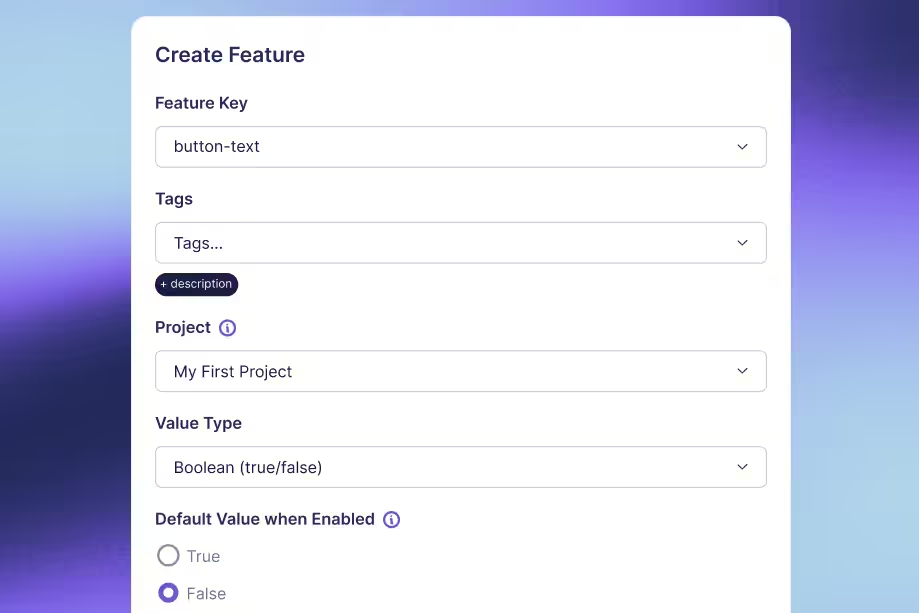

How to Use Feature Flags for Trunk-Based Development
DORA’s research identifies trunk-based development as a capability that drives software delivery performance. It’s not just a habit that high performers happen to share. Here, they work in small batches and merge into a shared “trunk” at least once a day to deploy continuously.
This only works if you’re building something that can be done in a day.
For instance, if you’re replacing a rules-based fraud detection system with an AI-powered risk scorer, it can take weeks. And trunk-based development becomes complicated as you see more merge conflicts.
That’s the exact problem feature flags solve by decoupling deployment from release.
In this guide, we’ll walk you through how trunk-based development works—and how feature flags make it possible for complex development pipelines.
What is trunk-based development, and why do you need to pair feature flags with it?
In trunk-based development, you maintain a single main branch and merge your work into it frequently—maybe daily, or even multiple times a day. The trunk stays deployable at all times.
If you’ve worked in a Gitflow model, you know what the alternative looks like. You typically have branches for development, and release can run for weeks. When the branches finally converge, the process of merging them takes longer than building the feature itself.
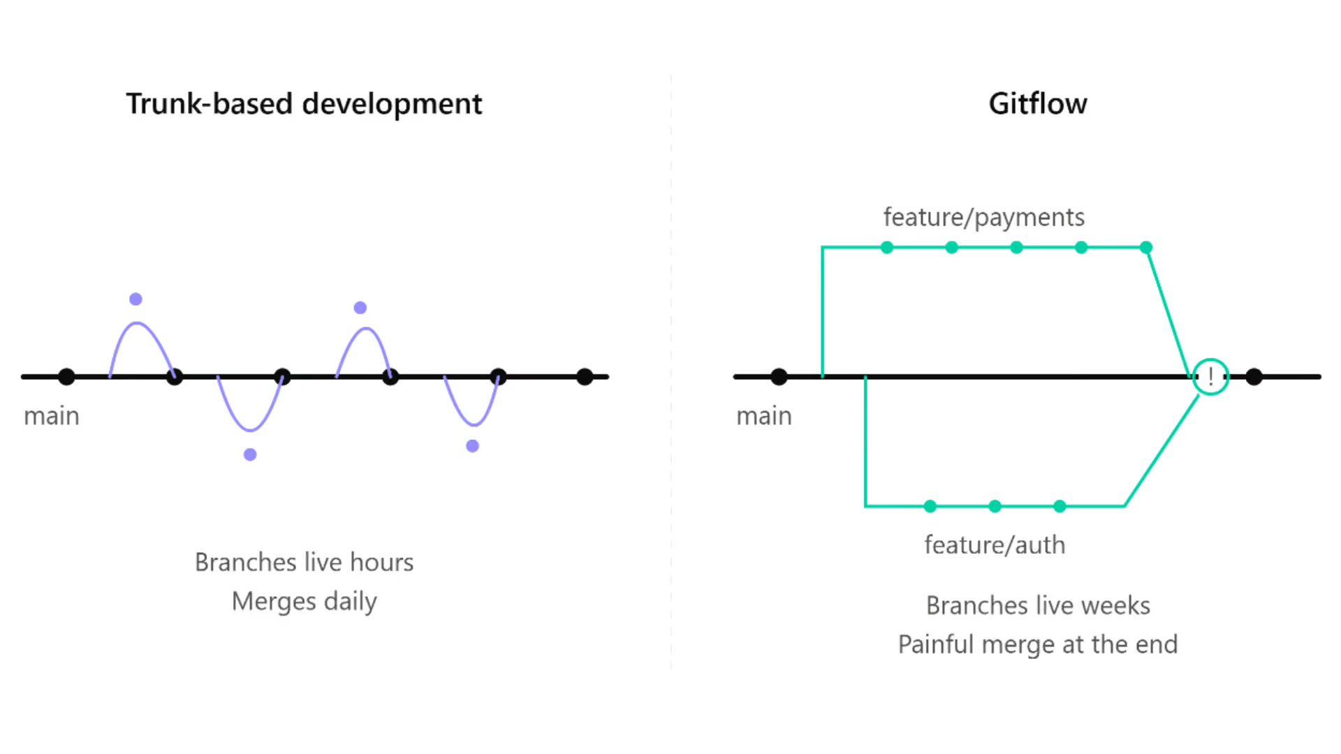
A 2025 analysis of 21 large-scale repositories found that merge-conflict potential grows with both the number and age of concurrent branches. So the longer your branch lives, the worse the merge gets.
That’s why even enterprises like Spotify run trunk-based development processes with feature flags. This lets their developers collaborate on the same codebase without needing to isolate themselves. They commit to main every day and catch any issues in hours instead of finding them during deployment.
That said, trunk-based development does require your main branch to be releasable. As a result, you have to find a way to hide unfinished code from users while you’re still building it.
Feature flags give you that capability.
You wrap new functionality in a flag from the very first commit and deploy it to production in a dormant state. But you only flip it on when you’re ready. So, you can keep merging without exposing the functionality to users. This makes feature flags a prerequisite for trunk-based development and without them, the model breaks the minute a feature takes more than a day to build.
How does flag-first trunk-based development work?
Let’s assume you’re building a new risk scoring model for your AI platform. Here’s how trunk-based development would work with feature flags within GrowthBook:
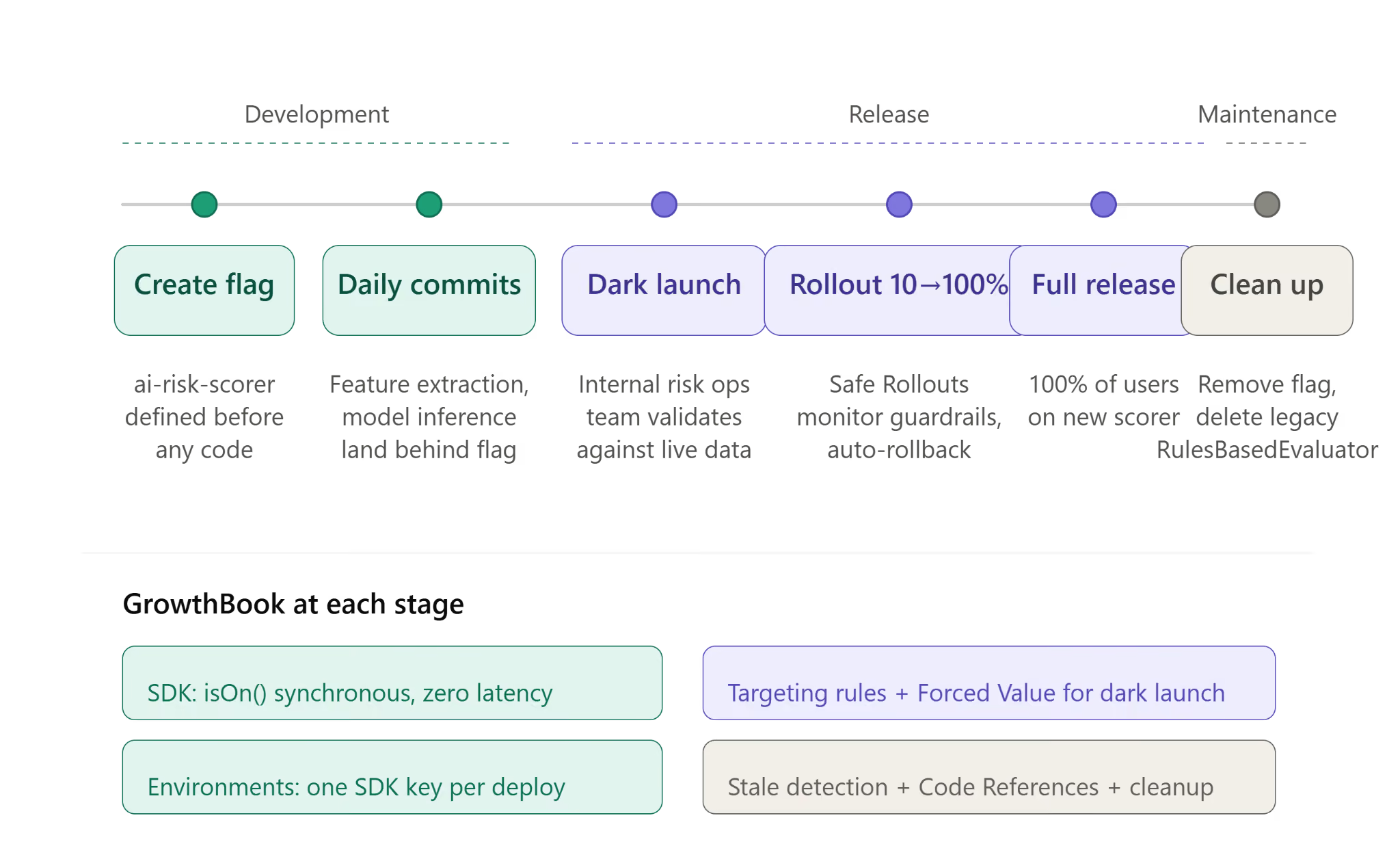
Step 1: Define the flag before you write any code
Before your team writes a single line of code for the new risk scorer, create a feature flag named ai-risk-scorer. So, every commit after that, such as the extraction logic or the model inference call, lands behind that flag.
In GrowthBook, it can look like this:
import { GrowthBookClient, UserContext } from "@growthbook/growthbook";

// Module scope -- initialized once at startup, shared across all requests
const gbClient = new GrowthBookClient({
  clientKey: process.env.GROWTHBOOK_CLIENT_KEY,
});

// Waits up to 3s for the flag payload; on timeout or network failure it
// resolves anyway and every flag evaluates to its fallback (off)
await gbClient.init({ timeout: 3000 });

// Per request -- user identity flows into every flag check
async function scoreTransaction(transaction: Transaction, user: User) {
  const userContext: UserContext = {
    attributes: {
      id: user.id,
      email: user.email,
      role: user.role,
    },
  };

  if (gbClient.isOn("ai-risk-scorer", userContext)) {
    return await mlRiskScorer.evaluate(transaction);
  }

  // Legacy rules engine continues running
  return rulesEngine.evaluate(transaction);
}
The isOn() call is synchronous. The SDK evaluates flags locally from a cached payload, so there’s no network call per check. You can wrap every commit in a flag without adding latency.
This changes what it means for code to be “in production.” The new scorer deploys and passes CI, but it doesn’t execute for any user. The feature flags keep it in an “off” state by default until you toggle it on. And your production environment will just carry the code without running it, so the main stays releasable even with half-built features inside it.
As a result of this process, your code reviews have changed. Instead of asking, “Is this ready to ship?” reviewers will start asking, “Is this safe to merge behind the flag?”
You’ll have a lower bar for review but a faster feedback loop during development.
Step 2: Commit daily and merge to main
Because the flag hides incomplete work from users, you can merge partial implementations into main every day.
For instance, if you’re conducting a 6-week migration, you’ll ship the risk scorer incrementally:
- Weeks 1–2: The feature extraction pipeline and model inference layer are launched behind the flag.
- Weeks 3–4: Response formatting and normalization of scores follow.
- Weeks 5–6: Shadow comparison against the legacy engine, plus performance tuning under production load.
Within GrowthBook, you can define how the flag behaves in different environments. So the flag stays off in production while you can test it in staging. There’s no “big bang” merge at the end of it. You just review and integrate each commit immediately, catching issues before they happen.
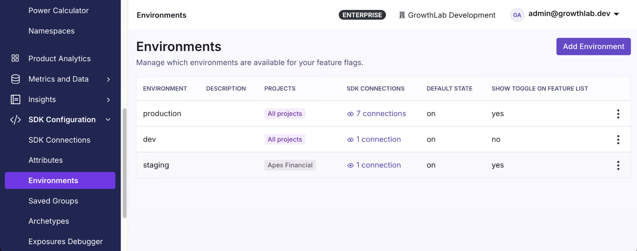
One thing you need to note is that when you’re merging code daily, it also changes how your CI/CD pipeline works. Since every commit runs the full build and test suite, the build time itself becomes a constraint. You’re adopting trunk-based development to avoid batching commits but if you use the same CI/CD process, you’re more likely to fall back into old processes. Avoid this by keeping pre-merge checks under 10 minutes and move slower ones to a post-merge state.
Also, your tests need to cover both flag states because main runs with ai-risk-scorer off, so the new code path merges and passes CI without executing. Make sure you force the flag to be on in your test setup to see how it works before deployment. In GrowthBook, SDKs accept feature values directly so CI evaluates flags from a local object instead of calling the API.
Step 3: Dark launch in production before you release
Once you’ve tested the feature and want to roll it out, you can conduct a dark launch. Here, you enable it for your risk operations or internal testing team first.
In GrowthBook, you can set this up with targeting rules and enable the flag for a specific segment. Define this segment based on attributes such as the internal email domain or member role. The Forced Value rule locks the flag for those users without changing the rollout state for anyone else.
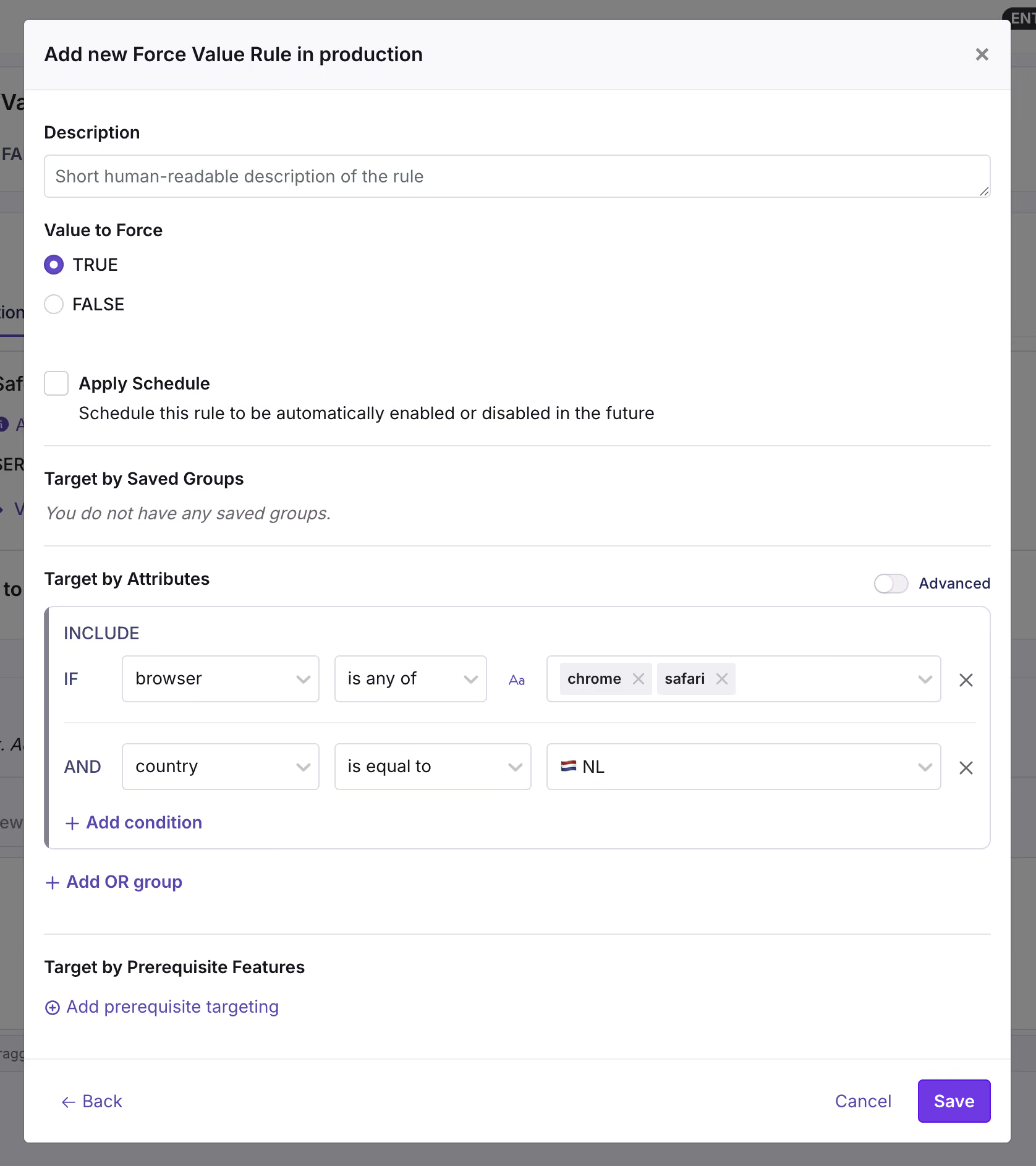
Now the new model runs in production against real transactions at real traffic volumes—but only for the segment you chose. Your team then compares its output against the legacy engine on that live traffic and decides whether to widen the rollout.
The goal is to test the feature/model with real users and traffic volumes to see if the new change makes a meaningful (and positive) difference.
Best practices for feature flags in trunk-based development
Here are a few things you should keep in mind while using feature flags for trunk-based development:
1. Use branch by abstraction for large-scale refactors
There might be cases where your changes don’t fit in a simple on/off flag. For instance, if you’re replacing a fraud detection system, you’re not adding a new feature. Instead, you’re replacing the entire code path for another and both of these paths need to live in main while you continue to build.
Branching by abstraction solves this issue. Here, you define a single contract that says what the component does but without explicitly saying how it does it.
Let’s say you’re migrating a risk scorer. The contract will be “take a transaction and return a risk score.” Both the versions of this risk scorer can do this but every part of your application calls the contract instead of the implementation directly. The factory (function) decides which ones to hand back at runtime based on the flag’s value. So, you can swap systems through a simple flag change instead of changing the entire code.
Here’s what that looks like for our risk scorer migration:
interface RiskEvaluator {
  evaluate(transaction: Transaction): Promise<RiskScore>;
}

class RulesBasedEvaluator implements RiskEvaluator {
  async evaluate(transaction: Transaction): Promise<RiskScore> {
    // Legacy rules-based scoring
    // ...
  }
}

class MLRiskScorer implements RiskEvaluator {
  async evaluate(transaction: Transaction): Promise<RiskScore> {
    // New AI model inference
    // ...
  }
}

// gbClient is the initialized GrowthBookClient from Step 1.
// Call this per request -- not once at startup -- so flag changes,
// targeting rules, and percentage ramps take effect immediately.
function createRiskEvaluator(userContext: UserContext): RiskEvaluator {
  if (gbClient.isOn("ai-risk-scorer", userContext)) {
    return new MLRiskScorer();
  }
  return new RulesBasedEvaluator();
}
isOn() is synchronous. The SDK evaluates locally from a cached payload, so the abstraction doesn’t cost anything at runtime. You can wire every factory function through a flag check without worrying about performance.
However, there’s also a degradation benefit. Until init() resolves, and if GrowthBook is unreachable entirely, the SDK has no flag definitions to read. isOn() returns false and your fallback path runs.
For the risk scorer, it could mean the legacy RulesBasedEvaluator will continue to process transactions.
2. Manage flag states across environments
In trunk-based development, the same code deploys everywhere. Your feature flag’s states need to respect the environment’s boundaries, or the new code could activate in production while you’re still validating in staging.
Avoid this by defining behavior at the environment level.
For instance, GrowthBook handles this with one SDK connection per environment and each SDK carries its own key. GrowthBook generates the key so you can point the same variable at a different key per deploy:
# Staging
GROWTHBOOK_CLIENT_KEY='sdk-K2p9mXvQ4wRt'
# Production
GROWTHBOOK_CLIENT_KEY='sdk-8Hn3bZfL6yTc'
If you’re debugging unexpected behavior, disabling the flag won’t return false. The platform completely removes the flag from the payload, so the SDK finds nothing there and isOn() returns false. Your fallback path runs.
3. Plan for the full flag lifecycle to avoid debt
The typical feature flag lifecycle looks like this:
- You create a feature flag.
- Ship the feature wrapped in the flag.
- Release the feature by enabling the flag.
- Monitor guardrail metrics while traffic increases, and roll back if they degrade.
- Delete or archive the flag after releasing the feature and it holds up in production.
The problem is that it’s easy to forget about the cleanup step when you’re moving onto your next sprint. In fact, a 2026 study across Kubernetes and GitLab found that toggle removals lag behind additions by 35% and 13%, respectively. And this creates technical debt.
Let’s say you’re releasing the new AI risk scoring model. You create a flag called ai-risk-scorer with a clear owner and removal date (8 weeks from now). When the feature is ready, you can use GrowthBook’s Ramp Schedules to ramp traffic from 10% to 100% in increments instead of flipping it all at once. You can use Safe Rollouts which is a targeting rule with a Ramp Schedule and monitoring attached to it so that the platform runs sequential tests against the guardrail metrics you’ve defined. If the metrics look fine, you can keep proceeding to the next step until you’ve rolled the feature out completely.
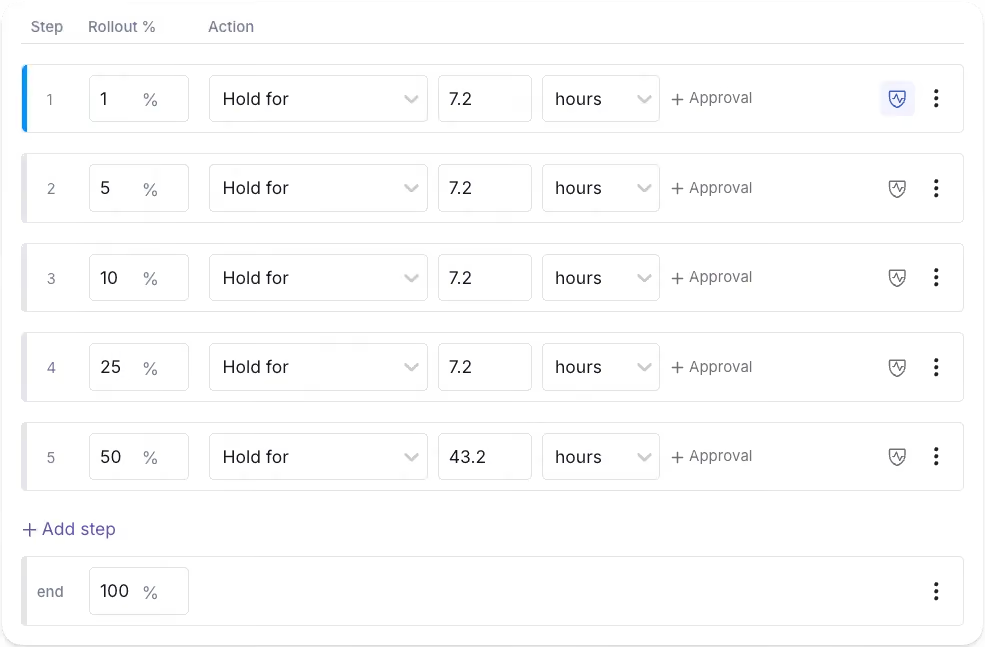
But you have to remember to remove the feature flag after the rollout is complete. If you forget to remove the ai-risk-scorer flag, three months later, you can use the Stale Detection tool to surface it and pinpoint where it is using Code References. From there the cleanup is two steps: delete the conditional in your codebase, then archive the flag in GrowthBook.
You can also use GrowthBook’s GitHub skills to walk an AI agent through this process. Once you do, archive it first to confirm nothing broke and then remove it from your codebase.
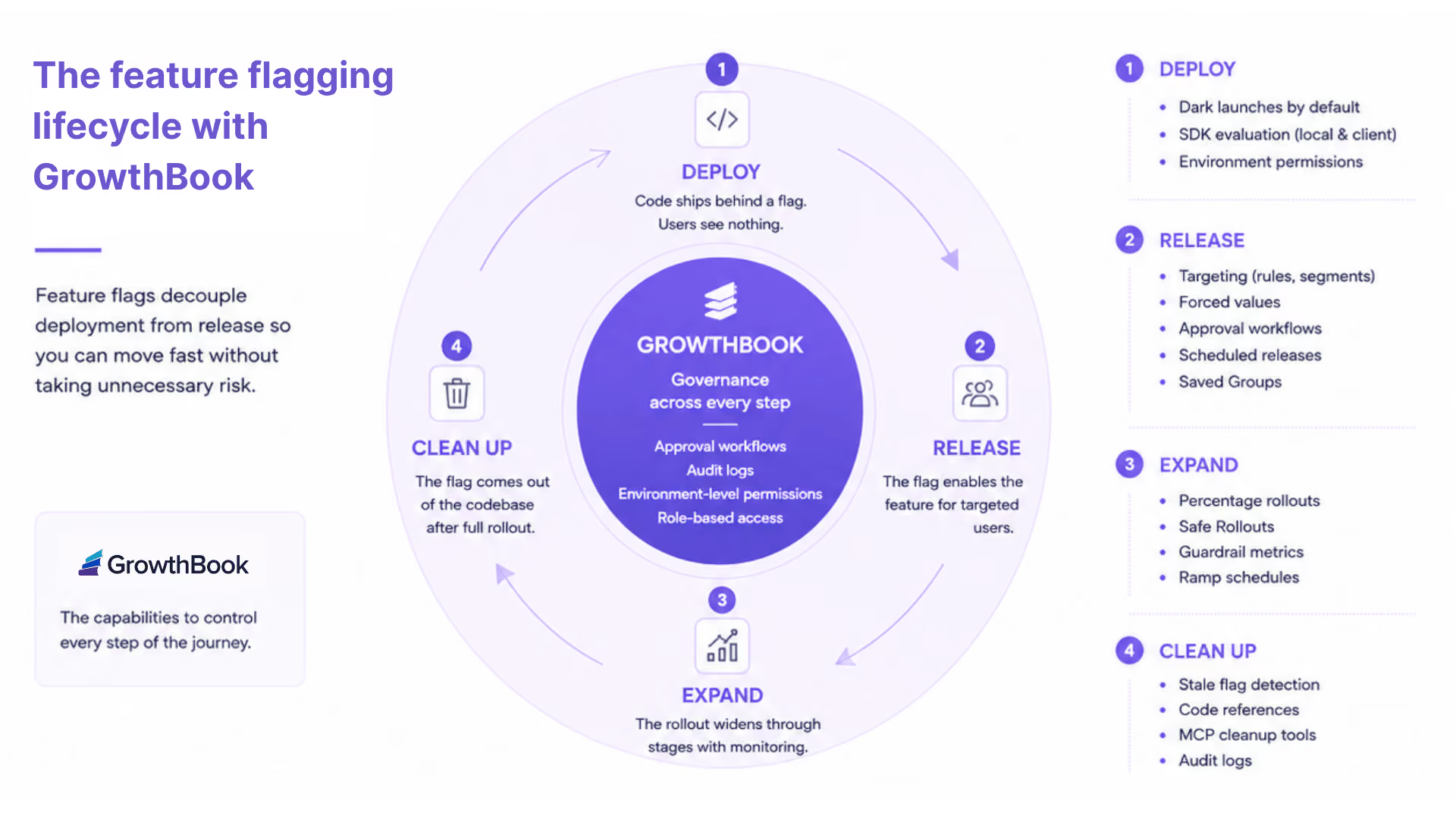
That’s how you can keep technical debt low while taking advantage of feature flags.
3 mistakes that break trunk-based development with feature flags
Here are a few concerns you should keep in mind while working with feature flags:
- Adding the feature flag after the code: If a developer merges the code to main and creates a flag later, you’re essentially rewriting live logic under pressure. A simple misstep can expose unfinished features/code to real users. That’s why it’s best to create the flag before you write any new code and wrap everything inside it from the first commit.
- Long-lived branches with a flag bolted on at the end: This issue usually happens when a team adopts trunk-based development in name but still isolates work on a branch for weeks. It’s the inability to let go of old habits. But the problem is that as the branch accumulates more merge conflicts, the flag shows up as a release mechanism. It’ll mask a failed branching strategy instead of enabling trunk-based development. So, use the flag as a development mechanism from the beginning to avoid any kind of drift.
- Flags that never get cleaned up: Every new flag you add to your codebase adds a conditional branch. For example, a single flag can create two possible code paths. But 10 feature flags create 1,024 code paths. When you don’t remove these stale flags from your codebase, they’ll accumulate into technical debt that slows you down and causes outages. So, assign an owner to each flag and target a removal date for temporary flags. Some platforms, like GrowthBook, automatically surface stale flags after two weeks of inactivity with no active targeting rules to help with cleanup—so that’s an option too.
How GrowthBook supports trunk-based development
Every new feature or model launch starts with a constraint we know too well. It takes weeks to build a feature, but the main still needs to stay releasable. Even though trunk-based development makes the build easy, you can only keep the main releasable without risk when you couple it with feature flags.
For example, in the ai-risk-scorer example we used, the code shipped daily and the internal team validated it against live transactions. But it was only possible using feature flags as it prevented us from adding too many merge conflicts as we added more code.
The feature flag acts as the release interface and the delivery mechanism to make this possible.
Platforms like GrowthBook give you the exact infrastructure to run this workflow:
- SDKs evaluate flags locally from a cached payload. The isOn() path is synchronous, so when you wrap every commit in a flag, there’s no performance overhead.
- You get unlimited environments with every plan, each with one SDK key.
- You can roll out features using Ramp Schedules, and opt into auto-rollback if any key metric degrades during the rollout.
- The revision system handles merge conflicts similar to Git. So you’re using the same mental model your team already uses for code.
- Features like Stale detection and Code References surface inactive flags and map them to your codebase. As a result, flag cleanup is the norm.
If you’re ready to explore how feature flags support trunk-based development, try GrowthBook for free today.
.avif)
Build vs Buy: Should You Build Your Own Feature Flag Tool?
When it comes to feature flagging, it’s easy to build a simple server-side, on/off feature flagging system, but that simple project can quickly grow into a full platform as your requirement list grows. Use this checklist to assess your mid-term needs.
What will you need in the next two years?
- Number of developers
- Number of features requiring flags per release
- Number of SDKs required
- Flag controls: simple on/off or the ability to control feature behavior through configs
- Ability to target users by browser, device, location, plan, etc
- Gradual feature roll-outs
- Automatic roll-backs if key metrics dip
- Audit logs - know who changed a feature and when
- Governance - ensure all new features/updates are reviewed and approved
- Debugging tools
- Integrations with other tools
- Flag clean-up capabilities
- Support for A/B testing
- Uptime/reliability requirements
- Performance requirements
- Time to market
- Better uses of your dev team’s time
Engineers are builders by nature. In fact, a DORA report found that 89% of organizations use an internal developer tool. So it’s not surprising that when you’re faced with the decision to build or buy a feature flag tool, you’ll err on the side of building one.
For some teams, it makes sense. But for others, it might not be the right choice.
For instance, Dropbox’s engineering team did the exact thing you’re considering right now. They built an in-house feature flagging tool, and for years, it worked. But as the product grew, so did the tools, and eventually they had six separate systems with overlapping roles. Even simple experimental analysis took days because of the time it took to wrangle the system.
If you’ve ever added a config toggle or database flag and watched it become the infrastructure your team relies on, you’ll recognize the problem here.
In this article, we’ll dig into why engineering teams build or buy a feature flagging tool so that you can decide which direction is the right one for you.
Why it might make sense to build your own feature flagging tool
Let’s face it. It’s a perfectly reasonable decision to build your own feature flagging system. DORA found that teams that use their own internal platforms tend to show 8% higher individual productivity and 10% higher performance. It makes sense because you’ve literally built it for yourself.
But beyond that, there are other reasons why it’s the right choice:
You get full control over your architecture
When you build your own flagging tool, you own every decision related to it. How it’s built, who can access and use it, and even how you set the governance system up. Every layer in the tool maps to what you need, not to what a vendor recommends.
For example, if your deployment pipeline manages environment changes/promotions, then your flagging system can hook into it. You’re not forced to work around a tool you’ve bought because a home grown system is purpose-built for your infrastructure.
You can integrate it with your existing stack
Even in our experience, we’ve seen that many teams have a very specific tech stack. But if it doesn't integrate with your stack, it takes significant time to build a workaround.
For example, think about the difference between importing a library versus using an external API. The former lives within your existing process, while the latter adds a dependency you can’t always control.
A homegrown flag system works like the library. It deploys alongside your services but also shares the same points of failure as your application code. If something goes wrong, you’re debugging one system instead of two.
Your use cases are fairly simple
Not every engineering team needs advanced targeting or multi-environment management. They’re just looking for a simple Boolean toggle to flip features on or off. In fact, a Reddit user built one using AWS Lambda to get and set feature flag states and flip flags.
Here are a few use cases where building a tool might be the right call:
- Fewer than 20 flags across a single service
- Boolean on/off toggles, which are server-side only
- One language with one deployment target only
- Engineers are the only ones changing the flag state
In these cases, it doesn’t make sense to buy a full-blown platform as it adds more complexity.
You don’t have to depend on another vendor
Vendor lock-in is one of the biggest problems in the SaaS industry. And it’s not any different in the feature flagging space either. Platforms that cater to mid-market and enterprise companies are known to be opaque with their pricing policies. In fact, several Reddit threads document cases where vendors changed their pricing models with little warning. In one example, a feature flagging vendor moved from user-based to per-service-connection pricing, and customers saw costs jump 5X because of their Kubernetes pod count rather than any change in actual usage.
When you build your own platform, you control its uptime and the costs of building and maintaining it. The costs increase only when your team decides it needs to.
You might prefer building in general
Sometimes you might just prefer building something for reasons beyond “investing” in your growth. Too often, buyers have a mental block when it comes to shopping for a new tool, especially with the number of options with limited differentiation these days and the ability to use AI coding assistants.
If it’s easier and faster just to build the tool, it makes sense to do so. In fact, even behemoths like Google and Meta built their own feature flagging systems. But it comes with a caveat. These companies also dedicated hundreds of engineers to the task and treat the tool internally as another product rather than another project. It’s part of the reason it continues to work for them.
In other cases, if the vendor’s not responsive or doesn’t improve the platform regularly, you’d be right to switch or build your own tool.
Where do homegrown feature flagging systems start breaking down?
Here are a few reasons why it might make sense to buy a feature flagging platform instead:
1. Ballooning costs of building a feature flag tool
The more you use feature flags, the more likely you are to be running your app on it. When your feature flag system goes down, or something breaks, your team is responsible for carrying the SLAs and on-call rotations associated with it. And many teams realize this before building their own tools.
For instance, Upstart, a lending marketplace, had evaluated this option. It realized that it would’ve required four engineers in the first year and at least two after that. Those engineers “would be building tests instead of building a product.”
The math looks like this, if we assume the salary of a junior developer in the United States:
- Year 1: 4 engineers × $87,519 = $350,076
- Year 2+: 2 engineers × $87,519 = $175,038 per year
If you’re going with a more experienced team, the costs can easily reach more than $500,000 just in salaries. And this doesn’t account for additional costs like:
- Server costs and maintenance
- Costs associated with an outage
- Time lost building a platform
- Technical debt and flag debt
- Security and compliance incidents
- Building advanced features (audit logs, support for multiple languages)
Every engineer you dedicate to this project is an engineer who could’ve been improving your core product or service. The long-term costs may not be worth the hassle, especially with the options available today.
Even developers know this. In a Hacker News thread, one user estimated that a $100K engineering salary balloons to $400K fully loaded, meaning each engineer needs to generate at least $600K in annual value to justify the investment. At the same time, others pointed out that maintenance costs for internal tooling almost always exceed the initial build. And this is especially true once you factor in on-call rotations, documentation, and onboarding new team members onto a system that they’re not familiar with.
2. Targeting and rollout complexity
It might take 30 minutes to build a Boolean flag in a config file. But if your product manager asks you to roll out a new feature to 10% of enterprise customers, the config file can’t do that.
You need the ability to run percentage rollouts using deterministic hashing so that your users see the same variant every time they visit the app. This is usually the moment engineering teams realize that their config system won’t cut it for this purpose. In fact, a 2020 study confirmed that although feature flags and configurations are similar on the surface, they are used for different purposes.
A config value controls how your app behaves. A feature flag controls who sees what, and when. Once you need targeting, rollout logic, and per-user evaluation, you’ve outgrown your config system and you’re building something new whether you planned to or not. And the config toggle becomes an evaluation engine which needs ongoing maintenance in the long run.
Note: GrowthBook includes advanced targeting and rollout capabilities that enable granular targeting and deterministic hashing. It’s available on every plan, including the free tier.
3. SDK maintenance across multiple languages
Your first flag evaluation is probably in one language. But products grow, and within months, you’ll add a few more languages, especially if you’re launching mobile apps with it.
You need to ensure users get a consistent experience regardless of the device they use. If your Python SDK evaluates a targeting rule differently from the React SDK, users see different behavior depending on the device they’re using. It’ll be hard to debug in those cases and pull your team away from working on your actual product.
And engineering teams like Treatwell’s marketplace have already faced this. Because they integrate through Java, React, Swift, and Kotlin SDKs, building a homegrown system would mean building and maintaining four separate SDKs with four separate test suites, all while building their own product. On the flipside, GrowthBook ships and maintains 24+ SDKs across every major runtime, so SDK maintenance was moot once they switched to it.
So, if you’re using multiple languages and a feature flagging platform supports it, consider paying for one.
4. Governance, compliance, and access control
These days engineering teams are shipping features a lot faster and updating features even faster than that. When you’re running a development team that’s responsible for all these changes, you need new levels of governance to keep up with their pace. For instance, you need review processes before changes go live, especially when you’re modifying features running behind a feature flag. And you need a log of what changed and when to maintain quality and to pinpoint when new bugs may have been introduced. As your flag tool matures and becomes an important part of your infrastructure, your team will have to keep building more. For example:
- If a product manager needs to toggle a flag, you need a self-service UI.
- If something breaks in production, you need an audit log.
- If a regulated customer asks about change management, you need approval workflows in place.
- If your security team asks who can change the production state, you need role-based access control.
Also, if you’re handling sensitive data, you also need to ensure you don’t send data to a third-party tool. If you’re using a platform that comes with a self-hosting option, you can avoid this hassle.
“The fact that we could retain ownership of our data [with Growthbook] was very, very important. We have data from children stored in our servers, and that's something that we have to really protect.”
— John Resig, Chief Software Architect, Khan Academy
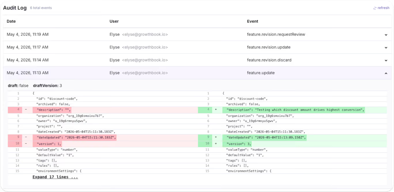
The question is: is it worth the hassle to continue building the tool? In most cases, the answer becomes clear once you add up the features you’d need to build and maintain just to keep pace with your team's growth.
5. Stale flag and technical debt
Stale flags clutter your codebase and make it dangerous to modify. That’s because every flag that stays beyond its expiry date is a conditional branch your team might see in a remediation plan one day. If you remove the wrong one, you could also break production.
In short: it’s too many what-ifs to leave to chance. It’s such a huge problem that companies like Uber had to build their own automated refactoring tool, Piranha, to clean up 1,381 flags and remove 71,000 lines of code.
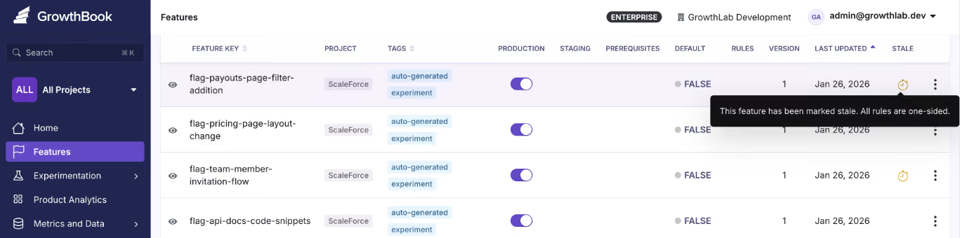
6. Risk reduction can become risk accumulation
Feature flags exist to make releases safer by decoupling deployments from releases. That’s a fact. But without proper lifecycle management, they can also become the very tool that increases risk over time.
Every stale flag is a conditional branch your team has to reason about during code reviews and incident response. If you remove the wrong one, you may break production but if you leave it in, you’re carrying dead code that makes debugging harder and in turn, makes every release riskier. That’s why you need to also build an automated stale flag management system within your homegrown tool.
If you don’t have the time or resources to build an accompanying tool, you should consider buying a feature flag tool.
7. AI coding doesn’t change the math of building a tool
The dawn of AI coding assistants has also brought another question into play: “I can generate a feature flag service in an afternoon with Cursor or Claude Code. Why would I buy one?”
At the outset, it sounds great. You use a $20 tool to build a functional toggle platform in a day. But considering the hidden costs and regulatory environment you’re in, the answer’s different.
A 2026 study found that the “SaaScopalyse” is wildly overstated. AI lets you build tools for a nominal cost if you know exactly what you want and the problem is simple to solve.
But if you’re in a regulated industry or are considering mission-critical systems (like a full-blown feature flagging platform), that’s not the case. These tools don’t take responsibility for when the systems malfunction or go down. Long-standing vendors in the market have already spent years solving your problem and building the reps (and certifications) to remain a contender in the space.
How do you decide whether to build or buy a feature flagging tool?
A 2026 study found that a majority of software build vs. buy decisions are made through fragmented expertise and informal reasoning rather than a proper systematic evaluation. That’s why you need a proper framework to decide what the right choice is here.
Use this framework to do so:
If most of your answers lean on the left side of this table, you’re better off building a tool internally. If not, you’ve either outgrown the homegrown system or should just buy a feature flagging tool.
Note: Just because you’re buying a platform doesn’t mean you have to give up transparency or get locked into a single platform for years. There are open-source options you can self-host on your own infrastructure.
Plus, many feature flagging platforms (including GrowthBook) support the OpenFeature standard, a CNCF specification that offers vendor-agnostic APIs. It’ll help you use any supported platform and switch without a painful migration.
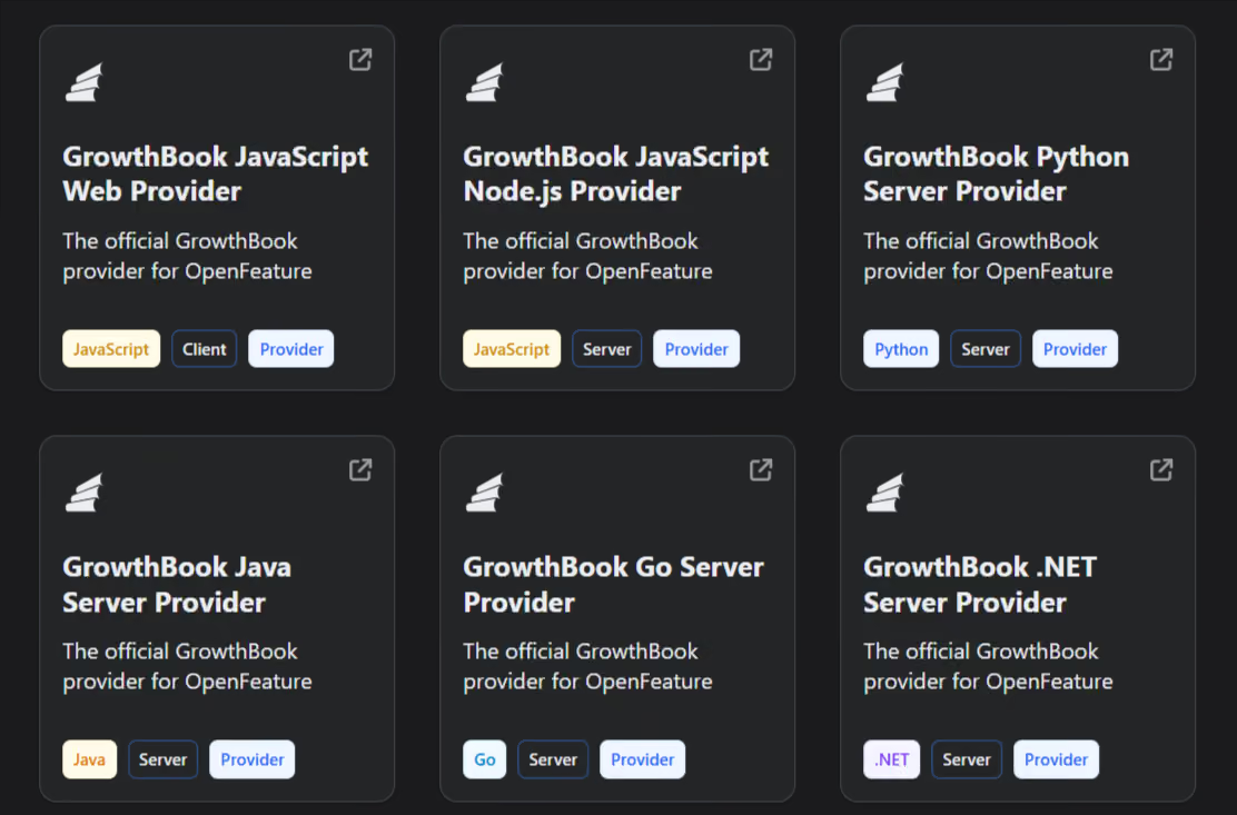
What should you look for in a feature flag platform?
If you’ve decided to buy a feature flagging platform, evaluate it based on these factors:
- SDK coverage for every language in your stack: You need to check two things here: how many SDKs does the platform support, and how many of those include the ones you actually need or might in the future? For instance, GrowthBook ships 24+ SDKs covering server-side (Go, Python, Java, Ruby, PHP, .NET, Elixir, Rust), client-side (React, Vue, Angular, vanilla JS), mobile (iOS, Android, React Native, Flutter), and edge runtimes. Other platforms may have a smaller support system.
- Local evaluation with no per-request latency: Your flag checks shouldn’t depend on a network call. GrowthBook SDKs download flag rules as a cached JSON payload and evaluate every check-in-process. So each call happens in sub-milliseconds and doesn’t have an external API in your critical path. If the platform’s servers go down, your application keeps working.
- Governance and access control: You shouldn’t have to build approval workflows or audit logging yourself. Make sure the platform has configurable approval workflows that require reviewers before any changes hit production. And it should be controlled based on specific roles in the organization.
- Stale flag detection and lifecycle management: Feature flags clean technical debt but can also accumulate technical debt over time. That’s why you need a way to automatically identify flags that aren’t active anymore or are not needed. Platforms like GrowthBook offer a Stale Detection feature to help you with this, and Code References tells you where it sits in your codebase.
- Ramp Schedules with automated guardrail monitoring: Even though gradual or percentage rollouts are relatively easy to set up in a homegrown system, it’s hard to build monitoring or observability alongside them. You need the ability to attach guardrail metrics to a rollout so you can detect when it degrades performance and roll it back immediately.
- Feature Evaluation Diagnostics: When a flag evaluates unexpectedly in production, you need to know what went wrong and where to fix the issue. Platforms like GrowthBook give you the capability to see a rule-by-rule trace with attribute values. So, you know exactly why a flag returned what it did for a given user.
- Prerequisite flags and typed payloads: Beyond boolean on/off, look for JSON flag values with schema validation and flag dependencies that prevent invalid state combinations. GrowthBook Enterprise supports prerequisite flags and JSON Schema validation that auto-generates a form UI so non-technical users can safely edit complex configuration values.
- Warehouse-native analytics: Your feature flag data should live alongside the metrics your team already uses for decision-making instead of within multiple analytics platforms. Look for a platform that integrates directly with your existing data warehouse (Snowflake, BigQuery, Redshift, Databricks) so you can analyze flag performance against your business data without building custom pipelines. Platforms like GrowthBook are warehouse-native by design so it queries your data from existing data sources directly and nothing leaves your infrastructure.
- Self-hosted option with real data residency: If you work in an industry with strict data residency requirements, make sure the feature flagging platform offers self-hosting. GrowthBook self-hosted runs via Docker or Kubernetes with no end-user PII, leaving your environment.
- Open-source codebase: If transparency and auditability are a concern, especially if you work in a regulated industry, you should be able to read every line of code in the platform you depend on. GrowthBook is open source under the MIT license.
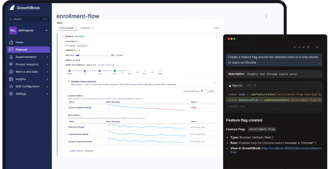
Should you build or buy a feature flagging tool?
The answer comes down to three things:
- Is your use case fairly simple?
- Is the workflow recurring and painful enough to solve?
- Is it worth redirecting resources to a product that’s not your main source of revenue?
Even Dropbox’s engineering team built its feature flagging systems in-house, and it worked for years. But when the maintenance cost outgrew the value they were getting, switching to GrowthBook was an easy decision. Now, they’ve consolidated six tools and run 3 billion feature evaluations every single day on their own infrastructure.
You might be biased towards building a solution as a virtue of being an engineer, but you might be better off buying one instead.
If you’d like to test-drive a feature flagging solution to make a better decision, why not try GrowthBook for free? Or book a demo to let us show you the ropes.
The four questions Early Warning asks before any A/B test
Running an experiment is the easy part. The hard part is knowing whether it was worth running at all.
Priya Singhee has spent a decade finding out where that line sits. As global head of storefront product analytics at Wayfair, her teams tested every step of the funnel, from the moment a shopper searched for a couch on Google to the moment they checked out. Today she is VP of Enterprise Analytics & Data Science at Early Warning, the 30-year-old consortium owned by the seven largest US banks that fights identity and payment fraud, and the operator of Zelle, which processed a trillion dollars in payments last year.
On The Experimentation Edge, she told host Ashley Stirrup something most experimentation teams don't want to hear: the majority of testing dysfunction happens before the test ever launches.
Listen to the episode here.
The framework: can you test this validly?
Singhee's decision framework starts with a reframe. The question is never whether a change deserves a test. "It's really not about should we test, but it's more about can you test this validly?"
Four questions decide it.
First, can you truly randomize? "It truly only works when the randomization is clean," she says — clean separation between who gets treatment and who was going to succeed anyway. If cross-pollination, unrandomized seeds, or a mismatched randomization unit contaminate the split, there is no case for a standard A/B test. The unit question is subtler than it looks: teams routinely randomize on one unit — session, user, device — and then read out results on another. That mismatch alone invalidates a readout.
Second, is your effect size plausible given your traffic? "If you only get 5,000 checkout sessions a month, you're hoping for a half percent lift in conversion — you'll need months of data." Most people's guesses about detectable effects are wrong, and the power math has to happen before launch, not as an afterthought.
Third, is the change reversible and cheap to test? A return-policy change, for example, contaminates so much of the experience that a clean split becomes nearly impossible. Some changes simply aren't testing candidates.
Fourth, and the one Singhee weighs most heavily: do you actually have a hypothesis, or are you just poking around? "A test without a specific falsifiable hypothesis is just like a fishing expedition in my mind." Writing it down — if we cut checkout from four steps to two, conversion improves by 1.5 points — forces the team to articulate a mechanism and creates the standard the result gets checked against later. It is also, she notes, the single best vaccine against p-hacking.
The statistic nobody builds their culture around
Here is the number that should reshape how every experimentation program measures itself: 85 to 90% of tests fail. It's a well-known statistic. Yet in most companies, the pressure runs entirely the other way — hunt for wins, stack up wins, report wins.
Singhee flips the incentive. "You have to understand the A/B test is a learning agenda. If you've learned something, it's good enough." And the corollary cuts deeper: "If you're winning too many, I would be very skeptical, because really 85 to 90% of them are supposed to fail." A suspiciously high win rate isn't evidence of a brilliant team. It's usually evidence of a broken measurement pipeline — novelty effects read too early, hidden segment effects miscalled as wins, or multiple comparisons quietly inflating false positives.
Her prescription is to decide the endings before the story starts. Every pre-registered analysis plan should answer three questions: What will we do if it succeeds? What will we do if it fails? What will we do if the primary metric wins but guardrail metrics decline? Getting VP-level approval on those answers up front means nobody is left "desperately trying to prove it to be a win" after the fact.
The best organizations she has seen go one step further: they log every test and every learning in a place the whole company can see. "That is a world-class organization where there's this reinforcement loop going on... And that's how you learn as an organization."
Pre-registration is the antidote to p-hacking
P-hacking rarely announces itself. In Singhee's experience, it arrives politely, after a test has gone sideways, in the form of requests to the analytics team: Can you look at just new users? Just the mobile segment? Just this one slice?
"You will start with your power and duration on a particular sample and a detectable size," she explains, "but nevertheless, you'll then start wondering, 'Oh, how would it do on new users? How would it do on just the mobile traffic?' You never pre-registered for that, so you can't be reading out your experiment results on those."
The fix has to be installed before launch. Her analyst checklist: the hypothesis, the mechanism, the primary metric, the exact statistical test that will be run, and every subgroup analysis the team plans to perform. Anything outside that list is exploration, not evidence.
Then comes the discipline most teams skip entirely: a pre-registered kill criteria. "What would make you say out loud that this idea was wrong, we're not shipping it?" Without a written answer, the default human behavior is to hunt for a subgroup where the losing idea secretly worked.
None of this is about winning more. "The biggest thing for me in a learning agenda is what did you learn from this test? I don't care if it won or lost."
Losses are where the money is
Singhee closed the conversation with the argument she wishes every skeptical executive would internalize. If 85 to 90% of ideas fail, then a company that ships everything without testing is silently absorbing all of those losses. "Imagine if you didn't A/B test... you'd actually be losing revenue." The wins get the headlines, but loss avoidance pays the bills: ship ten features untested and the two losers can erase everything the two winners gained.
Her sincere request: "People do more A/B testing, not less."
The teams that get this right won't be the ones with the highest win rates. They'll be the ones who can answer, for every test they've ever run, one simple question: what did we learn?
Ready to put a real decision framework behind your experimentation program? Start for free or get a demo at growthbook.io.
.avif)
How to Build a Feature Flagging Governance Framework
Feature flags are one of the few tools you can use to change production behavior in seconds, without deploying code. As powerful as that sounds, it also comes with its own risks.
Your team could have dozens of engineers on board who create flags across multiple environments. The same flexibility that sped up your deployment process now becomes the liability that works against you. The reason for that is that if anyone ships a change without approval or leaves an ungoverned flag in the codebase, that’s a potential point of failure that could cost you thousands, and potentially millions, of dollars.
The 2012 Knight Capital incident is one example of this. The company lost $460 million in 45 minutes after a deployment activated dead code on its production servers. When the SEC finished its investigation, it said that the lack of governance controls was one of the contributors to the incident.
That’s why you need a governance framework for feature flagging. In this guide, we’ll explain what it is, what you need to create one, and how to create one for your organization.
What is feature flag governance?
Feature flag governance is the organizational layer of policy and automation that controls how your team manages feature flags across their lifecycle. It covers who can modify a flag in each environment and what review a production change requires before it ships.
It goes beyond being just a best practice for software development. Rather, it's about enforcing a strict process with the right tools and frameworks to determine how your team uses flags. That’s because if you don’t account for this while using feature flags at scale, you could end up with:
- Flag-related technical debt that multiplies quickly.
- Changes in production that have no audit trail.
- Production incidents that could result in unnecessary audits.
- Massive penalties from regulatory institutions for lack of compliance.
The 6 pillars of a feature flag governance framework
Before you even think about implementing a governance framework for feature flags, you need to know what controls it stands on first. Here’s a list of the most important pillars to start with:
1. Flag categories and lifecycle
Every feature flag you create needs a purpose, a designated owner, and a lifespan. This helps you categorize its type and document it properly. If you don’t have this recorded, you won’t be able to tell whether a release flag needs to be deleted or an operation flag (like a kill switch) lives forever.
You can classify feature flags along four axes:
- Purpose: What the flag does (release, experiment, operational, permission)
- Lifespan: How long it should exist in your codebase (short-lived vs. long-lived)
- Scope: Whether it applies uniformly to all users (system-level) or varies per user based on attributes like plan, geography, or device (user-level)
- Value type: The data the flag carries (boolean, string, number, or JSON)
Purpose determines who owns the flag and which lifecycle policy applies to it, whereas the lifespan determines when to clean it up.
If you’re using a feature flagging platform for this, they may not have a built-in category field, as it varies based on how you define it. So you can build a taxonomy by creating the required fields that enforce classification and, as a result, its categorization. For example, an enum for a subscription status.
2. Naming conventions and metadata
A flag’s name should tell you what team owns it and what it does. If you can’t answer both questions from the key, that’s a discoverability issue that scales with every flag you create.
Consider defining your own naming convention to avoid this problem. You can use a structure like team.scope.feature.type and enforce it with a regex validator. You can pair it with the required metadata so every flag has a dedicated owner and review or expiry date.
For a new trading UI, it could look like this:
- Name: tradingUI.redesign.release
- Owner: Matt Hodges, Engineering
- Review date: 10/10/2026
To control flag sprawl, make it mandatory to assign every flag to a project. So nobody can create one without assigning it to a team, which makes ownership a default requirement.
Tip: Some feature flagging platforms enforce naming rules only in the UI, not in the API. If your team or AI agents create flags programmatically, ensure your naming validation runs on every write path.
3. Role-based access control (RBAC)
Depending on the environment the flag is in, the unit of risk changes completely. For example, a flag in staging just means your engineers can see the effects of the changes, but in production, a negative impact could trigger a full-blown incident.
In fact, the OWASP Top 10 found that broken access controls are among the top reasons for application security risks. That’s why you should scope permissions by environment, so there are more restrictions where needed.
The same flag change carries different risks depending on the environment, and your permissions should reflect that. Also, the ability to draft or edit a flag should be separate from the ability to publish that change to your SDKs. It’s recommended because developers can iterate on changes in staging, but that doesn’t mean they have the authority to push them to production. If your platform doesn't separate these natively, enforce the split at the CI/CD layer by requiring a different deployment token for production-related changes.
4. Approval workflows and change control
Any production change you make using a feature flag reaches your entire user base in seconds. If it results in an incident, you won’t have any record of who did it, who approved it, or why.
That’s why it’s better to gate flag changes behind specific approval layers so that everything requires approval before your SDKs see it.
A good rule of thumb to use is the four-eyes principle. Here, the person who requests a change shouldn’t be the one to approve it. To avoid applying the same unit of risk to all changes, ensure that lower environments require approval only for changes with drastic consequences. Otherwise, limit layered approval to production only.
In fact, in the Knight Capital incident, the SEC noted that the company lacked written procedures requiring review for critical deployments. The missing control was a second pair of eyes to validate the change.
Tip: If you’re conducting high-risk rollouts, embed approval gates directly into the rollout itself. For instance, a staged Ramp Schedule can require sign-off before moving on to the next rollout percentage if all the guardrail and signal metrics look like they’re regressing.
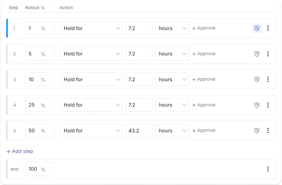
5. Automated validation and guardrails
In July 2024, CrowdStrike experienced a global outage that took down 8.5 million Windows devices due to a configuration update that caused the validator to check against the wrong input count. Validation only works when the schema the validator enforces matches the schema the runtime consumes.
This is why you need automated validation that works with guardrails like human review. The former asks questions like “Is the configuration valid?” while the latter asks questions like “Should you even make this change?”
If you’re building a homegrown tool or using a feature flagging platform, check if it has capabilities like:
- JSON schema validation for non-boolean flag values, so nobody can save a configuration that violates the expected shape.
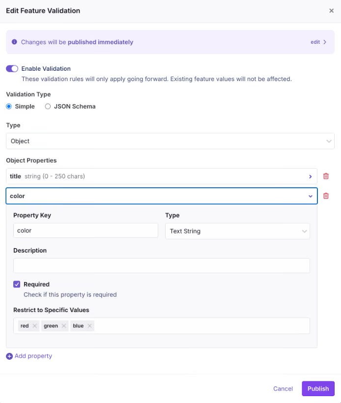
- Unreachable rule detection to warn you during editing when a targeting rule will never fire because a higher-priority rule already covers the same population.
- Attribute hygiene that rejects unregistered targeting attributes. It prevents typo’d attribute names from creating rules that appear correct but match no users.
- Publish gates that collect every active validation check at the time of publishing and return them in a single response. As a result, the audit trail records which policies a change bypassed.
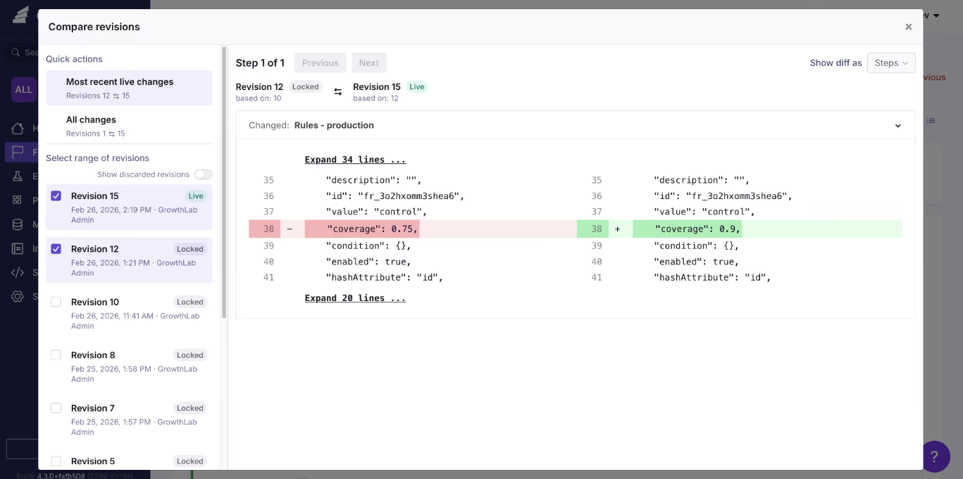
6. Lifecycle cleanup and audit trails
Any flag that outlives its purpose is considered technical debt. Your governance system should surface them proactively rather than relying on someone to clean them up.
You can either set up reminders in Jira or similar tools to notify you when it’s time to review the flag. Or use a platform with automated stale flag detection to flag stale flags. You can pair this with Code References, a CLI that scans the codebase and where the stale flag lives. So you can pinpoint the exact line and delete or archive the flag.
All of these changes should be recorded in a clear audit log, including a description of who made the change and what it was. Platforms like GrowthBook even differentiate between human-made changes and automated ones. Typically, automated ones show an API badge, but human-made ones show the user based on their Personal Access Token (PAT).
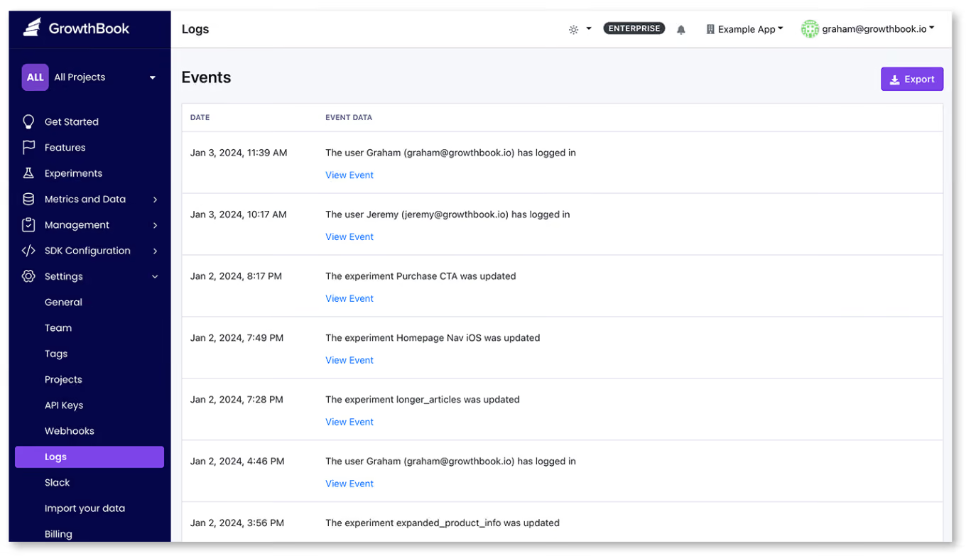
How governance works in the agentic era of development
We’re living in a time where AI coding agents can create and modify feature flags on your behalf. As wonderful as it sounds, it comes with its own risk.
A recent DORA report found that even though AI adoption improves software delivery throughput, it also increases the instability of these releases. As engineering teams ship faster, it has become harder to enforce governance at scale—especially as 30% of respondents report little to no trust in AI-generated code.
Here’s how each AI-driven change maps to a governance control:
That’s one of the reasons we’ve built agent governance into GrowthBook, too. Since users can connect agents like Claude Code and Cursor to GrowthBook using Agent Skills and the MCP server, they hit the same REST API that powers the dashboard. So every agent-initiated change runs through the same governance controls as a human-made one would.
Note: You can see how GrowthBook has evolved its governance controls to keep up with the agentic era.
How to implement feature flagging governance in your organization
You don’t need to implement every single pillar at once. Start with the controls that take the least effort but offer the most value. You can use the following progression as well:
Step 1: Lock down naming and ownership
Make it mandatory for every new flag to belong to a project and enforce a naming convention through your flag creation flow.
In GrowthBook, you can enable the require-project setting in your organization settings and configure a regex validator with an example key format under Settings → General → Features.
It takes two minutes and immediately prevents unowned flags from entering the system.
Step 2: Scope permissions by environment
Assign roles so that developers can toggle flags in development and staging, while only release managers or project leads can publish changes to production.
In a platform like GrowthBook, the permissions for drafting a change and publishing it to SDKs are separate. So you can scope each permission to specific environments and projects.
Step 3: Turn on approval requirements for production
Enable review requirements for production flag changes so every change goes through a review cycle before it reaches your users.
In GrowthBook, you configure approval rules scoped by environment and project. Plus, you can block self-approval and reset reviews when a draft changes after approval. RBAC for flags looks like this in GrowthBook:
Step 4: Add validation guardrails
Attach JSON schemas to your non-boolean flag values and enable attribute hygiene to reject unregistered targeting attributes.
GrowthBook supports JSON Schema validation and Custom Hooks, which run server-side on every write path to enforce organization-specific policies. For example, if you want to make sure your team adds description or other types of metadata while creating flags, you can do so using Custom Hooks.
Example of an approval policy that requires a service-account approval from at least one human being:
if (revision) {
  const approvals = (revision.reviews || []).filter(
    (r) => r.decision === "approve" && !r.stale
  );
  if (!approvals.some((r) => r.userId === "key_abc123")) {
    throw new Error("Publishing requires approval from the release-bot service account.");
  }
  if (!approvals.some((r) => r.userId !== "key_abc123")) {
    throw new Error("Publishing requires at least one human approval.");
  }
}
Step 5: Schedule cleanup from day one
As you create flags, add an expiry date and owner. If it’s manual, you can add a ticket with specifics in your platform of choice. If you’re using a platform like GrowthBook, you get stakeholder detection and code references in one place.
Here, it scans the codebase and surfaces dead flags whenever the enabled environment yields a one-sided result, and it has been more than 2 weeks since it has been untouched. And Code References connect each flag to its call sites in your codebase via a GitHub Action or CLI.
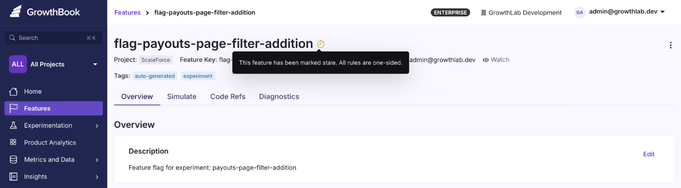
Step 6: Make governance enforceable
There are process elements to the entire feature flag lifecycle too. Uptime Institute’s 2025 Annual Outage analysis found that 85% of human-error-related outages occur because staff don’t follow procedures or because procedures themselves are flawed.
Even if you have a governance policy, it doesn’t mean everyone follows it. While the platform can enforce it by virtue of its capabilities, you still need to build enforcement into your workflows. For instance:
- Add flag ownership checks to your code review process. If a pull request is created without an owner, it shouldn’t pass review.
- Schedule a recurring flag audit (monthly or quarterly) to review stale flags and verify ownership is up to date.
- Wire governance alerts into your team’s existing channels, such as Slack or Teams, to make them visible.
- Assign a governance owner who holds the team accountable when certain rules or frameworks are bypassed.
Build governance you trust to truly reduce organizational risk
Feature flags give your team the power to change production behavior without redeploying code, but if you don’t use them correctly, they become a liability.
The Knight Capital incident began with a flag no one thought to remove from the codebase. But it only got pushed into production because nobody reviewed that change or bothered to cross-check if there was a dependency that could trigger a glitch.
It’s the reason governance has become the focus for engineering teams today and why feature flagging platforms choose to build these features in. GrowthBook offers the tools you need to implement every pillar of this framework:
And since GrowthBook is open-source and can be self-hosted with a warehouse-native architecture, your audit data goes to your own data warehouse, and nothing leaves your environment. If you’re in a regulated industry that mandates SOC 2 or HIPAA compliance, the governance system itself is under your control.
Try GrowthBook for free or book a demo to see how the governance system could work for your organization.
.avif)
How to Scale Your Experimentation Program
Getting your first experimentation win is one thing. Scaling A/B testing to hundreds of experiments a year across many teams is a distinct discipline with its own challenges. Programs that add velocity without changing how they operate often run into similar problems: teams rerun the same tests without realizing it, small mistakes in assignment and tracking distort results, different teams define the same metric differently and reach conflicting conclusions, false positives accumulate as volume increases, and new launches get backed up in the same engineering queue.
The pressure to scale is also rising. Kevin Yang, executive director and head of experimentation at JPMorgan Chase, described that pressure on The Experimentation Edge:
"With AI coming through, everybody is going to ship faster. But do you have the right infrastructure in place to measure the things you're shipping out? If you don't measure them right, your mistakes are going to compound."
Shipping faster only pays off if you can trust what you're measuring. And when teams optimize for test count, easy tests crowd out important ones, so the program learns less. The point of scaling is faster, more reliable learning that compounds across teams and keeps the product improving.
What "scaling experimentation" actually means
Scaling experimentation means moving from isolated, ad-hoc tests to a standardized, company-wide system. More teams run more experiments, and the data stays as trustworthy as it was when one analyst reviewed every result. The test count grows as a consequence of that system. You're building an operating model that lets measurement keep pace with how fast your teams ship. Shared metric definitions, automated health checks, and approval gates replace the quality control that used to live in a few experts' heads.The culture also has to scale alongside the system so that testing becomes the default for every new feature, and what team learn informs each other's next experiments.
How to scale your experimentation program: 5 pillars for success
Reaching hundreds (or even thousands) of experiments a year without losing trust in your results rests on 5 foundational pillars: infrastructure, prioritization, institutional memory, statistics, and governance. Whichever of the 5 is weakest sets the limit on how far your program can scale.
Pillar 1: A scalable technical foundation
Every experiment adds analysis work, so experiment volume is limited by how much of that work you can reuse. With a warehouse-native architecture, experiments are analyzed directly against the data warehouse you already maintain. There is no copied dataset in a vendor's system to reconcile. Fact tables and metrics are defined once in SQL against your warehouse tables, and that single metric definition serves feature flags rollouts, experiment analysis, and analytics. When the growth team and the checkout team both measure "conversion rate," they are running the same SQL, and you can compare their results.
Agreeing on which metrics to use is as important as agreeing on how they're defined. There are different schools of thought on the right structure. Some programs align the whole company on a single overall evaluation criterion (OEC) or North Star metric, while others set different primary metrics for different parts of the business. Many structures can work as long as the choice is deliberate. If every team picks its own success metrics, you lose the ability to compare results across the program. Whichever structure you choose, require experiments to declare their primary metrics up front, so results are judged against the metric the test was designed to move rather than whatever happened to improve.
It's also important to confirm that nothing in your experimentation pipeline is broken before you scale up. A/A tests (experiments where both groups receive the identical experience) are the gold standard for validating your pipeline. Any statistically significant difference between the groups is either chance or a bug. With GrowthBook's default thresholds, about 10% of A/A tests will flag a single metric as a winner or loser, so 1 flagged metric in 1 test is plausibly chance. Several flagged metrics in the same test, especially with large measured effects, point to broken assignment or tracking, a problem that’s much better to discover at 10 experiments a year rather than at 300.
Pillar 2: Ruthless prioritization
As a program grows, test ideas usually accumulate faster than the capacity to run them. A scoring framework such as ICE (impact, confidence, ease) or PIE (potential, importance, ease) forces every proposed test through the same filter. Most frameworks weigh how large of an effect is plausible, how strong the supporting evidence is, and what the test costs to build, run, and analyze. The scored ideas form a ranked experiment backlog. AI can help at both ends of that process, brainstorming test ideas and scoring them against your framework, with a human in the loop making the final determination. The exact score matters less than the habit of weighing expected value against cost. Low-value tests consume capacity and analyst time, so a mediocre idea that is cheap to run can still cost more than the information it returns.
Sometimes you can even measure an idea's impact without building it. Crystal Ammari, digital product optimization strategist at Disney, described on The Experimentation Edge how a customer service team she worked with tested demand for a video-chat support feature before committing to build it:
"We did what I call dry testing, which is essentially testing a feature without that feature actually being built."
The team added a button for the unbuilt feature to the help page and measured clicks.
"I believe there was somewhere around 4 million people that had entered the test, and only 106 people clicked on the button. I will never forget that 106 because it was such stark, obvious evidence that this is not something people wanted." She estimates the result saved the business millions of dollars in build, hiring, and training costs for a feature almost nobody would have used.
Pillar 3: A living experiment repository
As the experiment count grows, "didn't we already test this?" becomes harder to answer from memory. Some teams track past tests in a spreadsheet or shared doc, but this is only as good as your ability to keep it updated. A useful repository has to be part of the experimentation platform itself. When every experiment runs through the platform, the hypothesis, audience, dates, variations, and results are all captured automatically in a queryable record. That record is the single source of truth for what has been tested.
The repository has 2 uses: teams catch redundant tests before launch, and the accumulated record becomes a portfolio you can analyze for experiment velocity, win rates, average lift, and the scaled impact of shipped winners (the projected effect once a winning change rolls out to everyone). In GrowthBook 5.0, meta-analysis blocks on Product Analytics dashboards track what's running, win percentages, lift, and cumulative impact across the program. The new Learnings feature goes a step further and captures patterns across experiments, with each learning tied to its supporting and contradicting evidence, so people and AI agents can build on what the program has already discovered.
Insights still need to circulate outside the platform. Guests on the Experimentation Edge frequently describe the same two habits: a shared Slack channel where teams post results, and recurring meetings where they review experiment results as a group. Ilya Izrailevsky, the senior engineering manager leading DoorDash's experimentation platform, described how far that can go:
"After we run an experiment, no matter the results, whether ship or no ship, we send the results out across the company and have a discussion. Our leadership, including our CEO, Tony, would read and reply to those experiment emails and would congratulate folks, but also encourage them to try some alternative ways."
Pillar 4: Statistical rigor and clean data at volume
False positives multiply as experiment volume grows. Some of your winners are false, and the share depends on your program's true success rate. When the true success rate is around 10%, about 22% of statistically significant wins are false, roughly 1 in 5, even in a properly powered program. For a program running 300 experiments a year, that works out to about 30 winners, with roughly 7 of them being false positives.
Several techniques protect statistical rigor as experiment volume grows:
- Pre-committed experimental designs: Set the sample size and duration before launch. Stopping a test as soon as it crosses the significance threshold inflates the false positive rate, because at each look, random variation alone can produce a statistically significant result. When teams need the flexibility to monitor and act on results mid-experiment, sequential testing widens the confidence intervals so that repeated looks keep that rate under control.
- Health checks on every experiment: A sample ratio mismatch (SRM) (where the observed assignment ratio differs from what was configured) signals a data problem serious enough that the results can't be trusted. Other checks flag problems like multiple exposures and suspicious uplifts. At scale these checks must run automatically to catch problems before teams act on the results.
- Multiple testing corrections: Evaluating many metrics and variations per experiment multiplies the chances of a false positive. There are statistical corrections that you can implement to compensate for the extra comparisons. At scale, they should be a platform default rather than remembered analysis by analysis.
- Variance reduction: CUPED (Controlled-experiment Using Pre-Experiment Data) uses each unit's pre-experiment behavior to reduce noise in the outcome metric, so an experiment can detect the same effect with a smaller sample. When each test needs fewer users, the same user base can support more experiments at once.
- Isolation for concurrent tests: Concurrent experiments can contaminate each other's results when their changes interact, because some users experience both at once. Namespaces make conflicting experiments mutually exclusive, so a unit is only ever assigned to one of them, while unrelated experiments can continue to overlap freely.
When a result is significant but can't be explained, rerunning the test is the best way to validate the results. Medha Umarji, VP of growth and experimentation at Fanatics, described catching a false winner: a change the team had tested 6 to 8 times before, always with flat results, suddenly showed a statistically significant revenue lift.
"Another thing that we do here to reduce our false positive risk is we replicate our outcomes. We try to replicate it if we are not able to explain it. And so we ended up turning off this test and rerunning it, and we weren't able to replicate it. It was really flat."
Pillar 5: Open access without losing governance
Engineering capacity limits experiment velocity in a way prioritization can't address. If every experiment requires engineers to implement variations, review the setup, and launch, velocity is capped by their sprint capacity. PMs, marketers, and analysts with testable ideas wait on engineering time. Self-serve tooling removes that dependence with features like a no-code Visual Editor for frontend changes and a simplified experiment creation flow.
Self-serve only works with a quality gate, because opening creation to more people also opens it to more setup mistakes. A draft-first approval flow provides that gate. Anyone can build an experiment, and a reviewer approves it before it reaches production. The same control extends to software agents. In GrowthBook 5.0, AI agents can brainstorm, create, and launch experiments, and their production changes wait for the same human review as everyone else's. When the review step is enforced by the platform, nothing slips through accidentally, even as the number of experiments grows.
What scaling experiments looks like in practice
These 5 pillars are visible in every large experimentation program. Izrailevsky put numbers on DoorDash's current scale:
"We run about 12,000 experiments per year. Over 42 million monthly active users on DoorDash's platform."
At peak, the platform evaluates experiment feature flags around 300 million times per second. No team can review 12,000 experiments a year manually. DoorDash balances a success metric against multiple guardrail metrics for each experiment and shares every result across the company.
The Home Depot's online business recently passed $25 billion in revenue. Kim Ting Li, senior manager of online experimentation there, described on The Experimentation Edge how much attention leadership pays to the tests:
"All the executives and leaders love to learn about the tests. They really truly understand A/B testing is the golden rule to understand incrementality, the real impact."
The same foundations show up in much smaller programs too:
- Chess.com ran about 400 experiments one year and set a goal of 1,000 for the next year, according to Nafis Shaikh, director of product management there. Each team aligns on and owns its own metric area, with the gameplay team optimizing the core experience and the monetization team optimizing revenue.
- Fyxer, an AI email assistant, ran 541 experiments in one year with a small team while growing from $1M to $35M in ARR. AI agents make the code changes and engineers sign off on video previews, so each developer can run several experiments in parallel.
- The Philadelphia Inquirer built a centralized program where marketing, the newsroom, and product all test under one set of standards.
- Lingokids, a kids' learning app with over 3 million weekly active users, roughly doubled its parallel experiment volume to about 15 per month after adopting namespaces to keep concurrent tests from colliding.
How to scale experimentation without sacrificing quality
An experimentation program can hit its velocity goals and still learn very little. Test count is only one input into learning, and once the count becomes the target, teams find ways to raise it that don't necessarily produce useful insights. Judge your program on its outputs instead: the winning changes it shipped, the harmful ones it caught before rollout, and what the results taught you about your users.
GrowthBook is built to implement these 5 pillars, with a warehouse-native foundation, SQL-defined metrics, health checks and false positive controls in the stats engine, a living portfolio view of every experiment, and governed self-serve access for people and agents alike. Ready to scale your experimentation program? Explore GrowthBook's experimentation platform or try it for free.

A/B testing 300 million players without breaking their trust: the Supercell approach
Three hundred million people play a Supercell game every month. Clash of Clans, Clash Royale, Brawl Stars, Hay Day, Boom Beach: some of the most successful mobile games ever made, built by a company of about a thousand people in Helsinki. A player base that size could justify thousands of A/B tests a year, and plenty of companies a fraction of Supercell's scale run exactly that many.
Supercell runs fewer than a hundred a quarter.
That number is not a program falling behind. It is the most deliberate thing about how the company experiments, and understanding why requires understanding two things Supercell refuses to compromise: its creative culture and its players' trust. On The Experimentation Edge, Shan Huang, a data scientist on Supercell's central experimentation team, walked through how both survive contact with rigorous testing, and what happens now that AI lets anyone in the company analyze an experiment on their own.
Listen to the episode here.
A company where decisions are made bottom up
Supercell's structure explains almost everything about its testing philosophy. "Supercell is a very decentralized company, where decisions are made bottom up," Shan explained. "Each game teams are completely independent in what games they develop, what decisions they make in terms of their games."
Shan's central experimentation team has two jobs. The first is the platform: giving game teams a shared way to run and analyze A/B tests without repeating setup work, with rigor built in. The second is harder to put on a roadmap. "The second part of our team's role is to drive the experimentation culture at Supercell," he said. Because for most of the company's history, A/B testing simply wasn't how games got made. "Historically A/B test was not part of the culture of developing a product because we consider ourself a very creative company, and we still are."
That framing produces the question that anchors the whole episode: "How can we be more hypothesis-driven while keep being creative."
Note the word choice. Not data-driven. When Ashley described the company as baking a data-driven approach on top of its creative core, Shan offered a gentle correction: "I think we prefer to use the word hypothesis-driven." The difference is not semantic. Data-driven can mean chasing whatever the dashboard rewards. Hypothesis-driven means a designer's creative conviction comes first, gets written down as a falsifiable claim, and then meets the players. In Shan's telling, the contradiction is the prize: "If you see the data contradicts with your hypothesis, that's actually the best part of experiment where you actually learn something completely new."
So the volume stays low on purpose. Four or five big games plus a few in testing, ten to twenty experiments per game per quarter, each one chosen because the answer matters. Retention is the North Star, and revenue is deliberately not the goal: "If we make the experience of the game better, business outcomes comes naturally. It's not our first goal."
The scale is what makes the discipline necessary rather than optional. "You can design a very creative and very good mechanism for players," Shan said, "but you don't really know what setup works best for the masses." Intuition produces the idea. Only an experiment can tell you how it lands across the average of hundreds of millions of people.
Telling players they're in the test
Here is where Supercell diverges from nearly every experimentation program you've heard of: they tell players about A/B tests before running them.
"We always try our best to be as transparent as we want to the player community," Shan said. When a test is coming, community managers announce it upfront: the team will be experimenting with features in this part of the game over the next month or two, because they are not yet sure which design makes the experience best. The message to players is an invitation, not a disclosure. We want to try a few things and learn from you.
Then comes the part that turns transparency into policy. "We also want to make players rest assured that if they don't get the better experience during the test period, they will always have a make-up event later on. We take fairness very seriously."
Why go this far? Shan's answer draws on his previous life in e-commerce. "Users come to the website to buy something. But game players, they go to the game to have fun. They are trying to entertain themselves using this time. So if we are testing them by giving some people a disadvantage, it's not a good experience because their main motive is just to have fun."
A shopper who lands in a losing checkout variant loses a few seconds. A player who lands in a losing game variant loses some part of the thing they came for. Supercell's community is famously vocal, and "I don't want to be tested on" is a sentiment any experimentation leader will recognize. Ashley put the underlying math plainly on the show: most new features lose, which is exactly why measuring matters, but to an individual player who doesn't see that math, testing can sound like a scary thing.
Supercell's answer is to treat the fear as legitimate and design around it. Announce the test. Explain the uncertainty. Guarantee the make-up. The result is an experimentation program that a skeptical, passionate community tolerates, and even participates in, because the fairness contract is explicit.
Everyone can analyze an experiment now
The third act of the conversation is the newest, and it will sound familiar to any team watching AI reshape their workflow.
"It's a really new era," Shan said. "We have some experiment skills they can just import to Claude, and then they can ask Claude, okay, use this skill and now I have been set up this experiment and data. You can find the data yourself and analyze it. Tell me the result. What shall I do?"
The consequence is a wholesale change in who does analysis. "It's not restrict to only data analyst or product manager with experiment knowledge. Basically everyone can run and analyze experiment on their own now."
For a central team whose mission is spreading experimentation culture through a decentralized company, this is the dream scenario. Analysis used to queue behind a small number of qualified people. Now it doesn't. But Shan is candid about what got traded away. "It also creates a new challenge that we don't know the quality of running those AI-driven analysis. I'm sure that people with experience, they can guide the AI to run the analysis correctly, but we don't know everybody who's running analysis using AI."
When quality lived inside the gatekeepers, removing the gate meant removing the guarantee. And AI's failure mode is uniquely dangerous in this domain, as Ashley noted: it can give you a very confident answer built on half the data. A false winner doesn't just waste one launch. It quietly redirects investment and, eventually, undermines trust in the whole program. The emerging answer, the one GrowthBook is investing in, is to move rigor from people into the system itself: experiment templates, guardrails, and defaults that make the AI behave the way your best data scientist would.
Trust is the infrastructure
Pull the three threads together and Supercell's approach resolves into a single principle: experimentation at scale runs on trust, and trust has to be engineered as deliberately as the statistics.
The game teams trust the central team because it partners and shares learnings instead of dictating. The creative culture trusts experimentation because hypotheses serve the craft rather than replacing it. Players trust the tests because the company announces them and guarantees fairness. And the next frontier, AI-driven self-serve analysis, will earn trust the same way, through guardrails that make every analysis as rigorous as the expert-run ones.
Fewer than a hundred tests a quarter for 300 million players sounds like restraint. It is actually the cost of doing every one of them in a way nobody, inside the company or out, has reason to doubt.
Ready to bring that kind of rigor to your own experimentation program? Learn more at growthbook.io.
.avif)
Bad controls: why splitting your experiment on a post-treatment variable backfires
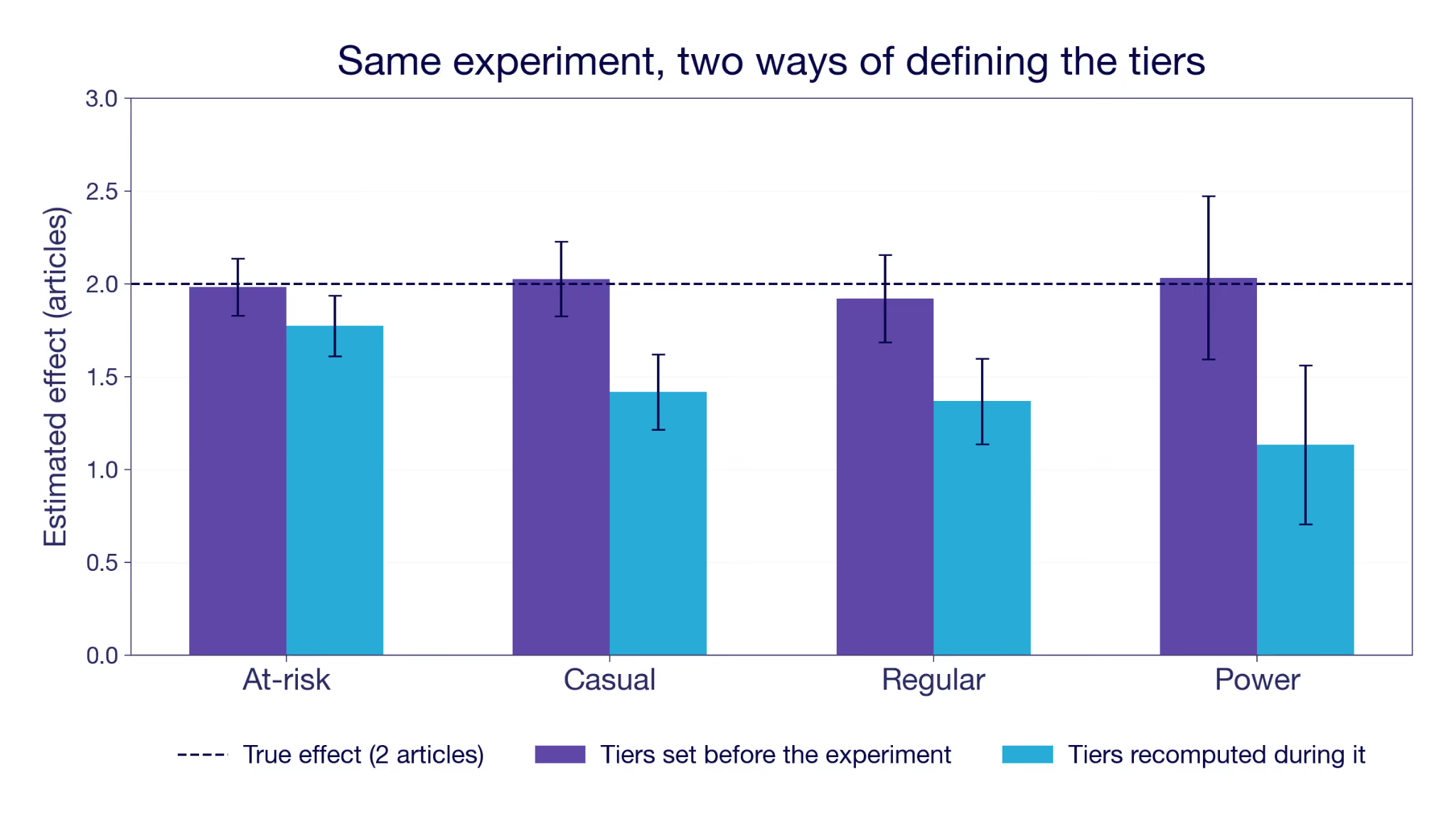
You ran a solid experiment. Good sample size, clean randomization. The overall effect is clearly positive, and you're ready to write it up.
Then you break it down by the new customer segmentation, and something is off. Every segment sits well below the overall number. Not one or two. All of them. How can the whole be bigger than every single one of its parts? Is this the famous Simpson's paradox?
Or maybe you toggled variance reduction on and off and the estimate moved a lot. Either way, you may have walked into one of the worst traps there is: splitting or adjusting your sample on a variable that is itself an outcome. The tell is that it is defined after users entered the experiment, which means the treatment could have moved it. This post is about how that happens, how it poisons your estimate, and the one simple rule that keeps you out of it.
Where bad controls sneak into experiments
Three analysis errors do this, and we will work through each below.
The first is splitting by a segment, the everyday analysis of who the feature helped (there is a whole piece on segment analysis without fooling yourself that guides you past other traps). You break the results down by a dimension computed over the experiment window, like a revenue tier or an engagement segment. It looks like a fair comparison, but the feature itself pushed users between tiers.
The second is conditioning on a funnel step. You restrict to the people who reached it, or you divide by them, and either way the group you compare across is one the treatment helped select.
The third is variance reduction. You tighten your estimate by adjusting for a covariate, except the covariate was measured during the experiment instead of before it, so adjusting for it strips out part of the very effect you are trying to measure.
All three share a red flag. The variable got its value after users were assigned, so the treatment had a chance to change it. That is what makes it a bad control.
What is a bad control? A bad control is a variable you split on, adjust for, or filter on that the treatment affected. Anything that is measured after the experiment starts risks biasing your results.
Why does every segment look worse?
Let's imagine a reading app that ships a new recommendation feature. It increases reading by two extra articles for every user, on top of a base of about ten articles a month. The effect is identical in every segment, so there is no real heterogeneity for a breakdown to find.
You run the experiment for 30 days and collect the data. You want to know who the feature helped most, so you split the results by engagement. There is no ready-made segment for it. So you reuse the definition from the dashboards. The Engagement segment is based on days active in the last 30 days, cut into four tiers from At-risk up to Power. It is a different quantity from the metric you are measuring, which is what makes it feel safe.
You run the split, and the tiers come back with effects at 1.8, 1.4, 1.4 and 1.1 articles. Every one of them sits below the overall estimate of 1.95, and the gap widens as engagement rises. It reads like a real finding: the feature helps your at-risk readers most and does little for power users. Might be worth targeting. How did that happen?
The error is hiding in the segment definition. "The last 30 days" counts backward from the day you run the analysis. That is exactly the experiment window. Better recommendations bring people back a little more often, so the feature moved some users up a tier. You sorted people on something the feature had already changed, then measured the effect inside the resulting groups.
The data here is simulated, so we know the true answer. That also lets us run the split correctly. Set the tiers using the 30 days before the experiment started, so the groupings cannot depend on the feature. Now every tier returns an estimate close to two articles. Not exactly two, because assignment is random and each tier holds a limited number of users, but every confidence interval covers the true effect. The targeting story disappears with it. Same data, same experiment. The only thing that changed was the timing of the segmenting variable.
Figure 1: The same simulated experiment, split two ways. Tiers fixed before the experiment (purple) recover the true effect. Tiers recomputed from days active during the experiment (blue) fall short in every tier, and fall furthest for the most engaged.
The arithmetic looks like Simpson's paradox, and the diagnosis is the opposite. In Simpson's the subgroups are real and conditioning on them is what repairs the picture. Here the subgroups are the damage, because the treatment helped define them. The overall number is the trustworthy one, and the breakdown is what introduces the bias.
When you group by engagement measured during the experiment, you are grouping by something the treatment itself moved. It does not have to be your intended goal metric. It can be any variable the feature affected, perhaps unintentionally. The treated users in a tier got there partly because the feature pushed them up, so you compare them against control users with a higher baseline intent. You silently get the treatment effect plus a bias term.
What the within-tier split actually estimates when defined post-treatment
Inside a tier you do not get the effect for that tier. You get the effect for the users who would have been there anyway, plus a selection gap: the difference in articles read under treatment between the users you actually observe in the tier and the users who would have been there without the feature. The feature reshuffles who ends up where, so those two groups are not the same people. The gap is zero only when the treatment doesn't move the tier, which is exactly what a pre-experiment definition buys you.
The reshuffle runs both ways, which is easy to miss. Every tier except the lowest gains users the feature pushed up. Every tier except the highest loses users the feature pushed out. At-risk gains nobody at all, so its bias comes purely from departures: the users most able to climb out do, and the treated group left behind is less active on average than the control group it gets compared with. The notation in the next section covers both cases without comment, because X(1) and X(0) differ whichever direction someone moved.
Why you end up comparing different people
Before talking about the two other failure modes, it is worth seeing why this happens in general, and where that bias term comes from.
Randomization buys you one thing: on average, the treatment and control groups are comparable on everything apart from the treatment feature. Write each user's potential outcomes as Y(0) and Y(1), the result you would see without and with the feature. If that notation is new, the guide to treatment effects walks through it. A clean experiment compares the average Y(1) among the treated against the average Y(0) among the control, and because the groups are otherwise alike, the difference is the real effect.
Segment analysis is to estimate conditional average treatment effects (CATEs). It is the effect inside each subgroup rather than across everyone. Take a characteristic X, like the engagement tier. The CATE at X = x is the average of Y(1) − Y(0) among the users in a given tier, x.
This is well defined when the treatment cannot move X. Usually that means fixing it before launch, but a variable recorded later is fine too, as long as the feature could not have touched it. The users with X = x are the same set whether or not they were treated. Within them you compare Y(1) against Y(0), and the difference is the CATE you were after.
It breaks when the treatment can move X, which is what typically happens when the tier is recomputed from activity during the experiment. Now each user has two versions of it, X(0) without the feature and X(1) with it. The treated users you see at X = x are the ones with X(1) = x. The control users you see there are the ones with X(0) = x. So the comparison you run is
A real effect would hold the group fixed across both terms. This one conditions on X(1) = x on the left and X(0) = x on the right. Those are different groups of people, so the difference in Y is meaningless.¹
How big is the error? The bias is
the reading gap between two sets of treated users. One set is the users the feature lifted into the tier, with X(1) = x. The other is the users who would have been under control, with X(0) = x. The first set arrived from a lower baseline, so even treated they read less than the already-heavy readers. That gap is selection, not a treatment effect. Define the tiers with pre-experiment data so X(1) = X(0), and the bias is zero. More notation details in the appendix.
This is a known failure mode called post-treatment bias, and it is not bounded by the size of the real effect. It can exceed it and flip the sign.² It is also common, well documented in research. A review of published experiments in political science found that nearly half had conditioned on a variable measured after treatment.³ If it slips past peer review that often, it slips into a rushed product readout even more easily. I've seen it many times.
What about funnel steps and conversion rates?
Back to the failure modes now. There is a second way in, and it may be the most common of all. Say the reading app tracks a funnel: saw the recommendations carousel, opened something from it, finished the article.
The direct version is the one we just derived. Someone proposes cutting the analysis down to users who opened something from the carousel, to buy back some power. Most people scroll straight past it whatever is in it, so dropping them looks like dropping noise, and the estimate should tighten.
But that is a bold bet on how the feature works. Better recommendations can make the people already browsing the carousel open something more relevant, which leaves the set of openers untouched. They can also make someone who would have scrolled past stop and open something instead, which does not.⁴ A recommendation feature is usually built to do both. You would be assuming half the effect away in order to measure the other half. The openers left in the treatment arm are partly the ones the feature pulled in, and they have no counterpart on the control side. It is the segment split again, with a filter instead of a tier.
You might do the same thing in a subtler way, simply because that's how some important metrics are defined. A funnel conversion rate divides each step by the step before it. Of the people who opened something, what share finished it? Nobody was dropped and both arms are whole, so it feels safe. But when finishing implies opening, finishes divided by opens is exactly the finish rate among openers. It is the same quantity the filter gave you, reached by a different route. The denominator does the conditioning for you.
E-commerce teams meet this constantly, because almost every rate they care about has a moving denominator. Click-through rate divides by impressions. Conversion rate divides by sessions. Any feature that changes how often people show up, or how many of them reach the step before, moves the denominator. This changes the ratio but not necessarily the final step, which is the one you actually care about.
The fix is not a pre-experiment version of the step, because there isn't one. It is to put the randomized group in the denominator. Finishes per assigned user, purchases per assigned user. That is what funnel metrics in GrowthBook do, measuring every step against everyone who was exposed, and why they deliberately do not hand you the step-to-step rate as a decision metric with a confidence interval.
Can variance reduction backfire?
Splitting and dividing are the visible ways in. Adjustment is the quiet one. Most variance reduction methods, whether CUPED, post-stratification, or plain regression with covariates, work by feeding in a variable that predicts the outcome. The PE in CUPED is for Pre-Experiment, so standard CUPED is by definition safe. But the hunger for power has made it common for tools to offer more extensive variance reduction, by including more covariates that predict the outcome. Post-stratification is one approach.
Take retention as the outcome, whether a subscriber renews next month. The experiment runs on existing subscribers only, everyone who was already paying when it started. Standard CUPED would adjust using last month's retention, the same metric one period back. But that is one for every user in the sample. If it were zero they would have churned and never entered. So the covariate is constant, and there is nothing to adjust with. You grasp for another variable that predicts next month's retention. Reading volume seems like a natural one. Heavy readers renew more often, so reading predicts retention. But the feature raises reading too. Adjust on the during-experiment count and you subtract a difference the feature created, not one that was there to begin with.
But reading volume comes in two snapshots, and the choice matters. Reading from before the experiment is clean. Reading during the experiment is not, because the feature itself raised it. Adjust on that during-experiment number and the estimate collapses, from around four percentage points on retention to roughly zero.
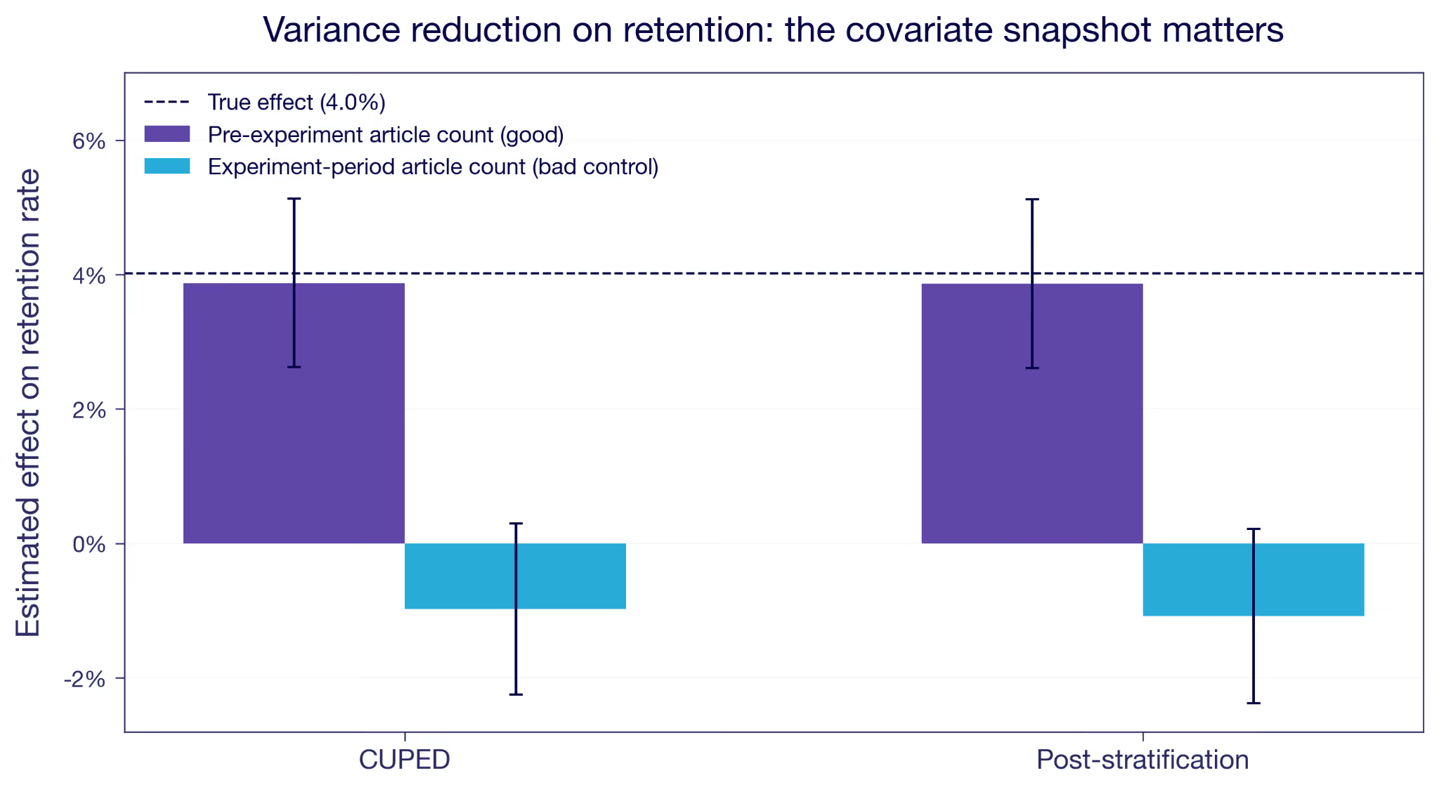
Figure 2: Reducing variance on retention. A pre-experiment covariate (purple) tightens the estimate around the truth. The same signal measured during the experiment (blue) drags it to zero and slightly past.
An imbalanced sample would produce the same gap, but then the adjustment would be repairing the estimate rather than wrecking it, and the pre-exposure balance check would have said so. When balance passes and the estimate still moves this much, suspect the timing of the covariate.
How do you avoid bad controls?
The rule is simple. Check the definition of every variable you split or adjust on, and ask when it was measured. If any part of its window falls after the experiment started, it's a hazard. Condition on pre-experiment data only.
One check is the SRM inside each segment, which GrowthBook runs on the experiment health page. It helps, but it's not bullet proof. In our simulation it fires for the top and bottom tiers but not for the two in the middle. An SRM test spots the net count across a boundary, while the bias comes from who crossed rather than how many.
The most relevant check is pre-exposure balance inside each segment. Randomization guarantees the groups are comparable on anything measured before assignment, so a gap inside a segment could be because you let the segmentation use post-assignment data.
The reading example is fairly simple, as the example segmentation is based only on one metric only that you would think twice about after reading this. But often segmentation is more complex, where a model determines the segments based on many different input variables. In such cases it is easy to think of segments as stable over time, when in fact they depend a lot on recent user activity. Make sure to fetch the segment assignment from before the user entered the experiment.
A striking result in a single segment should raise suspicion. Before you build a story on it, check the timing of the variable underneath. You ran a clean experiment. Keep it clean by splitting and adjusting only on what was already known before it started.
Appendix
The simulated experiment in numbers
Here is that simulated experiment tier by tier, with the users in each arm and their average articles read over the window. The overall estimate across all 20,000 users is +1.95, very close to the simulated +2. The setup details of the simulation are at the bottom of the appendix.
Tiers defined before the experiment
Tiers recomputed from days active during the experiment
First, look at the counts. With pre-experiment tiers the two arms are balanced inside every tier, which is what randomization should give you. With experiment-period tiers they are not. At-risk holds 1,775 treated against 2,111 control, and Power holds 3,200 against 2,859. The feature brought people back a little more often, which pushed treated users upward through the tiers.
Tier switching in itself is not the problem. Nearly 40% of users switch tiers across the time periods, resembling normal segment behavior when based on recent activity. What breaks the analysis is that the switching has a direction correlated with the treatment. Net upward moves run +1,131 in the treated arm against +111 in control. That is the kind of imbalance a per-segment sample ratio check is meant to catch, though as the main text notes it doesn't necessarily in every segment.
Take the Power tier, for example, where the estimate came back at +1.13 instead of +2. The treated users counted there are of two types.
The first type entered the segment only because of the treatment. These users had on average been less active in the pre-experiment period. They got pushed over the tier boundary, and they are also less active during the experiment than the Power-anyway users who would have been there even without the treatment. Pooling both groups drags the treated Power average down compared to the Power-anyway type.
The other tiers behave similarly but also have the highest-propensity users in each tier pushed up to the next tier.
Where the bias comes from
First, the notation. Let D be the assignment, with D = 1 for treated and D = 0 for control. Each user has potential outcomes Y(0) and Y(1), and potential tiers X(0) and X(1). We observe Y = Y(D) and X = X(D), and random assignment makes D independent of all four.
We compute the within-tier estimate at tier x, the treated mean minus the control mean among the users observed there. By randomization, conditioning on the observed tier is the same as conditioning on the potential tier in each group, so
A real conditional effect compares Y(1) and Y(0) within one fixed group. This compares them across two. The treated term conditions on X(1) = x, the control term on X(0) = x. The only way those are the same type of people is if the treatment leaves the tier memberships alone, X(1) = X(0). The real requirement is to condition on a tier the treatment did not set, and a pre-experiment tier meets it by construction. It is the same idea as principal stratification, where the legitimate conditioning is on a treatment-independent quantity.
To size the gap when X(1) ≠ X(0), add and subtract the treated mean on the control stratum, E[Y(1) | X(0) = x].
The first bracket is the ATE for that group, the actual effect among the users who would have been in tier x without the feature. The second is the selection gap from the main text. When X(1) = X(0) it is zero, and the estimate is exactly that ATE. Otherwise it is the difference in treated outcome between the users the feature moves into tier x and the ones who would have been there anyway.
How the simulation works
Here is the setup behind the simulation. The exact constants are in the script.
I generate 20,000 users. Each has a baseline reading count, the articles they read in the 30 days before launch, drawn from a right-skewed negative binomial. The mean is 9.8 articles with a standard deviation of 7.6, the median is 8, and the 90th percentile is 20. That spread is the point: a realistic engagement distribution has a mass of near-dormant users and a long tail of heavy ones, which is what gives the tiers something to separate. Each also has a habitual visit propensity that rises with that reading count, with normal noise of 0.05 on top. Days active is a binomial draw over 30 days at that propensity, averaging about eleven. I sort users into four engagement tiers by the quartiles of days active in that pre-experiment window, from At-risk up to Power. The cut points are set once and never change, the way a real segmentation would be. What moves later is which side of them a user falls on.
I simulate the potential outcomes directly. Y(0) is what a user reads over the experiment window with no feature, a Poisson draw whose mean is that user's own pre-experiment article count. Y(1) is Y(0) + 2, for every user, with no variation. I assign treatment at random to 50%, and observe whichever of the two applies.
The feature also makes people come back slightly more often, enough to add about 0.8 days on a base of eleven. That is deliberately modest next to the 20% effect on reading, because most of the extra reading is more articles per visit rather than more visits. Days active during the experiment is a second binomial draw at the raised propensity, plus month-to-month drift with a standard deviation of 0.04, same for both treatment groups. The biased results in Figure 1 come from re-sorting users into the same four quartile cut points using this experiment-period day count.
About 40% of users end up in a different tier than they started in. Most of that is drift and affects both arms equally. The part that matters is the direction: net upward moves run +1,131 among the treated against +111 among control. Driven by the treatment effect on days active.
Figure 1 reports the within-tier effect on articles read, once for tiers fixed before the experiment and once for tiers recomputed during it. The true effect is two articles in every tier, as simulated.
Figure 2 uses a second outcome, retention. Every user in the experiment is already a subscriber, so pre-period retention is one for everyone. That makes it a covariate with no variance and no use for variance reduction. The natural fallback is reading volume. I model retention as a logistic function of pre-period reading and treatment, tuned to about a four percentage point effect. Then I reduce variance two ways, with CUPED and with post-stratification. Each time I use either the pre-experiment reading count, which is safe, or the experiment-period count, which is the bad-control case. The safe version tightens the estimate around the truth. The bad control drags both downwards. The strata for the post-stratification run are quartiles of that same reading count, so the two methods condition on the same variable, one continuously and one in four bins.
¹ Conditioning on the joint pair {X(0), X(1)} rather than the observed X does define a valid effect, the idea behind principal stratification (Frangakis and Rubin, 2002). The subgroups are latent, though, so they are hard to use in practice.
² Two formal treatments of bad controls. Wooldridge, "A Formal Investigation of 'Bad' Controls" (SSRN working paper 4688295), works in potential outcomes. Cinelli, Forney, and Pearl, "A Crash Course in Good and Bad Controls," Sociological Methods & Research 53, no. 3 (2024): 1071–1104, give the causal-diagram (collider) version.
³ Montgomery, Nyhan, and Torres, "How Conditioning on Posttreatment Variables Can Ruin Your Experiment and What to Do about It," American Journal of Political Science 62, no. 3 (2018): 760–775. They found 46.7% of the studies they reviewed, 35 of 75, conditioned on a post-treatment variable.
⁴ Economists call these the extensive and intensive margins: whether someone acts at all, versus how much or how well they act if they act at all. The filter here is safe against movement on the intensive margin and broken by movement on the extensive one.
.avif)
Segment analysis in experimentation: how to avoid fooling yourself
Dimension splits can surface what your Average Treatment Effect hides, or fool you with noise. How to avoid cherry-picking your results, correct for multiple tests, and steer clear of bad controls.
Why your experiment results look different across segments
Your experiment's Average Treatment Effect (ATE) is just that, an average. As we wrote in the previous piece, behind a flat or modest headline result, users can be having very different experiences. Real gains for some, real losses for others, with the effects canceling out in aggregate. How do you actually find those differences, and how do you know when you've found something real?
The answer, in most experiments, is dimension splits: cutting your results by user properties like market, device, plan tier, or account age. It's a natural instinct and a reasonable one. The problem is that the same dataset that contains real signals also contains noise, and noise has a habit of looking like signal when you cut the data enough ways.
That doesn't mean you shouldn't do it. There are three good reasons to look at segment-level effects:
- Understanding the mechanism. Why did this feature work, and for whom?
- Informing a rollout decision. Should this go to everyone, or only to certain users?
- Assessing commercial value when short-term metrics fall short. Some features matter most to your most valuable users, and a single headline number won't show you that.
To make these questions concrete, we'll use a running example throughout: an upsell banner prompting users to join a paid loyalty program.
Whatever your reason for splitting, what you're estimating in each segment is its own Conditional Average Treatment Effect (CATE): the treatment effect for users in that subgroup rather than for the full population. And one caveat applies no matter how you slice: segment samples are smaller than the full experiment population, so estimates are noisier and you have less power to detect an effect of a given size.
This piece covers three ways those splits can mislead you. Each calls for a different response.
Before the experiment: pre-specify your segments
The most defensible approach to segment analysis starts before the experiment runs. You identify the dimensions you want to examine and write down the hypothesis behind each. For the loyalty program upsell banner example, at least two dimensions make sense: recent buyers (those who made at least one purchase in the 30 days before launch), who may respond more strongly because they are already more loyal; and market, because the loyalty program is more developed in some countries. We pre-specify these dimensions because we have clear hypotheses.
Why write the hypothesis down?
Pre-specifying protects against a specific failure mode: cherry-picking. When you choose which dimensions to examine after seeing the results, it's easy, even unintentionally, to frame a fishing expedition as a deliberate analysis. You report back the dimensions with interesting results, but quietly discard the ones without. Writing down your dimensions and hypotheses before the experiment starts makes that impossible: everyone can see you made the choice before the results could influence you.
Pre-specifying doesn't solve everything, though. Pre-specify 20 markets and you'd expect roughly one to come up significantly by chance, even if the feature does nothing anywhere. That's the multiple testing problem, and pre-specifying only means you're facing it honestly.
Which correction fits the decision?
When the goal is a per-segment rollout decision rather than understanding the mechanism, the stakes change. You're making an independent call for each segment: does this market get the feature, or not? A wrong call ships a feature to users it doesn't help.
The obvious fix is to raise the bar. Instead of calling a result significant at 5%, demand 1%. That instinct is right, and it's essentially what a multiple testing correction does. The difference is that a correction sets the bar for you, based on how many segments you tested and which kind of mistake you're trying to avoid. Set it by hand and you're guessing. Too loose and you roll out to segments that were noise. Too strict and you miss the segments where it worked, which is a real risk when each segment is a fraction of your sample.
So the question isn't whether to correct, it's which correction matches the decision you're making. The table below summarizes the two standard approaches. Both are frequentist, framed around p-values. GrowthBook's Bayesian engine has a direct counterpart for each, which we note as we go.
For per-segment rollout decisions, FDR is probably more natural. When you're making independent calls for potentially many segments, a small proportion of incorrect rollouts is an acceptable cost as long as most are right. The principle generalizes: match the correction to the decision rather than applying one uniformly.
The Bayesian equivalent
The same decision carries over to GrowthBook's Bayesian engine without any p-values. Each segment reports a Chance to Win, the posterior probability that the variation beats control. The posterior probability that a given rollout is a mistake is therefore 1 − Chance to Win. Rank the segments by Chance to Win and roll out down the list until the running average of (1 − Chance to Win) reaches the false discovery rate you're willing to accept. That average is the expected share of your rollouts that aren't real. It is the same notion of error Benjamini-Hochberg targets, read off the posterior instead of from p-values.
One assumption underpins that number. If your prior is flat, you are treating every effect size as equally plausible before you look. Scan twenty segments on that assumption and the top of your list will look better than it deserves to. A prior centered at no effect corrects some of this, because it pulls the noisiest segments toward zero hardest. Exactly how hard to pull is an open debate.
In practice, very few experimentation platforms apply any correction to dimension splits at all; most treat them as exploratory by default. GrowthBook applies correction within each dimension breakdown when the metric is a primary metric. However, it corrects within each dimension separately, not across all dimensions at once. For FWER users that's something to bear in mind: each additional dimension you run adds more chances for a false positive to slip through. For FDR the concern is much more limited, since you're controlling a proportion rather than a count.
After the experiment: how should you explore post-hoc?
Once an experiment finishes and you see the main results, you instinctively want to start slicing. Maybe the overall effect was smaller than expected, or it moved in an unexpected direction, or you're just trying to understand who moved the number. That's a useful impulse. This section isn't an argument against exploratory analysis, it's about how to do it without fooling yourself.
Exploratory analysis is harder to keep honest, because the protection you had before is gone. Pre-specifying made cherry-picking impossible to hide. Post-hoc, you're slicing after the fact, which is, in all but name, a fishing expedition. Even though it might not feel like one. The multiple testing problem hasn't gone anywhere either, and now nobody's counting. With pre-specified markets you knew how many tests you were running. Post-hoc slicing is open-ended: you cut by device, then tenure, then market, and by the time you cut by purchase frequency you have forgotten about device.
How do you explore honestly?
What changes is the goal. You're generating hypotheses now, not confirming them, so the question is no longer whether a segment cleared a significance threshold, and formal corrections aren't the tool for that job. Read the unadjusted intervals directly: the point estimate is the candidate signal, its width is the noise around it, and you judge each segment by how far it stands out. In GrowthBook's Bayesian engine, rank by Chance to Win and read the list the same way. Then say it out loud, to yourself and your audience, that you're ranking candidates rather than confirming findings. Keep one caveat in mind: the more segments you scan, the more spurious front-runners appear at the top of the list. Thus, a strong result is a reason to run a confirmatory test, not a finding in itself.
Report every cut you ran
Be transparent about what you actually ran. Report how many cuts you made. "We sliced by five dimensions post-hoc and the recent buyer segment showed the strongest signal" gives anyone reading the analysis the context to calibrate. Omitting that information, even unintentionally, is how people mistake exploratory findings for confirmatory ones. A shared results interface helps, since what you ran is logged and visible to the whole team rather than only to whoever ran the analysis.
One thing should raise your confidence: convergence. When independent dimensions point to the same story, that should move you more than any correction can. Just watch for the temptation to grasp for whatever story fits the results in front of you.
Treat every post-hoc result as a hypothesis, not a finding.
Replicate. That's the bottom line for exploratory segment analysis. Design a follow-up experiment that tests the result properly: pre-specified, sized for that segment, with the appropriate correction if a rollout decision is on the table. If you're not willing to run the follow-up, you're not ready to act on the finding. A result that survives replication is something you can stand behind. What doesn't replicate remains a hypothesis.
Any segment: avoid bad controls
There's one mistake that ruins a segment analysis no matter how careful you were everywhere else: splitting on a variable that the treatment itself changed. It has nothing to do with how many tests you ran or whether you pre-specified them. If the treatment moves the dimension you're splitting on, the comparison is worthless before you start.
The loyalty program example makes this concrete. After the experiment ends, you want to know whether Top Customers responded differently to the upsell banner. Makes sense: these are the users whose behavior matters most commercially. So you define "Top Customers" as anyone who spent more than $200 over the 60 days before the analysis date. Well intended, but that window overlaps the experiment period. Some treatment-group users saw the banner, joined the loyalty program, and then bought more than they otherwise would have. The program's perks gave them a new reason to spend. Some of those users crossed the $200 threshold because of the program, not because of any prior purchasing pattern.
In the control group, Top Customers are established high spenders. In the treatment group, Top Customers now also include people the program pushed over the line during the experiment. So within the same segment label, you're comparing established high spenders against a mixed group that includes newly converted ones. Any CATE estimate for Top Customers from this comparison is biased: the two groups share a label but have different baseline intentions.
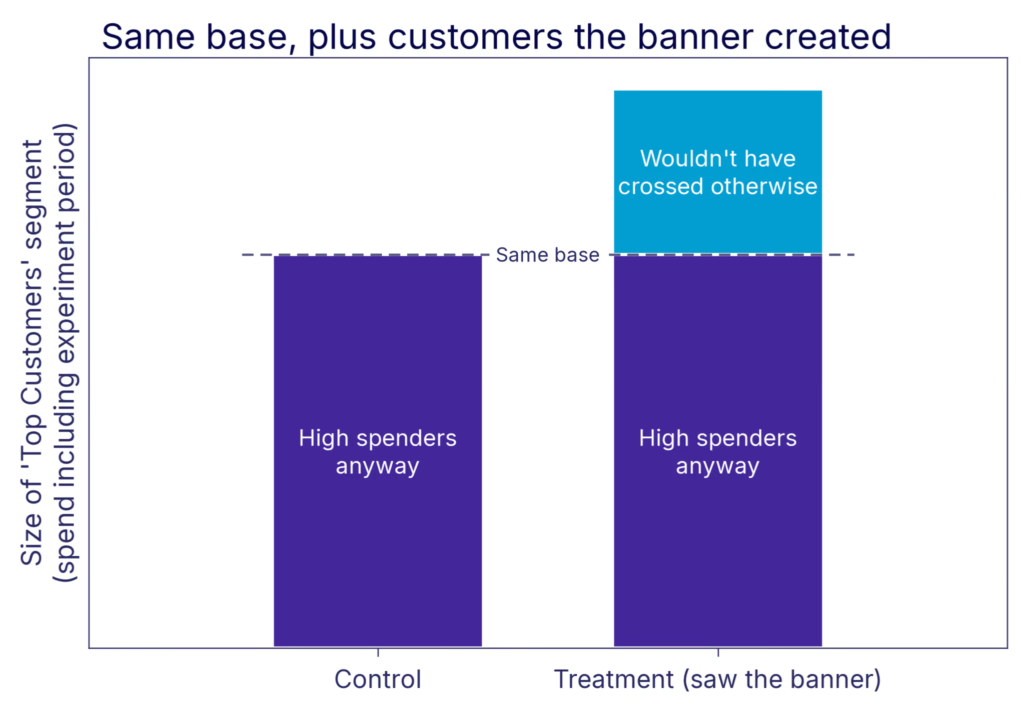
The fix is simple: segment only by pre-treatment variables. Any dimension that could plausibly have shifted in response to the treatment is off-limits, regardless of how natural it feels to look at. Top Customer status defined using spend from before the experiment started is fine. Defined using a window that overlaps the experiment period is not. With dimensions that change over time, this happens by accident. A join that picks up a user's current attribute value instead of the value at assignment time quietly reintroduces the problem.
Why post-treatment splits backfire covers the full mechanics, with a simulated experiment where every segment comes back understated.
What good segment analysis looks like
Pre-specify when you can, and apply the right correction for what you're deciding. When you explore post-hoc, do it honestly: report what you ran, treat results as hypotheses, and replicate before acting. That covers the first two reasons for running dimension splits. The third is simpler.
Think back to the Top Customers segment, defined cleanly on spend from before launch. Those users' long-run value far exceeds what a normal experiment duration can show. A feature that concentrates its effect on them can be worth shipping even when the headline ATE looks modest. That's the third reason to split: not to act on each segment, but to see whether the case for shipping to everyone is stronger than the headline number suggests.
Post-hoc slicing is exactly the kind of analysis statisticians warn you against, and the concerns above are precisely why. But the cost of never looking is just as real. Some of the most important segment effects are ones nobody had a hypothesis for, and exploration is the only way to find them. There is a more systematic way to do this. Methods like causal forests search across many dimensions at once, looking for heterogeneous treatment effects without asking you to pre-specify where to look, which takes much of the cherry-picking problem off the table. That's a topic for its own piece.
One thing worth doing this week. Pick three experiments you've already called, ideally ones where the headline came out flat or ambiguous, and open them up in exploratory mode. Not to relitigate the decision, but to build a list of segment hypotheses worth following up on. Past experiments are the cheapest source of hypotheses you have.
As Hattori Hanzō would say: any fool can pick up a blade. Knowing where to cut is the craft.
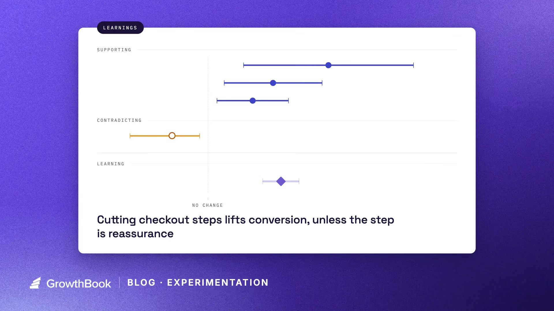
Unlock more learning with every experiment
Running an experiment gives you an answer to a question. Running thousands of experiments gives you a lot of answers, but also something much more valuable: a body of evidence about how your product, users, and business actually behave.
The problem is that this knowledge is surprisingly difficult to use in practice.
A PM working on onboarding might not know that another team tested a similar idea six months ago. An engineer building a new checkout flow might not know which patterns have consistently helped conversion on other parts of the product. Even when people remember that relevant experiments exist, reading through dozens or hundreds of them to find the important patterns is rarely practical.
Today, we are launching Learnings in GrowthBook to help solve this problem.
Learnings let teams capture what they have learned across experiments, user research, and other sources of evidence, then make that knowledge available to both people and AI agents when they are building something new.
Experiments produce more than winners
The most obvious output of an experiment is a decision. Those decisions create incremental gains, and over time those gains compound.
But there is another output from experimentation that is easier to overlook: knowledge. Every experiment produces it, including the ones that lose or move nothing at all.
You might learn that:
- Showing pricing earlier in the funnel consistently improves qualified conversions.
- Simplifying onboarding helps new users but hurts activation for experienced users.
- Social proof matters on acquisition pages but has little effect inside the product.
- Asking users to configure everything upfront creates friction, while progressive configuration performs better.
None of these conclusions necessarily come from a single experiment. They emerge after five, twenty, or a hundred experiments, once somebody notices the pattern.
This is where an experimentation program becomes more powerful than a sequence of isolated A/B tests: individual tests give you answers, but the program gives you a model of how your users behave. You are gradually identifying patterns and putting your learnings to work for future growth.
Learnings compound your experimentation program
If an experiment improves conversion by 2%, that improvement can continue generating value for as long as the change remains in the product (novelty effects aside). That’s real compounding, and it’s the return most programs measure.
But that win only compounds one thing: a metric. A learning acts on something different: the quality of the next decision.
Imagine your team learns through repeated experiments that users perform better when complex actions are introduced progressively rather than all at once. That insight might influence your next onboarding flow. Then your settings experience. Then a new AI feature. Then the way an agent designs a workflow six months later.
It doesn’t stay with one team either. An insight can travel to whoever picks your onboarding feature or settings work next. Your experimentation program can widen, since everyone starts from organizational knowledge.
The value is not limited to the experiment that produced the learning. It changes the starting point of future work. Instead of beginning every project from first principles, your team starts with a set of evidence-backed assumptions about what tends to work (and what doesn’t).
Learnings in GrowthBook
GrowthBook Learnings are designed to capture this organizational knowledge explicitly.
A learning can reference evidence from multiple experiments, rather than being tied to the result of a single test. That matters because many useful conclusions only become visible across a collection of experiments.
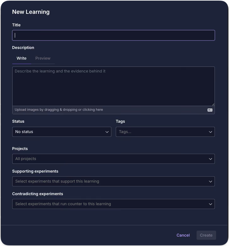
You can use Learnings to document things like:
- Patterns that repeatedly improve a metric
- Approaches that consistently fail
- Differences between user segments
- Design principles supported by experimentation
- Unexpected behaviors observed across multiple tests
- Areas where the evidence is contradictory or uncertain
The same change isn’t universally applicable, though. Streamlining a flow can lift conversion in one part of your product and lower it in another, and the right amount of friction depends on what the user is trying to do. Learnings can be scoped to specific projects or tags, so that patterns that have been tested for your self-serve signup aren’t applied to your enterprise onboarding flow.
And learnings do not have to come exclusively from experiments either. You can capture qualitative findings from user research, customer interviews, support conversations, or other sources and combine them with quantitative evidence.
The goal is not to turn every observation into an immutable rule.
It is to give your organization a shared, evidence-backed memory. Each learning can be updated if new evidence comes in, and also have a specific status for when the learning is not verified yet, or if it’s no longer relevant. Statuses for learnings are entirely customizable. Once captured this way, that memory becomes something both people and AI agents can draw on, which raises the question of how much of it to hand an agent at once, and in what form.
The context window problem for organizations
There is a useful analogy to working with AI coding tools.
If you give an agent every line of code your company has ever written, you have technically given it more information. But you have not necessarily given it better context.
The useful question is: what does the agent actually need to know to make this decision well?
Organizations have the same problem. After thousands of experiments, nobody should need to read thousands of experiment reports before starting a project. They need the relevant conclusions.
Learnings act as a compressed context layer over your experimentation history. The underlying experiments are still there as evidence, but people and agents can work from the higher-level patterns that those experiments have established.
For example:
Learning: Users are more likely to complete complex setup flows when advanced configuration is deferred until after initial success.
Evidence: Seven onboarding experiments across three product areas.
A PM planning a new onboarding experience can start with that knowledge instead of rediscovering it. An engineer can incorporate it while designing the implementation. The same applies to agents, even more strongly. An agent without access to your evidence will still produce a confident answer, but it will be generic and maybe an approach you’ve already disproved. Point your agents at your Learnings, and they start from what you already know.
Learnings are available through GrowthBook's APIs and MCP support, just like your experiments and other experimentation data. Through GrowthBook Skills, you can instruct agents to retrieve relevant Learnings before they design or implement something.
Instead of giving agents generic product-development best practices, you can give them exactly what they need to know to make this decision well: your company’s own compressed, decision-relevant knowledge, grounded in real outcomes and updated as new evidence comes in.
AI can help find the patterns humans miss
As experimentation programs grow, manually identifying patterns becomes harder if not impossible. A team running ten experiments a year can probably remember most of them. A company running thousands cannot. GrowthBook can use AI to analyze your experiment history and surface commonalities across results.
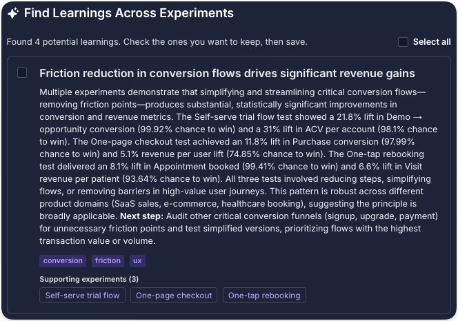
Perhaps a certain type of messaging consistently works for new users but not existing customers. Maybe several unrelated experiments show that reducing perceived commitment improves activation. Maybe a UI pattern that teams keep proposing has actually failed in four different areas of the product.
These patterns are easy to miss when every experiment is analyzed independently.
AI makes it possible to search across a much larger body of evidence, while Learnings give teams a place to review, refine, and preserve the conclusions that matter.
Good experiment hygiene becomes even more valuable
There is an important prerequisite.
AI cannot infer very much from an experiment called "Homepage test 7" with no hypothesis, description, or conclusion.
The better your experiment documentation, the more useful your accumulated knowledge becomes.
This is one reason GrowthBook has increasingly invested in experiment quality and hygiene, including checklists and workflows that encourage teams to document the hypothesis, context, results, and conclusions of an experiment. Good documentation has always made individual experiments easier to understand.
With Learnings, it also makes the entire experimentation history more valuable. Every well-documented experiment becomes another piece of evidence that can contribute to future decisions.
From experimentation history to organizational memory
The long-term value of experimentation is not just making better decisions today. It is making every future decision from a stronger starting point.
Experiments that win improve the product. All your experiments improve the ideas, assumptions, and decisions that come next, increasingly including the ones your agents make. That’s the part that really compounds. Firmer footing leads to better experiments, which produce better evidence, which produces better judgment. Over time, your experimentation program is not only improving your product, it’s improving your organization’s ability to build one.
Experiments should not disappear into a results archive once a decision has been made. The best ones should keep teaching you.
.avif)
Battle tested before it reaches the counter: experimentation at Clover
Running an experiment is the easy part. The hard part is knowing which experiments are worth running at all, and what to do when the textbook playbook, the classic 50/50 production split, is simply off the table.
That's the situation Ben Schein lives in every day. On this episode of The Experimentation Edge, host Ashley Stirrup, CMO of GrowthBook, sits down with Ben, Director of Product Management at Clover, one of the largest point-of-sale and payment processing providers in the world. Ben oversees product strategy for the on-premise and digital tools that restaurants run their businesses on: the point of sale a server uses on the floor, the handhelds they carry between tables, and the systems behind menus, promotions, reservations, online ordering, and catering.
The scale is staggering. Clover serves more than 300,000 merchants in the United States alone and processes billions of dollars every day. Ben can watch spikes ripple through the system in real time when a World Cup match or a major concert hits a city. And that scale shapes every decision his teams make about testing.
Listen to the episode here.
You can't A/B test a work tool
Here is the constraint that makes Clover's experimentation program different from most: the product is someone's workday.
"Testing is not really 'let's put something in production and see what happens,'" Ben explained. "The worst possible thing is to show up to work the next day and suddenly the tool that you use for work is totally different and no one told you why. You can't do an A/B test in that environment."
A consumer app can quietly ship a variant to 5% of users and watch the metrics. A server picking up a handheld during the dinner rush cannot be a surprise test subject. So Clover inverts the standard model. Instead of testing in production, everything is proven before rollout: structured pilots, ground-level validation, and a detailed go-to-market plan for every feature that ships.
The consequence is that testing carries real financial weight at Clover. "If we don't know that this thing is gonna be successful, we're not gonna invest all those dollars in getting this thing to market," Ben said. Testing is not a stage gate that slows the roadmap down. It is the evidence that justifies the rollout budget in the first place, part of the company's vernacular and culture, as Ben puts it.
Uncertainty and downside set the testing depth
If you can't test everything in production, you have to be ruthless about what earns deep experimentation. Ben's triage comes down to two variables: how much uncertainty is built into the change, and how much real downside exists if it goes wrong.
At the high end sit things like payment authorization flows or the entire funnel a server uses to place an order on a restaurant floor. Those changes are high touch and central to the core experience. They get intentional, ground-level testing before any system-wide change, because when something less proven trips up, the impact is significantly bigger.
At the other end sit table stakes features. Adding Apple Pay matters to the business, but it is an industry standard; the uncertainty was resolved years ago by the rest of the market. You monitor the impacts after rollout, and you move on.
The lesson for experimentation teams: testing depth should follow the risk reward math, not the visibility of the feature. A flashy redesign might need less rigor than an invisible change to an authorization flow. Most roadmaps get this backwards.
Ben applies the same discipline to what happens after a test reads out. His advice to PMs who are new to experimentation is to know the strategic value of a test before running it. "We want the learnings of those tests. We don't always know why we want those learnings," he observed, and a junior PM staring at a significant result with no idea what to do next is the predictable outcome. His fix: structure tests for durable business value rather than pass-fail verdicts, pair every headline metric with counter metrics, and anchor on ground-level measurements like items per check that stay resilient whether $100 or $100 million is being spent on marketing that quarter.
What a burger chain teaches about checkout funnels
Before Clover, Ben led product at Shake Shack, joining at the tail end of the pandemic when the brand's digital channels had gone to market fast and the open question was whether they were any good.
The team's answer became a masterclass in treating a conversion funnel as a brand channel. Shake Shack is built on hospitality, so the question Ben's team asked was strange and productive: what does hospitality look like in a checkout flow?
Some of it was classic optimization: removing redundant steps, and fixing customers who accidentally ordered from the wrong location as store density grew. But the more interesting work was additive. The team tested how presenting prep-time expectations affected conversion, because a Shake Shack burger takes longer than typical fast service and an unexplained wait erodes trust. Set the expectation honestly at checkout, and NPS downstream reflects that the promise was kept.
Then there were the loading screens. Those interstitial moments after a purchase became deliberate brand real estate: the quality of the beef, the fact that the patty is never frozen, conveyed in a passive moment the customer was already spending rather than buried third in a product description. The same thinking carried to the kiosks in the restaurants themselves.
The thread connecting it all is context. "I don't even think of it as personalized, it's contextualized," Ben said. Nobody opens a restaurant app just to browse; they are hungry, they are in the car, they are standing somewhere they can't see the menu. Funnels that acknowledge that intent outperform funnels that don't.
Why this matters for experimentation teams
Ben's career runs from hand-writing test parameters in Firebase config files at NPR, with weeks of work per readout, to a world where the same test runs in an afternoon. His prediction is that the democratization keeps going: interns running hypothetical experiments in sandboxed environments without asking permission, with AI tools making analysis approachable to anyone regardless of background.
But the through line of the conversation is that tooling was never the hard part. The hard part is judgment: knowing which changes carry real downside, structuring tests so their learnings have durable value, and understanding the context your users bring before you measure what they do. Machines may beat humans at allocating ad spend, as Ben readily concedes. Knowing your audience well enough to see where they are going next is still a human edge.
Hear the full conversation with Ben Schein on The Experimentation Edge. And if you're ready to bring that kind of rigor to your own rollouts, visit growthbook.io to see why the open source experimentation platform leader powers testing programs at any scale.
From 22 clicks to 5: the zero impact experiment that shaped how Edd Saunders at JobLeads tests
Every experimentation program has a story it keeps coming back to. For Edd Saunders, product experimentation manager at JobLeads, it involves pizza.
On this episode of The Experimentation Edge, Edd walked through the experiment that looked like a guaranteed winner, failed completely, and permanently changed how he designs tests. He also shared the problem mapping framework he uses to train new experimenters and explained how JobLeads multiplied its experiment velocity almost tenfold in about a year.
Listen to the episode here.
The sure thing that went nowhere
A few years back, during his consulting days, Edd worked with a large, established pizza company that wanted to explore personalization as a way to improve its web experience. The research was thorough. Customer journey maps showed that the average customer needed around 22 distinct inputs from starting a session to completing an order. About half of all traffic came from returning users, and those returning users ordered the same pizza week after week. Previous experiments had shown that customers kept two or three competing delivery sites open at once, racing whichever basket filled first, hungry and increasingly irritated as their blood sugar dropped.
The logical conclusion practically wrote itself: reduce the number of clicks. The team built a database that captured every item a customer ordered, saved it against their user ID, and served their usual order back in a nicely designed widget on their next visit. One click added the entire order to the basket and sent the customer straight to checkout. Twenty-two steps became five or six.
"It had absolutely zero impact, zero impact on user behavior," Edd said. "It didn't increase purchases. It didn't decrease purchases. People saw it and just thought, nah, I'm not using that."
The team iterated a few times, then drew the honest conclusion: forcing personalization on these customers wasn't worth the money. But the deeper learning was about why the feature failed. "The exploration is still a massive part of customers' delight," Edd explained. Customers wanted to feel in control of their experience. "By making it easier to find their order again, we actually took away some of their control." People would tell themselves they wanted something different this time, browse the menu, and land on the same pizza they always ordered. The browsing was the point.
For Ashley, the story hit close to home. He admitted he personally would have wanted the feature, and that its failure would have kept him up at night. That is precisely the value of the experiment. It saved the company from continuing to invest in a direction that data, logic, and intuition all endorsed, and that customers quietly rejected.
Getting out of the solution space
The pizza story sets up the question every experimentation leader eventually faces: how do you guide someone who has never run a test before? Edd spent about six years consulting and training people who were new to experimentation but full of ideas, and he has a clear diagnosis of where they go wrong.
"The trickiest part is getting people out of the solution space thinking and moving them into the problem space thinking," he said. Solution space thinking means generating ideas and throwing them at the wall. And because everyone carries a natural bias that their own ideas are better, everyone new to testing eventually has the same humbling experience. "Everyone new to this has to go through this kind of ego death, where their brilliant idea actually has zero impact whatsoever."
His alternative starts with the customer. Edd runs an exercise called customer journey mapping that doubles as an introduction to analytics tools. First, understand where people come from, where they land, and every micro step between acquisition and activation, then calculate funnel drop-off rates in granular detail to find the biggest leak. Second, layer qualitative data on top: heatmaps, session recordings, click maps, and scroll maps that reveal the how behind the what. Third, add user research, from interviews to third party reviews. At JobLeads, social media reviews alone provide a huge amount of intelligence about where the product should go.
From those three sources, problems get written as statements: as a new user, I don't register for JobLeads because I don't trust the brand. Then comes the exercise Edd loves most, problem mapping. Each problem lands on a 2x2 matrix. The horizontal axis measures evidence, from pure assumption on the left to fully validated on the right. The vertical axis measures impact. The top right quadrant, high impact problems you know are real, becomes the first batch of hypotheses to test. High impact unknowns get logged for additional research, or simply tested if they're cheap to run.
The payoff goes beyond win rate. Validated problems are useful to marketing, customer support, and leadership, not just product teams. And the approach solves the fear that haunts every new experimenter: running out of ideas. "If you live in the solution space, your ideas run dry pretty quickly," Edd said. "If you understand the problems you're trying to solve, naturally you'll come up with multiple hypotheses for each problem. One problem can spring a nice tree of ideas."
Democratizing experimentation
JobLeads only started testing seriously in early 2025, and the program's growth has been steep. Velocity has climbed from roughly 0.3 experiments launched per month to about 2.8. Edd, who was the second dedicated experimentation hire, has spent much of his time on experiment operations: standardized workflows, making each departments roadmap accessible to everyone, and a company-wide knowledge base that synthesizes the learnings from every experiment for anyone in the organization, whether they sit in marketing, customer support, or product.
That knowledge base serves a second purpose: keeping people excited. Edd has watched interest in experimentation spike at launch and then dwindle as people discover that most of their ideas won't win. His counter is to reframe what a result means. "It isn't look at what's won, look at what's lost. It's look at what we've learnt and look at what better decisions we're empowered to make because we've run an experiment."
Ashley summarized the compounding effect with a baseball metaphor: experimentation isn't about home runs, it's about stacking singles. Edd agreed. "Your one test might not have a huge amount of impact, but when you look back over a year, the 100 or so tests you run might. The growth will have compounded over time."
Looking ahead, Edd's ambition is to push experimentation beyond the specialists. He wants content managers and everyday marketers to take an idea from problem to live experiment themselves, then watch it get validated and absorbed into production. "I guess you could call it democratizing experimentation, giving the power to the people."
The obstacle isn't primarily education. It's habit change. People are already under pressure, and mandating experimentation on top of their day jobs breeds resistance. Edd's answer is to make the value of each contribution visible: "Hey, you had that great idea a few weeks ago. We ran it as an experiment, and the company now knows X, Y, Z because of your insight."
AI plays a quiet supporting role throughout. Edd uses it to validate MVPs cheaply before features get built properly, and for the unglamorous automation that keeps the machine running: drafting tickets, standardizing documentation for the knowledge base, and small workflow automations like extracting Figma links between ticket statuses. Little stepping stones, as he put it, that ease the burden across the organization.
The takeaway
The thread running through the conversation is humility in the face of evidence. The most logical feature can have zero impact. The most brilliant idea can flop. What compounds isn't any single win but the accumulation of validated learnings, shared widely enough that the whole company gets smarter with every test.
Hear the full conversation with Edd Saunders on The Experimentation Edge. And if you're ready to raise your own experiment velocity, visit growthbook.io to see why the open-source experimentation platform leader powers testing programs at any scale.
.avif)
Feature flags vs. remote configuration: what’s the difference?
In 2025, Google Cloud went down globally for roughly three hours. This happened because of a simple configuration change that left blank fields, and within seconds, it was replicated across the entire service.
Google’s own incident report was blunt about the root cause. They admitted they did not have appropriate error-handling measures, such as feature flags, in place.
A config value broke production. But a feature flag would’ve stopped it.
A remote config and feature flag both change production behavior without a redeploy. That’s what makes the boundary hard to see.
In this article, we’ll explore the differences between feature flags and remote configs and when it makes sense to use either or both.
What’s the difference between a feature flag and remote config?
A feature flag decides whether something happens with your code. Remote configuration decides what a value is. Both of these functionalities live outside your codebase, and both change without redeploying code. That’s why many developers conflate them.
Let’s say you’re rebuilding a checkout feature. The initial rollout is 10% of users while you monitor error rates, and the payment service it calls has a rate limit you can tune as traffic increases. The checkout page has a JSON object that controls field order and input density. So, in this case, the flag asks who should experience the new checkout flow, while the config values such as the rate limit and layout object define how the system behaves once you’re in it.
Now, the difference is clear in how you target different aspects of your infrastructure and what the payload is meant to do.
For instance, flags evaluate only against specific user attributes, such as geography or device type. If two users hit the same endpoint, they see different answers depending on their attributes. Remote configuration can do the same thing. You can serve the same value across an entire environment or segment them based on certain attributes like geography. But the focus is on what value a setting holds (the payload) and not on who should see a feature. In either case, the value is permanent and continues to stay in your codebase, unlike a feature flag.
Here are a few other differences between feature flags and remote configuration:
The method you reach for works the same way in the codebase, too:
// Feature flag: should this user see the rebuilt checkout?
if (gb.isOn("new-checkout-flow")) {
  renderNewCheckout();
}

// Remote configuration: what rate limit applies here?
const rateLimit = gb.getFeatureValue("payments-rate-limit", 100);
isOn() returns a boolean and gates a block of code. getFeatureValue() returns a value your application then uses—along with a fallback for the moment before the SDK has loaded.
Typically, developers see this type of configuration in Firebase Remote Config for the first time, but it’s possible on other platforms like GrowthBook as well.
What happens when feature flags and remote config overlap in your infrastructure?
Many feature flagging platforms (including GrowthBook) now support string, number, and JSON values. So if you put a specific feature, for example, your pricing tiers in a JSON flag, you’ve built a remote configuration service inside a flagging platform.
Firebase had covered similar ground—but in reverse. So, it added progressive rollouts and per-user targeting to an existing config service.
You can no longer separate a platform based on whether it’s best for feature flagging or remote configuration. In fact, several studies treat feature toggles and remote configuration as belonging to the same family of techniques. If the academic community can’t always clearly differentiate between the two, engineering teams shouldn’t expect to either.
That said, here’s what happens when they overlap within the same platform:
1. Intent and lifecycle
The intent of the capability changes how long it stays in your codebase. Remote configuration is usually permanent by design, while toggles are (mostly) temporary—unless it’s a kill switch.
For example, a rate limit is tuned over years and stays useful the whole time. But a rollout feature flag’s utility ends the minute you reach 100% rollout. If you serve the same value from a flag for more than 12 months and it stops working as a release control, then that’s just an undocumented config.
In either case, if flags or config remain in your codebase with no use whatsoever, you’re dealing with a stale flag. And once they pile up, you’re leaving more room for unnecessary incidents.
Tip: If you’re using a feature flagging platform like GrowthBook for both purposes, take advantage of the Stale Detection feature to clean up unnecessary config or flags. It’ll alert you if the flag has no active environments or if it sends all its traffic to a single variation. That’s your cue to clean it up.
2. Targeting
If you’re unable to figure out whether you have a feature flag or remote config in place, just open the flag and review its rules.
If the value is making your code branch an if/else where only one path runs, you have a feature flag, whether it's temporary or permanent. For example, it could be a checkout button rollout which is temporary or even a kill switch that's more permanent.
But if the code consumes the value directly, you have a remote configuration. For example, a rate limit for your service or a layout JSON your UI renders. Here, the code runs on the same path but only the parameter or payload changes. There's no dead branch to clean up because you didn’t create any. It’s a permanent value.
3. Auditability and ownership
Whether you’re working with feature flags or configs, you need versioning.
When someone on your team drops your checkout service’s rate limit from 100 to 50 requests per second and latency spikes, the first question is who made that change and what the previous value was. An audit log solves that problem because an unversioned config can create production failures.
But feature flags need lifecycle management in addition to versioning. When you’re creating them, you need to assign an owner and expiry date. If you don’t do this, you’ll increase your software’s technical debt, which only increases the surface area of failure over that period.
This is all to say that both of these techniques need governance, but the measures look different.
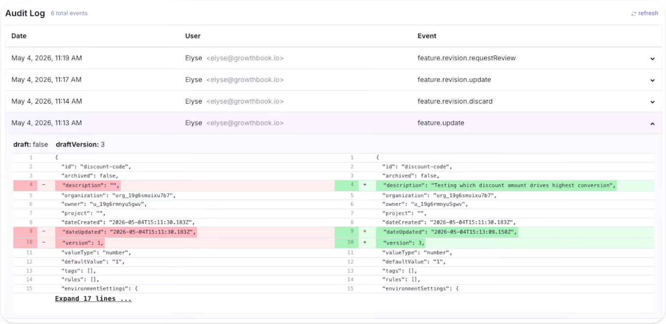
When does using feature flags as remote config become a problem?
You can run flags and config through the same platform. The problem starts when you run them through the same mental model. Here’s why:
1. Stale flags that become undocumented configuration
As you keep creating more flags or configurations, your codebase becomes more cluttered over time. In fact, a 2026 study found that feature toggles in Kubernetes stay in the codebase for a median of 734 days, while they stay for 185 days in GitLab. Stale flags are the norm, so you need to prepare for that.
Within GrowthBook, you can identify dead code snippets using the Stale Detection feature. If you’re using the MCP, the platform also offers agent skills to find flags and clean them up without leaving your AI agent.
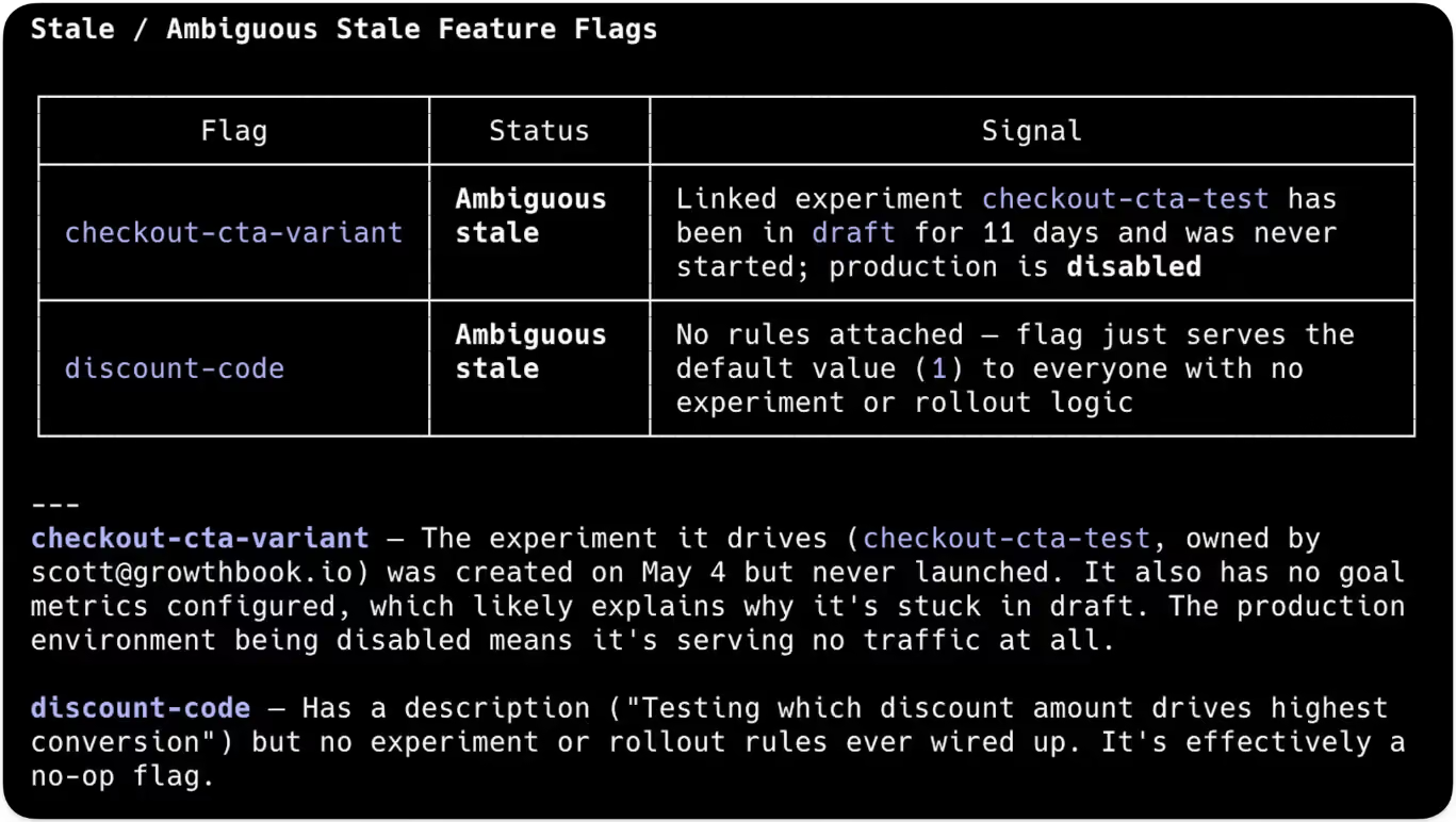
2. Too many active flags create points of failure
Every flag you create results in 2n possible code paths. For example, 10 active flags create 1,024 possible code paths while 20 create over a million. Only a few of those combinations are valid states for your product, and you can’t test the rest. Even though only 7% of toggles interact directly with each other, toggle interactions grow by an average of 22% over time, so complexity increases with every flag you leave in place.
3. Storing secrets and API keys in flag payloads
Since feature flag payloads are cached client-side, anything inside them can appear in browser dev tools. Typically, API keys and credentials should be stored in a secrets manager or in environment variables to avoid this issue.
If you’re using a feature flagging or remote configuration platform, make sure it offers the necessary protection. For instance, within GrowthBook, the server-side SDKs keep the full payload in a secure environment where it never reaches the browser.
Remote evaluation takes it a step further by evaluating them server-side and returning only the resolved values to the client—so rules and unused variation stay hidden.
4. Config changes that ship without release controls
In 2024, CrowdStrike shipped a content configuration update to every Falcon sensor, and the change didn’t contain any new code. It took down millions of Windows systems globally, resulting in a $5.4 billion loss for the company.
Even Cloudflare’s November 2025 outage happened because an internally generated config file doubled in size past a hardcoded ceiling. The company responded by hardening config generation and enabling more kill switches.
In both cases, the company shipped a config change globally and eventually concluded that the config needs the same controls that feature flags already give you. That’s because config carries the same risks as standard deployments, so you should treat it the same way.
How to choose between feature flags and remote config for development
Here are a few questions you can run through before choosing the right technique:
If you get the most yeses in the feature flag column, create a flag and use it for your rollout. If most of the yeses sit in the config column, use your flagging platform or a dedicated remote config system to create the config.
For the latter, you can use a string or JSON flag with a clear permanent-value intent and give it a rule that applies to every user.
How GrowthBook supports feature flagging and remote configuration
The Google Cloud outage started with a config value and eventually led to the realization that feature flagging would’ve solved this problem. That’s one of the reasons GrowthBook was built as a single feature primitive with four value types rather than two products bolted together.
A few ways GrowthBook does both jobs well:
- Feature flags and remote config: Every feature has a key, a type, a default value, and rules per environment. Boolean features run through isOn() for releases, while string, number, and JSON features run through getFeatureValue() for configuration.
- JSON schema validation: It enforces structure on non-boolean flag values—you define the allowed shape, and the platform rejects invalid entries before they reach production. The raw JSON editor becomes a generated form with typed fields and inline validation errors.
- Rules: You can use targeting rules across all four value types and serve different configurations per segment when you actually need them.
- Audit logs: You can review draft revisions and audit logs to answer who changed a value and when, with approval flows for changes that need a reviewer.
- Stale detection: This feature surfaces flags that stopped making decisions, and Code References show you where the dead code is present. You can decide whether to keep or remove it.
- Configs: The platform also ships dedicated Configs, which are typed and validated JSON objects with schema enforcement and per-environment overrides.
- Constants: It’s present alongside Configs and is a reusable value you define once and reference across multiple flags. These give long-lived configuration its own first-class object inside the platform rather than treating it as a side effect of a non-boolean flag.
If you want to see how GrowthBook handles feature flags and remote config in one place, start for free or book a demo with us today.

Designing experiments that produce trustworthy results: a pre-launch guide to validity threats
Every experimentation team has had this experience: An A/B test showed a statistically significant lift, but after the change was rolled out, the primary metric didn't budge. It turned out the intervention didn't have an effect and the lift was caused by a flaw in the experimental design that introduced bias. By the time you're analyzing an experiment's results, many of the decisions that determine whether those results are reliable have already been made.
We've already looked at several components of trustworthy experiments in depth: reducing false positive rates for more reliable wins, reducing variance to run conclusive experiments more often, and diagnosing sample ratio mismatch when you detect sample bias.
This article is a pre-launch framework for the decisions you need to make and the checks you should run before your experiment starts collecting data to ensure your results are trustworthy.
The 4 validity types that matter for experiment design
Validity describes the trustworthiness of an experiment's conclusion, whether the effect it reports is real or just a flaw in how the test was built. The standard experimental-design framework, from Shadish, Cook, and Campbell, breaks it into 4 types.
1. Internal validity
Randomization is supposed to guarantee internal validity, meaning the change you tested, rather than some other factor, caused the observed difference between the test and control groups. But two randomized groups stop being comparable when the intervention itself causes a change in their composition.
For example, if a new checkout flow loads half a second slower, impatient users may abandon it before they're counted in the analysis, leaving the test group without the users who would drag conversion down. Novelty, network effects, selective enrollment, and attrition can all threaten internal validity when an experiment isn't designed properly.
2. External validity
A 2-week test run over the winter holidays can show a statistically significant lift that disappears in January when normal user behavior returns. When that happens, you have an issue with external validity.
External validity requires that an experiment's measured effect apply to more than just the users and the time period you tested. An effect won't generalize when the conditions during the test differ from the conditions after rollout. Plan to run your experiment during a representative period on a representative sample to get reliable results.
3. Construct validity
An experiment can be internally and externally valid while still measuring the wrong thing. Construct validity means the metric you measure actually reflects the outcome you care about. Metrics are often just proxies for something harder to measure, and they can improve even when the outcome they represent does not.
For example, a recommendation carousel test might measure click-through as a stand-in for purchases, but a variation can lift clicks while purchases stay flat. Choosing the right metric up front prevents issues with construct validity.
4. Statistical conclusion validity
Statistical conclusion validity depends on your analysis supporting your conclusions. Checking the dashboard each morning and stopping when the result looks significant raises the chance that the winner you declare is a false positive, even when the design itself is sound. You can protect statistical conclusion validity by setting the sample size in advance and pre-specifying the analysis details before launch.
GrowthBook's statistical validity guide covers 2 more types as well as common threats to validity like p-hacking, peeking, and regression to the mean.
How to design for experiment validity before you collect any data
The decisions that determine an experiment's validity happen at the planning stage. Pre-registering an experiment means fixing all the details in advance, such as the hypothesis, the primary metric, the sample size, and stopping criteria. Committing to them before launch means you can't go looking for a significant result by peeking at the data or choosing what to measure after you've seen the numbers.
Start with a hypothesis that has a mechanism
Without a stated mechanism in your hypothesis, you have no way to pick the right metric or to judge whether a result makes sense. Write your hypothesis so the reason is explicit. A clear research hypothesis names the change, the metric, the expected direction, and the mechanism: we believe [change] will move [metric] [direction] because [mechanism]. The because is easy to leave out, and it's the part that makes a null result informative. When the metric doesn't move, you can use the mechanism to decide which link in the causal chain to check first. Stating it up front also constrains the metric you pick next, because it names the specific behavior the feature is supposed to change.
Match your randomization unit to your analysis unit
Randomization creates balanced groups, but this balance only applies to the unit you make assignments on. For example, if you randomized by user, the user groups would be balanced. If you then analyzed that experiment using sessions instead, you would no longer be comparing the same groups you balanced. Since one user can generate multiple sessions, a variation that alters user behavior (like visit frequency) can skew the session count in one arm for reasons independent of the metric you are testing.
A mismatch between identifiers can cause the same problem. Many metrics rely on anonymous IDs, because the tracking events fire before users sign in. If your SDK assigns on a user ID, one user can map to several anonymous IDs in your data, and those IDs may not split evenly across your groups. To prevent this, assign and analyze on the same identifier. You’ll need to choose the one that's available when users first see the change: the user ID on signed-in surfaces or the anonymous ID before sign-in.
Randomize whole groups when users affect each other
Some treatments change how users affect each other. Standard randomization assumes that one user's assignment doesn't change another user's outcome. Statisticians call this the stable unit treatment value assumption, or SUTVA.
For example, imagine a referral test where the treatment arm sees an offer for $10 if they refer a friend, and the control arm doesn't. Treatment users send invitations. When the invited friends arrive, some are assigned to the control group, and of course they sign up. The control group's conversion rate rises because of the treatment, so the gap between the arms shrinks and the measured effect understates what the feature does. The split is still 50/50, and every health check passes, but the estimate is wrong.
Marketplaces where buyers and sellers draw on shared inventory have the same problem, as does any social feature where treated and control users interact. The measured effect is still biased, and you can't easily predict the direction.
There's no way to correct for interference between groups in the analysis afterward, so you have to design for it in advance. Cluster randomization assigns whole groups to the same variation, like every user in a city or a connected social graph, so the effect stays contained inside a cluster instead of leaking between groups. Geographic holdouts and time-based designs, where the treatment switches on and off across time periods, do the same job when the groups don't divide neatly. The best option depends on how your users connect to each other. Whichever design you choose, the decision has to happen before launch.
Re-randomize when you reuse a surface
Reusing the same randomization across back-to-back experiments lets users keep their old assignment, so anyone in the treatment arm last time stays in it for the new test. If the earlier treatment caused a lasting effect, that effect is now correlated with the new assignment and biases the result. For example, if a previous feature redesign confused users, their temporary frustration will artificially drag down engagement with the new tool. Re-randomize with a fresh seed for every experiment, so each user's new assignment is independent of any prior test. GrowthBook does this automatically when you start a new phase with re-randomization or create a fresh experiment.
Keep the arms identical except for the change you're testing
A new variant introduces new code, and new code can differ from the control in ways you didn't intend. It might degrade performance or have a bug the control doesn't, and suddenly you’re not just measuring the intervention, but also everything else that came along with it.
For example, a redesign might appear to fail simply because the new page loads more slowly, confounding the design change with added latency. Compare latency and error rate across the arms so that a performance issue doesn’t bias the treatment effect.
You also need to measure all experiment arms the same way. They have to fire the exposure event (which records that a user entered the experiment) at the same point and use identical metric definitions. If the exposure event fires after variation-specific code runs, the slower arm will lose users before they're counted, creating a sample ratio mismatch (SRM) and a biased result.
An A/A test, where both arms serve the same experience, can help you check your measurement setup. With no real difference between the arms, any difference the analysis reports came from your assignment or tracking. But it can't catch problems that only appear when the real variant runs, so monitor latency, error rates, and SRM warnings during the live test.
Choose a single primary metric that measures the right thing
The more metrics you analyze, the more likely you are to find a false positive. You can control that risk with a multiple comparisons correction, but you lose some sensitivity when you do. Declare a single primary metric that directly tests your hypothesis. Ideally, it should connect to your Overall Evaluation Criterion (OEC), the organization-wide definition of success that experiments are judged against.
Three questions help with primary metric selection:
- Is it proximate to the feature, meaning it measures something the feature directly changes?
- Does it predict the long-term outcome you want, rather than a short-term proxy that can rise while the real goal stays flat?
- Is it a rate or a binary metric, rather than a total that a handful of high-spending users can disproportionately influence?
With a proximate, predictive, outlier-resistant metric, you can detect a real effect with far less data than with a noisy one.
In addition to your primary metric, you can also declare guardrail metrics. These are the metrics that must not degrade. Revenue, support tickets, latency, and error rate are all common here. You don't use a guardrail metric to call a winner, even when it improves. Instead, its purpose is to detect when the variant makes something important worse that the primary metric wouldn't catch. When you declare guardrails before launch, you see the decline during the test instead of after rollout.
Set your decision criteria before launch, too. Your metric choices describe what to measure, not when a result is good enough to ship, so document which combination of outcomes means you ship, roll back, or iterate. For example, you might only ship if the primary metric improves with 80%+ confidence and your guardrail metrics don’t degrade. Committing to your criteria up front is part of pre-registration, and it helps make sure all your stakeholders are aligned on what success looks like.
Calculate your sample size and set a minimum duration
Peeking at results early and acting on what you see is one of the easiest ways to accidentally increase your false positive rate. Without a sample-size target set in advance, every early look triggers a decision about whether or not to stop. As you're designing your experiment, run a power analysis to determine your sample-size target.
Power analysis is built on 3 inputs:
- Minimum detectable effect: the smallest increase in a metric's performance that would be meaningful for your business.
- Baseline value: your primary metric's current value for the same audience, from 2-4 weeks of pre-experiment data.
- Power target: the chance of detecting a real effect if there is one. 80% is standard for most decisions, but you may want to go higher if missing a real effect would be costly.
Split the two arms evenly unless you have a reason not to, because a 50/50 allocation gets the most power out of a given sample. Using a ratio like 90/10 to limit exposure is a reasonable safety choice on riskier changes, but it will cost you sensitivity and lengthen the test.
If your test enrolls users continuously, like most product and website tests, it also needs a minimum duration, regardless of when you reach your sample-size target. A 2-week minimum is common. User behavior varies across the week, so running experiments in whole-week increments gives every day equal representation. Duration also needs to outlast the burst of first-time curiosity a new feature draws, and features that change habitual behavior, like navigation or a core workflow, need longer still.
Some metrics also take time to mature. If your primary metric is completing a 7-day trial, users who enroll in the test's final week haven't had time to complete it. Set a conversion window on the metric, which counts each user's events only within a fixed period after their own exposure, in this case 7 days, so a user who enrolled on day one and a user who enrolled in the final week are measured on the same terms. You’ll need to wait for the last enrollees' windows to close before analyzing. The window keeps the measurement period equal rather than shortening the wait.
Together, the sample size, the minimum duration, and metric maturity determine your analysis date. Plan to analyze the results once, when all 3 are met. If you know you'll want to act on results as they come in, enable sequential testing at design time, which adjusts the statistics so that repeated looks don't inflate the Type I error rate.
Plan how concurrent experiments share users
When several experiments run on the same audience at the same time, they will inevitably share users. That's usually fine because experiments assign users independently, and shared users spread evenly across each experiment's arms. When Microsoft analyzed every pair of concurrent tests running across 4 of its products, 3 products showed no statistically significant interactions at all, and the fourth showed them in 1 in 50,000 test-pair metrics.
But when you expect two treatments to interact, for example if both are making changes to the same onboarding flow, you can design the experiments to be mutually exclusive so users only get enrolled in one. GrowthBook supports this with namespaces. Since mutual exclusion spreads your sample further, reserve it for experiments that actually interact.
Run pre-experiment checks before launch
A final round of checks catches potential validity issues while they are still relatively simple to correct. Before the experiment goes live, confirm the following:
- A/A test passed: Run an A/A test on any new experiment surface or after making tracking changes. Since both arms are identical, any statistically significant result points to a problem in your instrumentation or assignment.
- Pre-experiment balance check: If you’re assigning a fixed cohort before launch, confirm the groups don’t already differ on your primary metric (like revenue per user) before the treatment starts. An imbalance that predates the experiment means your results will be biased from the start. This is only possible for batch-assigned experiments on existing users who have historical data.
- Enrollment overlap reviewed: Check which live experiments this one will overlap with. Having users in multiple experiments is fine as long as they change independent parts of the product. If two do interact, make them mutually exclusive so users only get enrolled in one experiment. You can do this in GrowthBook using a shared namespace.
- Runtime confirmed: Given your user volume and minimum detectable effect, confirm the experiment can reach its required sample size in a reasonable amount of time. A test projected to take 9 months at your current volume needs a different design.
Common threats to internal and external validity in experimentation
The design decisions above reduce the risk of a validity failure, but they can't eliminate it entirely. Once the experiment is live, watch for these common threats to validity, especially when the results don't seem to make sense.
Novelty and primacy effects
Users behave differently when they encounter something new, so the first week of data often shows a bigger effect than later weeks will. Novelty pushes the early effect up, and its opposite, the primacy effect, pushes it down. This is because experienced users need time to adapt before a change starts helping them. When a test is too short, it measures the reaction to a change rather than the change itself. You can spot novelty after rollout, when a winning result decays over the following weeks.
Network effects and SUTVA violations
Network effects are hard to spot because they pass standard health checks. You'll see a balanced split between groups, but if users are influencing one another, the results are skewed anyway. Beware of SUTVA violations anytime your experiment involves referrals, social interactions, or shared inventory, especially when the results are surprising. Since you can't fix this bias after the fact, it's best to catch it early and rerun the test using a group-based design, such as cluster randomization.
Interference from concurrent experiments
Concurrent experiments usually only contaminate each other when their treatments interact, like two changes to the same algorithm. As covered earlier, independent assignment keeps ordinary overlap from biasing either result. That said, you should suspect an interaction when two teams have shipped changes to the same surface at the same time, and either result looks implausible. To verify your results, make the experiments mutually exclusive with a namespace and rerun them, so that each test measures its own change.
The pre-launch checklist for trustworthy experiments
This checklist is your pre-registration record. Answer each item with a yes or no before the experiment goes live. Each item corresponds to an A/B testing best practice covered in the sections above.
Hypothesis written with its mechanism. We believe [change] will move [metric] [direction] because [mechanism].
- Decision-making criteria written down before launch, including which combination of goal and guardrail metrics means you ship, roll back, or iterate.
- Guardrail metrics declared for anything that must not degrade, like revenue, support tickets, latency, or error rate.
- Randomization unit matched to the analysis unit, on both grain and identifier.
- Randomization re-seeded if reusing a surface or the same users from a prior experiment.
- Exposure event confirmed to fire at the same point in both arms, with latency and errors compared across arms.
- Network effects assessed: does this feature change how users affect each other?
- User-sharing plan set: overlap allowed for independent experiments that change different parts of the product, or mutually exclusive namespaces for tests that interact.
- Sample size calculated from the minimum detectable effect, baseline, and power target, with an even split unless there's a reason otherwise.
- Minimum duration set for continuously enrolling tests, on a window without holidays or major promotions.
- A/A test passed on new surfaces and after tracking changes.
- Pre-experiment balance check run, with no significant imbalance between groups.
- Concurrent-experiment enrollment overlap reviewed.
- Stopping criteria written down. Analyze once at the committed sample size and date, or use sequential testing if you need to look early.
How GrowthBook supports pre-launch validity
GrowthBook's pre-launch checklist lets you encode these checks as required steps before an experiment moves to production. Use the power calculator to project power over time before launch and commit to a realistic runtime.
GrowthBook automatically flags SRM and pre-experiment imbalance on the Results tab once the test is live, the opt-in Health tab adds deeper checks and visualizations, and sequential testing keeps results valid if you need to monitor early.
GrowthBook’s Decision Framework lets teams define decision criteria directly in the experiment, so the readout includes a shipping recommendation. The stats engine is open source, so you can see exactly how each check is computed.
Trustworthy results begin during the design phase, long before data collection starts. GrowthBook's experimentation platform puts these safeguards in place by default. You can try it for free or book a demo with the team.
.avif)
Scaling 100 tests a year across 1,100 dentist owned offices at Aspen Dental
Running 100 tests a year is the easy part. The hard part is knowing what a win actually means when the "customer" on the other side of your website is 1,100 different businesses.
That is the problem Arie Polycarpou works on every day as Senior Manager of Test and Learn at Aspen Dental. On this episode of The Experimentation Edge, he walked host Ashley Stirrup through twelve years of building experimentation programs at Kohl's, Marriott, Total Wine, and now the largest company in The Aspen Group's healthcare portfolio. Along the way he shared the two numbers he actually manages to: a win rate he deliberately expects to fall, and stacked win math with a haircut built in.
Listen to the episode here.
Twelve years from volunteer to program builder
Arie's route into experimentation started with a hand raised at Kohl's Department Stores. He had landed in digital analytics out of a marketing analytics background, drawn to digital because, unlike most data work, you get to see a whole customer experience start to finish. A/B testing was a growing field at Kohl's with exactly one person working on it. That person needed help. Arie volunteered.
Twelve years later, the pattern of his career is remarkably consistent: join as an individual contributor, connect the data sources, install the rigor and the processes, then build the team. At Marriott he helped bring measurement discipline to A/B tests. At Total Wine, a company that grew tremendously during COVID, he took a program doing a couple of big product tests a quarter and turned it into a full-fledged, hundred-test-a-year operation. After graduate studies in digital transformation, he joined Aspen Dental in October 2025 to bring its agency-run testing in-house and accelerate both the volume and the depth of what the program can measure.
Now he leads a team of three: himself, a manager of analytics, and a coordinator of testing and analytics. The descriptive work matters, but the bread and butter is turning known business opportunities into tests, then working with product managers, the merchandising and production group, and a team of front-end developers to build them. The target: about 100 tests a year, with room to grow.
Healthcare retail: one website, 1,100 offices
Aspen Dental is not a typical B2C business. It is part of TAG, The Aspen Group, which owns several healthcare organizations, and Arie describes the model as healthcare retail. Aspen Dental has about 1,100 offices across the country, and none of them are corporate-owned. Private dentists own the practices, in a model Arie compares to Marriott: the brand provides resources, training, and education, but the practice owners run the businesses.
The website's job is focused: attract new patients, help them learn about the offering, and get them on the books. Appointment bookings per location is the North Star. As Arie puts it, the website's role is to "give the offices a chance to serve a user."
But that franchise structure changes what a win means. Every office has its own star rating, level of service, show rate, and patient return value. A test that lifts bookings overall can still be a bad trade if it routes more patients toward weaker offices or lower-value visit types. So Arie's team monitors what happens after the booking: the value of a patient, whether the mix of users is changing, and whether the mix of offices receiving those patients is changing. Promoting stronger offices, with higher show rates and higher return value, is simply better for the business than spreading demand indiscriminately.
For experimentation teams, the lesson generalizes: when your business is really a network of businesses, the unit of analysis has to follow the value, not just the conversion.
The win rate that should fall as you mature
Ashley asked Arie a question every experimentation leader gets from their executives: what's your win rate?
His answer runs against instinct. Arie strives for a true win rate of about 25%, and he treats the roughly 40% win rate that new programs often post as a symptom of youth, not excellence. Early programs feast on low-hanging fruit: the obvious fixes, the long-postponed ideas, the big value opportunities. As those get knocked out, the tests get more ambitious and the win rate should decline.
The logic cuts both ways. Too low a win rate means you're wasting effort testing the wrong things. Too high means you're not testing anything hard. And the baseline is stiffer than a coin flip suggests: your current experience already embodies years of descriptive data, UX best practices, and accumulated knowledge. Beating it significantly takes real work.
The industry's most mature programs bear this out. Ashley noted that Bing has been quoted around a 20% win rate, and Airbnb as low as 10%. The more mature the product, the harder it is to move the needle. A falling win rate, in other words, can be evidence that your program is finally testing things worth testing.
The haircut rule: two 5% wins don't make 10%
The second number Arie manages carefully is the one that gets reported upward: the stacked, annualized value of the program's wins.
His rule is to be optimistic about better and conservative about how much. A 5% lift measured during a test window rarely survives a year in market. Customers acclimate and the novelty gets baked in. New changes get layered on top of old ones. And lifts don't compound the way arithmetic implies: a 5% homepage win followed by another 5% win does not produce 10%. "I know the math should make it seem like it does work like that," Arie says, "but it doesn't."
So depreciation gets baked into estimates before they reach leadership, in the form of haircuts. The approach echoes what Ronny Kohavi described on a GrowthBook webinar: apply a 20% haircut when you stack wins. Arie goes further when the evidence is thinner, taking a bigger haircut on tests that ran shorter or won with weaker confidence.
The alternative, long-term holdouts, is statistically cleaner but operationally messy. Holdouts force you to maintain two experiences, effectively two sets of code, and the longer they run, the harder they get. For most programs, disciplined conservative estimation is the more sustainable path, and it pays a cultural dividend: conservative numbers that hold up build trust with stakeholders in a way inflated dashboards never do.
Where the program goes next
Aspen Dental's program is still young; Arie joined less than a year ago and the muscle is still being built. The road map runs toward specificity: localization, where each of 1,100 offices can be served differently, and service lines, where the experience that books a denture repair is very different from the one that serves a dental emergency.
On AI, Arie is interested but deliberate. Testing tools are adding AI to analyze tests faster, look up results faster, and even help build tests. He sees the opportunity, and Aspen is looking into it, but with guardrails: keep a clean code base, keep top engineers in control of the site, and use AI as additional analytics hands that free the team to think more strategically, not as a replacement for rigor.
Why this matters for experimentation teams
Three disciplines run through this conversation. Follow the value past the conversion event, even when that means office-by-office analysis. Read your win rate as a diagnostic of maturity, not a scoreboard. And report stacked wins with a haircut, so the number you promise is one that holds.
Ready to take control of your experimentation program? Start for free or get a demo at growthbook.io.

Decoupling deployment from release with feature flags
Engineers never deliberately decided to couple deployment and release. It happened by default, because there was no way to draw a hard line between merging code and exposing it to users.
And because of this process, your release schedule depends on whether you’re ready to deploy and not on whether your product roadmap requires it.
Well, that’s not the case anymore.
Feature flags allow you to decouple deployment from release by controlling what gets exposed to users, even after deployment. In fact, a 2026 study found that coupled deployments produce unsafe activations 60% of the time. But decoupled ones produced none for rollouts with gated exposure.
In this guide, we’ll explain how feature flags decouple deployment from release and why you should consider adopting them.
Deployment vs. release: What’s the difference?
Deployment is a technical event in which you push code to production, where it runs on your servers, but real users don’t see it yet. On the flip side, release is a business decision. Here, you make the feature visible to users, and it depends on your organization’s roadmap rather than when the code was shipped.
Without feature flags, deployment and release happen together. Even a half-finished feature gets released to users if you deploy it. With feature flags, you separate these events.
Why you should consider decoupling deployment from release
.avif)
When you separate deployment from release, it changes the risk profile of every change your team ships. Here’s how:
- It makes releases low-stakes
A bad release doesn’t have to be a crisis anymore. In the traditional software development process, if something goes wrong, the fix also runs through the same pipeline that caused the problem. And your users continue to experience issues until you rectify the problem.
But when you decouple deployment from release using feature flags, the risk becomes containable. The code stays deployed and only the exposure changes. If someone turns the flag off, users can see the older version of the code in seconds while your team looks into the problem.
For instance, in a platform like GrowthBook, because flag evaluation happens locally from a cached payload, a simple toggle switch sends the updates to every SDK in real time. As a result, the changes show up on the next check, which is almost immediately.
In short: the act of reverting a change becomes boring, and that’s the goal.
It lets you ship faster
The fear of breaking production also pushes teams toward batching releases. When every release is an all-or-nothing bet, you hedge by bundling changes into bigger, less frequent releases. But that also increases your risk and slows down development.
Decoupling releases solves that issue. The 2025 DORA survey shows what teams do once it’s gone:
- 22.7% of organizations deploy to production at least once per day
- 44.6% deploy at least once per week. This is the type of cadence a decoupled release offers. You can deploy continuously, but release only when you’re ready.
In fact, trunk-based development becomes the norm, with every merge going straight into main behind a feature flag. So you don’t have to deal with long feature branches or the bugs they introduce.
It gives product teams control over the release moment
Once you separate deployment and release, you can also change the ownership of the release process to the team that should hold it. While engineers deploy code, product managers can decide when users actually see the new change or feature, without relying on the development team.
Here’s how it differs:
- Engineering answers, “Is this code safe to run in production?”
- Product answers, “Should users see this now?”
Let’s say a product manager for a telehealth platform wants to release a new appointment-booking flow in one region before rolling it out nationwide. If engineers already deployed the feature two weeks back, all the PM has to do is set the targeting rules using a feature flag (such as geography or plan type) and launch it.
Tip: Choose a platform that gives non-technical teams full control too. For instance, GrowthBook’s dashboard is built so that non-engineers can manage flag states. If they need attribute-based targeting or want to build Saved Groups, they can do that without writing code.
How feature flags decouple deployment from release
Feature flags create the missing layer between deploying code and releasing features. Here’s how you can set them up as is or using GrowthBook:
Step 1: Wrap new code in a flag
Attach an if/else wrapper to your new code so that when you deploy the feature, it defaults to an “off” state. In this case, the code runs in production while it still allocates memory and initializes its dependencies. However, users can’t see or experience the feature yet.
if (feature.isOn("new-booking-flow")) {
  renderNewBooking();
} else {
  renderCurrentBooking();
}
This process is called a “dark launch.” A 2026 study found that these kinds of shadow deployments identified 40% of potential regressions that the sandboxing stage didn’t catch. You can see what goes wrong before you release the feature.
Note: Within GrowthBook’s feature flagging platform, every feature wrap dark launches by default. Dark launches still rely on the flag’s state so the performance matters here irrespective of whether your users see it. GrowthBook's SDK evaluates flags locally from a cached payload rather than making a network call per check, so there’s no latency between each call. Also, if its servers become unreachable, the SDK continues working with the last cached state. As a result, your dark launch doesn’t break because the flag service went down.
Step 2: Choose your release strategy
Once your code sits dark in production, the flag becomes the release mechanism. Now, whoever owns the flag owns the release moment.
You can use any of the following release strategies to launch the new change, depending on the risk level and level of validation you’ve done:
If you’re launching a minor change, you might want to do an instant release. In GrowthBook, it uses a simple Forced Value rule where you define the targeting conditions and release the change. If you need more control over who sees the feature, you can add targeting conditions based on any user attribute using the same Forced Value rule. You can also add prerequisite features to ensure the flag only activates when another feature or rule is already in effect. If you target the same segment frequently, use Saved Groups to create reusable segments.
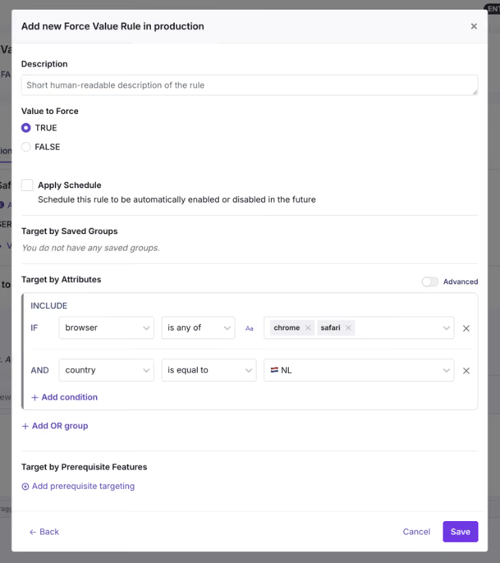
Here’s a list of attributes you can use in GrowthBook:
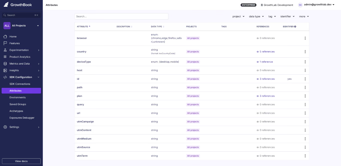
Even though targeting lets you choose a specific audience, it can’t tell you whether it actually works for them. The safest way to test that is to use a Percentage Rollout along with an experiment. Here, you define the percentage of users to run the test with and then monitor the metrics you need to see whether the feature improves or degrades them. You can do more granular targeting using Saved Groups or Prerequisite Features.
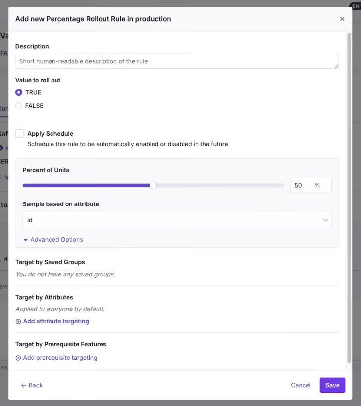
But if you roll out the feature while testing at every step, Ramp Schedules and Safe Rollouts are the best ways to do that. It uses a combination of percentage rollouts and observability to make that happen. A Ramp Schedule is a release plan you attach to a targeting rule, and at each step, all you have to do is define the percentages, timeframe, and approval workflows. GrowthBook automates the step-up on a timeline you define, so you don’t have to manually go back and ramp it up. If you attach guardrail metrics like error rates or latency spikes to it, it becomes a Safe Rollout (Monitored Ramp-up) where the rollout can be paused or reverted automatically if the metrics degrade.
For instance, if you’re monitoring the new booking flow feature, review metrics such as conversion rate and error rate before the rollout starts.
Step 3: Monitor the rollout and remove the flag
Once the feature flag and accompanying code go live, it’s time to monitor the rollout. This means the guardrail metrics you defined earlier have to be monitored. Here, you’ll do a percentage rollout and monitor performance at each stage.
Let’s say you’re monitoring error rates for a new booking flow. If you notice a spike at 10% rollout, you can revert to the old version immediately. If nothing goes wrong, move on to the next step of the rollout. Within GrowthBook, the platform monitors these metrics at every stage and pauses or reverses the rollout if they cross the defined thresholds.
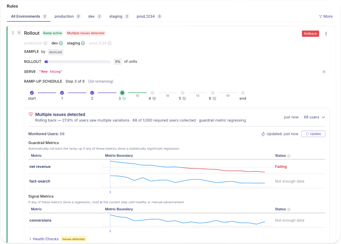
After you hit 100% with stable performance, archive the flag or remove it from your codebase.
How does governance work when deployments and releases are decoupled?
When you start decoupling your delivery process, you’ll contend with two questions:
- If any engineer can toggle a flag in production, what stops an accidental release?
- And if PMs own the release, what stops someone from exposing a feature that isn’t finished?
Both of these questions have one answer: approval workflows.
On platforms like GrowthBook, you get this built in, so every change is treated as a draft that eventually goes out for review. It only gets merged into production when the right person approves it. And the published versions “lock” because every time you make a change, the platform takes an immutable snapshot of the change. If any changes cause an issue, you can always roll back to the previous version, and that gets recorded in the audit logs too.
As a result, the staging process runs without interference, and you involve stakeholders only when the flag needs to go live.
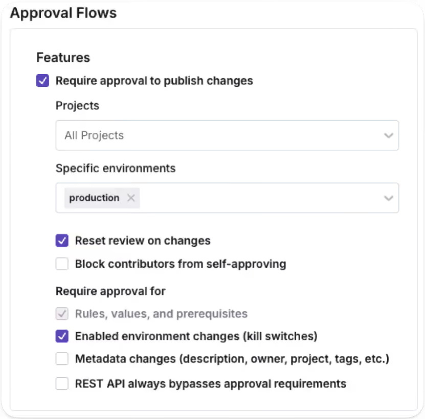
That said, the “who” changes as more organizations use AI to deploy and release features. You can now use AI coding agents to draft flag configurations and release plans programmatically through GrowthBook’s MCP server. Even though the agent handles the setup, a human stakeholder still approves them before anything goes live.
Note: GrowthBook blocks authors from approving their own requests, so you use the four-eyes principle by default. If someone edits a draft after approval, the review process is reset (unless you’re an admin).
What does the feature flag lifecycle look like?
The decoupling process doesn’t end when you hit 100% rollout. The full lifecycle runs through four stages:
- Deploy
- Release
- Expand
- Clean up
.avif)
We’ve seen that most engineering teams forget the fourth stage, which is the clean up. In fact, Uber built their own automated refactoring tool, Piranha, to clean up over 2,000 stale feature flags. It’s expected when you haven’t baked in governance during the deployment process. Your team keeps adding flags without removing them until something goes wrong.
In a nutshell, the control layer you added for safer releases becomes technical debt that increases risk.
Your “definition of done” should include clean-up, too. Once the feature serves 100% of users with stable metrics, it shouldn’t exist in your codebase. Either archive it or remove it altogether.
Platforms like GrowthBook automatically surface stale flags. If a flag is untouched for more than 2 weeks and is disabled everywhere or routes all traffic to a single variant, it’ll show up in the dashboard. You can use Code References to pinpoint exactly where it is in your codebase.
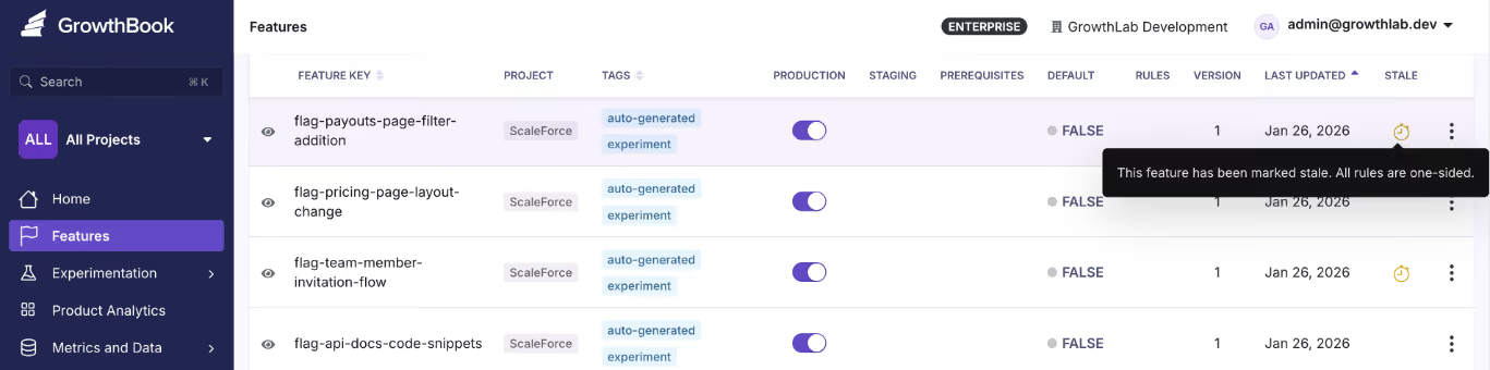
And then use the GrowthBook MCP server and ‘flag-cleanup’ GitHub skill to clean it up without ever leaving your AI agent’s interface. Once you’re done cleaning up the stale flags, document it and move on to the next release.
5 mistakes engineering teams make when decoupling deployment from release
Even though decoupling solves the issue of slow development, you still need strong governance in place to implement it effectively. Here are a few mistakes every engineering team should avoid while using feature flags for decoupling:
1. Leaving flags in the code indefinitely
It’s easy to create a flag, but it’s also just as easy to forget about it after you’re done releasing a new update or feature. The problem is that it’ll continue to quietly serve a single variant of the change to every user via a hidden conditional branch. That’s why you should continue to clean up stale flags once you’re done using them or at least every 90 days. Assign an owner and a removal date while you’re creating the flag to avoid this issue.
2. Skipping approval workflows in production
Without a proper approval workflow in place, there’s a good chance unauthorized users can create a flag that accidentally releases something. Gate production behind sign-off and let staging happen freely so that the risk lives in an environment where real users don’t experience the bug or a premature feature.
3. Using flags as permanent configuration
Feature flagging systems are usually built for even minor configuration changes, but the problem is that engineering teams assume that when they create the flag, they’ll eventually settle on one path and remove the other. In reality, that’s rarely the case. When you forget to clean up your flags or even switch off (if needed), that’s just not the case. That’s why we’ve seen incidents like the Knight Capital accidental trading glitch happen. If you are using feature flags as a permanent toggle, like with kill switches or toggles for location-based capabilities and plan-based tiers, mark it as permanent and document it. If it’s not permanent, it should have an expiry date.
4. Releasing without a rollback criterion
Before you flip the flag, define what “something went wrong” looks like for this specific feature. That means identifying the issues your users could experience and tying those issues to guardrail metrics that would degrade if the feature has problems. If you don’t, your users might experience severe app performance issues, while you won’t even know that something broke in production. Consider defining your guardrail metrics and their thresholds while creating flags, and use a Ramp Schedule (Safe Rollout) to monitor performance as you slowly ramp up the rollout.
5. Treating decoupling as an engineering-only win
Decoupling deployment from release is a cross-functional change, and that’s also why it’s a sociotechnical problem. In addition to engineers, even quality assurance (QA) teams and product managers are involved in the process, so each team needs to have the right level of access and visibility into the release. The goal is to give each team self-serve access to the data and controls they need. For example, product managers should be able to target segments and schedule releases, while QA teams should be able to monitor the metrics and roll back if needed. Ideally, you’re working with a platform that gives even non-technical users the right access to make changes without writing code.
It’s time to deploy continuously, but release features intentionally
Nobody decided to couple deployment and release. It was the default for the longest time, but that doesn’t mean it should continue to be.
You have tools like feature flags that help you decouple deployment from release successfully without breaking things. In fact, you can ship fast without breaking things. Deployment becomes a non-event, and release becomes a deliberate choice made by whoever’s closest to the customer.
That’s why the engineering teams that adopt feature flags improve deployment frequency while reducing change failure rates.
Curious how feature flags could improve your development process? Try GrowthBook for free today.
.avif)
Synthetic audiences meet real A/B tests at Principal Financial Group
Running an experiment is the easy part. The hard part is running one at a 150-year-old financial services company, where customer journeys stretch across months, risk tolerance sits near zero, and half the organization believes "we tried that years ago" settles the question.
That is the environment Erika Dunn works in every day. As assistant director of data science at Principal Financial Group, she built the company's experimentation center of excellence and, more recently, something most enterprise teams are still only reading about: synthetic digital audiences, built entirely in house, that just picked a winner in a live A/B test. On this episode of The Experimentation Edge, she walked host Ashley Stirrup through how it all works, and what experimentation leaders at any company can borrow from it.
Listen to the episode here.
From observational studies to clean 50/50 splits
Erika's path into experimentation started in quantitative psychology, which gave her the statistical grounding long before she had the corporate title. Her first job studied childhood obesity: observational work with no control groups, just trying to understand what happens when an intervention lands in the real world. At H&R Block, Adobe Analytics brought regular experimentation into the marketing space, and she realized the work she loved in her graduate program had a corporate career attached to it. Then came Amazon, where, as she put it, they can turn anything into an experiment. Eventually she landed at Principal, where she got to dig in and build her own center of excellence around a simple pair of questions: what is experimentation, and how do we share what it teaches us?
That range matters. Someone who has run studies with no control groups and clean web tests with 50,000 users in each arm knows exactly what rigor buys you, and what you lose without it.
When testing gets watered down
The biggest challenge Erika names is not tooling or statistics. It is vocabulary. In more than one company, she has watched testing get watered down as a concept, where "let's try out something" passes for an experiment even though nothing is controlled and nothing is compared. She is careful not to dismiss it: trying things means a team recognizes their ideas need contact with reality. But the difference between trying and testing is a control group, and getting people to appreciate the advantage of rigor takes time, intentionality, and sometimes money. Her core argument is that with just a little pre-planning, you get so much more out of every test.
The second enemy is tribal knowledge. Every organization has it: the insight that lives in one silo and never travels, or the confident claim that "we did that years ago." Ashley recalled a guest from Twitch who spent years being told pricing had already been tested and was off limits, until a rigorous retest showed a huge impact on the business. Erika hears the same pattern inside companies that are 60, 100, or in Principal's case 150 years old. Things change. The segment that ignored an offer three years ago is not today's segment, and a test that lost on the whole population may be a clear winner with high-revenue customers.
Her structural answer is a center of excellence where teams share experimentation wins and losses in one place. Losses are the important part. A visible record of what did not work, and when, is what turns "we tried that" from a conversation ender into a data point with a date on it.
Turning frustration into a metric
Erika's team supports Principal's marketing organization, where the goal is getting the right message to the right people across email and web. The data science advantage, as she describes it, is simple: come in with additional data, or help teams see the data they already have in a new way.
Two examples from the episode stand out. The first is content analysis. Her team broke marketing copy down with readability statistics, including reading level, sentence counts, nouns, verbs, and possessives, and correlated those features with how people responded. That gives content writers something concrete to think about beyond instinct.
The second is the looping metric, developed with her longtime collaborator Josh Ellington, who she is quick to credit. Built in SQL on top of existing web behavior data, it measures how many times a user winds up back at the same main page within tight time frames. When that ratio climbs, it flags desperation behavior: searching, backtracking, revisiting the same section over and over. The team confirmed the signal against session replay tools, and it holds. In tax services, looping predicts bounce. In finance, it predicts something quieter and more expensive: customers who slowly disengage from tools they find frustrating, dragging down engagement and retention over time.
The same discipline shows up in how the team handles assumptions. When they set a nine-second window between an email click and a website visit, it is because Josh dug into the data and found that is how long the trip actually takes. Not five minutes, because a lot can happen in five minutes, and the behavior you attribute across that gap may have nothing to do with your email. Keeping behaviors linked closely in time is unglamorous work, and it is the difference between data and noise.
Customers that look like your customers
The centerpiece of the conversation is Principal's synthetic digital audience program, which Erika describes, for better or worse, as completely Erika built. Drawing on her probabilistic Bayesian background, the system uses real customer data to drive a synthetic data normalization process, producing bell-curve populations of profiles that represent Principal's actual segments without using any real customer data. Each audience is tuned to a specific experimental space: the profiles look like the employer audience in that particular marketing domain, not like a generic average person.
The workflow is deliberately conservative. Before profiles are set loose on new material, they are trained on existing similar content so they replicate known response patterns. Then, through a gen AI process, the team asks each profile its likelihood of opening, clicking, or engaging with a piece of content. Partners can hand over 20 subject lines or banners and get back a ranked list. Teams that want to go wider can generate 50 AI-created variations and let AI duke it out against AI, without burning weeks of human review time.
Erika is precise about what the system does not do. It will not tell you what results to expect. It creates a priority process, narrowing a long list of ideas to the short list worth spending real traffic on. That distinction is what makes the program credible inside a risk-averse company, and it addresses two problems at once. It compresses time in a business where financial journeys are long and feedback is slow, and it creates a safe playground for teams whose tone has always been neutral to finally test new voices, new phrasings, and new content without betting a live campaign on them. As Erika puts it, an experimentation mindset requires that people cannot get punished for making mistakes. They need guardrails, and they need room to learn.
The first win, and three more in August
The credibility test came recently: the first traditional A/B test using a synthetic audience selection ran against a control, and it won. An earlier partner had already seen lift, but without a traditional test design, and Erika's team held their applause until the clean result landed. That partner, working with a small population and a small engagement window, had previously paid outside consultants without moving the needle. The in-house synthetic process is now outperforming that spend.
Three more tests launch in August, after a year spent helping teams across Principal build their audiences. The roadmap points toward agents: Erika sees synthetic audiences moving into agentic workflows, and more broadly, she sees AI helping teams answer the question she hears everywhere now that everyone finally has the data they asked for. We are drowning in information, so where should we experiment next? Her bet is that the next edge in experimentation is efficiency: agents that read your roadmap, your data, and your ideas, and point you at the gains you cannot see from deep in the weeds.
What this means for your experimentation program
Erika's playbook at Principal compresses into four moves any team can apply:
- Draw the line between trying and testing. A control group and a little pre-planning turn "let's try something" into an experiment worth learning from.
- Turn behaviors you already log into metrics. A looping metric built from existing web data found pain points no heat map had surfaced, and checked assumptions as basic as how long an email click takes.
- Use synthetic audiences to prioritize, not replace, live tests. Rank 20 ideas cheaply, then spend real traffic on the strongest, and confirm with a clean A/B lift before celebrating.
- Share losses as loudly as wins. A center of excellence with a visible record of failed tests is the only durable cure for "we did that years ago." None of this required buying a platform her company was not ready for. It required statistical rigor, creative metric design, and the patience to build trust one clean win at a time.
Ready to take control of your experimentation program? Listen to the full episode of The Experimentation Edge
From bottleneck to self serve: scaling experimentation at US Bank
Running an experiment is the easy part. The hard part is running hundreds of them when every request routes through one central team, every customer interaction carries regulatory weight, and even a one percent gap in coverage is unacceptable.
That is the reality Vijay Lal manages every day. As Lead Product Manager for Experimentation at US Bank, he sits at the intersection of marketing partners who want to test everything, engineers who have to keep a banking platform secure, and customers who expect their login page to work every single time. On this episode of The Experimentation Edge, he walked through how a regulated bank scales experimentation without sacrificing rigor, and what product managers everywhere can take from it.
Listen to the episode here.
The bottleneck every experimentation program hits
Vijay's experimentation career started in 2016 at Comcast, after a redesign project for MassMutual convinced him that customer experience was where he wanted to build. At Comcast he supported sales and marketing teams running tests for prospective customers at enormous scale, on traffic volumes so large the platform itself had to be upgraded, with Adobe Analytics and Adobe Test & Target underneath.
Six and a half years later he moved to US Bank, into a similar role in a very different industry. Financial services is more regulated than telecom, and the stakes of a broken experience are higher. When money is involved, nobody gets to shrug off an error.
The problem he found is one nearly every experimentation program recognizes. Demand for experiments outgrew the central team's capacity to run them. Marketing partners wanted to test at a volume that Vijay's team could never cater to alone. Most organizations respond by hiring, queueing, or saying no.
Self serve, with guardrails
Vijay chose a fourth option: make the platform self serve. In his words, why not make it so that anyone who does not know anything about technology can start using the platform and run experiments for customers?
That decision sounds simple. Executing it is not, and Vijay was clear about where the real work lives:
Step 1: Simplify the complex. An experimentation platform is not a simple tool. A friendly UI does not make experiment execution easy for people who are not proficient with the technology. The platform team's job is to compress that complexity into something a marketer can safely operate.
Step 2: Train continuously. Technology evolves every month. New capabilities, platform upgrades, tool changes. Self serve only works if the people using the platform stay current, so training is not a launch activity, it is a standing commitment.
Step 3: Attach responsibility to capability. Handing someone the power to put changes into a customer facing production environment is not a small thing. Every self serve user needs to understand the implications of what they ship, and guardrail metrics need to catch what they miss.
That last point is the one experimentation leaders should sit with. Democratization is not just access. It is access plus guardrails plus the knowledge of what the implications will be. Get all three right and a small central team can support an enormous testing program.
Every customer accounted for
The best story of the episode is about a login widget, and it shows what experimentation discipline looks like when the stakes are real.
US Bank's login widget historically loaded after the page finished loading. Vijay's team wanted it embedded, loading with the page, for a faster and cleaner experience. The complication: the login widget is one of the most secured components a bank has, because customers enter their user ID and password into it. Rebuilding how it loads meant working through security constraints, multiple technology partners, and an architecture where the component is delivered separately as an experience fragment.
Then testing surfaced a harder problem. For customers on slower internet connections, the embedded widget might not load properly. Most teams would look at the percentage affected and call it acceptable. Vijay's team did the opposite. In his words, every customer matters. Even if five percent of customers cannot see an experience, that is a big deal, and slippage of one or two percent is not acceptable.
The solution was elegantly simple: a fallback. Any customer whose page did not load within two seconds got a front end that looked the same, with the login widget displayed slightly differently, so it always worked. Every customer was accounted for in either control or challenger. No one fell through the cracks, the experiment stayed clean, and the security bar never moved.
There is a lesson here that goes beyond banking. Your users are on fast connections and slow ones, new devices and old ones. An experiment that only works for the top deciles of performance is not a complete experiment. Designing the fallback is part of designing the test.
Hypothesis first, metrics second
The third theme of the conversation is about how experiments get measured, and Vijay drew a sharp line between two approaches.
The traditional approach: a leader wants to run an experiment or ship a product, and a KPI gets attached to justify it. The modern approach: every experiment starts with a hypothesis, and the hypothesis drives the metrics. Not one metric in a silo, but a primary KPI for the immediate behavior, such as engagement on first visit, paired with secondary KPIs for what happens later, such as whether the customer is still engaged when they return.
Why does the order matter? Because metrics without a hypothesis can tell you what happened but never why. Vijay's example: data analysts can see customers rage clicking on a page and revenue falling. What the dashboard cannot say is that the button is disabled and the customer expects it to work. The hypothesis is what connects the number to the behavior behind it.
This also connects to a point Ashley raised about metric distance. The further a metric sits from the feature, the more noise other factors introduce. A North Star metric like revenue matters, but the experiment needs a goal metric close to the feature's immediate behavior, plus guardrail metrics to catch degraded experiences across segments, devices, and platforms that a topline average would hide.
What this means for your experimentation program
Vijay's approach at US Bank compresses into four moves any team can apply:
- Make the platform self serve so your central team stops being the bottleneck for testing velocity.
- Pair capability with guardrail metrics so non technical users can ship safely to production.
- Design for every customer, including the slow connections and edge cases, with fallbacks built into the experiment itself.
- Start from the hypothesis, then derive a primary KPI and secondary KPIs, rather than letting a leader's preferred number define the test. None of this requires a bank's budget. It requires treating experimentation as a product with users of its own, and treating rigor as non negotiable even when only one percent of customers is on the line. Especially then.
Ready to take control of your experimentation program? Listen to the full episode of The Experimentation Edge
Why migrate from Statsig to GrowthBook
GrowthBook is the industry's only open-source, warehouse-native experimentation platform, giving you predictable pricing, full data ownership, and results you can verify. Here's why Statsig customers are switching to GrowthBook.
Statsig has changed hands twice in eight months. OpenAI acquired the company in September 2025, and founder Vijaye Raji became OpenAI's CTO of Applications. In May 2026, Amplitude took over the Statsig brand and customer base, while the engineering team that built Statsig stayed at OpenAI.
Statsig isn't the same company today that it was a year ago. We're hearing questions about who owns the roadmap, whether experimentation will stay a high priority within a broader analytics and self-improving product company, and who'll handle support with so many product experts gone. Amplitude has published a phased plan to converge the two products, which answers some questions and opens more. Whether to sign on or renew with Statsig is an open question for teams now.
GrowthBook is where many of them land. This post explains what GrowthBook offers, what the migration looks like in practice, and how to decide whether GrowthBook compared to Statsig makes sense for your team.
What is the GrowthBook open-source platform?
GrowthBook is an open-source feature flag, experimentation, and product analytics platform. It is the original warehouse-native platform, trusted by more than 3,000 companies, including Dropbox, Khan Academy, Upstart, Sony, and Wikipedia. It handles over 1 trillion feature flag lookups per day.
The warehouse-native architecture is the defining design choice. Rather than copying your data into its own system, GrowthBook queries your data where it already lives — Snowflake, BigQuery, Databricks, Redshift, ClickHouse, Postgres, and more. Analysis runs in your warehouse with read-only access. Every SQL query is visible. Every result is reproducible.
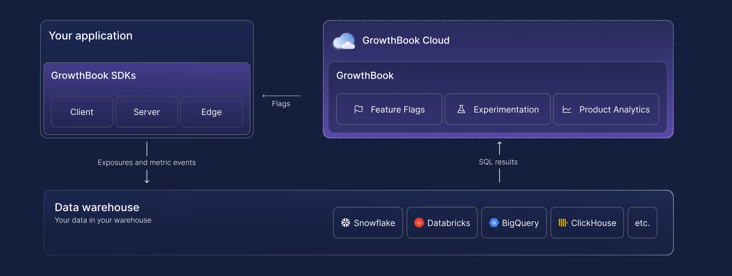
That's the short version. The longer version explains why it matters when you're evaluating a replacement.
4 reasons product and engineering teams switch from Statsig to GrowthBook
1. Statsig's ownership, roadmap, and support have changed
Statsig is now a brand and customer base inside Amplitude, running on a perpetual non-exclusive license to tech whose original engineering team stayed at OpenAI. Amplitude has committed to maintaining it and published a plan for the product. That may work out great. But, it's a different plan than most Statsig customers made a bet on, so teams are asking about the roadmap, whether experimentation stays a priority in the broader company, and whether support relationships survive with the same quality.
GrowthBook is independent and remains focused on feature flagging and experimentation. We can't promise who will own us in ten years, but our core is MIT licensed, so every version you deploy stays yours to run and modify.
And because GrowthBook queries your warehouse with read-only credentials instead of ingesting your events, your event history and experiment data already sit in infrastructure you control. There is nothing to extract if the relationship ends. Raw PII never leaves your environment either, which for teams under GDPR, HIPAA, CCPA, COPPA or data residency requirements is operational, not philosophical. Self-hosting goes further, with zero external data egress and air-gapped deployments available for the most sensitive environments.
John Resig, Chief Software Architect at Khan Academy, described exactly this concern: the ability to retain data ownership was, in his words, "very, very important," because most platforms require passing user data to a third-party service.
2. Statsig is expensive to scale
Statsig prices on events and traffic. That structure makes sense when you're running a handful of experiments on modest traffic. At scale, it penalizes the behavior you want to encourage: more experiments, more feature flags, more coverage.
Teams using Statsig often end up managing their experimentation volume to manage their bill — sampling down traffic, avoiding flagging minor changes, skipping experiments on low-stakes features. That's the opposite of a healthy experimentation culture.
GrowthBook uses per-seat pricing. A team that runs 10 experiments a month pays the same as one running 100. Feature flag evaluations don't generate a cost event. The experimentation ROI calculator can model your specific usage to show expected savings.
3. Statsig has limited visibility into underlying results
Statsig's statistics engine is proprietary. You can see the outputs, but not the logic that produced them. When a result is surprising, your options for investigation are limited to the interfaces Statsig exposes.
GrowthBook's engine is fully open source on GitHub (8,000+ stars). Every calculation is inspectable. Every query is visible in your warehouse. If a result looks off, you can drill into the underlying SQL, check the raw data, and confirm or refute the calculation on your own terms.
Diego Accame, Director of Engineering at Upstart, put it this way: "Our strength is as an AI-powered lending marketplace, not an experimentation framework company. GrowthBook lets us focus our resources where they matter most — on growing our core business."
That confidence comes partly from owning the infrastructure and partly from being able to verify what the infrastructure is doing.
4. Statsig has limited statistical depth
GrowthBook supports Bayesian, frequentist, and sequential testing, with CUPED variance reduction and post-stratification. Statsig supports a similar range, but without post-stratification and the ability to inspect or reproduce the calculations.
For data science teams that care about methodology — particularly at companies where an experiment result drives a significant product or business decision — the ability to validate the math is a meaningful advantage.
See GrowthBook before you switch
Join a live demo to see flags, experiments, and warehouse-native analysis working together before you plan your move.
Pick a Demo DateHow to migrate from Statsig to GrowthBook
GrowthBook ships a migration kit specifically for Statsig customers, including an AI-powered assistant that can transform your existing codebase.
Here's what migrates:
Projects, teams, and tags carry over cleanly, preserving your workspace organization so teams can keep working without rebuilding their context.
Feature gates from Statsig map to GrowthBook feature flags, which support multiple environments, targeting rules, gradual rollouts, and instant kill switches.
SDKs migrate automatically. The AI migration assistant points at your codebase and handles the transformation — feature gates, dynamic configs, and user attributes converted to GrowthBook equivalents. JavaScript, TypeScript, and React are supported today, with more coming.
This is the step that usually takes weeks; the assistant reduces it to minutes.
Experiments transfer, including past experiments run on Statsig. You can generate custom reports from past Statsig experiments in GrowthBook, which preserves institutional knowledge.
Targeting rules transfer with full visibility into conditions and rollouts. GrowthBook includes debugging tools that simulate flag values for specific audiences, making it straightforward to verify that migration behavior matches pre-migration behavior.
Safe rollouts remain a first-class concept. GrowthBook supports gradual exposure with automatic monitoring of guardrail metrics, so regressions trigger alerts before they reach your full user base.
The SDKs themselves don't require replacement during migration. If you're moving from Statsig cloud to GrowthBook cloud, or from Statsig to self-hosted GrowthBook, your feature flag configuration and experiment setup carry over without requiring SDK changes or redeployment of your application code.
The full GrowthBook platform you're migrating to
Migration is the starting line, not the finish line. Here's what GrowthBook offers beyond Statsig feature parity.
Feature flagging that doesn't cost per evaluation
GrowthBook's feature flags run through zero-network-call SDKs. The SDK downloads a payload at startup and evaluates flags locally, so each flag evaluation adds sub-millisecond latency without generating a billable event. You can flag every feature in your product — including low-traffic, experimental, and internal-use features — without worrying about cost.
GrowthBook supports 24+ SDKs: JavaScript, React, React Native, Node.js, Python, Ruby, Go, PHP, Java, Kotlin, Swift, and more. The Chrome debugger lets you inspect flag state and experiment assignment in real time without touching application code.
Experimentation with SQL you write and own
GrowthBook's metric system is SQL-first. You write metrics using your warehouse's SQL dialect, join against any tables in your schema, and apply whatever business logic your team uses. A metric for revenue per activated user might join your experiment assignment table to your payments table to your activation events — all using the same logic your data team uses everywhere else.
Forgot to add a metric before an experiment started? Add it retroactively. The data is already in your warehouse. Just define the metric and run the analysis against the historical assignment data.
Metrics can be standardized in a library, enabling every team to measure success consistently. They can be scoped to specific experiments or applied globally as guardrails.
Deployment on your terms
GrowthBook Cloud runs on AWS with automatic updates, encrypted data at rest and in transit, 99.99% uptime SLA at Enterprise tier, and SOC 2 Type II, ISO 27001, GDPR, COPPA, and CCPA compliance.
GrowthBook Self-Hosted runs on your infrastructure, choose any major cloud provider or on-premises, deployed with Kubernetes or any container platform. Same codebase. Same features. Same development roadmap. The only difference is who manages the infrastructure.
Many teams start on GrowthBook Cloud for the fastest path to running experiments, then migrate to self-hosted when compliance requirements or internal policy require it. GrowthBook's SDK and configuration structure don't change in that migration, so the transition preserves everything you've built.
If you don't have a data warehouse yet, GrowthBook's Managed Warehouse gives you a fully functional environment immediately, with the option to migrate to your own warehouse at any time.
AI-ready experimentation
Three of the five leading AI infrastructure companies use GrowthBook to test and optimize their products. The platform handles the non-deterministic, high-variance nature of AI feature testing well.
- Sequential testing reduces false positives
- CUPED variance reduction accelerates decision-making
- Fully custom SQL metrics capture what matters for AI outputs (task completion, output acceptance, engagement depth) rather than just clicks
The other half of AI readiness is whether your agents can operate the platform, not just whether the platform can test AI features.
With GrowthBook 5.0, we shipped 25 open-source agent skills covering flags, experiments, and product analytics. Each is a readable Markdown playbook for a single task (flag-create, flag-ramp, experiment-design, experiment-analyze), so an agent follows your order of operations instead of inventing its own. They install through your agent's plugin system and run without an MCP server. A rebuilt CLI covers 100% of the REST API, and the MCP server is there for Cursor, Claude Code, and other MCP clients that want it.
The part that matters for adoption is what happens when an agent gets it wrong. Agent changes land as drafts for a teammate to review rather than as live tests, inside the same approval policies and audit trail your team already uses. Deletes take two steps. Analysis skills are read-only. And you can read any skill before you run it, then fork it if your review process differs.
Getting started for free
You can evaluate GrowthBook without a contract or commitment. The migration kit, including the AI-powered SDK migration assistant, is available immediately.
The practical starting path for most teams:
- Connect GrowthBook to your data warehouse. Pre-built SQL templates get you to first results without custom data engineering. Customize from there.
- Run the AI migration assistant against your codebase. It transforms Statsig feature gates to GrowthBook equivalents and generates a diff for your team to review.
- Import your Statsig experiments. Historical results carry over so you don't lose the record of what you've learned.
- Start your first GrowthBook experiment. The Chrome debugger and visual editor make the first experiment accessible to non-engineers.
The decision to switch to GrowthBook
If your team depends on Statsig and the OpenAI and Amplitude acquisitions raise questions you can't yet get answered, about roadmap continuity, company priorities, and who supports you through a transition, then GrowthBook is the switch that costs the least to evaluate and offers the most structural independence.
Open source lets you inspect and audit what you're running. Warehouse-native architecture gives you data ownership that doesn't depend on a vendor relationship. Per-seat pricing gives you the freedom to run more experiments without watching a meter.
The migration kit makes the practical barriers manageable. The question is whether the reasons to switch outweigh the friction of switching. For most Statsig customers evaluating the post-acquisition landscape, that math is becoming clearer.
Ready to get started?
Read the GrowthBook vs. Statsig comparison →
Plan your Statsig migration
Book a demo to map your Statsig flags and metrics to GrowthBook and plan the switch with our team.
Book a Demo
Farfetch's case for building your own experimentation platform
Buying an experimentation tool is the easy part. The hard part is admitting when that tool costs more than it teaches you.
Luis Trindade has watched that math play out from the inside. He joined Farfetch twelve years ago as employee 700, just as the luxury marketplace opened its second tech hub in Lisbon. The company grew to 7,000 people worldwide, was acquired by Coupang, and refocused on the marketplace that connects luxury boutiques and brands to customers in markets Amazon has tried and failed to crack. Through all of it, Luis built the experimentation program that now runs a couple hundred experiments a month in low season, on a platform Farfetch built entirely in house.
On The Experimentation Edge, Ashley Stirrup asked Luis how that happened and what it cost. The answer is a case study in build versus buy, and in the difference between owning a testing tool and running an experimentation program.
A hybrid setup that stopped making sense
Early Farfetch looked like most companies at hyper growth. Engineering ran tests on a tool it had implemented itself. Marketing used an external vendor because that was the tool it could get access to. Some teams did not know experimentation capabilities existed at all.
"How could we make sure that we talked the same language all as a company?" Luis asked. His answer was organizational before it was technical. Farfetch stood up an experimentation center of excellence, but rejected the standard version of one from day one. "Let's wait for somebody to ask us to execute for them and deliver just the results. I never believed on that," he said. The center would enable teams to run their own experiments, not run experiments for them.
On the engineering side, that meant Fabs, the Farfetch A/B testing system. Split engine, setup engine, stats engine, all built internally, layered on top of an omni-tracking system designed to follow a customer across web, app, and even into physical boutiques. For a while, Fabs ran alongside the external vendor that marketing used, a hybrid arrangement many companies would recognize.
Then the bill for the hybrid came due. The injected JavaScript hurt page performance. The results were inconsistent. And the team was already doing rework to pull data back internally for the deep dives the vendor could not provide. "Especially with tools that are based on JavaScript and code injection, they break a lot," Luis said. "They create inconsistent results." For a tech heavy company at Farfetch's maturity level, the external tool had become pure overhead. They phased it out and consolidated everything on Fabs 2.0.
One door for every experiment
The most distinctive choice in Fabs 2.0 is architectural. Farfetch's feature toggling system is the only entry point for running an experiment at the company. Every test, from any team, goes through it.
This is not a typical feature flag setup with on and off key values. The toggling system is deeply interconnected with Farfetch's segmentation service, benefits service, and user systems, which means teams can define exactly who sees what and when, then connect that definition to a randomized split. It also plugs into the CMS, the recommendation system, and the messaging systems, so marketing and content teams run their own experiments with full control and zero code injection.
The single door did more than clean up the architecture. It gave every team the same language. A single hypothesis template is used across the company. Weekly experimentation clinics, which Luis describes as group therapy sessions, put hypotheses in front of peers to be challenged before they ship. A monthly test and learn session opens the results to everyone from junior developers to C level executives. New joiners upskill just by sitting in the room.
That is where the center of excellence spends its effort now. The central team has shrunk over time while experiment volume keeps growing, and Luis considers that the point. "Practices, for you to be good, you need to practice, practice and repeat," he said. Roughly 80 percent of his time goes to enablement: ceremonies, coaching, and the shared knowledge base of learnings.
The metric Farfetch refuses to manage by
Ask most experimentation leaders about their win rate and you will get a number. Ask Luis and you get a shrug. "Oh, what is your winning rate? We don't even track it," he said. It exists on a dashboard somewhere. Nobody manages by it.
Instead, Farfetch rebranded the outcome of every experiment, in the tooling itself. The question is not whether a test won or lost. It is whether the team was able to learn from it, yes or no. "A failure is actually a test that was badly set up, wrong metrics, created many biases like sampling biases," Luis said. "That was a failure test. All the other tests are opportunities to learn."
The target that follows is unusual: a learning rate of 100 percent, meaning zero failed tests. A disproven hypothesis is not a failure. It is money the company did not spend on an idea that was not worth pursuing, and teams are encouraged to announce that proudly.
The reframe matters because it changes what people are willing to test. When losing counts against you, teams protect safe hypotheses. When learning is the metric, they bring their riskiest, most interesting ideas to the clinic.
Two years to beat the market leader
The hardest test of that philosophy came from Luis's own area. Farfetch was paying the world's leading recommendation engine vendor while sitting on a lake of behavioral data the vendor could never fully use. Strategically, the company wanted the dependency gone. So the team built its own engine, called Inspire.
"Surprise, at the beginning, it was completely losing against the world leader of recommendations," Luis said.
A strict fail fast reading says kill it. Farfetch did not, because the vision was strategic rather than tactical. What the team refused to do was run the bet blind. Every additional dollar spent on Inspire had to be justified while the vendor contract was still being paid, so the team ran hundreds of small, quick, directional iterations: A/B tests where volume allowed, quasi experiments where it did not, qualitative insight wherever it sharpened the picture.
"We all have a tool belt of experimental tools that you can use. All of them are valid," Luis said. "We just need to understand the different capabilities of them and their limitations."
Around the halfway mark of what became a two year effort, the tide shifted. Inspire started winning. Farfetch increased its investment, phased out the vendor, and today the engine powers recommendations across the business. Even accounting for full maintenance costs, the economics compensated.
"Strategy is key when we are doing experimentation," Luis said. "But at the same time, we need to do it in multiple and small, quick learning iterations." Keep the vision fixed. Let the iterations decide the path.
When building is the right call
Luis is not dogmatic about building. His own caveat: "I would not recommend to do this for a company that is not core for them to have a tech team." Farfetch is a product and technology company by DNA, with the maturity to maintain a statistical engine, a tracking layer, and a toggling system as first class products. For a company without that core, the same decision could be a costly mistake.
The honest version of build versus buy is not about features. It is about whether the platform is strategic to your business, whether you have a data advantage to exploit, and whether the hidden costs of an external tool, in performance, control, and rework, exceed the visible cost of engineering time.
Steps to take from Farfetch's playbook
- Audit what your external testing tools actually cost. Count page performance, inconsistent results, and every hour spent pulling your own data back for analysis.
- Route every experiment through one entry point. A single door creates a single language, and a single language is what makes learnings transferable between teams.
- Measure learning rate, not win rate. Define failure narrowly as bad experimental design, and celebrate disproven hypotheses as avoided spend.
- Give strategic bets a longer clock. Use quick directional iterations to decide whether to keep investing, and reserve fail fast for tactics, not vision.
- Spend your central team on ceremonies, not execution. Clinics, shared templates, and open review sessions scale further than a service desk ever will.
Sample ratio mismatch (SRM): how to identify the root cause and decide whether to restart your experiment
The experiment you spent weeks making the case for is finally live. It runs its planned two weeks, the treatment comes out ahead, and you open the results to write up the win. At the top of the page sits a warning: sample ratio mismatch detected.
That sample ratio mismatch (SRM) warning means the observed traffic split doesn't match the one you configured, and until you know why, you can't trust the experiment results.
Diagnosing an SRM is much harder than detecting it. The root cause can sit anywhere from assignment to how the data gets processed and analyzed. This article covers the 5 types of SRM and how to prevent them, then walks through the investigation step by step: how to isolate the cause and how to decide if the experiment can be saved.
What is sample ratio mismatch, and why does it matter?
A sample ratio mismatch is a statistically significant gap between the traffic split you configured and the split your experiment produced. If you implemented a 50/50 test and the realized allocation is far enough from 50/50 that chance can't explain it, you have an SRM. For example, if a 50/50 test with a few thousand users in each arm comes back 45/55, that gap is far too large to be chance.
Even the most mature experimentation programs experience SRMs. For example, roughly 6% of experiments at Microsoft had SRM issues and LinkedIn has reported rates around 10% for some kinds of experiments.
Random assignment is what makes an A/B test valid. It guarantees the groups are comparable, so a metric difference can be attributed to the treatment rather than to who ended up in each group. Whatever caused the mismatch added or removed users non-randomly, which introduces bias.
For example, a slower treatment loses users who bounce before the exposure event fires. Those impatient users drop out of the treatment group, but their counterparts stay in the control group. The treatment group is left with more patient, engaged users than the control, so its metrics look better even if the treatment didn’t have an effect. The result is a false positive.
A chi-squared goodness-of-fit test detects an SRM by comparing the observed unit counts to the expected ones and returning a p-value, the probability of seeing an imbalance this large or larger if the samples were randomized correctly. GrowthBook runs this check automatically on every experiment. The test tells you an SRM exists. The rest of this guide is about finding out why.
The 5 types of sample ratio mismatch
Every SRM traces back to one of 5 types. This grouping is based on the taxonomy from a 2019 study of experiments run by four companies, which classified SRM root causes by the experiment stage where they enter. The diagnostic steps below tell you which type you have.
1. Assignment SRMs
With assignment SRMs, the randomization assigns users to variations in the wrong proportions, before any data is collected. Causes include a biased randomization function, eligibility criteria applied unevenly across variations, a hash attribute (the identifier used for bucketing) that's empty for some users, and 2 concurrent experiments whose bucketing isn't independent (users from one arm of the first test cluster into one arm of the second). Running an A/A test on a new experiment surface catches most of these before a real experiment depends on them.
2. Exposure logging SRMs
When users are assigned correctly, but not all of them get recorded, you have an exposure logging SRM. This is one of the most common types of SRM, because assignment often happens server-side while the tracking event (in GrowthBook, the SDK's `trackingCallback`) fires client-side. Because bots, ad blockers, and users who bounce before a page loads often prevent tracking code from executing, some users are assigned to an experiment but never recorded. This creates a data imbalance (SRM) if the experiment’s variations cause these issues at different rates. For example, a slower variation loses more users to bounces before the tracking event can fire. Firing the exposure event from the backend, before any variation-specific code runs, is the most reliable way to prevent this.
3. Analysis and filtering SRMs
The data is collected correctly, but the analysis drops users unevenly, usually through a filter such as an activation metric, which limits the analysis to users who reach a certain event. If the treatment changes who reaches that event, the filter removes more users from one arm than the other. Choosing activation metrics the treatment can't influence prevents most of these.
4. Data processing SRMs
The exposure data is right and the analysis is configured correctly, but rows for one variation get dropped or duplicated in the pipeline, by a faulty join, a deduplication step, or bot filtering. Monitoring how many units each join and filter drops per variation catches these early.
5. Interference SRMs
Someone or something acts on the running experiment itself. A variation's traffic percentage gets changed mid-run, an internal team assigns itself into a variant, or an attacker submits injection strings through a form field that gets recorded in your telemetry, corrupting events in whichever variation they were assigned to. Alerts on changes to running experiments prevent most interference from your own team.
How to identify the root cause of an SRM
Identifying the root cause of an SRM is a process of systematically ruling things out. Each step below eliminates one or more causes or points directly at the culprit. Go through each step in order, because each result tells you what to look for in the next step.
Step 1: Confirm the SRM is unexpected
Not every SRM warning points to a data-quality problem. There are 2 configuration issues you can try and rule out right away.
Check that your metric matches the assignment grain
An SRM warning can be caused by metric choice rather than the experiment. A metric needs to be built at the grain you randomized, meaning its denominator counts the same unit, and it uses the same identifier.
Sessions per user, for example, is fine in a user-randomized experiment, because the denominator is users, and users are what the randomization balanced. Conversion rate per session is not, because its denominator is sessions, a unit the randomization didn't balance. A variation that changes how often visitors return generates more sessions in one arm. The session counts diverge for a legitimate reason, but the divergence still triggers an SRM warning.
The same thing applies to identifiers. Randomization only balances the specific identifier you use for hashing. If your metric relies on a different identifier, it may count units that weren’t part of the original randomization. For example, if you randomize by user ID but your metric tracks anonymous ID (common for pre-login events), a single user could map to multiple anonymous IDs. Since these IDs aren’t guaranteed to split evenly across variations, your groups will be imbalanced.
In either case, you need to rebuild the metric on the unit you actually randomized and rerun the analysis.
Check whether the experiment was altered mid-run
Editing the assignment ratio or targeting, or starting a new phase without re-randomizing, can also cause the imbalance on its own. If that's what happened, there are 2 solutions, and the choice depends on the data collected before the change:
- End the analysis at the point of the change: Choose this option when the truncated experiment still satisfies your experimental design. Cutting an experiment short can violate the experimental design in ways that bias or weaken the result. For example, ending mid-week introduces day-of-week bias, an incomplete business cycle changes which users you capture, and a smaller sample can leave the test underpowered.
- Re-randomize and restart the experiment: This is the only solution when the data collected before the change doesn't satisfy the experimental design.
If the metric matches the assignment grain and the experiment wasn't altered mid-run, the imbalance is unexplained. Move on to the next step.
Step 2: Determine whether the SRM is isolated or systemic
An SRM can be systemic or specific to one experiment. It's systemic when other live experiments show SRM warnings at the same time, or when an A/A test (an experiment that serves the same experience to both arms) shows one. Systemic problems live in infrastructure shared across experiments, such as the assignment system, the tracking code, or the data pipeline. Comparing experiments identifies systemic problems much faster than debugging a single experiment. GrowthBook runs the same SRM check on every experiment, so checking your other recent experiments for warnings only takes a few minutes.
- Several experiments show an SRM at once: The cause is likely in shared infrastructure, not in any single experiment, so start the investigation there. The 2019 study describes a bug in Microsoft's assignment service, which randomized users into 1,000 buckets that each held 0.1% of traffic. The bug gave the control one bucket fewer than the configured split called for, so every 50/50 test on the platform ran at 49.9/50. An A/A test surfaced it.
- Only this experiment shows an SRM: The cause is local to this experiment's setup, data, or treatment. Continue to the next step.
Step 3: Read the severity and direction of the SRM
Severity describes how far the observed split sits from the one you configured, and direction describes which arm is missing units. In GrowthBook, the Health Tab's balance check shows observed and expected units side-by-side for each variation so you quickly identify both.
- The imbalance is small but statistically significant: The cause is likely narrow, like a bug that affects a specific browser or a brief tracking outage.
- The imbalance is large: Causes this big tend to be structural, like a redirect that fails for a whole variation or a tracking event missing from one code path.
- The treatment arm is short: Treatment users are being lost before they're counted. This usually means an exposure or performance problem, like a slower variation where users bounce before the tracking event fires.
- One arm is at or near zero: The exposure event or trigger isn't firing for that arm at all, and there is probably a telemetry problem that needs to be fixed.
Step 4: Pinpoint when the SRM started
The timing of the imbalance separates causes that were present at launch from causes that arrived later. GrowthBook's Health Tab plots units by the date they were first exposed.
- Present from day one: Assignment or exposure logging broke before anyone entered the experiment.
- Appears mid-run: Something changed partway through the experiment. Check for things like a targeting change, a delayed variation start, or a change to the data source behind the experiment.
- Strongest on day one, then fades: A rollout effect is usually the cause here. For example, one variation starting a few hours late or cached pages serving the old experience until the cache expires. Users who joined the experiment during that window end up in one arm disproportionately, but the gap closes as more units accumulate.
Step 5: Segment the data to localize the SRM
Many SRMs can be localized by comparing data: the filtered analysis against the unfiltered exposure counts, and the population broken down by segment. Use what you learned in the previous investigation steps to decide where to look first.
- The SRM appears only in the triggered or filtered view, not in the unfiltered exposure counts: The filter is likely the cause and the problem is in the analysis. Activation metrics that sit downstream of the treatment are a common culprit, because a slower or heavier variation can reduce how many users reach the activation event.
- The imbalance originates in one dimension: The cause is something that varies with that specific population rather than the experiment as a whole. For example, if one browser has an SRM while the rest are fine, you probably have an implementation bug in that browser. GrowthBook's Health Tab makes it easy to break units down by the dimensions you’ve defined.
Most dimensions have typical causes to check for:
- Browser: Ad blockers or tracking-prevention features block the exposure event in that browser.
- Device: An SDK bug affects one app version, or slower devices lose users before the event fires.
- Region: Consent requirements suppress tracking for some users, or bot traffic concentrates in one geography.
- Channel: A campaign link sends users directly into one variation, bypassing randomization.
- New vs. returning users: An imbalance concentrated among returning users points to a feedback loop, like a treatment that changes how often users return and re-enter the experiment.
- Login status: Signing in mid-experiment switches a user from an anonymous ID to a user ID, which can hash into a different variation, so the user is re-assigned, double-counted, or removed by the multiple-exposure filter, which excludes users who were seen in more than one variation.
The login-status case only skews the split when the treatment changes how often users sign in, like a checkout that requires an account. With an uneven split like 90/10, the multiple-exposure filter compounds the loss. A re-evaluated user from the small arm usually lands in the large arm and gets removed, while large-arm users mostly re-hash into the same arm and are never flagged.
Localizing the SRM also tells you which subject matter expert in your company to reach out to, because they can often explain what happened faster than further analysis will. For example, if there are more organic search visitors in one variation of a URL redirect test, your SEO manager may know that Google indexed that variation's URL, so searchers land on it directly, bypassing randomization. Or if an imbalance is limited to one app version, the lead engineer can quickly check if a recent release affected exposure logging.
Step 6: Compare performance and engagement metrics
Comparing performance and engagement across the arms separates a treatment-driven difference from an instrumentation one. In GrowthBook, if you track load time or errors as guardrail metrics, they will be visible alongside your goal metrics in the results table.
- The treatment arm is short with worse load times, or long with better ones: The treatment's performance change is altering who gets recorded, causing selection bias. A variation that adds 800ms of load time loses its most impatient users before the exposure event fires, while one that gets faster gains users instead. Either way, the two groups are no longer comparable.
- Engagement per user differs between arms: The direction tells you who is missing. A higher average in the short arm means less-engaged users are being lost, which points to bounces or tracking loss. A lower average means the most-engaged users are being removed, which points to filtering, like a bot detector catching heavy users.
Step 7: Inspect the data pipeline
If nothing upstream explains the imbalance, the cause is likely in the data pipeline itself. Between the raw tracking events and the results table, the data passes through steps that join, filter, and deduplicate it, and any of those steps can drop or duplicate rows for one variation. To locate the faulty step, count the units per variation after each one. The first step where the split becomes imbalanced is the one introducing the SRM. In GrowthBook, the experiment assignment query defines how units are counted, so start there.
- Your own count doesn't match the platform's: Counting units per variation directly from the raw events table checks every filter, join, and date window your experiment platform's queries apply. If your count is balanced and the platform's isn't, the bug is in those queries. If your count is imbalanced too, the loss likely happened before the warehouse, which points back to exposure logging.
- The split is balanced entering a step and skewed after it: The imbalance is entering at that point in the pipeline, so inspect the step's logic directly. For example, if the raw exposure events are balanced but the counts skew after a join that stitches anonymous IDs to user IDs, that join is dropping or duplicating rows for one variation. This is the login-status pattern from Step 5, seen at the query level.
- Records that failed to join skew toward one arm: An inner join drops rows with no match on the other side, and nothing in the output indicates it happened. If the dropped rows come disproportionately from one variation, that asymmetric loss is likely the cause of your SRM. Filters deserve the same scrutiny. Count how many units each filter excludes from each variation and check whether the exclusions are balanced.
- The identifier in your queries doesn't match the hash attribute your SDK randomizes on: The units being counted are not the units that were assigned. This is the same mismatch from metric check in Step 1, seen from the warehouse side instead. GrowthBook's Multiple Exposures warning will usually appear alongside the SRM warning when it happens.
How to decide whether to restart your experiment
Once you've identified the cause of your SRM, there are 3 possible outcomes: recover the result, restart the experiment, or salvage a directional insight. Which outcome applies depends on whether the correct data exists and whether the treatment itself changed which units were counted.
Recover the result
If the raw events were logged correctly and a processing step created the SRM, you can fix that step, rerun the analysis, and keep the result. A bot filter that removed real users, a faulty join, or a misconfigured analysis filter all fall into this category. The 2019 study describes a case just like this where an SRM was traced to a bot filter that had removed the most-engaged treatment users. Once the filter was corrected, the experiment showed a statistically significant win, and no rerun was needed.
Restart the experiment
If the correct data was never captured, or the treatment changed the underlying population, no reprocessing brings the lost units back, and you have to restart. An exposure event that never fired for one arm, or a slower variation that lost users from one arm faster than the other, both leave you with groups that aren't comparable. Before you restart, fix the root cause first and re-randomize with a new salt (the value that seeds the hashing function). In GrowthBook, that means creating a new phase with re-randomization or starting a fresh experiment, so users from the first run are independently reassigned instead of carrying their old assignments forward, which would introduce carryover bias. You’ll also want to restart when the imbalance is severe and the cause remains unidentified because with an unknown bias direction, neither a win nor a loss can be trusted.
Salvage a directional insight
If the cause is unrelated to user characteristics (like an issue with how units were allocated to buckets), or external and time-bounded (like a one-day bot spike that doesn't coincide with the movement in your metrics), you can sometimes treat the result as directional evidence. Document your reasoning before making decisions on any SRM-affected number so readers know it’s directional.
SRM diagnosis table
Every row below maps to a step or decision above, so you can either follow the investigation in order or jump to the observation that matches what you're seeing.
How GrowthBook helps you find and fix SRMs
GrowthBook's experimentation platform automates several of the steps in this investigation. Every experiment gets an automatic SRM check, so you learn about an imbalance without having to run the test yourself. The Health Tab covers 2 of the quickest steps directly: traffic over time to see when the imbalance started, and traffic by dimension to identify which segment is affected. A Pre-Exposure Bias Check flags when the groups already differed before the experiment started, and Multiple Exposures detection surfaces the hash-attribute mismatches that often cause SRMs. These run alongside a larger set of data quality checks that run on every analysis. When you've found the cause of an SRM, the troubleshooting guide provides guidance on how to address the most common ones, and because the stats engine is open source, you can read exactly how any check is computed.
If you want these health checks running on your experiments by default, try GrowthBook for free.

Fabian Hans of Cogniteer on why deep dives beat mass produced tests
Running an experiment is the easy part. The harder part is knowing which experiment is worth running at all, and understanding why it wins or loses when it does. That distinction sits at the center of a recent episode of The Experimentation Edge, where host Ashley Stirrup spoke with Fabian Hans, founder and behavioral psychologist at Cogniteer, a consultancy that helps enterprises build in-house experimentation programs and raise both their testing velocity and their win rate.
Hans is unusual among the show's guests. Most are practitioners inside a single company. He works across many, which gives him a wide view of where experimentation programs go right and where they quietly go wrong. The pattern he keeps returning to is a warning to anyone scaling a testing program: it is easy to produce more tests, and much harder to produce more understanding.
🎧 Listen to the full episode →
Who is Fabian Hans?
Hans got into conversion rate optimization the way a lot of strong practitioners do, by accident and by being honest. Fifteen years ago he applied for an online marketing role and was asked, as a small test, what he thought of the company's website. He told them plainly that he did not like it, and gave specific reasons why. They hired him as a CRO manager before he had the vocabulary for the title.
From there he built an agency, then moved in-house for the depth that agency work rarely allows, and four years ago founded Cogniteer. Today the company helps enterprises stand up their own experimentation programs, increase test velocity, and improve win rate, drawing on Hans's background in behavioral psychology to understand not just what users do, but why.
The trap of mass-produced tests
The agency years taught Hans what not to do. With many clients and little time, his team fell into a familiar habit: if a test had won somewhere, they assumed it would win somewhere else, and rolled it out again. "It ended up that all of the clients got the same tests," he said. "It's a mass production of tests. And I did not like this approach."
The clearest example was a single line his team added to the basket: your items are not reserved. "It's one line. It's super easy to develop. It's psychology. It sells well to the clients. And we had a 50% win rate with that," Hans said. On paper, that is a great result. In practice, running the same idea for the hundredth time stopped teaching him anything. "You're losing the passion for it if you always do the same things over and over," he said.
That is the quiet cost of copy-paste experimentation. The win rate can look healthy while the learning goes to zero. Hans went in-house, and later built Cogniteer, precisely to trade breadth for depth: fewer clients, deeper understanding of each one's users, and tests designed to answer a specific question rather than repeat a familiar template. Mass-produced tests can raise velocity. Only deep understanding reliably raises win rate.
Most ecommerce drop-offs are structural
One reason the same tests keep reappearing is that the same problems keep reappearing. Across most ecommerce shops, Hans sees identical leaks: a high drop-off in the basket, and another on the product detail page. His counterintuitive point is that these are usually not your fault. "That is not because of the company or of the product," he said of basket abandonment. "It's just shopping." In roughly 80% of the shops he sees, the same issues show up simply because it is ecommerce.
The deeper cause is a mismatch between the product and the channel. Online shopping, as Hans notes, effectively started with Amazon selling books, and books are easy to sell on a screen because you can judge the content and the cover. Most other products are harder. A washing machine looks identical to every other washing machine in a photo, so the image barely influences the decision, and buyers care about features like capacity and water use instead. Fashion is the opposite, where style and design carry the decision and the picture is the point. And some products resist the screen entirely. "Perfume, you cannot sell online, because you need to smell it first," he said. Other products need to be touched.
For experimentation teams, the lesson is to diagnose before optimizing. Before testing a new basket layout, it is worth asking whether the drop-off is a genuine interface problem or the structural reality of selling something the screen cannot fully represent. That framing changes what you test and what you expect a test to fix.
Match the interface to how people actually buy
If the first job is understanding the product, the second is understanding the buyer, and Hans is emphatic that not all buyers are the same. One client asked Cogniteer to help win more new customers. The business was built on habit buying, where customers return regularly to restock, much like buying the same groceries every week. The page was perfect for that returning user, who wants to come in, press a button, and leave. It was almost useless for a first-time buyer, who needs information to decide whether the product is even right for them. "All the information is not accessible," Hans said. "New users don't convert because they are confronted with the transactional element way too early."
The fix was not a better page but a personalized one. New users are given the context they need before buying, while returning users keep the fast, transactional path they prefer. Same product, two interfaces, matched to two very different states of knowledge.
The same principle reshaped a B2B client selling water dispensers. In B2B, Hans explained, the buying behavior is different: someone is handed a budget and asked to find a fitting solution, then gather offers to bring to a manager. They do not want to browse a catalog and guess which product suits a thousand-person office or a factory. So Cogniteer removed the shop interface and replaced it with a finder, a short survey that ends by proposing a solution and inviting the buyer to request an offer. It reframed the page from a product catalog into a lead-generation tool, and conversion rose sharply. Sometimes the highest-impact change is deleting the thing everyone assumed the page needed.
Why this matters for experimentation teams
Underneath all three stories is the same argument. The biggest obstacle to a strong experimentation program is rarely tooling. Hans notes that AI is already dissolving the old developer-resource constraint through prompt-based experimentation. The stubborn obstacle is understanding: understanding the product, the buyer, and the specific problem worth solving. Ask five people what is wrong with a website and you get five answers, and in-house teams often lose the outside perspective that a first-time user brings.
That is why deep dives beat mass-produced tests. A program built on genuine understanding of user behavior does not just ship more experiments, it ships better questions, protects the metrics that actually drive decisions, and learns something whether a test wins or loses. Velocity without understanding produces motion. Understanding paired with velocity produces a program that compounds.
For product, data, and engineering teams building that kind of program, the tooling should get out of the way so the thinking can take center stage. That is the problem GrowthBook is built to handle, connecting experimentation to your existing data warehouse with a statistics engine your team can actually trust. Explore the open-source platform and start for free at growthbook.io.
Listen to the full conversation with Fabian Hans on The Experimentation Edge, and consider where repetition may have quietly replaced understanding in your own testing program.
.avif)
Variance reduction in A/B testing: 5 techniques to increase experiment sensitivity
Big experimental wins are rare. On a mature product, most of what you test produces a small effect. Across 1,450 experiments on Microsoft's Bing, most changes moved their target metric by a fraction of a percent. An effect that small is hard for a standard A/B test to detect. The treatment may be moving the metric, but the effect is small relative to its natural variation, and the sample isn't large enough to separate signal from noise, especially when the change reaches only a fraction of the user base. Without variance reduction, experiments like these often end up underpowered, with no significant result and a decision left to judgment rather than evidence.
To detect an effect that small, the experiment has to be more sensitive. Sensitivity is its ability to detect an effect when one exists, and short of waiting for a larger sample to accrue, the only input you can change is the variance of the metric itself. When that variance comes down, the same sample detects a smaller effect, or the same effect sooner.
This is a practitioner's guide to 5 variance reduction techniques in experimentation: metric choice, winsorization, CUPED, post-stratification, and triggered analysis. Each section covers how the technique works and the trade-off that comes with it. They're ordered from the simplest to the most complex, and, at the end, there's a decision framework for which to try first.
Why variance is slowing your tests down
Variance slows your tests down because a noisier metric needs a larger sample to separate a real effect from chance, and a larger sample takes longer to collect. Required sample size scales linearly with the variance of the metric, so halving the variance roughly halves the time to significance and tightens the confidence interval you end up with.
Most of that variance has nothing to do with your experiment. The signal you're after is the effect of your change. The noise is everything else. A user who was always going to spend $400 this month sits in the same dataset as one who was always going to spend $4, and that variation exists before your treatment does anything. Required sample size scales with that variance, so a noisier metric costs you directly. It also scales with the inverse square of the smallest effect you want to detect, so detecting an effect half as large needs four times the sample, not twice. A noisy metric and a small target effect compound each other, and both push your runtime up.
Lower variance also helps in the other direction. At a fixed sample size, it shrinks the minimum detectable effect (MDE), the smallest effect your test can reliably detect, so a 1% change that was previously below that threshold now comes within range. That leaves 2 ways to detect a smaller effect: collect more data, or remove variance. You usually can't generate more units on demand, whatever your experiment's grain (users, sessions, requests), so the 5 techniques below all take the second path.
1. Fix your metrics before you fix your statistics
The largest change to your experiment's sensitivity is the metric you choose to measure, not the statistical method you apply to it. No amount of adjustment can rescue a primary metric that is intrinsically noisy, while a cleaner choice of metric can shorten the test's duration before you change anything in the analysis.
Move the metric closer to the treatment
A proximate metric measures the action your feature directly affects. A distal metric sits far downstream, where your change is one of hundreds of influences. If you're testing a new checkout button, the proximate metric is checkout starts or add-to-cart rate. The distal metric is revenue, which is moved by pricing, inventory, seasonality, and everything else your team ships that month.
Proximate metrics carry less of that unrelated variation, so they respond faster and detect smaller effects. Moving your primary metric closer to the treatment is often the largest single sensitivity gain available, and the easiest to make.
The caveat is that proximity can cost you business relevance. The reason you care about checkout starts is that they are supposed to lead to revenue. But if checkout starts come back significant and positive while revenue stays flat, you've shipped a win that delivered none of the value you were after. A proximate metric is only worth using if it tracks your Overall Evaluation Criterion (OEC), the metric or weighted blend of metrics that defines a successful experiment. A good OEC is measurable within the experiment but still predicts the long-term value you ultimately care about. That lets you decide now instead of waiting weeks or months for lagging metrics like revenue or retention. Pick the closer metric, but confirm it actually moves with the downstream outcome it stands in for.
Committing to a single primary metric also preserves statistical power. Each additional metric you test raises the probability of a spurious significant result, which forces a multiple-comparison correction that reduces sensitivity across every metric, including your primary. One well-chosen primary outperforms a battery of hedged ones.
Use rates and binary metrics over totals
The shape of a metric drives its variance. A binary metric like conversion rate is naturally bounded. Each user contributes only a 0 or a 1, so no single user can dominate the variance. (Formally, for a conversion rate p the per-user variance is p(1 − p), which tops out at 0.25.) A total like revenue per user has a long right tail, where a handful of high-spending users sit far above the rest. Those users move the mean on their own, and the variance they add is what makes a small treatment effect hard to detect.
When possible, make a rate or a binary metric your primary. For example, instead of average order value or revenue per user, where a few big spenders dominate, measure the share of users who spend more than some amount, say $50. Each user counts once, above or below that line, so no single $5,000 order can dominate the result. That's a proportion metric, the rate form of a yes-or-no outcome, rather than a mean metric. The tradeoff is that you lose magnitude, since it tells you whether more users crossed the threshold, not how much they spent past it. Keep revenue as a secondary or guardrail metric so you still track it.
2. Handle outliers with winsorization
Winsorization, also known as outlier capping, limits each user's aggregated value to a chosen threshold so a few extreme outliers can't dominate the result. If revenue per user normally runs around $40 and one customer places a $5,000 order, that single order can make whichever variation the customer was assigned to look like the winner. Set the cap at the 99th percentile, say around $200. The $5,000 order then counts as $200, so the customer still contributes to the result but can no longer make their variation look like the winner on their own.
Extreme values don't just move the mean. They inflate variance, which widens your confidence intervals and extends the experiment duration. Capping trades a small, deliberate bias for a reduction in variance.
Two practical notes matter here. First, the cap has to be pre-specified. Decide the rule before launch, whether that's an absolute cap or a percentile like the 99th, not after you've seen which users are outliers and which variation they helped. Choosing the threshold once results are in, to move the result in your favor, is p-hacking. GrowthBook's percentile capping computes the actual cutoff from experiment data, but you commit to the rule up front.
Second, and less often stated, capping changes the estimand, the quantity you're actually estimating. Once you cap, you're no longer estimating the treatment's effect on mean revenue. You're estimating its effect on capped revenue, and those aren't the same number. The deeper issue is that you can't see how the capped users would have responded, because you've flattened exactly the part of their behavior the feature might move. If the real value of your change lives in the tail, like a feature meant to get your highest spenders to spend more, capping can hide the effect you're testing for. Before trusting a capped result on a revenue metric, check the tail directly with a quantile metric to confirm the outliers aren't carrying the effect.
3. CUPED experiments: the most powerful general-purpose technique
CUPED (Controlled-experiment Using Pre-Experiment Data) is a form of covariate adjustment that reduces variance by adjusting each user's outcome for how they behaved before the experiment started. It removes the part of the metric you could have predicted in advance, leaving behind the part your treatment is responsible for.
How CUPED works
CUPED uses each user's pre-experiment value of the metric to estimate what they would have done without the treatment, then subtracts it. Those baseline differences have nothing to do with your treatment, so subtracting them lowers the variance without biasing the estimate. For example, a frequent buyer who keeps buying at the same rate in treatment no longer looks like a treatment effect, because the adjustment already accounted for their baseline.
CUPED comes from a 2013 paper by Deng, Xu, Kohavi, and Walker. It has one requirement: for each user, you need a pre-experiment measurement that predicts their behavior during the experiment. Usually that's the same metric measured beforehand—a user's revenue in the weeks before the test predicts their revenue during it. The stronger that relationship, the more variance CUPED removes, because that predictable, pre-existing variation is exactly what it subtracts out.
When CUPED works (and when it doesn't)
CUPED's variance reduction is proportional to how strongly a user's pre-experiment behavior correlates with their in-experiment behavior. When that correlation is high, the gains are large. Netflix reported roughly a 40% variance reduction on key engagement metrics, and Microsoft found CUPED equivalent to adding about 20% more traffic to an experiment.
CUPED's limitation is that it does little when the correlation is weak or missing. Brand-new users have no pre-experiment history to adjust against. Rare conversions, like a first purchase, often have no usable pre-period signal either. GrowthBook applies CUPED across your metrics as an organization-wide default, and skips it automatically where there's no pre-experiment data to use.
4. Post-stratification: stacking on top of CUPED
Post-stratification splits users into groups, measures the treatment effect within each group, and combines those into a weighted average. Where CUPED removes variance using each user's own history, post-stratification removes the variance between groups, like the gap between countries or devices, which your treatment didn't cause.
For example, comparing US users only to US users, and Indian users only to Indian users, removes the large between-country differences from the comparison. Because it targets variance that CUPED leaves behind, it stacks on top of CUPED rather than competing with it. GrowthBook combines the two into a single setting called CUPEDps, which in the right conditions can be equivalent to running your experiment with 20%+ more traffic. Beyond cutting variance, it also corrects for imbalance. If the treatment-control split in a country comes out 48/52 instead of 50/50, post-stratification reweights the two groups to the split you set.
Post-stratification only helps when the groups you stratify by actually differ on the metric. If they don't, there's little between-group variance for it to remove. A related technique, stratified randomization, balances the groups before assignment rather than after.
5. Use triggered analysis for low-coverage features
Triggering restricts your experiment to the users actually exposed to the treatment, not everyone assigned to it. It's most useful for low-coverage features, where the unexposed users dilute your effect the most.
The dilution problem
When your analysis includes users who were assigned but never exposed, their treatment effect is exactly zero, and they pull your measured effect toward zero. The treatment effect concentrated among the exposed users gets averaged down across everyone who wasn't. If your feature adds $4 of revenue per exposed user but only 20% of assigned users are ever exposed, that $4 effect shows up as $0.80 across everyone assigned, because the other 80% contribute nothing.
Triggered analysis fixes this by filtering the unexposed users out of the analysis, leaving only those who were exposed. GrowthBook logs exposure from feature flag evaluation, so you can tell exactly who was exposed and filter the analysis to only include them.
Filtering relies on the treatment not changing who gets exposed. When it does, like a banner that drives more users to scroll or a variant that loads slower so fewer reach the feature, you get a sample ratio mismatch (SRM) where the realized split no longer matches the one you set. The two groups are no longer truly random, and a measurable difference between them could be caused by that mismatch rather than the treatment. Run an SRM test on the triggered split before trusting a filtered result.
When the treatment might change who gets exposed, move randomization to the trigger point instead, assigning each user the moment they're first exposed rather than up front. If you're testing a redesigned cart page, assign users the first time they open the cart, not before. Only users who reach the cart enter the experiment, and because the redesign appears only once they're there, it can't have changed who reached the cart.
The estimand caveat
A triggered result describes the triggered users only, not everyone. A 10% lift among users who experienced the change is not a 10% lift for your business, because most of your users never see the feature. Before you make a launch decision or a revenue projection, translate the triggered effect back to the full population.
Which technique should you use? A decision framework
Each technique can be stacked, so all 5 can run on a single experiment when relevant.
How GrowthBook implements variance reduction
GrowthBook implements most of these variance reduction techniques directly, so you don't have to build them yourself. Capping is a metric setting, either an absolute threshold or a percentile. CUPED runs as an organization-wide default on Pro and Enterprise plans, and post-stratification on Enterprise combines with it into CUPEDps.
Variance reduction is one half of running experiments faster. Safe peeking is the other, and GrowthBook makes this possible with sequential testing, which lets you check results repeatedly without inflating your false positive rate. The stats engine behind all of this is open source, so you can read exactly how any adjustment is computed.
The metric Debug tab added in GrowthBook 4.3 shows how CUPED, post-stratification, and capping each move a given metric's variance. Variance reduction is otherwise easy to treat as a black box, where the intervals come out tighter, and you trust that the adjustment was applied correctly. Seeing each layer's contribution makes that adjustment auditable.
If you want variance reduction by default, you can try GrowthBook for free or book a demo with the team.
.avif)
Fin fixed the fake refund promises without losing the upside
A customer opens a support chat with a simple question about a refund. The AI agent, trying to be helpful, replies: "Of course, we're going to process your refund." It sounds perfect. It is also a problem, because no human ever authorized that promise, and the agent essentially made it up.
That moment is at the heart of how Fin, the AI support agent formerly known as Intercom, actually gets better. Pedro Tabacof, Principal Machine Learning Scientist at Fin, has spent three years running the experiments that turn a promising demo into a product companies trust. Fin now crosses $100M in ARR, serves more than 10,000 customers, and is Anthropic's own first line of customer support. None of that came from shipping features that looked good. It came from testing everything, especially the things that failed.
🎧 Listen to the full episode →
Why you cannot unit test an AI agent
Most software teams have a comforting ritual: write the test cases, watch them go green, ship with confidence. Tabacof's first argument is that this ritual quietly breaks the moment you put a large language model in the loop.
"Unit tests, like traditional software unit tests don't work with AI," he says. The reason is that the system is non-deterministic and the inputs are effectively infinite. "Even if you try to come up with all sorts of use cases, your end user is always gonna surprise you, and there's always gonna be something new, like a change in the product or the world that's gonna make users ask different questions."
If you cannot enumerate the cases, you cannot pin the behavior down with examples. What you can do is measure it at scale. That is why A/B testing, not offline evaluation, is Fin's gold standard for every decision. Offline evals run on maybe one thousand to ten thousand examples. Fin's live experiments pull millions of samples in a few days, which gives them the statistical power to detect very small effects with real confidence, sometimes in a single day.
The result is a culture where testing is the default reflex, not a special occasion. Fin runs one to two dozen experiments concurrently, has run thousands over three years, and A/B tests changes most teams would never bother to check, down to a single comma or period in a prompt. "Whenever we have any kind of question dilemma, we just put it to the test," Tabacof says. They even hired a full-time AI analyst whose only job is improving the experimentation framework itself.
The experiment that made Fin slower and better
The clearest example of why this matters is an experiment nobody expected to run. Leadership wanted to reduce Fin's latency. The instinct was universal: faster is better, and the literature on e-commerce and search backs it, where even 100 milliseconds moves revenue. But no one at Fin actually knew what latency cost their business.
There was a catch. You cannot easily test reducing latency, because if you could make the agent faster, you would have already done it. So the team did the counterintuitive thing and tested increasing it. They designed the experiment carefully, raising latency roughly in proportion to the natural distribution so that no single user would feel something was obviously wrong and contaminate the result.
Then the data came back inverted. "Higher latency only saw good stuff happening," Tabacof says. Some users bounced, which was expected. What was not expected was that positive feedback went up. The result was so counterintuitive that his manager forced him to run a confirmatory experiment, check for selection bias, and rule out any metric miscalculation before anyone would believe it.
The best explanation is psychological. When an AI answers a hard question instantly, it reads as a canned macro rather than real thought. A human never replies that fast. A small delay makes the agent look like it is doing the work, more human-like, and people reward that with more positive feedback. Fin still reduced latency in the end, because a slow agent looks bad in a sales demo. But they learned something durable: latency is a confounder. Now, when they run experiments that reduce it, they add a third arm that holds latency constant, so they can isolate the effect they actually care about.
Turning a hallucinating loser into a shipped winner
The article's title comes from the experiment that best captures Fin's whole philosophy. The team wanted to give the agent more conversation history when it generated answers. It is one of the most obvious ideas in the book: more context, better understanding, better replies.
The first result was genuinely mixed. Positive feedback improved massively. But hallucinations, which Fin measures as a hard guardrail metric using LLM judges, went up too. Worse, some of that new positive feedback appeared to be caused by the hallucinations, like the fake refund promise. As Tabacof puts it, "Fin could say things such as, yeah, of course we're gonna process your refund. This can be a very serious fake promise." It was not common, but it was common enough to register in the metric, and that made the first experiment a failure despite the upside.
Here is where most teams choose between two bad options: ship the feature and accept the hallucinations, or scrap it and lose the gain. Tabacof's team refused both. They went back to the drawing board, used offline analysis to map every new pattern of hallucination that the added context was creating, and addressed those specifically in the prompt. Then they reran the experiment to measure the real effect of the context with the new instructions in place.
The fix cut the positive-feedback gain roughly in half. But that remaining gain was real, and it now came with no increase in hallucinations at all. That was shippable, so they shipped it. Fin has carried a much stronger conversation-history context ever since, without the trust cost.
The lesson generalizes. "For most changes which fail, almost always with the right prompting you can overcome most of the challenges, not all," Tabacof says. A losing experiment is frequently a winning one with a single broken component. The skill is diagnosing which component, then fixing only that.
The uncomfortable math of a real experimentation program
If all of this sounds like a lot of work to ship one feature, that is the point. Tabacof estimates Fin's experiment win rate at roughly 20 to 30 percent, and he is quick to note they do not even track it formally because defining the denominator is genuinely hard. Most people, he observes, implicitly assume that 90 to 100 percent of their new features are winners. Learning the real number is humbling, and it is exactly what pushes a serious team to test more and claim less.
What makes it work at Fin is that leadership treats experimentation as the cost of quality, not a tax on speed. The team's manager, now Chief AI Officer, came from an experimentation background and once sold a company to Optimizely. That protection means the scientists can run losing experiments without fear, because everyone understands that "AI development is inherently very uncertain, very experimental, because you never know how much ground you have covered."
Looking forward, Tabacof expects AI to drive more of the experimentation itself. Claude already launches and analyzes many of Fin's experiments, dredging through data and flagging problems. But he draws a sharp line about where judgment still lives: "We humans this year, we own the strategy but Claude's owning the tactics." The tools will keep getting better at writing the prompt and running the test. Knowing which question is worth asking remains the human's job, and the way you answer it does not change. As he puts it, "decision-making can only essentially be done through experiments."
For product, data, and engineering leaders building on top of non-deterministic models, that is the whole playbook in one line. Ship less on intuition, measure more at scale, and treat every loser as a diagnosis waiting to happen. To see how teams run experiments like these end to end, learn more at growthbook.io.
.avif)
How fintech teams use feature flags to deploy safely
In January 2026, DownDetector reported roughly 4,000 user reports about Monzo. Its mobile banking app stopped working for 2 hours, leaving thousands of customers unable to log in or make payments. For a fintech company serving 14 million customers, even a brief outage could put years of trust at risk.
When you’re running digital infrastructure for financial services, you can’t afford to continue using legacy processes.
Every software deployment you do carries a unit of risk with it, especially if you’re using all-or-nothing deployments. If something goes wrong, it can trigger a domino effect leading to significant financial consequences for you and your customers.
That’s why fintech organizations have started using feature flags to have more control over the process.
In this guide, we’ll explain why fintech organizations need feature flags and how they can consider using them.
Why fintech companies need to adopt feature flags for deployment
Here are a few reasons why fintech companies need feature flags:
Every failed deployment is a financial event
Every time your engineering team deploys a new feature without proper testing and observability, you’re increasing the surface area of risk. That’s because a problematic feature in your app prevents customers from accessing their funds or using them for other purposes.
Even one incident could result in heavy regulatory scrutiny. Cross-border payments fail at an average rate of 11%. And 82% of merchants don’t even know why payments fail in the first place.
That’s not a risk you should take when your customers trust you to know what’s happening under the hood.
Compliance is the basis of everything you do
Because of the nature of the work you’re doing, you’re also answerable to regulatory bodies across borders. You’re essentially operating in an environment that very few organizations do.
For instance, the EU’s Digital Operational Resilience Act (DORA) took effect in January 2025. So now you’re required by law to ensure your digital infrastructure can recover quickly when something goes wrong. That’s why banks like Monzo had a failsafe called “Monzo Stand-In” that took over when it experienced an outage in January 2026.
Feature flags are another way to make sure you can automate the fallback path.
Deployment safety requires data, but you can’t use it
Typically, to enable safe deployments, you need a continuous feedback loop. You ship a change and see how real users interact with it. The rollout behavior changes based on the metrics you choose to observe.
But in fintech, those signals are regulated financial data. You can’t export it without having the proper privacy protections in place.
Feature flags can bring rollout control in the same trusted environment as the financial data, as long as you’re using a compliant platform.
How are fintech teams using feature flags to ship safely?
The most basic use case and benefit of feature flags is decoupling deployment from release. It reduces the risk of deploying code, but also gives you more flexibility to track and manage new features without rushing to deploy everything at once.
Here are a few other use cases of feature flags for fintech companies:
1. Progressive rollouts for payment and onboarding features
Let’s say you’re rolling out a redesigned checkout flow. If you push it to 100% of users on day one and the conversion rate drops, you’ve just broken the revenue path for your entire user base. That’s the problem progressive rollouts fix.
Here, you start small by exposing the new flow to 1% of traffic and defining what “safe to expand” looks like before you launch. It could be that the conversion rate improves or holds steady, or that the error rates stay flat. You only move on when those conditions are met.
GrowthBook’s Monitored Ramp-Up automates the progression. You configure each stage with a target percentage and time window, and the platform moves traffic forward on a schedule. A fintech rollout might look like:
- Internal QA team first
- 5% of free-tier users
- 25% of free-tier users
- Approval gate before paid users enter the mix
- 25% paid to full rollout
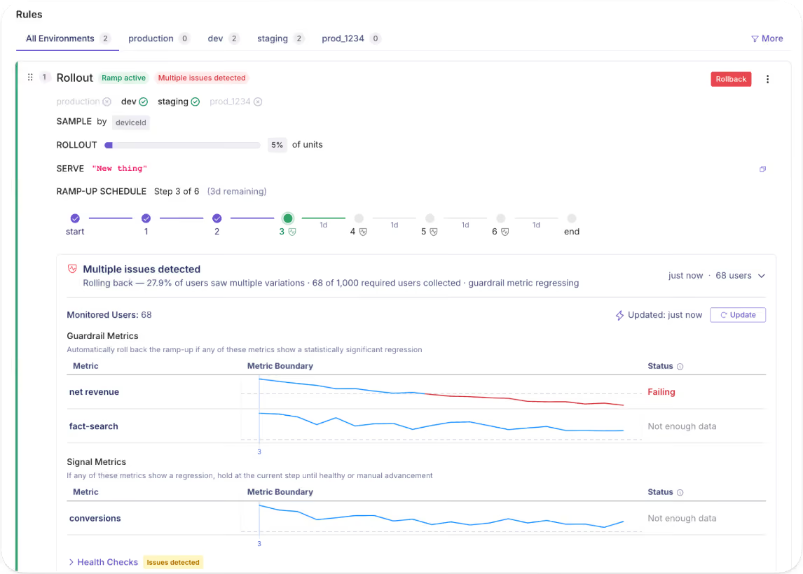
2. Automated rollbacks with guardrail metrics
Progressive rollouts limit your blast radius. But they still assume someone on your team is keeping an eye on things. That’s not the reality your engineers deal with.
GrowthBook’s Safe Rollouts remove that dependency. You define guardrail metrics at flag setup time, such as payment conversion rate or transaction error rate, and the platform continuously monitors them as traffic ramps up.
If any guardrail metric shows a statistically significant regression, the platform automatically reverts the rollout.
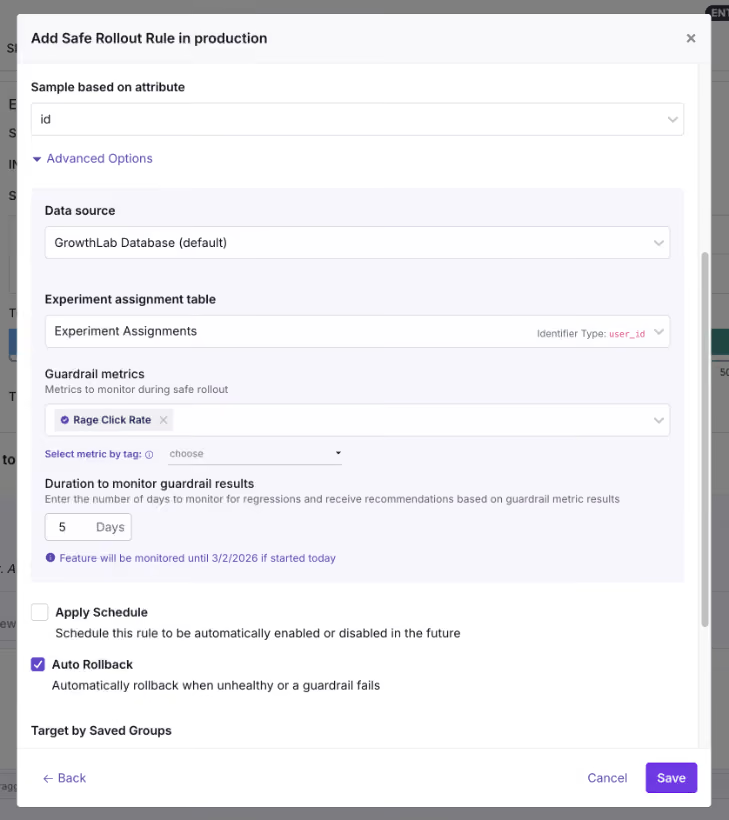
3. Compliance gating and jurisdiction-based targeting
A World Economic Forum report found that 60% of fintech companies operate in multiple jurisdictions, while 31% operate in multiple regions. This means that if you’re releasing a new feature or an update, you need the ability to control where it’s released first.
For example, if you’re releasing a new lending feature and it’s approved in the US but not in Singapore, you have three choices:
- Maintain separate code branches per region
- Delay the entire launch till approval
- Release in one region through granular targeting
GrowthBook’s Forced Value rule lets you implement option 3 with feature flags. You can define the segment as US-only, deploy the feature to all environments, and make it live only for those accessing it from the US.
When you get the approval for Singapore, just update the targeting condition.
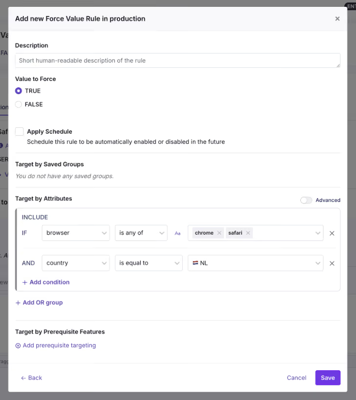
4. AI model rollouts for fraud detection and credit underwriting
World Economic Forum’s report also found that 80% of fintechs are now implementing AI across multiple business lines. They’re either adopting it for software development or shipping AI features.
Let’s say you’re releasing a new fraud detection model. If the model misfires, it might give you too many false positives and reject legitimate ones for no reason.
Instead of rolling out a bug to your entire user base, just wrap it in a feature flag. Roll it out to 5% of traffic and monitor your guardrail metrics to decide whether to scale up or reverse the rollout.
Note: Within GrowthBook, you can even experiment on prompts and AI model versions to see what works best. And all of this works with feature flags being the main delivery mechanism.
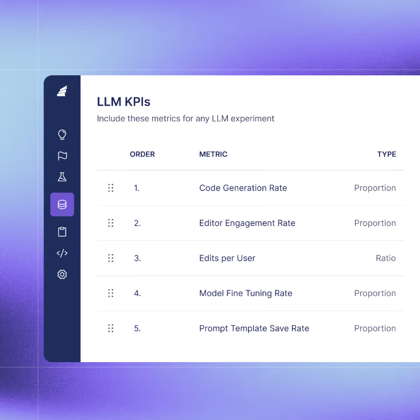
How feature flags satisfy fintech compliance requirements
Here are some of the features your feature flagging platform needs to help you stay compliant with fintech regulations:
Audit trails and revision history
Every time you go through an audit, your auditor might ask you to reconstruct every change to your payment processing flag over the last six months. Things like who enabled it, when, what the previous state was, and who approved it.
You should be able to pull that up in a minute. In fact, if you’re going through SOC 2 Type II audits, this is a baseline requirement.
GrowthBook’s audit logs capture every flag event, with timestamped records available across all plans. You can pull up the version history for any flag and compare revisions side by side to see exactly what changed.
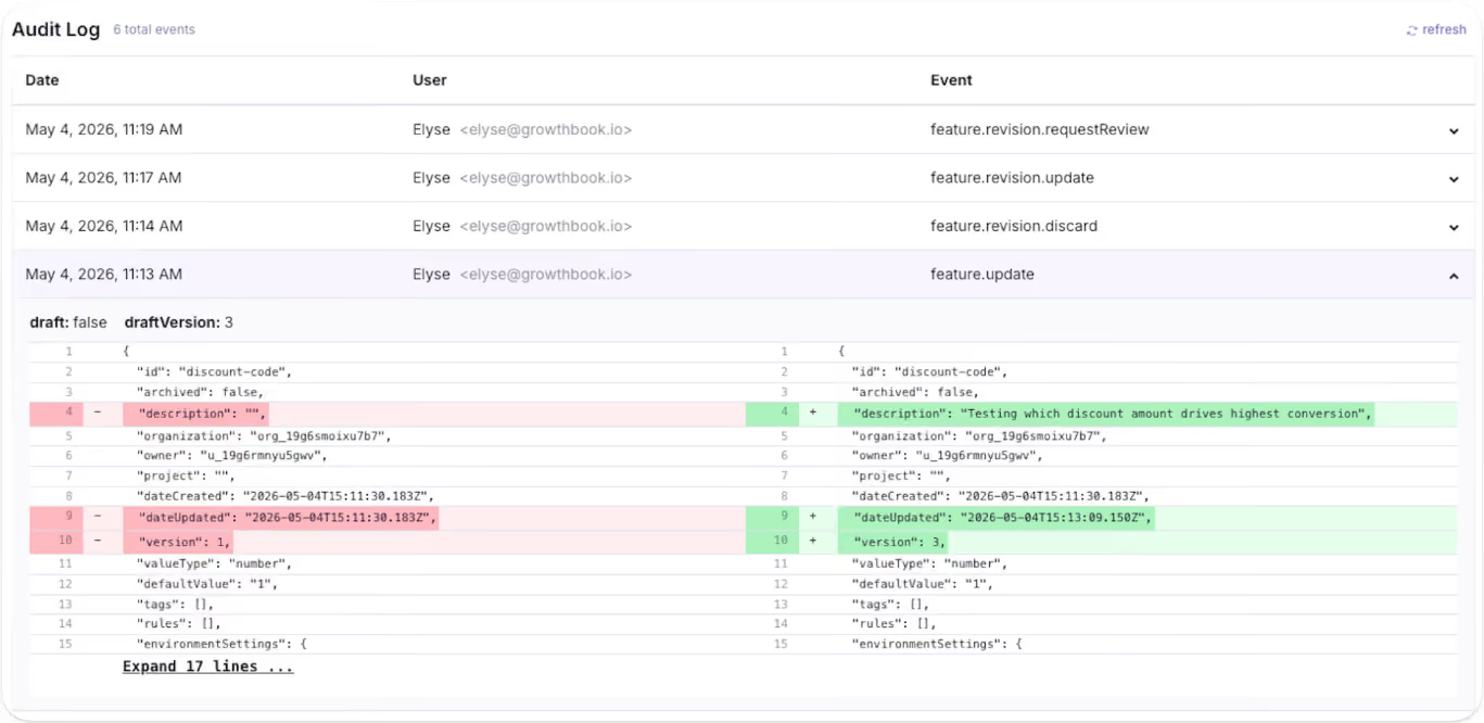
Approval workflows and the four-eyes principle
You don’t want to be in a situation where an engineer pushes a change that hits production immediately. It could result in smaller bugs or full-blown incidents. That’s one of the reasons the “four-eyes principle” is a baseline expectation these days.
Essentially, one person creates the flag with specific rules, and another person approves it before it goes live.
In GrowthBook, approval workflows serve as configurable gates. You can draft the change and submit it for review. Your peer or manager can approve it before it goes live. Irrespective of whether you’re creating a kill switch or a saved group, you can require approval for everything.
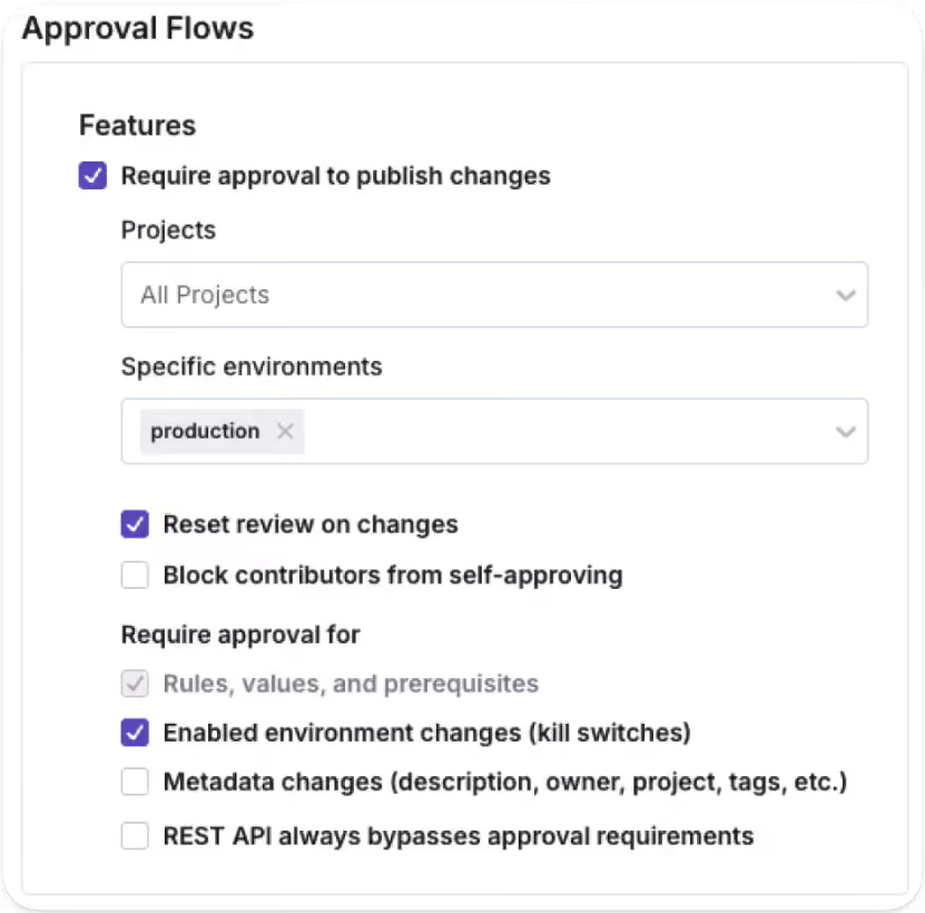
Stale flag management
As you create more flags, you’re also creating more technical debt. Because feature flags are typically temporary, once a feature ships, engineering teams forget to remove them. The problem is that it’s still active in your codebase and could cause incidents later.
Make sure your feature flagging platform can detect these stale flags. For instance, GrowthBook automatically marks feature flags as stale if:
- They haven’t been active for two weeks.
- They aren’t in any active environments (the flag is disabled everywhere).
- Have one-sided rules that send 100% of traffic to a single variation.
You can also use its MCP server to find feature flags and pinpoint where they exist (via Code References). And then use the cleanup skill to remove them.
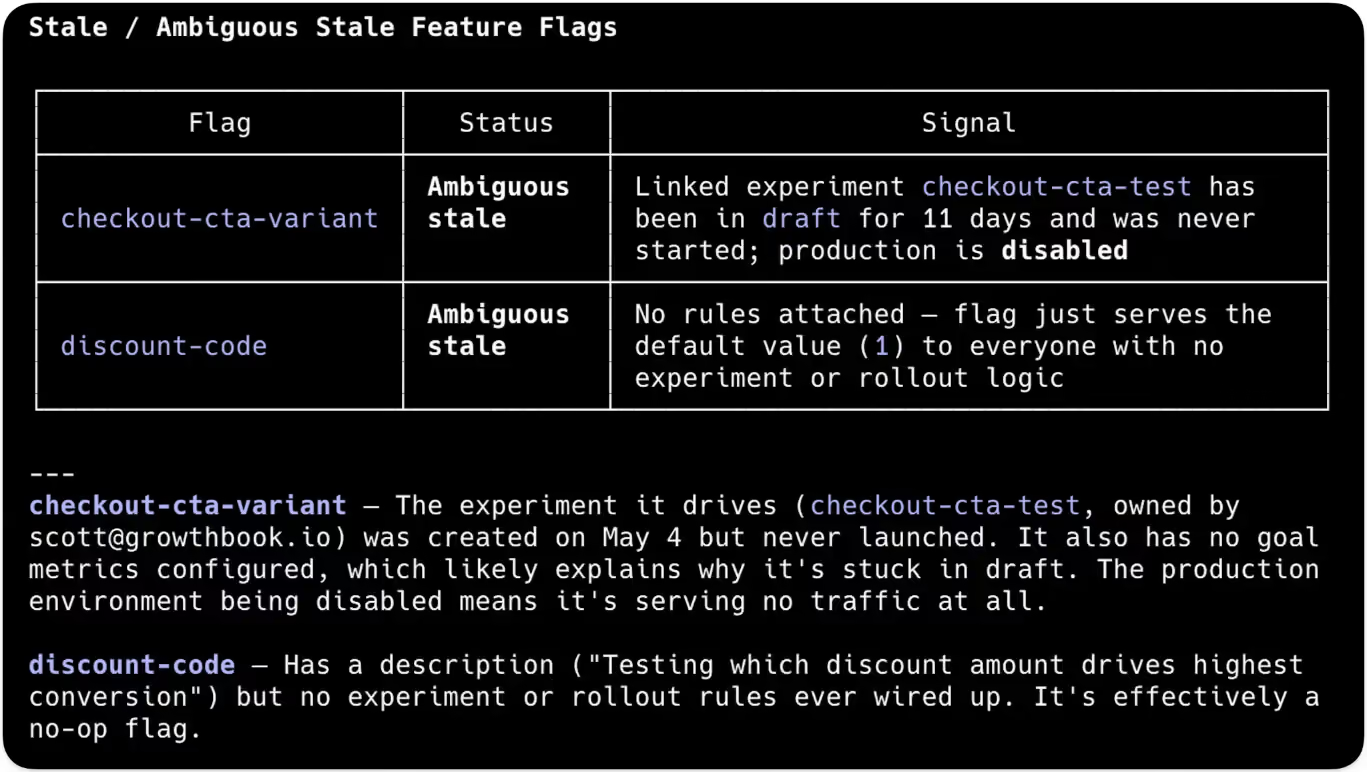
Keeping financial data in your infrastructure
Most feature flag vendors need your data on their servers to evaluate experiment metrics. Very few of them offer self-hosted deployments or a warehouse-native architecture. But in the fintech industry, that could result in heavy penalties and reputational risk.
So choose a platform that:
- Offers a warehouse-native architecture that queries existing data warehouses for anything.
- Offers self-hosted deployment with air-gapped installations.
- Has compliance certifications such as SOC 2 Type II, GDPR, COPPA, or CCPA.
How Upstart cut experimentation time from days to hours with GrowthBook
Upstart is an AI-powered lending marketplace that connects consumers with over 100 banks and credit unions. Its engineering team runs experiments against real credit models and transaction data.
Before GrowthBook, Upstart’s setup was fragmented. They ran a third-party tool for feature flags alongside two separate in-house experimentation platforms. As a result, engineers kept switching between tools, and analysis depended on manual work.
Since it was a financial services company, they couldn’t let sensitive financial data leave their infrastructure. That’s where GrowthBook’s self-hosted deployment model solved the compliance problem, as all experimental data remained within its infrastructure.
Upstart’s team consolidated three platforms into one, GrowthBook, and cut experimentation time from days to hours. But they were also able to clean up legacy feature flags, which also helped them reduce technical debt in the long run.
“We had to rally our teams for this project and get our old tools cleaned up, but the process is significantly improving the quality of our systems and reinforcing best practices around experiments and feature-flagging hygiene. GrowthBook allowed us to uplevel our code, speed up decision-making, and focus on what we do best—building a world-class AI lending marketplace.”
— Diego Accame, Director of Engineering, Growth, Upstart
What your feature flag platform needs to handle in fintech
If you’re actively evaluating feature flagging tools, these are the questions you should ask before choosing one:
Note: GrowthBook does all of this and more. Learn more about how we help fintech organizations.
Use feature flags to ship faster with confidence without risking your reputation
Monzo’s two-hour outage reminded the industry what fintech teams already know: when you’re handling other people’s money, there’s no such thing as a minor production incident. And at least in the bank’s case, they had a fallback path in place.
But the reality is that most fintech organizations don’t. This is why you should consider adopting feature flags. They give you the infrastructure to ship fast without taking on that risk. Whether you want to test in production or create fallback paths, you can do so without building excessive tooling.
If you’d like to see how feature flags can improve your deployment process, try GrowthBook for free or book a demo.
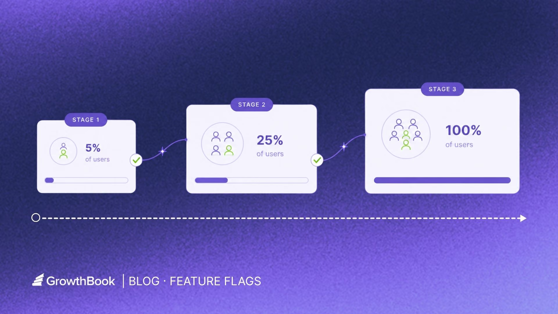
How to reduce deployment risk with canary releases and feature flags
On July 19, 2024, CrowdStrike pushed a configuration update to every one of its Falcon sensors at once. A single logic error crashed 8.5 million Windows systems and cost Fortune 500 companies an estimated $5.4 billion.
It wasn’t a silly mistake that brought down global systems. CrowdStrike tested the update, but it didn’t use a staged rollout, so a bug that could’ve been contained to 1% of users became a global outage instead. The problem is that using a delivery process like this just opens up your surface area of risk.
In fact, deploying software change is one of the three top causes of an IT outage. And downtime costs average at $14,056 per minute.
The question is: How do you ship changes into production without turning every release into an all-or-nothing bet?
Using canary releases with feature flags is one way to do that.
In this article, we’ll walk you through the concept of canary releases and how to implement them.
What is a canary release?
A canary release exposes a change to a small group of users before you roll it out to everyone. The name “canary” comes from a time when coal miners brought canaries underground to detect toxic gases in the mine. If the bird showed any signs of distress, miners left before anything bad happened.
In software development, the same logic applies. A small group of users absorbs the initial deployment risk so the rest of your users can stay protected. This helps even if you have staging and test environments because production traffic behaves differently with real data under real load. Edge cases only show up when you deploy the changes to production.
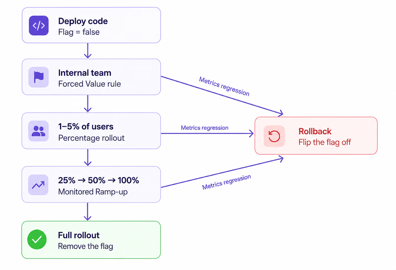
Pros and cons of canary releases
What’s the difference between infrastructure canary vs. feature flag canary?
You can run a canary at two different layers of your stack. The layer you choose determines how fast you can roll back.
With an infrastructure canary, you route a percentage of traffic at the load balancer or service mesh level to a new version of your service. You’re releasing the entire service as one unit. And if something breaks, you shift all the traffic back to the older version, which can take several minutes.
A feature flag canary is different. Here, you deploy the code to 100% of your servers but wrap the new behavior/change behind a flag. Only users who match your rollout criteria see it. If something breaks, you flip the flag. That takes seconds.
In short: an infrastructure canary controls which building your users walk into. A feature flag canary controls which rooms are unlocked inside the same building.
Mature engineering teams use both models.
For instance, Facebook deploys code continuously to all production servers but gates every feature through Gatekeeper, its internal feature flag system. Its employees see the new features first and assess their performance. Only when everything looks good do they roll out the change to 2% of production traffic and test it there.
How to do a canary release with feature flags?
Let’s say you’re launching an AI tutor product within your edtech platform. It’ll call an LLM, so there are new risks to consider, like timeout errors or unpredictable token costs.
Here’s how you can do using GrowthBook’s feature flagging platform by using feature flags for the canary release:
Step 1: Wrap the change in a flag
Create a new boolean flag called ai-assistant with a default value of false. It’ll decouple deployment from release, so nobody sees it unless somebody should.
Here’s what it looks like in GrowthBook:
if (gb.isOn("ai-assistant")) {

  return renderAIAssistant();   // new LLM-backed path

}

return renderManualFlow();       // existing path
gb.isOn() evaluates the flag locally without a network request, so it adds zero latency to your code path.
Deploy this to 100% of your servers with the flag set to false in your production environment. This step helps you deploy code to development, staging, and test environments, but it won’t appear in production unless you enable it.
Step 2. Define your rollout ladder
A rollout ladder is the sequence of stages your flag moves through before reaching 100%. Typically, you monitor specific metrics at each stage before moving to the next.
If you’re using GrowthBook, you can use the following features to do this:
- Internal team only: In GrowthBook, create a Forced Value rule targeted at a Saved Group of employees or design partners. You can also target by attribute (email contains yourdomain.com or plan = “internal”). Everyone else falls through to false.
- 1–5% of users: Add a Percentage Rollout rule below the forced value. GrowthBook uses deterministic hashing based on user ID, so the same user always gets the same experience—no server-side session storage required.
- 10–25%: Bump the rollout percentage if metrics look healthy.
- 50% → 100%: Full rollout.
Note: The riskier the change, the smaller the interval should be. But make sure you add an approval step based on parameters like error rates or similar criteria to gain more control over the process.
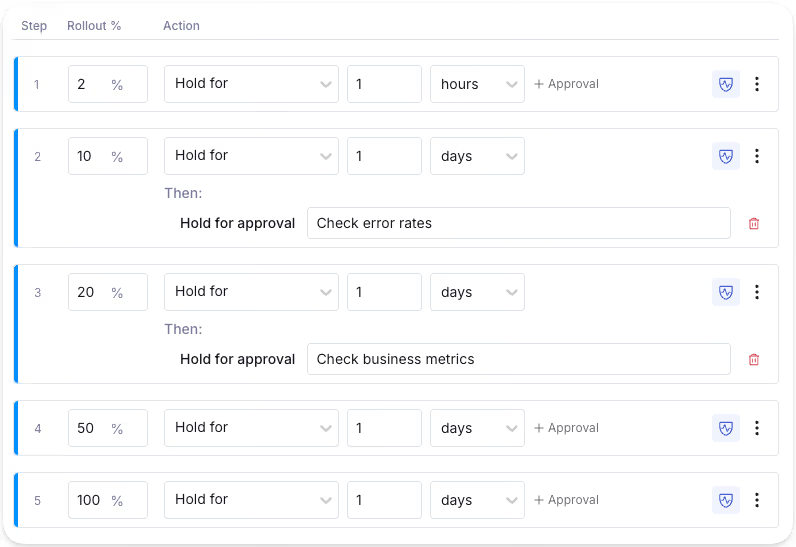
Step 3. Define success and guardrail metrics before you ship
Before you enable the flag, set up two categories of metrics: success metrics and guardrail metrics. While success metrics tell you whether the feature is doing what you built it to do, Guardrail metrics tell you whether it’s breaking something else.
In GrowthBook, you define these as Fact Tables and Metrics that are directly connected to your data warehouse. Each metric has a type:
- Proportion for rates (error rate, timeout rate)
- Mean for averages (cost per request)
- Quantile for percentiles (p99 latency)
- Ratio for derived measures like tokens per resolved query
You can then mark each metric as either a guardrail (a hard gate that can trigger a rollback) or a signal (a leading indicator you watch but don’t gate on).
Step 4. Enable the flag, monitor, and ramp up accordingly
In GrowthBook, every flag change goes through a draft-to-review-to-publish workflow. The goal is to make sure changes don’t reach real users unless you want them to. Once you’ve defined all the changes and metrics, roll out the change and monitor your metrics.
For example, if you’re launching the AI tutor, start with the internal dev team and monitor error rates. Are the AI responses rendering correctly? Is the fallback path working when the flag is off? Is the UI responding well?
Once you’re confident, roll it to real users and ramp up slowly.
Step 5. Automate the rollout with guardrail monitoring
You can use Monitored Ramp-Up in GrowthBook to automate this whole process. You define a ramp schedule, attach guardrail metrics, and the platform moves on, or rolls back the changes based on what the data shows.
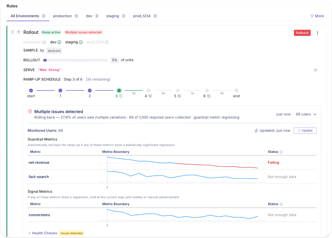
GrowthBook ships with a built-in preset:
- Linear ramp
- Fast ramp (three steps)
- Approval-gated milestones (define any ladder and any hold time)
For the AI tutor, your ramp config might look like this:
You can use the following metrics to monitor the rollout:
- Guardrail metrics (hard gates which trigger a rollback): llm_error_rate, p99_latency, cost_per_request
- Signal metrics (watch, don't gate): answer_acceptance_rate
Note: If you prefer to automate this process, just use GrowthBook’s flag-monitoring AI agent skill via your MCP and create the ramp up schedule in minutes.
The first step ramps to 10% and monitors for 24 hours. The next one ramps it up to 50% and waits for manual approval before proceeding. The guardrail failures trigger an automatic rollback.
Tip: When you need to pull the plug completely, GrowthBook has a built-in environment toggle on every flag so if you disable it in production, the SDK stops evaluating all rules simultaneously. It acts as an instant kill switch. It’ll turn off the previous flag and stop evaluating every rule immediately. The SDK returns the default value for all users, regardless of the ramp schedule.
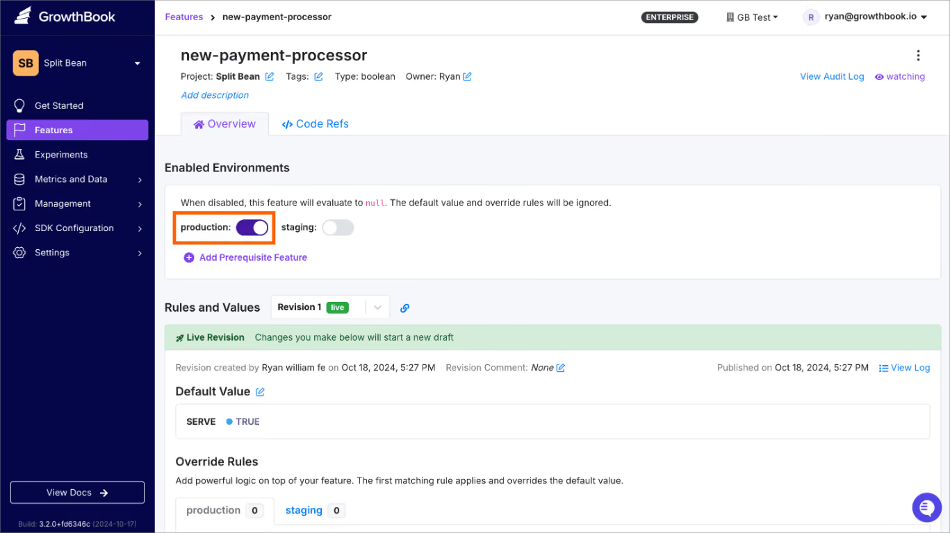
Step 6. Clean up the flag
Once you’ve confirmed that the AI tutor feature works well, it’s time to clean up the flag. A 2022 study on feature toggles found that 33% of toggles interact with other code expressions—and those interactions grow 22% each year. So, the longer a flag stays in your codebase, the more entangled it becomes.
Use GrowthBook’s stale flag detection to automatically surface flags that have been fully rolled out for more than two weeks. You can even use Code References to show you where the flag is within your codebase.
When you’re ready, archive it and check if there’s a change or regression in your app. If not, delete it.
Tip: Schedule the cleanup the minute you create the flag. You can add a note in your calendar and use GrowthBook’s MCP to clean it up later. In fact, you can use the flag-cleanup skill to find these flags and archive them from your AI app.
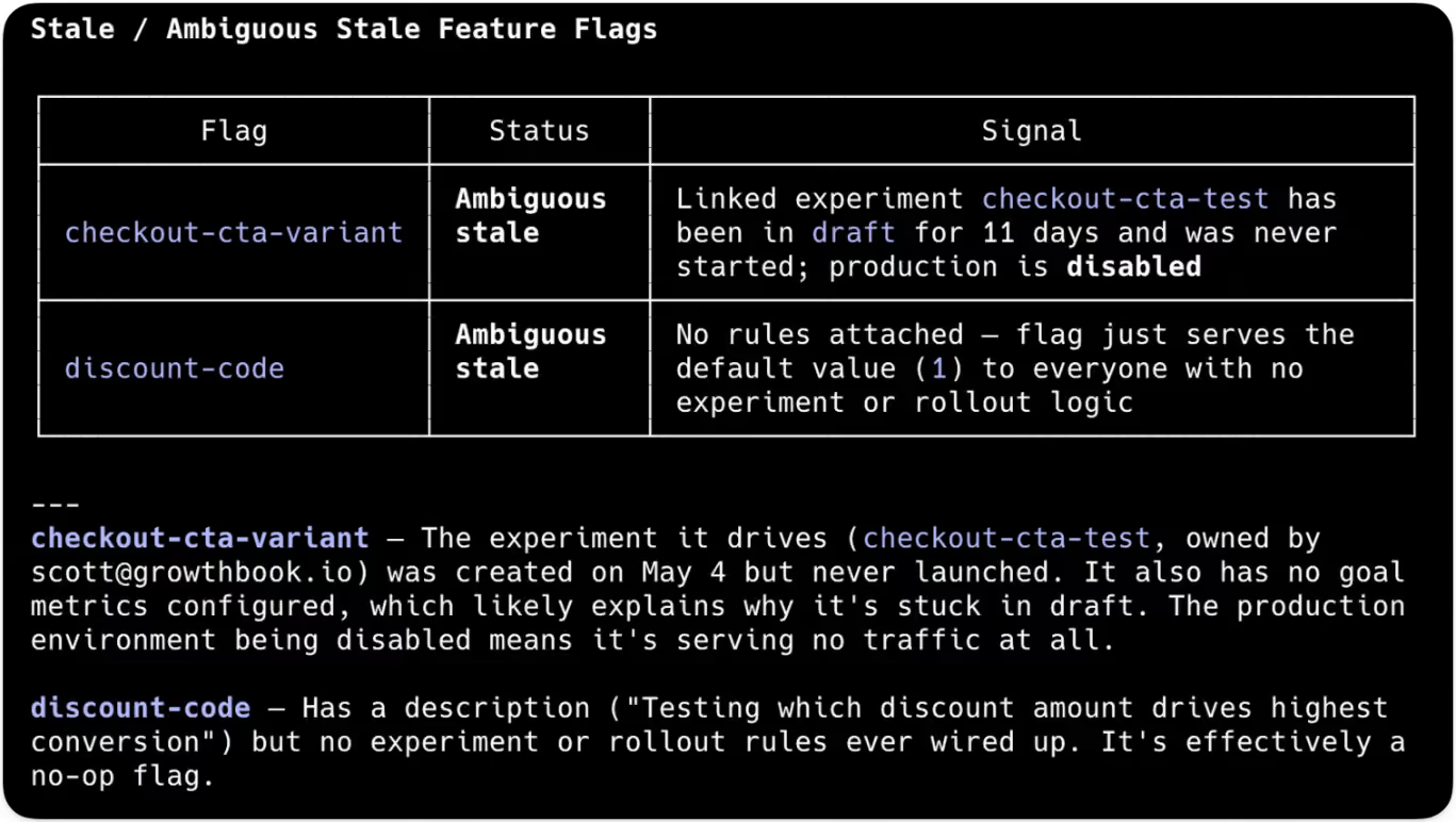
Which metrics should you monitor during a canary release?
Here are three categories of metrics you should monitor with every canary release:
Infrastructure metrics
These tell you whether the servers are handling the new code path.
Application metrics
These tell you whether the feature itself is working.
Business metrics
These tell you whether the change is moving the needle in the right direction.
Tip: Always set your thresholds before you ship so you can act in real time rather than decide whether to act. Once your data team defines a metric in SQL, GrowthBook references it directly in your data warehouse and notifies you accordingly.
6 mistakes to avoid while using canary releases
Even with canary releases, you can still experience failure modes. Here’s what to avoid:
- Treating the canary as your test suite: A canary is supposed to catch edge cases that pre-production testing can’t. So, if you’re using it to find issues that unit and test integrations should’ve caught, you’re just testing in production without real guardrails. Run your pre-canary gates (contract tests, integration tests, performance smoke tests) before the actual release to avoid this.
- Not defining rollback criteria before shipping: You don’t want to spend time figuring out which metrics are “bad enough” to trigger an incident response. It’ll cost you time, money, and resources you’d rather spend elsewhere. Define your thresholds before the flag goes live. For example, which metrics you’ll track, when you’ll decide to act on them, and how you’ll act (your incident or remediation response).
- Rolling out the feature too quickly: If you need robust test results, it doesn’t make sense to jump from 1% to 10% in a minute. Ideally, you should test the initial rollout for 30 minutes to a few hours or longer if you’re doing an infrastructure canary release. Over time, you can set your own thresholds based on previous experimental releases.
- Using a canary cohort that doesn’t represent your users: If your canary group is only employees, only one region, or only power or enterprise users, you can’t generalize your results. Unless it’s something you know applies only to a specific segment, it’s best to test with a broader segment first and then drill down over time. Alternatively, run release experiments with different cohorts to see how they respond, then generalize the results.
- Letting a canary sit at partial rollout for weeks: If your rollout is stuck at 10% for weeks at a time, you have a zombie canary. It creates a forked production environment with continuously diverging behavior. Avoid this by setting a maximum dwell time for each stage, especially when automating the process. Once it crosses that threshold, either promote it to the next stage or roll it back.
- Skipping session stickiness: Without sticky assignment, a user might see the new version on one page load and the old experience on the next. It confuses them, and you won’t be able to realistically measure how the new version is performing. Platforms like GrowthBook handle this by using deterministic hashing based on user ID, so the same user sees the same flag state as long as the release is in progress.
Use canary releases to stop treating deployment as an all-or-nothing bet
After the July 2024 outage, CrowdStrike has adopted the “phased release” approach, which is essentially a canary release. Now, updates roll out in concentric rings, with monitoring at each stage, and customers can choose to adopt the change early or opt out altogether.
And this is the exact approach engineering teams should adopt.
With the pace of software development increasing by the day, especially with AI, you don’t need to add unnecessary complexity around every release. A canary release simplifies this process and removes any anxiety around it.
If you’re ready to start adopting a canary release approach with feature flags, try GrowthBook for free or book a demo.
Experimentation friction changes as you grow. GrowthBook keeps pace.
Every team that runs experiments wants to run more, faster. The difference between teams is where friction lives.
Consider two teams. The first team is finishing its first dozen experiments. Their process works, technically, but they run all experiments through two or three technical staff they trust. Experiments feel complex and high-stakes, and they worry that a bad customer experience could set the company back. The second team runs hundreds of experiments every day, against a warehouse with petabytes of data. They have the opportunity of fast, high-scale experimentation, but every analysis run has compute costs that equal real time and money. They need infrastructure to match their opportunity.
Different stages produce different friction.
GrowthBook 5.0 meets friction at every stage, making it easier to experiment when you’re building the habit, faster and more efficient at the frontier, and safer all along.
Starting an experiment should be easy
One of the biggest barriers to early teams is an empty experiment creation screen, especially when it’s long and involves more complex, technical options.
In 5.0, we cut the experiment creation flow from 23 fields to 5. The rest of the options move to the experiment overview page. You can write a hypothesis, set up experiment assignment, and share the draft to your team in the time it used to take to scroll through the previous version.
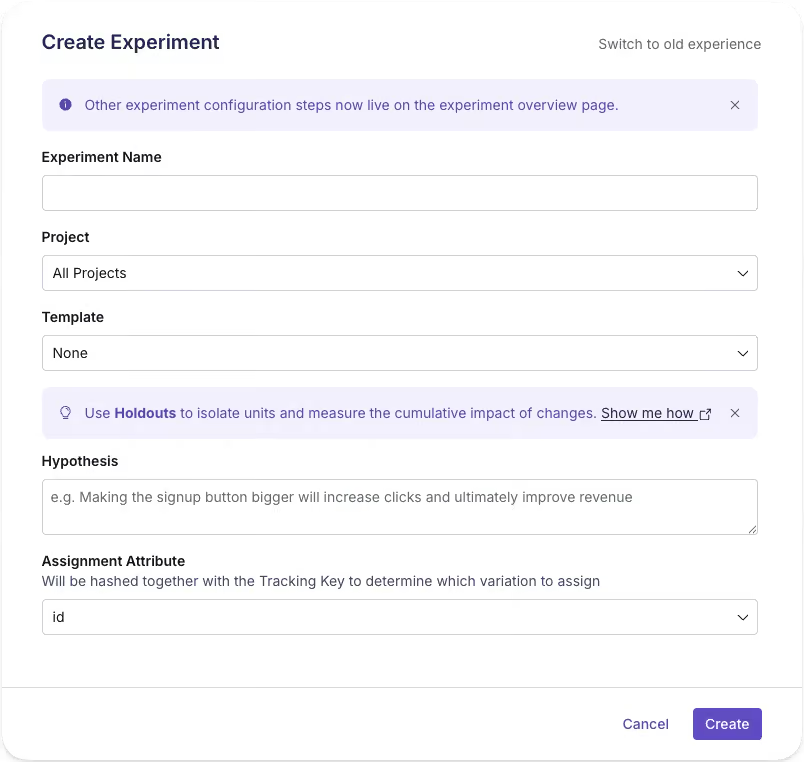
We ran an experiment as we rolled this out, and there’s a surprisingly large effect. More people can create an experiment without feeling like they need to be an expert, and with sensible defaults, starting doesn’t mean shipping something accidentally.
Making experiment creation “cheaper,” with less time and expertise invested, makes it easier to imagine running more experiments and building a broader culture of experimentation. A thin experiment, with just the minimum fields, becomes a shared surface your team can edit and learn in together. Experimentation begins as collaboration rather than a handoff.
More hands, same standards
As the team grows and experimentation velocity increases, more and more people kick off experiments. You have an experimentation process that works, and you want more of it. More teams want to experiment, but a small handful of experts is still a bottleneck. Ideas for experiments might abound, but the organization is short on the people needed to push experiments from beginning to end.
Scaling experimentation means handing more people, more operations, the keys without giving up control of what ships. GrowthBook 5.0 helps.
More people can create. AI agents can now operate GrowthBook, which means anyone, through their code editor or with our new in-app AI Assistant, can brainstorm and create experiments, launch them, and check results with natural language. The new AI Visual Editor opens another door for teams, like growth and marketing, who prefer a point, click, and prompt experience. With the slim experiment creation flow and reusable templates, it’s so much easier to set up an experiment now and build on an existing experimentation program.
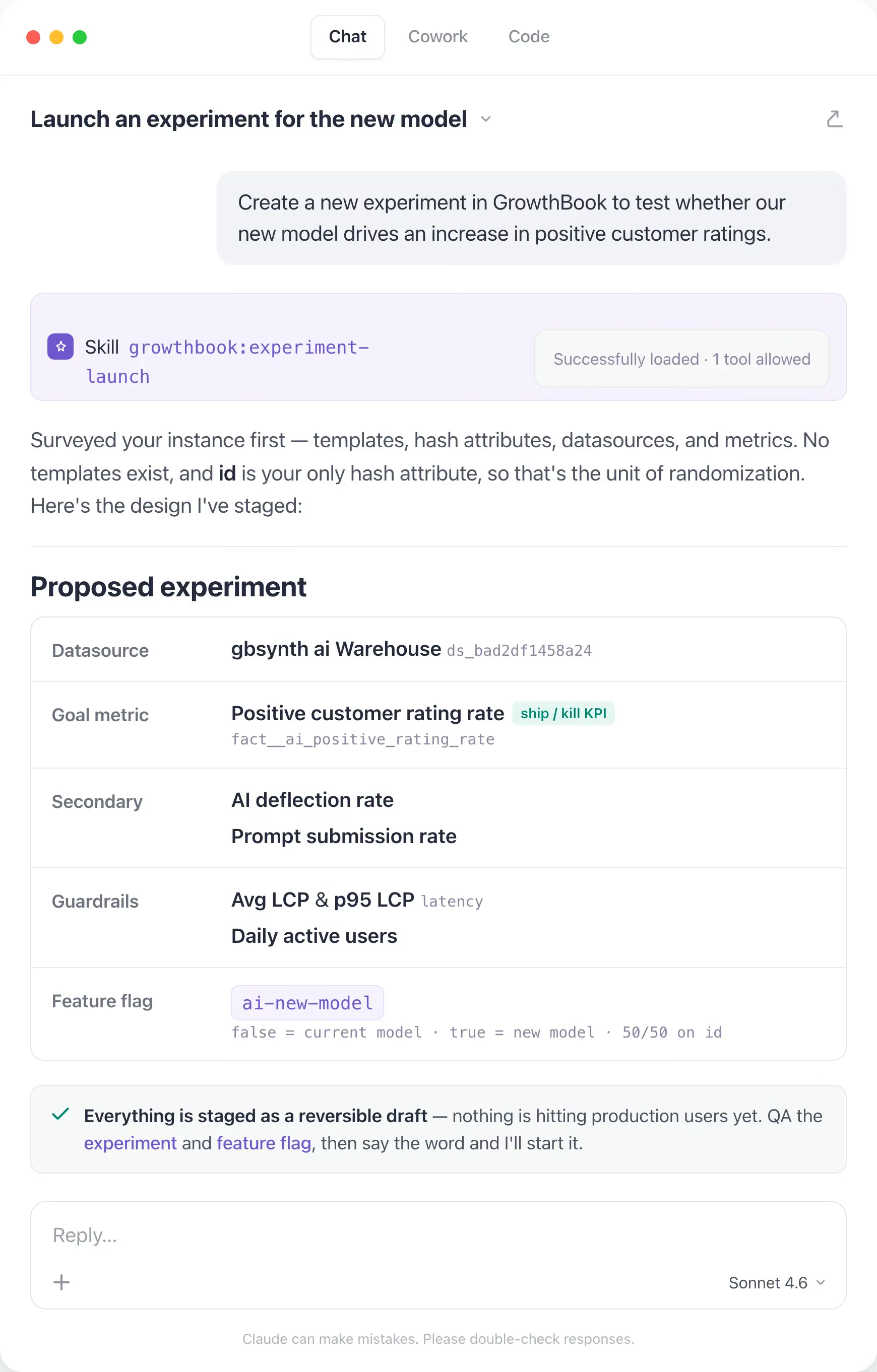
Guardrails travel with tests. Opening the door for more experimentation only helps your org if your best practices and processes stay in place for everyone. Our new custom hooks let teams codify their own rules and run checks for every experiment before it starts, automatically. Mandatory custom fields make sure every experiment is categorized and filled before it’s ever created. Linked feature flags mean a teammate still reviews production changes before launch. These checks live with the experiment, and are present and documented in GrowthBook.
Shared understanding builds shared commitment. Experiments that finish and features that roll out without others knowing can help a business, but they don’t help build shared knowledge and experimentation culture. We now have new meta-analysis experiment blocks for dashboards, so your team can have better oversight of what’s running, win percentages, lift, and scaled impact. Everyone in the org can learn, and, hopefully, be inspired to experiment also.
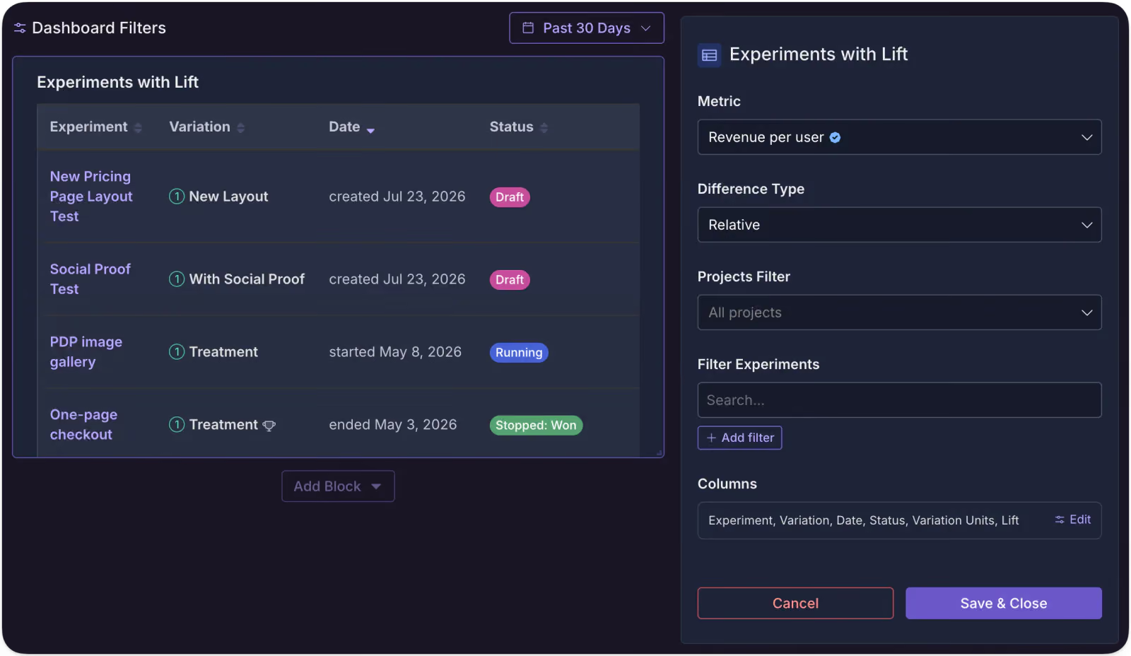
You don’t have to be at your desk to launch. GrowthBook 5.0 supports scheduled starts for experiments. You can kick off a test without being live at your computer. It sounds like a small thing, but as you scale and coordinate more and more experiments, control like this is what keeps a program manageable, right up until the next constraint takes over: compute.
Solve for people and trust, though, and a new limit appears: the volume of experiments you can now run starts to outgrow the infrastructure running them, and the bottleneck shifts from who can experiment to what your compute can afford.
Where compute is the constraint
At the frontier of experimentation scale, the bottleneck becomes compute. Data-rich environments give you the raw material for fast, accurate results, but can come with a bill to match. Teams that run hundreds of experiments a day against high-volume warehouses need infrastructure that meets their opportunity without equally large bills or compromises on velocity.
We think two techniques are highly relevant for these teams: quantile treatment effects (like the effect of a change on your p99 latency) and CUPED, which uses pre-experiment behavior to cut noise and bring results faster. Neither technique is new, but there’s a challenge to running them efficiently with a warehouse-native platform when data is large and quickly changing.
GrowthBook 5.0 includes major performance improvements with both approaches. For quantiles, we use KLL sketches to gather an event-level histogram into a single column that doesn’t grow as events pile up, which keeps quantiles cheaper at volume and even allows for pre-aggregations in the warehouse to be consumed by GrowthBook. For CUPED, we can now run a nightly pre-aggregation of each experimentation unit’s history, and since GrowthBook holds metric definition in our semantic layer, it refreshes only summaries that go stale when a definition changes.
We’ve seen >80% reduction in wall time for an experiment update, faster individual runtimes for experiments, and overall reduction in compute, which leads to lower warehouse bills. We’ll write about this in more detail later, but if you’re experimenting and analyzing at petabyte scale, come talk to us.
A platform you never outgrow
Everything in this post moved as you grew: the friction of starting, the bottleneck of people, the ceiling of compute. Safety is the one thing that didn't.
With GrowthBook 5.0, you can run experiments a little more easily, a little faster, with as much safety as ever, so you can make more chances to really learn about your product and users. That’s the real goal of experimentation: knowing instead of guessing, and building a better product for the people who use it.
Want to hear from our co-founders and engineers how we’ve made feature flagging and experimentation better? Come to our live Office Hours on July 30, 9am PT, and we’ll answer any questions you have.
.avif)
Feature flag governance — GrowthBook 5.0
Governance, for those unaccustomed to this buzzy word, is simply referring to guardrails. With feature flags, it can be really easy to work yourself into a pickle. Our latest 5.0 release focused on many cool things, but one of the big ones was protecting you and your co-workers from yourselves. So you can work faster while still shipping safely.
As AI speeds up how fast code can be written and large organizations release more changes across more teams, the challenge is no longer simply getting work out the door. It is vital to make sure every change is valid, behaves as expected alongside everything else, and reaches production with the right context.
With this in mind, there are three areas in which we focused our feature flag governance in 5.0:
- Catch problems while someone is making the change
- Catch problems created by the full rule set
- Make the final decision with context
Catch problems while someone is making the change
For this category of features, GrowthBook is checking whether the change itself is valid, sensible, and no larger than it needs to be. The best time to catch a bad flag change is before it becomes a review comment, a Slack thread, or a production scavenger hunt.
Schema validation for string and number flags
GrowthBook could already validate the shape of JSON flag values. Now you can also set rules for string and number flags.
For example, you can now limit a checkout layout flag to classic, compact, or express. GrowthBook will reject anything else, including typos.
["classic", "compact", "express"]For number flags, now you can set a minimum and maximum, such as allowing results-per-page to be anywhere from 10 to 100.
It is basically type safety for remote config, because TypeScript cannot save you from someone entering "expres" in a dashboard. Invalid values can now be caught before they are saved or published.
Feature-scoped Custom Hooks
Custom Hooks let your team write its own rules for what counts as a valid flag change.
For example, you could require a description, prevent targeting by email address, or make sure every rollout uses userId.
Custom Hooks already existed, but they previously applied to every feature in an organization or project. Now you can attach one to a single feature that needs its own rules.
- Organization-wide: Every feature flag must have an owner and at least one tag.
- Project-wide: Every rollout in the checkout project must use userId for hashing.
- Single feature: Only the checkout-config flag must include a Jira ticket before it can be changed.
Soft warnings
Not every questionable choice deserves the full red-screen treatment.
Custom Hooks can now raise a warning instead of blocking the save:
addWarning("Consider adding a ticket number");The person editing can review it and choose Save anyway.
So now you have two volumes:
- addWarning() says, “Are you sure about this?”
- throw says, “Absolutely not.”
Sparse patches for JSON rules
Suppose a JSON flag has ten fields, but a rule only needs to change one.
Instead of copying the entire object, you can save just the keys and values you want to update:
{
"theme": "dark"
}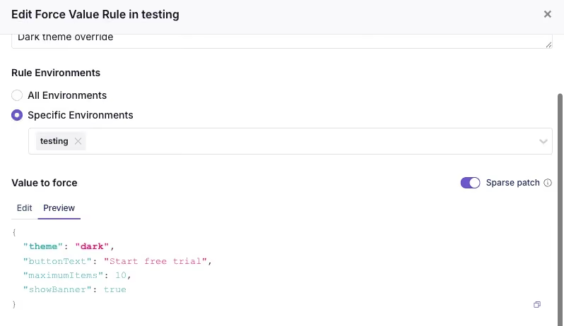
GrowthBook merges that onto the default value, which means smaller changes, cleaner diffs, and fewer stale copied fields.
One important caveat: the merge is shallow. It only merges top-level keys, not deeply nested objects.
Catch problems while someone is making the change
Together, these features make the editor feel less like a blank text box with consequences and more like a development environment that knows what “valid” means.
The value can be checked against an expected shape, custom rules can catch requirements unique to your team, warnings can flag questionable choices without blocking every save, and sparse patches keep changes focused on the fields someone actually meant to touch. By the time the change reaches review, many of the easiest mistakes have already been caught, while they are still cheap to fix.
Catch problems created by the full rule set
A rule can be perfectly valid on its own and still cause trouble once it joins the group chat.
GrowthBook evaluates rules from top to bottom. An earlier rule can serve a user before a later rule ever gets the chance.
For example:
- Force a value for everyone in the US.
- Force a different value for Pro users in the US.
The second rule will never run. Pro users in the US already matched the first rule and left the building.
GrowthBook already warned when a rule was completely unreachable. In 5.0, that detection expands to catch more ways rules can compete for the same traffic.
The warnings now have three levels:
- Unreachable: No matching traffic will reach the rule.
- Will not reach: Some matching traffic will definitely be served by an earlier rule.
- May not reach: An earlier rule might serve some of the same traffic, but we cannot say exactly how much.

That last distinction matters for partial rollouts. A 90% rollout above another rule does not completely block the rule below it, but it does take a large bite out of the traffic before it gets there.
The warning also points to the earlier rule causing the conflict, so you can reorder the rules, narrow the targeting, or confirm that the overlap is intentional.
This catches a different class of problem than schema validation or Custom Hooks. Each rule may be valid, but the full rule set may not behave the way you pictured it.
Make the final decision with context
Automated checks can catch a lot, but eventually a human still has to decide: Is this change ready to go live?
GrowthBook 5.0 adds a dedicated Review & Publish tab that brings the scattered pieces of that decision into one place. It replaces separate publishing, review, and conflict-resolution flows with one shared workspace.
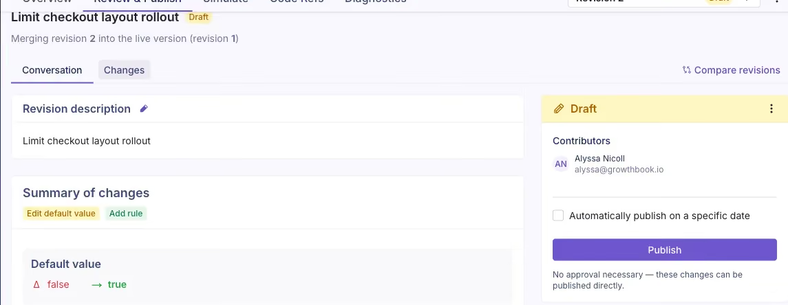
The Conversation view gives you the readable version of the story: what changed, why it changed, who contributed, any comments or reviews, and what needs to happen next.
When you need the technical receipts, the Changes view shows the detailed diff and lets people comment on the specific changes.
If Approval Flows are enabled, reviewers can leave a comment, request changes, or approve the draft before it is published. Without required approvals, someone with permission can still review the same context and publish directly. Approval Flows are a commercial feature.
The goal is not to make every flag change pass through a courtroom. It is to put the diff, discussion, reviewers, conflicts, and final action in the same room, so the person clicking Publish knows exactly what they are sending out the door.
Guardrails not stop signs
Good governance is not about slowing creators down. It is about making the work they publish quality and catching problems early before they hit users.
By adding governance while changes are created, when rules interact, and before publishing, teams will catch mistakes earlier and ship with more confidence. I'm so excited for what 5.0 at GrowthBook has brought to feature flags. If you'd like to learn more or hear from the engineers behind all of our newly released features, you can join us for Office Hours Live on Thursday, July 30 at 9 a.m. PT. See you online and happy experimenting!
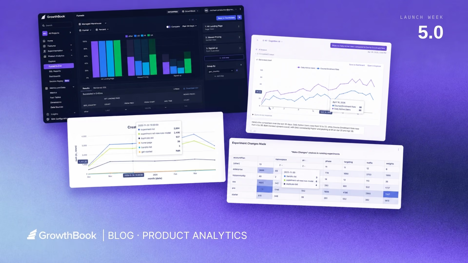
GrowthBook 5.0: Product Analytics is now generally available
GrowthBook’s Product Analytics is now generally available. Monitor your KPIs, explore trends, build dashboards, and analyze funnels, using the same trusted metric definitions your team already relies on for experimentation and feature flags.
If you're running experiments in GrowthBook, you've already done the hard work. You've connected your data warehouse, defined your metrics, and built a shared language for how your team measures success.
Product Analytics puts those metrics to work beyond experiments. Keep your north star KPIs front and center so your team can identify new opportunities to test, and track how past experiment wins are translating into long-term impact. Build dashboards that show product trends and experiment impact side by side, giving stakeholders the full picture in one place.
This post covers everything that is now generally available within Product Analytics.
AI-powered analytics
A native AI chat agent is built directly into Product Analytics. This opens up analytics to any user, turning a few prompts into actionable insights without needing to know the schema or rely on a data analyst for answers.
Ask questions in plain language, such as “Chart the number of daily users and conversions for the past 30 days” and the agent will build the exploration, render the chart, and surface insights behind the data.
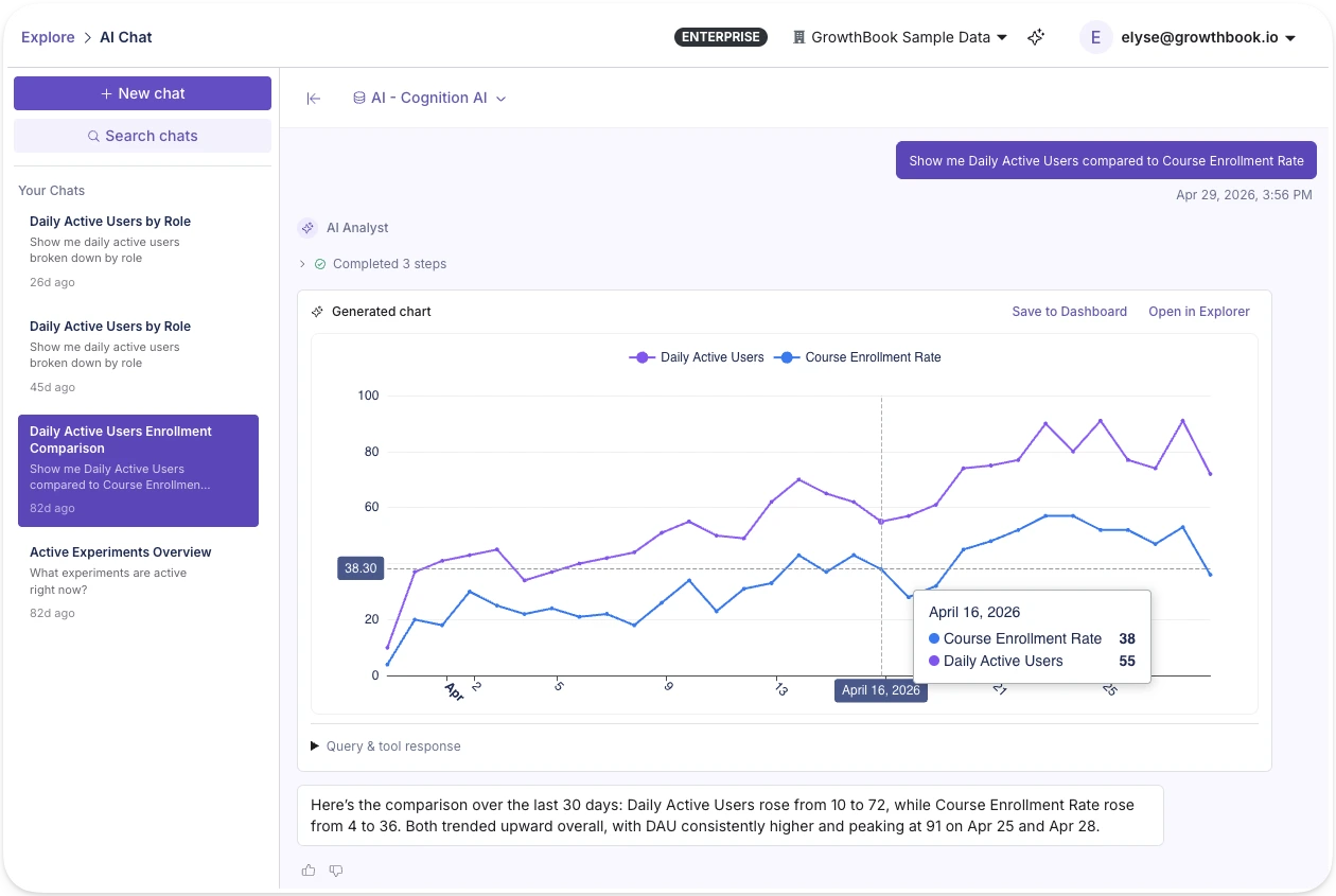
In-app AI assistant
GrowthBook 5.0 also includes a platform-wide AI assistant available from any page in the app. In addition to taking action and supporting workflows across feature flags and experiments, it can also pull up analytics and surface trends from wherever you're working. This assistant pulls from 25+ open-source skills spanning feature flag management, experiment design, and product analytics.
See Product Analytics live
Join a live demo to walk through the Metric Explorer, funnels, and dashboards built on warehouse data.
Pick a Demo Date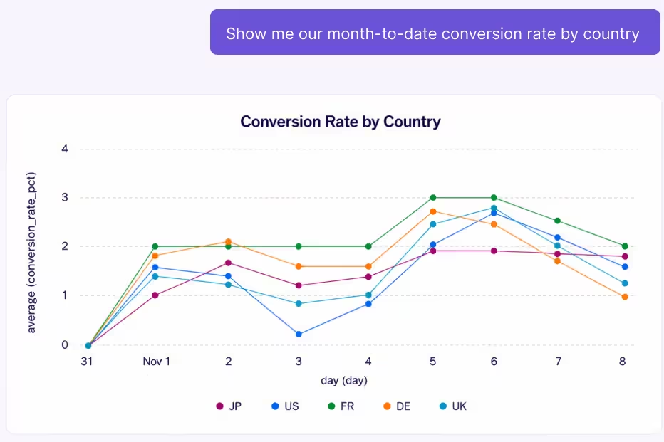
The Metric Explorer: visualize and explore your data
The Metric Explorer lets you visualize any metric your team has defined in GrowthBook without needing to write SQL. These are the same metric definitions powering your experiments, so there's no custom SQL to write and no risk of metric drift between your analytics and your experiment results. This lets teams go quickly from question to chart in seconds.
The Metric Explorer supports a range of chart types (line, area, bar, stacked bar, horizontal bar, stacked horizontal bar, timeseries table, table, and big number) and the ability to segment by dates, dimensions, and filters.
If your team hasn't fully defined metrics yet, the Explorer also supports querying fact tables directly or even raw data source tables in your warehouse, so you can start exploring immediately and promote what you find to reusable metrics over time.
Because GrowthBook generates the SQL behind the scenes, it works with GrowthBook's Managed Warehouse, BigQuery, Snowflake, Databricks, Redshift, ClickHouse, Postgres, and more. Your data never leaves the warehouse.
SQL Reports
The SQL Explorer lets you write, save, and share queries directly within GrowthBook. No external BI tool needed. Pin results to any dashboard alongside your metric explorations and experiment data.
Write a query in the built-in editor with schema browsing and autocomplete, or describe what you want in plain language and let AI generate the SQL from your warehouse schema. Run the query, then layer on the types of visualizations you’d like to see: bar, line, area, scatter, pivot table, or big value (KPI). Configure axes, aggregations, dimensions, and filters visually without touching the SQL again.
Save reports, refresh them on demand, and pin individual visualizations to any dashboard alongside your metric explorations.
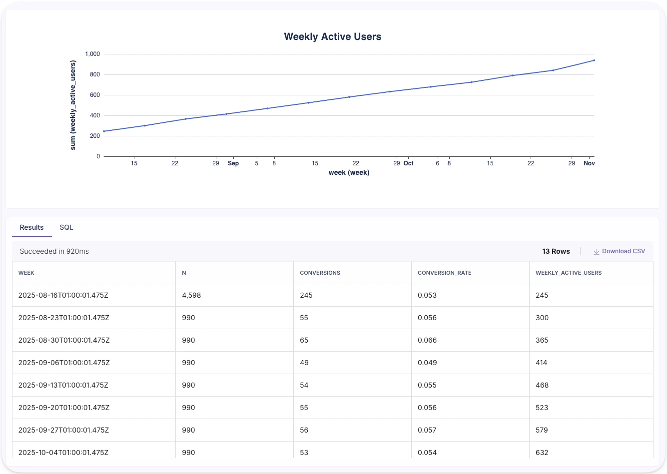
Funnel analysis
Define step sequences to visualize conversion rates between each step and understand where users fall out of the flow. Break funnels down by any dimension to find where specific segments convert differently.
For example, you might define a checkout funnel and break it down by device type. You notice mobile users drop off at the payment step at twice the rate of desktop. That's a clear signal. From the same platform, you can launch an experiment to test a simplified mobile payment flow and measure whether it closes the gap.
Whether it's your onboarding flow, checkout, or activation sequence, funnel analysis turns drop-off points into experiment hypotheses you can act on immediately.
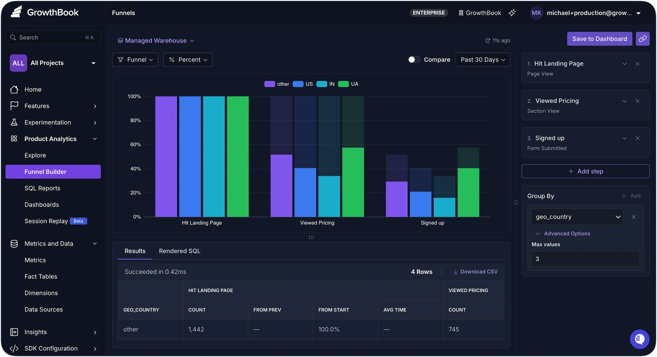
Dashboards
Dashboards let you tell a story with your data. Create custom dashboards tailored to your north star metrics so they remain front and center. Arrange the KPIs that matter most to you on a flexible grid with drag-and-drop, and set a refresh schedule to keep everything current, and share with your team.
GrowthBook dashboards support a range of block types, from metric explorations and saved SQL queries to rich text, so you can build exactly the narrative your team or stakeholders need to get the full picture.
A typical dashboard might include your north star metric trend, a product funnel showing where users drop off, and the scaled impact from all your experiments pertaining to the relevant metrics.
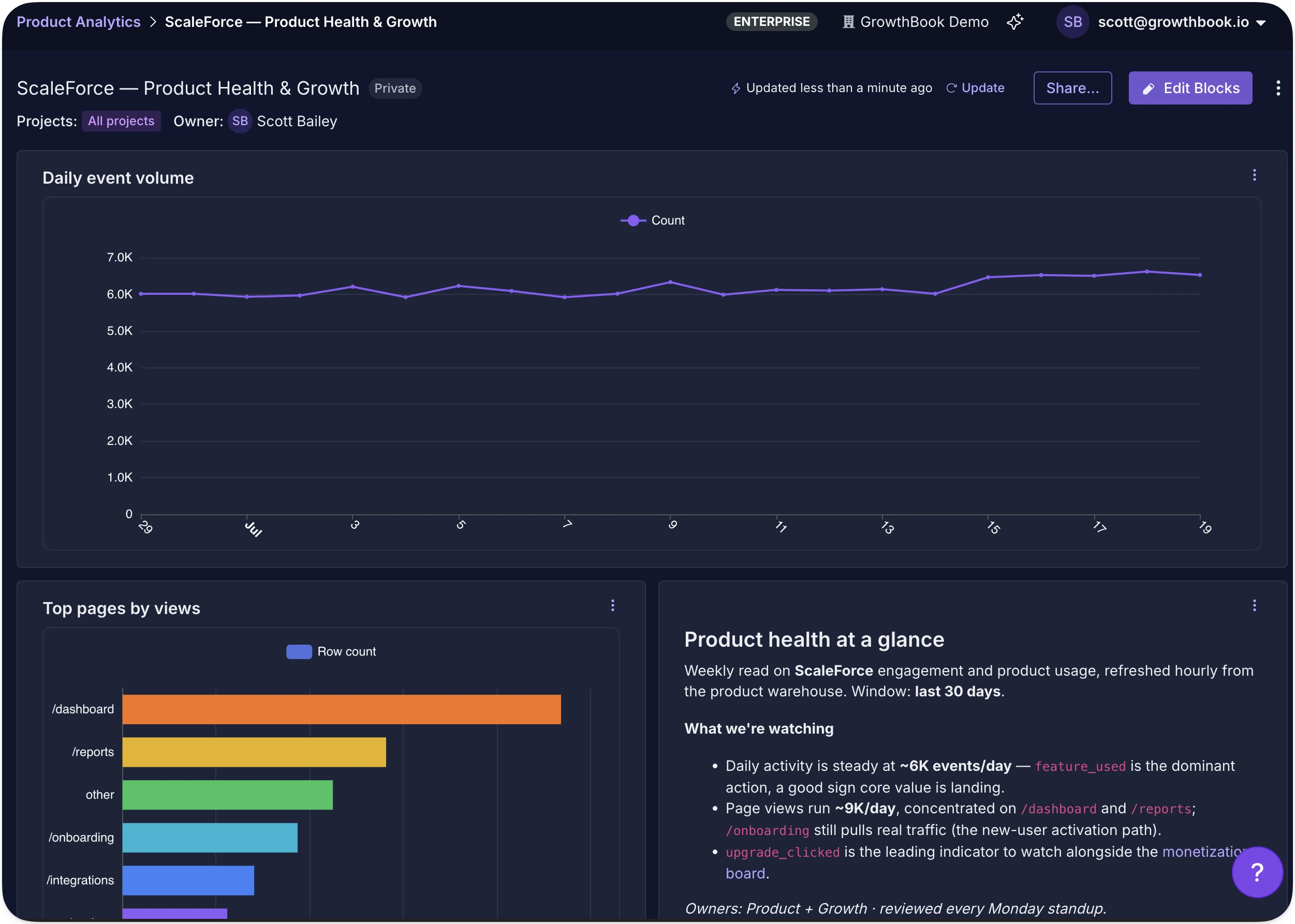
One source of truth
Product Analytics is an extension of the work your data team has already done. The metrics are defined. The warehouse is connected. Now those same definitions power dashboards, funnels, and ad-hoc exploration, not just experiment results.
For teams that want programmatic access, the REST API exposes endpoints for running explorations, and every exploration gets a shareable URL encoding its complete configuration.
Product Analytics is available now. Get started or book a demo to see it in action.
Analyze your own warehouse data
Create a free account, connect your data warehouse, and build your first dashboard.
Start Building Free
AI Visual Editor: opening up experimentation for growth and marketing teams
TL;DR: GrowthBook 5.0 ships with an AI Visual Editor that lets anyone build and launch a live experiment on their website from a plain-language prompt, no engineering ticket required.
Growth and marketing teams rarely suffer from a shortage of ideas.
There is always another headline to test, another landing page to improve, another audience that may respond to different messaging, or another campaign that could convert more effectively.
The problem is getting those ideas into production. The reality for many marketing and growth teams is that testing capacity is capped by engineering bandwidth.
The GrowthBook AI Visual Editor unlocks this entire process. For the first time, anyone can vibe code a new home page or product page and deploy a rigorous experiment in minutes without engineering expertise. The AI Visual Editor allows users to move sections, change text and colors, and even swap out images with just a series of prompts. Once a new variation is built, these same users can kick off rigorous experiments using the same metrics and templates created by your data science team. So anyone can run experiments you can trust.
See the AI Visual Editor in action here:
Run experiments without waiting for engineering
The most immediate benefit of a visual experimentation system is straightforward: growth and marketing teams can move from an idea to a live experiment without waiting for an engineer to implement every variation.
Using GrowthBook’s AI Visual Editor, teams can describe a change in plain English or make it directly through a WYSIWYG interface. They can update text, modify styles, rearrange content, replace imagery, hide elements, or create more substantial page variations.
The editor then turns those changes into an experiment that can be previewed, reviewed, and launched through GrowthBook.
This removes a significant source of friction from the experimentation process.
Engineering teams no longer need to spend time implementing every headline test, campaign-specific landing page, image variation, or call-to-action adjustment. Growth teams no longer need to wait for an open sprint before learning whether an idea works.
And GrowthBook’s AI Visual Editor keeps engineering teams happy. The AI Visual Editor, like all of GrowthBook, is built on transparency so the technical teams can still review exactly what the experiment is doing, audit the results, look at the metrics, etc. Visual experiments also run on the same SDK used for other parts of GrowthBook, and even be flicker-free.
The difference is that engineering is no longer required for every step of every experiment.
What you can do with the AI Visual Editor
Many visual editors fall short and break on modern sites, and quietly push you back into writing CSS or HTML. We fully rebuilt our new AI Visual Editor from scratch to fix these issues.
The AI Visual Editor lets anyone describe the change they want in plain language and get a working variation without writing code. Use manual mode or enter a prompt to do things like:
- Generate images with AI: Use AI to generate and modify hero images, product photos, background visuals, and more.

- Change headlines and copy: Manually update copy to test different messaging.
- Generate new copy ideas: Prompt the AI to write different headlines, CTAs, or copy variations to test.
- Run multi-arm bandits: Use the AI Visual Editor to make changes to your site and run it as a multi-arm bandit to dynamically allocate traffic to the highest performing variant.
- Update designs and layouts: Adjust fonts, padding, button styles, restructure layouts, and more.
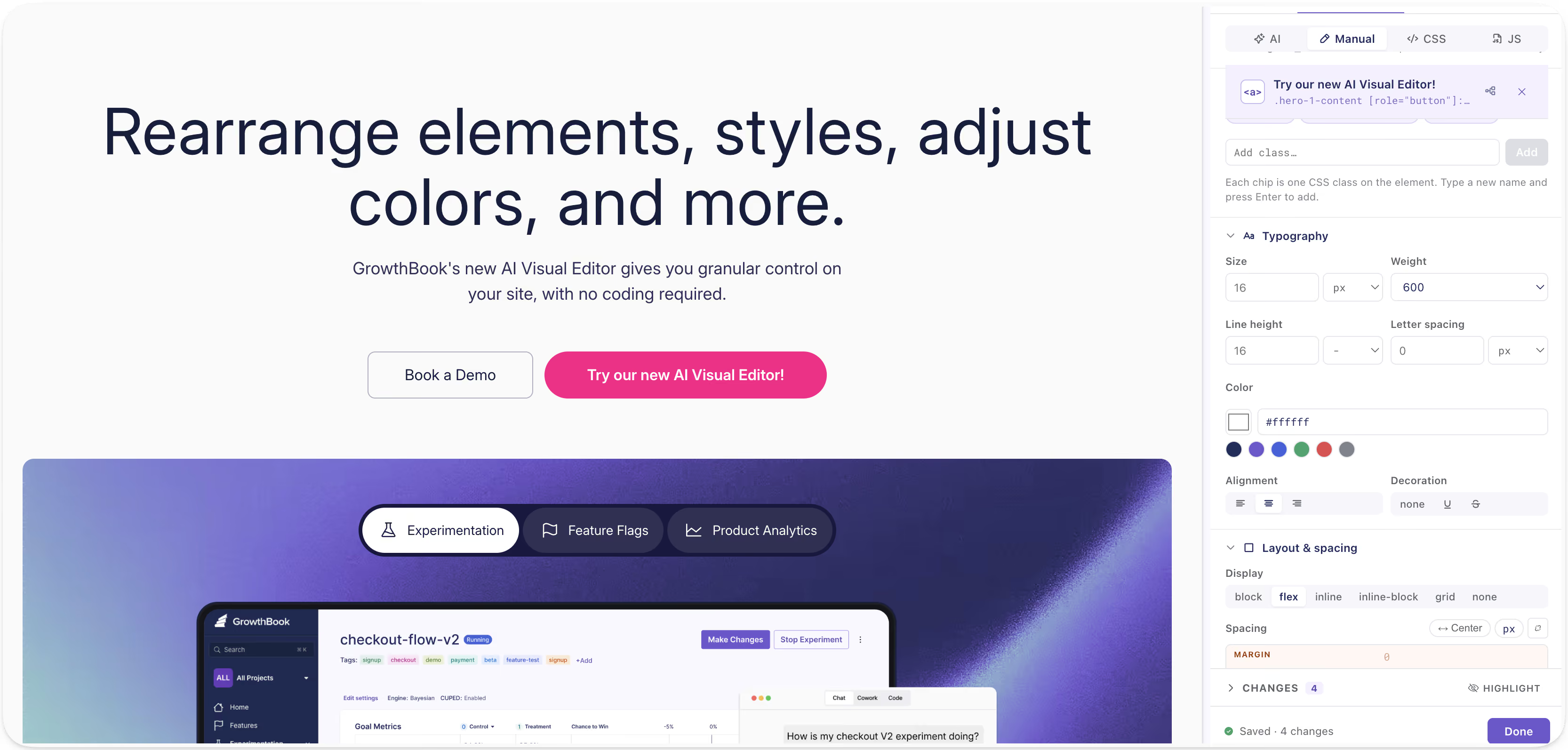
- Import Figma frames or mockups: Bring in a design straight from Figma to test actual user interaction without rebuilding it from scratch, not just as a static image.

- Import image files: Pull in your own images or brand assets.
The variation is built directly in the editor so you can see exactly how all your changes will look to your end users.
Test more ideas and learn faster
Reducing implementation work changes more than test speed. It changes which ideas are worth testing at all.
When every experiment requires engineering time, teams naturally reserve experimentation for larger ideas. Smaller questions remain unanswered because the expected value of the result does not justify the cost of implementation. A visual editor lowers the incremental cost of answering them, resulting in teams running more experiments.
The real advantage is that teams can explore more ideas, test smaller assumptions, iterate on promising concepts, and build a clearer understanding of what customers respond to.
Instead of spending weeks debating which message should become the new default, teams can put several credible alternatives in front of real users and measure the result. You can even run a multi-arm bandit directly from the AI Visual Editor. The new workflow becomes:
- Identify an opportunity.
- Create a high-quality variation.
- Launch it safely.
- Measure its effect.
- Use the result to inform the next decision.
The faster that loop becomes, the faster a team can improve.
Personalize messaging for different audiences
Most websites present a single version of the company to every visitor.
But not every visitor arrives with the same problem, the same level of familiarity, or the same reason for evaluating the product.
Someone arriving from an AI-focused campaign may care about evaluating nondeterministic product experiences. An enterprise buyer may care more about security, governance, and deployment flexibility. A developer may care about SDK performance and implementation details. A marketing leader may care about conversion rates and how quickly their team can launch tests.
Sending all of these visitors to the same generic page often means presenting each of them with a diluted version of the message they actually need.
Client-side experimentation gives growth and marketing teams a practical way to test more relevant experiences for different audiences. The objective is not personalization for its own sake. Every additional experience creates complexity, and not every audience needs its own version of a website.
The value comes from being able to test whether a more relevant message actually improves the outcome.
Validate ideas before investing in permanent development
Some ideas require substantial engineering work to implement correctly.
A redesigned pricing page may need new components. A different onboarding flow may require backend changes. A personalized experience may eventually need to be integrated deeply into the application.
But teams do not always need to build the complete version before learning whether the underlying idea has value.
A visual experiment can serve as a lightweight production prototype.
A growth team can create a realistic variation, expose it to a controlled audience, and measure whether it changes customer behavior. If the experiment performs poorly, the company avoids investing in a larger implementation. If it performs well, the team has evidence that can justify and guide the permanent build.
Not every experiment can or should be implemented through a visual editor. Changes involving application logic, backend systems, authentication, pricing calculations, or complex product behavior will still require engineering.
But even in those cases, a client-side test may help validate the customer-facing premise before the company commits to the full investment.
Turn experimentation into a fun part of your work
Growth and marketing teams should not need to choose between moving quickly and running rigorous experiments. But more than that, GrowthBook’s AI Visual Editor allows your team to express their creativity while measuring quantifiable results.
Because the goal is not simply to change the website faster.
It is to learn what works, and have fun while doing it. The new AI Visual Editor is a Chrome extension. You can add it to your browser, open up the extension, connect to your GrowthBook account, and create experiments. Read the AI Visual Editor docs to see how it fits your setup.
Your agents can operate GrowthBook now
The Fyxer team ran 541 experiments last year with a small team. They didn’t just get faster at using their tools. They put agents in the loop to run the workflow itself.
This is the workflow they shared with us: someone fills out a form with a hypothesis and target metrics. This triggers an agent to create a flag and experiment in GrowthBook and publish to a company-wide experiment index. Someone starts the experiment with a “launch” message in Slack. Only 25% of their experiments won, but that fast iteration and learning loop helped drive ARR growth from $1M to $35M.
Fyxer wired that together themselves. GrowthBook 5.0 makes this agentic experience first-class and accessible for more users and teams natively. Now, agents can operate GrowthBook: create flags, set targeting rules, brainstorm and create and launch experiments, with a consistent experience across interfaces.
How agents operate GrowthBook
Agents can now run GrowthBook from the places you work. Picture one experiment over the course of a week.
You start a morning in Claude Desktop brainstorming your next experiment. The GrowthBook skills ground your ideas in your own history: what you’ve run, what succeeded, and how metrics moved.
You pick a direction, switch to Cursor and build it. Your agent creates the feature flag, sets up the variations, and configures the experiment alongside the code changes. Our skills carry guardrails, so the experiment lands as a draft for a teammate to review rather than a live test. Review, launch, and ship it.
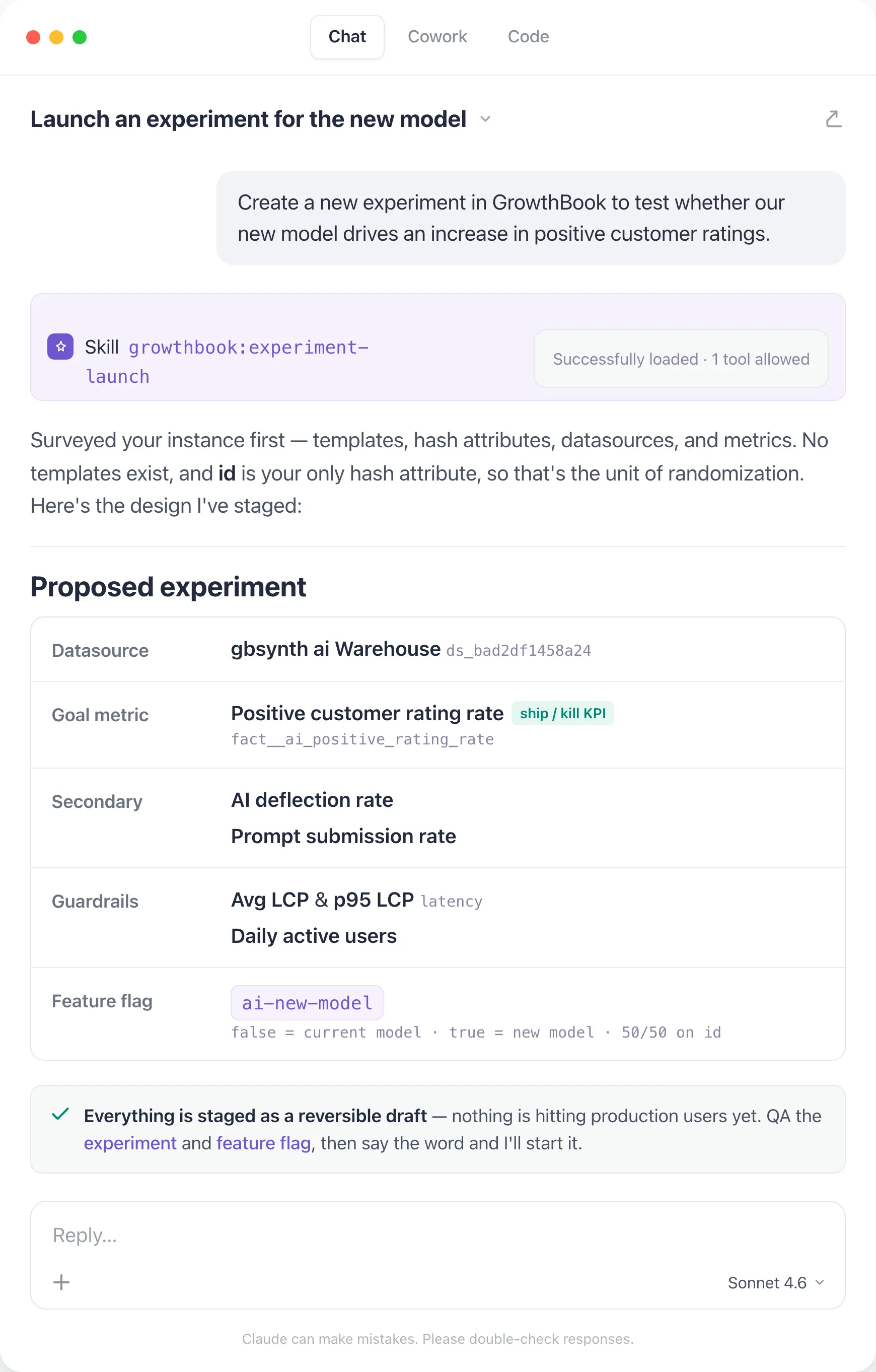
Later in the week, you’ve got results. You open the GrowthBook app and ask the new AI Assistant how the test did and whether you should ship. You want to dig deeper into how feature usage differs across segments, so you work with the AI analyst to build out a dashboard to share with the team.
You change tools, but the platform and the experience stay the same.
We built this consistency by building reusable foundation elements:
- 25 open-source skills that teach an agent how to use GrowthBook effectively across flags, experiments, and product analytics.
- A CLI rebuilt with Speakeasy that covers 100% of our REST API and regenerates automatically from our OpenAPI spec. It won’t drift, and it returns typed output with errors an agent can use effectively.
- A comprehensive REST API underneath that fuels the skills and the CLI. If you’d rather see it than read about it, watch here.
This foundation powers new ways you and your agents can run GrowthBook: the in-app AI Assistant, a reworked MCP server that integrates the skills, and a native Slack app (coming soon!).
Watch agents run GrowthBook
Join a live demo to see how agents work with GrowthBook through the MCP server and CLI.
Pick a Demo DateHow to trust your agents
When agents are part of your team, they should follow your team’s standards and processes, just like anyone else shipping flags or experiments. Agents can make mistakes, but we’ve built our skills and Assistant so that agent-driven changes land as drafts and a person reviews before anything publishes. The same approval policies, audit trails, and guardrails to catch bad flags before they ship apply to both humans and agents. Your team maintains judgment and governance.
We’ll dive more into the improvements we’ve made to governance, especially for features flags, on Thursday.
One platform for humans and agents
Whether you and your agents are in the terminal, the editor, or the app, you’re working on the same GrowthBook platform, with your flags, experiments, and warehouse data. We’ll keep evolving interfaces; you should never feel like you’ve outgrown the platform.
Connect your agent and run your first skill.
Sign up and join us for a live Office Hours Thursday, July 30, at 9am PT and tell us what to build next.
Tomorrow: the new AI Visual Editor, rebuilt from scratch to make experimentation easier in the browser.
Connect your agents today
Create a free account and give your coding agents access to feature flags and experiments through GrowthBook's MCP server.
Start Building Free
GrowthBook 5.0: Build, ship, and improve at scale
GrowthBook 5.0 ships today
It’s not enough to write code and ship at the speed of AI. Companies that win consistently make their products better. GrowthBook 5.0 enables companies to build, ship, and improve their product at any scale.
Our last major release (v4) shipped a year ago. Since then, we’ve rewritten feature flags from scratch, built Product Analytics, made experimentation significantly faster, and integrated AI throughout.
GrowthBook 5.0 crystallizes the last year of work, and it’s big enough that a minor version number just wouldn’t do. We've touched nearly every corner of the platform, from how experiments are built to how flags are governed. And we’ve opened experimentation to your whole team, not just engineers. More people can ship flags, run tests, and make decisions from shared data, wherever they work: in the app, terminal, code editor, or browser.
There’s far more to cover than we can fit into one post, so we’re covering something new every day, all week:
- Monday: Agents. Official skills, a new in-app assistant, and a CLI that covers our entire API. Your agents can operate GrowthBook directly: ship flags, launch experiments, analyze results, and clean up after.
- Tuesday: The new AI Visual Editor. Rebuilt from scratch, AI-native experimentation from your browser, with image generation and Figma support. Your growth team can ship tests without waiting on an engineer.
- Wednesday: Product Analytics hits GA. Warehouse-native product analytics for engineers and experimenters, out of beta. Built on the same metrics your experiments already use, now with funnels, composable dashboards, and experiment meta-analysis.
- Thursday: Governance for feature flags. Customizable guardrails that catch bad flags before they ship, protecting rollouts whether they come from humans or AI agents.
- Friday: Faster experiments. Streamlined experiment setup, scheduled starts, and faster, cheaper warehouse queries. Designed for running experiments at scale.
See 5.0 features in action
Join a live demo to see agents, the AI Visual Editor, Product Analytics, and flag governance in one walkthrough.
Pick a Demo DateGrowthBook 5.0 is live on Cloud now and available for self-hosted deployments. Check out the full release notes.
Sign up and join us for a live Office Hours on Thursday, July 30, at 9am PT. Bring your questions and tell us what we should build next.

Lessons learned from Ronny Kohavi and Luke Sonnet: running trustworthy experiments
GrowthBook recently hosted a webinar with two people who have spent their careers on one hard problem: how do you know an A/B test result is real? Ronny Kohavi is the co-author of Trustworthy Online Controlled Experiments and previously led experimentation at Amazon, Microsoft (where his teams eventually ran about 300 new treatments every workday), and Airbnb. Luke Sonnet is head of experimentation at GrowthBook, where he leads the team building the statistics, metrics, and analysis behind the platform.
The theme was simple and a little uncomfortable: getting numbers is easy, getting numbers you can trust is hard. That line comes from an article Ronny co-wrote in 2010, and it still describes most published test results. Running an A/B test looks trivial. You ship the change, read the p-value, celebrate the lift. Underneath sit a dozen gotchas that quietly turn a "win" into noise.
This post distills what we took away: how easy it is to run an untrustworthy experiment, the steps that can improve trust during setup, the checks to run after it finishes, and the best questions from the live Q&A. You can watch the full webinar or download the slides.
1. It's surprisingly easy to run an untrustworthy experiment
Ronny opened with a John F. Kennedy line: we choose to go to the moon "not because it is easy, but because it is hard." His twist on it describes what he sees constantly: too many teams run experiments not because it is easy, but because they thought it would be easy.
To make it concrete, he dissected a real, recently published experiment. The claims were impressive. A 44.8% lift, with a conversion rate jumping from about 55.7% to roughly 80%. "99% confidence," which the author defined as being 99% certain the result reflected a genuine difference and not a statistical accident. A 50/50 split with 54,000 users per variant. And an AI-powered treatment that, in the write-up, "smashed it out of the park." It was, as Ronny put it, buzzword compliant.
Then he took it apart. Four things were wrong, and every one of them is common:
- The real sample was tiny. The 54,000 "users per variant" counted everyone who entered the site. Only a small fraction actually reached the page that changed. That triggered population, the only one that matters for the test, was about 300 users total, split 176 and 124.
- No power calculation. With those numbers, the test had roughly 7% power instead of the standard 80%. In a low-power test, a significant result is almost guaranteed to exaggerate the true effect, here by an expected five times, and there was nearly a 10% chance the result pointed in the wrong direction entirely.
- The p-value was misread. "99% confidence" was treated as "99% chance the result is real." It is not. Accounting for a realistic win rate, the false positive risk on this result was about 87%.
- Sample ratio mismatch. A 50/50 design that produces 176 vs 124 has a p-value of about 0.003. The split being wrong was more statistically significant than the "win" itself.
The uncomfortable takeaway: this was not a uniquely bad experiment. It looks like a large share of the A/B test results published today. The rest of this post is about not being that example.
2. Steps to take during setup to make your test more trustworthy
Most trust problems are decided before a single user is bucketed. Here is what Ronny and Luke recommend building into setup.
Run a power calculation, and respect what it tells you
Power analysis gives you the minimum sample size you need. It takes four inputs: your baseline variance (or conversion rate), alpha (industry standard 0.05), power (industry standard 80%), and the minimum detectable effect, or MDE. The first three are easy. The MDE is where teams go wrong.
The MDE is the smallest effect you want to be able to detect, and reality is humbling. Real average treatment effects are small. At Bing, across tens of thousands of experiments, the average effect was rarely above 0.3%. Airbnb Search’s successful experiments improved conversion by about 0.3%. One widely cited toolkit analysis found a median lift of 0.1% across more than a thousand experiments. Ronny’s rule of thumb: never set an MDE above 5%. Anything higher is unreasonably optimistic, because results above 5% almost never happen unless the product is broken.
The catch is that small MDEs demand large samples, and many teams do not have them. That is a real trade-off, not a moral failing, but you have to make it consciously. Ronny’s own community project, Trustworthy A/B Patterns, settled on a 2% MDE because that matched the sample sizes available.
To ground it, here is roughly how many users you need to detect a 5% relative change, by baseline conversion rate:
Ronny’s blunt summary: if you only have around 10,000 users, you are nowhere unless your metric converts at around 50%.
Pick your significance threshold on purpose
Luke’s framing is that trust in an experiment is built on transparency and reliability. Statistical significance is the signal most teams lean on, and you control the threshold, often without realizing it. The default alpha of 0.05 says that if there is no real effect, 5% of experiments will look significant anyway. But why 0.05 for everything?
The better question is how costly a wrong call is. A feature that will dictate your roadmap for three years, or that needs ongoing support, deserves a stricter threshold like 0.01 or 0.001. A small, low-consequence change can tolerate a more relaxed one. The number should reflect the risk you are actually willing to take, not habit.
Plan against peeking and metric-shopping before the data can tempt you
Two of the most damaging habits are either baked in during setup or prevented there. Peeking, which means checking results and stopping the moment something looks significant, or simply running longer until it does, inflates your false positive rate. Running two weeks and then checking daily for another two weeks pushes a 5% Type 1 error rate up to about 17%, and it inflates the estimated effect size on top of that. Testing many metrics has the same effect: with one decision metric your error rate is 5%, with two it is 10%, with three about 14%.
If you know you will want to look early, plan for it. Use an alpha-spending approach that only looks at pre-set intervals, or sequential testing if you have robust enough data infrastructure to check continuously. If you genuinely need multiple decision metrics, apply a multiple-comparisons correction. The goal is not to make experimentation impossible; it is to decide the rules before the data can tempt you.
Setup checklist
- Define your OEC (overall evaluation criterion) and guardrail metrics first; they set your MDE and required sample size.
- Run a power calculation. Do not skip it because the MDE is hard to pick.
- Set your MDE at or below 5%, and lower if your sample allows.
- Size for the triggered population that actually sees the change, not total site traffic.
- Choose alpha based on how costly a wrong decision would be.
- Commit to a fixed runtime or sample size up front, and write it down.
- Aim for a single decision metric; if you need several, plan a correction now.
- If you are underpowered, try variance reduction such as CUPED before concluding you cannot test.
3. What to check after you've run an experiment
A clean setup is not enough. Before you trust a result, run these checks.
Check for sample ratio mismatch first
This was Ronny’s number one test. If you ran a 50/50 split, you should see roughly equal counts in each variant. When you do not, something is usually broken. He showed a Microsoft experiment split 50.2 / 49.8, which sounds close enough, but with large samples that deviation should occur only about 1 in 500,000 times. Since you did not run 500,000 experiments, you have a problem.
And SRM is not rare. Microsoft found 6% of its experiments had one, years into a mature program, measured against a strict 0.001 threshold. Convert.com found 6.5% after adding the check. One company Ronny consulted for had SRM in 20% of its experiments.
Why it matters so much: an SRM usually means a skewed population snuck in. He showed a Bing experiment with gorgeous results, five key metrics all up, some p-values as small as 2e-10. But the split was 0.497 instead of 0.5. The cause turned out to be a bot. Once they excluded it, none of the five metrics was significant anymore.
Back to the published example: 176 vs 124 on a 50/50 design gives a p-value of about 0.003, so the mismatch was more significant than the reported result. If your tool does not run a sample ratio mismatch check automatically, it is a quick p-value calculation, and it is worth doing at the end of every experiment.
Compute false positive risk, not just the p-value
"99% confidence" does not mean a 99% chance the result is real. A p-value is a conditional probability: it assumes the null hypothesis is true. What you actually want is the false positive risk, the chance that a statistically significant result is a false positive. That needs one extra input: the prior probability that an idea succeeds. Historical win rates give you that prior.
At a median success rate and alpha 0.05, you do not have 95% confidence, you have about 22% false positive risk, so roughly 78% confidence. Ship at a looser 0.10, as some tools default to, and more than a third (36%) of your "significant" results are false positives. If you do not know your win rate, Ronny suggests assuming 10%. Applied to the published example, the false positive risk was about 87%.
Apply Twyman’s Law to anything that looks great
"Any figure that looks interesting or different is usually wrong." When you see a beautiful lift, the instinct is to email the whole company. Do not. Double- and triple-check it first, because extreme results are usually bugs. Ronny has never seen a trustworthy experiment move a real OEC by 44%. It does not happen unless the product is broken, like a checkout that literally cannot complete.
Run the background sanity checks
- A/A tests. Ronny’s top recommendation. Split users into two identical groups with no difference between them. If the system is healthy, a given metric should be significant only about 5% of the time. Better still, run many A/A tests and confirm the p-values are roughly uniform; deviations expose bugs in randomization, variance estimation, or the pipeline.
- Bot traffic. Most teams underestimate it. At Bing, 50% of US traffic was bot-generated, and 90% in Russia and China. Yours is probably lower, but bots create skew and SRMs, so filter them.
- Novelty and primacy effects. If the treatment effect drifts up or down over time, it may be users reacting to newness rather than a durable effect. It is less common than people fear, since early trends are often just noise, but it is worth watching.
Post-run checklist
- Run the SRM check and treat a failing one as a red card, not a footnote.
- Compute false positive risk using your real win rate, not just the p-value.
- Do not peek or extend runtime just to reach significance.
- Do not cherry-pick whichever metric happened to turn out significant.
- Apply Twyman’s Law to any unusually large result.
- Confirm A/A tests, bot filtering, and novelty/primacy checks are in place.
Questions from the webinar
We are a B2B product with low user counts and are always underpowered. Should we just not A/B test?
No. B2B is genuinely harder; even Microsoft struggled to power tests on products like Office when randomizing by company. But you have levers. Use CUPED variance reduction, which exploits historical data and pays off especially when customers are repeat visitors: it cut required sample size by roughly 50% at Bing and 5 to 10 times at Airbnb. Consider larger MDEs, since B2B changes are often bigger, and accept a longer runtime. Luke’s higher-level point is to fit experiments into your broader information ecosystem. Sometimes the honest goal is just to rule out that you are cratering a key flow, which you can do with a one-tailed non-inferiority test instead of pretending you have precision you do not.
How do we keep the winner’s curse from burning us?
Use holdouts. Combine a batch of shipped tests and compare their summed predicted effect against a long-running holdout. If your experiments claimed +10% conversion for the quarter but the holdout shows +5%, that gap tells you how much you are fooling yourself.
Is Bayesian A/B testing affected by low power? Would it change the 300-user example?
Not really. You still only have 300 users. Bayesian methods let you bring in prior information, but with uninformative priors the results align closely with frequentist ones. Informative priors only help if you genuinely understand the domain, and in online experiments, believing you have strong, correct priors is usually misleading. Notably, GrowthBook uses weak informative priors over the lift, which actually widens the uncertainty bounds and makes a 44% lift on 300 users harder to claim, exactly the Twyman’s-Law guardrail you want.
How do we handle ratio metrics (like views per user) when randomization is at the user level?
Use the Delta method to correct the variance for metrics whose denominator is not the randomization unit. Good tools handle this automatically in both the analysis and the power calculation; GrowthBook, for example, uses your historical data to size ratio metrics correctly.
If one arm wins on every single day of the week, is that extra evidence it is a real winner?
A little, but do not invent new rules like "three winning days means ship." Trust the aggregate and its p-value. The more useful version of this habit is the reverse: if an experiment is positive every day and then sharply negative one day, investigate that day for an outage or bug, but only exclude it if you find a real, documented cause.
In low-power settings, can we use more sensitive proxy metrics, like add-to-cart instead of revenue?
Yes, if you have a sound mental model of how the proxy relates to the real goal. Both Ronny and Luke are fans of validated surrogate metrics; Ronny’s teams ran experiments specifically to confirm a surrogate’s causal link before trusting it. Just keep an eye on the downstream metric so you are not optimizing add-to-cart while customers fall off later.
Conclusion
The theme running through the webinar: A/B tests are the gold standard, but trust does not come free. It comes from effort, from the sanity checks, the power calculations, and the discipline to honor the threshold you set. The published "44.8% lift" failed four independent checks at once, and it is representative, not exceptional.
Run the setup checklist before you launch and the post-run checklist before you ship, and you will catch the overwhelming majority of untrustworthy results before they reach a roadmap. If you want a platform that runs SRM checks, CUPED, sequential testing, and proper ratio-metric handling out of the box, you can start experimenting in GrowthBook. And to hear the full discussion, including Ronny’s worked calculations, watch the webinar recording or explore his A/B testing courses on Maven.
7 Best LaunchDarkly alternatives & competitors (2026)
LaunchDarkly is the enterprise default for feature management, and for good reason. It offers mature governance, broad SDK coverage across 25+ languages, progressive delivery controls, and since the Highlight acquisition in 2025, an observability layer for release monitoring.
The platform was built for release governance, and it excels there. But here are a few areas that make many users report an issue with:
- Usage-based pricing that increases as you grow. So, you pay per service connection and per client-side monthly active user, and teams regularly report costs doubling at renewal with little visibility into what drove the increase.
- The experimentation product is sold as a separate paid add-on with its own metering at $3 per 1,000 client-side MAUs, in addition to your existing feature management tier.
- There’s no self-hosting option for the control plane. This is a problem for engineering organizations with strict data-residency requirements or air-gapped environments.
- There are documented reliability concerns, including the October 2025 outage that affected flag evaluation for multiple customers.
- It’s closed source with no way to audit the stats engine or fork the code if the vendor relationship changes.
A recent Reddit thread drew dozens of engineers making this exact point. The tool that simplified releases has become its own source of vendor lock-in.

If you’re looking for a LaunchDarkly alternative, this guide walks you through 7 platforms that include a combination of feature management, experimentation, analytics, and deployment governance.
What is LaunchDarkly?
LaunchDarkly is a proprietary enterprise feature management platform that’s now specifically catering to companies adopting AI-native development processes. It was established in 2014 and was one of the first tools to give engineering teams a way to separate deployments from releases at scale. Since then, though, it has expanded well beyond that original scope through acquisitions.
The platform covers the core feature management workflow and, as of 2026, also spans observability and analytics. You get:
- Boolean and multivariate feature flags with percentage-based rollouts
- User targeting and segmentation by attributes and custom contexts
- Approval workflows, audit logs, role-based access controls, and environment-level permissions
- Progressive delivery with kill switches and flag scheduling
- Experimentation via a paid add-on with its own stats engine
- Warehouse-native analytics via the Houseware acquisition (February 2025), currently Snowflake-only
- Session replay and error monitoring via the Highlight acquisition (April 2025)
The Highlight acquisition was one of the reasons the company repositioned LaunchDarkly around what the company calls “Runtime control for AI-era software.” In practice, the platform now spans feature flags, experimentation, analytics, and observability. But all of those products are billed separately, which balloons the overall cost of ownership. It has four pricing plans:
- The free Developer tier caps you at 5 service connections and 1,000 monthly active users.
- Paid plans start with Foundation, priced per service connection plus per client-side MAU, with experimentation billed separately at $3 per 1,000 client-side MAUs.
- Enterprise and Guardian tiers use custom pricing for advanced security and governance features.
When it comes to deployment, it’s SaaS-only with no self-hosted control plane. The Relay Proxy lets you cache flag evaluations locally, but the management UI, targeting rules, and experiment configuration all depend on LaunchDarkly’s infrastructure.
As of July 2026, G2 users rate it 4.5/5 based on 740+ reviews.
It’s built for large engineering organizations with complex release pipelines and strict compliance requirements. But if you need experimentation, analytics, governance, and feature flags working together without separate billing for each, you’ll want a platform that integrates these capabilities from the beginning.
Why engineering and product teams look for LaunchDarkly alternatives
Even though LaunchDarkly does feature management well, engineering and product teams start evaluating alternatives when issues start arising after the flag goes live. Here’s what happens:
- The usage-based pricing model is unpredictable: LaunchDarkly bills per service connection on the server side and per monthly active user on the client side. Many LaunchDarkly users say that the costs frequently spike at renewal. In fact, one user said their annual contract would increase from $10,000 to $45,000 under the new pricing model. These billing surprises come too late, when you’re already locked in, and migrating can be a huge hassle. Many teams find LaunchDarkly to be too expensive and end up looking for a cheaper alternative.
- Experimentation sold as a paid add-on: The experimentation module isn’t bundled with feature flags. It’s a separate product with separate billing. And it’s metered layer at $3 per 1,000 MAUs. The stats engine offers Bayesian and frequentist methods, but percentile analysis is still in beta and incompatible with CUPED. Also, funnel metrics are limited to average analysis only. If you want to run experiments with the rigor you’d apply to product analytics, you’re paying extra for a module that doesn’t fully deliver it.
- The stats engine is a black box: You can see experiment results within the platform, but you can’t reproduce the statistical calculations independently or validate them in your own warehouse. They don’t publish their methodology, so there’s no way to audit how results are computed. For data teams that need to verify outcomes before making product decisions, this is a significant gap.
- No self-hosting option: The control plane is SaaS-only. That means your targeting rules, experiment configuration, user segments, and the management dashboard all run on LaunchDarkly’s infrastructure. If you’re in a regulated industry or need an air-gapped environment, this won’t work because it poses a significant security and compliance risk.
- Reliability tied to vendor uptime: LaunchDarkly has logged over 800 tracked outages since November 2019. The October 2025 incident affected approximately 99% of server-side SDKs globally for 24 hours. Even though the Relay Proxy mitigates network dependency, it adds operational complexity, and you’re still dependent on the vendor for configuration updates. The new updates have also resulted in a more unstable version of the app, forcing users to look for more reliable alternatives.
- Warehouse-native capabilities limited to Snowflake: The Houseware acquisition added warehouse-native experimentation, but it’s currently restricted to Snowflake and requires high-level account permissions to set up. The platform-managed metrics can fall out of sync with your warehouse data, creating discrepancies between what LaunchDarkly reports and what your data team sees.
- Complex targeting that requires cross-team coordination: LaunchDarkly’s multi-context targeting model requires upfront schema design and SDK-level changes. If you’re adding a new targeting rule, you’ll need to coordinate across engineering teams, and you can run only one active experiment per feature flag without workarounds. This issue limits how quickly you can iterate.
- No native way to measure rollout impact: The platform controls how features ship, but doesn’t connect the rollout to an actual result. You’ll need additional tools to actually see if the feature flag and its associated rollout made a difference to business-related metrics.
- Closed source with high switching costs: LaunchDarkly SDKs, which are roughly twice the size of most competitors’, embed deep into your codebase across services. It takes months to migrate from LaunchDarkly, and there’s no way to run a self-hosted fallback during the transition. The code is proprietary, so you can’t fork it or audit the internals.
What to look for in a LaunchDarkly alternative
Here are a few things you need to look at before choosing an alternative to LaunchDarkly:
- Breadth versus depth: Do you need a single-purpose feature management platform, or an all-in-one tool that bundles experimentation, analytics, and session replay? A dedicated platform will go deeper into flag governance and release safety, but an all-in-one platform will consolidate your tool stack. However, the latter could treat any single capability as one product among many, so the product you need may not be as robust.
- Pricing model predictability: LaunchDarkly bills per service connection and per client-side MAU, with experimentation adding another metered layer. While per-seat pricing scales with your team size, per-MAU and per-event pricing scale with your traffic. You really need to look at your traffic patterns and team size to see which model makes the most sense for your organization.
- Built-in experimentation with a transparent stats engine: Some platforms include experimentation as a core capability with an open, auditable statistical methodology. If your data team needs to reproduce and verify results, the difference matters because it decides how credible your experiments are—especially if you’re making product-related decisions.
- Self-hosting and open source: A full self-hosted deployment gives you control over data residency, air-gapped environments, and vendor independence. But an open-source license (MIT or Apache 2.0) adds another layer of transparency and auditability. In this case, you can audit the code, fork it if the vendor relationship changes, and contribute to the product. This gives you more space to comply with regulatory requirements while building confidence in your infrastructure.
- Warehouse-native measurement: If your data already lives in Snowflake, BigQuery, or Redshift, a warehouse-native platform can run experiment analysis directly against your existing tables. This keeps metrics consistent across your analytics pipeline and eliminates the need to reconcile numbers between vendor dashboards and your own data warehouse. If you do use other platforms, check if the alternative actually integrates with them.
- Depth of governance and at what tier: These days, governance features like approval workflows, audit logs, RBAC, ramp schedules with guardrails, and stale flag detection are table stakes even for mid-market teams. But most feature flagging, experimentation, and analytics platforms gate it behind enterprise tiers. So cross-check that before signing up.
- SDK coverage and evaluation architecture: Choose a platform with SDKs for every language in your stack. Evaluate the initialization workflow because some SDKs require a network call on every evaluation, which adds latency to every request. Others evaluate locally from a cached payload and stay off your hot path entirely.
- Migration path from LaunchDarkly: Switching feature flag platforms touches every service that evaluates a flag. Look for a dedicated importer that can pull your existing flags, environments, targeting rules, and rollout configurations via API. This is the part that decides whether you’ll actually spend months migrating between platforms.
Best LaunchDarkly alternatives in 2026
Here’s how different alternatives to LaunchDarkly stack up against each other:
1. GrowthBook
GrowthBook is an open-source platform that pairs enterprise-grade feature flags with built-in, warehouse-native experimentation and product analytics. It also offers full self-hosting so you can stay compliant with different regulations in your industry.

You can think of GrowthBook as three products inside one MIT-licensed codebase:
- A fast feature flag engine with 24+ SDKs and sub-millisecond local evaluation
- A production-grade experimentation engine that runs SQL against the warehouse you already use.
- A strong product analytics product that acts as a managed warehouse for your product data.
All your feature flags evaluate from a locally cached payload, so your application never depends on GrowthBook being available. That’s how companies like Dropbox process over 3 billion flag evaluations daily on self-hosted GrowthBook. The platform is trusted by Khan Academy, Upstart, Breeze Airways, Mistral, and 3 of the 5 largest LLM companies in the world.
“GrowthBook gave us a modern experimentation and release platform that actually fits how Dropbox works. We can run analytics directly on our data lake, roll features out safely in stages, and support teams across different stacks without duplicating data or tooling.”
— Alex Kalish, Engineering Manager, Dropbox
In fact, GrowthBook’s latest 4.4 release closed the governance gap that enterprise teams previously cited when comparing to LaunchDarkly. You get in-depth features like:
- Ramp schedules to define staged rollouts with guardrail metrics at each stage and auto-rollback if those metrics degrade.
- Approval workflows now cover environment kill switches, prerequisites, saved groups, and metadata changes.
- The rebuilt API exposes over 250 Zod-driven endpoints
- The MCP server makes the full experiment and flag lifecycle programmable for tools like Claude Code and Cursor.
In short: GrowthBook doesn’t treat feature flagging, experimentation, or product analytics as three separate modules—but rather as one platform to make better product decisions.
GrowthBook key features
Pros of GrowthBook
- Create and manage feature flags, experiments, and rollout plans directly from Claude Code or Cursor through the MCP server and the rebuilt REST API.
- Smart feature flags with ramp schedules, per-stage guardrail metrics, and auto-rollback connect to any metric in your data warehouse. You can ship features at velocity and verify they’re working without switching tools or waiting for a separate analysis.
- Flags and experimentation live on a single platform with a single data source, so you don’t reconcile data across vendors. Several users say that these capabilities being available on a single platform make it a much more affordable option.
- The lightest-weight SDKs in the category evaluate locally with zero network calls, so your application never depends on GrowthBook’s availability.
- Per-seat pricing with unlimited traffic and experiments means your bill stays predictable as your product scales. GrowthBook costs roughly 1/5th the cost of LaunchDarkly for comparable deployments.
- The stats engine is fully open source, and every calculation is reproducible via SQL. Your data team can audit the math on GitHub rather than trusting a vendor’s black box.
- Even though it has its own experimentation product, you can still import data from other tools and analyze it in GrowthBook.
Drawbacks of GrowthBook
- Full experimentation value depends on having a data warehouse. GrowthBook Cloud now offers a Managed Warehouse, but self-hosters need to bring their own.
- Fewer federal-specific compliance certifications compared to LaunchDarkly. Even though it has certifications such as SOC 2 Type II and ISO 27001, it’s not FedRAMP or ISO 27701-certified.
- No Terraform provider for infrastructure-as-code workflows.
- Narrower niche SDK coverage. LaunchDarkly supports Haskell, Erlang, and Apex, in addition to the standard set. GrowthBook’s 24+ SDKs cover most platforms but don’t support these legacy runtimes.
How GrowthBook compares to LaunchDarkly
Both platforms handle enterprise feature management, but they’re built on different assumptions about what happens after the flag goes live:
- GrowthBook wins for teams that want enterprise-grade feature flags with predictable per-seat pricing, open source and full self-hosting, lighter SDKs with zero-network-call evaluation, and built-in experimentation measured in their own warehouse—at roughly 1/5th the cost. The dedicated LaunchDarkly importer means most teams complete the migration the same day.
- LaunchDarkly wins for large enterprises that need the most mature release-governance ecosystem with multi-stage approvals, the broadest integration catalog (including native Terraform and ServiceNow), specific federal compliance certifications like FedRAMP, and are comfortable with cloud-only, usage-based pricing.
See a full side by side comparison of GrowthBook vs LaunchDarkly.
Who is GrowthBook best for?
Engineering, product management, and data teams from any kind of company, whether it’s a startup or an enterprise. These companies typically want LaunchDarkly-grade feature flag management plus real experimentation without per-MAU pricing or vendor lock-in. It’s a particularly strong fit for companies in regulated industries like fintech, healthtech, and AI software, where data sovereignty and self-hosting are non-negotiable.
2. PostHog
PostHog is an all-in-one, MIT-licensed product platform that bundles product analytics, feature flags, A/B testing, session replay, error tracking, surveys, and heatmaps into a single codebase.

The platform’s main focus is on consolidation, so instead of stitching together LaunchDarkly for flags, Amplitude for analytics, and FullStory for session replays, you get all of it from one vendor with a shared event model. Considering this, the pricing model is quite generous and usage-based, and in fact, 90% of PostHog users don’t pay for the platform.
But where it actually differs from LaunchDarkly is the scope of the product. While LaunchDarkly was built for feature management, PostHog was built analytics-first—and it shows. So, you might get robust analytics data, but you won’t get the feature-flagging depth that the former offers.
PostHog key features
Pros of PostHog
- Analytics, flags, experiments, session replay, error tracking, surveys, heatmaps, and a CDP in one tool with a shared event model. You don’t reconcile data across vendors because everything runs on the same data layer.
- The free tier includes 1M analytics events, 5K session recordings, and 1M feature flag requests per month with no credit card required. Most small teams never hit the paid threshold.
- The core codebase is MIT-licensed and self-hostable for full data control, though the infrastructure footprint is substantially larger than that of lighter-weight alternatives.
- You can go from a funnel drop-off to the exact session recording that shows what happened, without switching tools. In fact, even error tracking becomes easier because of the qualitative data at hand.
- Many users also say it’s quite easy to install and get started with, even if you’re a non-technical user.
Drawbacks of PostHog
- The experimentation engine is not as advanced as GrowthBook or LaunchDarkly. For example, it doesn’t offer sequential testing, CUPED variance reduction, post-stratification, or SRM detection. You can’t add metrics retroactively after an experiment starts.
- PostHog analyzes experiment results inside its own platform, not in your data warehouse. Results aren’t reproducible via SQL against your own data, and you can’t audit the calculations.
- Growth and marketing teams can’t run headline tests or CTA changes without a visual editor — every experiment requires code.
- Every experiment evaluation counts as a feature flag request, which means high-traffic experiments directly increase your bill. You’ll need to plan your event-tracking strategy carefully to avoid it.
- Self-hosting requires ClickHouse, Kafka, PostgreSQL, and Redis at a minimum, along with 4 vCPU, 16GB RAM, and 30 GB+ of storage. Kubernetes deployments are no longer officially supported for new installs. The company actively discourages self-hosting for that reason.
- The web app tends to use too much memory, which can slow down your browser/computer while you use it.
How PostHog compares to LaunchDarkly
PostHog and LaunchDarkly solve different problems. Here’s how they compare with each other:
- PostHog wins for product teams at startups and mid-stage companies that want one vendor for analytics, flags, session replay, and experimentation. And this is especially true if the free tier covers their volume and they value MIT-licensed source code.
- LaunchDarkly wins for mid-sized and enterprise teams that need multi-stage approval workflows, the broadest integration catalog, federal compliance certifications, and deep feature management. LaunchDarkly also has stronger enterprise governance controls that PostHog simply doesn’t offer right now.
Who is PostHog best for?
Product teams at startups and growth-stage companies want to consolidate their analytics, feature flag, session replay, and experimentation tools into a single platform. If you’re currently paying for Amplitude plus LaunchDarkly plus FullStory and want one vendor instead, PostHog is designed for that tradeoff. It’s less suited for teams that need deep, warehouse-native experimentation or enterprise-grade release governance.
3. Statsig
Statsig is a product experimentation platform founded by former Facebook VP of Engineering Vijaye Raji. The platform bundles feature flags, A/B testing with advanced statistics, product analytics, and session replay.

While it’s known for its excellent experimentation capabilities, its recent acquisitions have brought that into question. In September 2025, it was acquired by OpenAI, but by May 2026, Amplitude took over the Statsig brand. Essentially, Amplitude takes over the code but not the team behind it. It has not yet been clarified how Statsig’s warehouse-native architecture will coexist with Amplitude’s event-stream roots, or what the pricing will be at renewal.
Statsig key features
Pros of Statsig
- It offers various analysis methods, such as CUPED, sequential testing, stratified sampling, switchback experiments, mutual exclusion layers, and holdout groups. Before the acquisition, this was one of the most statistically rigorous experimentation platforms.
- Enterprise customers can run experiment analysis directly in their own BigQuery, Snowflake, Databricks, or Redshift instance through warehouse-native mode. Data never leaves your infrastructure.
- The free Developer tier includes 2M metered events per month, unlimited seats, and 50K session replays with no credit card required. Analytics and experimentation are both included.
- You can define customer user dimensions, which makes it easier to slice and dice data as you see fit.
Drawbacks of Statsig
- The engineering team that built Statsig is at OpenAI. Amplitude inherited the code, customers, and brand — but not the people. How quickly Amplitude can staff up, learn the codebase, and ship improvements is an open question that every buyer should pressure-test before signing a multi-year contract.
- The platform is entirely proprietary and cloud-only. You cannot audit the statistical engine or run the platform on your own infrastructure.
- Some users report that the platform can feel overwhelming at first, and it takes time to set up (typically days to weeks).
- Feature flagging capabilities are best suited to experimentation use cases rather than launching new features. Statsig’s bread and butter is A/B testing.
- Statsig’s feature flags auto-capture a lot of metrics, which is useful for product analytics, but can cause Statsig’s event-based pricing to increase dramatically, even if the customer isn’t using Statsig product analytics.
- Event-based metering means costs grow with traffic. So, higher-volume applications can see bills increase faster than expected, and you’ll need to jump between plans to keep up.
How Statsig compares to LaunchDarkly
Statsig and LaunchDarkly overlap on feature flags but differ in the depth of experimentation. Here’s how you can choose:
- Statsig wins (or won, pre-acquisition) for teams that want advanced experimentation bundled with feature flags and analytics at a lower entry price than LaunchDarkly’s experimentation add-on.
- LaunchDarkly wins for enterprise teams that prioritize platform stability, the broadest compliance certifications, and mature release governance.
Who is Statsig best for?
Teams that already use Statsig and are evaluating whether to continue using it through the Amplitude transition. For new buyers, the calculus is different: the experimentation engine is strong, but signing a new contract with a platform mid-ownership change requires confidence that Amplitude will maintain the quality and roadmap that attracted customers in the first place. If you need warehouse-native experimentation from an independent vendor, GrowthBook is a much more stable long-term bet.
4. Optimizely
Optimizely is an enterprise digital experience platform (DXP) that bundles several features under the Optimizely One brand. Some of them include:
- A/B testing
- Feature flags
- Content Management System
- Commerce
- Content marketing
- AI-powered personalization

It was founded in 2009 as a pure-play A/B testing tool. The company was acquired by Swedish CMS vendor Episerver in 2020, which rebranded itself as Optimizely in January 2021. That’s how it moves on from being a pure experimentation platform to “powering” digital experiences. The pricing is quite comparable to LaunchDarkly, as they cater to enterprises. In fact, the average contract value is $82,894, according to public data.
But if you’re evaluating Optimizely specifically as a LaunchDarkly alternative for feature flags, you’re buying a full DXP to solve a feature management problem.
Optimizely key features
Pros of Optimizely
- Several users say it’s not that hard to set up feature flagging for experimentation, even though implementing the full suite takes months.
- The Web Experimentation product gives marketing teams a no-code visual editor for client-side A/B tests, so you don’t have to write code.
- You don’t need extensive technical knowledge to set up and run experiments within the platform.
- Warehouse-native analytics connect experiment results to Snowflake, BigQuery, Databricks, and Redshift, enabling you to tie experiments to downstream metrics such as LTV and subscription renewals.
- For enterprises already using Optimizely’s CMS or Commerce Cloud, adding experimentation means having a single vendor for content, commerce, and testing, with shared audience definitions.
Drawbacks of Optimizely
- While you can use the feature experimentation platform to define experiments and run them, integrating in-house metrics can be particularly problematic.
- There’s no free tier or even a trial version you can demo before using the product. There’s no way to evaluate the costs without talking to sales—and users report it’s too expensive for what it is.
- There’s no open-source option and no self-hosting. The platform is entirely proprietary and cloud-hosted, so if you have data-residency requirements, you can’t use it.
- When you add more audiences or handle a large audience in the experimentation platform, the front end suffers. The app slows down because it has to load too many elements and doesn’t render quickly. And it’s also difficult to track the specifics later.
- Its flag management tooling is weaker than dedicated feature management platforms. You don’t have capabilities like an overview of running versus stale flags, custom tagging or labeling, insights into flags running too long, or native Slack integration for flag notifications.
- SDK coverage is narrower at 12 SDKs compared to LaunchDarkly’s 25+ or GrowthBook’s 24+. There’s no Haskell, Erlang, Rust, Elixir, or edge runtime support.
- No automated rollback tied to health metrics. While LaunchDarkly offers Guarded Rollouts with circuit-breaker-style automatic rollback, GrowthBook offers ramp schedules with automatic rollback—but Optimizely offers neither.
How Optimizely compares to LaunchDarkly
Both these platforms were made for enterprise companies, but they serve different buyers. Let’s see how they compare:
- Optimizely wins for enterprises that need a no-code visual editor for marketing-led experiments, want CMS and commerce capabilities alongside experimentation, and have a mid five-figure USD budget for multi-year contracts. The experimentation stats engine is also more methodologically complete than LaunchDarkly’s add-on.
- LaunchDarkly wins on feature management depth, SDK breadth, automated rollback with Guarded Rollouts, enterprise governance maturity, and federal compliance certifications. It’s also substantially less expensive for teams that only need feature flags.
Who is Optimizely best for?
Large enterprises with huge annual budgets that need marketing-led web experimentation alongside server-side feature flags—especially if they already use Optimizely’s CMS or Commerce Cloud. If you’re evaluating it purely as a LaunchDarkly alternative for feature management, it’s dramatically over-scoped and overpriced for that single use case.
5. Split (Harness)
Split (by Harness) is a feature management and experimentation platform that Harness acquired in June 2024 and now sells as Harness Feature Management and Experimentation (FME). Its original pitch focused on being a “Feature Data Platform” in which every toggle corresponds to business and engineering metrics. But over time, the platform has changed completely.
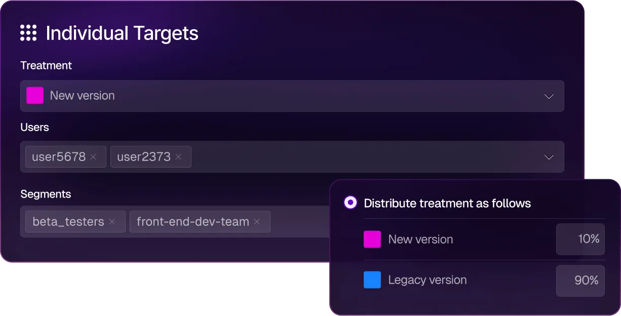
Despite being a strong feature flagging and experimentation platform, Split is no longer a standalone platform. It sits inside Harness’s broader DevOps platform alongside CI/CD, security testing, cloud cost management, and chaos engineering. FME is only available on the Enterprise tier, and you need to contact sales to find out the actual cost. For teams that only need feature flags and experimentation, engaging with the full Harness platform feels like overkill.
Split (Harness) key features
Pros of Split (Harness)
- Automated impact measurement ties every flag toggle to business and engineering metrics without requiring manual experiment setup. You can toggle a flag and immediately see whether it moved conversion rates or error rates with statistical significance calculated automatically.
- Since it offers several built-in connectors and a broader set of CI/CD and security features, enterprises tend to get more value from a single platform.
- It offers extensive cost-optimization features powered by AI, so you can easily save on cloud costs.
- You also get detailed reports on feature management and rollouts so that you can communicate them to different stakeholders with ease.
- You can create an entire CI/CD pipeline without writing any code, which is useful as teams move to more AI-native development processes.
Drawbacks of Split (Harness)
- FME is only available on the Harness Enterprise tier. There’s no way to buy it standalone, no public pricing, and the sales motion is a full platform engagement. For teams that only need feature flags and experimentation, this is a heavy procurement process for a focused use case.
- There’s no open-source version or self-hosted version for FME. The Split Proxy can be deployed in your infrastructure for latency and caching, but the control plane and analytics remain in Harness’s cloud.
- The integration ecosystem is much narrower than LaunchDarkly’s. You get a few primary integrations like Datadog, Jira Cloud, New Relic, and Sumo Logic. But other connections require custom webhooks or Zapier.
- It doesn’t offer advanced feature management capabilities, such as CUPED variance reduction and scheduled rollouts. And there’s no easy way to revert flag changes to a previous state.
- There’s no built-in bandit optimization for automatically shifting traffic, and you have to do a custom build for similar optimization techniques.
How Split (Harness) compares to LaunchDarkly
These platforms were built on different product philosophies. While Split was built around automated metric attribution, LaunchDarkly was built around release governance. That’s why:
- Split (Harness) wins for teams already on the Harness platform that want feature flags integrated into their CI/CD pipelines, and for organizations that value automated impact measurement without manual experiment setup.
- LaunchDarkly wins on SDK breadth, governance maturity, integration ecosystem, federal compliance certifications, and better billing structure. You can buy LaunchDarkly without buying an entire DevOps platform.
Who is Split (Harness) best for?
Teams already invested in the Harness DevOps platform that want feature flags and experimentation tightly integrated with their CI/CD pipelines. If you’re not already a Harness customer, the enterprise procurement process and platform bundling make Split a difficult choice for teams that just need feature flags and experimentation.
6. Unleash
Unleash is an open-source feature flag platform, licensed under Apache 2.0 with 13,600+ GitHub stars and 500+ contributors. It only does feature flags and enterprise governance—and nothing else. It was founded in 2019 and built its reputation on deployment flexibility and enterprise compliance.

The platform has a very simple architecture, which consists of a stateless Node.js API server backed by PostgreSQL, deployable on Docker, Kubernetes, bare metal, or fully air-gapped networks. And the recent version includes updates such as observability metrics and an MCP server in beta to support more granular feature rollouts. But the biggest gap shows up in experimentation and product analytics. It doesn’t have any capabilities for these use cases and you’ll need external tooling to make it possible.
Also, with its recent push to move away from the open-source version, it’s pushing users towards paid plans or building their own edge layer.
Unleash key features
Pros of Unleash
- Because of the way it’s set up, you can manage a large scale of feature flags with ease, even if you’re working with multiple teams.
- It uses an API-first approach and also lets you automate provisioning and configuration, which is ideal for complex microservice architectures.
- Server-side SDKs ensure that no end-user data ever leaves your infrastructure, as the privacy architecture is built into the platform.
- Unleash claims most customers cut their LaunchDarkly bill by 75% or more. So it might be a more cost-effective solution for feature flags and governance only.
- Many users say that the documentation is excellent, and so is the customer support, as they regularly gather customer feedback and incorporate it into the product.
Drawbacks of Unleash
- Unleash’s browser and mobile SDKs are thin clients as they don’t contain targeting logic, hashing, or bucketing. All of that runs on a separate Unleash Proxy or Frontend API server that you have to deploy and maintain. If that proxy goes down, your client-side flags stop evaluating.
- It uses a polling-based architecture so your SDKs periodically fetch the latest configuration rather than receiving changes via streaming.
- OSS Edge is sunsetting December 31, 2026. After that, self-hosted open-source users lose the edge evaluation layer entirely unless they upgrade to Enterprise Edge or build their own version.
- Given the price point, the fact that you only get feature flagging with basic experimentation makes it an expensive alternative. Even features like SSO and real-time streaming (beta) are only available on the Enterprise plan.
- It doesn’t offer the capability to monitor whether a feature rollout is degrading a metric and reverse it automatically. If you need guardrail-driven rollbacks, you’ll have to use another tool like GrowthBook.
How Unleash compares to LaunchDarkly
Both Unleash and LaunchDarkly were built for enterprises and have comparable SDK breadth and governance. That said, the differences are architectural and philosophical:
- Unleash wins on cost (claims 75%+ savings), full self-hosting including air-gapped deployments, FedRAMP-ready infrastructure, and data privacy by design. If feature management is your only use case, it makes sense to use it.
- LaunchDarkly wins on experimentation (Guarded Rollouts with metric analysis vs. Unleash’s zero experimentation), integration ecosystem depth, multi-stage approval workflows, and the breadth of enterprise compliance certifications. LaunchDarkly is also an independent, publicly traded company with a stable roadmap.
Who is Unleash best for?
It’s meant for engineering teams in regulated industries like finance or government that want full deployment flexibility and don’t need product analytics or experimentation. But if you want feature flags and experimentation on a single platform, GrowthBook covers both under the same open-source license.
7. VWO
VWO (Visual Website Optimizer) is a conversion rate optimization platform that bundles A/B testing, heatmaps, session recordings, on-site surveys, and personalization into a single dashboard. Founded in 2008, it’s one of the oldest experimentation tools on the market.

VWO merged with AB Tasty in January 2026. AB Tasty brings AI-powered personalization (including Evi, an agentic AI engine that automates A/B testing workflows), and the combined roadmap is still being defined. But the pricing plans have already changed as the free plan was discontinued and new sign-ups get a 30-day trial.
It’s essentially a marketing experimentation platform that happens to have feature flags, not a feature management platform. That’s why the flag governance features are basic compared to LaunchDarkly or GrowthBook.
VWO key features
Pros of VWO
- Since it’s made specifically for marketing and CRO teams, many users say it’s quite easy to set up and run experiments. It has a mature no-code visual editor for client-side A/B testing.
- Customer support consistently receives high praise across platforms, and their response times are quite fast compared to other platforms.
- The AB Tasty merger brings AI-powered personalization (Evi engine) and a deeper European enterprise presence. So, it has actually strengthened the platform’s positioning as an A/B testing and CRO tool.
- It bundles qualitative tools like heatmaps, session recordings, form analytics, and on-site surveys with quantitative data. So CRO teams get a complete behavioral analytics toolkit alongside experimentation.
- It has 12+ SDKs and server-side feature flags via FME, enabling progressive rollouts so your basic feature flagging use cases are covered.
Drawbacks of VWO
- It only offers MTU-based pricing, with modular add-ons that scale aggressively. So much so that, post-merger, there’s no public pricing available, and average contracts sit above $16,000 per year.
- It also doesn’t offer self-hosting options, open-source infrastructure, or warehouse-native analytics, so it might not be a fit for companies in regulated industries.
- The visual editor breaks down on complex or dynamic pages with heavy JavaScript. As you add more event-based goals, it becomes buggy, and you’ll need to involve a developer.
- VWO’s client-side snippet increases load time and can cause Cumulative Layout Shift (CLS) issues, which Google penalizes in Core Web Vitals. The anti-flicker technology helps but doesn’t eliminate the fundamental performance impact.
- Feature flagging and experimentation live on two different platforms and require separate billing.
How VWO compares to LaunchDarkly
Within VWO, feature flags are merely an addition that lets you run A/B tests and similar experiments. But in LaunchDarkly, that’s not the case. That’s why:
- VWO wins for marketing-led experimentation programs that need a visual A/B testing editor, heatmaps, session recordings, and surveys alongside basic feature flags, without engineering involvement for most workflows.
- LaunchDarkly wins for engineering-led feature management, with better SDK breadth, governance depth, compliance certifications, release automation, an integration ecosystem, and flag lifecycle management.
Who is VWO best for?
Marketing and CRO teams at mid-market companies that want a complete web optimization toolkit to understand how users experience the website and how to improve it. Feature flagging is essentially a secondary capability. If you’re evaluating VWO as a LaunchDarkly alternative for engineering-led feature management, it’s the wrong tool. They solve different issues, so you’d be better off using a platform like GrowthBook, which is made for developers and engineering teams.
How to choose the right LaunchDarkly alternative for your team?
Yes, LaunchDarkly built the category, and it remains the strongest option for teams whose primary need is enterprise release governance, with the broadest SDK coverage and compliance certifications. Depending on what you need and your primary use cases, there may be a better or more cost effective solution for you.
Here’s what we recommend based on what’s driving the switch:
- If you want open-source feature flags with built-in, warehouse-native experimentation and product analytics at predictable pricing, GrowthBook is the best choice. It covers the full flag-to-experiment-to-analysis lifecycle in a single MIT-licensed platform that runs on your infrastructure or GrowthBook Cloud.
- If you want one vendor for analytics, flags, session replay, and experimentation, PostHog consolidates the entire product tool stack under a generous free tier. But you won’t get advanced experimentation capabilities.
- If you want advanced experimentation and are already using Amplitude, consider Statsig, which offers a robust stats engine and was recently acquired by Amplitude.
- If you want marketing-led web experimentation with a visual editor, heatmaps, and session recordings, Optimizely (enterprise budget) or VWO (mid-market budget) is the way to go. But if you’re an engineering-led team or are looking for a platform for those use cases, you’re better off with GrowthBook.
- If you want enterprise flag governance with full self-hosting and don’t need experimentation, Unleash offers the simplest self-hosting architecture in the category with FedRAMP-ready infrastructure.
- If you’re already on the Harness DevOps platform, Split (Harness FME) makes the most sense since it integrates feature flags directly into CI/CD pipelines with automated impact measurement.
If you already know that factors like open-source development, self-hosted deployment, and feature flagging/experimentation are a deal-breaker for you, why not give GrowthBook a shot?
We’ve made it easy with our LaunchDarkly importer. Just follow the steps and get started for free.
.avif)
Kargo shows how to shift the mindset on losing experiments
Most companies say they value experimentation. Far fewer have built a culture where a failed test is treated as a win. James Falzone, Director of Product Management at Kargo, leads a team that does, and on The Experimentation Edge, he made a case for why that distinction is the whole game.
🎧 Listen to the full episode →
Kargo engineers technology that helps brands connect with consumers and grow their businesses. Every day, its teams build products across agentic AI, CTV, eCommerce, social, mobile, and its OpenAI integration, giving advertisers new ways to reach audiences across premium media. When you tap a link and a page loads, the ad you see didn't get there by accident. In the split second before the content renders, a real-time auction fires. The publisher signals an opportunity, companies like Kargo bid on behalf of advertisers, and the winner places the ad, all inside roughly a thousand milliseconds. Multiply that by up to 10 billion ad requests a day, across tens of thousands of advertisers and publishers, and you start to see why Falzone says experimentation at Kargo isn't a team you visit. It's embedded in the culture because the scale and constant change of the industry require it.
A bad result is not a bad experiment
The line that anchors Falzone's philosophy is simple: "There's a difference between a bad result and a bad experiment." A bad result is the market telling you an assumption was wrong. A bad experiment is the one you were too cautious to run.
"If you're not getting those bad results, if you're not failing, are you really trying anything new?" he asked. It's a reframe worth sitting with. Most teams instinctively measure themselves by hit rate, the percentage of experiments that succeed. But a high hit rate often means a team is only testing the safe, obvious bets. The genuinely new ideas, the ones that could move the business, are exactly the ones most likely to fail at first. A perfect record isn't a sign of great experimentation. It's a sign you stopped experimenting.
Falzone is candid that his team probably learns more when it fails than when it wins. That isn't a consolation prize. It's the operating model.
The experiment that failed, and why
The clearest example came from Kargo's own bidding strategy. The team built a click optimization model: predict the likelihood of a click within five milliseconds, then adjust the real-time bid accordingly. For Kargo's direct demand, the advertisers who come straight to the company, it worked beautifully. The improvements were real and substantial.
So the team did what looked like an obvious next step. They took the same model, the same tech, the same rationale, and applied it to their third-party demand, where another party taps Kargo's inventory on an advertiser's behalf. "And we failed," Falzone said. "It did not work. Bad results across the board."
The instructive part is the diagnosis. "The bad results didn't come from technical implementation," he explained. "They came from a lack of contextual implementation." The model was sound. The context was wrong. With first-party demand, Kargo has rich visibility: the geographies a customer wants to serve, the audiences they're targeting, the dates, the budget. Third-party demand is full of idiosyncrasies, and crucially, it isn't just customers reacting; it's their models interacting with Kargo's models. Different segments react to different data and different inventory. What a customer says they want and what their models actually optimize for are not always the same thing.
The fix wasn't a better algorithm in the abstract. It was going back to the drawing board to customize the model around the verticalization of those customers, and to make sure the metrics and signals being tested were business-driven rather than borrowed. Eventually, the team recovered the 25 to 40% performance gains they'd been chasing. But the takeaway outlived the project: a result that works in one context is a hypothesis everywhere else, not a conclusion.
Putting failure on the agenda
Knowing that failure is valuable is one thing. Building a team that acts on it is another. Kargo's mechanism is refreshingly concrete. In every biweekly retro, there's a dedicated section: "Where did you fail?" Everyone takes a turn. "I tried this, it didn't work." Out loud, on the agenda, by design.
The effect is cultural, not procedural. When failure is a scheduled topic instead of a quiet embarrassment, three things happen at once. Losses get normalized, which is the precondition for taking real swings. One person's dead end becomes the whole team's shortcut. And the psychological safety that every leadership book talks about stops being aspirational and becomes a recurring calendar item.
Falzone is also honest about a tension he hasn't fully resolved. He believes deeply that a single person should be able to run an experiment without needing a committee, that autonomy and speed and a startup mentality matter. But he equally believes the best ideas come from bouncing ideas off other people. "You're a person first," he said, not a job title, and the best ideas can come from outside your function. Holding both individual speed and collective creativity is an ongoing balancing act rather than a solved problem. That he names it openly is part of the same culture that schedules failure into the retro.
Better, not bigger
Asked where experimentation goes next, Falzone did what almost everyone does now and brought up AI. But his framing was specific. AI's real unlock, he argued, is access. People who previously couldn't read the code or understand the system can now form opinions and run experiments, whether that's generating a SQL query or interrogating data they couldn't reach before. More people at the table mean more ideas and more experimentation opportunities.
He's also clear-eyed about the limits. In ad tech's latency world, where everything has to resolve inside a second, large language models simply aren't fast enough to sit in the live auction path. But they can operate at an orchestration layer, and Kargo is already thinking about agents that run tests on the team's behalf. The caution underneath the optimism is the part worth keeping: AI can't be treated as a magic bullet, because everything still has to be built on solid ML and infrastructure engineering.
His closing phrase captured the whole conversation. "Better, not bigger." More compute, more data, and more agents don't matter if they're pointed at the wrong thing. What compounds is a team that runs new experiments, welcomes the bad results, talks about them openly, and rebuilds with context. In an industry where a single mistake can burn an entire campaign budget in under a minute, that discipline isn't a nicety. It's the edge.
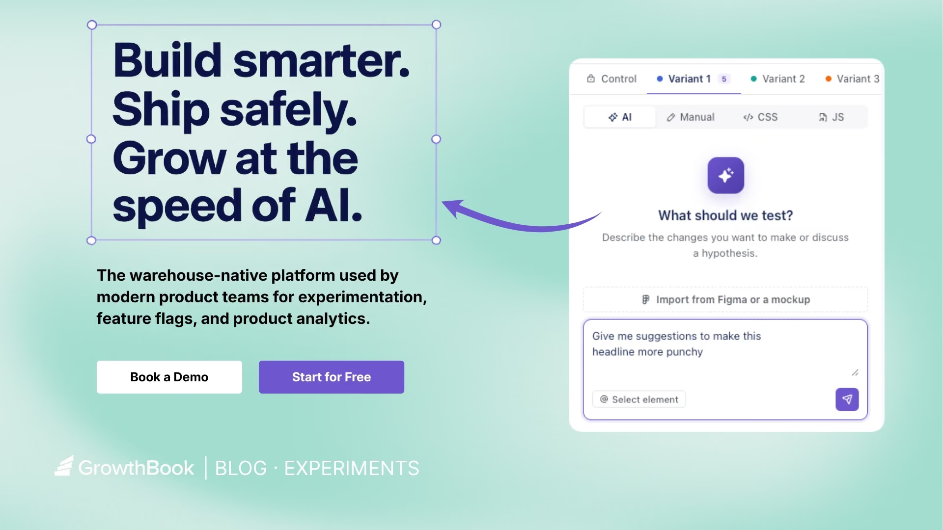
AI Visual Editor: from idea to live experiment in minutes
GrowthBook’s AI Visual Editor lets anyone on your team go from idea to live experiment in minutes, without touching code. It's a way to scale experimentation beyond one team and across your whole organization.
Just describe the change you want in plain language. The editor handles the rest. No code, no dev ticket, no flicker. The result is a fully configured A/B test ready to launch from your GrowthBook account.
The AI Visual Editor is available on GrowthBook Pro and Enterprise plans.
How does GrowthBook’s new AI Visual Editor work?
The AI Visual Editor is a Google Chrome extension. Open it, connect to your GrowthBook account, and immediately get started. The extension stays in the sidebar and doesn’t overlap your page.
Describe the change you want, such as “make the headline larger and move the CTA button directly beneath,” and the editor will generate a variant in seconds.
There's no code to write. The editor understands the structure of your page, applies the change, and connects it directly to a GrowthBook experiment. You prompt, then preview your changes in real time without ever leaving the browser. If you want more control, you can use the manual editor to do fine adjustments.
Key features
AI-generated image creation and visual testing
The AI Visual Editor is a powerful creative tool. Describe the image you want and the editor generates it in real time, along with options you can place into the right spot on your page and size to fit exactly. Test hero images, product photos, background visuals, and more, iterating until you get what you want without a designer or a design file.
It’s a quick way to immediately see changes in context and visually brainstorm live before you build anything. Once you’re aligned on variations, publish and A/B test new designs in minutes.
Images are stored in GrowthBook’s image storage bucket and served from a CDN-fronted URL so SDKs can fetch them efficiently when delivering variations.
Design updates and layout changes
Beyond text and images, the AI Visual Editor also lets you adjust fonts, colors, padding, button styles, layouts, and more all through prompts or via the manual editor.
Make design decisions without mocking anything up or writing a line of code. Try it, see how it looks in context, and decide if it's worth testing before it goes live.
Import from Figma or an image design
You can quickly turn a Figma frame or mockup image into a testable variation. Import the file into the AI Visual Editor and it will rebuild it as a new component, placing it on the page as a variation. You can also add additional context as to how the AI is to implement the design. This makes it easy to test designs your team has mocked up, such as a new hero, redesigned pricing card, modal window, or promo banner.
What use cases does this work well for?
Landing page optimization and headline testing
The AI Visual Editor is ideal for landing page optimization, such as testing headlines, messaging, copy order, and structure. Use AI to generate variant ideas, preview them directly on the page, then launch the test in minutes.
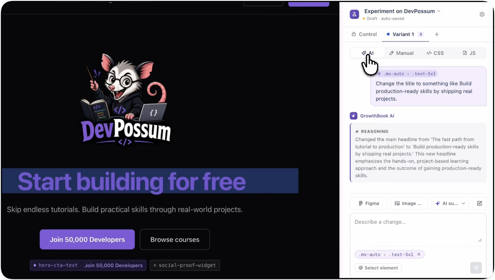
Promotional banner and offer testing
Test things like the impact of a promotional banner on bookings to Hawaii. The AI Visual Editor lets you build and swap promotional messaging directly on the page. Run the experiment, read the results, and roll out the winner.
With GrowthBook’s feature targeting capabilities, you can deliver different promotions to different audiences based on the criteria you choose, personalizing as you see fit.
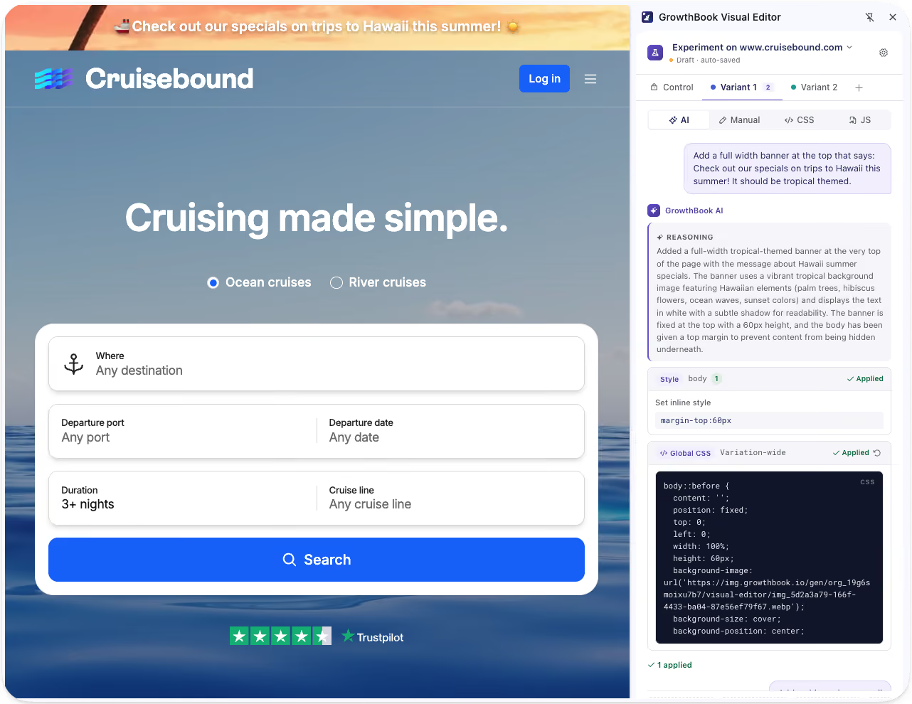
Experimentation for every team
The AI Visual Editor expands experimentation across your organization by putting the ability to build and launch tests directly in the hands of the people with ideas, regardless of technical skillset.
- Marketing and growth teams can independently run their own tests on landing pages, campaigns, and offers.
- Teams that want to move fast can go from idea to live experiment in minutes without touching a line of code.
- Product and design teams can validate new layouts, messaging, and user flows before investing engineering time.
- Developers can stay focused on higher-complexity work instead of implementing every copy or design test.
By unlocking experimentation across your organization, you get more tests, more learning, and faster iteration for everyone. It also improves collaboration by giving marketing, growth, and product teams shared visibility into what's working, so no one operates in a silo.
Your existing guardrails stay in place
The AI Visual Editor handles the creative execution by generating variants, applying changes, and wiring up the experiment, but everything still runs through the GrowthBook platform. Your approval and review workflows, as well as existing processes, remain in place, so your team maintains governance and control.
Get more out of your experimentation platform
The ability to go from idea to experiment in minutes, without engineering support, means more people can run experiments than ever before. And when more people can run experiments, it results in more learnings, faster and more informed decisions, and improvements that compound over time.
Try out the AI Visual Editor (beta)
The AI Visual Editor is currently in beta. Try it today, share your feedback directly with our team, and connect with other users in our community Slack channel.
.avif)
AI coding agents and A/B testing: how to automate the experiment lifecycle
Ideate on features, create feature flags, analyze product data, and test what you build, all from Claude Code, Cursor, or Codex against GrowthBook.
AI coding tools are reducing the cost of coding in ways no one ever imagined. Coding that used to take days now takes a prompt. But coding is just one step in the software development lifecycle. Deciding what to build, deploying safely, and tracking the impact of new features still take time. Finding ways to speed to up these processes unlocks even more of the benefits of agentic coding.
That is the vision behind GrowthBook’s 4.4. Your AI coding agent can now drive the entire experiment lifecycle against GrowthBook. From a single conversation in your editor, an agent can analyze your product data, ideate on a new feature, create the feature flag, build the variant, and test it. This post covers what that workflow looks like, how you can incorporate guardrails to create trust, and how to run it from any AI coding agent.
How AI agents can automate the entire lifecycle
Automating the lifecycle is broader than running a single A/B test. AI coding agents can now cover the full product development lifecycle:
- Analyze product data. The agent pulls product metrics and experiment data to identify new product opportunities
- Ideate. Describe a problem in plain language and have the agent propose concrete changes to try, grounded in your actual codebase.
- Create feature flags. The agent creates the feature flag and wires it into your code, so the change is rolled out gradually and safely.
- Build and test. Create experiments using templates, standardized metrics and guardrails.
- Analyze experiments and make decisions. Use AI to analyze experiment data, extract learnings, and make go/no-go recommendations.
How templates and guardrails streamline using AI to create experiments
There are many ways an experiment can go wrong, including flawed assignment rules, bad metrics, and unexpected side effects. Consistency and rigor become even more important as you scale.
GrowthBook addresses these needs in a couple of key ways. Experiment templates pre-define the metrics, randomization, and setup for a class of experiments, so the agent knows your best practices. A team can keep a template for, say, logged-out conversion tests, and every front-end experiment of that type inherits the right goal metrics and guardrails automatically. A built-in decision framework encodes when a result is genuinely shippable, rather than leaving that to the agent's guesswork. And GrowthBook stays the source of truth, so business context lives in one place instead of being re-derived in every prompt.
This is the real shift behind agentic experimentation. The agent handles the mechanics. The platform holds the judgment.
AI can apply a series of skills to automate the experimentation process
Take a simple example: testing new copy for a landing-page headline. You give your coding agent the idea in plain language and point it at the file. From there, the agent works the lifecycle:
- Ideate and build. Reads the file, proposes a few headline variants, and picks one to test.
- Configure. Finds the right experiment template in GrowthBook, confirms the metrics, and creates the experiment in draft.
- Wire it up. Creates the feature flag, links the experiment to it, and edits the component to read from the flag. Nothing is live yet.
- QA checkpoint (you). Confirm the flag is wired correctly in GrowthBook before anything ships.
- Launch. On your approval, the agent starts the experiment and tracking fires automatically as users are bucketed into variants.
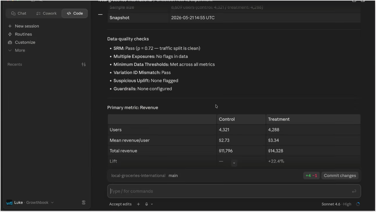
Reading and shipping work the same way. Later, you ask the agent how the test is doing:
- Analyze. Pulls the latest results, checks the test is well-powered with clean data, and summarizes what happened.
- Recommend. Because the decision framework lives in GrowthBook, the recommendation reflects your team's shipping criteria, not a generic heuristic.
- Ship (your call). If the result clears the bar, tell the agent to roll out the winner. It ships the treatment and writes up the result, with flag cleanup as an optional next step.
This works from any AI coding agent
Whether you use Claude Code, Cursor, Codex or any other coding agent, you can apply this same workflow. All the key components are coding agent-independent, including the programmatic endpoints, the CLI, and a set of open-source skills that teach an agent how to drive GrowthBook correctly. All of this then combines with the context of your own repository.
The governance layer, the templates and the decision framework and your source of truth for experiments, all work the same, consistently and safely with any tool.
The skills are open source and available on GitHub. You can use them as-is or adapt them to how your team runs experiments.
Where humans stay in the loop
Automating the lifecycle does not mean removing yourself from it. The workflow is designed around checkpoints precisely because some decisions should not be fully delegated.
QA is the clearest example. Before an experiment goes live, a person should confirm the feature flag is wired correctly and behaves as expected. Ambiguous results are another. When a test is underpowered, or a goal metric moves while a guardrail slips, that is a judgment call about tradeoffs, not a mechanical decision. The agent can surface the situation and make a recommendation, but a human should own the call.
Think of the agent as a fast, tireless operator that handles the setup, the wiring, the data pulls, and the rollout. The strategy, the QA gate, and the final ship decision stay with you.
Key takeaways
- AI made building cheap, but the experiment lifecycle stayed manual. Agentic experimentation closes that gap.
- An AI coding agent connected to GrowthBook can run the full product development lifecycle: ideate, create feature flags, analyze product data, build, and test.
- Guardrails are what make it trustworthy. Experiment templates and a built-in decision framework move judgment into the platform so agents cannot improvise metrics or ship on noise.
- It is tool-agnostic. The workflow runs from Claude Code, Cursor, Codex, or any agent, because the logic lives in GrowthBook's skills, CLI, and endpoints.
- Humans still own QA and the ship decision. The agent handles mechanics, not judgment.
Get started
The build step and the test step are now both moving at the speed of AI. The way to keep that fast loop safe is to put your experimentation structure into the platform, then let your coding agent drive against it.
The GrowthBook skills are open source and ready to try on GitHub. To see the full workflow end-to-end, watch the walkthrough video. And if you are new to GrowthBook, you can start with feature flagging and experimentation in one platform.
Diligent reveals the PM's most costly mistake in experimentation
Running an experiment is the easy part. Knowing what it's telling you, and what to do when it tells you nothing clearly, is the hard part. That's the thread running through Dan Layfield's fifteen years in product management, from a mid-2010s startup to one of the largest consumer apps in the world to the boardrooms of the Fortune 1000.
Layfield is Director of Product Management at Diligent, a roughly 2,000-person company that serves around 70% of the Fortune 1000 on bespoke corporate governance problems. Before Diligent, he was head of growth at Codecademy, where he took the company from about $10M to $50M ARR, and a backend-focused PM on Uber Eats' home feed ranking system. Across all three, the constant has been experimentation, and lately, a new collaborator in the work: AI.
The losing experiment that became a 35% win
The story product teams should sit with is the one that didn't work right away. At Codecademy, Layfield's team set out to rebuild the trial model, the single biggest growth lever for most consumer subscription products. A predecessor had already shipped a successful reverse trial, where new users get the paid product automatically and then have to decide whether to keep it. Layfield's team went further, removing the auto-enroll step and asking people to choose the trial and enter a credit card upfront.
The first rounds did not produce a clean win. They produced the thing most experiments produce when they lose: inconclusive results. Not statistically significant positives, not statistically significant negatives, just noise that tells you very little.
This is where most teams move on. Layfield calls moving on too early one of the biggest mistakes he made in his career. A PM's life is a roadmap of things to ship, and every extra week on one project is a week stolen from the others. The pull toward the next thing is constant.
His team stayed. Over roughly four months and three to four rounds of tests, they kept refining the paywall structure, the question of how and where free users come into contact with the paid product, and whether they hit it at a moment that relieves real pain. The tool that broke it open was almost embarrassingly simple: they put every screen of the user experience onto a giant Figma board and overlaid the metrics at each decision point. With the entire funnel laid out, they could see how users flowed through the product and exactly where to move the gates. The payoff was a 35% increase in conversion, a massive result for a business where monetization compounds.
The lesson is not "never give up." It's that a losing test is often a map, not a verdict, and the discipline is knowing when a problem is big enough, and your read of the data deep enough, to take another shot.
Two flavors of experimentation, and one feature factory to escape
Layfield draws a clean line between two kinds of experimentation. One is high-volume conversion rate optimization: run many small tests, expect a quarter of them to deliver small wins, and let volume do the work. The other is using experiments to de-risk something big and genuinely uncertain. The trial-model rebuild was the second kind, which is exactly why taking multiple shots made sense. Email subject-line tests are the first kind; no single one matters much by the time it trickles down to a purchase.
That distinction gets sharper in B2B, where many teams aren't really experimenting at all. Layfield's description of the failure mode is precise: the feature factory. You have a thousand clients, the top 5% request things in every QBR, and the PM's job becomes shipping that list. It keeps the biggest accounts happy in the short term and produces a disjointed product over the long term.
The alternative is a foundation of disciplined, top-down product management: a top-down OKR system where leadership sets meaningful business goals, each team owns a thoughtfully chosen North Star metric that ladders up to those goals, and feature pick metrics that ladder up to the North Star. Layfield's most useful observation is about how this breaks. When a planning process goes wrong, it's usually not that any single layer is broken. Leadership picks good goals. Teams pick reasonable metrics. The failure lives in the connections between the layers, when a team's North Star only loosely relates to what the business actually cares about. Every layer can look healthy while the whole structure quietly drifts.
B2B makes this harder than B2C because of the feedback loop. In consumer products, an unhappy user leaves immediately, which is painful but fast. In B2B, clients sit on long-term contracts, so there's a long delay between weak product usage and the dollar retention hit at renewal. If you aren't watching usage and adoption closely, the bill arrives long after you could have done anything about it.
Anchor the North Star to the natural use case
At Diligent, Layfield's team thinks about North Star metrics by product. The flagship is a board-of-directors collaboration suite used by, in his estimate, nearly every famous board director you could name. The core value isn't receiving a document; if all you do is print a board deck, Diligent is an expensive way to move a file. The value shows up when directors actually collaborate, comment, take edits, and prepare on the plane. So the team anchors the board product on director-side usage.
The catch is rhythm. A director on one board has a meeting roughly once a quarter, so they use the product the week before and a few days after, and then nothing. Push for more engagement than that and it starts to feel spammy, because unless a board deck is waiting, there's genuinely nothing to do. Layfield's rule is worth posting on a wall: retention and engagement should always ride whatever the natural use case is, not fight it. Guardrail metrics like session length and abandonment matter, but the headline number has to respect how the product is actually meant to be used, especially in a regulated space where Diligent deliberately tracks far less than a consumer app like Uber ever would.
AI as the data scientist in the room
Which brings us back to the title. Ask Layfield where AI has earned its place so far, and the answer is research and data synthesis. The old workflow was weeks of labor: find a hundred users, email all of them, spend two to three weeks scheduling calls, write up every interview, then synthesize by hand. Now he points AI at the raw material. Gong's MCP delivers reasonably good synthesis from sales calls in an hour or two, and for simple A/B test analysis, in his words, Claude is a pretty good data scientist.
The point isn't that AI replaces product judgment. It's that AI collapses the weeks of grunt work between having a question and having an answer. For experimentation teams, that's the part that compounds: the faster you can synthesize what users are telling you and what a test actually did, the more shots you get at the problems that matter, and the less tempting it is to move on too early from the one that's about to pay off.
Listen to the full episode of The Experimentation Edge with Ashley Stirrup. How does your team decide when a test is worth one more round? Share below.
Box uncovered these interesting surprises that reshaped how they run e-commerce experiments
When Danielle Olean describes her job, she does not start with a feature roadmap. She starts with a number. As Director of E-commerce at Box, she is not measured by whether she shipped something on time. She is measured by revenue. That single distinction, she argues, changes everything about how a product team should work, and it is the thread running through one of the most practical conversations The Experimentation Edge has hosted.
🎧 Listen to the full episode →
Olean has spent more than 15 years in e-commerce. She came up in the B2C world at companies like Wayfair and Drizly, then spent nearly six years scaling online sales at Zoom through the chaos of the pandemic, watching a one-person operation balloon into a 100-person department almost overnight. Now she is at Box, helping reposition the company from a cloud storage business into an AI platform for managing unstructured content. Across all of it, one tool has been her constant: the A/B test.
Experimentation is not an e-commerce luxury
The most important idea Olean offers is also the one most product teams resist: experimentation is not just for people who own a checkout flow. It belongs to everyone who builds.
Her reasoning is hard to argue with. Time is finite. Engineering capacity is finite. Every feature you choose to build is an opportunity cost for one you chose not to. So the question that matters is never simply "did we launch it." It is "did this actually move the business, and was it a net positive."
You do not need a shopping cart to ask that question. As Olean points out, every product has a flow. Even an AI chatbot has one. A user asks something, gets a response, and either abandons the interaction or comes back. Someone trying to create a document has to find the right place, start the action, and complete it with the formatting they wanted. All of that is a funnel, and a funnel can be measured.
That measurement reveals things intuition never would. Olean describes a recurring pattern: a feature that very few people discover, but that the small group who find it use at a high rate. The instinct is to call the feature a failure. The data says the opposite. The feature is valuable. The placement is wrong. Catching that early turns what would have become a customer complaint or a pile of technical debt into a quick fix.
The humility underneath this is what makes it powerful. Host Ashley Stirrup framed it as the hard truth of experimentation: only two or three out of ten ideas tend to land the way you expected. That is not a sign that the other ideas were bad. It usually means a piece was missing, the wording was off, or the timing was wrong. For a B2B product manager, that is not discouraging. It is an enormous opportunity to double their impact by building what customers actually want to use.
The simplification tightrope
If the first lesson is that you should test, the second is that testing will humble you, even when you are winning. Olean's pricing page saga is the clearest example.
Box's pricing page was, in her words, robust. Lots of colors, lots of elements, eight self-service plans, and a tangle of security, compliance, and AI features competing for attention. Her hypothesis was straightforward: simplify the page, reduce the cognitive overload, and more customers will be able to choose a plan and buy. The team did a large overhaul, even setting rules to keep feature descriptions to one line with tooltips for anything longer. The result beat expectations. A genuine, measurable win.
And here is where most teams go wrong. A win feels like a direction. "This is the right hypothesis, let's do more of it." So the team kept simplifying. They tested removing the slash-out pricing, the crossed-out higher number next to the discounted one, assuming it was just more clutter. It failed. That crossed-out price was quietly reinforcing the 25% annual discount, and customers valued the cue more than anyone realized.
Undeterred, they tried once more, trimming each plan's feature list to show only what differentiated it from the plan below. That failed too. Box's plans are complex, and customers wanted the full detail to feel confident about what they were buying. Stripping it away did not reduce overload. It removed information people needed.
One win, two losses. Olean calls it the tightrope. There is a diminishing return where simplification stops helping and starts hurting, and the only way to find that edge is to test until you cross it. Tellingly, the team's next move was not more simplification but an addition: a third tab to serve a new persona, on the theory that the page was now simple enough to absorb it. And of course, they are testing that too.
The wine effect
The third lesson is Olean's favorite kind of result: the test that wins for a reason you never hypothesized.
In a prior role, the team faced a churn problem. So they created a cheaper plan called Basic Plus and showed it only to customers in the cancellation flow, never on the public pricing page. The hypothesis was logical. These people think we are too expensive, so offer them something cheaper and convert a full churn into a partial one.
The test won. But not because people downgraded. The Basic Plus plan had roughly 70% fewer features, and simply seeing it made customers' current plan look far more valuable by comparison. So instead of switching down, more of them stayed exactly where they were.
Olean calls it the wine effect. On a wine list, you rarely order the cheapest bottle. You order the second-cheapest because the cheapest one makes the next option up look like a deal. The experiment succeeded, the hypothesis was wrong, and both things were true at once. That gap between what you predicted and what actually happened is not noise. It is the entire reason to run the test.
Building a culture that can handle losses
None of this works if a team is afraid to lose. Olean is deliberate about that. She presents every win and every loss to leadership, with a biweekly impact report to the COO and a monthly one to the CEO. The wins build credibility and prove the team knows what it is doing. The losses, presented just as openly, create the psychological safety that a testing culture depends on. Every loss comes with what was learned and what the team will try next.
The payoff has been cultural. A year into her role at Box, Olean now has executives who proactively say "let's make sure we test that" before shipping a new feature, and a growing line of colleagues asking how to run experiments of their own. She thinks about it as a pyramid: start with the widest-impact experiences like the pricing page and checkout, then work up into smaller cohorts, like desktop versus mobile or high-context international markets such as Japan. And she is already looking ahead to monetization tests and AI agents that scan competitors and help ideate new experiments.
The throughline is simple. You will be wrong more often than you are right; you cannot reason your way to the balance point, and your most valuable insights will arrive disguised as surprises. The teams that win are not the ones with the best guesses. They are the ones willing to find out.

How to avoid false positives in high-velocity experimentation
If you run A/B tests long enough, you'll eventually ship a false positive. Your test calls a winner, you ship it, but the metric that should have moved stays flat. This happens far more often than the 5% significance threshold promises, even at big companies with mature experimentation programs like Microsoft, Bing, Netflix, and Airbnb. What's worse is that the faster you test, the more false positives you ship. This is the technical playbook for keeping that number down without slowing your program to a crawl.
How bad is the false positive problem in A/B testing?
False positive rates in real-world A/B testing run far higher than the 5% most teams assume. Even mature experimentation programs carry 6% to 26% risk that a given statistically significant win is a false positive (a Type I error), and at the industry-median success rate, roughly 1 in 5 experiments called winners are a false positives.
Below is a list of false-positive risks by company. False positive risk is the probability that a statistically significant winner has no real effect, and it follows directly from how often a team's experiments succeed. The lower the success rate, the higher the risk.
The more experiments you run, the more false positives you ship. A team running 100 experiments a month at the median 10% success rate sees about 10 winners, and roughly 2 of those are false positives with no real effect. Each one costs engineering time and gets counted as a win, so the team keeps building on a feature that did nothing. Over a year, that's around 24 of them, and the faster a program runs, the faster they accumulate.
What causes false positives in experimentation?
Most false positives trace back to 4 causes: peeking at results early, testing too many things at once, assignments that are not truly random, and underpowered tests. Each one pushes your true false positive rate higher.
Peeking
Peeking happens when you check results while a test is still running and stop as soon as you see a significant positive result. The bias comes from an asymmetry in how the test ends. A positive result that crosses significance stops it, while a flat or negative one keeps running to give it time to resolve. A test with no measurable effect will still cross into positive significance from time to time through sampling variation, and stopping at one of those crossings mistakes that fluctuation for a real win.
A p-value assumes a sample size fixed in advance and examined once, so repeated looks invalidate them. Each additional look raises your false positive rate. With no correction, it climbs from 5% at a single look to roughly 14% by 5 looks and 19% by 10.
Multiple comparisons
With 20 metrics in a single test, your odds of at least one false positive are about 64%, even if nothing you changed had any effect. Each metric you add is another test with its own 5% chance of a false positive, so the family-wise error (FWER) rate keeps climbing as the list grows (FWER is the chance that any one of your metrics shows a false positive). Teams that track a wide metric dashboard on every experiment are especially exposed here. Learn more about how to choose the right metrics and KPIs for A/B testing.
Sample ratio mismatch (SRM)
Sample Ratio Mismatch (SRM) happens when the traffic split you actually get doesn't match the one you configured. A 50/50 test that comes out at 53/47 because of a bot exclusion, or SDK bug, or targeting error no longer has comparable groups, so you can't separate a real effect from bias. SRM is common and easy to miss, and the only way to catch it is to test the observed split against the one you configured, usually with a chi-squared test, which GrowthBook runs automatically.
Underpowered tests under pressure
An underpowered test without the sample size to reliably detect the effect you care about is usually framed as a false negative (Type II error) risk, but it feeds false positives too. It produces wide confidence intervals and unstable point estimates. When an underpowered experiment does cross significance, that win is disproportionately likely to be spurious, and the winner's curse inflates its measured effect, since only the largest swings reach significance when power is low. Deadline pressure makes this worse, as teams peek, stop the first time the result crosses significance, and ship it. Underpowering and peeking reinforce each other, and a high-velocity program tends to run into both at once.
7 ways to limit false positives in experimentation
Some false positives are unavoidable, but the inflated rates described above are not. Every cause has a practical control. Here are 7 actions you can take to lower your false positive rate.
1. Pre-commit to sample size and duration
Do your power analysis before launch, not after the early numbers start looking good. Define your minimum detectable effect (MDE), set power to at least 80%, and design your experiment around the required sample size. Then leave it alone. "It's trending positive" is not a stopping criterion. GrowthBook's power analysis computes the required sample size before you launch.
2. Calibrate with A/A tests
Run an A/A test whenever you stand up a new experiment surface or change the data pipeline behind it. An A/A test is an A/B test where both arms serve the same variation to validate your instrumentation and assignments before a real experiment. With no true effect by construction, a sound setup should return roughly identical results for both arms.
A significant A/A test result for a single metric doesn't necessarily mean something is broken. Even when there is no real difference, some metrics end up significantly different by chance alone. At GrowthBook's default 95% chance-to-win threshold, that's about 10% for a single metric, or 41% across 5 independent metrics. 1 metric out of 5 with a statistically significant difference is usually fine, especially if no SRM or other experiment issues are detected. A genuine problem produces a different pattern, with many metrics reaching significance simultaneously, often at extreme values such as 99%+ chance-to-win. To tell them apart, re-randomize and rerun the A/A test. Random noise will affect different metrics each time, while a real bug will consistently affect the same ones.
3. Use sequential testing to solve the peeking problem in A/B testing
Sequential testing lets you watch results as often as you want without inflating your false positive rate. It works by using confidence intervals that are wide enough to remain valid no matter how many times you look. GrowthBook implements asymptotic confidence sequences from Waudby-Smith et al. (2023), with a tuning parameter (N*) that you can set to the sample size you expect to reach when you make a decision. Since sequential testing produces wider intervals than fixed-sample testing, you trade a little power for the freedom to peek. At any serious velocity, catching a bad variation early and shutting it down is worth the small loss in power.
Learn more about common A/B testing methodologies.
4. Run SRM checks before interpreting results
Each time you conclude an experiment, check for a sample ratio mismatch before you read the results. An SRM means the realized traffic split doesn't match what you configured, like a 50/50 test that comes out 53/47. When you detect an SRM, the comparison is invalid, and no metric can be trusted, even the ones that look unaffected. Discard the results, identify and fix the cause, and rerun the experiment. GrowthBook automatically flags SRM in your experiments, so you can catch it before acting on the results.
5. Apply multiple testing corrections
The more metrics or variants you test, the more likely it is that at least one will appear significant by chance. That's the multiple comparisons problem. A correction counters it by tightening your significance threshold as the number of comparisons grows. The two corrections, Holm-Bonferroni and Benjamini-Hochberg, are explained below. Decide on the correction and your primary metrics before launch, not after seeing which ones moved. Choosing after the fact introduces bias from p-hacking.
Which correction to use depends on how costly a single false positive is.
Holm-Bonferroni is the more conservative option. It raises the bar for calling any result significant, so it's unlikely that even one of your metrics is a false alarm. In statistical terms, it controls the family-wise error rate (FWER), the chance of even one false positive across all your comparisons. The tradeoff is power. A higher bar also means missing some real effects, so use it when a single wrong call is unacceptable, as in pricing, legal, or safety decisions.
Benjamini-Hochberg is the more lenient option. Rather than guard against every false alarm, it keeps the share of false winners among your significant results low. In statistical terms, it controls the false discovery rate (FDR), the expected proportion of your significant results that are wrong. You catch more real effects in exchange for tolerating a few false positives, so use it when you're monitoring many secondary metrics and can absorb some noise.
Microsoft's Windows experimentation team evaluated both in production across 200+ metrics and found Benjamini-Hochberg won on the combined scorecard of precision, recall, and A/A false positive rate, in exactly the many-metric setting where you'd reach for it. GrowthBook supports both corrections as an organization-wide default, applied across your goal metrics.
6. Validate winners with the causal chain
An increase in your primary metric is strong evidence for a trustworthy win, but not sufficient on its own. A real effect should also show up in the metrics downstream of your primary metric, not just in the metric itself. For example, if the session-to-free-trial rate rose, the session-to-paid-plan rate should rise too, since some of those incremental free trials could reasonably be expected to convert to paid.
Fanatics, which runs close to 100 experiments a month and credits experimentation with about 8% of its annual growth, caught a false positive this way. The team tested removing ads from its product grid pages, and the results showed a positive effect at the 95% confidence level, with higher revenue. But the supporting micro-metrics like products viewed and grid-to-cart all stayed flat, and nothing explained the revenue lift.
The team stopped the experiment, reran it, and the second run found no measurable effect. They have run the same change 6 to 8 times over the years, and it comes back flat every time. It turns out, shoppers simply overlook the ads, so removing them changes neither how people browse nor what they spend.
A win that can't be traced through the behavior that should have produced it is usually a false positive.
7. Reduce false positives through variance reduction with CUPED
CUPED (Controlled-experiment Using Pre-Experiment Data) reduces variance in your results by using each user's pre-experiment behavior to account for noise unrelated to the treatment. Lower variance lets you reach a sound conclusion faster, removing the temptation to peek and stop a slow test early.
Netflix reported a roughly 40% reduction in variance for key engagement metrics, and Microsoft found CUPED to be equivalent to adding roughly 20% more traffic to an experiment. CUPED has one important limitation. It only helps when you have pre-experiment data correlated with your metric, so it does little for brand-new users or rarely observed events. Where it applies, faster experiments with lower variance mean fewer false positives. GrowthBook automatically applies CUPED to every metric as an organization-wide default, so variance reduction is built in.
How GrowthBook handles false positives by design
The best experimentation platforms offer multiple features to prevent false positives. They let you monitor results mid-test without inflating your false positive rate, they correct for multiple comparisons, they run SRM checks automatically on every experiment, and they reduce variance so experiments reach significance sooner and there's less reason to peek in the first place.
GrowthBook's experimentation platform supports all of these features. Sequential testing, included in Pro and Enterprise plans, handles safe peeking, with the confidence sequences and configurable tuning parameter described earlier. Multiple testing corrections (Holm-Bonferroni and Benjamini-Hochberg) ship as organization-level defaults. SRM detection runs automatically on your experiments. CUPED, available on Pro and Enterprise plans, cuts variance and experiment duration.
GrowthBook's stats engine is also open source, so you can read the exact code that produced any result instead of trusting a black box.
The false positive prevention checklist
Use this checklist to reduce your false positive rate in every experiment, especially as your experimentation program scales.
- Pre-commit to your sample size and stopping date before launch.
- Calibrate your setup with an A/A test on new surfaces and after tracking changes.
- Turn on sequential testing if you need to watch results while the test runs.
- Check for SRM before you interpret any metric.
- Apply multiple testing corrections: Benjamini-Hochberg for many metrics, and Holm-Bonferroni when a single false positive is unacceptable.
- Confirm every winner against its full causal chain.
- Reduce variance with CUPED to take the pressure off peeking in the first place.
False positives can slip in at any stage of an experiment, from experimental design through implementation and analysis. The 7 controls above each close a different gap, and they compound, so teams that run all of them get far more trustworthy results than teams that run only 1 or 2.
Want these controls on by default? GrowthBook’s experimentation platform runs SRM checks automatically and lets you enable multiple corrections, sequential testing, and CUPED as organization defaults.
If you’re looking to run high-velocity experimentation, try GrowthBook for free or book a demo with our team.

Why summing your experiment wins overstates impact
Sum your significant experiment wins, and you almost certainly overstate the true impact. The reason is the winner's curse: you're adding estimates that were selected for looking good. Corrections help a little, but a holdout is the real fix.
You ran forty experiments this quarter. A dozen of them had significant results, so you rolled them out. You summed up the effects, and the slide going to the leadership team says your team drove a 10% gain. Everyone celebrates. The only problem is that the number overstates the true impact.
Sure, every one of those experiments was run cleanly and read correctly. And they did pass the significance threshold. The significance threshold is what's causing the bias. The estimates you're summing are already skewed upward because lucky draws are more likely to pass than unlucky ones. So the total comes out larger than the value you actually generated.
How big of a problem can it be? Airbnb measured it: a set of winning experiments summed to 7.2%. Their de-biasing formula pulled that back to 5.3%, and a holdout put the real number near 4%. Nearly half the reported impact wasn't there, and the holdout caught more of it than the formula did.
A holdout is a simple idea: hold back a small group of users from all your new changes and measure the gap directly. There are different ways of configuring a holdout, but any of them is better than trying to infer the total impact from individual estimates.
The leadership slide is only one purpose you might have. Any time you sum individual significant results up into a single number, the same bias applies. A meta-analysis of a program, the quarter's total impact, and one team's contribution next to another's. Aggregating results that way is still useful and worth doing. This post is about doing it without overstating what you actually found. We walk through the exact mechanics of the selection-on-significance bias to give you a solid understanding. That is how you can judge, for your setting and purpose, just how big a problem you might have. And what you should do about it.
What is the winner's curse?
Every experiment hands you a measured effect, and that number is the true effect plus some noise. Run the same test next week, and you'd get a slightly different figure.
The problem arises when you look only at the significant, or shipped, results. Counterintuitive, I know. If you summed all forty estimates, winners and losers, you'd be fine. The lucky-high and the unlucky-low roughly cancel, and the total should come close to the truth. The bias enters only when selecting on statistical significance.
It is because the significance threshold isn't a random gate. An experiment is more likely to pass when the noise component pushes its estimate up than when it pulls it down. So the winners you keep aren't a fair sample of the effects you tested. On the contrary, they over-represent the ones that got a lucky draw. Gelman calls this the statistical significance filter, and the amount by which it inflates the survivors is his Type M (magnitude) error.¹
To fully understand, let's walk through the mechanics of hypothesis testing visually. Figure 1 shows the distribution of estimates you would draw from under the null, and the distribution you would draw from at a given true effect size. The scale of the x-axis is in standard errors to make it more general.
The null distribution sets the significance threshold by the chosen false positive rate (that's your α).² We can use it to visualize what part of the true-effect distribution would fall below. That's the hatched grey chunk, and these features don't get shipped. Those are your unlucky false negatives, which are more likely if your power is low (imagine the distributions widening).
The blue area illustrates the results of the significance filter. It shows the estimates that pass the significance threshold, with some luck, and get shipped. And the difference in luck is the problem. You cut away the low draws and keep the high ones, even though they have the same underlying true effect. Therefore, the average of what's shipped jumps to the right, while the center is the true effect. The average of what you shipped is higher, and it goes that way, whatever the true effect is.

This figure is constructed to show the case with 80% power, and it leads to an overestimate of 13%. The next part shows how it gets even worse with lower power.
Figure 2 shows the relationship between power and overestimated winners. At 80% power, where you'd like to be, the overstatement is the 13% we just saw. It's real, but maybe you can live with it. If the true effect comes in smaller than expected, however, the same metric and sample size give you less power. At 40% power, the survivors overstate by more than half. The reason is mechanical. A smaller true effect makes the distributions overlap more. The same thing happens if your metric is noisier than expected, or your sample is smaller than planned. Kohavi and colleagues recently replicated four widely cited 'win' patterns across eight large experiments, and the published effects came back far smaller than first reported.³
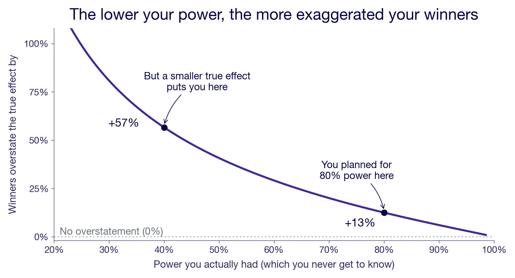
80% power is the good case, but even there, the bias is 13%. And in reality, you're probably running lower power than that on most of your experiments without knowing it. Actual power depends on the true effect you never see. Imagine the true effect actually being 40% lower than your powered MDE. Then, your realized power is 40%. Even a miss of 20% in true effect size drops your power to 60%, where you overstate your true effect by 30% when selecting on significance.
Unfortunately, you can't read the bias off a single result. A win that barely cleared could be a lucky draw from a small effect or an unlucky draw from a large one, and the number itself can't tell you which. What you can judge are the conditions you run under. If your metrics are noisy, your samples are thin, and your experiments often end inconclusive, power is scarce across the board. Your significant wins then mostly sit on the steep part of the curve. If you are generally well powered, the bias is milder. Understanding your general power situation can give you a hunch, but not the exact bias.
How to correct for the winner's curse
Can't you just correct for it? Partly. The crude way is a flat discount: Ronny Kohavi's rule of thumb is to knock at least 20% off your reported wins, the figure they used at Bing. The more careful way is to let a model do it per estimate. Switch on a proper prior in GrowthBook's Bayesian engine, and the number you read becomes the posterior mean. The raw estimate is pulled toward zero, hardest when the estimate is noisy. It shrinks on precision, not luck, which lands right on average because the noisy wins are the ones most likely inflated.
Both are more sound than estimating power from the effect you just measured and then deflating with that. Because that estimate is already inflated, it makes your power look better than it was, so the correction comes out too small. And it misses by the most, exactly when power is low. Post-hoc power like that is a known trap, not a fix.³ It's also a closed loop. The only input is the number you're trying to correct, so no new information ever enters.
What every correction shares is that it re-reads the same selected sample. To undo the selection you need a measurement that wasn't selected on. A fresh draw.
The textbook way to get one is replication. Re-run a winner and read it once, without filtering on significance, and the lucky draw that pushed it over the line the first time has no reason to repeat. That removes the bias, one experiment at a time. But replicating every winner is expensive. You would spend next quarter re-proving last quarter's, and you would still read each feature alone, with no view of what they add up to. If the purpose is to get the aggregate effect, you might as well replicate them all together in one go.
Replicating them all together is the holdout. Hold back one group from all your new changes and measure the gap once against the rollout. You give up knowing which individual winner was exaggerated, but you get the thing you were aggregating for: one honest number for the whole batch. Whether that's the total on the leadership's slide, a meta-analysis of the program, or one team's output against another's, the holdout is the complete solution for ambitious experimentation teams.
It also solves other problems for you. Some of those wins were driven by novelty effects that fade out over time. Depending on how you configure your holdout, you can solve this problem at the same time. In other experiments, your outcome metric was a proxy because your key metric was too noisy for the effect size you expected. Literally, the low power problem we have iterated here. Pooled in the holdout, these experiments either finally show an effect on the key metric, or you find out that the proxy approach doesn't work.
Because the holdout is solving multiple problems at once, there are different ways to configure it. The differences may seem subtle, and how they matter isn't obvious. That is why we cover those carefully in a separate post: what each holdout configuration actually measures.
You may have heard another reason to hold out: interactions between experiments. Several platforms list this as a key motivation. But it probably isn't moving your sum much against the holdout. When two winners interact, the sum already captures it, the same way the holdout does. That holds as long as they ran concurrently, or you shipped one before testing the next. What's left is a winner interacting with a loser, and that only biases the winner if the loser was still live during the winner's test. Because losers get switched off when they lose, often early, they should interfere less. Winners get shipped and stay on, which is the harmless case the sum handles. Interactions are worth understanding properly, and that's why we will cover them in a separate post.
Should you trust the sum of your wins?
The sum overstates what you generated, and the winner's curse is the main reason. Every winner you kept leans high because you selected it for looking good. Discounting the total or shrinking each estimate toward a prior helps, but those corrections don't solve the underlying problem. The holdout does.
Add up your wins if you like. Just think twice before you put the total on a slide.
¹ The Type M (magnitude) error, or exaggeration ratio, and the design-analysis framing the figures use are from Gelman, A., & Carlin, J. (2014). "Beyond Power Calculations: Assessing Type S (Sign) and Type M (Magnitude) Errors." Perspectives on Psychological Science, 9(6), 641–651. PDF.
² The diagram uses a two-sided 5% test, and counts only the positive, significant part as shipped, which is what you'd actually roll out. A true-zero feature lands there 2.5% of the time, not 5%. Going one-sided wouldn't change the story. It only slides the threshold to the left, to about 1.64 standard errors. That raises power and trims each winner's overstatement a little. But it buys that by doubling the rate at which pure noise ships, and the selection is still there. Drop the threshold and more marginal winners crowd into the sum, not fewer.
³ Kohavi, R., Linowski, J., Vermeer, L., Andreev, A., Dodin, M., & Furuseth, J. "Trustworthy A/B Patterns and the Winner's Curse: Lessons from Eight Large-Scale Replications." KDD 2026 (forthcoming). Preprint; doi:10.1145/3770855.3818498. Across eight high-powered replications, only two effects were significant in the expected direction and one was significant in the opposite direction. The paper quotes the same exaggeration-by-power factors used here: a relative 13% at 80% power, 40% at 50%, and 130% at 20%.
⁴ Hoenig, J. M., & Heisey, D. M. (2001). "The Abuse of Power: The Pervasive Fallacy of Power Calculations for Data Analysis." The American Statistician, 55(1), 19–24. The companion practitioner argument is McKenzie & Ozier, "Why ex-post power using estimated effect sizes is bad, but an ex-post MDE is not," World Bank Development Impact (2019).

What does a holdout test actually measure?
Teams use holdouts differently but call them by the same name. This post is about what each one actually estimates, what it's for, and when the configuration matters.
TL;DR: A holdout measures what everything you shipped over a period was worth. Holdout estimates are usually less than the sum of your individual A/B test wins, mostly because the wins are inflated by the winner's curse. This piece explains four different configurations that all get you slightly different versions of the "effect of everything over the last period". The right pick depends on how much your features interact, how much novelty effects worry you, and which version you find most relevant.
What is holdout testing?
Most experiments answer a single-feature question: what is the value of shipping this change, versus staying with the current product? A holdout experiment asks the bigger question about the effect of every feature you shipped recently. You hold a group of users back from everything your team shipped (or tested) over a given period and compare them against users who got all of it. The result tells you whether the cumulative impact of those releases actually moved the needle for the business.
You hear people talk about holdouts, and it sounds like a good idea. But why exactly would you do it, and what do you do if it comes back flat? Roll back a quarter of the features? Probably not. So why bother?
Part of the trouble is the word. "Holdout" covers a few different things, and people reach for it to mean whichever one they have in mind. Two are worth separating before we go further.
One is about a single feature. You shipped something, it won, and you keep a small group on the old version for a few months to see whether the short-term win holds up in the long run. That's a question about the long-term effect of one change, and we'll cover that separately someday, but that's not this piece.
The focus of this post is testing everything at once. You hold a group of users back from the whole set of shipped work and compare them against everyone who got the changes. That's the kind of holdout this piece is about: the one you run to answer "how much did all of this really help the business?"
The idea is simple. What's confusing is that many companies are doing this slightly differently, and each tends to present its way as the obvious one. Same word, different machinery, different answers. To see what's really going on, and whether the differences matter, you have to be precise about what each one estimates. Let's start with that.
What a holdout actually measures
A combined holdout is just an experiment. The only unusual thing is the treatment you assigned. Normally, the treatment is one feature, and you hold everything else still. Here, the treatment is the whole batch of changes you shipped this quarter, and the control group stays on the product as it was before any of them.
That can sound like a clumsy way to get a number you could back out for free. You ran a bunch of experiments, kept the winners, and you can add up their effects. Why hold a group out from everything to learn what summing the wins would tell you?
Because summing fools you. The wins you kept are inflated: you only ship the experiments with significant effects, and those oversample the ones whose noise happened to push them up (the winner's curse). A companion piece, Why summing your experiment wins overstates impact, works through how much and the mechanics more clearly. Interactions are the softer second worry: two changes that each win in isolation can partly cancel when both ship, so the sum overcounts them. But that only happens when they were genuinely tested apart. If they ran concurrently, or you shipped one before testing the next, the sum already captures the interaction, the same way the holdout does. Whether it alters the sum at all depends entirely on how your experiments overlapped, and under a clean rollout, it often doesn't. We’ll cover this in a separate piece too. Either way, a holdout sidesteps both: it turns everything on and reads the joint effect as a whole. Here we take that as given and ask: what, precisely, does the holdout measure?
What holdout testing is actually for (and what it isn't)
If a holdout comes back flat, you're not going to roll back the quarter, so what was the point?
The point is rarely a ship-or-rollback decision. A holdout is an accounting instrument and an alarm. It tells you whether the wins are real once they're added up, and what to expect going forward (with some faith). The holdout result answers, "Did all the work we did really move the needle?" Hold out per team instead, and the question changes to "which teams are driving more impact," which is a funding-and-headcount call as much as a measurement one. Etsy, a marketplace, runs a quarter-long holdout for exactly this kind of company-level read: the collective impact of everything its teams shipped, which is rarely the sum of the individual wins.
That alarm is worth taking seriously. A holdout is the safety net against naive claims: it measures the whole configuration at once, so the net of every interaction, detectable or not, is already in the number. It won't tell you which culprit is at work, the inflated wins or the features stepping on each other, but it tells you there's something to find, and roughly how much of your reported progress went missing on the way. Airbnb reported a case where a run of individual wins summed to a 7.2% effect, but the holdout put the real number near 4%, almost half the sum gone.
Four holdout testing configurations: what each one estimates
Now, the part that confuses everybody: implementation. The configurations really do differ, and we will now unpack exactly how. Whichever one you run, you get an answer to the same bottom-line question of what the quarter was worth. But each answers a slightly different version of it, and two choices set them apart. First, what you compare the held-out group against. It is either a sample of the full population that lived through the rollout, losers and all, or a clean winners-only arm carved out of the holdout itself, a split. Second, when you read the result. Either incrementally, as the winners accrue, or in a terminal window at the end with everything on. Those two choices make four configurations, one per cell of the grid below. A fifth, the Reverse holdout, sits off the grid. It is the after-the-fact option for when you never set one up.
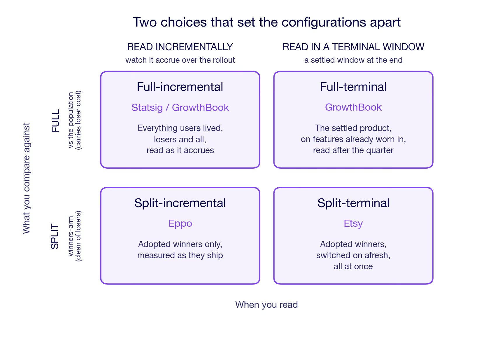
Two things separate the configs below. Which features are on when you measure: today's adopted winners, or also the losers users lived through on the way. And how fresh those features are when you read: just-shipped, worn-in, or averaged across the whole rollout. Each configuration is described in plain terms here. The corresponding potential-outcomes estimand for each lives in The estimands, formally at the end.
Full-terminal (GrowthBook)
GrowthBook reads a single held-out group two ways from the same setup, switched by a toggle on the analysis window: the terminal read here, the incremental one in the next configuration. One holdout group, both reads. Hold a group on the old product and compare it against a sample of everyone else, deliberately the same size as the holdout, so the comparison stays balanced. The held-out group gets no new features after the holdout starts. The comparison group lives through the full product experience over the time period, features arriving as they ship, and the losers are the losers switched on for a while before getting dropped.
What makes this read terminal is the analysis period: after the active period, the set of features freezes, and the number is read over a few weeks. By then, it is the adopted winners all on and the losers all off. So the transient cost of weeding out the losers is not part of the measurement, only the cost that really persists. What's left to measure is the impact of the winning features, net of most novelty effects and the persistent cost of finding the winners. One thing to keep in mind: the comparison group lived through the losers earlier in the period, so any permanent damage the losers did still pulls the number down. The transient cost of running the losers is taken out, but the lasting cost is not.
Full-incremental (Statsig/GrowthBook)
Statsig keeps the same structure. A single held-out group against an equal-size sample of everyone else. However, it is measured continuously from the start. It thus captures the winners as they accrue and the losers as they get tested. No terminal measurement window. So the number is the net effect on your users as they actually lived through the full product experience. The winners and the running cost of weeding out the losers, each interaction weighted by how long the features overlapped. This is the full account of what happened.
Read this way, the held-out gap is not one number but a moving one: small early, when only a few winners are on, and growing as they accumulate. You add the gap up as it builds, rather than reading a single end-of-quarter snapshot.
For GrowthBook, this is the same held-out group as the terminal read, now read continuously, the other setting of that toggle.
Split-incremental (Eppo)
Take a holdout of any size, say 10%, and split it in half: half see no new features for the whole period, the other half get each winning feature the moment it's adopted. Both are shielded from the live experiments. Because the winners were picked from the population outside the holdout, the split re-measures them on a fresh sample. That is a replication on a fresh sample: winners that got through on noise tend not to survive it, and the number can come in lower than the individual tests promised.
Both arms come from the holdout and sit out every live experiment, so the contrast runs between two halves: a winner's arm that picks up each winner the moment it is adopted, against a status-quo arm still on the old product. Read incrementally, like the full version, but over winners only. Two things set it apart from the full version. The losers never reach either arm, so no loser cost enters. And because the winners were selected from the population outside the holdout, this re-reads them on units that took no part in picking them, the cleanest form of replication that every holdout does.
Split-terminal (Etsy)
Splits the holdout in half, too, but delivers everything at once. Hold a group out from everything for a quarter. At quarter's end, turn on all the adopted winners together for half the holdout for several weeks. Compare that half against the other half still on the old product. Because every feature goes live at the same moment, they all have the same age when measured. No ambiguity about which feature has been live the longest and which was turned on only at the end. Like split-incremental, this is a split, so the winners reach held-out users who had no hand in picking them, the same clean replication on out-of-sample users.
In the other configurations, features arrive across the holdout period. So at the measurement, each carries a different age. Turning everything on at once for half the holdout group gives every feature the same starting line instead. All of them fresh.
Every winner shares the same age, and that age is young. It aims at the same winners-all-on contrast as GrowthBook's full-terminal read, but with the features fresh instead of worn in: every feature at the same young age, measured the first time users meet it.
Reverse holdout
The one you probably didn't plan. Every design above has to exist before launch, because you can't hold a group out from something you already shipped. If you didn't set one up, you can still take a random group and revert them, turning the quarter's changes off again. That measures something genuinely different: not the effect of never having the features, but the effect of losing them. Take away something people have settled into, and you measure their annoyance along with the feature's value. Useful when it's the only option, but "had it and lost it" is its own estimand.
The same comparison shows the asymmetry. The kept group is on the worn-in winners. The reverted group is back on the old product, but reached by removal: its baseline carries the history of having had the features and lost them, not the clean never-had-it baseline the other four compare against. Losing something you have settled into provokes a reaction of its own that a never-had-it baseline never contains. Strip out features that were doing real work, and the reverted group drops below the kept one, so the number comes out positive; the bigger it is, the more the quarter is worth.
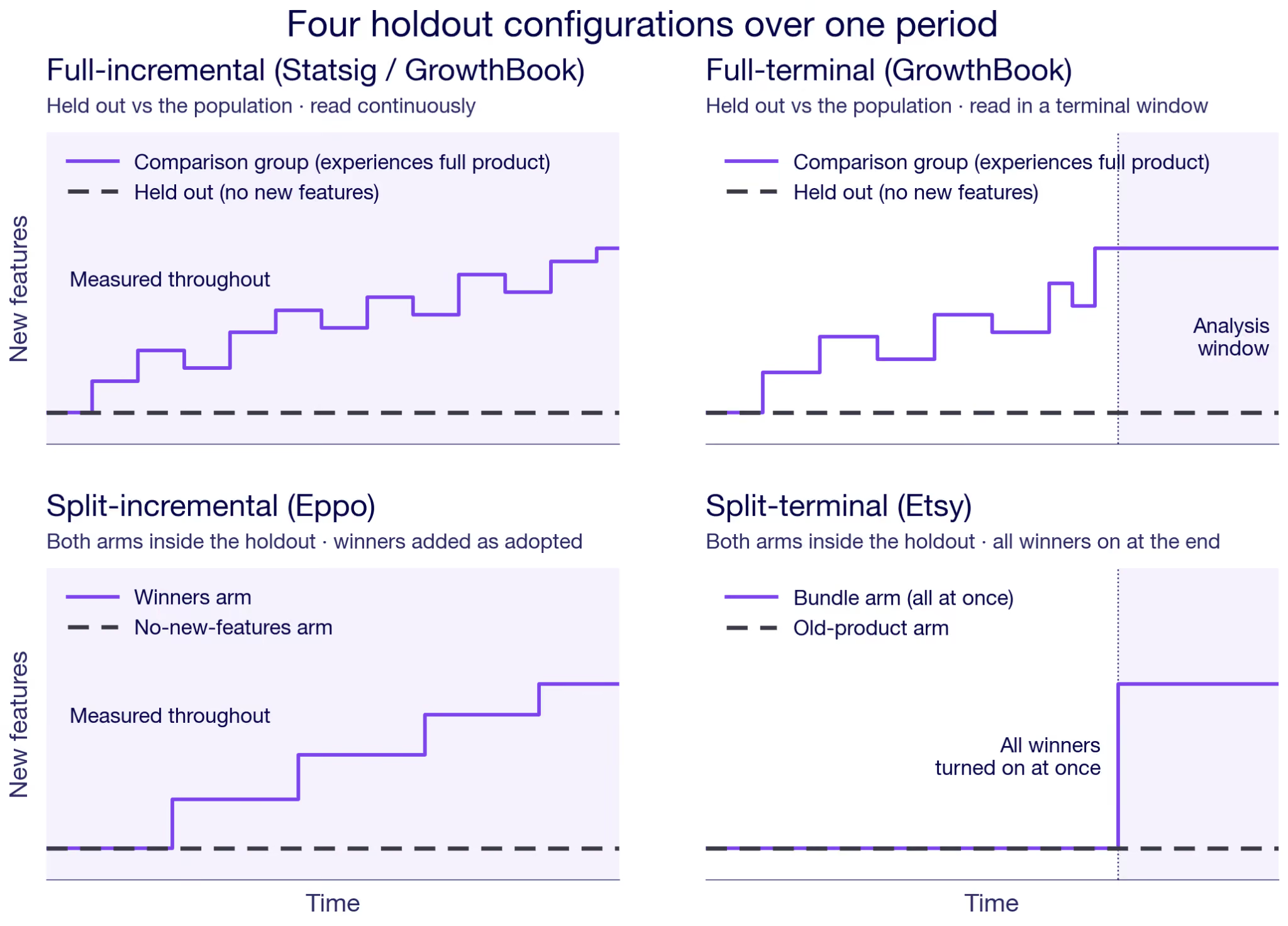
One practical thing cuts across all four, but not the Reverse holdout. Something has to keep the held-out users out of every experiment. On a platform that's handled for you: a feature-flag prerequisite in GrowthBook, the holdout config in Eppo or Statsig. The coordination cost mainly shows up if you build it yourself, which is why Etsy's writeup is half about the infrastructure it takes to keep a holdout clean across every team for a whole quarter.
Does your holdout testing configuration actually matter?
Start with what you actually want to measure. Read continuously against the full population, like Full-incremental, and you get the quarter as your users lived it, losers and all. The other four lean toward what to expect going forward: they focus on the winners, and the terminal reads let novelty settle before they measure.
How much the choice between configs then bites sharpens along the grid's two axes. The read axis, terminal versus incremental, decides how interactions and novelty land. The comparison axis, full versus split, trades the winner's curse against power.
On the read axis, start with interactions. If your teams ship to separate corners that don't touch, features barely interact, and the choice hardly matters. When many fight over the same surface, it does. The two terminal reads have every winner on when they are measured. So each interaction enters at full weight. Clean interaction accounting. The two incremental reads absorb interactions as they build over the rollout, each pair weighted by how long the two features happened to coexist. That is a more faithful picture of what users lived through. It is also a less clean account of the period's all-on state. The larger the interactions, the more the two reads diverge, so the choice matters. If you want the joint effect of everything turned on together, a terminal read measures it at full weight. If you want what users actually lived through the rollout, the incremental read is more appropriate.
Novelty is the other read-axis driver, and it sets the two terminal reads apart. They look like the same measurement taken at different times, and novelty is the difference you notice first. Split-terminal turns everything on fresh, so its window is novelty-heavy, while Full-terminal reads the winners worn in. With strong novelty effects, the two genuinely disagree, one catching the first reaction, the other closer to the mature state. A longer read settles the novelty but leaves the held-out group further behind. Age is not all that separates them, though: one is a full comparison and the other a split, so they part on the compare axis too.
On the compare axis, hold the read axis fixed and line up two terminal reads: GrowthBook's full-terminal against Etsy's split-terminal. Going from full to split changes two things at once, and they are worth separating.
The first is who you measure on. A full comparison measures the winners using a new sample of the same population from which they were selected. A split comparison measures them on held-out users who took no part in the selection. The winner's curse isn't creeping back in either case: both compare against a freshly randomized held-out baseline, so a false-positive winner regresses toward its true effect anyway. The split is the cleaner replication, but a full comparison is mostly fine on this count, too, since it still draws a fresh group to compare against, independent of the one that picked the winners.
The second is whether the losers are in the number. A full comparison's baseline lived through the losing experiments, too, so whatever lasting damage they did still sits in the comparison. A split's winners reach users who never met a loser. So a split also isolates the winners from the loser residue. Put the two together, and a split gives a cleaner, selection-independent read of the winners on their own. The more underpowered your experiments, the more lucky draws you ship, and the more that a cleaner read is worth.
That cleaner read costs something, though. A split keeps two arms out of your experiments, where a full comparison keeps only one, so it takes more traffic, and so more power, from the feature tests you're running. Whether a cleaner winner number is worth thinner experiments is a real trade-off, so it matters how much traffic you have to spare.
One caveat cuts across all of them. Every configuration assumes the held-out group shows you the world without your changes. In a marketplace, or any product with network effects, that breaks. The held-out users shop in the same market as the treated majority, who just moved. So the holdout's baseline is not really the old world. It is the old product in a moving market. This is not unique to holdouts. But a holdout makes it bite harder. The holdout group is deliberately tiny, so the market has shifted almost completely to the new equilibrium under the shipped features. And a batch of winners all pushing demand the same way moves that market more than any single test would. So read a holdout in a marketplace as a partial-equilibrium number, not the grand total.
The estimands, formally
For readers who want the potential-outcomes version, here is each configuration written as an estimand. Everything above stands without it, but here is a more technical description that can add some clarity.
Take every change you shipped as a switch, on or off. The product is a vector d, one entry per feature, and a customer's outcome under it, say revenue per user, is Y(d). The held-out group stays on the start-of-quarter product, every switch off: Y(0). Today's product is the winners you kept with the losers switched back off; call that configuration W.
A feature's effect the week it ships is not its effect once users settle in, so tag the treated outcome by age:
- Y(·; novel): just shipped, the first reaction
- Y(·; mature): worn in, the settled effect
- Y(·; global): the whole lived experience, novel and mature together, averaged across the rollout
The age tag, not a day-by-day index, is what separates the reads. A terminal read lands on a single settled state, mature if novelty has likely worn off, novel if everything goes live at once. An incremental read integrates the gap over the whole rollout, which is exactly the global outcome: young and mature in the proportions users actually lived them. One more tag, Y(0; loss), marks a baseline reached by taking features away rather than never having them.
The five estimands, side by side:
- Full-terminal (GrowthBook): E[ Y(W; mature) − Y(0) ]
- Full-incremental (Statsig/GrowthBook): E[ Y(d; global) − Y(0) ]
- Split-incremental (Eppo): E[ Y(W; global) − Y(0) ]
- Split-terminal (Etsy): E[ Y(W; novel) − Y(0) ]
- Reverse holdout: E[ Y(W; mature) − Y(0; loss) ]
A couple of things to read off the list. The treated state is W, the adopted winners with losers off, everywhere except full-incremental, which keeps the full lived configuration d because it never drops the losers from the measurement. The age tag carries the terminal-versus-incremental distinction: mature or novel for a settled window, global for the running read. And the reverse holdout is the only one whose baseline moves, from Y(0) to Y(0; loss).
Note that W = W(S) is a function of the selection time window data — the winners are whichever features cleared the bar during the rollout period. The formal estimands above condition on the realized W. Whether the estimator that produces them is independent of S is the argument in the compare-axis section of the body.
Know what you're measuring with holdouts
Simple idea, but messy in practice. The choice between configs comes down to three things. Whether you want the quarter as your users lived it or the settled value going forward — that's the read axis. Whether novelty effects are strong enough to matter, which separates the two terminal reads. And whether the power cost of a split is worth it for your traffic situation. Get those three straight, and the config mostly picks itself.
Know what you're holding out for.
For the GrowthBook implementation specifically, see the mechanics and the business case.
Rebuilding the GrowthBook AI Visual Editor
Visual editors are a staple of experimentation platforms. The promise is simple: let anyone change a website and launch an A/B test without writing code or waiting on engineering. In practice, most visual editors fall short. They break on modern sites, cause flicker, and quietly push you back into writing CSS or HTML the moment anything gets tricky.
We designed the GrowthBook AI Visual Editor from a blank slate to fix these issues. The result is an AI-first editor that lives in your browser's side panel, and it finally lives up to the full potential of a visual editor. This post walks through what is new and why each piece matters for running A/B tests without engineering overhead.
AI first
Most visual editors are visual right up until they are not. The moment you need to nudge spacing or fix a layout, you are back in a CSS box. GrowthBook’s AI Visual Editor moves the editing into an AI prompt by default, so any change you can describe, you can build.
Ask it to change the background color, rewrite a headline, generate a few alternative CTAs, or restyle a section. The editor applies the change on the page instantly, and you approve it, reject it, or ask for something different. Nothing is saved to your variation until you accept it.
The AI also reads the live page, including the real elements and their computed styles, so its suggestions are grounded in your actual site rather than guesses. If it is unsure which section you mean, click to select one or more elements and the prompt uses them as context.
AI image editing and generation
Images are often the highest-impact thing to test and the hardest to change without a designer. GrowthBook builds image editing and generation directly into the editor.
Ask the AI to generate a brand new image from a description, replace an existing image, or produce variations based on the image already on the page. Generated images are automatically cropped to the exact dimensions of the slot they replace, so nothing stretches or distorts. You can generate several options at once and pick the one that fits.
Import from Figma or a mockup
Designs usually start in Figma or as a static mockup, and getting them into an experiment has meant a manual rebuild. GrowthBook can import directly from either.
Connect your Figma account and point the editor at a frame, or hand it an image of the design you want. It analyzes the design and turns it into a variation you can preview and refine, so a mockup can become a running test without rebuilding it by hand. You can also add additional context about how you want the design implemented.
Built for modern web platforms
This is where most visual editors quietly fail. Modern frameworks and site builders generate class names like css-1x9f3k that change on every deploy. A visual editor that targets those names will silently break the next time your site ships, and the experiment stops running with no warning.
GrowthBook builds durable selectors instead. It ignores hashed and build-generated class names, prefers stable attributes, and anchors to elements in a way that survives redeploys. Your variations keep working after the next release.
Manual mode and global code
When you want precise control, manual mode gives you a full WYSIWYG editor for any element you pick. Edit text, typography, layout, background, visibility, and classes, with each control pre-filled to the element's current values so you are adjusting from where the page actually is. This is also where the most advanced image editor lives. Select any img element to see the options. For changes that span the whole variation, the global CSS and JavaScript editors let you drop in custom code without leaving the panel (or let the AI generate this for you).
No flicker
Flicker is the flash of original content that appears before a variation loads, and it is one of the fastest ways to bias an experiment. GrowthBook avoids it by applying changes before the page renders. Serve the GrowthBook SDK and your feature definitions from your own CDN or edge, and the variation is applied on the initial render rather than after it. Visitors see the variant immediately, with no flash of the control. If you don’t use a CDN, you can still enable the usual no-flicker scripts. See the docs on avoiding flicker for setup.
Edit in 4 languages, and even in dark mode
The editor speaks more than English. Switch the interface into German, Spanish, or Portuguese so teams outside English-first organizations can work in their own language. And if you prefer a darker workspace, dark mode is one click away.
Complete transparency
Every change the editor makes is listed in one place. You can see each edit, preview it on or off, jump straight to the affected element on the page, and edit or delete anything you no longer want. Nothing happens in a black box. You can also test your targeting before launch: the built-in URL tester tells you whether a specific URL would be included in the experiment, using the exact same logic the SDK uses in production.
Try it out!
The rebuilt GrowthBook AI Visual Editor is AI-first, works on modern sites, and keeps you in control of every change. It makes launching an A/B test faster for everyone on the team, not just the people who write CSS. Get started with GrowthBook to create your first visual experiment, or read the AI Visual Editor docs to see how it fits your setup.
.avif)
How JP Morgan ships faster, measures better: experimentation in the age of AI
When Kevin Yang puts a number on what experimentation has been worth to JPMorgan Chase, it stops the conversation. Over the years, his team estimates the value driven by experimentation and innovation at more than a billion dollars. For most companies, that figure alone would be the headline. For Kevin, who has spent the last six years building experimentation across Chase's digital platforms, the more interesting story is hiding inside it.
"That's only from the winners of the experiments," he told Ashley Stirrup on The Experimentation Edge. "Not even the losers." And then the line that reframes the whole discipline: "A lot of the value, if you think about it, the losers are probably where the value is really coming from."
That idea runs against the instinct of almost every team that ships software. We are trained to celebrate wins and quietly bury losses. Kevin's argument is that the losses are the point. They are the cheapest insurance a business can buy, and the only reliable engine of learning it has.
Why the losers matter most
The logic is simple once you sit with it. When an experiment wins, you ship it and move on. You rarely interrogate it, because success doesn't demand an explanation. When an experiment loses, you are forced to ask the question that actually makes a team smarter: why did this lose? Was the assumption wrong, or was it the execution? Should we refine the idea, or abandon it?
A losing test also does something the win never does. It stops you from rolling out a change that would have quietly degraded the experience for millions of customers. At Chase's scale, where Kevin says nearly every line of business could be its own company, that protection is enormous. The billion-dollar figure counts the upside of the winners. It doesn't even count the losses avoided by catching bad ideas before they scaled.
That scale is real. Kevin's team supports roughly 100 product teams across Chase's consumer bank, spanning credit cards, checking and savings accounts, mortgages, a sizable travel business, and even call-center and backend systems. They run about 300 experiments a year now, up from just eight in the first year after the infrastructure was in place. The team is built on two pillars: a platform that lets product teams self-serve experiments without needing a data scientist embedded on every team, and a practice arm that embeds experts into strategic initiatives to instill the right culture and decision frameworks.
The chart nobody can read
The cultural work is harder than the technical work, and Kevin has a favorite exercise for it. He puts up a 90-day time series of an app completion rate, a metric where a small relative change is worth millions to the business. Somewhere in that chart, a real and significant change occurred. He asks the room to point to it.
"So far, every time I try this, I don't think I've ever had anybody get it right," he said.
People pick the spikes. They pick the drops. They pattern-match to whatever looks dramatic. But the dramatic movements are just noise and seasonality, the same up-on-Monday, down-on-Sunday rhythm that anyone who has stared at marketing data will recognize. The genuinely valuable change is invisible to the naked eye, buried under variance.
Then Kevin reveals the trick. Add a control group, and a second line appears. The orange control line and the shaded gap between it and the treatment are the impact, finally made visible. "Most of the stuff you're releasing to market is not going to create huge spikes that you can really observe," he explained, "especially with seasonality and everything. So having a control group is super important."
This is the first myth he busts in every training: the belief that you can simply monitor a metric and know whether your change worked. At Chase's scale, where a single percentage point can be worth millions and is almost impossible to see by eye, monitoring without a control is just trusting noise. As Kevin put it, once you start measuring everything, you don't just learn more about individual features. You start to see your whole portfolio at a higher level, and that comprehensive view is what moves an organization in the right direction.
Measuring what's easy to count and hard to interpret
Not every metric behaves. Kevin is careful about engagement in particular, calling it one of those things that is easy to measure and hard to interpret. For a bank, more time in the app is not automatically good. The goal is trust and fast task completion, not screen time.
He gave a concrete example. On the mobile home screen, there's a tile that leads to your credit score. The team debated whether to bring the score forward or tuck it away, worried that surfacing it might stop people from clicking deeper into the feature. They brought it forward, and what they saw was repeat engagement, the healthy kind, alongside satisfaction and retention holding up over time. That's the difference between real engagement and vanity engagement.
Sometimes the right move is to deliberately slow users down. Chase introduces speed bumps in payment flows, including on Zelle, to protect customers from being tricked into sending money to the wrong person. Raw engagement would say to remove the friction. Customer trust says add it. Only a balanced decision framework, agreed on before the results come in, keeps a team honest about that trade-off.
Plan for failure before you run the test
That phrase, "before the results come in," is where Kevin spends a lot of his energy. Confirmation bias, he warns, creeps in precisely when a team never expected to lose. When the loss arrives unplanned, people start hunting for evidence to support what they wanted to do, questioning the metric or the methodology after the fact.
His antidote is to plan for failure up front. "One of the things we want to preach when we work with teams is to plan for failure," he said. Build the playbook for a loss before you run the test. Decide in advance what a loss would mean for your assumptions and what you'll do next. When losing is just the trigger for an already-planned next step, it stops feeling like a defeat, and teams stop gaming the outcome. He points to the iPod, which didn't truly become a winner until its third version, as a reminder that expecting V1 to win is rarely realistic.
The golden era, and the measurement it demands
All of this becomes more urgent in the AI era, which is where Kevin sees experimentation entering a golden age. The reasoning is direct. AI lets everyone ship faster, and soon lets people build and customize their own features. But speed without measurement is dangerous. "If you don't measure them right, your mistakes are going to compound," he said. More output multiplies the cost of being wrong.
AI also pushes teams into a non-deterministic world, where the same input doesn't always produce the same output, and the most important outcomes are qualitative. Ashley offered the example of Khan Academy, a GrowthBook customer whose AI tutor optimizes for cognitive engagement, whether a student is genuinely trying to learn rather than just extracting an answer. They lifted it by 6%, an outcome no automated eval could grade. Evals are strong at QA, at confirming you got the expected answer. They are weak at predicting how millions of real people, asking the same question nine million different ways, will actually behave and whether they leave satisfied or frustrated.
That gap is exactly where experimentation earns its place. As more software gets built faster, by more people, the teams that win won't be the ones shipping the most. They'll be the ones who can still tell which of those ships actually worked. "Everybody becomes a builder," Kevin said. "It's a fun time." It will be a fun time for the teams that remember to measure.
.avif)
8 ways to use feature flags to reduce risk in deployment
You’re deploying more often than you were a year ago. And there’s a good chance your team has already shipped AI-assisted code into production. Despite these changes, your deployment pipeline still works the same way it always has. It either goes out, or it doesn’t. That’s where the risk is.
The 2025 DORA report found that AI adoption increases throughput and stability. As you ship more code, the surface area for mistakes increases, too. And recovery just takes longer when you don’t have fallback systems or derisking mechanisms in place.
That is the same operating problem behind JPMorgan Chase's experimentation in the age of AI: AI changes shipping speed, but teams still need measurement systems that catch bad changes before they scale.

However, feature flags change the unit of risk. Instead of every deployment being an all-or-nothing bet, you control who sees what, when, and how fast—and reverse it if needed.
In this article, we’ll walk you through different ways how feature flags can reduce risk during deployment.
1. Decouple deployment from release
Instead of merging code and exposing it to users in the same step, you can use feature flags to decouple those steps. Just wrap the feature with a flag, and deploy code to production with the flag off. Once you confirm everything looks good, you can release the feature independently. The operational impact is on your recovery time. A rollback means flipping the flag off, not undoing your work entirely.
If something breaks, you can actually investigate the specific issue and reverse the deployment immediately. Even companies like Amazon Web Services (AWS) operate this way. They deploy features weeks in advance but hide them behind flags. When executives announce the features on stage, their engineers flip a flag to make them available. As a result, nothing risky happens during a keynote.
This use case requires your flag platform to maintain an independent state per environment, so a flag stays off in production while it’s enabled in staging.
Platforms like GrowthBook let you use feature flags for all of this and more, free with unlimited environments on every plan. Each environment gets its own API key and independent flag states, so the separation between ‘deployed’ and ‘released’ is enforced at the infrastructure level.

2. Kill switches
Typically, if you have to roll back a deployment, you need to reverse the entire deployment. It takes more time, more coordination, and adds another layer of risk to the issue you’re dealing with.
In fact, DORA’s report found that 56.5% of engineering teams need between 1 and 7 days to recover from failed deployments. Only 21.2% recover within an hour. If you want to be a part of the latter group, you need to use kill switches.

Create a kill switch by wiring a pre-configured feature flag into a feature before it goes live. And when something goes wrong, you just have to flip it off to kill the feature. In 2024, CrowdStrike experienced a global outage when a faulty Falcon sensor update shipped directly to endpoints. It bricked 8.5 million Windows machines, and the recovery had to be done manually for each device.
If CrowdStrike used a staged rollout process and had a kill switch in place, it could’ve dramatically reduced the blast radius of this update.
The speed of a kill switch depends on how fast your flag platform evaluates state changes. If evaluation requires a server round-trip, you’re adding latency to your recovery window. So, choose a feature flagging platform that evaluates flags in milliseconds to enable almost immediate responses. In GrowthBook, kill switches work instantly because flag evaluation happens locally in the SDK.
3. Progressive rollouts
An all-or-nothing release means that a single bad deployment immediately affects 100% of your user base. And the CrowdStrike incident is just one example. That’s why you should use feature flags for progressive or staged rollouts instead.
Instead of releasing to everyone at once, you start with a small percentage of users and expand in increments based on what you observe. This directly reduces the severity of your change failures over time.
The rollout sequence typically looks something like this:
- 5–10%: Validate core functionality and watch for error rate spikes
- 25%: Confirm performance holds under moderate load
- 50–75%: Monitor business metrics like conversion and latency at scale
- 100%: Full release once confidence is established at each stage
Automating the ramp requires two things: deterministic evaluation so users don’t flip between variants mid-rollout, and metric-aware expansion so the rollout doesn’t advance past a stage it shouldn’t. GrowthBook offers both through Safe Rollouts where it automates this process. So, the same user always sees the same variant throughout the rollout. You can monitor results at each stage—and only ramp it up if the observability thresholds have been met.

4. Attribute-based targeting
Progressive rollouts control how many users see a new feature. But it distributes the exposure randomly. That means your highest-value customer could experience the buggy version of your release. You can use attribute-based targeting to avoid this.
Instead of random assignment, you control which users see the feature based on specific properties. For example:
- Organization
- Subscription tier
- Geography
- Device type
- Internal employee status
The impact is similar to progressive rollouts, where you’re reducing the severity of your change failure rate.
Also, this kind of targeting requires flexible rule logic where you can combine attributes with AND/OR conditions and reuse audience definitions across flags without recreating them every time. You can use GrowthBook to do this, as it supports AND/OR rule logic for targeting and Saved Groups for reusable segments like “beta users” or “enterprise tier.” Since it uses deterministic hashing, you can keep the experience consistent based on the attributes you choose.

5. Dark launches
You deploy in staging so that you can dot all your I’s and cross all your T’s. But in reality, you can’t accurately replicate production because the data volume or traffic shapes aren’t the same.
Dark launches resolve this issue by routing real production traffic through a new code path while discarding the output. None of your users sees the feature or experiences any change. But your engineers do see how the new code behaves under real-world conditions. From an operational perspective, dark launches improve your change failure rate by catching regressions before release. You’ll still see the failures, but your users won’t.
Let’s say you’re launching a new AI feature. You can route it to a small percentage of your traffic. Then compare guardrail metrics, such as latency or error rate, against the existing path. You can discard the output and just use the results to iterate from there.
It’s useful for database migrations, infrastructure swaps, algorithm changes, and new API integrations.
6. Guardrail metrics and automated rollback
Even with progressive rollouts, someone still has to watch the dashboard—unless you’re using a platform that alerts you automatically. But that’s not the case for most engineering teams. By the time you notice something, the damage is done.
Guardrail metrics and automated rollback remove that bottleneck. Within GrowthBook, you can define thresholds that are continuously monitored during the rollout. If the threshold is breached, you can expect the rollout to reverse automatically. It reduces the severity of change failures and your mean time to recovery for each incident.
GrowthBook uses sequential testing and one-sided confidence intervals to monitor guardrails continuously. And it’s warehouse-native, so you’re checking against the same data definitions your analytics team already trusts.
The metrics you choose depend on the feature or deployment, but here are a few examples:
- Error rate on affected endpoints (e.g., rollback if error rate exceeds 2% in the treatment group)
- p99 latency on critical paths (e.g., rollback if checkout latency exceeds 800ms)
- Conversion rate on revenue-critical flows (e.g., rollback if purchase conversion drops below baseline)
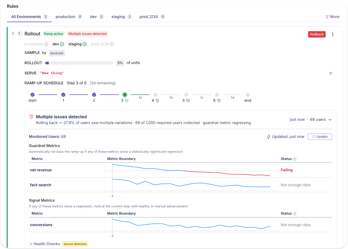
7. Multi-service release coordination
It’s normal for a single feature to span multiple services in a microservice architecture. But that also makes deployments a messy process.
Let’s say you deploy a new checkout feature to the cart service, but the payment service still runs the old version. You end up in a partially live state, and you can’t debug without coordinating it across multiple teams and repositories. With feature flags, you remove that intermediate state.
You can deploy all the services with the flag off and verify the deployment independently. When everything works well, you can activate the feature across all services together by flipping the flag on. As a result, you can reduce your chance of failure rate—and improve recovery time if there’s an incident.
GrowthBook’s REST API lets you verify that your services are ready before activating the flag programmatically. So, the release is atomic across your entire system instead of a staggered manual process.
8. Flag-based circuit breakers
Failed deployments are more the norm than the exception. And that’s by design. If you don’t have the right measures in place to derisk a deployment, it’s expected. And since every deployment has dependencies, it only runs through your entire infrastructure.
A flag-based circuit breaker gives you a pre-built fallback path gated by a feature flag. When an external dependency starts failing, you flip the flag to activate the fallback. It could be a kill switch or even something as simple as cached data. It doesn’t always prevent a dependency failure, but it does contain the blast radius of an incident.
In October 2025, AWS DynamoDB experienced an outage in the US due to a DNS race condition that affected several other services. Because there were no circuit breakers in place, every subsequent system failed—and was down for 15 hours. If its engineering team had activated cached fallbacks or degraded modes, it would’ve been a minor incident.

With GrowthBook, it’s a simple fix. You can build a fallback path and gate it behind a flag. Here’s how:
- Create a boolean flag set to off by default, as this serves as the fallback path.
- Your application code checks the flag. When it’s off, the primary integration runs, but when it’s on, it activates the fallback.
- When a dependency degrades, you flip the flag manually in the dashboard or programmatically via the REST API.
- The SDK evaluates the new state locally, so the switch propagates quickly.
Reduce deployment risk with feature flags
You’re shipping more code than you were a year ago, and if the Cortex 2026 benchmark is any indication, you’re nowhere close to slowing down. That also means the risk of incidents increases over time.
The report found that pull requests (PRs) per author have increased 20% YoY, and incidents per PR rose to 23.5%. As more code goes out the door, failure rates are climbing.
Your risk model needs to adapt to tackle this. Feature flags give you the controls to maintain deployment speed while derisking deployments. It lets you expose a feature with more intention, so you’re never betting 100% of your user base at once. If something breaks (and it usually does), you can catch those regressions and roll back immediately.
If you want to test out feature flags for any of these use cases, why not try GrowthBook? It gives you feature flags, Safe Rollouts, attribute targeting, and a full REST API with unlimited environments, flags, and SDK connections.
You can get started for free or book a demo to see how it can work for you, too.
.avif)
Twitch: false negatives are killing your best product ideas
Running an experiment is the easy part. The hard part is making sure a wrong answer doesn't quietly bury a good idea for years.
That is the uncomfortable truth Arun Bodapati, director of data science at Twitch, kept returning to on this episode of The Experimentation Edge. Most teams obsess over false positives — the experiment that says "yes" when the real answer is "no." But after building and leading experimentation work at Schwab, Uber, and now Twitch, Bodapati has come to fear a more expensive mistake: the false negative.
The result that costs the most is the one nobody questions
A false positive, at least, tends to get caught. The effect looks too large, someone digs in, and the team applies more scrutiny. A false negative is quieter and more corrosive.
"False negatives are the killer," Bodapati said. Here is why. A product manager proposes an idea. The team runs an experiment. The result comes back negative — but it is a false negative, an artifact of a weak trigger or an underpowered test rather than a real read on user behavior. The statistical nuance is visible to only a few people. Everyone else, including the executives who allocate resources, hears one thing: "You tried it, it didn't work. Let's move on."
Then the damage compounds. "The worst thing is it gets institutionalized," Bodapati explained — the organization quietly files away that "we did try that intervention, and it did not work." A genuinely good idea can sit on the shelf for years because of one test that was never trustworthy in the first place.
For experimentation leaders, the lesson reframes where rigor matters most. Guardrail metrics and clean analysis protect you from acting on a bad win. But avoiding the false negative protects every future idea that resembles the one you wrongly killed.
Most of the work happens before you push play
If false negatives are the disease, Bodapati's prevention is almost entirely upstream — and it is unglamorous.
His first rule is to spend more time before pushing the play button. That means being clear on the enrollment logic and writing the hypothesis in plain English. "Have a hypothesis and an intervention," he tells product managers, engineers, and data scientists — and then resist the temptation to optimize before the experiment has even run. "You can always optimize later."
The plain-English test doubles as a filter. "If the intervention in plain English is very weak, just don't do the experiment," he said. "You're just wasting time." It is a deceptively strict standard. A surprising number of experiments are launched not because the underlying idea is strong, but because running a test feels like progress. Bodapati's bar is higher: if you cannot articulate a strong intervention in a sentence, the experiment is unlikely to teach you anything, and a null result will only add noise to the record.
Then comes the part he admits is hardest to systematize: experiment hygiene. "What is the actual trigger? Are the events that underlie the trigger reliable?" The honest answer, especially on mobile, is often no. "The client-side events, especially on mobile devices, are notoriously unreliable." An enrollment trigger that fires inconsistently is one of the most common sources of the false negatives he warns against — the experiment never cleanly measured the thing it claimed to.
There is a second, subtler trap in enrollment: over-narrowing. Teams often restrict an experiment to the exact users they believe will respond, because they already have a specific mental model. Bodapati pushes the other way. A small population has little statistical power, which raises the odds of a false negative. His guidance is to run a broad "explore" experiment first — particularly the first time you try a given intervention — and then do the segment analysis after the fact. Heterogeneous treatment effects models let you find the subpopulation that actually responded without sacrificing power up front. "You can always do the analysis ex post to figure out if your hypothesis was correct."
And when a result does come back positive, Bodapati does not simply celebrate. He asks the team for two things: a mechanistic understanding of why the change worked, and which segments are contributing most to the lift. "The numerical result is less interesting than actually describing in plain English what the user behavior was." If no one can explain the behavior, the win may itself be a statistical mirage.
When "we're worried" became something measurable
The clearest demonstration of this discipline at Twitch was pricing — a decision the company had treated as nearly untouchable.
Twitch had not raised subscription prices in a long time and had stayed resistant even as post-COVID inflation reshaped costs across the economy. The hesitation was not really about Twitch's own revenue. "We only make money if our creators make money," Bodapati said, and the company feared a price increase would cost creators their income. The instinct was protective — but it was an instinct, not a measurement.
The complication is that Twitch could not borrow an answer from anyone else. "Unlike Uber, which has real-time elasticities being computed, we don't have that." Twitch is closer to Netflix: prices do not move on the fly. The models the team had were built in a pre-inflation world and no longer described the present. The only honest path was to generate new data.
So the team designed geo-fenced experiments. They raised prices in carefully matched markets and used causal inference on the back end to estimate the true elasticity. The matching was deliberate: UK and Ireland served as a read on the US East Coast, because viewer composition and — crucially for live streaming — time zones lined up, with large audiences tuning in after 5 or 6 PM. The German-speaking markets of Germany, Austria, and Switzerland formed another homogenous block that watched similar creators.
The findings were, in Bodapati's words, "no surprises — just econ 101." Raise prices, lose some units, but make it up on the increase when the net effect is accretive. The one genuine surprise came from gifted subscriptions, a behavior unique to Twitch's sense of community, where viewers buy subs in batches of 15 or 20 for others. Elasticity models suggested a basic price increase could cost the platform some of its biggest gifters, which led the team to experiment with promotions, despite early hesitation, and to demonstrate that promotions could drive incremental revenue.
The deeper shift was cultural. Pricing stopped being a one-time experiment the team ran and walked away from, and became a permanent lever — "a measurement technique to figure out the efficacy of that lever," built to be tuned again and again. Watching elasticity estimates translate into the company's actual financial reports gave executives, engineers, and product managers confidence that experiments could inform one of the most consequential decisions Twitch makes. An area once governed by "thou shall not touch" is now mature enough that the team is exploring bandits.
The takeaway for experimentation leaders
The thread connecting all of it is that an experimentation program is only as trustworthy as the results it produces — and a false negative erodes that trust silently, one shelved idea at a time. The defense is not more sophisticated math after the fact. It is discipline before the test: a strong hypothesis in plain English, reliable triggers, enough power to detect a real effect, and a refusal to run experiments that cannot teach you anything.
Ready to build an experimentation program your whole team can trust? Explore how GrowthBook helps you ship winning experiments with a transparent, open-source statistical engine at growthbook.io.
.avif)
Squarespace killed Its blank template — and built something better from the wreckage
Picture the moment a product team has been waiting for. Squarespace — the platform where 3 million customers build their websites — ships a blank template. No pre-designed layout, no guardrails, just a white screen and total creative freedom. The early dashboards light up: more users than ever are entering the CMS. Then the team looks one metric downstream, and the celebration stops.
"This was actually a bit of a disaster," says Lina Blackman, Director of Product Analytics at Squarespace. "It was not a good user experience. We saw early signals that we were increasing the number of users coming into our CMS — but they didn't end up converting."
On The Experimentation Edge, Blackman walked host Ashley Stirrup through what happened next — and why one of Squarespace's worst-performing launches became one of its most valuable. Her account is a case study in what separates mature experimentation programs from teams that simply run tests: the discipline to treat a loss as data, not as a verdict.
🎧 Listen to the full episode →
Three Million Customers, Two Kinds of Users
The blank template wasn't an unreasonable bet. Plenty of users say they want full control, and the most technical ones mean it. But when Blackman's team dug into why entry rates rose while conversion fell, they found something more useful than a verdict on one feature. They found a fault line running through the entire customer base.
"We realized that we have two very distinct user types," Blackman explains. "One that is more technical and wants the customization, and then a whole lot of users who actually need a guided way to design their templates." The second group — small business owners with no time to dig into HTML — weren't failing to use the blank template. The blank template was failing them.
The segmentation that emerged, learners versus builders, did more than explain one bad result. It reshaped how teams thought about the entire onboarding flow. The blank design was killed forever. The thinking it forced became Blueprint, the AI-guided builder now live on squarespace.com.
"Sometimes if you ask a user what they want," Blackman says, "what they tell you they want is not actually what they want."
That single line is the quiet engine of the whole story. Stated preference said: give us freedom. Behavior said: give us guidance. Only a controlled experiment could refute that disagreement — and only a team prepared to interrogate a loss could hear the answer.
The Two Questions That Rescue a Losing Test
Squarespace runs 150 to 200 experiments a year, with analysts embedded in every product team and a centralized program — shared test repo, briefs, decision matrices — holding it together. At that volume, most tests will not win. What matters is what happens next.
"I heavily believe that failed tests are just as good," Blackman says. When no variant wins, her analysts ask two questions. First: are there granular segments where this experience actually worked? That's the analytics deep dive — the kind that surfaced learners and builders. Second: should we continue investing in this idea at all?
The second question is the one most teams skip, because it's not a statistics question. It's a portfolio question. "There's a million things that a product team can be building," Blackman notes. "Experimentation's just a good way to focus and revisit all of the user problems that you could be solving and figuring out which one's most impactful."
Every closed test, win or lose, also feeds a knowledge library: this worked for our users, these kinds of experiences don't. Not the final say on future decisions, Blackman is careful to add, but compounding context that makes the next hypothesis sharper than the last.
One or Two Big Wins a Quarter Is the Healthy Number
There's an emotional dimension here that experimentation leaders will recognize. Teams root for their variants. Even Blackman's analysts — whom she affectionately calls the "spies" embedded in product teams — get attached. The antidote isn't detachment; it's calibrated expectations.
"Teams only need one or two big wins a quarter," she says. "It's just not sustainable to have a million hits."
That math changes how a loss reads. If you expect most tests to lose, a losing test isn't a failure of the program — it's the program working. The ideas that would have quietly hurt the business get caught before they ship to 3 million customers. The fault lines in your user base get mapped. And the rare big win arrives with the statistical confidence to bet on it.
If AI Runs the Test, Why Run It?
The conversation turns sharpest when Stirrup asks where experimentation at Squarespace goes next. Blackman's answer starts where everyone's does — AI — and then takes a turn most don't.
Yes, AI is speeding up the A/B testing workflow, and her team is already experimenting with it. But she's wary of automating away the thinking. "The tests that are less risky, sure — have an AI run the analysis, have an AI run the test brief," she says. "But then I might question: why are we running it then?"
Her emerging dividing line: hand AI the mundane parts of the analyst workflow — tracking, assignment setup — and keep the methodical reasoning human. "We'll still have to approach some parts of the process manually, because we need to be thinking methodically through each of the steps."
The same clear-eyed pragmatism applies to AI-powered features themselves. With every company releasing a chatbot, the launch decision is often already made. "We know we wanna roll this out because that's what the industry is doing," Blackman says. "But we could definitely leverage experimentation for optimizing the experience or the entry points." The test isn't whether to ship — it's whether the prompt quality, the entry points, and the long-term value actually hold up once users arrive.
The Wreckage Is the Asset
The blank template story tends to get retold as a redemption arc: failed launch becomes beloved AI builder. But the more useful reading is structural. Squarespace didn't get lucky. It had embedded analysts close enough to the product to dig past the surface metric, a program disciplined enough to ask the two questions, and a culture honest enough to kill a design forever without killing the learning.
That's the real argument for experimentation — not that it produces wins, but that it converts losses into direction. The blank screen didn't survive. What Squarespace learned from it is now the front door to the product.
Box’s e-commerce team reached the same conclusion by building psychological safety into their reporting: they share both wins and losses with leadership every two weeks, which keeps a losing test from feeling like a career risk.
Ready to put more rigor behind your own losing tests? GrowthBook is the open-source feature flagging and experimentation platform built for teams that want to ship winning experiments — and learn from the rest. Start for free or get a demo at growthbook.io.
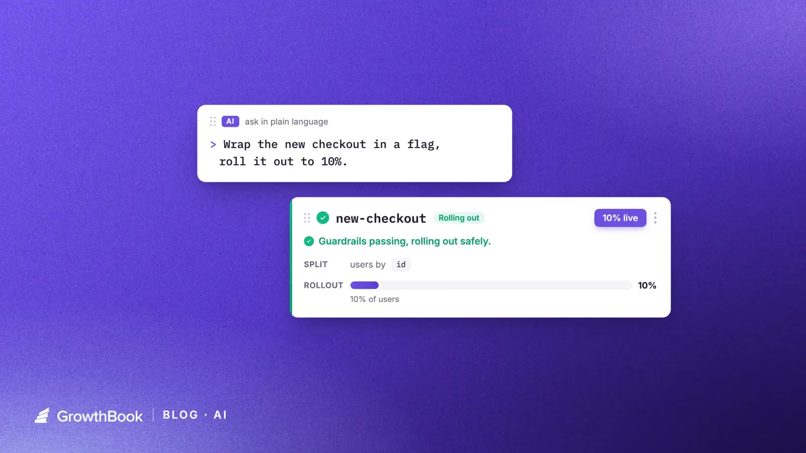
Your agents shouldn't guess at feature flags and experiments
If you use Claude, Cursor, or another coding agent day to day, you've probably tried to use it to create a feature flag or analyze an experiment. The agent can parse your intent and call the GrowthBook API, but it guesses at the procedure. It might ship a flag enabled by default. It might read experiment results without checking for a sample ratio mismatch first. Its results are all plausible, and you only find out later what it skipped or got wrong.
GrowthBook's new open-source agent skills library is built around a different model. You give the agent a written playbook that encodes the procedure and best practices. The agent follows the playbook.
What are agent skills for feature flagging and experimentation?
Agent skills are Markdown files that an AI agent reads as instructions for how to do something. Each skill covers a specific GrowthBook task: creating a feature flag, designing an experiment spec, analyzing results, cleaning up stale flags. The agent follows the steps in the skill, calls the GrowthBook REST API directly, and returns the output to you.
Install them with:
npx skills add growthbook/skillsOr install via the Claude Code plugin. The skills follow the Agent Skills standard, so they work in Claude, Cursor, Codex, or any agent that supports it. Every skill is a readable Markdown file at github.com/growthbook/skills, so you can inspect exactly what the agent will do, fork the repo, and adapt skills to your workflow. We welcome ideas and contributions to the library. The GrowthBook docs cover setup and the full list of skills.
Why plain prompts fail for feature flag management in AI agents
Asking an agent to "just create a flag" works until it doesn't. Your agent might add a rollout rule, or ship the flag at 100% right away. Ask it to "analyze the experiment" and it could read the p-value off the page without checking for a sample ratio mismatch first. A simple prompt doesn't constrain an agent or guide it through best practices.
A skill turns those best practices into steps the agent follows every time:
- New flags ship disabled. The skill creates the flag in an off state. You explicitly add rules to enable traffic.
- Changes follow draft, review, publish. Edits don't go live until they move through GrowthBook's approval flow.
- Experiment analysis includes SRM checks. Before reporting lift, the skill checks for sample ratio mismatches that would invalidate the result, then reports confidence or credible intervals, not a raw p-value.
- It won't invent what has to be real. Ask it to run an experiment on a metric that isn't defined in GrowthBook yet, and it stops and tells you to create it first, instead of inventing a metric ID and confidently reporting success.
The guardrails aren't instructions you hope the agent remembers. They're written steps in a file it always references.
What the GrowthBook skills library covers
The library spans the full GrowthBook lifecycle:
- Feature flags: create, target, ramp, safe rollout, and cleanup
- Experiments: brainstorm, design, launch, analyze, stop
- Discovery: search and audit your flags, and trace their dependencies
Example: running a flag-based experiment with an AI coding agent
Say you're shipping a new checkout flow. Here's how a session might look.
Prompt 1: "Wrap the new checkout in a feature flag and roll it out to 10%."
The skill creates the flag in a disabled state, then adds a percentage rollout rule set to 10%. The flag goes live only after you confirm.
Prompt 2: "Set up an experiment on the new checkout measuring conversion."
The skill collects a hypothesis, the primary metric (checkout conversion), and any guardrail metrics you want to watch, say revenue per user. It calculates a recommended sample size from your baseline and a minimum detectable effect, then drafts the experiment spec. Draft state, not live, so you review before it launches.
Prompt 3 (one week later): "Did the checkout experiment win?"
The skill fetches results, runs an SRM check first, and reports the lift with a confidence interval (frequentist) or credible interval (Bayesian), depending on your stats engine. You get an honest read: whether the results are conclusive, what the interval says, and a recommendation on whether to ship or keep running.
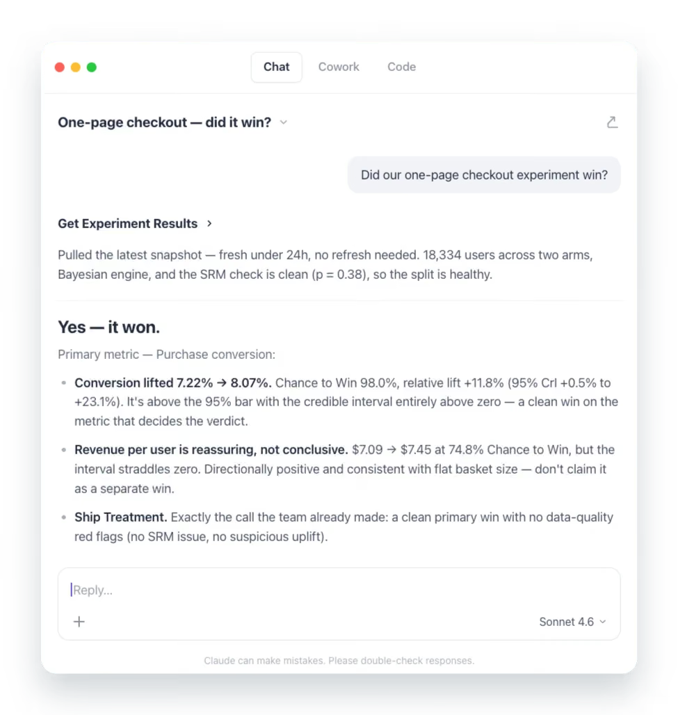
Each prompt is plain language. Each runs a specific, auditable skill under the hood. You stay in your preferred editor or terminal the whole time.
Get started with GrowthBook agent skills
The full library is open source at github.com/growthbook/skills. Each skill is a short Markdown file you can read and adapt to your team's own conventions. Skills also compose: analyze an experiment, stop it with a documented conclusion, then clean up the flag, all in one workflow without jumping between tasks.
If something doesn't match how your team works, open a PR or file an issue. The goal is a set of skills the community trusts because the community has read, used, and refined them. These skills are an active project, and we're adding new ones all the time. We'd love your feedback and ideas on what to build next.
6 alternatives to Unleash for feature flags (2026)
Unleash is one of the most established open-source feature flag platforms in production today. It was founded in 2015 with 13,300+ GitHub stars and earned its reputation by doing one thing reliably: giving engineering teams a self-hosted, API-first way to toggle features in production. That’s why companies like Visa, Wayfair, and Deutsche Telekom trust it.
However, feature flagging in general has outgrown the toggle. Your team now expects flags to connect to metrics, trigger rollbacks when something degrades, and feed directly into experimentation workflows. Unleash was built before those expectations existed, and its architecture reflects that.
As teams scale, a few limitations surface repeatedly:
- The burden of self-hosting increases as your architecture grows, and now it will be the default, as the OSS Edge version will depreciate in December 2026, after which you'll need Enterprise Edge (paid) for edge-based flag evaluation.
- It uses a polling-based architecture by default, but Unleash Edge now offers streaming as a real-time alternative (in beta).
- It doesn’t offer server-side identity or trait storage, meaning every flag evaluation requires full user context at runtime.
- There are no native AI or agentic workflows for flag management—so if you’re moving to more AI-led development processes, it’s not the right platform for you.
- There’s no built-in experimentation or statistical engine, so you need a separate tool to measure whether a flagged feature made a difference.
If you’re currently moving away from Unleash or exploring friendlier and more flexible options for feature flagging, this guide walks through six Unleash alternatives for the same.
What is Unleash?
Unleash is an open-source feature flag management platform focused on enterprise engineering teams and release workflows. It was originally Apache 2.0 licensed (source code moved to AGPLv3 from v8.0.0; official Docker images remain Apache 2.0) and self-hostable.
The platform lets you do the following:
- Toggle features on or off for specific users or groups
- Roll out features gradually by percentage
- Define custom activation strategies based on user IDs, constraints, or environment
- Manage flags across multiple projects and environments
At the moment, Unleash’s positioning leans into “FeatureOps,” where it treats flag changes as formal change events. You get governance workflows, such as change request approvals with 4-eyes review, granular RBAC, and full audit logs. And if you’re in a regulated industry, the platform offers FedRAMP-ready infrastructure, ServiceNow integration, and air-gapped deployments right out of the box.
You can deploy Unleash using its open-source self-hosted version (limited to 1 project and 2 environments) or its managed cloud offering. The open-source version of Unleash Edge reaches end-of-life on December 31, 2026—after which you'll need Enterprise Edge for edge-based flag evaluation.
Here’s what the pricing structure looks like:
- Open source (self-hosted): Free, but limited to 1 project and 2 environments.
- Pay-as-you-go (cloud): $75/seat/month with a 5-seat minimum.
- Enterprise: Custom annual pricing for self-hosted, cloud, or hybrid. Includes SSO, SCIM, and advanced governance.
There’s no viewer-only seat option for read-only users, which means costs scale quickly once non-engineering teammates need access.
Unleash holds a 4.7/5 rating on G2 across 123 reviews, and most users compliment its flexible rollout capabilities and the ability for both developers and product managers to manage flags without any issues. So, it’s ideal for enterprise platform engineering teams in regulated industries that need self-hosting at a large scale and mature governance features.
Why engineering and product teams look for alternatives to Unleash
Unleash does feature flags well. The reasons teams look elsewhere almost always trace back to what happens after the flag goes live—and what Unleash can’t do at the flag level itself.
Here are some of the most common reasons users switch:
- Client-side SDKs may require a separate proxy server: Unleash’s browser and mobile SDKs are thin clients as they don’t contain targeting logic, hashing, or bucketing. Frontend SDKs don't evalaute flags locally. That said, in production, Unleash recommends deploying Unleash Edge as a separate server to handle client-side evaluation. The built-in Frontend API is an alternative but it can't be scaled horizontally as it's not designed to handle such large volumes.
- By default, Unleash uses a polling-based architecture. Your SDKs periodically fetch the latest configuration rather than receiving changes via streaming. However, Enterprise Edge now offers streaming via Server-Sent Events as a beta feature (as of June 9th, 2026), but streaming is not available in the OSS edition.
- No identity or trait storage server-side: Unleash doesn’t store user attributes. Every flag evaluation requires you to pass the full user context at runtime. If you’re using a microservice architecture where this data spans multiple services, each service either fetches context from a shared store or passes it through the request chain.
- 5-segment limit per activation strategy: On cloud and paid plans, you’re capped at five segments per strategy. If your targeting logic is more complex—say, you’re rolling out to enterprise customers in three regions while excluding a specific account tier, you’ll hit this ceiling. This is a soft limit that can be adjusted by the customer; customers can map multiple activation strategies (each with up to 5 segments) to the same flag.
- Safeguards offers automated rollback but not to a known-good state: Unleash launched Impact Metrics with safeguards in V8 and is out of beta as of July 2026. Safeguards can automatically pause rollouts or disable the flag in that environment when a metric crosses a threshold. But it requires instrumenting metrics via the SDK or connecting Prometheus. This is only available on Unleash Enterprise. If the rollout is paused, you have to manually resume or revert it. If a rollout is disabled completely, it reverts to its fallback path and you have to manually re-enable or reconfigure the rollout state. There's no option to automatically revert to a previous rollout configuration.
- No dedicated edge SDK packages: Unleash Edge is a standalone Rust binary that you compile and deploy separately. There are no lightweight npm packages for Cloudflare Workers, Fastly Compute, or Lambda@Edge. And the open-source version of Edge reaches end-of-life on December 31, 2026—after which you’ll need Enterprise Edge (a paid dependency) for the same functionality.
- Limited AI-native flag workflows: Unleash recently added an MCP server, but the platform doesn’t ship opinionated agentic workflows. You can use its tools to create, roll out or clean up feature flags. But it doesn't offer robust advanced agentic workflows like GitHub skills or similar.
- OSS Edge deprecation forces you to switch to Enterprise Edge: Unleash OSS Edge reached LTS in December 2025 and hits end-of-life on December 31, 2026. If you’re running Edge in production for edge-based flag evaluation, you’re facing a forced migration to Enterprise Edge or switch platforms (which could be why you’re here!).
- Per-seat pricing gets expensive quickly: The paid plan starts at $75/month per user with a 5-seat minimum. Even though there's a viewer-only seat for product managers or stakeholders who just need read access, it's a licensed seat. So, the costs can scale quickly without any increase in value.
Try an open-source alternative
Start free with GrowthBook's open-source feature flags, then add experimentation on the same platform when you need it.
Start Building FreeWhat to look for in an Unleash alternative
Before you start comparing platforms, decide what actually matters for your team’s use case. Here are a few factors you can consider while making that decision:
- Open-source availability and license: Do you prefer MIT, Apache 2.0, or BSD-3? The license determines how freely you can fork, redistribute, and modify. Also, check whether the self-hosted version has feature parity with the cloud, as some vendors gate key capabilities behind paid tiers even when the codebase is technically open.
- Self-hosting viability: “Self-hostable” means different things across vendors. Some platforms require Kafka, ClickHouse, Postgres, and Redis running together. Others deploy as a single Docker container. Assess the operational overhead realistically. Ask yourself: How much engineering time goes into maintaining the deployment? And is a managed cloud option available at a reasonable cost if you outgrow self-hosting?
- Real-time flag propagation: Streaming vs. polling architecture matters when you need a kill switch to take effect in seconds. If the platform uses polling, understand the default polling interval and whether you can push changes more frequently when something breaks in production.
- Identity and trait storage: Does the platform store user context server-side, reducing per-evaluation overhead? In microservice architectures, passing full user context with every flag check introduces latency and coupling that increase as you scale.
- AI and agent readiness: If your team uses AI coding tools like Cursor, Claude Code, or Codex, check whether the platform integrates with the MCP server or via a REST API. Can an agent create flags and manage rollouts from your IDE? As more teams move towards an AI-native development process, it’s becoming table stakes.
- Warehouse-native analytics: If your data already lives in Snowflake, BigQuery, or Redshift, a warehouse-native platform can query it directly for experiment analysis and guardrail metrics. This keeps your metrics consistent across teams and eliminates duplicate data pipelines.
- Pricing model predictability: Per-seat pricing is predictable, but if you have a large team or read-only seats, the costs can get out of hand. However, per-MAU or per-event pricing scales with your success—which sounds fine until a traffic spike doubles your bill. Understand what you’re paying for, and at what point costs become unpredictable.
- Governance depth: For many teams in regulated industries, approval workflows, RBAC, audit logs, and scheduling workflows are critical. But many platforms gate these behind enterprise contracts. So, cross-check what’s available at each pricing tier before you sign up.
- SDK coverage and evaluation architecture: Choose a platform with SDKs for every language in your stack. But also evaluate how the SDK works. For example, does it evaluate flags locally (no network call per check) or does it phone home on every evaluation? This decides how quickly your flags evaluate and whether your users will experience latency.
- Built-in experimentation and stats engine: Can the platform run A/B tests with statistical analysis, or does it require you to wire up a third-party tool? Look for methods like Bayesian inference, frequentist testing, CUPED variance reduction, and sequential analysis. If your team ships features and wants to know whether they moved a metric, it’s a non-negotiable.
Quick comparison of the best Unleash alternatives
Here’s a quick overview of the six best alternatives to Unleash for feature flagging:
| Feature | GrowthBook | LaunchDarkly | Flagsmith | Statsig | PostHog | Split (by Harness) |
| Open-source | ✅ MIT | ❌ | ✅ BSD-3-Clause | ❌ | ⚠️ Partially | ❌ |
| Self-hosted | ✅ Full-featured | ❌ (Relay Proxy only) | ✅ (Enterprise only) | ❌ | ⚠️ Limited | ❌ |
| Smart feature flags | ✅ Warehouse-connected guardrails | ✅ Guarded Releases | ❌ | ✅ Bundled flag intelligence | ⚠️ Basic | ✅ Metric-aware monitoring |
| Guardrails and auto-rollback | ✅ | ✅ | ❌ | ⚠️ Limited | ❌ | ✅ |
| AI-native features (MCP) | ✅ MCP + 19 AI skills + 250 REST API endpoints | ✅ | ⚠️ MCP endpoint only | ✅ | ✅ | ✅ |
| AI application control | ✅ | ✅ | ⚠️ Limited | ⚠️ Limited | ⚠️ Limited | ⚠️ Via SDK only |
| Built-in experimentation | ✅ Warehouse-native | ✅ (Paid add-on) | ❌ (Bucketing only, no stats) | ✅ Warehouse-native | ✅ Basic | ✅ Warehouse-native |
| Pricing model | Per seat | Per service connection + MAU | Per API request | Per event | Per event | Custom |
| Best for | Teams wanting open-source flags + experimentation | Enterprise teams needing max reliability | Teams wanting flags + remote config with native analytics integrations | Teams optimizing for flags + analytics in one tool | Product teams wanting flags + web/LLM/product analytics + session replay | Teams on Harness CI/CD or focused on CI/CD automation |
Best alternatives to Unleash for feature flagging
Let’s look at how each of these platforms stacks up against Unleash and why you should consider it:
1. GrowthBook
GrowthBook is an open-source feature flagging and experimentation platform that connects directly to your data warehouse. You can think of GrowthBook as three products inside one MIT-licensed codebase:
- A feature flag engine with 24 SDKs and sub-millisecond local evaluation.
- A production-grade experimentation platform with Bayesian, frequentist, sequential testing, and CUPED variance reduction built in.
- A strong product analytics product that acts as a managed warehouse for your product data.
All these products share the same flag and the same warehouse-defined metrics, so you never need to reconcile data between systems. Your application doesn’t depend on GrowthBook being available, because feature flags are evaluated from a locally cached payload. As a result, if GrowthBook’s cloud goes down (and it rarely does!), your app keeps running with the last known configuration. It’s the architectural equivalent of building a circuit breaker into the foundation rather than bolting one on later.
With its latest 4.4 release, the feature flagging product has gotten a serious upgrade as it enables forward-thinking development teams to centralize the workflows around AI.
That’s why teams like Dropbox (3 billion+ daily flag evaluations on self-hosted GrowthBook), Khan Academy, Sony, Pepsi, Wikipedia, Mistral, and Upstart run GrowthBook in production at scale.
“What I like best about GrowthBook is that it gives teams a practical way to manage feature flags and experiments without making the workflow overly heavy. The interface is generally clear, and it is useful to have experimentation, rollout control, and analysis connected in the same environment. That makes it easier to move from idea to test to decision with more structure and less back-and-forth between teams. I also appreciate the flexibility on the integration side, because it can fit into an existing data stack rather than forcing a completely closed setup. From an ROI perspective, that matters a lot, since it allows teams to get value from experimentation and progressive delivery without necessarily committing to a much larger platform than they need.” — Arthur H., G2 user.
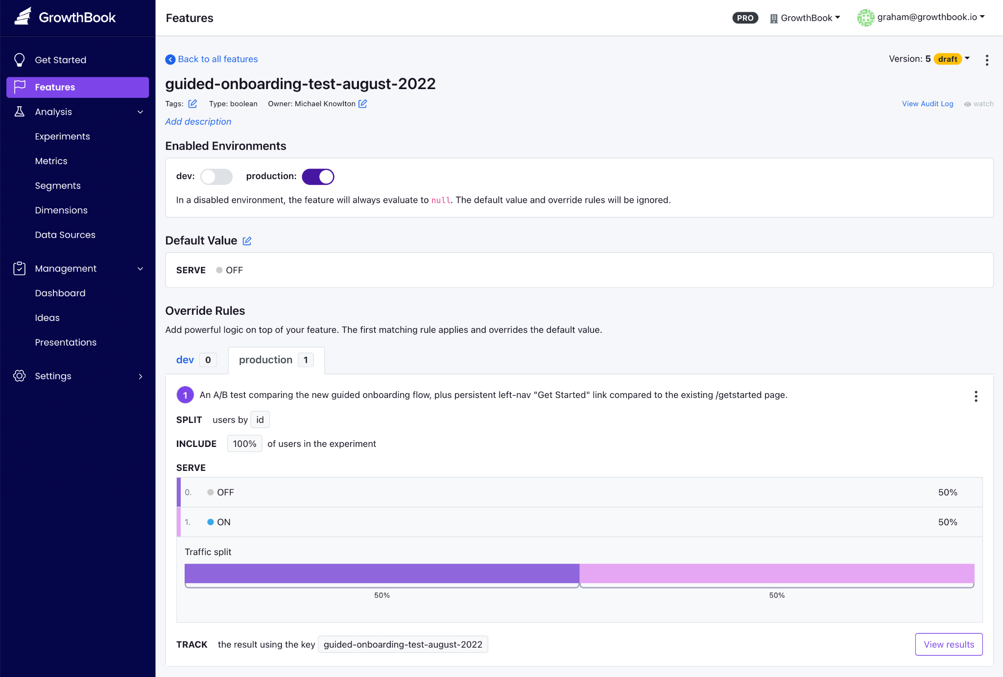
GrowthBook key features
| GrowthBook's features | |
| Feature flags (including AI-native flags) | Boolean, string, numeric, and JSON feature flag values with multi-environment management. Targeting by attribute, device, geography, or custom properties; saved groups for reusable segments—gradual rollouts from 10% to 100% with deterministic hashing. AI-native capabilities include ramp schedules for model and prompt deployments, stale feature detection, Feature Evaluation Diagnostics for rule-by-rule traces, and approval flows that work whether a human or an agent makes the change. |
| Open source and standards | MIT license. OpenFeature-compatible (CNCF standard) with official providers for Java, Python, Go, .NET, JavaScript, and the Vercel Flags SDK. |
| License and deployment | MIT-licensed open source. Three deployment options: GrowthBook Cloud, fully self-hosted (Docker / Kubernetes), and Cloud with Managed Warehouse. Same codebase across all three. |
| SDKs and performance | 24 SDKs across server-side, frontend, mobile, and edge runtimes. JavaScript SDK ships at 13.6kb gzipped. SDKs evaluate locally from a cached payload, so you get sub-millisecond performance with zero network calls per check. |
| Statistical engine | Bayesian and frequentist analyses, sequential testing with always-valid confidence intervals, CUPED variance reduction (cuts experiment runtime by 20–50%), sample-ratio mismatch detection, post-stratification, and multi-armed bandits. Open source and inspectable on GitHub. |
| Data warehouse support | Direct connection to Snowflake, BigQuery, Redshift, ClickHouse, Databricks, Athena, Postgres, MySQL, MS SQL, Presto/Trino, and Vertica. |
| Safe rollouts and governance | Staged rollouts from 10% to 100% with sequential guardrails pulled from your warehouse. If a rollout degrades revenue or error rates, the platform surfaces warnings and can auto-rollback. Enterprise adds approval workflows, ramp schedules, and prerequisite flags. |
| MCP server | MCP server for Cursor, Claude Code, and Codex. AI Data Analyst for natural-language metric exploration. |
| AI skills | Access over 23 pre-built skills for creating feature flags, targeting rules, rollout plans, and flag clean-up. |
| APIs | Over 250 REST API endpoints so that AI coding tools can use the CLI to do almost everything a human can do through the GrowthBook UI, including creating feature flags, roll-out schedules, and feature flag clean-up. |
| Advanced governance | Role-based access control, full audit logs on every flag and experiment change, and configurable approval workflows requiring one or more reviewers before changes go live. Enterprise adds prerequisite flags, code references for stale flag cleanup, custom validation hooks, and granular approval gates for production environments. |
| Security and compliance | SOC 2 Type II and ISO 27001 certified. Compliant with GDPR, COPPA, and CCPA, with HIPAA BAA available for Enterprise customers. Self-hosted Enterprise deployments can satisfy HIPAA requirements inside your own certified infrastructure. Warehouse-native architecture means no end-user PII ever leaves your environment during flag evaluation. |
| Migration tools | Built-in importers for LaunchDarkly and Statsig pull projects, environments, flags, targeting rules, rollouts, and prerequisite flags directly through the dashboard. |
| Pricing | Cloud Starter is free (3 users, 3 environments, 1M CDN req/mo). The paid plans include the Pro plan at $40/user/month for up to 50 users, and the Enterprise plan (custom quote). Self-hosted OSS is free with no traffic cap. |
| Reviews | G2: 4.6/5 across 26 reviews. 8,000+ GitHub stars. 1T+ daily flag evaluations across the customer base. |
Pros of GrowthBook
- Rich control over feature flag creation, deployment, and cleanup right from your AI coding tool of choice. You can create flags, set targeting rules, configure rollout plans, and remove stale flags without leaving your IDE.
- You can use smart feature flags to tie feature flags to any metric in your data warehouse. And then use Ramp schedules with guardrails to monitor performance at each stage and auto-rollback if a metric degrades.
- The platform enables AI-led development with its new MCP server and lets you bring AI agents into the process without friction. You can automate release plans and even clean up stale flags without leaving your agent.
- You can see the SQL queries under the hood, and audit the stats engine on GitHub when your data team wants to verify the math.
- The platform is well-known for its responsive, technically adept customer support.
- Since the platform is open source, you can contribute to the project, and some users have said the new feature request was merged within weeks.
- Flags and experimentation live on a single platform. You don’t have to reconcile data across multiple vendors, and you can load experimental data from another platform into GrowthBook to run more advanced tests.
Drawbacks of GrowthBook
- You’ll get the most out of experimentation features if you already have a data warehouse. GrowthBook Cloud offers a Managed Warehouse, but self-hosters still need to set one up if they don’t have one.
- There’s some onboarding time to learn advanced feature flag capabilities—particularly JSON payloads, advanced targeting rules, and experiment configuration.
- You’ll need an Enterprise license for SSO/SAML, SCIM, holdout experiments, and cross-experiment insights, though the core flagging and experimentation capabilities remain free in the OSS edition.
- The UI can be complex for less-technical team members—particularly non-engineering stakeholders who are navigating experiment results.
How GrowthBook compares to Unleash
Even though both platforms support self-hosting and prioritize the developer experience, the main difference shows up when your feature flags go live.
GrowthBook provides a full local SDK evaluation and doesn’t require a proxy. So, all the targeting, hashing, and bucketing all happen inside the SDK with zero network calls. But Unleash’s client-side SDKs are thin proxies that require a separate Unleash Proxy or Frontend API server, which adds a potential point of failure.
So, choose the following because:
- GrowthBook wins for engineering and data teams who need strong feature flagging capabilities for traditional or AI-native development alongside statistically rigorous A/B testing, a single open-source platform, and don’t want to send data to a vendor or run a separate proxy.
- Unleash wins for data-conscious teams that want flags only (no experimentation), value the larger community and 11-year track record, or specifically need FedRAMP-ready infrastructure and ServiceNow integration.
Who is GrowthBook best for?
Engineering and data science teams at growth-stage or enterprise companies who already have a data warehouse and want feature flag management plus real experimentation in one open-source platform. This is especially true if you don’t want to pay for separate experimentation tools or send data to another vendor.
It’s also a strong option for companies in regulated industries like fintech, healthtech, edtech, and AI software, where data sovereignty is non-negotiable. And for smaller engineering teams or solo developers looking for a robust feature flagging platform that can grow with them as they mature into experimentation.
2. LaunchDarkly
LaunchDarkly is the category-defining enterprise feature management platform—the incumbent that every alternatives article is measured against. It was founded in 2014, and now LaunchDarkly serves over 5,500 organizations, including roughly a quarter of the Fortune 500 (Hulu, IBM, Atlassian, iCIMS).
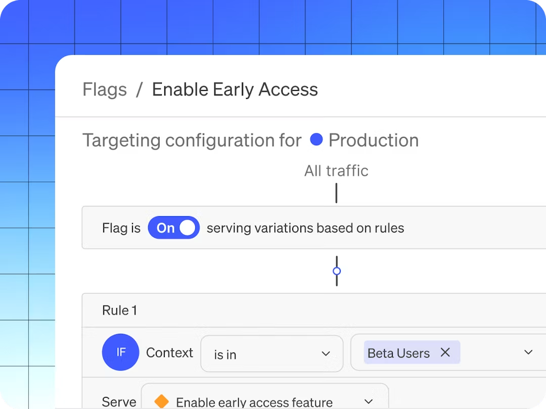
The earlier version of its product was focused on decoupling deployment from release. So, the code ships to production in the dark, and the feature gets switched on independently and gradually. But as of 2026, it has moved to bring the “runtime control for AI-era software.” The platform now bundles feature flags, Guarded Releases (progressive rollout with observability), experimentation, and AI Configurations for managing LLM prompts and models at runtime.
If your evaluation criteria require support for specialty platforms like Apex, Erlang, and Haskell, or enterprise governance depth, LaunchDarkly is usually the safest default.
The platform holds a 4.5/5 on G2 across 700+ reviews, but most users consistently flag two negative things: cost and the feeling that valuable features keep getting gated behind higher tiers.
LaunchDarkly key features
Here’s a list of features LaunchDarkly offers:
| LaunchDarkly's features | |
| Feature flags | Feature flagging for advanced targeting, segmentation, release management, and more. Offers Boolean and multivariate flags, along with a dashboard for multienvironment tracking. |
| Statistical engine | Bayesian and frequentist methods, CUPED variance reduction, sequential testing, SRM detection, and multi-armed bandits. Sold as a paid add-on at $3 per 1,000 client-side MAUs on Foundation, or bundled into Enterprise. |
| License and deployment | Proprietary SaaS only. No self-hosted or on-prem option, which is a blocker in regulated industries that need full data residency. |
| SDKs and performance | 25+ idiomatic SDKs covering server-side, client-side, edge (Cloudflare, Vercel, Akamai), mobile, and AI-specific runtimes. Real-time flag propagation in seconds. |
| Warehouse support | Warehouse-native experimentation following the Houseware acquisition, but currently limited to Snowflake. Requires high-level Snowflake account permissions to set up. |
| Safe rollouts and governance | Guarded Releases automate progressive rollouts with real-time monitoring and instant rollback. Enterprise adds change windows, advanced approval workflows, full audit logs, and custom roles. |
| AI agent support | AI Configurations let you tune models and prompts at runtime without redeployments. Strong fit if you're shipping AI features and want runtime control over model selection and prompt versions. |
| Pricing | The "Developer" plan is free (3 environments, 5 service connections, 1K contexts/mo). There are three paid tiers: Foundation starts at $12/mo per service connection + $10 per 1K client-side MAUs + add-ons. The Enterprise and Guardian plans are priced custom. |
| Reviews | G2: 4.5/5 across 700+ reviews. TrustRadius: 7.7/10 across 54 reviews. Capterra: 4.7/5 ease of use. |
Pros of LaunchDarkly
- The platform offers robust observability features, including qualitative data such as session replays. So, you can see what goes wrong during a feature rollout.
- The platform’s targeting engine is strong because it offers context-based rules, reusable segments, and percentage rollouts with high-level granularity.
- Flag propagation is real-time via streaming, which means changes reach every environment in seconds instead of the next polling interval.
- SDK coverage is among the broadest available (25+ official SDKs), including specialty platforms like Apex, Erlang, and Haskell.
- It also has Guarded Releases, which bring observability directly into the feature rollout workflow, so you can see error rates spike and roll back before users notice.
Drawbacks of LaunchDarkly
- Pricing is the most common complaint across all review platforms. The consumption model (service connections + client-side MAU + experimentation MAU + add-ons) scales unpredictably, and many users report contract costs nearly doubling at renewal.
- Experimentation is a paid add-on at $3 per 1,000 MAUs—on top of the base tier’s cost. If experimentation is your primary use case, it gets expensive quickly.
- There’s no self-hosted or on-prem option. For teams currently on Unleash because of data sovereignty requirements, or for those in a regulated industry, it’s a huge drawback.
- The free Developer tier caps at 3 environments, 5 service connections, and 1,000 client-side MAU, which is easy to outgrow these days.
- The platform still lacks robust flag lifecycle management, as it lacks service- or team-based grouping, so you have to rely on naming conventions.
- Multiple reviewers describe a steep learning curve and a UI that “becomes overwhelming when managing large numbers of flags.”
- The AI features are still quite underdeveloped because they don’t take advantage of all the feature data they pull right now to help with rollout-related decisions.
How LaunchDarkly compares to Unleash
Both platforms target enterprise engineering teams, but they sit on opposite sides of the build-vs-buy spectrum. Unleash gives you open-source control and self-hosting, while LaunchDarkly gives you managed reliability and deeper governance automation. But it comes at the cost of vendor lock-in and expensive contracts. Here’s where they win:
- LaunchDarkly wins for large enterprises that need the deepest governance, widest SDK breadth, and Guarded Releases with observability. And they should have the budget to cover annual contracts of $20,000–$200,000+.
- Unleash wins for teams that require self-hosting, open-source transparency, or predictable per-seat economics. Unleash also supports FedRAMP-ready infrastructure, which LaunchDarkly does not.
Who is LaunchDarkly best for?
Large enterprises and Fortune 500 engineering organizations that need maximum governance depth and a fully managed release-safety layer. But only if they’re comfortable with a cloud-only and consumption-based pricing model.
It’s also particularly strong if you’re shipping AI features and want runtime model control via AI Configurations—but it still doesn’t offer compliance-aware model routing to prevent data from moving through disallowed regions. If you’re in a regulated industry, it could cause compliance issues.
3. Flagsmith
Flagsmith is an open-source feature flag and remote configuration platform, which is BSD-3-Clause licensed and bootstrapped. The platform pairs two things engineers usually wire together themselves: feature flags and remote configuration. You can toggle features, push key-value config changes, and target by user segment without redeploying code.
The platform serves customers like Pfizer, BP, and Komerční Banka. Most users consistently praise the ease of setup, responsive support, and value for money, but since it was purpose-built for feature flagging, that’s all it does well.
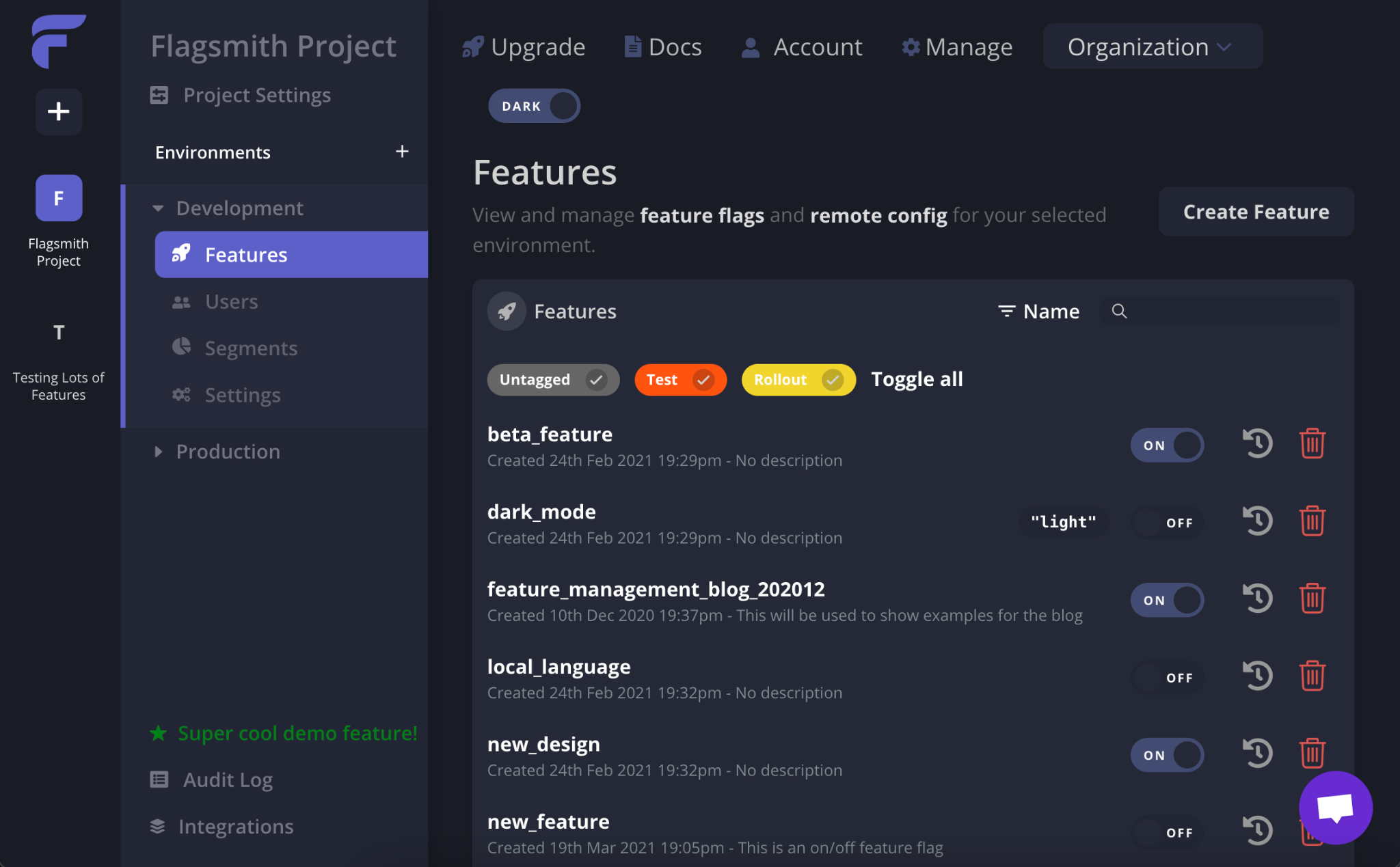
Flagsmith key features
| Flagsmith's features | |
| Feature flags and remote config | Unlimited flags and environments on every tier. Boolean toggles, multivariate variants, percentage rollouts, and key-value remote configuration are managed from one interface. |
| Identity and trait storage | Stores user identities and attributes in-platform, which enables per-user overrides and lower-latency evaluation in distributed systems. |
| Real-time Edge API | Global, low-latency Edge API across eight regions. Flag changes propagate instantly without any polling interval. |
| Segmentation and targeting | Attribute-based segments for beta cohorts, percentage rollouts, and targeted releases. |
| A/B and multivariate testing | Multivariate flags with percentage weightings for phased rollouts and canary deployments. But there's no built-in stats engine — analysis requires an external tool like Amplitude or Mixpanel. |
| Deployment flexibility | SaaS, private cloud (your provider/region), self-hosted on-prem via Helm and an OpenShift Operator, air-gapped deployments. Free open-source edition available. Note: on-prem is Enterprise-only. |
| Governance | RBAC, change requests, audit logs, 2FA, SAML/SSO (Scale-Up+), LDAP/SCIM (Enterprise). SOC 2 certified. |
| Integrations | 16 native integrations, including Segment, Amplitude, Mixpanel, Google Analytics, Datadog, Terraform, Jira, and GitHub. There's also an MCP endpoint available, but anything else requires webhooks. |
| Pricing | Free tier for up to 50,000 requests per month. Paid plans start at $45/month, and the Enterprise plan is priced on a custom basis. |
| Reviews | G2: 4.8/5 across 37 reviews. |
Pros of Flagsmith
- Multiple users say the platform is easy to get started with. And both developers and non-technical team members can navigate the UI without a training session.
- It provides identity and trait storage, which reduces per-evaluation overhead in microservices.
- You get real-time flag propagation via the Edge API, so you don’t have to wait for a polling interval when something needs to change immediately.
- The company provides responsive, engineering-led support—even on lower-priced tiers. Many users point this out and say it’s one of the biggest differentiators.
- By providing remote configuration alongside flags, it lets you manage feature behavior and visibility in one place, without maintaining a separate config service.
Drawbacks of Flagsmith
- There’s no built-in statistical engine. Flagsmith handles bucketing (splitting users into variants), but the actual analysis happens elsewhere, so you need to either integrate an analytics tool or conduct the analysis there.
- It’s not a warehouse-native platform. Your experiment data flows through third-party analytics integrations rather than being queried directly from your data warehouse. So, reproducing flag-related data depends on the integrations sitting between your tools.
- Some reviewers note that the UI can be “hard to explain to non-developers,” particularly around segmentation and per-environment value management.
- As of June 2026, there are only 16 native integrations. Anything beyond Segment, Amplitude, Datadog, and a few others requires webhooks. One of the most limited sets of integrations compared to other feature flagging providers.
- As the platform uses request-based pricing on paid tiers, it can scale unpredictably. The free tier covers 50,000 requests/month, and overages cost $7 per additional 100,000 requests. The costs can rise quickly for high-traffic applications.
- On-premises deployment is only available on the Enterprise plan, which may be cost-prohibitive for smaller teams that need self-hosting for compliance.
How Flagsmith compares to Unleash
Both are open-source feature flag platforms with strong self-host options. At its core, Flagsmith addresses Unleash’s two most commonly cited architectural gaps: it stores identities/traits server-side (reducing per-evaluation context overhead) and uses real-time propagation instead of polling. But it does just feature flagging well.
- Flagsmith wins for teams that need real-time flag updates, identity-aware targeting, remote configuration as a primary use case, or native integrations with their existing analytics stack (Amplitude, Segment, Mixpanel).
- Unleash wins for enterprise platform teams that need FedRAMP-ready compliance, air-gapped deployments, and the governance depth that comes with a decade-plus track record in regulated environments.
Who is Flagsmith best for?
Mid-market engineering teams and enterprises that want feature flags and remote configuration in a single open-source platform. But it’s also particularly strong for teams in regulated industries that need self-hosting with SOC 2 compliance and that don’t require built-in experimentation.
4. Statsig
Statsig is an experimentation-first platform that bundles feature flags, A/B testing, product analytics, and session replay into a single product. It was founded around 2020 by Vijaye Raji (formerly an engineer at Facebook), so Statsig grew on the strength of warehouse-native experimentation and a famously generous free tier.
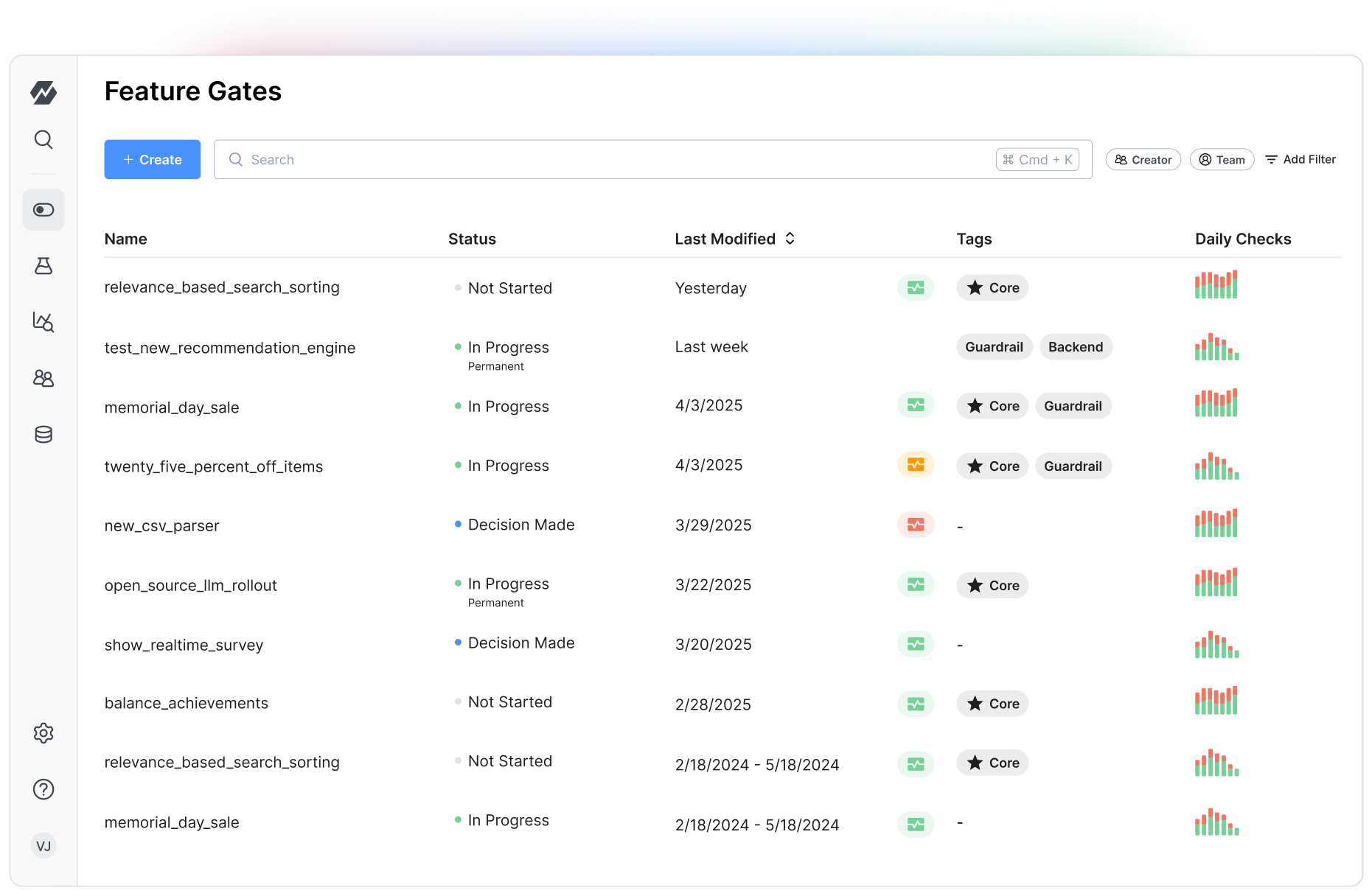
There’s an elephant in the room, though. In September 2025, OpenAI acquired Statsig for $1.1B, and founder Vijaye Raji became OpenAI’s CTO of Applications. Then in May 2026, Amplitude announced it would take over the Statsig brand, customers, and codebase—while the original engineering team stayed at OpenAI. The product now has Amplitude’s brand backing but none of its original builders. If you’ve made or are planning to make a multi-year platform commitment, the roadmap remains quite unstable over the next few months.
Statsig key features
| Statsig's features | |
| Feature flags | Feature flagging for smarter releases includes automated release management workflows. Flag analytics are built in to monitor exposure events in real time. |
| License and deployment | Proprietary, cloud only. Some open-source SDKs, but the core platform and stats engine are closed source. The warehouse-native mode keeps your data in the warehouse, while the control plane stays in the Statsig cloud. |
| SDKs and performance | 30+ SDKs across server-side (Java, Kotlin, Node, Python, Ruby, Go, .NET, PHP), client-side (JavaScript, React, iOS, Android, Dart, Flutter), and edge environments. |
| Statistical engine | Bayesian and frequentist methods, CUPED variance reduction, sequential testing, SRM detection, holdouts, layers, and contextual bandits. Included on all paid plans. |
| Warehouse support | Warehouse-native architecture supports Snowflake, BigQuery, Databricks, Redshift, and Athena. Its compute runs in your warehouse, but the control plane stays in the Statsig cloud. It's only available in the Enterprise plan. |
| Product analytics and replay | Bundled product analytics (events, funnels, retention, cohorts), session replay (50K sessions/mo free), and surveys all in one platform. |
| Industry focus | Gaming, B2B SaaS, Ecommerce |
| Pricing | Free Developer tier (2M events/mo, unlimited flag checks, 50K session replays). Two paid tiers: Pro at $150/mo base + $0.05 per 1K events over 5M, and Enterprise is priced on a custom basis. |
| Reviews | G2: 4.7/5 across 347 reviews. |
Pros of Statsig
- The free tier is quite generous in this category, as you get unlimited feature flags across all usage levels, and the platform charges only for analytics events.
- The statistical engine is included on every paid plan with advanced capabilities: CUPED, sequential testing, contextual bandits, and SRM detection. Also, many users praise the speed of experimentation setup and the clarity of the Pulse results interface.
- You can get feature flags, experiments, analytics, and session replay in one tool, so it reduces integration overhead for teams consolidating their stack.
- The platform detects experiment bias, runs sanity checks, provides guardrail metrics, and delivers confidence intervals. As a result, you can get robust experiment results without needing in-house expertise for interpretation.
Drawbacks of Statsig
- The platform is in a mid-acquisition transition. With the engineering team at OpenAI and the brand at Amplitude, the product’s stability and roadmap are open questions. At this point, only existing Amplitude customers are likely to take on this risk for new deployments.
- No self-hosted option because Statsig is cloud-first. Also, warehouse-native analytics is an enterprise-only option, and even then, the control plane is hosted—not a fully in-your-infrastructure deployment.
- Multiple reviewers cite a steep learning curve and insufficient documentation, especially for less-technical users or teams new to experimentation.
- Some users report that SDKs automatically capture a wide range of metrics, which can dramatically inflate subscription costs beyond the free tier.
- If you want to backfill metrics mid-experiment, it requires workarounds that limit flexibility when goal definitions shift after an experiment has started.
- It’s not open source. You can’t audit the stats engine, fork the codebase, or run it fully on your own infrastructure.
How Statsig compares to Unleash
Unleash is a dedicated flag-management tool with no analytics. However, Statsig is an experimentation platform that includes flags. If you’re switching between both, you’d be making a huge jump because of the differences between the platforms:
- Statsig wins for teams that want flags and experimentation in a single product and are comfortable with cloud-only deployment and the uncertainty around the acquisition. Even though it offers warehouse-native analytics, it’s only available on the Enterprise tier.
- Unleash wins for teams that need open-source self-hosting, FedRAMP-ready compliance, and a stable, independently governed roadmap. Unleash is also the safer bet for teams that can’t accept a platform whose engineering team no longer maintains it.
Who is Statsig best for?
Teams that want a unified cloud platform spanning feature flags, experimentation, and analytics—and are comfortable with the Amplitude ownership transition. Existing Amplitude customers will especially have the smoothest path. But if you need self-hosting, open source, or a stable long-term roadmap, you need to look elsewhere.
5. PostHog
PostHog is an open-source, all-in-one developer platform that bundles product analytics, feature flags, session replay, A/B testing, surveys, error tracking, and an AI assistant into one MIT-licensed product. It was founded in 2020 and now serves 190,000+ customers. The platform’s pitch is consolidation, where you replace five or six separate tools with a single SDK and a single billing relationship.
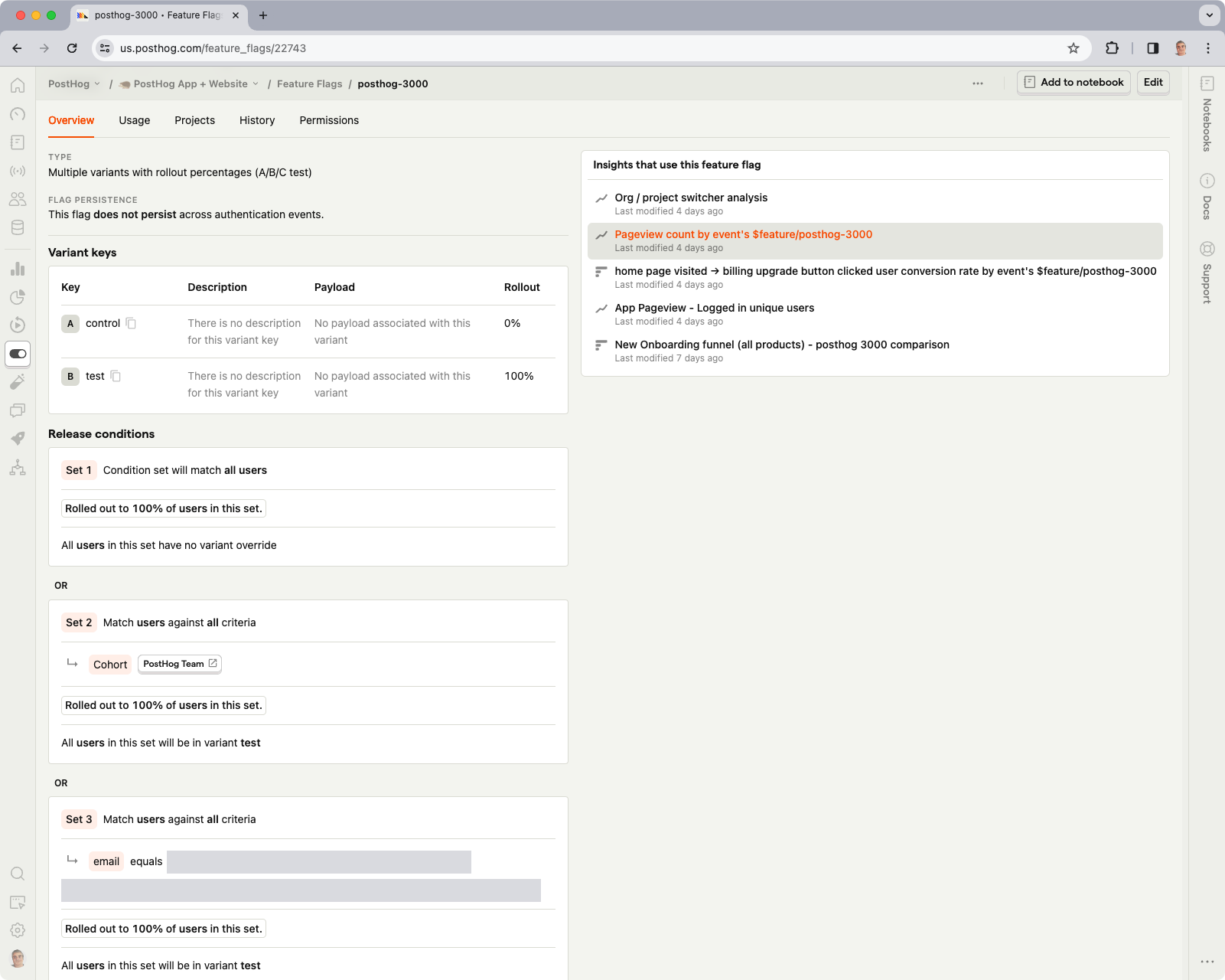
For an Unleash user, PostHog represents a different kind of upgrade. You’re not just getting better flags; you’re getting the entire analytics and experimentation stack you’d otherwise assemble from parts. The trade-off is that feature flags are just one of many features in PostHog, not the platform’s core focus. If you need deep, sophisticated flag management at enterprise scale, PostHog won’t match Unleash’s governance depth.
PostHog key features
| PostHog's features | |
| Feature flags | Offers Boolean and multivariate flags and lets you customize your rollout strategy by user or group properties, cohort, or traffic percentage. Also lets you bootstrap flags on initialization, so all flags are available immediately on page load. |
| Experimentation | Run experiments even on qualitative data, such as session recordings. Supports A/A testing, A/B testing, A/B/N testing, holdout testing, fake door testing, and redirect testing. |
| License and deployment | MIT-licensed core with a proprietary ee/ directory for enterprise features. Three options: PostHog Cloud, self-hosted Docker Compose (recommended only up to ~300K events/month), or the posthog-foss build for teams that want zero proprietary code. |
| SDKs and performance | Coverage across JavaScript, React, Node, Python, Ruby, Go, PHP, Java, iOS, Android, and Flutter. Autocapture is available for browser-based products. Performance can degrade on large datasets. |
| AI observability | Monitor AI products by inspecting latency, traces, spans, usage, and per-user costs. |
| Product analytics and session replay | Native product analytics with autocapture, session replay, web analytics, error tracking, surveys, and CDP. |
| PostHog AI and MCP server | Use PostHog AI (Max), a natural-language assistant to debug code and answer analytics questions. The MCP server lets you connect PostHog with tools like Claude Code and Cursor and run actions through them. |
| Pricing | Generous free tier covering 1M events, 1M flag requests, and 5K session recordings monthly. Offers pay-as-you-go pricing per event, starting at $0.000100/request for feature flags (after 1 million requests). Startup program offers up to $50K in credits per year. |
| Reviews | G2: 4.5/5 across 1,048 reviews. |
Pros of PostHog
- Many reviewers say that having qualitative and quantitative tools on a single platform helps them get a complete picture without switching between tools.
- The free tier is the most generous, given its breadth. You get 1M events, 1M flag requests, and 5K session replays without even offering your credit card. For early-stage teams, their traffic/event numbers are quite low.
- A single SDK handles flags, analytics, session replay, and experiments. You don’t need separate instrumentation per tool.
- The platform offers transparent, usage-based pricing with no gatekeeping. You can evaluate and adopt the product by signing up for yourself.
Drawbacks of PostHog
- Feature flags are not PostHog’s primary offering. The platform isn’t built for sophisticated flag management at enterprise scale, and it lacks approval workflows, advanced RBAC, and the governance depth you’d expect from a dedicated flag tool.
- PostHog is cloud-first. The self-hosted edition is unsupported at scale and recommended only for ~300K events/month. In fact, Posthog’s team discourages its use at scale because of the costs of managing the infrastructure, and the product may not be as robust. If you’re leaving Unleash specifically to maintain self-hosted data sovereignty, PostHog doesn’t solve that problem.
- It also involves a steep learning curve because the breadth usually comes with complexity, and some teams report taking months to implement it fully.
- Since it offers only event-based pricing, the pricing can scale unpredictably at high volume. As your product grows, so does your bill, which is a concern if you’re processing millions of events monthly.
- It’s not warehouse-native either. PostHog ingests events into its own system. If your team has invested in a data warehouse as the source of truth, PostHog creates a second one.
- The experimentation engine doesn’t include CUPED variance reduction or sequential testing. For teams running experimentation as a core discipline, you’ll hit the ceiling quickly.
How PostHog compares to Unleash
PostHog and Unleash are very different, as Unleash is a dedicated, self-hosted flag platform that deliberately doesn’t try to be an analytics tool. On the other hand, PostHog is a broad analytics suite that includes flags as one of many capabilities.
It makes sense to switch if you’re a product team switching to more features. Here’s how they stack up:
- PostHog wins for early-stage product engineering teams and startups that want analytics, flags, session replay, and surveys in a single product, with a generous free tier. It’s particularly strong if you’re building consumer-facing software and want consolidation over specialization.
- Unleash wins for teams that need dedicated flag management with enterprise governance, self-hosting at production scale, and FedRAMP-ready compliance. Unleash is also the better fit if feature flags are your primary concern rather than one feature among many.
Who is PostHog best for?
Early-stage product engineering teams and startups that want analytics, feature flags, session replay, A/B testing, and surveys in one cloud product with a generous free tier—and don’t need deep flag governance or self-hosting at scale. Particularly strong for consumer-facing software, where you need a broader tool stack versus deep specialization.
6. Split (by Harness)
Split is now Harness Feature Management & Experimentation (FME), a feature flagging and experimentation module embedded in Harness’s full-stack, AI-powered software delivery suite. While it was an independent platform earlier, it was acquired by Harness in 2024, and feature flagging is just one part of a much broader CI/CD platform.
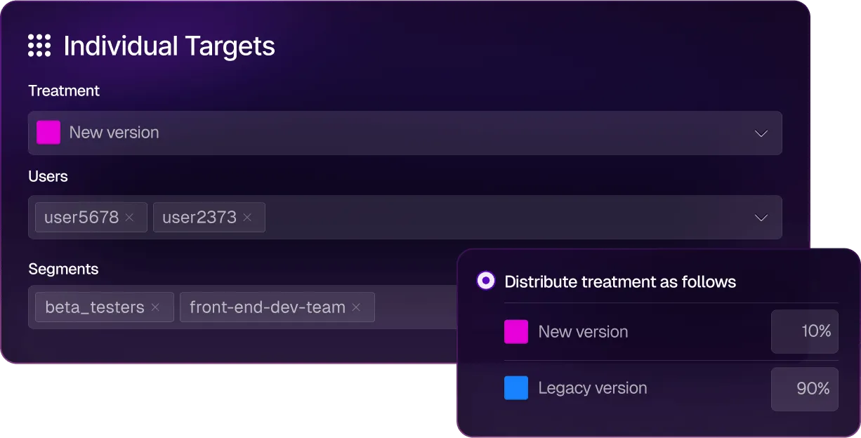
For an enterprise DevOps team that already lives in Harness, FME is a natural addition. But for an Unleash user motivated by open source needs or dedicated feature flagging functionality, it might not be the right choice.
Split key features
| Split (Harness FME) features | |
| Feature management | Boolean toggles, multivariate variants, configuration flags, and percentage rollouts are core flag types. Coupled with cloud-based and warehouse-native experimentation and observability for feature rollouts. |
| Continuous delivery and GitOps | Native integration with the Harness CI/CD pipeline and GitOps engine. Feature flag rollouts can be tied directly to deployment events, allowing you to coordinate flag changes with release pipelines across services and environments. |
| AI SRE | AI-driven service reliability capabilities link feature management to incident response. When a flag rollout correlates with degraded service health, AI SRE surfaces the connection so your team can investigate and roll back. |
| License and deployment | Proprietary, cloud only. No self-hosted or on-prem option. Operates inside the broader Harness Cloud platform alongside CI/CD, Chaos Engineering, Continuous Verification, and Cloud Cost Management. |
| SDKs and performance | 15+ SDKs covering server-side (Java, .NET, Node, Python, Ruby, Go, PHP, Elixir) and client-side (JavaScript, React, React Native, Angular, Redux, iOS, Android, Flutter). Real-time streaming with sub-second flag evaluation. Evaluator service available for unsupported languages. |
| Experimentation | Offers automated metric impact analysis, sequential testing with multiple-testing corrections, multi-metric experiments, holdouts, and a patented attribution engine. Available on all plans. |
| Warehouse support | Warehouse-native experimentation was added under Harness in 2026. Assignment and metric data can run inside the customer's data warehouse. |
| Safe rollouts and governance | Progressive delivery (1% to 100%), automated rollout monitoring, change history, audit trails, approval workflows, RBAC, and feature flag archiving (added 2026). |
| Harness AI | Powered by AIDA, the AI layer that runs across the Harness Platform. AIDA assists with feature flag creation, rollout decisions, experimentation analysis, and stale flag detection. It also integrates with other AI agents through its MCP. |
| Pricing | Contact their team for pricing. |
| Reviews | G2: 4.6/5 across 281 reviews and 4.6/5 on Gartner Peer Insights (147 reviews). |
Pros of Split
- The experimentation engine is quite robust as it offers advanced features like sequential testing, dimensional analysis, and the flag-to-impact feedback loop.
- It offers deep CI/CD pipeline integration, so your feature rollouts can be automated based on experiment outcomes. You don’t have to do it manually.
- It uses real-time streaming and delivers sub-second flag evaluation, which matters for live experiments and progressive rollouts on consumer traffic.
- The AI Release Agent now adds an agentic layer that interprets results and recommends rollout decisions. As a result, it reduces the cognitive load on release engineers.
Drawbacks of Split
- It’s not an open-source platform, and it doesn’t offer a self-hosted deployment option. If you’re leaving Unleash to maintain data sovereignty and infrastructure control, Split moves you further from that goal.
- Many users say the platform’s UI is too complex to navigate, which also results in long implementation times. The learning curve is too steep because you need to get up to speed on everything else it offers.
- Harness doesn’t publish its pricing and usually bundles its offerings, so you might pay more than you expect. On average, teams pay $49,200 per year—and it can exceed $200,000.
- Users report that the product can be quite unstable and that internal transitions can even slow down their implementation process.
- You’re buying into a platform, so if you don’t use Harness for CI/CD, chaos engineering, or cloud cost management, you’re paying for a suite wrapper around the flag and experimentation capabilities you actually want.
- Some users find customer support less responsive than on other platforms they use.
How Split compares to Unleash
Even though Split offers a much better experimentation engine than Unleash, most Unleash users choose it for its openness and independence. That’s why:
- Split wins for large enterprises already standardized on Harness for CI/CD that want flags and experimentation integrated into their existing delivery pipeline.
- Unleash wins for teams that prioritize open source, self-hosting, transparent pricing, and vendor independence. Unleash is leaner, more focused, and doesn’t require commitment to a broader platform suite.
Who is Split best for?
It’s best for large enterprise DevOps and platform engineering teams already using Harness for CI/CD or chaos engineering. Especially if they want to add statistically rigorous feature flagging and experimentation inside the same delivery platform. It’s not a fit for teams that want an open source platform or standalone tooling for feature flagging without broader platform commitments.
So, which Unleash alternative is the right choice for your business?
All in all, Unleash has built a solid feature flagging tool. If your team needs open-source flag management with self-hosted deployment, it still does that well. But that’s where the buck stops.
If you need experimentation, real-time propagation, AI-native workflows, or flag lifecycle management beyond the toggle, you can consider choosing any of the following platforms:
- If you want strong feature flagging capabilities for AI-native development, GrowthBook is the best choice. It’s open source and has launched advanced feature flagging capabilities, including ramp schedules, automated stale flag cleanup, approval flows, AI MCP, and granular targeting. These features let you take full control of the traditional and AI-led development process, helping you ship features faster while reducing deployment risk.
- If experimentation is the gap, GrowthBook and Statsig are the strongest options. GrowthBook wins because it’s open source and offers warehouse-native experimentation from the get-go. Also, you can be sure that its roadmap is stable and governed independently, which is something Statsig can’t guarantee with its recent acquisitions.
- If you need the deepest enterprise-grade governance, LaunchDarkly is the safest default due to its feature set. However, GrowthBook is a close second, coming in at roughly half the price.
- If you’re already on Harness CI/CD, consider using Split (by Harness). You’ll benefit from the native pipeline integration and AI Release Agent without adding another vendor.
- If you’re a startup and want analytics, flags, and replay in one cloud product with a generous free tier, PostHog is a strong choice.
- If you want a feature-flagging product with built-in remote configuration, Flagsmith could be a good option. It offers the same open-source ethos and deployment model, but with real-time flag evaluation.
If you’re looking to try out an open-source feature flagging platform immediately, give GrowthBook a shot. Here are a few ways to get started:
- You can spin up GrowthBook for free.
- Run the self-hosted edition on your own infrastructure.
- Book a demo with our team to get a more tailored solution.
See the alternative in action
Join a live demo to see GrowthBook's feature flags, rollouts, and experimentation working on one platform.
Pick a Demo Date
7 best alternatives to Flagsmith for feature flagging (2026)
Flagsmith, an open-source feature-flagging and remote-configuration platform, has earned its place in the space. It’s bootstrapped and self-hostable, which is why many engineering teams choose it for their infrastructure. But as your team matures and feature flagging becomes a core part of your delivery infrastructure, you’ll need more advanced capabilities like automated rollbacks and feature diagnostics to deploy safely.
Unfortunately, Flagsmith is a small, self-funded business with fewer resources and funds than its competitors. As a result, Flagsmith lacks some important capabilities that customers need as their use of feature flagging matures, including:
- Limited AI assistant integrations compared to larger vendors. While Flagsmith does expose an MCP endpoint, it does not currently ship opinionated skills or workflows for common IDE agents like Cursor, Claude Code, or Codex.
- Less comprehensive diagnostic and debugging workflows, making it harder to quickly troubleshoot issues.
- Fewer built-in safeguards for progressive delivery, such as opinionated guardrails, automatic rollback based on key metrics, and guided rollout for product and SRE teams.
- No concept of “smart” feature flags tied directly to metrics in a data warehouse, so you need to build your own experimentation/analytics stack.
- Limited native experimentation capabilities, especially for organizations that need advanced statistical methods and governance.
As you scale, these limitations impact your ability to deploy code while tying feature flags to business or technical metrics.
If you’re looking for a Flagsmith alternative, we’ll walk you through seven platforms that could help you use feature flags for use cases beyond remote configuration.
What is Flagsmith?
Flagsmith is an open-source feature flag and remote configuration platform. It’s BSD-3-Clause licensed and bootstrapped, which means there’s no VC pressure shaping the roadmap.
The platform pairs two things engineers usually wire together themselves: feature flags and remote configuration. You can do the following:
- Turn features on for a percentage of users
- Target by attribute or segment
- Ship multivariate variants
- Schedule rollouts
- Store arbitrary key-value pairs alongside your boolean flags
These help engineers use the platform for server-driven UI configuration and basic A/B testing without needing a separate config service.
You can deploy Flagsmith using its cloud-only model (SaaS or private cloud) or the self-hosted on-premises version, which is available only to Enterprise users. It’s a well-loved option, with G2 users rating it 4.8/5 for its flagging features, ease of use, and friendly support.
The platform uses a volume-based model that depends on the number of API requests you make. The free tier covers 50,000 API requests per month with unlimited flags, while paid plans start at $45/month for the Start-Up plan and $300/month for the Scale-Up plan. There’s an Enterprise option with custom pricing.
It’s ideal for solo developers and mid-market engineering teams in regulated industries. But if you need it for use cases beyond basic feature flagging, you’ll need a different platform.
Why engineering teams look for Flagsmith alternatives
Flagsmith does feature flags and remote config well. The reasons engineering teams shop for alternatives almost always trace back to what Flagsmith intentionally doesn’t do. Here are a few reasons why:
- No advanced feature flagging capabilities: Flagsmith doesn’t offer advanced flagging features like automated rollbacks or guardrail metrics monitoring that monitors the behavior of the feature in real time and automatically rolls the feature back if something goes wrong.
- No automated rollouts: It doesn’t support automated rollouts based on certain thresholds. So, you’ll have to rely on an external pipeline to automate this process using its “Scheduled Flags” feature.
- Fragmented analytics stack: In the same vein, your experiment data isn’t stored in your data warehouse. Everything related to your flags lives in Flagsmith, while the analytics data lives somewhere else. As a result, reproducibility depends on the integrations that sit between these tools. At the moment, Flagsmith doesn’t offer out-of-the-box integrations with warehouses like Snowflake or BigQuery, which can create issues while analyzing experiment data.
- No AI-native flag workflows: Flagsmith doesn’t ship explicit patterns for controlling AI features through feature flags. If you're versioning prompts, swapping models, or adjusting chatbot UX in production, you end up wiring it together yourself. Plus, it offers limited AI support via its MCP and doesn’t offer “skills” out of the box.
- Request-based pricing scales unpredictably: Flagsmith charges by API request volume rather than per seat. Pricing is free for 50,000 requests per month and steps up to 1M on the $45 Start-Up plan. But any overage can cost $7 per additional 100,000 requests. If you have a high-traffic website or tend to run more experiments or API requests, it can compound quickly.
- Lack of decisioning workflows: Flagsmith doesn’t connect rollout to result. You can split users into variants, but the platform has no way to iterate on metrics mid-experiment or backfill them when the goal definition shifts. Also, any collision detection between overlapping experiments has to live elsewhere.
- Requires patchwork to get value: If you want to understand how your deployments affect actual business metrics, you’ll spend time and effort engineering it. Many users say that using the platform is easy, but getting value beyond mere feature flagging is a task. You need to use Webhooks to make it fit into your workflows and expand its functionality.
- No built-in statistical engine: Flagsmith handles bucketing (splitting users into variants), but the actual analysis happens somewhere else. The platform doesn’t ship a results UI, and statistical methods like CUPED variance reduction or sequential testing live entirely in your analytics stack. If you want to know whether a feature actually moved a metric, you have to wire up an analytics partner like Amplitude or Mixpanel to do the math – or choose a feature flagging platform that has built-in product analytics.
- Limited integration capabilities: As of May 2026, the platform has only 16 native integrations with tools such as Terraform, Dynatrace, Jira, and GitHub. Anything else needs to be integrated using Webhooks. But many users point out that the lack of important integrations, such as Vercel, limits its use. Also, platforms like Jira don’t have a native integration if you use the on-premise version.
What to look for in a Flagsmith alternative
Before you start comparing platforms, decide what actually matters to you. In our experience, here are a few factors that matter for engineering teams:
- Open source availability and license: MIT, Apache 2.0, or BSD-3? The license shapes what you can do with the code, as it decides how you can deploy and redistribute the code.
- Viability of self-hosting: Does the self-hosted version have the same capabilities and integrations as the cloud version? If not, you might miss out on key features for the sake of compliance.
- Predictable pricing: While most feature flagging tools charge based on the number of events, choose a platform that has a base charge for a defined number of events. It makes your monthly bill more predictable, especially if you have a steady traffic rate and predictable usage. You could also look at seat-based pricing as it scales with your team’s size.
- Governance and change management: The more teams that can flip a flag, the more governance you need. Look for features such as approval workflows, audit logs, role-based access control (RBAC), scheduling workflows, etc. Many platforms gate these behind enterprise features, so cross-check before signing up.
- SDK coverage and developer experience: Choose a platform with SDKs for every language in your stack, as it’ll save your team from having to build wrappers or run services to bridge gaps. Also, evaluate the initialization workflow. Some SDKs require a network call on every evaluation, which adds latency to every request your application serves. Others evaluate locally from a cached payload and avoid your hot path entirely.
- Warehouse-native analytics: If your data already lives in a warehouse such as Snowflake or BigQuery, a warehouse-native platform can query your data directly. This means all of your feature flagging metrics can live in the same data warehouse you’re already using. It’ll keep your metrics consistent and prevent duplication across your analytics pipeline.
- AI application control: Does the platform let you use flags to manage AI features without a redeploy where you can swap models or adjust app behavior at runtime? If your team ships AI-powered features, you should be able to act on any regression almost immediately.
- Data sovereignty and compliance: Some industries require user data and experiment assignment data to never leave your infrastructure. If you’re in fintech or healthtech, look for full self-hosting, compliance certifications your regulators require, and clear data residency provisions.
- Built-in experimentation and statistical analysis: Does the platform compute results internally with methods like Bayesian inference, frequentist testing, CUPED, and sequential analysis, or does it require external analytics for results? If not, you’ll have to add a few more tools to analyze the results.
- Acquisition and roadmap stability: Because feature flag SDKs are in every service in your codebase, migration becomes a painful process. If another company acquires your platform, the roadmap can shift, and the actual flagging product could fall by the wayside.
Best alternatives to Flagsmith for feature flagging
Each platform below gets a deep dive into what it does, how it stacks up against Flagsmith, and where it earns a spot on your shortlist.
Here’s a quick overview of the 7 best seven best alternatives to Flagsmith for feature flagging.
1. GrowthBook
GrowthBook is an open-source feature flagging and experimentation platform that connects directly to your data warehouse. You can think of GrowthBook as two products inside one MIT-licensed codebase: a fast feature flag platform with 24 SDKs and sub-millisecond local evaluation, and a production-grade experimentation engine that runs against the warehouse you already use.
Both halves share the same flag and the same warehouse-defined metric, so you never need to reconcile data between systems. We believe that your application should never depend on GrowthBook being available. Flags evaluate from a locally cached payload, so if GrowthBook’s cloud goes down, your app keeps shipping the right experience.
That’s why teams like Dropbox (3 billion+ daily flag evaluations on self-hosted GrowthBook), Khan Academy, Sony, Pepsi, Wikipedia, Mistral, and Upstart run GrowthBook in production at scale.
As one G2 reviewer put it:
“What I like best about GrowthBook is that it gives teams a practical way to manage feature flags and experiments without making the workflow overly heavy. The interface is generally clear, and it is useful to have experimentation, rollout control, and analysis connected in the same environment. That makes it easier to move from idea to test to decision with more structure and less back-and-forth between teams. I also appreciate the flexibility on the integration side, because it can fit into an existing data stack rather than forcing a completely closed setup. From an ROI perspective, that matters a lot, since it allows teams to get value from experimentation and progressive delivery without necessarily committing to a much larger platform than they need.”
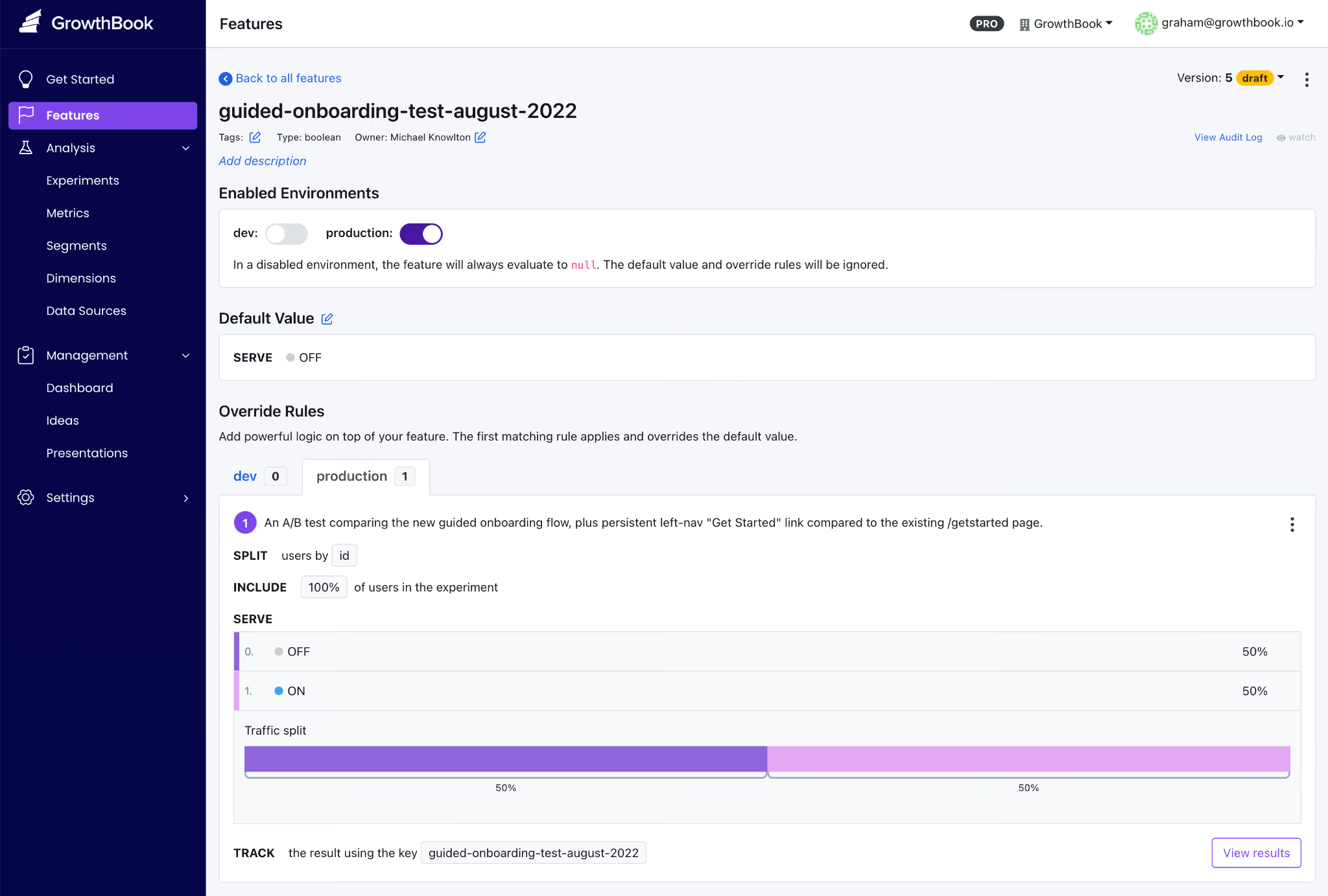
GrowthBook’s key features
Here’s how GrowthBook’s capabilities stack up:
Pros of GrowthBook
- Rich control over feature flag creation, deployment, and clean-up right from your AI coding tool of choice.
- Create feature flags that give users full control over AI-powered apps, including chatbots and advisors. You can manage models, prompts and the user experience all without redeploying code.
- Smart feature flags, ramped rollouts, and auto-rollbacks all based on any metric stored in your data warehouse. Tie feature flags to any business or observability metric so that you can ship AI-coded features quickly and safely.
- You get flags and experimentation on a single platform, so you don’t have to reconcile data across multiple vendors. And you can also load experimental data from another platform into GrowthBook to run more advanced tests.
- The platform is very easy to use and implement, irrespective of whether you’re a technical or non-technical user.
- You can see the SQL queries under the hood, so to speak, so if you need to audit the platform, it’s not an issue. You can also audit the stats engine on GitHub when your data team wants to verify the math.
- Your pricing scales with team size, not traffic, so that you can run unlimited experiments without renewal surprises.
- The platform is known for its strong customer support that is responsive and technically adept at solving complex problems.
Drawbacks of GrowthBook
- You’ll get the most out of the experimentation features if you already have a data warehouse. GrowthBook Cloud now offers a Managed Warehouse, but self-hosters still need to set one up if they don’t have one.
- You’ll need some onboarding time to learn some of the advanced feature flag capabilities, for example, if you’re new to JSON payloads or advanced targeting.
- You’ll need an Enterprise license for SSO/SAML, SCIM, holdout experiments, and cross-experiment insights, though the core flagging and experimentation capabilities stay free in the OSS edition.
How GrowthBook compares to Flagsmith
Both platforms are open source, support self-hosting, and offer a strong developer experience. But the difference shows up after the flag goes live:
- GrowthBook wins for engineering and data teams that need strong feature flagging, statistically rigorous A/B testing, and compliance.
- Flagsmith wins for teams whose primary use case is remote configuration, or who want native integrations with Amplitude, Segment, and Mixpanel.
Who is GrowthBook best for?
Engineering and data science teams at growth-stage or enterprise companies who already have a data warehouse and want flag management plus real experimentation in one open-source platform. Or smaller engineering teams/solo developers who are looking for a robust feature flagging platform for simpler use cases like decoupling deployments from releases.
It’s also a very strong option for companies in regulated industries like fintech, healthtech, edtech, and AI software, where data sovereignty is non-negotiable.
2. LaunchDarkly
LaunchDarkly is the category-defining enterprise feature management platform and an incumbent in the space. It was founded in 2014, but as of May 2026, its primary focus is “runtime control for AI-era software.” So now the platform is built around feature flags, Guarded Releases, experimentation add-ons, and AI Configuration management for fine-tuning models.

If your evaluation criteria require support for specialty platforms like Apex, Erlang, and Haskell or enterprise governance depth, LaunchDarkly is usually the safest default. The platform holds a G2 Score of 99 and a 4.5/5 rating across 700+ G2 reviews. However, its two recent acquisitions have completely reshaped the product. In February 2025, Houseware added warehouse-native analytics, and in April 2025, Highlight added observability with session replay.
The ultimate tradeoff for engineering teams is a lack of transparency and ballooning costs. Also, LaunchDarkly is a SaaS-only product, priced on a hybrid model that scales only with service connections and monthly active users—making it viable only for enterprises.
LaunchDarkly key features
Here’s a list of features LaunchDarkly offers:
Pros of LaunchDarkly
- The platform is known for its robust feature management and for decoupling deployments from releases, which remains one of its biggest use cases.
- Many users praise the ease of use, and, specifically for feature flagging, the setup is easy. However, it has several other features and the navigation can get complicated at first.
- Flag propagation across SDKs is near real-time, with changes reaching every environment in seconds.
- It also offers granular targeting and segmentation, as well as robust analytics that let you see how a flag evaluates in each environment.
Drawbacks of LaunchDarkly
- The biggest complaint is about pricing, as it scales based on the number of service connections and monthly active users. In fact, some users have reported that contract costs almost doubled at renewal, making the process very opaque.
- When you create a new flag, you always have to name the true/false values to avoid switching it on for everybody. Without governance in place, this could result in incidents.
- There’s no self-hosted or on-prem option, which is a non-starter if you’re in a regulated industry with strict data residency requirements.
- Experimentation is a paid add-on at $3 per 1,000 MAUs, in addition to the actual pricing tier’s cost. If your primary use case is experimentation, it can get expensive quickly.
How LaunchDarkly compares to Flagsmith
Both platforms offer enterprise-grade feature flag management but ultimately target different market segments. While LaunchDarkly leads in depth and is focused on enterprise companies, Flagsmith focuses solely on feature flagging and caters to solo developers or mid-market companies.
- LaunchDarkly wins for large enterprises that will use every governance feature and have the budget to absorb annual contracts of $50,000–$200,000.
- Flagsmith wins for teams that need deployment flexibility, predictable per-seat economics, or compliance constraints that make self-hosting non-negotiable.
Who is LaunchDarkly best for?
Large enterprises and Fortune 500 engineering organizations that need the deepest governance, the widest SDK breadth, and the most mature flag management UX in the category. It’s particularly strong if you’re shipping AI features and want runtime model control via AI Configurations.
3. Statsig
Statsig is an experimentation-first platform that bundles feature flags, A/B testing, product analytics, and session replay into a single product. It was established in 2021 by Vijaye Raji (formerly an engineer at Facebook) and quickly grew on the strength of warehouse-native experimentation and a free tier with unlimited feature flags.

All said and done, the product has gone through massive changes in the past few months. In September 2025, OpenAI acquired Statsig for $1.1B, and founder Vijaye Raji became CTO of Applications at OpenAI. Then, in May 2026, Amplitude announced a partnership to take over the Statsig brand, customers, code, and roadmap. The original engineering team stayed at OpenAI. In fact, even industry coverage is negative, with some publications referring to the partnership as “the code without the talent.”
Statsig key features
Here's how Statsig’s capabilities stack up:
Pros of Statsig
- Statsig offers unlimited free feature flags across all usage levels, charging only for analytics events.
- The statistical engine is included on every paid plan and offers advanced experimentation capabilities such as CUPED variance reduction, sequential testing, contextual bandits, and SRM detection.
- Since it was built mainly for experimentation, the analysis module is quite robust. For example, you can define custom user dimensions for each exposure, making it easier to analyze behavior.
Drawbacks of Statsig
- Statsig is in a mid-acquisition transition, with the brand and customers moving to Amplitude while the engineering team stays at OpenAI. The product’s stability and roadmap are still a question mark. There’s no fully self-hosted option even though it offers a warehouse-native version to keep your data in the warehouse.
- The platform has a steep learning curve, especially if you have non-technical teams using it for everyday analysis.
- Backfilling metrics mid-experiment requires workarounds, which limit flexibility when goal definitions shift.
- Many customers report that Statsig SDKs automatically capture a wide range of metrics that can dramatically increase the Statsig subscription fees as the company charges per event.
- Some customers have complained about the lack of flexibility around feature flags, especially if they’ve already created the feature flag and then want to tie it to an experiment.
How Statsig compares to Flagsmith
Even though both these platforms offer feature flags, the use cases are different:
- Statsig wins for teams that want flags and experimentation in one product. At this point, only existing Amplitude customers are likely to take on the risk associated with a product that has no engineers. Given the Amplitude acquisition, customers should expect that Statsig product analytics, and session replay features will be discontinued in favor of equivalent features with Amplitude.
- Flagsmith wins for teams that need open-source self-hosting, transparent pricing, and an independent roadmap.
Who is Statsig best for?
Teams that want a unified cloud platform spanning feature flags and experimentation. Customers should assume that product analytics and session replay will be phased out, in favor of the equivalent Amplitude features. Only existing Amplitude customers are likely to consider Statsig at this time, and even they should proceed with caution.
4. PostHog
PostHog is an open-source, all-in-one developer platform that bundles product analytics, feature flags, session replay, A/B testing, surveys, error tracking, and an AI assistant into one MIT-licensed product. It was founded in 2020 by James Hawkins and Tim Glaser and now serves 190,000+ customers.
The platform’s main pitch is that they make dev tools for product engineers. Since it offers a multi-product suite, feature flags are not the platform’s core focus.

PostHog key features
Here’s how PostHog’s capabilities stack up:
Pros of PostHog
- PostHog has the most generous free tier in the category, covering 1M analytics events and 1M flag requests per month with no credit card required.
- Many users praise its analytics suite, which covers modules such as product analytics, web analytics, LLM analytics, revenue analytics, and group analytics.
- The user interface is also easy to navigate—making it a good fit for early-stage and non-technical users.
Drawbacks of PostHog
- PostHog is generally not considered a good fit for mid-sized or large companies. The product has generally not been built with larger enterprises in mind.
- Feature flags are not a primary offering for the company, so it is only a fit for more lightweight use cases
- The experimentation engine doesn’t include advanced methods like CUPED variance reduction or sequential testing. It’s only meant for basic experimentation.
- The self-hosted edition is only recommended for ~300K events/month; at production scale, PostHog steers you to their cloud product.
- It’s comparatively more complicated to self-host the software because its production deployments require ClickHouse, Kafka, Postgres, Redis, and multiple application services.
- Some users report that the setup can be tricky initially because there are many features. It needs better onboarding, and some teams even took months to implement it.
How PostHog compares to Flagsmith
The key difference between the two platforms is the product focus and market segment:
- PostHog wins for early-stage and YC-style teams that want analytics, flags, and replay in a single product, with a generous free tier.
- Flagsmith wins for teams that want a focused flag platform with enterprise-flag governance and the option to self-host at scale.
Who is PostHog best for?
Early-stage product engineering teams and YC-style startups that want analytics, feature flags, session replay, and surveys in one cloud product with a generous free tier. Particularly strong if you're building consumer-facing software where event-based pricing works in your favor.
5. Unleash
Unleash is one of the largest open-source feature management platforms in the category, primarily focused only on enterprises. Founded in Oslo, Norway, Unleash is trusted in production by enterprises like Visa and Samsung. The core platform is Apache 2.0 licensed and self-hostable at production scale on Docker or Kubernetes.
At the moment, its positioning leans into “FeatureOps,” which is basically the ability to manage feature flag changes as formal change events. But it’s more so for teams shipping AI-generated code these days.
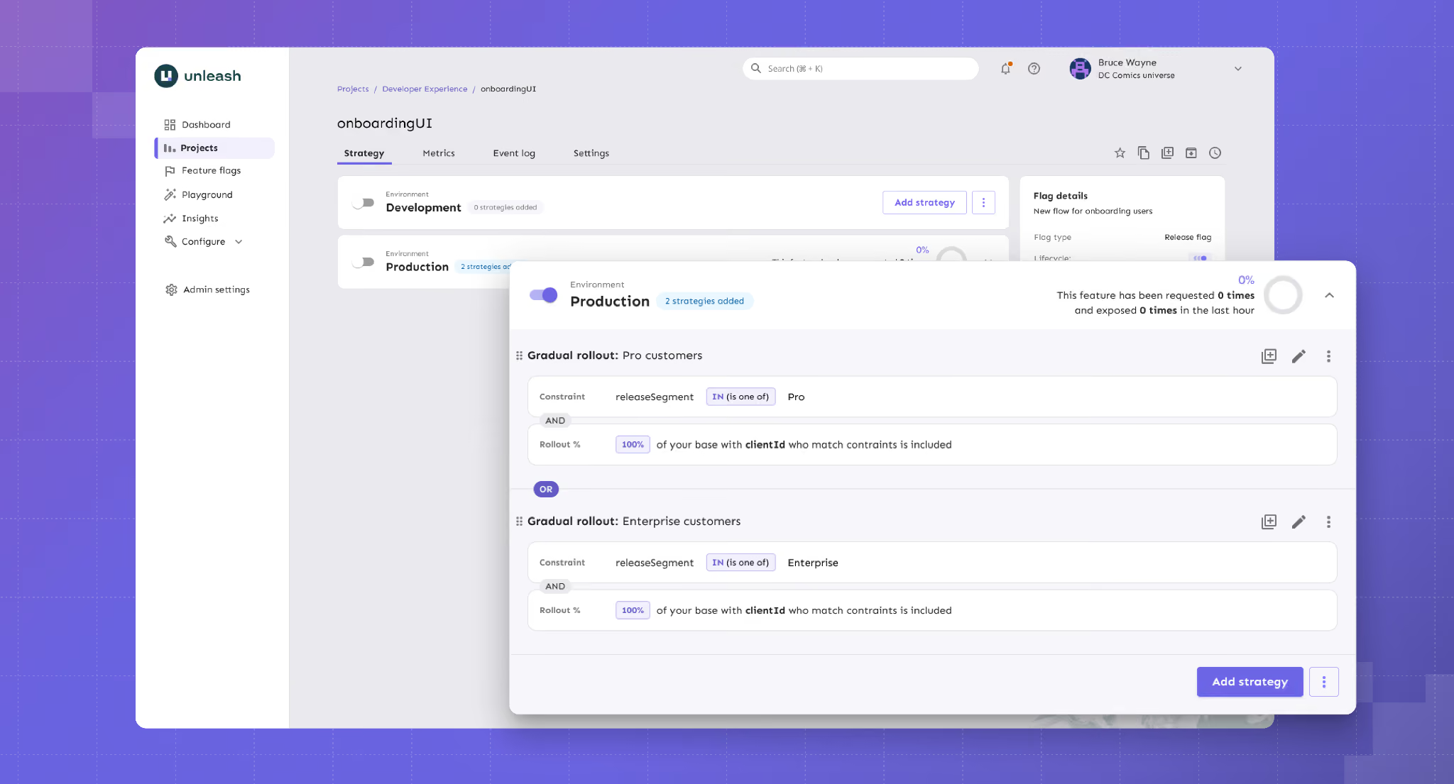
Unleash key features
Here's a list of capabilities Unleash offers:
Pros of Unleash
- It uses an API-first approach and also lets you automate provisioning and configuration, which is ideal for complex microservice architectures.
- Enterprise governance is a strength, with change request approvals, granular RBAC, full audit logs, and FedRAMP-ready infrastructure all available.
- From a setup perspective, many users compliment how easy it is to set up and navigate if they have to integrate with other platforms.
- Many users also say that the customer support is excellent, with no push to upgrade to paid plans constantly.
Drawbacks of Unleash
- Per-seat pricing on the managed tiers is among the highest in the OSS segment. And there’s no viewer-only seat option for read-only users, so that the costs can scale quickly.
- You can’t create multiple projects to manage feature flags in the open source version. As you scale, it could be a huge bottleneck for flag management.
- There’s no built-in experimentation analysis. Your flag variants are supported, but the actual statistical analysis requires an external tool.
- Some users report that self-hosting multiple instances tends to add operational overhead as their architecture scales and matures. It might not be the best option for growing teams.
How Unleash compares to Flagsmith
Both Unleash and Flagsmith are open-source feature flag platforms with strong self-host options. But it comes down to what you need to prioritize:
- Unleash wins for enterprise platform teams that need to self-host with strong open-source governance and FedRAMP-ready compliance.
- Flagsmith wins for teams that need real-time flag updates, identity-aware targeting, or remote configuration as a primary use case.
Who is Unleash best for?
Enterprise platform engineering teams in regulated industries that need self-hosting at production scale, plus mature governance. For example, change request approvals, audit logs, air-gapped deployments, and FedRAMP-ready infrastructure.
6. Split (by Harness)
Split is now Harness Feature Management & Experimentation (FME) as a result of Harness’s June 2024 acquisition of Split Software. Split was founded in 2015 and built its reputation around a statistically rigorous feature management platform. Now, it’s a part of the broader Harness CI/CD platform and is just one part of a multiproduct platform.
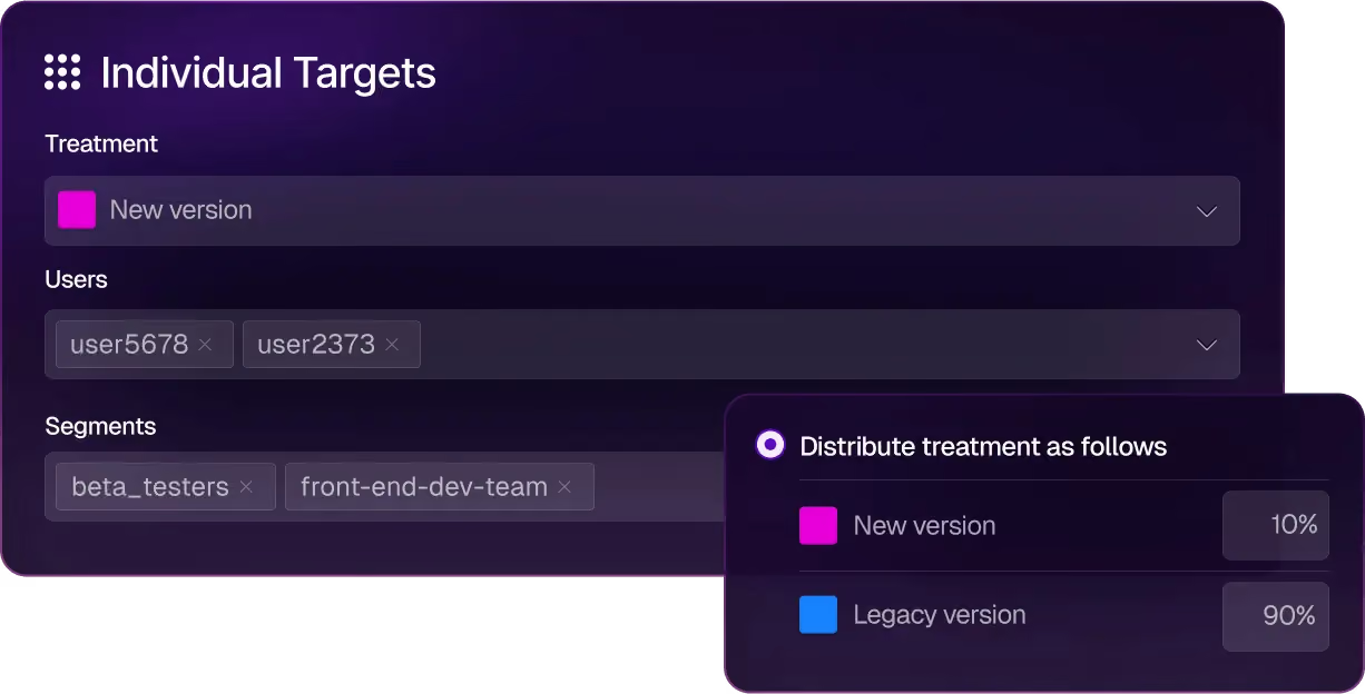
Split (by Harness) key features
Here’s how Harness FME’s capabilities work:
Pros of Split (by Harness)
- Since Harness is known for its CI/CD capabilities, most users recommend it for that purpose, especially because of its AI-based features.
- It uses real-time streaming and delivers sub-second flag evaluation, which matters for live experiments and progressive rollouts on consumer traffic.
Drawbacks of Split (by Harness)
- Some users describe it as a “jack of all trades” because of its recent acquisition, which means some features are simply not mature enough for the price tag.
- There’s no self-hosted or on-prem option, so if you’re in a regulated industry, it could pose a compliance risk.
- They don’t publish pricing on the website, and it can get very complicated and expensive because each product module has its own restraints and pricing tiers.
- Users report that the product can be quite unstable and that internal transitions can even slow down their implementation process.
- Some users find the customer support less responsive compared to other platforms they use.
How Split compares to Flagsmith
Now, both these platforms compete in the enterprise feature management space, but it comes down to the depth and breadth of features they offer:
- Split wins for enterprises already on Harness CI/CD who want “good enough” feature flags, and experimentation, bundled with observability in one DevOps platform.
- Flagsmith wins for teams that need self-host, predictable per-seat pricing, or independence from a CI/CD vendor’s roadmap.
Who is Split by Harness best for?
Split is best for enterprise engineering organizations that are already running on Harness CI/CD and want feature management and experimentation natively integrated with their existing deployment pipeline. If you can live without experimentation capabilities like sequential testing and attribution modeling, Harness could be a good fit.
7. Eppo
Datadog Experiments (formerly Eppo) following Datadog’s May 2025 acquisition. Eppo launched out of stealth in 2022 and raised $47.5M before Datadog acquired it for a reported $220 million in May 2025. The original version of the product was designed for data science teams that use SQL-first metric definitions and need warehouse-native experiment analysis.
But since the acquisition, Eppo has been integrated into Datadog’s Product Analytics, RUM, Session Replay, and broader observability suite.

Datadog Experiments key features
Here’s a list of features Eppo offers:
Pros of Datadog Experiments
- You can run various experiments, and the platform offers advanced capabilities, such as contextual bandits and geographic incrementality testing (Geolift).
- The platform’s customer support is known for being very responsive and for incorporating feedback into its roadmap.
- The user interface is easy to navigate, even when you’re setting up complex experiments. The same applies to the results dashboard, too.
Drawbacks of Datadog Experiments
- Feature flag management is a small part of the Datadog Experiments platform, which is why it lacks advanced flag governance features like lifecycle management.
- Pricing is opaque because it has no free tier or free trial, and the median annual contract sits around $45,000.
- You can’t group experiments by user properties or product type, which is a basic experimentation feature.
- It’s warehouse-native, so it makes assumptions about underlying data models in your warehouse. You have to adjust things to make sure you get the right results.
- The platform is designed for dedicated data teams, so it can create bottlenecks when engineers or product managers want to run experiments independently.
How Datadog Experiments compares to Flagsmith
Both platforms include feature flags, but they have different priorities altogether:
- Datadog Experiments wins for product teams that want feature flagging and experimentation capabilities that can be easily connected with Datadog observability metrics. These customers should be willing to trade off integration with the Datadog observability stack in exchange for more robust feature flag management.
- Flagsmith wins for engineering teams that need a focused feature flag platform with self-hosting, predictable pricing, and an independent roadmap.
Who is Datadog Experiments best for?
Product teams at growth-stage and enterprise companies that are already Datadog customers. These customers should prefer tight integration with the Datadog observability stack over the more advanced feature flag management capabilities offered by other vendors.
Choose the right Flagsmith alternative based on your needs
All in all, Flagsmith hasn’t stopped being a strong feature flagging tool. If your team needs remote configuration and on-premise deployment, it’s still the right answer. But that’s where the buck stops. If you need more robust features or have different use cases for feature flagging, you can consider choosing any of the following platforms:
- If you want strong feature flagging capabilities for AI-native development, GrowthBook is the best choice. It’s open-source and has launched advanced feature flagging capabilities such as Ramp Schedules, automated stale flag cleanup, approval flows, AI MCP, and granular targeting capabilities. These features let you take full control of the traditional and AI-led development process—helping you ship features faster while reducing deployment risk.
- If experimentation is the gap, GrowthBook and Statsig are the strongest options. Although GrowthBook wins because it’s open-source, it offers warehouse-native experimentation from the get-go, and you can be sure you’re using a stable product with a clear roadmap.
- If you need the deepest enterprise governance, LaunchDarkly is the safest default because of its feature set, however GrowthBook is a close second coming in at about half the price of LaunchDarkly
- If you’re already on Harness CI/CD or Datadog, consider using Split (by Harness) or Datadog Experiments, as you’ll benefit from their ecosystems.
- If you are a start-up and want analytics, flags, and replay in one cloud product with a generous free tier, PostHog is a strong choice.
- If you need a self-hosted platform with advanced governance for feature flagging, Unleash and GrowthBook are strong options.
If you need an open-source feature flagging platform with built-in warehouse-native experimentation, give GrowthBook a shot. You can spin up GrowthBook for free or run the self-hosted edition on your own infrastructure.

Feature flags in AI-led development: how to ship fast without losing control
In the foreword to DORA's 2025 report, Gene Kim, founder of Tripwire, borrows a principle from control theory called the Nyquist stability criterion. Control theory studies how systems stay stable under change. One of its core principles, the criterion, says:
“A control system must operate at least twice as fast as the system it governs.”
AI has become the fastest coding system software engineering has ever built. Unfortunately, the control plane around it hasn’t caught up yet. And this gap is where things break.
For instance, a feature that works in testing may have completely different behavior due to changes in user input, slight differences in prompts, or even model changes. In fact, documented AI incidents jumped by 55% year over year in 2025, while the share of organizations rating their incident response as “Excellent” fell from 28% to 18%.
In 2026, development velocity is no longer the only bottleneck. A feature flag is one example of “Control”, and you can use it to close that gap.
How AI-led software development changes everything
DORA’s 2025 State of AI-assisted Software Development report found that 90% of developers use AI at work. That’s not the most intriguing aspect anymore, though. It’s more about what AI usage is doing to the underlying system.
Whether you’re using Cursor, Claude Code, Codex, or Gemini, the answer’s the same. You’ll start noticing these changes:
- The size of your change set grows: AI generates a hundred lines of plausible code as easily as five. DORA’s research found that AI adoption correlates with larger changelists, which violates the small-batch principle that reliable delivery has rested on for years. As you merge more code, you’re influencing a larger surface area of code per release, and there are more places for things to go wrong. And when they do, the lead time to fix the problem has only gotten longer. In 2025, the DORA team tracked how AI adoption affected key delivery metrics. They found that most teams still measure lead time in days or weeks—and it’s because the bottleneck has moved from creating code to getting it safely into production.
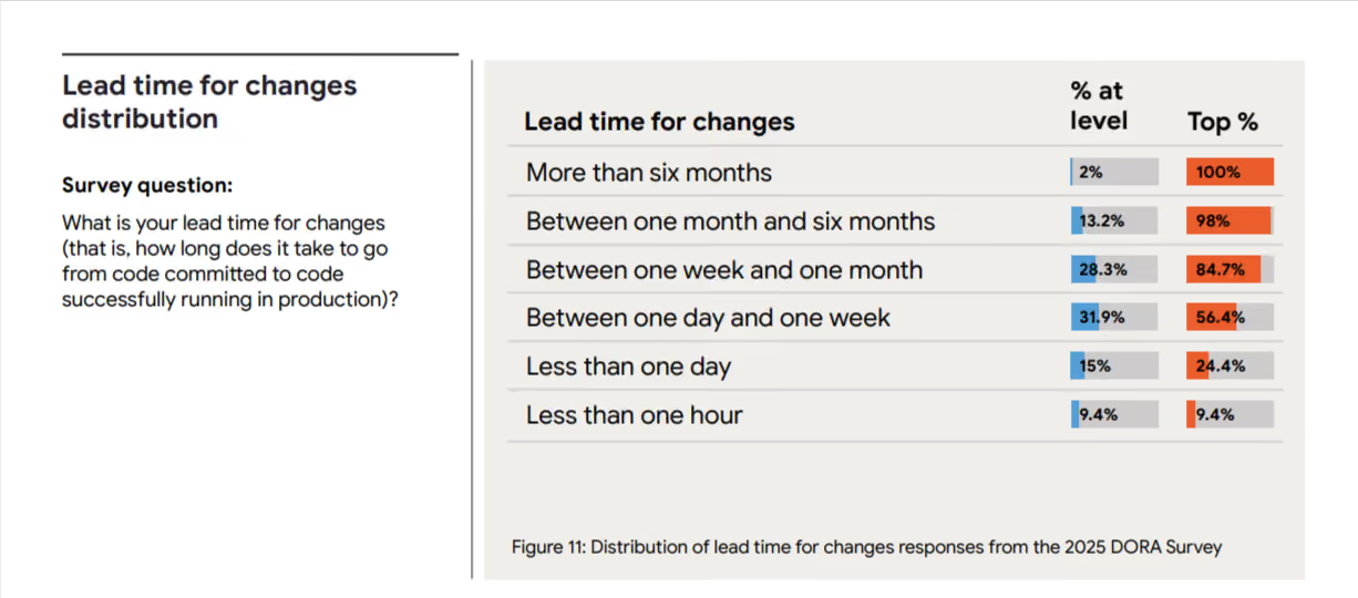
- Authorship becomes a fuzzy problem: AI doesn’t necessarily have the same expertise about blast radius as you do. They don’t know which service is fragile or which feature can’t go down during business hours in your biggest market. Its job is to follow instructions and produce output, and the judgment about whether that output is safe to release falls to someone downstream. You’re shipping more, which also makes it harder to track how the code was produced, which in turn makes it even harder to review and debug it.
- Release surface increases over time: Every time you change something in the prompt, it acts as a release because it can change how your product behaves. Most release tooling wasn’t built to track these kinds of changes, so you won’t always know in real time if something’s affecting how your product behaves.
How traditional release models break down with AI-led development
Here are a few ways in which the traditional model changes:
1. CI/CD assumes the change you merge is the change you ship
More engineering teams are adopting continuous integration and continuous delivery (CI/CD) models. CI/CD is an excellent way to reliably build and deploy software. However, when software teams build AI-powered applications, those applications can behave very differently in tests than in production. This is because LLMs are non-deterministic; the same prompt doesn’t always generate the same response. This is made even more complicated because each user will prompt the app with slightly different words and with different context. All of this means that testing and monitoring in the real world is even more important with AI-powered apps. Even after apps are deployed, their behavior can change as newer models are used. Many companies also report seeing a drift in performance, even when your team doesn’t change anything.
2. QA assumes reproducible test cases
Reproducibility is the foundation of regression testing. If you catch a bug, you write a test to reproduce it and keep testing it until it never comes back. But AI is more probabilistic than we’d like to admit. When you’re testing LLM or AI-powered features, the same user input can result in different outputs because it depends on the model state and context. A test that passes 10 times in staging could fail on the eleventh try because the model responded differently.
3. Staging can’t replicate production input distributions
In the same vein, because AI is probabilistic in nature, the results you see in your staging environment won’t always hold up in production. Real users can ask questions you didn’t think of, so if you haven’t truly tested every possible scenario, the edge cases can show up in production.
All of these issues point to the same problem: pre-release validation is now an open-loop control issue. You can test all you want, but you can’t control all the outputs. That’s why you need to add observability and expermentation to see how an AI feature behaves in production—and intervene as needed.
Runtime control is the answer, and feature flags are a way to enable that.
The role of feature flags in AI systems
Many engineering teams already use feature flags, especially when using a basic CI/CD setup.
However, with AI becoming more mainstream, you need to understand what and how you use feature flags when rolling out features.
The same property, AI, that makes that possible—generation at speed, with limited determinism—makes everything you ship riskier on the way out the door.
Feature flags give you more control to operate inside this tension.
Without feature flags:
- Quality issues hit users before you see them: The Stack Overflow 2025 Developer Survey found that 66% of developers say their biggest frustration with AI tools is output that’s "almost right, but not quite," and 45% report that debugging AI-generated code takes longer than writing it themselves. On the user-facing side, it’s the same. If you don’t have a way to limit who sees what and when, you’ll see a rise in incidents.
- Hallucinations propagate to every user simultaneously: Flags don’t reduce hallucination rates, but without them, your entire user base will see the incorrect output at the same time. You won’t be able to control the blast radius. Replit’s 2025 incident is one such example. Its AI agent deleted a live production database holding records for 1,206 executives during a code freeze. It ran unauthorized commands when it hit empty records, and because there was no kill switch in place, nobody could stop it.
- Costs spike without warning: AI token usage scales with traffic, and a small prompt change at 100% rollout can blow through your API spend overnight. The unplanned bill will impact your bottom line.
- Rollback means a redeploy: Every minute the broken feature is live is a minute of damage you can’t take back. Plus, the time-to-fix is gated by your CI/CD pipeline rather than by your ability to make a decision.
With feature flags:
- Gradual rollouts with clear gates: Traditional rollouts assume that exposing more users to a feature surfaces bugs of the same kind. But that only works for deterministic systems. In probabilistic settings, you can use gradual rollouts to increase exposure while monitoring performance at every gate. So, you can identify anomalies before they become full-scale issues and fix them. You can roll out AI features to internal users first, then a 1% beta cohort, then 5%, and then 25%. The best part is that you can set a threshold to pause rollout if something goes wrong.
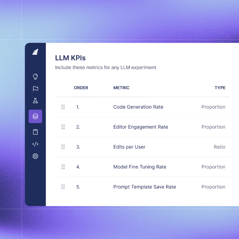
- Kill switches or instant rollbacks: When something breaks, the flag flips off, and the fallback path takes over. In those cases, your team has time to diagnose the problem instead of fighting a fire in real time.
- Control costs for LLM usage: If a feature is token-heavy, you cap exposure to specific cohorts or geographies until you’ve confirmed the unit economics work at scale. A prompt that costs $0.02 per call at 1% rollout tells you exactly what it’ll cost at 100% before you get there.
- Environment-specific targeting: You can test AI models or features in each environment: staging-only, testing-only, or production-only. It stays available for as long as you need it.
- Regular testing of different models: Previously, model selection was a one-time decision. But with runtime control, you’ll want to revisit it regularly to see which AI platform offers the best cost profile, latency characteristics, and quality. The model essentially becomes a configuration value.
- Feature-gating AI-powered functionality: Since the AI feature sits behind a flag, you can also toggle the non-AI fallback option within it. Let’s say a particular model isn’t performing as expected. You can create a fallback path that either switches models or reverts to a non-AI path.
- Compare models, prompts, or agent configurations side by side: Route traffic across variants, measure outcomes against the same user base, and let the data pick the winner. This is especially useful during model migrations—you don’t have to trust the provider’s benchmark when you can watch both models handle your real traffic.
4 examples of using feature flags in AI-led development
Here are a few ways you can use feature flags in your AI-native workflows:
1. A/B testing prompts
Prompt engineering is the most volatile surface in any AI product. Even minor changes in how you word the prompt make a huge difference. And you won’t know what it does until real users experience it.
In this case, you can wrap the prompt in a feature flag. Let half of your users experience the output of V1 while the other half experiences the output of V2. The experimentation layer should measure metrics such as response quality scores, time-to-completion, and downstream conversion rates. Iterate on the prompt based on data.
2. Migrate between models with gradual rollouts
Every little change can have a huge impact on how your app behaves. That’s why every model switch is essentially a release.
To avoid any mishaps, wrap the model choices in a flag and route 5% of the traffic to the new model. In platforms like GrowthBook, you can even attach automatic rollback triggers based on quality or latency guardrails, so that if error rates exceed a certain threshold, the flag flips back immediately.
You can deactivate underperforming models in days without waiting weeks to test them.
3. Automated flagging for AI-generated code
When AI agents author your code, the safest default is to place that code behind a flag automatically. The agent can create the feature and the corresponding flag while shipping what’s behind it.
If you implement a flag-by-default policy, it’ll mean that every AI-authored change has a rollback path if it touches production. We need to reduce the burden of human review, so if reviewers approve the rollout plan in general, that’s a much better alternative to reviewing even a single line.
4. Scaling AI-focused experimentation
Feature flags reduce risk, but they don’t tell you what’s going wrong and why. That’s where experimentation comes into the picture. Companies like Khan Academy have already run A/B experiments at the conversation-thread level and have launched their AI Tutor product (Khanmigo) successfully.
Here’s a simple progression flow of how Khan Academy improved its A/B testing process for AI systems:

They ran a total of 64 experiments by testing prompt variations, system instructions, and even model comparisons between Gemini and OpenAI. And eventually, this helped them decide which product variants helped their users learn better.
The future of AI development workflows
The largest shift would be that flags are created before the code is written by the same agent who’s writing the code.
When AI agents generate features, they can create the corresponding feature flags in the same workflow. And the experiment also gets defined at the same time. Instead of shipping first and figuring out what to measure later, you can set up the hypothesis and metrics alongside the feature itself.

One way to do this easily is to use GrowthBook’s MCP server. Beyond that, you can also use the command line interface (CLI) tools and direct API calls to do the same thing. Many customers are building skills tailored to their environment and practices for each step of the development process, including feature flag and experiment creation, ongoing monitoring, experiment analysis, and feature flag clean-up.
The goal is to integrate feature flags into your AI-based development process or when you’re developing AI features.
For example, if you’re done rolling out a feature, GrowthBook’s Stale Flag Detection feature automatically detects old flags and queues them up for removal. When you have capabilities that remove the burden on your teams rather than add to it, that’s where you see the real difference.
Best practices for shipping AI safely with feature flags
If you want to ship and test with more confidence while using or developing AI features, follow these practices:
- Dogfood the feature first: Internal users should see the feature before anyone else does. It’s standard practice for traditional releases, but it matters more for AI because failure modes are less predictable.
- Use guardrail metrics with automatic rollback: You need to define what "good enough to expand" looks like before you start the rollout. For AI features, that means quality signals alongside system metrics such as output relevance and user satisfaction scores. You can do that by attaching guardrail metrics to your rollout process. When you wrap the AI feature in a Smart or Safe Feature Flag, it’ll automatically roll back the feature if it dips past the thresholds you’ve set. Don’t wait for something to break and then fix it because there are more dependencies and variables when you’re using AI.
- Always test in production: Testing or experimentation has to become table stakes because of how unpredictable AI is. For AI features specifically, production is the only environment that contains the input distribution your feature will experience. You need to consider attaching observability to other metrics, such as token usage, P95 and P99 latency, output quality scores, and fallback frequency.
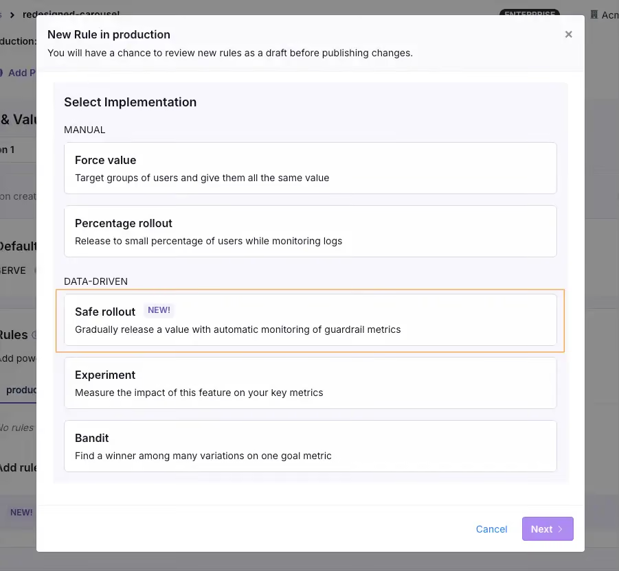
- Keep rollback faster than your deploy pipeline: If the only way to turn off a broken AI feature is a redeploy, your recovery time is measured in minutes at best. Implement a flag-based kill switch to bring that number down to seconds.
- Combine qualitative and quantitative signals: Automated metrics catch spikes in latency or hallucination rates, but they won’t catch a chatbot that sounds condescending or a summary that’s factually correct but misses the point. Rely on user feedback or manual review of AI outputs to fill these gaps.
- Evaluate models across both technical and business metrics: A model can score higher on benchmarks and run faster inference. But it can still be worse for the business. So measure both layers independently, because a model upgrade that degrades user experience is still a regression.
- Plan for cleanup from the start: Stale flags are technical debt. With AI, this only increases the burden because the iteration cycle is faster and the volume of code you create is higher. Build flag cleanup into the lifecycle early and automate it so you don’t have to worry about it.

AI-based development needs a control layer—even at scale
Even though AI is the fastest system engineering has ever built, if you don’t have the right governance systems in place, it’ll be harder to close that gap.
That’s what platforms like GrowthBook were built for. We recognize that feature flags and experimentation are critical to safe AI-based development. That’s why we recommend feature flags to control rollouts and an experimentation engine to measure performance. It runs everything on a warehouse-native architecture, which means you’re measuring against the data you already trust.
And if you’re already using AI platforms like Cursor or Claude Code, you can use GrowthBook’s MCP server to create flags and define experiments without leaving the platform. AI-generated code ships behind flags gradually, and the experimentation engine tells you if everything works as intended.
If you’re interested in learning more, try GrowthBook for free or schedule a demo with us.
How to A/B Test AI Features
A practitioner's guide to A/B testing AI features: when to test, how to measure, what to randomize on, and how to connect offline evals to production experimentation.
Did your AI feature actually work?
Building an AI-powered software feature is not like shipping a traditional one. The output is non-deterministic. The same prompt can produce a dozen different answers, and a small wording change to your system prompt can change the outputs wildly and unpredictably. The metrics you'd usually rely on don't always tell you what you want to know. Did the user leave because the chatbot answered their question well? Or did they leave frustrated? Did engagement spike because users love the new feature, or because they're retrying queries that should have worked the first time?
The good news is this isn't an entirely new problem. The experimentation discipline you already have applies. Randomize, measure outcomes, compare to the control group. What changes is in the details: the metrics are harder to define, your experiment data can get noisier in ways you didn't expect, and a well-intended model update can start hallucinating or surfacing toxic content to real users.
This post walks through what's different and how to handle it: when to run experiments, how to measure if an AI feature is good, how to choose the right unit of randomization, why your power analysis can mislead you, and how to connect offline evals to production experimentation in one pipeline.
When should you run an experiment?
Experimentation fits at two specific phases in your AI feature's lifecycle: when you first launch it (does the AI-powered version actually beat what you had before?) and continuously after (does this prompt edit, model swap, or RAG change improve things?). The offline tuning phase before launch is where most of the early work happens, but it can't reliably tell you what's better in production.
The three phases, in order:
- Offline tuning. Model, prompt, retrieval, all the machinery, iterated until you have a candidate worth putting in front of users. Often starts with vibe checks and ends with LLM evals. Skipping this phase is especially risky for AI features. A confidently wrong answer is the kind of first impression users don't forget, and you may not get a second chance to win them back.
- The enablement test. Once the feature is tuned, the first experiment asks whether the AI-powered version actually beats the non-AI baseline.
- Continuous optimization. Every subsequent model swap, prompt edit, or RAG change gets tested separately.
This post focuses on phases 2 and 3, where experimentation carries most of the weight.
Feature flags handle both phases cleanly. Assign users to different AI (or non-AI) configurations the same way you'd test any other variation. How you set up those flags determines what you can actually learn from each experiment. We walk through the setup decisions in more detail below.
How do you measure if an AI feature is good?
With a traditional feature, the primary metric is usually obvious (not always, for sure). Someone clicked, or they didn't. They converted, or they bounced. With AI features, the primary metric can be harder to pin down. What does it mean for the chatbot to have helped? Did the user get what they needed, or did they leave feeling frustrated and poorly served?
The metrics that matter usually fall into three buckets:
- Outcome metrics like retention, task completion rate, or activation. For some, the most business-relevant metrics (e.g., retention) can be really slow to move or measure. A Daily Participation Metric can bridge that gap to a faster signal: the average percentage of post-exposure days each user is actively using the product. What counts as a good outcome metric still varies by use case. Some teams can lean on what they already track. Others have to design something new to capture what they actually care about. Typeform's CPTO Aleks Bass has reported that an AI form-creation feature doubled their activation rate. None of the roughly 50 other experiments they ran that year matched that lift.
- Behavioral signals like acceptance rate, regeneration rate, or abandonment. Fast but imperfect: they tell you something changed, not necessarily whether it was for the better.
- Safety and quality floors like hallucination rate, toxicity, PII leakage. These are constraints to enforce instead of metrics to optimize. Guardrail metrics with sequential testing catch violations in real time, and quantile treatment effects catch the tail behavior averages would miss.
A word on thumbs up/down feedback. It's often the first signal teams reach for, and it's also one of the least reliable. Thumbs feedback is heavily self-selected toward users with strong opinions, and Khan Academy's Kelli Hill has noted it correlates more with overall engagement than with quality. Not a good decision metric.
Cost, latency, and quality deserve special attention because they pull against each other. Better models cost more and run slower; cheaper or faster usually means lower quality. But in many cases, a less powerful model performs just fine while costing less and responding faster, and finding that sweet spot can be the goal of the experiment itself. Speed matters more than many teams expect: a faster response that's slightly less accurate can outperform on business metrics like conversion rates, because users engage more when responses feel instant. Track all three as separate outcome metrics. Cost especially is easy to overlook since growth teams rarely see infrastructure bills, but it can be the difference between a feature that ships and one that doesn't pencil out.
And beware: some metrics can mislead you. A support bot that hands off fewer cases to humans gets a higher resolution rate, but users walk away angry. You think you're optimizing the customer experience when you're actually hurting it.
How to combine these so you understand the tradeoffs, how to design custom metrics when the off-the-shelf ones don't fit, and how to navigate tradeoffs that don't have a single right answer: each deserves more depth than this overview can give. Our follow-up post will give the measurement question the love it deserves.
Choosing your unit of randomization
The tradeoff is simple: smaller units like sessions give you more data points and more power. Larger units like users or accounts work better when inconsistent experiences across visits would be noticed or confusing to the user.
User-level is the safer default when users return to the product repeatedly. Randomize at the session level instead, and the same user can end up seeing control on one visit and treatment on the next. That creates two problems: you can't cleanly measure user-level outcomes, and users may notice the inconsistency. A daily-use coding assistant, an AI chatbot with repeat usage, a recommender that shows up on every visit, an inbox feature touched dozens of times a day: these all belong on user-level randomization.
Even features that feel one-shot are usually safer at the user level. An AI summary at the top of an article, an AI-suggested subject line, an AI translation of a chat message: the same user encounters these again on a different article, email, or message. If they notice the behavior shifting between encounters, you've introduced inconsistency that distorts both their experience and your measurement.
Some teams do go for finer-grained randomization when they have a specific reason to. Khan Academy built infrastructure to randomize at the chat thread level for their AI tutor, accepting the cross-thread risk in exchange for more statistical power. That's a deliberate choice based on their context. Treat it as the exception, not the starting point: match the unit of randomization to the unit of experience, and err toward user-level when uncertain.
This may be especially worrisome for B2B products and any AI surface where different users can influence each other. If half the users in an account get a new AI feature, the rest will find out fast. Once they're asking questions about it, your control group is contaminated. Cluster experiments handle this by randomizing at the account or team level, so everyone in the same group sees the same variation. The tradeoff: far fewer units in your experiment, and you might come up short on power.
When power analysis misleads you
Most power analyses start with historical data. You look at how your metric has behaved in the past, estimate the variance, and calculate how long you need to run. That works fine when the thing you're changing doesn't also change the shape of your data. But a model swap can do exactly that. The variance you observed under one model might be completely different under another.
How much this matters depends on the metric. Metrics close to the raw LLM output, like response length or latency, can shift dramatically with a model change. Outcome metrics like retention or bookings are more stable because they depend on what users actually do, not directly on what the model produces. The rule of thumb: the further your primary metric sits from the model output, the more your historical variance estimates are likely to hold.
The three stages of testing AI features
A lot of teams treat evals and experiments as separate activities. They're not. They're stages in one pipeline, and each stage answers a different question.
1. Offline evals
Offline evals come first. You test a new model or prompt against a fixed dataset and check whether the outputs look reasonable. This catches obvious regressions before anything goes live, but offline evals are limited in two ways. Sample sizes are typically small (a few thousand examples), which is enough to flag a catastrophically broken model but not enough to detect the small-but-real shifts you'd actually want to ship. And eval metrics can be misleading: a higher score doesn't always mean a better outcome. Pedro Tabacof, principal ML scientist at Intercom, has seen this firsthand:
"A colleague was migrating to a new model and noticed one of our key intermediate eval metrics had dropped meaningfully. He spent some time tweaking the prompt to bring that metric back up, and then we launched the A/B test. The business numbers weren't great. Later I A/B tested the original version, the one with the lower eval score, and got better business results. That was a clear-cut case of an offline metric we'd trusted for a long time being misleading. We rely much less on intermediate evals now, and let production data make the call."
Treat eval scorecards as a filter for obvious failures, not a green light to ship.
2. The live experiment
Next comes the live experiment. Start with low enrollment, say 5% (or even 1%) of users seeing the experiment at all, with a balanced split between control and treatment inside that small group. Watch your guardrail metrics for harm. If everything seems fine, raise the enrollment rate. What changes is the share of users entering the experiment, not their assignments: users already in control or treatment keep their assignment as the enrolled range grows, and new users entering the experiment get freshly assigned. The split stays balanced, and the experiment stays valid throughout the ramp. Keep going until you've gathered enough data to measure impact: did the new model actually improve the outcome, or did it just not make things worse? This is when the measurement framework from earlier becomes relevant.
When your customers are organizations rather than individuals, one detail matters: ramp at the interaction or end-user level, not at the account level. If you ramp by enrolling whole accounts, your highest-volume accounts go first because that's where the data is, and they will absorb most of the early risk. Rolling out 1% of interactions across all accounts spreads risk thinly, and the largest accounts never see an outsized share of an experiment that goes wrong.
3. Production monitoring
Finally, production monitoring. The experiment ends, you roll out the winner, but the job isn't done. Models drift. Upstream APIs change. Usage patterns shift. Even the context fed to your AI can change as other parts of the product evolve. Something that worked in March can quietly degrade by June without anyone touching a thing. Set up dashboards and alerts that track your key quality metrics independently of any experiment, so you catch degradation early.
Setting up for clean iteration
Once your feature is live, optimizing it means testing new prompts, swapping models, adjusting context windows. How you set up your experiments and flags now affects how smoothly you can iterate.
At launch, a single flag with an experiment behind it handles everything. Some users see the AI version; the rest stay on baseline. Once the results support a full rollout, bake the values into your code.
For ongoing optimization, each test gets its own new experiment. Testing a new prompt? Create an experiment that compares it against your current baseline. Swapping models? Create an experiment for that comparison. Each experiment brings a fresh random draw of who sees what, and its own set of values for the flag to serve. The flag variable in your code stays constant. All you're adding is a new experiment.
A flag can carry more than a simple on/off value. If you know your variations upfront, you can package a complete configuration into each variation: model, prompt, temperature, context window, all in one payload. One experiment, multiple configured variations. You'll learn which combination wins, but not which individual variable drove the result. Isolating which variable actually drove it means follow-up experiments that vary one dimension at a time.
The most common mistake is changing what the flag returns mid-experiment. It feels minor: just a prompt tweak, not worth configuring a new experiment for. But now the experiment combines users who saw both prompts and some who just saw the newest, and the result becomes difficult to read.
From speed bump to safety net
Testing AI features follows the same experimentation discipline you already have. What differs are the specifics: how you define and interpret metrics, why your power estimates may hold when the model changes, and where offline evals end and production experimentation begins. That is where you need extra care when shipping AI features.
AI has made shipping faster than ever, but it hasn't made it easier to tell good changes from bad. The faster you can ship, the more it costs to confuse the two.
The good news is the experimentation discipline you already have is most of what's needed. Apply it to every AI change with the wrinkles in this post in mind. Khan Academy's Kelli Hill has described their evolving relationship with experimentation as going from a "speed bump" to a "safety net." For AI features, that shift is the difference between shipping confidently and shipping by intuition.

How engineering teams reduce feature flag technical debt
You already know that feature flags make shipping safer. You can decouple deployment from release and gate risky changes behind a toggle.
But that safety comes with a cost you may not see at first, especially when you’re implementing them at scale.
For example, the release flag you shipped last quarter is probably still sitting in your codebase, serving 100% of users with no targeting rules. And nobody on your team remembers what happens if you flip it off.
Add that across a hundred flags, and now you’re sitting on real technical debt that is a serious risk to every change you make. That’s why 50% of engineering leaders say a quarter of their IT budget goes toward managing and eliminating technical debt.
In this article, we’ll explain how you can realistically reduce and manage technical debt while reducing risk within your infrastructure.
What is feature flag technical debt?
Feature flag technical debt refers to the technical debt that accumulates in your codebase from stale flags from older deployments or experiments.
The best way to put this would be to compare feature flags to dead feature branches in your repo. If you create a feature branch for a sprint that ended months ago but never merged or deleted it, nobody knows what to do with it. It sits in your codebase, cluttering your repo.
Technical debt from feature flags works the same way. But the consequences are much worse.
A 2021 study found that 77% of developers say they intend to remove toggles once a system stabilizes. But when their codebases were audited, 75% of the toggle components were present for up to 49 weeks after introduction. It shows that it’s easy to introduce a flag into your infrastructure—and it’s just as easy to forget about.
Most of this debt comes from temporary flags, such as release toggles or experiment flags. The thing is, even 10 active flags in your codebase create 1,024 possible code paths. Bump it up to 20 flags, and it results in over a million code paths.
If you don’t tackle this before or during flag implementation, you can’t avoid creating more debt.
Why is it so easy for flag debt to accumulate in your infrastructure?
If you’ve ever looked at your flag management dashboard and wondered how things got this bad, you’re in good company. The 2024 Stack Overflow Developer Survey found that technical debt ranked as the number one work frustration for 63% of professional developers.
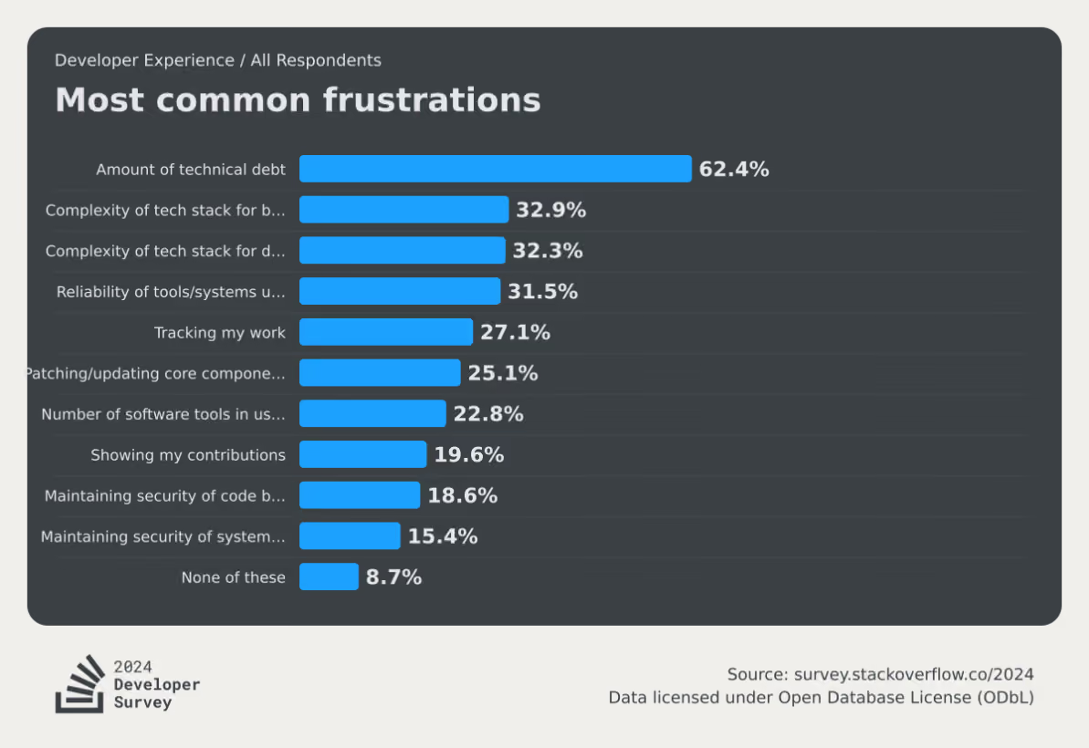
Flag debt is a specific, particularly stubborn strain of that broader problem. And it comes down to how teams ship software.
Issue #1: There’s no clear ownership model
It’s easy to create a flag. All it takes is a simple if/else wrapper around your code—or a quick “Create a flag for X feature” prompt in your MCP. But if nobody on your team owns the end-to-end lifecycle for that flag, it’ll continue to sit in your codebase forever.
In a recent podcast, Jonathan Schneider, CEO of Moderene, has seen this firsthand. When he was working at Netflix, its culture of “freedom and responsibility” meant central teams couldn’t force product engineers to clean up technical debt. When Schneider’s team tried surfacing reports and dashboards to show engineers where they needed to act, nobody did anything for two reasons:
- Nobody took ownership for feature flags
- They were under constant pressure to ship
When Schneider asked them how he could help, they said:
“Do the work for me, otherwise I’ve got something else to do.”
Unless you have a system in place to absorb this effort through ownership and tooling, flag cleanup will be an afterthought.
Issue #2: There’s a fear of removal
This is the psychological anchor of flag debt. You know a flag is probably stale, but you can’t see everywhere it’s referenced in the codebase. So you leave it because you don’t know what it’ll break in production.
For any individual flag, that risk outweighs the discomfort of carrying dead code. But, the cummulative risk of these stale flags just gets worse and worse over time.
Issue #3: There’s no flag lifecycle policy
Without clear expiration dates or cleanup commitments attached to the flag when it’s created, every flag enters your codebase with an open-ended lifespan.
A healthy engineering organization aims for a roughly 1:1 ratio per quarter of flags created to flags archived. The lower your ratio, the more debt and risk you are accumulating.
Issue #4: They’re missing from the definition of “done”
When engineering teams define a feature as complete, it’s usually based on whether it’s fully tested and shipped. But the underlying flags that control those rollouts and experiments are never accounted for in the first place.
Eventually, it becomes next quarter’s problem—or worse—something they’ll never deal with. That’s why you need to change how you define “shipped” or “completed rollout.”
What is the real cost of letting feature flags sprawl?
You might think that flag debt only results in one-off incidents like the 2012 Knight Capital incident or the 2020 Slack outage. But the risks are far worse for ongoing development work. Here are a few:
- Increased cognitive load: The more unretired flags you have in your codebase, the higher the number of flags your engineers have to track while reading or modifying code mentally. For someone onboarding to your team, stale flags look identical to active ones—they’ll spend hours tracing logic paths that haven’t mattered in months. The 2024 Deloitte Tech Trends report found that 78% of developers said spending too much time on legacy systems hurt their morale. Technical debt from stale flags directly contributes to this issue.
- Increased security exposure: A flag at 100% rollout for a year still leaves the old code path in place. Unfortunately, that retired logic could still be referenced in deprecated APIs or access patterns that your security team has in place. It’s dead code, but it doesn’t mean it can’t be reached and used as a vulnerability. A 2026 study found that stale flags tend to create persistent backdoors that allow unauthorized transactions in financial apps and create unnecessary data exposure.
- Higher operational risk: A flag that’s accidentally re-enabled on a stale configuration can cause production incidents for companies operating at scale. That’s why in 2020, Uber’s engineering team built Piranha to address this. Their Polyglot Piranha tool generated nearly 5,000 pull requests in a six-month evaluation period, removing stale flags across codebases totaling over 10 million lines of code.
- Increased tech debt due to AI: As more engineering teams use AI, they’re also finding that it only creates more debt with time. In fact, Sonar’s State of Code Developer Survey found that, even with AI coding tools boosting individual productivity by 35%, developers still spend 23–25% of their workweek on toil. AI creates more flags faster, but doesn’t auto-clean stale flags unless you have the tooling to do so.
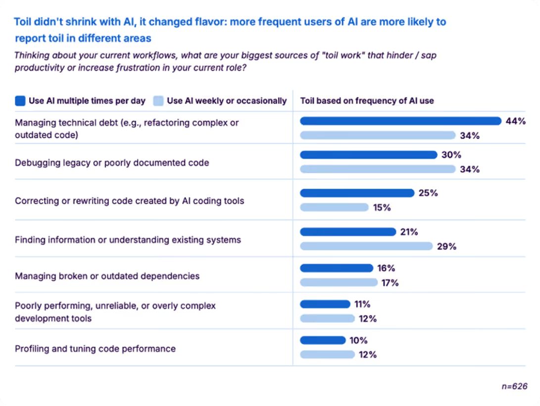
How to detect stale feature flags in your codebase
It’s a fact that you can’t clean up what you can’t see. That’s why stale feature flag detection is the first step. It determines whether a flag is actually a stale one that’s contributing to more debt.
Typically, you can decide that based on the type of flag it is. For example, an operational feature flag like a kill switch is not a debt because it’s there only for one-off incidents. But an experiment flag that’s there three months after the experiment is over needs to be removed.
Here are three ways you can find debt-creating flags:
1. Manual audits
Manual audits are the most common starting point. You pull up your flag inventory and evaluate each one against a few key signals:
- Serving state: Is the flag still serving multiple variations, or has it been rolled out to 100% of users? A flag pinned to a single variation for everyone is the clearest staleness signal.
- Code references: Is the flag still referenced anywhere in the codebase? Zero references means the toggle is dead weight regardless of age.
- Flag type: Was this a temporary release or experiment flag, or a permanent operational flag (kill switch, entitlement, config toggle)? Only temporary flags should be on the cleanup list.
- Last modified date: How long has it been since anyone touched this flag? For temporary flags, anything untouched past ~90 days deserves a closer look.
- Dependencies — Does anything else depend on this flag's state? Check for flags referenced in targeting rules, integrations, or other flags' prerequisites before removing.
If a temporary flag has been fully rolled out, has no remaining code references, and no downstream dependencies, it's ready for cleanup. That means two steps: archive the flag in your management platform and remove the conditional logic from your codebase. Skipping either one just moves the debt rather than eliminating it.
2. Automated stale detection
This is where you can add a layer of automation. Many feature flagging platforms let you automatically detect stale flags.
GrowthBook’s stale detection uses per-environment rule analysis combined with an inactivity window to surface flags that have outlived their purpose. It marks a flag as stale when it hasn’t been updated in two weeks and meets at least one condition: it’s disabled in all environments, or its rules send 100% of traffic to a single variation.
That said, you can override this per flag with a “Never Stale” designation for long-lived operational flags that are permanent by design. The stale indicator shows up directly in the Features view. You can remove it as and when you see it.
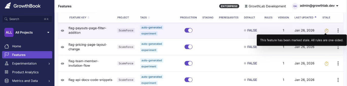
And because stale detection works through the REST API and GrowthBook’s MCP server, you can use AI tools like Cursor and Claude Code to check a flag’s state through chat.
3. Code References
Let’s say you know that there’s a flag in your codebase. But you don’t actually remember where it is or who owns it. That’s where tools like Code References come in.
Code References maps each flag to its exact location in the codebase, and it’s visible inside GrowthBook. When you combine it with stale detection, you can tell whether it’s stale and remove it immediately because you’ve pinpointed where it exists.
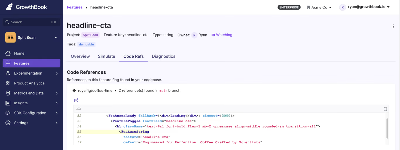
The best part is that you can also see whether these flags have dependencies. So you’re 100% sure that nothing will break if you remove them.
How to treat flag cleanup as an ongoing process
It’s a very common practice to treat flag cleanup as a “big-bang” event. Engineering teams run a sprint of sorts to find flags and remove them from the codebase. Some teams, like Uber, even go so far as to create their own tools to do it—but that’s not always necessary, because it wastes time and resources.

Ultimately, it’s a social engineering problem as much as it is a technical one. It comes down to your governance practices and engineering culture. Here’s a clear playbook you can follow to deal with this issue:
- Triage by flag type: Ideally, temporary flags (like release toggles and experiment flags) should be your first targets. Document them at creation and tag them with an expiration date. Also, create a cleanup PR that removes the flag and collapses the conditional logic to the correct permanent path.
- Verify before you remove: Use tools like Code References to trace every location where the flag is evaluated. If you’re doing it manually, just check that it doesn’t have any additional dependencies so that nothing goes wrong after removal.
- Remove flags in small batches: If you’re running a weekly sprint to remove them, don’t go all out at once. Start with maybe 10 flags and see how it’s affecting the rest of your services. Over time, you’ll learn the nuances and can bake them into your documentation and governance/lifecycle practices. Then you can include this in your existing release or experiment cycle rather than creating a separate backlog.
- Automate what you can: If you’re using GrowthBook’s MCP server, an AI agent can identify stale flags, pull their code references, and draft removal PRs. You still review and approve, but the discovery happens on its own or when prompted. But archive the flag instead of deleting them to preserve the audit trail.
- Build clear lifecycle rules: All of these practices only help when you have a governance layer in between to prevent debt from accumulating. Consider assigning an owner to each flag when it’s created, and add flag removal as a part of your definition of “Done.” When it’s archived, update your documentation.
A short checklist for each feature rollout or experiment goes a long way in managing technical debt.
How GrowthBook handles flag debt at scale
Right now, we’re sure you have a release flag from last quarter that’s just sitting in your codebase. But it really doesn’t have to be. With every passing week, you’re only adding more dependencies (and even more risk) to your development cycles.
That’s one of the reasons we built a feature flagging product with technical debt in mind. Here are a few ways GrowthBook can prevent technical debt accumulation:
- Stale detection automatically surfaces flags that have outlived their purpose.
- Code references show you exactly where each flag lives in your codebase.
- Approval workflows route those removals through the same review gates as any other production change.
- Its MCP server and REST API let AI agents like Claude Code and Cursor query lifecycle status and surface stale flags. And clean them up if needed.
- It's open-source so you can see the full detection and removal logic yourself.
You don’t have to let a quarter of your engineering capacity go toward managing debt that’s preventable.
If you’re interested in seeing how GrowthBook works to remove flag debt, sign up for free or book a demo with us today.
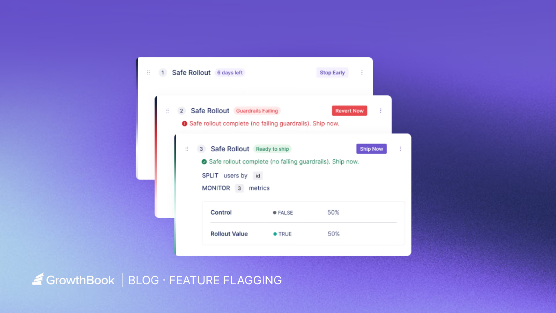
Feature flags in CI/CD: continuous experimentation
When your continuous integration and continuous development (CI/CD) pipeline works, you’ve solved the problem of reliable deployment. While CI/CD has made it trivial to ship code, it doesn’t answer three questions that actually determine whether a release succeeds:
- Who should see this change?
- Is it behaving safely in production?
- And how do we know if it’s actually working?
Without answers to those questions, deployments become binary events. A simple change is either on or off, and your team is forced to compensate with slower releases or reactive rollbacks when something breaks.
Feature flags mitigate that by decoupling deployment from release. They let you ship code continuously while controlling exactly when and how it becomes visible.
In this article, we’ll explain how feature flags improve the CI/CD process and why you should consider using them.
Why CI/CD alone isn’t enough anymore and how feature flags improve it
Deploying code and delivering value are two different things, and most pipelines treat them as one. Here’s why:
The all-or-nothing deployment problem
When you merge to main and deploy, that change hits 100% of your users instantly. Your deployment is your release—a “Big Bang” of sorts. And with every Big Bang release, there’s a risk that something goes wrong and you’ll have to undo the whole deployment.
Now, the natural response is to ship less often or to add manual approval gates. But those decisions make the delivery process slower and less continuous, which is not why you adopted CI/CD in the first place.
The average cost of downtime now stands at $14,056 per minute, with more than half of organizations reporting that their most recent outage cost over $100,000. Engineering leaders are worried and rightfully so. Over 40% of organizations have experienced an outage due to human error, and 85% of those incidents trace back to people failing to follow procedures or to flaws in the development process itself.
If you’re still taking the risk of deploying all at once, even while adopting a CI/CD workflow, you’re just creating more room for mistakes.
Plus, if you don’t have the measurement mechanisms in place, you’ll never know if the deployment actually made a positive difference. Teams wait until users report a bug or an outage happens—and then you’re stuck in a reactive deployment cycle that eats into your ability to ship value.
How feature flags improve CI/CD processes
You can solve the problems we’ve stated above by using feature flags to introduce a control layer between your deployment pipeline and your users. They change three things about how releases work:
1. Decouple deployment from release
With feature flags, deployment and release are two separate events. You keep shipping code to production continuously through your existing pipeline, but features only turn on for specific users or segments—based on how you define the flag’s parameters. As a result, you can turn a feature off in seconds without redeploying code.
You can also conduct a “dark launch” where you ship code to production without exposing it to any user. It lets you test in production before anyone sees the frontend change.
2. Move from binary releases to graduated rollouts
You can avoid shipping features to all your users at once. Instead, move on to gradual exposure. Start with 1% of users, evaluate, expand to 10%, then 25%, 50%, and 100%. At each stage, you can target specific users, segments, or environments.
3. Create better business outcomes
When your blast radius is controlled, the downstream effects are measurable:
- Increase confidence in delivery: Engineering teams ship more frequently because a bad rollout won’t affect everyone. That confidence translates directly into faster time-to-market.
- Reduction in incident costs: Exposing a feature to fewer users means fewer major incidents. When something does break, the impact is limited to the percentage you rolled out to.
- Simplify rollback procedures: Feature flags cut mean time to recovery because you can roll back the new feature immediately. In fact, many feature flagging platforms automate this process based on certain thresholds.
Why you need to adopt a continuous experimentation mindset
Continuous experimentation means you’re embedding measurement into every feature release. So every time you ship, you define what success looks like and how you’ll measure it. After you ship, you check whether it arrived. The experimentation loop becomes the standard for how your team operates.
Industry-wide, only about 30% of product changes meaningfully move the metrics they’re meant to improve, according to research from Ronny Kohavi and echoed by GrowthBook co-founder Graham McNicholl at a 2025 ClickHouse meetup. That means roughly two-thirds of the features you build either have no measurable impact or actively make things worse.
Without experimentation, you have no way of knowing which category yours falls into.
Running A/B tests through feature flag rollouts
When you roll out a feature to 10% of users with a flag, you already have a natural test setup. The 10% seeing the new experience are your treatment group. The other 90% are your control. You’re one step away from a structured A/B test.
To close that gap, you can start by defining two kinds of metrics before the rollout begins:
- Goal metrics: These metrics measure what you’re trying to improve. For example, conversion rate, cart completion, engagement, or retention.
- Guardrail metrics: These metrics measure what shouldn’t degrade. For example, error rates, latency, page load time, and revenue per user.
If a guardrail degrades, you can stop the rollout. If the goal metric improves, you expand the experiment to a broader user base.
Continuous experimentation changes the definition of CI/CD
Traditional CI/CD delivers code continuously. With built-in feature flags, experimentation delivers learning continuously.
Engineering teams that operate this way stop making purely intuition-based product decisions. Each release cycle produces data that informs the next one and it compounds over time. You build a track record of what actually moves your metrics instead of a backlog of shipped features you hope moved them.
What are the mechanics of deploying using Safe Rollouts?
Here are three elements you need to start using feature flags in the CI/CD process:
1. Progressive percentage rollouts
A progressive rollout follows a ramp-up schedule. You start at 10% of users, increase to 25%, then 50%, 75%, and finally 100%. At each stage, you’re watching a defined set of metrics before moving forward.
Typically, the engineer who built the feature or experiment owns the rollout. So they can monitor these metrics and escalate issues if something goes wrong. For instance, if you’re releasing a new interactive learning feature and notice that the first segment of users engage with it successfully, you can ramp up the segment size.
Platforms like GrowthBook offer Safe Rollouts that automate this ramp-up schedule, so you don’t need to bump the percentage manually. Since it’s based on one-sided sequential testing, the traffic percentage increases as the goal metrics improve or guardrail metrics aren’t met yet.

2. Guardrail metrics and automated monitoring
When a guardrail trips, the rollout pauses or rolls back automatically. You don’t have to worry about getting a pager at 3 AM or a Slack notification asking you to revert the rollback manually. In the same interactive feature example, if you notice that page load rates are decreasing for the interactive feature, it’ll roll back automatically.
GrowthBook lets you define guardrail metrics per rollout and automatically pause or roll back when they degrade.

3. Rollback decision criteria
You need to define your rollback thresholds upfront before the rollout begins. For example, “If the error rate increases by more than 0.5%, roll back automatically. If latency p99 exceeds 200ms, pause and evaluate.”
The platform you choose just executes the instructions. For example, GrowthBook has auto-rollback triggers for guardrail metric failures that execute predefined decisions. You can either customize this or use these built-in options:
- Clear Signals: It requires no guardrail failures and all goal metric successes
- Do No Harm: It only requires that no metrics are statistically significant in the harmful direction.
Here are the status signals you’ll see in GrowthBook:
How Khan Academy ships with feature flags
Khan Academy achieved a 5x increase in A/B testing capacity after adopting GrowthBook. Their Chief Software Architect, John Resig, explained this:
“Being able to turn a feature on and off with a flip of a switch is fantastic... That’s so much easier than having to do a deploy or a roll-back.[…] People [are] running more experiments with more confidence. GrowthBook is going to help us do a lot more testing.”
Its engineering team integrated the platform with their website, backend, and mobile apps. The workflow looks like this:
- Code merges behind a flag
- They define it based on attributes like classroom tags or student districts
- The flag turns on for a small percentage of users
- An experiment runs against goal and guardrail metrics
- Data informs whether to expand or revert
After full rollout, the flag gets cleaned up. GrowthBook’s Safe Rollouts tie this workflow together in a single feature. You get an automated ramp schedule, sequential testing, guardrail monitoring, and auto-rollback in one place.
Implementing feature flags in your CI/CD pipeline
Setting up feature flags requires more than just adding an SDK. You need the following to get started:
Environment-aware flags
Your flags need to respect the same environment boundaries as the rest of your infrastructure. A flag that’s on in staging should be independently controllable from the same flag in production. Use separate SDK keys per environment (development, staging, and production) to prevent configuration drift.
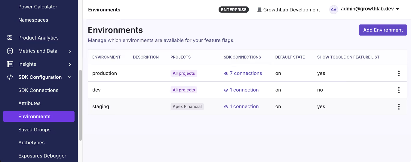
Integrating flags with your CI/CD tooling
Typically, integration happens at two levels:
- Scanning your codebase for flag references as part of your pipeline to catch stale flags.
- Automating flag state changes via a REST API so flags are live just when the code is.
Note: You can use GrowthBook’s CLI to scan your codebase for flag references and integrate it into GitHub Actions. The REST API handles flag promotion across environments as part of your existing deploy workflow.
Feature flag hygiene
Stale flags can cause issues at runtime if left unchecked for a long time. You can avoid this by defining a flag lifecycle as part of your development process:
- Create the flag with an owner, a purpose, and an expiration date.
- Roll out the feature using progressive delivery stages.
- Experiment against goal and guardrail metrics during the rollout.
- Decide whether to ship fully or revert based on the data.
- Clean up the flag once you’re done using it.
Note: GrowthBook surfaces stale flags through automated detection and Code References. If you’re not using a flag anymore, it’ll get flagged after it passes its expiration date or crosses the 90-day mark.
How to choose the right feature flag platform for continuous experimentation
When you’re evaluating feature flagging platforms, these are the questions that matter:
- Is experimentation built in or bolted on? If flags and experiments live in separate products, you’re context-switching between rollout decisions and impact measurement.
- Does it support safe rollout automation? Manual percentage bumps require someone to remember to do them. With automation, you can avoid this.
- Can you self-host and own your data? Many platforms route all evaluation data through their cloud. If you’re in a regulated industry with compliance or data residency requirements, it’s a must.
- Does it work across your stack? Choose a platform that has the right SDK across server, client, mobile, and edge environments.
- Is pricing predictable at scale? Per-MAU or per-event pricing penalizes growth. Per-seat pricing is ideal so that you only pay for the people who manage the flags.
- Does it support environment-level controls? You need independent flag states for each environment, with separate SDK keys.
- Can you integrate it with your existing CI/CD tools? Your flag platform should expose a REST API and a CLI to automate flag state changes during deployment.
- Does it help you manage flag lifecycle and cleanup? To avoid tech debt, choose a platform that surfaces them automatically and flags them for removal.
Learn more about the best open-source feature flaggting platforms.
Ship code continuously and measure what matters
CI/CD solved the deployment problem. You can reliably go from commit to production, and most engineering teams have that part figured out.
But the harder part is what happens after the deployment.
Feature flags help you control that part by decoupling deployment from release and treating rollbacks as minor configuration changes rather than redeployments. When you layer in experimentation, it closes the second gap by turning every rollout into a structured decision point.
If you’re looking for a feature flagging platform that enables CI/CD process, try GrowthBook for free or book a demo with our team.
The 2% close rate increase that turned Ford Credit's product teams into believers
A product team at Ford Credit had a feature they were sure about. Drop a vehicle selector at the start of the online prequalification form, let prospective buyers pick the car they were dreaming about, and more of them would finish the application. It felt obvious. They were ready to ship it.
Geoffrey Bell asked them to test it first.
Geoffrey is the experimentation product specialist at Ford Credit, the captive lender that finances Ford and Lincoln vehicles on behalf of Ford Motor Company. He came up through experimentation at Lowe's, then spent time at Microsoft running tests across Xbox, before bringing that discipline to an organization that was newer to the practice. He has seen what experimentation looks like when it's mature, and he has seen what it takes to build it from scratch.
The vehicle-selector test is a good place to start, because it lost. And the loss is the point.
The test everyone wanted to ship
The hypothesis was reasonable. Give a customer the choice of a vehicle early, and you create commitment. "The idea was, if we give a customer the choice of a vehicle, then there'll be higher likelihood that they will actually convert into a prequalified customer," Geoffrey said.
So they ran it properly. A control with no vehicle selector in the prequalification flow, a treatment with one. Within two to three weeks, the data was unambiguous. Completion rates fell. Customers presented with the vehicle selector were finishing the application less often, not more.
That's a result a lot of teams would quietly shelve. Nobody enjoys telling a product manager that their idea cost the business leads. But Geoffrey sees those moments differently.
"Isn't it always the case that it's the losing tests that wind up creating or finding the most value, the most insight?" he said.
In this case, the value was twofold. First, the team did not ship a change that would have reduced qualified applications across one of Ford Credit's most important flows. Second, and more durably, leadership saw what experimentation could do. A program that was still earning its place had just caught an expensive mistake in motion. The loss bought credibility that a marginal winner never would have.
Geoffrey is honest about the nuance. At the time, the team could not yet measure whether the customers who dropped off were actually weaker leads, which would have changed the read. They have since gotten more sophisticated about that throughput. But even without it, the headline was clear enough to stop a launch and start a conversation.
The lesson from the first beat is the one most programs skip: a losing test is not a failure to manage around. It's the cheapest insurance the business will ever buy.
Why the loss pointed to a fix, not a dead end
A losing result is only wasted if you stop there. Geoffrey's team treated the drop in completions as information about timing, not a verdict on the idea.
They moved the vehicle selector to after the prequalification step, once the customer already knew they qualified, and saw gains. Same feature, different point in the flow, opposite outcome.
It reminded Geoffrey of a joke from his Lowe's days, when the team worked in classic e-commerce metrics like add-to-cart rate and revenue per visitor. "It was rarely the case that just putting an add-to-cart button earlier in the customer journey, it seemingly never led to more orders," he said. The instinct to push the conversion moment earlier almost always backfired.
The pattern underneath both stories is about meeting customers where they actually are. A prospective buyer filling out a credit form is not in the same headspace as one who has just been told they qualify. Get the placement wrong, and a good feature reads as friction. Get it right and the same feature converts.
That's why a single test is rarely the end of the conversation. Conviction in an idea plus a willingness to iterate on where and how it shows up beats a graveyard of abandoned hypotheses.
The piggy bank nobody puts on the slide
If the vehicle-selector story is about what a loss teaches, the next idea is about how you count it.
Geoffrey picked it up at Microsoft, where the experimentation program ran at enormous volume. He called it the experimentation piggy bank, and it had two sides. "Here's the revenue that we were able to realize from positive experiments. But here is the revenue that we saved from shipping poor experiences," he said.
Most programs only report the first number. The wins go on the slide because they're easy to celebrate and easy to attribute. The saves, the launches that tested poorly and never shipped, stay invisible. There's no line of revenue for a bad experience a customer never had.
But that second number is real, and it's often the larger of the two. Every prevented regression, every feature pulled before it reached production, is money the business kept. A program graded only on lift is reporting half of what it actually delivers.
This is the discipline Geoffrey is rebuilding at Ford Credit: a way to stand in front of leadership and show both columns. Not just what experimentation earned, but what it prevented.
The two percent that finally moved receivables
For a long time, Ford Credit's online experiments could move clicks, page views, and bounce rates. What they could not do was prove that a test sold a car. The most important part of the business happens offline, inside one of more than 5,000 dealerships, long after the customer closed the browser tab.
The hard part was never the math. It was the plumbing. An online test and an offline purchase are separated by time, by a dealership visit, and by every other experience a customer has in between, which is why so few programs ever close the loop. Connecting those two worlds took years.
When the team finally built the throughput measurement, it changed how product managers saw experimentation. Geoffrey gave the example that lands the point. In a purchasing flow, a control closed at a 30% rate among customers who purchased and financed with Ford Credit. The treatment closed at 32%. "That two percent incremental revenue gain, when you kind of project it out and annualize it, it has a large impact," he said.
On a business that moves tens of thousands of vehicles at roughly $50,000 each, two points of close rate is not a rounding error. It's a number leadership recognizes. And once an experiment could be denominated in receivables rather than engagement, the questions from product teams changed. They stopped asking whether they had to test and started asking what else they could.
Geoffrey is careful not to overcorrect. Revenue should not be the only measure of an experimentation program. Engagement, scroll depth, bounce rate, and the dozens of other behavioral signals matter, especially on pages where a purchase is nowhere near. But revenue is the language the business runs on. "Experimentation is one of those unique places that marries customer behavior with business metrics," he said. Tying a test to that intersection is what makes it impossible to ignore.
The experimentation balance sheet
Put the three ideas together, and a single mental model falls out. Treat your experimentation program like a balance sheet.
On one side, the wins: the lifts you shipped, denominated in the metric the business cares about most. On the other, the saves: the expensive experiences you tested and chose not to ship. Both sides count. A program that only reports wins is handing leadership an income statement with the costs torn off.
Geoffrey's path from Lowe's to Microsoft to Ford Credit is really the story of learning to keep both columns honest. The moves are repeatable:
- Test the change you're most confident about, especially when the team wants to ship on instinct.
- Treat a losing result as a question about timing and placement, not a final no.
- Count the revenue you saved by not shipping, alongside the revenue you earned by shipping.
- Connect experiments to the downstream number the business actually runs on, so the value is undeniable.
- When you deliver a result, lead with the story of what the customer did, then bring the numbers.
None of it requires a bigger tool budget. It requires deciding that a prevented mistake is worth as much as a captured win, and then proving it.
Full conversation with Geoffrey Bell, Experimentation Product Specialist at Ford Credit, on The Experimentation Edge.
How to choose the right metrics and KPIs for A/B testing
Metrics as a key to A/B testing success
Metrics, often referred to as KPIs (Key Performance Indicators) in A/B testing, are the foundation of any successful experiment. They determine what you observe, how you evaluate performance, and ultimately what decisions you make. Without the right metrics in place, even the most promising idea cannot generate meaningful impact, because you won’t be measuring the outcomes it actually affects.
In this post, we take a comprehensive look at experimentation metrics: the phenomena they capture, how to select the right ones, and how to analyze and interpret them to drive clear, business-aligned decisions.
Understanding experimentation KPI types: binary, continuous, and ratio metrics
When running an A/B test, the impact of an intervention can be reflected in multiple aspects of user behavior, such as conversion rates or spending. In this section, we review the different types of KPIs based on the outcomes they measure. Broadly, KPIs can be classified into three categories: binary, continuous, and ratio metrics. Let’s take a closer look at each one.
Binary metrics
A metric may reduce user behavior to a simple yes-or-no outcome: retained or not, converted or not, clicked or didn’t click. These metrics capture whether a specific action occurred at least once, without reflecting how often it happened or how intense the behavior was. In some cases, the outcome is evaluated at a specific point in time, for example, whether a user is retained after 7 days or 30 days. When that’s the case, the measurement window is usually encoded in the metric name, such as Retention Day 7 or D30 retention.
Binary metrics are widely used because they are easy to interpret and closely aligned with key business questions (e.g., “Did the user convert?”). However, they intentionally compress behavior into a single bit of information, which makes them robust but sometimes less sensitive to subtle changes.
Continuous metrics
These metrics capture nuanced aspects of user behavior and can take a wide range of values. Examples include revenue, time spent on a page, or session duration. Unlike binary metrics, continuous metrics provide richer information about how much or how intensely users engage, rather than just whether they performed a specific action.
The most common approach for analyzing continuous KPIs is to compare group means. However, because the mean aggregates the actual values of the KPI, it is highly sensitive to extreme observations, which can distort results.
To address this concern, in highly skewed distributions, an alternative approach is to analyze quantiles, which rely on the ranking of values rather than their absolute magnitudes. This makes them substantially more robust to outliers. For example, when extreme values are present, focusing on the 50th percentile (the median) can provide a more reliable representation of the typical user.
Quantile-based analysis is also useful when effects are concentrated in specific parts of the distribution. In many cases, changes do not impact the entire population uniformly. For instance, if only a small fraction of users (e.g., ~10%) make purchases in a game, a new feature may primarily affect this subgroup. In such cases, examining upper quantiles (e.g., the 90th percentile) can better capture the true effect than comparing means.
Although this type of analysis is more complex, modern experimentation platforms such as GrowthBook provide robust methods for estimating and comparing a range of quantiles.
Continuous metrics are often more closely aligned with key business goals, such as increasing revenue or user engagement. By offering detailed observations of user behavior, they can be a double-edged sword: on one hand, they are more sensitive to subtle changes, enabling the detection of small effects; on the other hand, they often exhibit higher variance, which can make statistical inference more challenging.
Ratio metrics
In some experiments, the focus is not on a single metric but rather on the ratio between two variables. A common example is average revenue per paying user (ARPPU), where total revenue is divided by the number of paying users rather than by the entire user base. Similarly, average revenue per transaction (ARPT) is calculated as total revenue divided by the number of transactions, capturing the monetary value of each purchase event. In these cases, both the numerator and the denominator may vary across experimental groups and should therefore be treated as random variables.
This matters in practice because it affects how you analyze experiment results. When both the numerator (e.g., total revenue) and the denominator (e.g., number of transactions or paying users) can be influenced by the treatment, you should not treat the metric as if it were a simple average. Doing so can lead to incorrect variance estimates and, in turn, misleading statistical significance. Instead, ratio metrics require special handling in the analysis stage. A common and recommended approach is to use methods based on the delta method, which properly accounts for the variability in both components and produces more reliable standard errors and inference.
Matching KPI types with statistical tests
While the specific calculations used to analyze KPIs vary by metric type, the underlying logic is largely the same. In this section, we explain how different KPIs are analyzed and present the key formulas used in each case, providing a practical guide for working with common experimental metrics.
The first step is deciding how to compare the treatment and control groups. In practice, there are two common ways to express an effect:
- Absolute difference between group means
- Relative difference (experimentation lift) between group means
To understand the difference between these approaches, consider a simple example. Suppose we observe a 2% absolute increase in conversion rate. This change has very different implications depending on the baseline level: if the baseline is 50%, the increase corresponds to a modest 4% relative lift, whereas if the baseline is only 2%, the same absolute increase represents a massive 100% lift.
This example illustrates why relative change is often more informative. By normalizing the effect to the baseline, lift provides a scale-independent measure, making it easier to compare results across KPIs with different magnitudes and aligning more closely with how business performance is typically communicated. That said, absolute differences remain useful because they are expressed in the KPI’s natural units, making them more intuitive and directly interpretable.
When working with relative effects (lift), it is important to note that they are computed differently than absolute differences. Analysts often apply a logarithmic transformation to the ratio, which helps linearize the metric and stabilize its variance, ultimately making statistical inference more reliable.
Regardless of whether you compute absolute or relative difference, the next step is to compute the test statistic, which measures how extreme the observed result is under the assumption of no effect. The logic is straightforward: take the observed effect (whether difference or lift) and divide it by its standard error.
If you are interested in the details behind these calculations, Table 1 summarizes each KPI type and illustrates how the corresponding formulas are applied in practice.
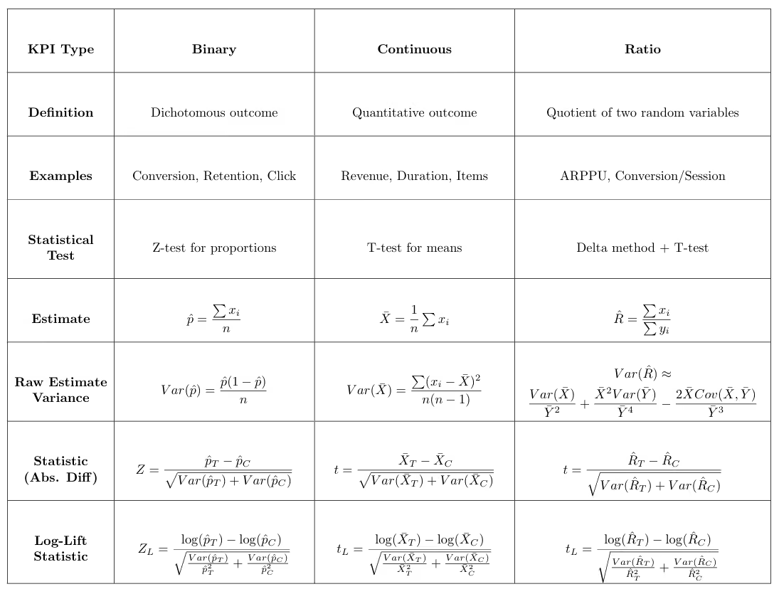
The role of KPIs in decision-making: primary, secondary, and guardrail metrics
Understanding KPIs goes beyond knowing what they measure or how to analyze them; it also involves recognizing how they guide experimental decisions. From this perspective, KPIs are typically grouped into three main categories.
Primary (goal) metrics
The primary metric is the main measure of success in an experiment, typically one per test. It captures the outcome that matters most for the business, such as conversion rate, revenue, or retention, and ultimately determines whether a change should be launched or rolled back. Statistical testing focuses on this metric, assessing whether the difference between treatment and control is significantly different from zero.
Secondary metrics
Secondary metrics provide context and explanation. They help reveal why a change worked (or didn’t), highlight broader effects, and identify potential trade-offs. Their role is to support interpretation rather than determine the final decision.
Because analyzing many secondary metrics increases the risk of false positives, their results should be interpreted cautiously and, when needed, adjusted using multiple-comparison corrections.
The purpose of these corrections is to keep the overall error rate under control. In stricter approaches, they ensure that the probability of getting even a single false positive remains below a predefined threshold. A common example is the Holm–Bonferroni method, which controls this risk while being less conservative than the standard Bonferroni correction.
Another approach focuses on controlling the proportion of false discoveries among all significant results. Methods such as Benjamini–Hochberg ensure that, on average, the fraction of false positives among the detected effects stays below a chosen level.
Guardrail metrics
Guardrail metrics monitor for unintended harm. They ensure that a change does not negatively affect critical aspects such as user experience, system performance, or long-term business health (e.g., churn, error rates, latency). These metrics are often evaluated using non-inferiority tests, where the goal is to confirm that performance does not fall below an acceptable threshold. Guardrail metrics are most effective when standardized across all experiments in an organization, as they help capture common pitfalls that can harm the product across different tests.
Clearly defining these KPI types during experiment setup helps maintain focus and transparency. Experimentation platforms such as GrowthBook allow teams to designate primary, secondary, and guardrail metrics when configuring a test, making objectives and evaluation criteria explicit.
How do you choose a primary KPI for experimentation?
While it may be tempting to track many metrics, decisions should be anchored around a single primary KPI. Beyond practical concerns, such as conflicting metrics, there is also a statistical reason: the more metrics analyzed, the greater the chance of observing a “significant” result that is actually random noise.
Choosing a primary KPI requires balancing business relevance with statistical considerations. From a statistical perspective, we prefer metrics that enable powerful tests, those with a high probability of detecting real effects. Power depends mainly on effect size and variance: metrics with larger expected impact and lower variance produce more sensitive tests. Binary metrics often have lower variance, which can make them statistically efficient.
From a business perspective, the KPI should reflect the outcome that truly matters, such as revenue, retention, or meaningful engagement. It should be sensitive to the experimental change, measurable within the experiment timeframe, and easily understood by stakeholders so results can translate into decisions.
Although these principles sound straightforward, choosing the right KPI in practice can be challenging. Two common dilemmas illustrate this.
Case 1: Which KPI best represents the goal of the test?
Many experiments influence multiple outcomes. For example, a pricing experiment might measure success as a binary outcome (“did the user purchase?”) or as a continuous metric such as average revenue per user (ARPU). How should you choose between them?
The primary KPI should reflect the experiment’s objective: are you trying to increase the likelihood of purchase, or the amount spent? A clear, well-defined hypothesis is therefore central to selecting the right KPI.
Statistical considerations also matter. Binary KPIs typically have lower variance and require smaller sample sizes, while continuous KPIs capture richer behavior and may reveal larger effects when the intervention changes magnitude rather than just occurrence.
Ultimately, business relevance should come first, but it does not always align with statistical efficiency. For example, the most meaningful KPI may also be the noisiest. When this trade-off arises, techniques such as CUPED or Winsorization (to limit the influence of outliers) can improve efficiency and help preserve metrics that best reflect the true goal of the experiment.
However, these methods should be applied cautiously. For instance, while Winsorization reduces variance, it may also introduce bias by altering the true distribution of the data. Therefore, understanding these tools, their advantages and limitations, is a prerequisite before applying them, and they should always be used with careful judgment.
Case 2: Using a proxy KPI
Sometimes the ideal KPI cannot be measured within the duration of an experiment. For example, if a feature aims to increase annual pass purchases or long-term retention, the true outcome may take months or years to observe.
In such cases, analysts rely on a proxy KPI: a metric that can be measured during the experiment and is strongly correlated with the long-term goal. Examples might include starting the annual pass purchase process, completing a trial membership, or remaining active after the first month. The proxy must be both predictive of the ultimate outcome and responsive to the experimental change.
Importantly, analysts should keep in mind that even if a proxy metric is predictive and responsive, there is no guarantee that the long-term metric will improve, even when the proxy does. Therefore, a good practice is to validate results in the long run, once the true target metric becomes available, to ensure it is also positively affected.
In today’s data-rich environment, the concept of a proxy KPI can be extended to derived metrics, more sophisticated measures constructed by processing raw signals rather than directly observing an outcome. While proxy KPIs typically aim to approximate a target that is only observable in the long term, derived metrics often go a step further by capturing complex or latent signals that may not be directly measurable at all.
To achieve this, AI and machine learning techniques are used to synthesize multiple data points into a single, actionable metric. This can include predictive models that estimate a user’s likelihood to renew, or automated data labeling approaches that infer higher-level constructs such as user engagement. By transforming qualitative interactions into structured data, organizations can build high-sensitivity metrics that surface meaningful behavioral insights that would otherwise remain hidden.
Bottom line on experimentation KPIs
Metrics are more than just measurement tools; the KPI you choose defines what success looks like, which trade-offs you accept, and ultimately, the decisions you make. By understanding different metric types, assigning clear roles (primary, secondary, guardrails), and selecting a primary KPI that balances statistical power with business relevance, you transform experimentation from guesswork into a reliable decision-making process.
Learn more about experimentation best practices, designing A/B testing experiments for long term growth, and practical checklist for running A/B tests you can trust.

Ship fast with a safety net: Feature flag management for the agentic era
AI has empowered developers to build new features faster than ever. What used to take a week can now be shipped in a day. The agentic era has transformed the way engineers work, but shipping fast without the proper guardrails can quickly lead to incidents. GrowthBook Feature Flags set your whole team up for the pace and volume of today’s development lifecycle.
The safety net for rapid AI development
Feature flags allow modern teams to ship fast while maintaining control. The best practice is straightforward: wrap every feature behind a flag so you can ship at scale and roll back the moment something breaks. But as teams scale and AI agents become more deeply embedded in workflows, ad-hoc flag management breaks down.
Without the right metrics monitored on every release, something that breaks in production could go undetected for weeks or even months before you realize the problem. By that point, dozens of other features may have shipped, making it difficult to identify which change is actually the culprit. Smaller failures compound the problem. Someone forgets to increment a rollout. A flag that should have been deleted six months ago is still sitting in production. Each rollout follows a different process depending on who is running it.
Consistency and guardrails are what enable teams to safely keep pace with the compressed development cycles that come with AI coding. Feature flags should be baked into the agent's coding workflow for every new feature, creating a safety net where guardrail metrics monitor performance and auto roll back if something degrades.
With that net in place, teams can move quickly, confident that bad releases will get caught early and rolled back. Humans can then focus on where judgment is actually needed, such as deciding which guardrail metrics matter, reviewing whether the rollout plan aligns to the risk, and approving changes that warrant human review.
Modern teams need enterprise-class flag management with the controls and governance to ship safely at AI speed. That’s where GrowthBook comes in.
GrowthBook 4.4: Safe and standardized feature flag management at scale
GrowthBook 4.4 extends our feature flag platform with 3 major new capabilities: release plans with automated ramp schedules, configurable approval workflows, and enhanced stale feature flag detection through expanded REST API and MCP server endpoints. 4.4 also includes SDK cache improvements, metadata in SDK payloads, a namespace overhaul, and more. Together, these controls turn feature flag management into a repeatable, scalable practice that lets you move quickly while de-risking every release.
Release plans with ramp schedules: Standardize and automate your rollout
In 4.4, we’re introducing release plans with ramp schedules: automated, staged rollout plans attached to a feature flag. Release plans make it fast and easy to define a standardized schedule and rollout process into a reusable template that everyone on your team can follow, with guardrails built in so safety is a standard part of how features are released.
You define the stages, set the percentages, time intervals, and guardrails, and GrowthBook executes the plan automatically. Choose from preset templates or build your own to target specific user groups and attributes. You can also gate individual stages of your release plan by prerequisite features or by the specific feature value a user is currently assigned.
With manual feature rollouts, you can run into two types of problems. Either someone forgets to increment the percentage, and a feature sits at a given stage indefinitely. Or someone moves too fast, and a problem that should have been caught at 10% instead hits 50% of users. Release plans keep rollouts from stalling at an early stage or accelerating past the point where a problem could have been caught. Build in approval requirements at specific stages based on your risk tolerance, requiring the rollout to pause for review and manual approval before advancing. You can also attach guardrail metrics so the feature auto-rolls back if any of them degrade, catching problems automatically between approval gates.
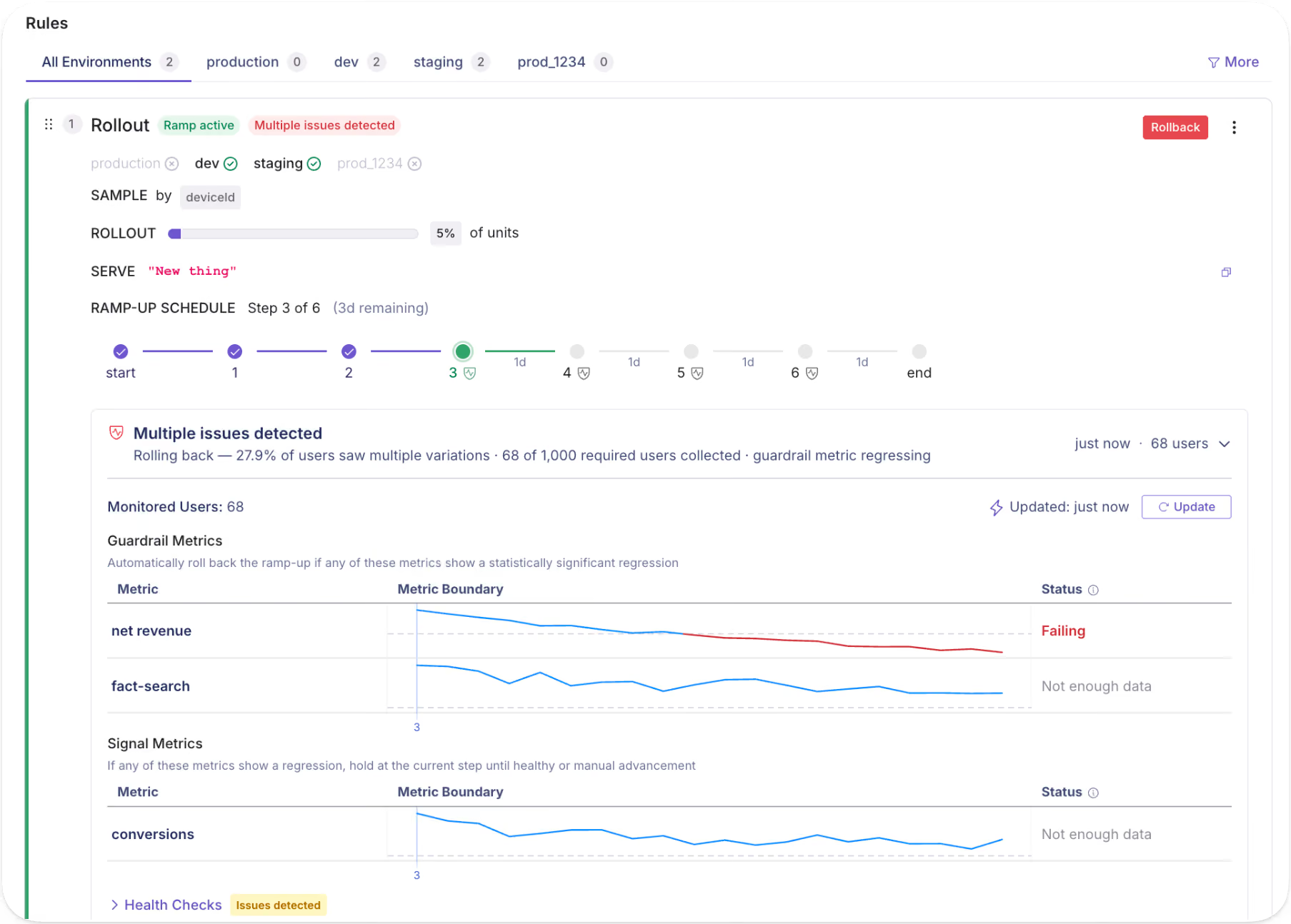
Best practices for designing a release plan
Guardrails help your team feel confident about shipping, and combining them with human approval gates ensures there are no gaps.
- Start simple and don't over-engineer your first release plan.
- Build out your process as you go, learning what works and what doesn't with each release.
- Choose guardrail metrics your team is aligned on
- Pair guardrail metrics with approval gates where it makes sense.
Once you have a process that works, standardize it as a default template with versions for different risk profiles or product needs (high risk, low risk, internal-only, etc.) Treat these templates as living artifacts and evolve them as your team learns what works and what areas need improvement.
Sample release plans
Rollout processes vary by team, product, and risk tolerance. Release plans are flexible enough to fit whatever process your team uses and ensure every rollout follows that process consistently, no matter who is running it. Below are two of the most common patterns we see, and how to structure a release plan for each.
Example 1: Simple percentage rollout
A simple percentage rollout is where you expose a small percentage of users before gradually going wider. Set approval gates at key checkpoints to enforce a metrics review and manual approval before committing to broader rollout.
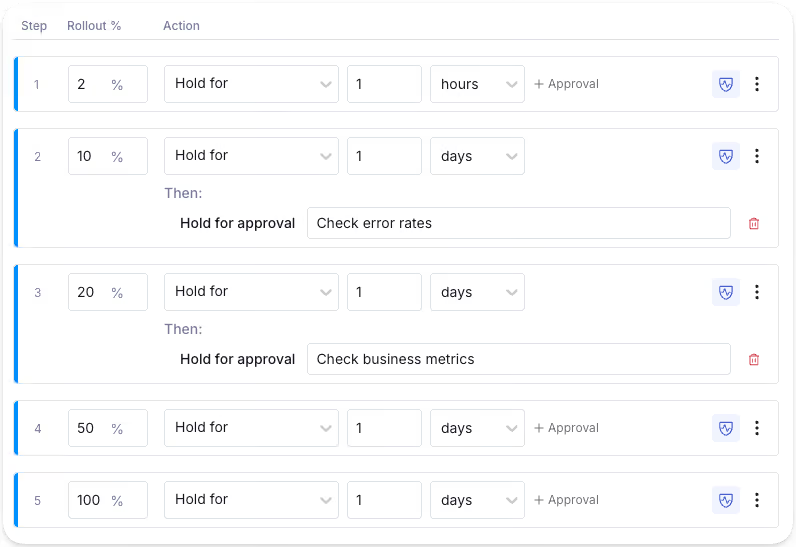
Example 2: Segmented rollout
A segmented rollout lets you control who gets access first, reducing risk to your highest-value users. For instance, you may opt to roll out a feature to free users before paid. Free users are valuable, but the risk of churn or revenue impact is lower than with paying customers. By the time you're ramping up paid users, you've already caught the obvious issues.
You may segment by any attribute available in GrowthBook, including location, device type, browser, user group, and more. Start simple or build in as much complexity as you need. You can also apply guardrails to specific stages; for example, you might be okay rolling the feature out to free users, but want it to auto-rollback if metrics degrade when it hits paid users.
The release plan with ramp schedules feature is available in the GrowthBook Pro and Enterprise plans.
Flag revisions, approvals, audit logs: maintain control and visibility
Feature flag revisions
When someone changes a feature flag, a draft revision can be submitted for review to approve or request changes. On approval, the change is published to the SDK. Nothing goes out unreviewed unless you want it to.
Flag revisions provide a complete audit trail, capturing who changed a flag, what they changed, and when they changed it. When something breaks, you get instant visibility into what recently changed. As multiple people manage flags over time, revisions also preserve the intent and context behind each change.
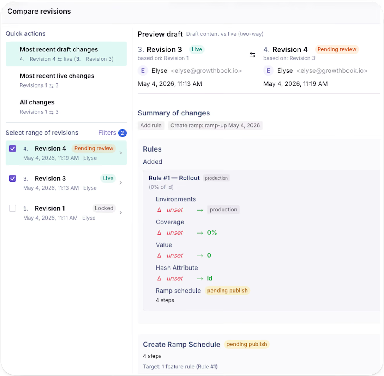
GrowthBook maintains a version history of all previous revisions of a feature flag over time, so you always maintain a clear picture of how a flag has evolved over time.
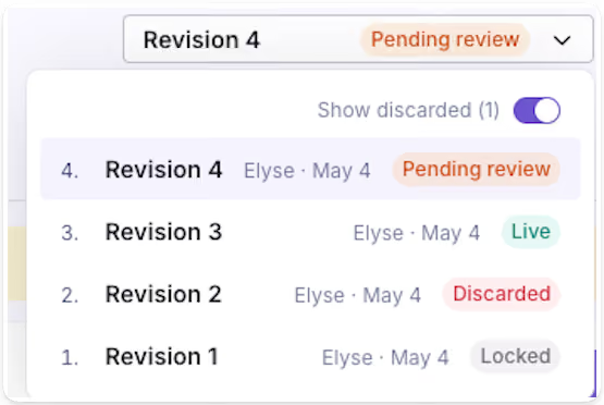
The revision feature is available for feature flags in all GrowthBook plans.
Feature flag approval workflows
Approval requirements are configurable per project and per environment, giving you the flexibility to require review gates where they make sense. For example, you can require approvals for production while letting staging updates flow freely.
GrowthBook 4.4 expands the scope of approval requirements. Previously, approval workflows applied only to changes to rules and values. Now, you can also require approvals for environment kill switches, pre-requisites, saved groups, and metadata changes. This gives more granular control over what can happen without a review.
These approval workflows help teams move fast with the right safety checks at the right time, making governance tunable to your team’s needs. This level of control is especially important when agents are acting on your behalf. Agents can create drafts for all these change types and require human approval. The separation is clear and enforced, so your governance is applied to the full scope of what an agent can touch.
The feature flag approval workflow feature is available in the GrowthBook Enterprise plan.
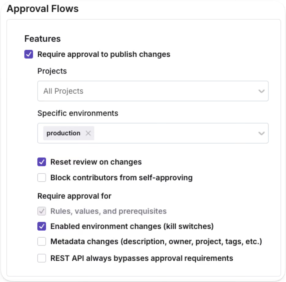
Audit logs
For teams with compliance requirements, the audit log provides the paper trail without any extra process. They provide a timestamped record of every feature flag event, including changes, approvals, publishes, creation, and more.
You may also expand for a more detailed view of the specific changes made for each event.
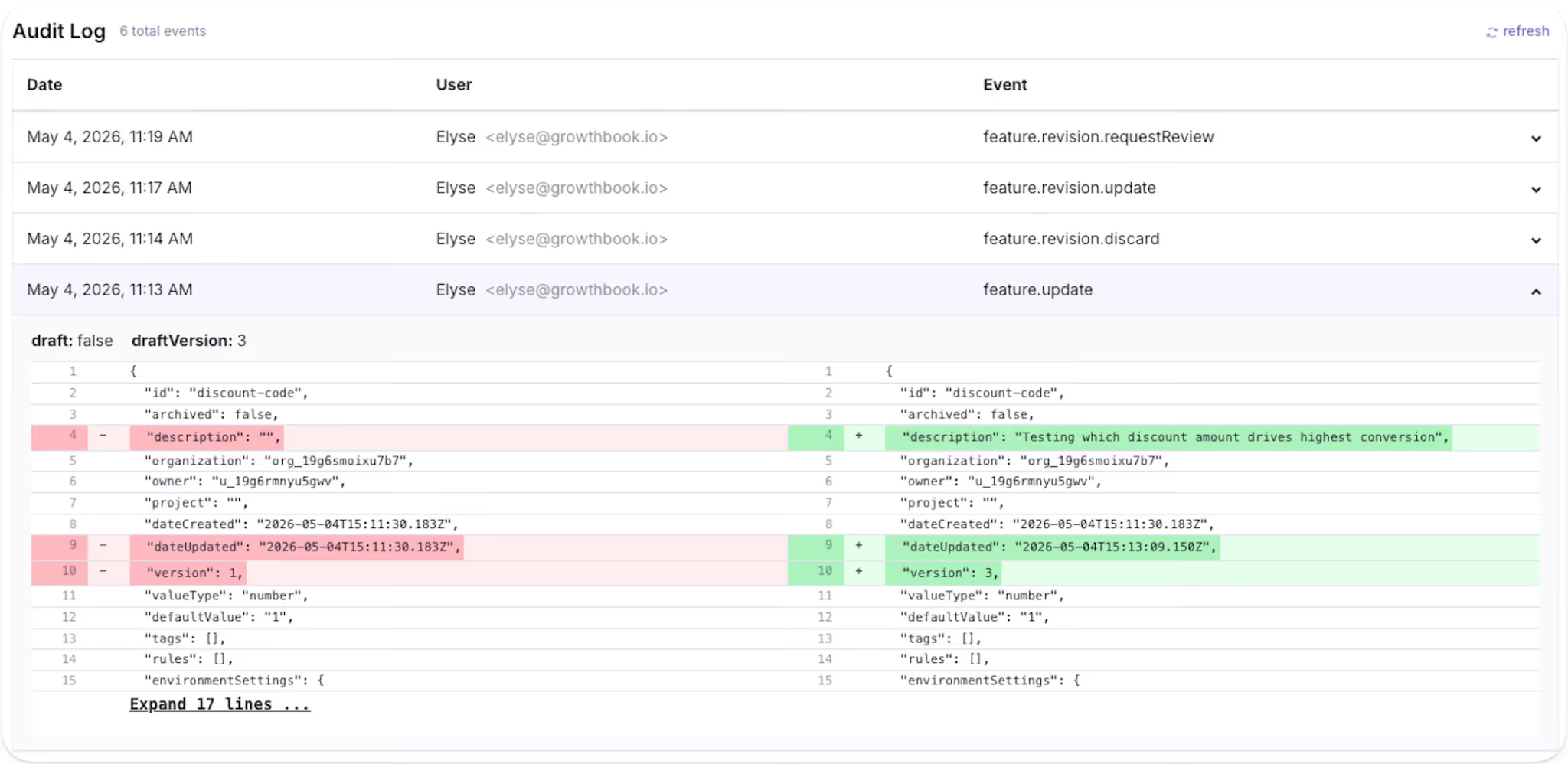
The audit log feature is available in all GrowthBook plans.
Stale feature flag cleanup with agents
GrowthBook categorizes a feature flag as stale if it hasn't been updated in 2 weeks and is not active in any environment, or if there is a one-sided rule that sends 100% of traffic to a single variation.
GrowthBook 4.4 also introduces support for teams using AI coding tools like Claude Code or Cursor to detect and remove stale flags that have outlived their purpose. Using GrowthBook's MCP server or REST API, you can prompt an agent to surface every stale flag in your environment, returning it as a reviewable table with additional context on why the flag is being surfaced as stale. Once you've decided which flags to remove, write a follow-up prompt asking the agent to locate and remove those flag references from your codebase to eliminate technical debt in one pass.
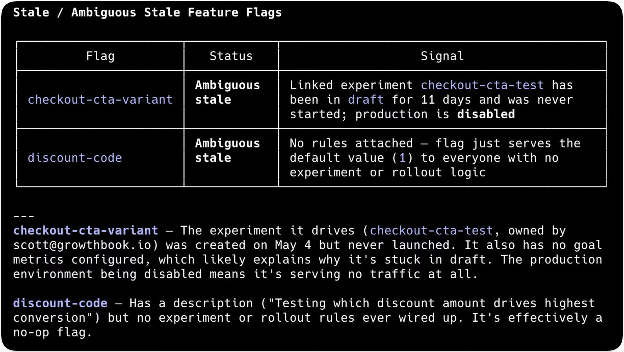
The same endpoints can also surface ambiguous flags that don't definitively meet the stale definition, but show signs they may no longer be in use. Examples include: flags with no rules defined, abandoned drafts, or disabled environments. Results come back as a table you can review to decide which flags genuinely need cleanup and which are still doing real work.
Stale flags create real risk: technical debt, performance overhead, and accidental production changes. Stale and ambiguous feature flag detection together help simplify flag hygiene by surfacing the flags worth reviewing, with enough context to tell what's truly orphaned and what's still needed in production.
The stale feature flag cleanup feature is available in all GrowthBook plans.
REST API and MCP server endpoints
In 4.4, we expanded our REST API and MCP server endpoints across the feature flagging surface. Anything your team can do in the GrowthBook app, AI agents can now do through the API or MCP server: create flags, manage revisions, configure release plans, set targeting rules, locate stale flags, and more.
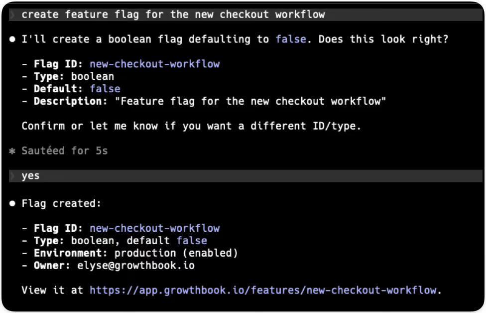
The same permissions, approval workflows, and audit logs apply to every API- or MCP-prompted action. Whether a human triggers a change from the UI or an agent runs it from your editor, it goes through the same review gate and shows up in the same audit log. Agents get the same platform and the same accountability as your team, with the scoping and guardrails calibrated for how they work.
The REST API & MCP Server endpoints are available in all GrowthBook plans.
Built for the way modern teams ship
The pace of development has fundamentally changed with AI, and the controls around how teams ship need to evolve with it. Teams need to move fast, test everything, ship safely, and roll back at the first sign of trouble.
GrowthBook 4.4 gives engineering and product teams the building blocks to do exactly that: a repeatable rollout process accessible through the app, REST API, or the MCP server. Whether the change comes from an engineer, a product manager, or an AI agent, the process holds.
GrowthBook 4.4: Product development at AI speed
We got a little carried away. 426 pull requests and 351,114 lines later, GrowthBook 4.4 delivers a rebuilt API with broad coverage to support programmatic use of GrowthBook, a conversational AI Data Analyst for self-serve product analytics, and ramp schedules that make targeted, time-based rollouts repeatable and safe.
Writing software with AI agents is the new standard, and this release fully positions teams to take advantage of new approaches to developing and shipping products with AI. We’ve rebuilt the foundations of our API and extended its coverage so that teams can work with GrowthBook however they choose, whether through the UI or agentic tools. We work with the leading AI companies, and we’re excited to keep building out features that make it easier to ship faster, more confidently.
Version 4.4 is available immediately to both our cloud and self-hosted users.
Experimentation: An API-first lifecycle
Experimentation has assumed a human is in the loop at every step:
- Writing the hypothesis
- Configuring the test
- Reading the results
- Deciding what to ship.
That assumption is breaking down.
Teams are pushing experimentation into agent-assisted and automated workflows. With GrowthBook 4.4, you can work programmatically at any stage of the lifecycle you choose to, from setup and operation to decision.
In 4.4, the REST API surface was rebuilt on Zod-driven endpoints. Zod is a schema library: define the shape of an API once, and the TypeScript types, runtime validation, and OpenAPI docs all generate from the same definition. They can't drift apart. That makes the experiment lifecycle a real programmable workflow instead of a collection of endpoints with a spec that lags behind reality.
Set up and launch experiments from a template
Templates encode your organization's standards: statistical methods, metric selection, guardrails, and the defaults a practitioner would otherwise select manually. Agents create experiments against those templates over REST. You get consistent experiment design at agent speed, with your rigor baked in.
In 4.4, an agent can pull the pre-launch checklist, see what passes and fails, and mark manual items complete. That covers automated checks for metrics defined, variations configured, and targeting set, plus any manual checks your team has added.
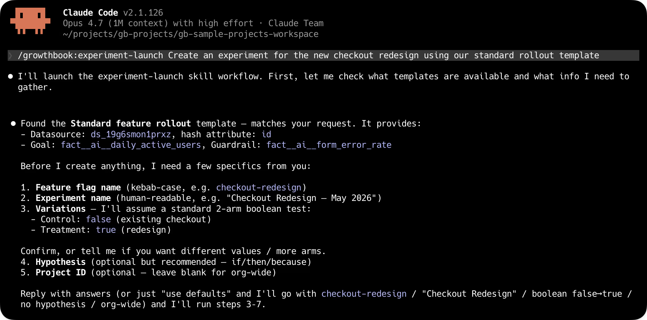
Observe experiments at the scale of your program
Instead of clicking through the UI to view every running experiment, your agents make a single endpoint round-trip. That call returns estimated completion times, metric direction, and any guardrail issues for every experiment at once. Snapshots, status, and results work the same way: one call across the program, not one per experiment.
Analyze, decide, and ship
Reports are a new first-class API resource in 4.4. An agent can build a persistent analysis from an experiment, customizing metric overrides, analysis settings, or dimension breakdowns. The report stays put, and doesn't get overwritten by the next snapshot. An agent can hand a report URL to a stakeholder, refresh it on demand, and link back to it from a write-up.
From the report, the agent reads results against your team's decision criteria and concludes the experiment programmatically, setting the winner, results, and analysis summary in one call.
Watch our Head of Experimentation, Luke Sonnet, set up and launch an experiment with Claude Code.
Bandits without sticky bucketing
Multi-armed bandits fit when you want continuous learning and traffic reallocation without the time cost of a full A/B test. That profile shows up frequently in AI application work: model selection, prompt comparison, response ranking. Until now, adopting bandits in GrowthBook meant setting up sticky bucketing first. Now, bandits are easier to set up, and we expect that teams building AI-powered products will use them extensively.
Product Analytics: Structured exploration with an AI-native interface
Analytics has three different bottlenecks, and traditional tools built around SQL and a dashboarding UI don't address any of them well.
- Non-data teams need to self-serve analysis on product metrics without queuing behind the data team.
- Repetitive review workflows run the same explorations over and over.
- Agents in the loop need programmatic access to metric data data, fact tables, and experiment results.
All three converge at the same place: the data team becomes a bottleneck for work that structured, repeatable tooling should handle. GrowthBook 4.4 introduces a new AI Data Analyst to improve self-serve analysis, and makes it explore data without SQL.
AI Data Analyst (beta)
The AI Data Analyst is a conversational AI assistant for Product Analytics. Ask a question in plain language, like “What’s our DAU trend by country” or “How is our model playground engagement rate compared to API key creation,” and get back charts and insights built with tooling specific to GrowthBook’s metrics, fact tables, and data sources. Product managers, marketers, and others can self-serve their questions without writing SQL or filing tickets with the data team.
It's in beta, and we want to hear how you're using it. Ask it real questions, try out your actual workflows, and let us know what we can improve.
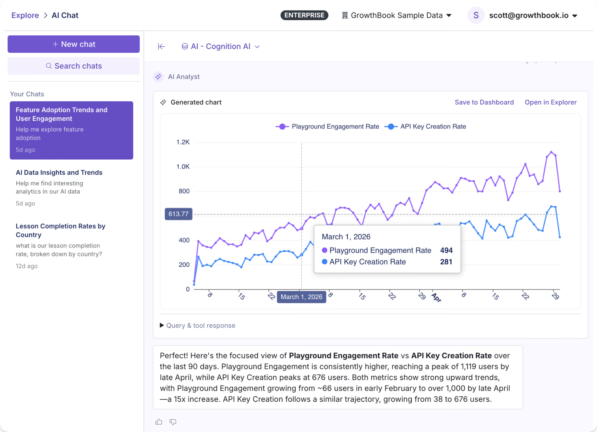
Explorations
Suppose you want to understand the change in daily active users of a new search feature, broken out by plan tier. GrowthBook’s Explorer lets you create charts (Explorations) from your warehouse data through a visual interface. Select your metric, dimensions, and date range to generate a chart that you can share or save. Or run the same exploration over the API and get the chart data back, plus a deep link to open it in GrowthBook.
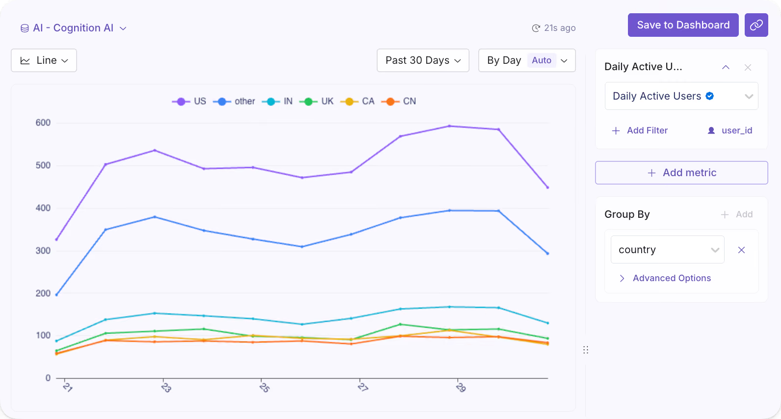
Product Analytics over MCP and API
Every exploration is now addressable through the MCP server and REST API. Queries run the same way whether they come from a person clicking through the UI or an automated workflow calling the endpoint.
Feature flagging: Safer flags, for whoever's shipping them
AI-assisted software development has rapidly increased the amount of code written and features deployed. Teams need flag infrastructure and governance that scale with the automation, so that problems like premature rollouts and flag sprawl don’t scale right alongside feature development.
GrowthBook 4.4 includes safety and governance features to prevent these failure types, and automated stale flag cleanup to mitigate flag sprawl in existing codebases.
Ramp schedules
Targeted releases now include automated, time-based rollouts with fine-grained controls and optional approval steps. Each step supports its own targeting in addition to a traffic percentage, so a canonical rollout might look like:
- Internal employees for 24 hours
- Free tier at 25%
- Free tier at 100%
- Paid tier at 25%
- Paid tier at 100%,
This is particularly useful for AI model and prompt deployments, where you want time between each exposure before widening the blast radius. With monitored ramp schedules, you can attach guardrail metrics and automatically hold, advance, or roll back releases. With reusable templates, teams codify standard rollout shapes they want to apply to new features quickly.
Revisions and approval controls
Approval flows are built directly into the flag change lifecycle, with REST coverage (in beta) for revisions, reviews, and approvals. When a change comes in, it goes through the same review gate regardless of origin. The same guardrails apply whether the change comes from a teammate or an automated process.
Fully automated stale flag cleanup
Engineering teams often find their codebases bloated with quietly accumulated stale flags, which drive significant technical debt. Cleanup is handled in occasional tech debt sprints or just perpetually deferred.
This release adds an endpoint for stale flag detection, which lets an AI agent run an entire cleanup process. An agent or tool can pull stale flags by API, provide a reviewable list, then find and clean up flag references in your codebase as you decide what to remove. Automating the cleanup process removes a major source of compounding debt, especially for large enterprise teams.
Read more on what's changed, including feature flag change comparisons, audit logs, and approval workflows in our feature flag deep dive.
Ship, test, measure, and decide at a new pace
GrowthBook was built for teams that ship product with discipline: engineering teams with release processes, data teams defining metrics and guardrails, and product teams trying to move fast without losing rigor. Our 4.4 release extends the same principles to the agents now working alongside all of them.
The changes across experimentation, feature flags, and product analytics connect. A programmable experiment lifecycle, analytics you can query by agent, and flag infrastructure with real approval controls form one continuous workflow: ship, test, measure, decide. Whether a product team runs it manually or an automated pipeline runs it continuously, the underlying system works the same way.
Faster iteration. Same rigor and safety.
What's next
- See the full 4.4 release notes →
- Read the feature flagging deep dive →
- Talk to our team →
.avif)
How DoorDash runs 12,000 experiments per year across a 3-sided marketplace
Most experimentation platforms optimize for one user. DoorDash optimizes for 3.
Ilya Izrailevsky, senior engineering manager leading DoorDash's experimentation platform, joined me on The Experimentation Edge to share how he runs a testing program that processed 12,000 experiments last year across 42 million monthly active users. At peak, the platform handles 300 million feature flag evaluations per second. But scale isn't the hard part.
The hard part is that every experiment has to satisfy 3 competing interests:
- Consumers who want fast, cheap delivery
- Dashers who want high earnings and low idle time
- Merchants who want order volume without inventory depletion
"We don't have one magic number or metric that we're going after," Ilya told me. "We need to balance between consumers, dashers, and our merchants."
Ilya brings experimentation experience from Amazon, Robinhood, Uber, Intuit, and PayPal. He's lived on both sides of the fence — building experimentation platforms and using them to optimize search and recommendation systems. At Amazon, he led machine learning automation for e-commerce search, running tests that narrowed billions of products down to the 10–20 results customers actually see.
Now at DoorDash, he's scaling experimentation in 4 dimensions at once: democratization (enabling non-technical users to run tests), global expansion (40+ countries), new verticals (grocery, electronics, retail), and AI-powered growth.
🎧 Listen to the full episode →
The CEO reads every experiment result
DoorDash is an operations-driven, data-driven company. That's not marketing speak. After every experiment — win or loss — the team sends results company-wide. CEO Tony Xu reads them. He replies. He congratulates teams. He suggests alternative approaches.
"This really builds a culture that experimentation is encouraged and everything we do should be through experiment," Ilya said.
It's a pattern I keep seeing: the strongest experimentation programs have CEO-level engagement with test results. When leadership reads the details, the rest of the company follows.
One size does not fit all (even within your own product)
DoorDash launched beyond restaurants into grocery, electronics, and retail. The default delivery radius was 11 miles. The team hypothesized that expanding the radius would increase selection and drive more orders.
They were half right.
The expanded radius worked for grocery stores. For retail and clothing, it killed order volume. Customers didn't want to pay higher delivery fees for a $20 T-shirt from 15 miles away. The noise from distant stores degraded the experience.
"One size really does not fit all," Ilya said. "You have to really look at different types of verticals and understand the customer behavior."
The team killed the experiment. But the learning stuck: they now segment by vertical and test category-specific behaviors. Your intuition doesn't matter. Test it.
A "failed" experiment that saved thousands of subscriptions per week
DoorDash offers DashPass, a $10/month subscription that waives delivery fees and unlocks perks. It's similar to Amazon Prime. At one point, churn spiked. Subscribers were canceling.
The team ran an experiment: at the point of cancellation, show users the value they'd received. If you order more than 3 times per month, you've already recouped the fee. Plus streaming perks. Plus faster shipping.
The intervention saved thousands of DashPass subscriptions per week.
But the real learning was bigger. Customers didn't realize the value they were getting. So DoorDash created an entire product area around proactive DashPass messaging — checkout flows, confirmation screens, and monthly recaps. The experiment didn't just save subscriptions. It created a roadmap.
"There's no such thing as a failed experiment," Ilya said. "Every experiment is a learning opportunity."
Protecting the 3-sided marketplace
Because DoorDash is a marketplace, every experiment has to protect 3 constituencies. The team uses separate success metrics for each:
- Consumers: Order quality, reliability, satisfaction, retention
- Dashers: Earnings, utilization (time spent idle), fairness (order distribution)
- Merchants: Order mix (avoiding inventory depletion on one SKU), unit economics, long-term business growth
Guardrail metrics protect the rest of the ecosystem. A test that boosts consumer conversion but tanks dasher earnings gets killed. A test that increases merchant orders but hurts order mix gets reworked.
"It's in our interest for them to be successful," Ilya said, referring to merchants. "We want to have that mixture of different types of orders that people try out."
This is the classic explore-exploit trade-off applied to a marketplace. If you only show what customers have already ordered, they get bored. If you only show new things, they don't convert. Balance matters.
Democratization: From PhDs to product managers
Right now, engineers instrument experiments in mobile, web, and backend code. Data scientists and analysts interpret results. It works, but it doesn't scale.
Ilya's team is building what he calls "opinionated experiment templates" — pre-configured tests with embedded success and guardrail metrics. The goal: let product managers, designers, advertisers, marketers, and business operations teams run their own experiments without needing a PhD in statistics.
But the real moonshot? Enabling merchants to run their own tests.
"We'd like restaurant or store owners to be able to run their own experiments — on promotions, prices, menu items — so they can attract more customers to their local stores," Ilya said.
If it works, it's a win across the board. Customers get more selection. Dashers get more orders. Merchants grow their businesses. DoorDash processes more volume.
AI throughout the experimentation lifecycle
DoorDash is using AI in 3 ways:
- Institutional knowledge mining: Past experiments inform new hypotheses. AI surfaces what worked and what didn't.
- Agentic setup and debugging: AI helps non-technical users configure tests, detect imbalance issues, and fix SRM violations.
- Automated readouts: AI generates experiment summaries for the company-wide emails that the CEO reads.
"AI can help you do a lot of research and give you insights, but at the end of the day, humans need to make calls," Ilya said. "Humans are always at the helm."
The barrier to shipping features has dropped. AI makes it easier to build. That means more features. Which means more tests. Which means experimentation platforms have to scale with AI-powered growth, not just headcount.
What's next
Ilya sees 4 scaling dimensions ahead:
- Democratization: Self-serve experimentation for non-technical users
- Global scale: 40+ countries, each with different customer behaviors
- Vertical expansion: Grocery, electronics, retail — each with different unit economics
- AI-powered growth: More features, more tests, more automation
The platform is already handling 300 million evaluations per second. The next challenge isn't technical capacity. It's making sure every experiment — across every vertical, in every country, for every user type — delivers real customer value.
Because at DoorDash, experimentation isn't the goal. Customer impact is. Experimentation is just the vehicle.
Want to scale your experimentation program like DoorDash?
Listen to my conversation with Ilya on The Experimentation Edge podcast. And if you are building your own experimentation program, GrowthBook gives you the platform to run, analyze, and learn from every experiment at scale.
.avif)
How to implement feature flags at scale
Creating your first feature flag is straightforward. You wrap a new feature in a conditional, roll it out to a small group of users, and monitor the results. It works well, and it’s easy to manage.
Then you add a second flag, then a third. Eventually, your team starts rolling out new features behind flags or testing their performance through percentage rollouts. It doesn’t take too long for feature flags to become a critical part of your infrastructure. But handling 10 flags versus 1000 flags is a whole different ballgame.
Even though they give you speed and control, at scale, they need better governance and architecture to keep delivering on that promise.
In this guide, we’ll explain how you can scale feature flag implementation and what to expect while doing so.
What are feature flags?
A feature flag is an if/else statement in your code that controls whether a feature is visible or active for a given user or segment in a specific environment. Instead of shipping a feature to everyone at once, you wrap it behind a flag and decide who sees it and when.
Note: If you’re new to the concept or need a refresher, check out our complete guide to feature flags that covers the fundamentals.
Watch here to learn more about how to use feature flags with GrowthBook
Why do product and engineering teams use feature flags?
Initially, feature flags were used as a convenience. But today, they’re central to how high-performing product and engineering teams ship software. Here are a few reasons why:
- Decoupling deployment from release: You can merge code to production without exposing it to users, so your deploy and release schedules don’t have to be the same. It changes the way you think about risk because deployment becomes a routine event. It’s not something that you have to worry about with bated breath.
- Faster iteration cycles: When you use feature flags, you can roll out features to a small user segment, test their performance, assess their viability, and decide whether to roll them out to every user much faster. Instead of weeks to test and make changes, you can do it in days. If something goes wrong, all you have to do is flip the flag.
- Enables continuous delivery: Without flags, continuous delivery often stops at the "deploy frequently" part because teams can’t separate shipping code from exposing it to users. Flags remove that bottleneck. You can merge to main multiple times a day while keeping everything behind flags. Only release when the feature is ready, not when the sprint ends.
- Better experimentation infrastructure: You can A/B test a new checkout flow or gradually roll out a backend migration to 5% of traffic before going wider. You learn on the go, and feature flags become the delivery mechanism for that purpose. The more you learn, the better the results (and user experience) over time.
Why is it important to implement feature flags at scale?
When you’re a small team shipping a single product, feature flags work well. It’s simple to use because there are only a handful of engineers and maybe a few product managers. So everyone knows which flags are live in the codebase, and they share a clear understanding of what’s happening.
But the real test comes when your organization starts growing. As your team grows, so does the deployment frequency. While you were creating maybe 10 flags a week, now you’re creating 10 flags a day to improve velocity and software quality.
In short, the more complex your product gets, the more complex your feature flagging practices become.
Without the right systems in place, feature and flag management start slowing you down. The very tool that was supposed to “accelerate” delivery introduces friction you didn’t anticipate.
As a result, you can expect problems like:
- Increasing technical debt as stale flags pile up in your codebase.
- Higher release risk because nobody knows which flags are active or who owns them.
- Inconsistent app behavior because the same flag evaluates differently across environments.
The Knight Capital precedent from 2012 is an unfortunate yet excellent example of how it can impact your business. It lost $460 million in 45 minutes after a deployment reactivated an obsolete feature flag tied to an old trading algorithm. Nobody removed the older flag, so when an engineer reused the same name, it pulled the older flag and started running unnecessary trades.
Even though this was an extreme case, it shows what’s really possible when you don’t have the right guardrails in place to govern flag management.
What challenges should you expect when scaling feature flags?
Here are a few issues you can expect while scaling feature flag usage:
Flag sprawl and lifecycle neglect
You’re expected to keep creating and using feature flags. But the problem comes in when you forget to retire or archive them. Over time, you end up with a growing layer of dead code.
It’ll make your app harder to test and harder to understand why things are going wrong. Typically, it’s best to keep the stale flag percentage under 15%. But most sit above 40%, if not 50%, because they can’t keep up with it manually. That’s why organizations like Uber had to build their own tool, Piranha, to remove 2,000 stale flags.
Learn more about when most companies adopt feature flags.
Ownership and cross-team coordination
In a small team, everyone knows who created which flag. In a larger organization, that tribal knowledge sits in a few engineers’ heads. Managing all the flags becomes harder, especially when multiple teams share the same service.
A 2021 study found that 25% of development effort is focused only on technical debt-related issues. When no one knows which targeting rules conflict with each other or who owns a flag, you can only expect to spend more time fixing problems.
Performance at scale
Flag evaluation happens on every request. When you’re running flags at a small scale, the overhead is barely noticeable. But at thousands of evaluations per second, it can become a different story.
For example, if your evaluation logic makes a remote API call to determine a flag’s state, it’ll add latency to every API response and page load. Even with reliable connectivity, you can still expect flickering and performance issues, whether you evaluate flags remotely or locally.
Tip: GrowthBook offers local SDK-based evaluation with ultralightweight SDKs (13.6kB zipped) to avoid flickering. Its SDKs also cache flag definitions locally with stale-while-revalidate semantics, so even if your connection to GrowthBook drops, your flags keep evaluating correctly.
User experience complexity
When you’re running dozens of flags simultaneously, it becomes genuinely difficult to know what any given user is actually seeing. You may not be able to answer questions like:
- Which flags are active for a user with a specific set of attributes?
- Which experiments are they enrolled in?
- Are two flags interacting to create a combination nobody has tested?
This is where simulation and diagnostic tooling becomes valuable. Platforms like GrowthBook let you preview what a specific user profile would experience before pushing a change live. And its Feature Evaluation Diagnostics show exactly why a flag was evaluated the way it was for a given user in production.
You can even pair this with the GrowthBook MCP Server to debug flag behavior directly from tools like Cursor or Claude Code. This helps you avoid dealing with UX bugs that are hard to debug in production because they’re so subtle—or even invisible in some cases.
Fragmented flagging and experimentation tools
Many engineering and product teams start with separate tools for feature flags and experimentation. As a result, you maintain two sets of SDKs and dashboards, which makes it harder to connect feature rollout to experimental results. Let’s say you roll out a new checkout flow to 10% of traffic and the conversion rate drops. If you don’t have the right connected tooling in place, you won’t find out until it makes a serious dent in your revenue.
As you scale flag usage, these issues get worse and harder to wrangle. More flags means more rollouts happening simultaneously, and without a shared data layer, you have no systematic way to know whether any of them are helping or hurting.
7 best practices for feature flagging at scale
Here’s how you can implement feature flags at scale with confidence:
1. Design a scalable architecture
The single most impactful decision you’ll make is how your SDK evaluates flags.
There are two models that you can consider:
- Remote evaluation makes a network call to a central service every time your application checks a flag. It’s easier to set up, but each call adds latency, which causes flickering. If that service goes down, your flags stop working.
- Local evaluation downloads flag definitions upfront and evaluates them in-process, with no network calls at runtime. The SDK has everything in its memory, so flag checks happen in sub-milliseconds. That’s why GrowthBook’s SDKs use this model because we believe that your application should never depend on GrowthBook being available.
But the evaluation model alone isn't the only thing you should look at. At scale, you also need caching at multiple layers of your architecture. For instance, CDN for serving flag definitions and distributed caching (like Redis) for microservice environments.
GrowthBook supports caching at every layer, including edge SDKs for Cloudflare Workers, Vercel Edge, and AWS Lambda@Edge. The cached rules update automatically in the background via streaming or polling, so the changes you make propagate within seconds.
Learn more about Client Side Feature Flagging.
2. Establish governance and ownership
You don’t want to work in a system where everyone can make changes, and no one takes responsibility for anything. That’s how incidents happen. Consider using measures like:
- Using a naming convention: A pattern like {type}-{team}-{feature}-{context} gives anyone on your team enough context to understand what a flag does without opening a dashboard.
- Assign ownership: Every flag should get an assigned owner at creation, and that owner is responsible for cleanup. Then layer in role-based access control (RBAC) to limit access to the right stakeholders.
- Set up governance documentation: Define naming and usage conventions to ensure everyone knows how things work in your organization.
- Set up additional guardrails: You need to make sure your dependencies are accounted for while working with feature flags. For instance, prerequisite flags let you define dependencies between flags where a dependent feature only activates when its parent flag is enabled, which prevents invalid state combinations in complex systems.
3. Manage the feature flag lifecycle
Every flag should have a planned end date—unless it’s a long-lived flag like a kill switch. So, set expiration dates when you create the flag so that you know when its usage has run its course.
Source
A good rule of thumb for release and experiment flags is to keep them on for 90 days.
4. Implement clean coding patterns
If you scatter raw if/else checks throughout your codebase, the flag’s logic can get mixed up with business logic. To avoid this, wrap flag evaluations in a centralized function or class. Instead of allowing if (flagService.isEnabled(’new-checkout’)) to appear in 12 different files, call it featureGates.showNewCheckout() from one place. Testing and cleanup get easier when you have to update in one location.
Also, create flags that serve a single purpose. If it controls too many unrelated behaviors or develops dependencies, you won’t be able to control where it gets used.
5. Integrate feature flags into CI/CD
Your pipeline already gates what code reaches production. Feature flags extend that control to what users actually experience after deployment.
For instance, you should run automated tests in both flag states (on and off) to understand its behavior. You’d be surprised how often code works fine with a flag enabled but breaks when it’s disabled.
6. Monitor, observe, and debug
You wouldn’t ship a feature without logging and monitoring. Feature flags deserve the same treatment. Start by monitoring flag evaluation events to see which user saw which flag state and when. It’ll give you the audit trail you need to debug issues later.
If you want a more sophisticated setup, consider integrating observability tools with your feature flagging solution or using one with built-in observability. This way, you can see what went wrong and its impact in real-time.
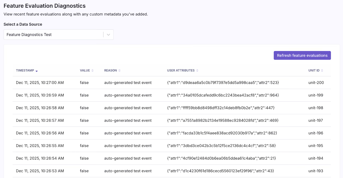
Source
7. Enable progressive delivery
Instead of shipping to 100% of users and hoping for the best, use a gradual rollout method. Start by rolling out to 1% of users, then 5%, 10%, and so on. The next step is connecting your rollouts to guardrail metrics. This enables automated monitoring that surfaces warnings if a rollout degrades key signals like error rates, latency, or conversion.
GrowthBook's Safe Rollouts help you do this. You can define the metrics that matter, and the platform watches them as you ramp up traffic. If something degrades, you see it in the rollout dashboard before it becomes an incident in production.
Over time, adopt progressive delivery methods like canary releases and blue-green deployments to reduce deployment risk.
Related reading: 12 Common Feature Flag Mistakes to Avoid
How to choose a feature flag platform for scaled usage?
Here are a few factors to consider when you’re choosing a feature flagging platform:
Architecture and performance
Look for local SDK-based evaluation rather than server-side API calls on every request. You’ll experience sub-millisecond evaluation times, which influences your app’s experience.
Also, caching and offline support are table stakes for any latency-sensitive application. A platform that evaluates flags locally means your application keeps working even if the vendor's servers are temporarily unavailable.
If the platform doesn’t separate its read and write systems, ask how it handles load at scale.
SDK and platform support
You need SDKs that cover your full stack: backend, frontend, mobile, and edge. Platforms like GrowthBook offer 24+ SDKs that provide wide coverage while maintaining a consistent experience across different environments.
Also, make sure the flags behave the same way irrespective of which SDK you use. You don’t want to keep resolving bugs just because you use a different language for your app.
Governance and access control
Without governance, it’s impossible to scale. That’s why, at a minimum, you want:
- Role-based access control (RBAC) to make sure only the right team members have access to sensitive controls.
- Approval workflows to allow senior team members to review changes before they go live.
- Audit logs and change history to see what’s happening and when—which is useful for compliance audits too.
- Clear ownership assignment per flag so that responsibility is spread across the team.
- Prerequisite flag support to define dependencies between flags, preventing invalid state combinations in complex systems.
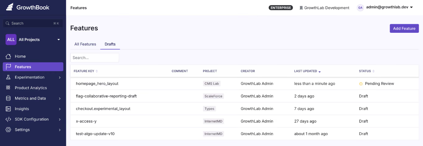
Source
Lifecycle management
The platform should make it easy to track flag status (active, stale, archived), set expiration dates, and surface unused flags for cleanup. These days, you can even connect to Claude or Cursor via an MCP and see where flags are referenced in your codebase, so look for capabilities like these to make it easier to manage flags.
Targeting and rollout capabilities
The ideal feature flagging platform should let you target users or environments. This capability is a building block for progressive delivery and robust experimentation.
At a minimum, the platform should support attribute-based targeting with AND/OR logic where you can target users by:
- Geography
- Device type
- Subscription tier
- Company ID
- Custom attributes
Here’s an example of what it looks like in GrowthBook. Within the platform you can even use Saved Groups to save time when the same targeting criteria apply across multiple flags. Another key capability is that when you use percentage-based rollouts, it uses deterministic hashing so the same user always gets the same variant, without requiring server-side session storage.
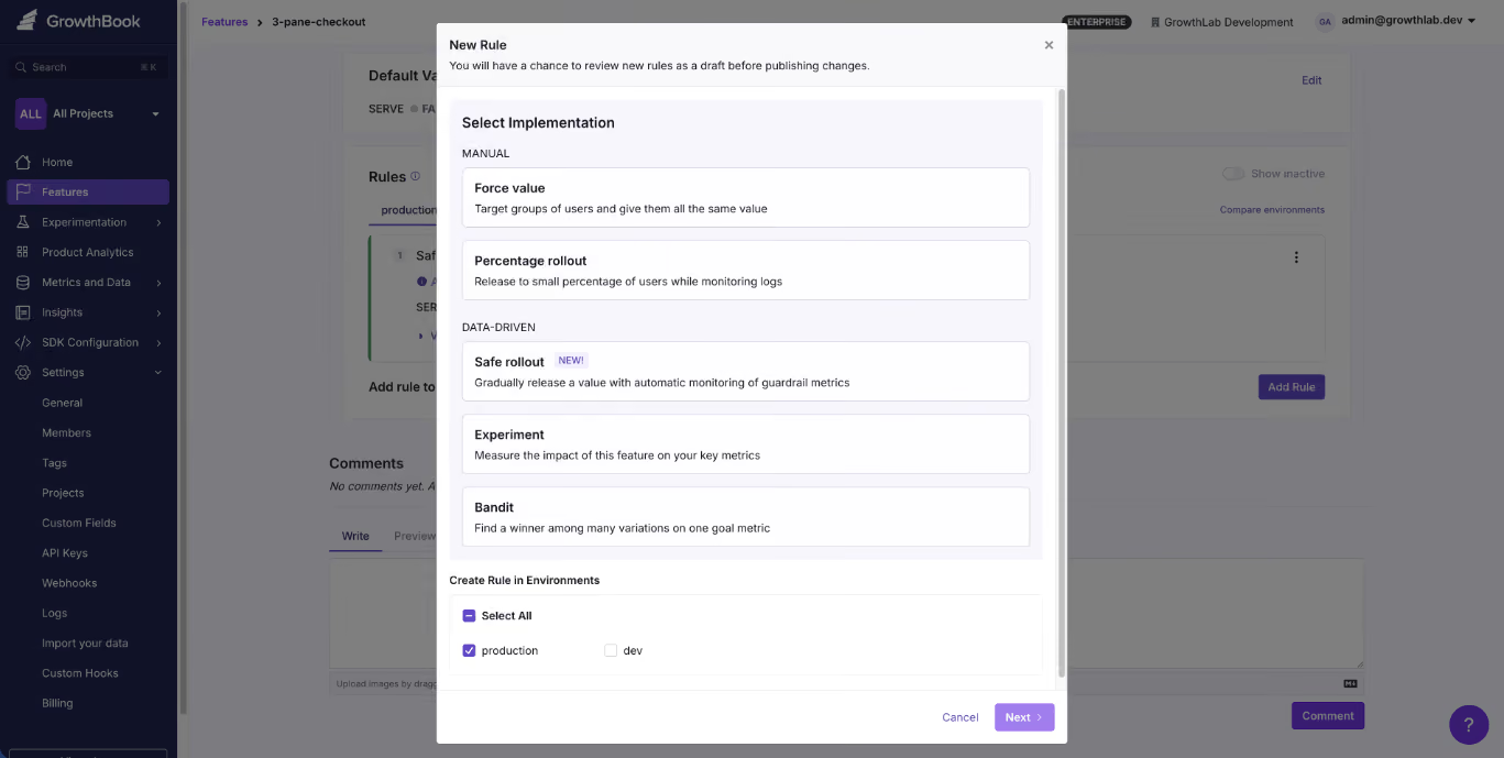
Source
Experimentation
You might not need experimentation today, but choosing a platform that supports it natively means you won’t have to rip out your flagging infrastructure when you do. With GrowthBook, any feature flag can become a measurable A/B test without changing your instrumentation or adding a second vendor.
If you plan to run A/B tests or more complex tests, such as multivariate or CUPED tests, look for native experimentation support.
Everything should come out of the box, helping you avoid connecting too many tools just to test performance. For example, GrowthBook links feature flags to experimental capabilities, so you can modify source code without switching between platforms.
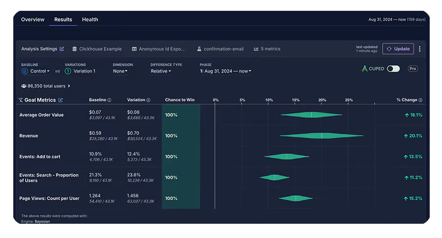
Source
Data ownership and deployment model
If you’re in a regulated industry like fintech, you need to make sure your platform of choice has a self-hosted option. It’s important to meet your compliance requirements—as data transfer or movement of any kind can introduce security risks.
For instance, GrowthBook offers warehouse-native experimentation and self-hosted options, which means you can run complex tests without sending your data to a third-party tool. Self-hosting solves compliance at the architecture level because end-user PII doesn’t leave your environment during flag evaluation.
And by connecting directly to your existing data warehouse like Snowflake, BigQuery, Redshift, ClickHouse, Databricks, and others, your rollouts will be informed by your actual data.
Integration with your existing stack
Make sure the platform also integrates with tools you already use, like:
- CI/CD pipelines (Command Line Interface)
- Observability tools (Datadog, New Relic)
- Communication tools (Slack, Discord)
- Infrastructure-as-code compatibility
- AI MCPs (Claude or Cursor)
Also consider vendor lock-in risk. Platforms that support the OpenFeature standard which is the CNCF specification for vendor-agnostic feature flag APIs give you a migration path if your needs change. For instance, GrowthBook supports OpenFeature with official providers for Java, Python, Go, .NET, and JavaScript. It also includes built-in migration tools for teams coming from LaunchDarkly or Statsig.
Cost and scalability of pricing
Look for a pricing model that fits your usage patterns. If you have very high-traffic websites or apps, it doesn’t make sense to go for a per-event or pay-as-you-go model. In fact, a fixed per-user cost might be a better option to control costs.
Note: While some platforms work well for small teams but force a migration when you outgrow them, others are built for enterprise but are painful to adopt. The ideal platform scales from your first flag to billions of daily evaluations without requiring a switch.
In fact, GrowthBook’s customers include teams processing 3+ billion evaluations per day on self-hosted instances and that’s because they built with scale in mind.
How Dropbox implemented feature flagging at scale
It’s one thing to talk about best practices in theory. However, it’s another to see them working at the scale of 700 million registered users.
Dropbox faced a problem that many growing companies run into. Their experimentation infrastructure had become fragmented through acquisitions. This meant they were managing too many platforms, including Stormcrow, their homegrown solution. And it resulted in challenges like:
- Increasing costs due to managing the flagging solution internally
- Dealing with long analysis periods, which delayed decisions
- Not having the flexibility to run experiments without changing the backend
That’s why its engineering team decided to implement GrowthBook. The platform allowed them to host the feature flagging product on-premise while allowing them to integrate with their existing Databricks warehouse.
As a result, they were able to consolidate six platforms into one — while processing 3+ billion feature evaluations every single day.
How GrowthBook supports feature flagging at scale
Your first feature flag was simple. But scaling it beyond 10 or even 100 flags requires clear architecture that stays out of your critical path and governance.
The best part is you don’t have to build this from scratch. You can use platforms like GrowthBook to put these practices into play—without the overhead of maintaining them yourself (unless you want to).
GrowthBook is built for teams that need an open-source feature flagging platform to deploy safely even as they scale to work together. You can take advantage of:
- SDKs that evaluate flags locally, so you don’t incur network overhead.
- Caching that works at every layer of your stack so that flag state stays consistent across services.
- A warehouse-native architecture queries your data where it already lives to avoid compliance issues.
- Governance features like RBAC, approval workflows, and even stale feature detection to keep your codebase clean and reduce technical debt.
- Built-in experimentation that lets you measure feature rollout impact with statistical rigor.
- A fully self-hostable platform that’s MIT-licensed, and supports the OpenFeature standard for vendor migration.
Over 3,000 companies use GrowthBook, including Dropbox, Khan Academy, Pepsi, and Typeform.
If you’re looking to scale feature flag implementation within your organization, you can start for free or book a demo.
Frequently asked questions
How many feature flags is too many?
There’s no clear number here because it depends on flags per engineer, flags per repository, flags per 1000 lines of code, the stale flag percentage, and the net monthly growth in number. A team with 500 well-governed flags is in better shape than a team with 50 abandoned ones.
How do you manage feature flag debt?
You should implement governance measures to reduce technical debt. For example, set expiration dates at creation, assign owners to every flag, and run regular audits to identify stale flags. Alternatively, you can use a platform like GrowthBook to automate these processes.
What is local vs. remote evaluation?
Remote evaluation makes a network call to a server on every flag check. Local evaluation downloads flag definitions upfront and evaluates them in-process without adding to your runtime overhead. That’s why local evaluation is faster and more reliable at scale.
How do feature flags impact performance?
It depends on your evaluation model. Remote evaluation adds network latency to every request. Local evaluation resolves in sub-millisecond time. At scale, this difference is significant — especially on mobile or in latency-sensitive user flows.
How do feature flags integrate with experimentation?
Feature flags control who sees what. But experimentation measures whether what they saw actually worked. When a platform supports both natively, you can run A/B or multivariate tests as part of your rollout process and make decisions based on real data before committing to a full release.
.avif)
From Amazon to Atlassian: one Leader's framework for testing assumptions instead of egos
Running an experiment is the easy part. The hard part is knowing when to trust your instincts and when to test them. Andrew Willingham, Head of Legal and People Products at Atlassian, learned that lesson the painful way—by shipping a product that experts loved but users couldn't figure out how to use.
Willingham spent over 11 years at Amazon, starting in consumer marketing, where every pixel on the homepage was A/B tested. He later led product development for Amazon's HR systems, building talent management software for 1.5 million associates. Now at Atlassian, he's applying those lessons to reinvent how companies hire, evaluate, and retain talent in the age of AI.
His career offers a rare perspective: he's built products for millions of consumers with unlimited test traffic, then pivoted to enterprise HR where user volumes are smaller and qualitative research becomes the primary de-risking tool. Along the way, he's developed a clear framework for when to test, when to ship, and when to trust a metric.
🎧 Listen to the full episode →
The talent review product that flopped on launch
When Willingham first joined Amazon's HR organization, his team was tasked with building a talent review product for operations. At the time, Amazon was running performance calibrations on Excel spreadsheets, PowerPoint slides, and Word docs. There was no consistency, no visibility, and plenty of data leakage risk.
Willingham's team is embedded with Amazon's Talent Management Center of Excellence—the IO psych specialists who design high-performing organizations. They built a product the experts loved. It reflected best practices. It had all the features a world-class talent review system should have.
Then they handed it to the HRBPs—the people who actually run talent reviews on the front lines.
"They got into it and they were like, what, this is way too complex. Like you have all these features. I don't know how to use this. And so it was a flop initially." — Andrew Willingham
The team had to go back to the drawing board. This time, they worked directly with the HRBPs. They simplified the interface. They made it so intuitive that any HRBP could run a talent review without a two-week prep cycle.
The result? Business leaders could now run their own talent reviews in real time, without waiting for HR support. That wasn't the original goal, but it became the product's biggest unlock.
"That was a really, really big win after that initial failure." — Andrew Willingham
The lesson: Know who your user is. It may not be the same person as your customer. And if you don't sit with the actual operator and watch them use your product, you're building in the dark.
From millions of tests to desk rides
At Amazon, A/B testing was the default. Every change to the buy button, every font size adjustment, every ad placement was tested at scale. Willingham's team would run double A/B tests: one to ensure no harm to page load latency, another to measure conversion lift.
Then he moved to HR, where the user base was 450,000 corporate employees and 1.5 million associates. Still large, but not compared to hundreds of millions of homepage hits.
"We did have to adjust our approaches. So instead of leading kind of with a pure data approach of like, cool, we did this and here's our p-values and everything else, we moved into kind of relying on a very close connection with customer research." — Andrew Willingham
He started attending talent reviews. He watched HRBPs prep Excel files and juggle PowerPoints. He asked questions: Why are you doing this step? Why did you bring this data? Didn't you already do that earlier?
This qualitative research became the proxy for high-volume A/B testing. It gave the team enough confidence to de-risk their roadmap before launch.
"You need to sit with your actual user and watch them use your product. It's going to be painful because you're going to be like, what are you doing? You're supposed to do this. But you can figure out pretty quickly, okay, that's actually what they're trying to do." — Andrew Willingham
The metrics that matter: efficiency and quality
At Atlassian, Willingham optimizes for two North Star metrics: efficiency and quality.
Efficiency means reducing the time it takes to run a talent calibration, complete a hiring funnel, or onboard a new employee. Quality means maintaining or increasing the outcome — hire quality, decision accuracy, and employee satisfaction.
These metrics are deliberately antagonistic. You can't optimize one without protecting the other.
"If our goal is to hire faster, I'll just get rid of all interviews and blind hire people. And then I'm going to hit my metric and walk away here. But that's why you have to have that quality metric to say, you're optimizing against these things that are naturally kind of antagonistic." — Andrew Willingham
This balance is critical when applying AI to HR processes. Willingham's team is reinventing hiring workflows from the ground up. They're testing whether steps in the traditional funnel — sourcing, recruiter screen, hiring manager screen, five interviews, offer — can be skipped, replaced, or reordered.
The goal isn't just efficiency. It's a better candidate experience and higher decision quality. That requires testing both speed and outcome.
When to test and when to trust
Willingham has a clear framework for deciding what to test.
If it's a durable truth—something you know is aligned with outcomes you care about—ship it. At Amazon, faster shipping times always translated to future revenue. No customer wants their package to arrive later. That's a truth you can bet on.
But if it's counterintuitive, test it. Willingham gives the example of dashboard usage time. Everyone assumes longer usage time means higher engagement. But it could also mean the product is slow and frustrating.
"You have to test one in that case, does usage time actually indicate satisfaction and helpful to customers? I can think of ways in which it would and ways in which it wouldn't." — Andrew Willingham
The other place to test: marketing copy and value propositions. Willingham's team tests how to get product managers to adopt AI features. Telling them "AI is important" doesn't work. Telling them "We'll generate your status report so you don't have to type it" does.
"A lot of what we're doing experimentation is trying to change behavior, if not everything." — Andrew Willingham
Why product managers resist experimentation
Willingham has seen reluctance to A/B testing across multiple companies. He thinks it comes down to ego.
"It's a bit scary as a product manager to go down this road, because again, you're giving up. It's a bit of an ego hit in some ways, cause you're not saying I have the answers. You're saying, cool. Here's my plan for testing. I don't know if I'm right or not." — Andrew Willingham
But admitting you don't know is the right posture. Executives don't have all the answers either. What they want is a plan to test, learn, and apply those learnings.
Willingham also points out that the most valuable experiments are often the ones that fail—especially the ones you expected to be slam dunks.
"The experiments that were the most helpful were the ones that didn't work. Particularly if we expected it to be a slam dunk and it didn't work, I'm like, whoa." — Andrew Willingham
That talent review flop taught him to always validate who the actual user is. It's a lesson he's applied to every product since.
From consumer marketing to AI-powered HR
Willingham's current focus is on applying AI to reimagine people and legal products at Atlassian. His team owns everything from HRIS and payroll to hiring systems and compliance tools. They're building zero-to-one solutions that reduce effort and increase quality.
But he's not testing every pixel. He's testing assumptions. He's testing value propositions. He's testing whether a workflow that's been standard in the industry for decades is actually optimal.
And he's doing it with the same mindset he developed at Amazon: small, iterative changes that compound over time.
"Amazon didn't jump to today's gateway. It's 20 years of experimentation. And along the way, you learn kind of what those pillars are that become enduring truths." — Andrew Willingham
The lesson for product teams: experimentation isn't about running the most tests. It's about learning the fastest. And the fastest way to learn is to test the things you're least confident about, sit with your users, and be willing to admit when you're wrong.
Ready to build an experimentation program that drives real learning, not just test volume? GrowthBook is an open-source feature flagging and A/B testing platform built for product teams who want to ship winning experiments faster. Start for free at growthbook.io.

UPS delivered $500M in revenue by testing e-commerce patterns on shipping flow
TL;DR: When Dave Massey joined UPS in 2016, experimentation was new. The company had a testing tool but no real program. Senior leaders gave him a pilot: prove UX improvements could move revenue. His first test — removing navigation from the checkout flow — drove $35 million. Nine years later, his team has delivered over $500 million in incremental revenue. Here's how they did it.
Most people don't think of UPS as an e-commerce company. But if you ship a package on UPS.com, that's e-commerce in every sense: a funnel, a checkout, a transaction. When Dave Massey, head of user research, personalization, and experimentation at UPS, walked into the company in 2016, nobody saw it that way. The shipping tool was just a tool. Not anymore.
Dave brings a background in digital advertising and conversion rate optimization. His first day, he walked into a meeting where leaders were choosing an A/B testing platform. He raised his hand to clarify some misconceptions about what the tools could and couldn't do. "You know how this works? Okay, so you get to play with it now and also own it," they told him.
He ran UPS's first test—a tiny button change—and then the program went quiet. Other business priorities took over. But in 2019, senior leaders came back. They'd heard this whole "UX thing" was worth considering. But like any big company, UPS needed proof. "We need to make sure that the juice is worth the squeeze," they said.
They gave Dave a revenue target, one other person, and vendor support. That was the pilot.
🎧 Listen to the full episode →
First test: remove distractions, add $35 million
Dave's first move was simple. He applied a basic e-commerce principle to the shipping flow: once a customer enters checkout, remove distractions.
"We basically removed navigation tools and stuff like that once somebody entered the shipping tool to get them to continue through the flow and not get distracted and go somewhere else," Dave said.
Before he launched, colleagues told him he was crazy. It wouldn't help. It would make customers angry.
He ran it anyway. "There's no such thing as a bad test. We learn what to do and what not to do."
The result? A conversion rate increase worth around $35 million over the course of a year.
But showing a number like that right out of the gate triggered skepticism. "Everybody's like, there's no way, we don't believe that," Dave said. His data team had to defend the results upside down and sideways. Holes were poked. Every assumption was challenged. When the dust settled, leadership agreed: "Yeah, this is legit."
The foundation: data rigor and UX research
Dave credits two things for UPS's experimentation success: a world-class data team and tightly integrated UX research.
"You gotta have the best data team you can afford," he said. UPS is an engineering company at its core. If you can't measure it, it doesn't matter. But when Dave joined, the analytics tooling was painfully slow. "You want to run a report, and you come back after lunch and hope it's done."
The company was modernizing its analytics stack around the same time the experimentation pilot launched. That timing was critical. Suddenly, the team had granular data and could connect dots fast.
But data alone isn't enough. Dave's team pairs behavioral metrics with voice-of-customer insights because his UX research team sits under the same umbrella as experimentation.
"Having the voice of the customer along with those behavioral metrics gives you that real 360 view," he said. "We can anticipate more before we even get to the A/B testing side because we've heard customers say, ' Hey, this is a problem, this is not a problem.'"
When a test fails, the team doesn't just look at the data. They go back to customers and ask: Why do you think this didn't work?
"I don't know, I've talked to a few other leaders of their experimentation programs at other companies. And when I tell them that we have our UX team connected to the hip of our experimentation team, it kind of blows their mind. But to me, it seems like that's 101. You would have to have that, right?"
The test that ran for 24 hours
Not every test is a winner. Dave's gut is "wrong more than it's right," he says. But some tests fail so hard they become teaching moments.
Senior leadership once pushed hard to make the recipient's email a required field in the shipping flow. The thinking: capture customer data for retargeting. The product team worried. Dave's team ran the test.
It lasted about 24 hours.
"We saw such a decline in conversion on shipping on UPS.com that we pulled the plug on it," Dave said. "We went back and told the business, yeah, you can't. This is not something that is a good experience, and therefore it will cost us business."
But a couple of years later, the international shipping team wanted to do the same thing—for a completely different reason. Customs paperwork. When a package gets held at customs, the recipient has to deal with it, not the shipper. The team wanted the recipient's email to streamline that process.
This time, the test worked. "We put it in there. This is to help it get through customs. We saw no issue. Nobody had a problem with it because we gave them the reason why. It's not just like, hey, we want this because we want this."
The lesson: context matters. Friction isn't inherently bad if customers understand the value.
Building a culture of testing
Today, Dave's team, the Journey Experience and Design Innovation team or "JEDI", runs experimentation for a $12.6 billion business. The team is about 80 people, including designers, data scientists, developers, and vendor partners. They support nearly 80 different customer-facing applications across UPS digital properties.
They can't test everything. But that's a good problem.
"The fact that we can't test everything that we want to test is great in my eyes because that means people understand it and understand the value of it," Dave said.
Business units across UPS now come asking to test ideas. The team has earned a reputation for rigor and honesty. "The business now knows that they ignore Jedi at their own peril," Dave said.
When senior leaders propose an idea, the team doesn't just say no. They test it. If it doesn't work, they come back with data and alternatives. "We tested your idea, and it did not work well, but we learned these three other things that we can do to accomplish the same goal. That changes that conversation."
That approach has made the team the center of excellence for proving what to do — first and foremost for customers, but also for the bottom line.
What's next: personalization and decentralization
Dave sees two big opportunities ahead. First, personalization. UPS serves a wide range of users: someone who ships once a year and someone who's in the tool all day as a shipping manager. Those users need different experiences.
"Maybe one day they're showing up to ship something to grandma for a birthday. The next day, they're at their day job, and they're the shipping manager," Dave said. "It's being able to understand that. And that's where experimentation and audience targeting and all those sorts of things can come together."
Second, decentralization. Right now, the team runs everything centrally. Dave would love to expand the capability, so other teams can run their own tests — but with the same rigor and standards his team uses.
"We need technology that is simple enough for other business units to be able to do this sort of thing," he said.
AI will play a role. UPS has been experimenting with AI since before it became a buzzword. Dave's team treats it as a tool to improve efficiency. They can get through results faster and generate hypotheses more quickly, but always with a human in the loop. "There's nothing that AI generates that just does not pass go. It has to go through its checks, just like something that a human on our team would have to go through."
The half-billion-dollar value of experimentation
Since launching the pilot in 2019, Dave's team has delivered over half a billion dollars in incremental revenue. That doesn't even account for the savings they've generated.
The formula isn't complicated. Treat your internal tools like e-commerce. Pair behavioral data with customer research. Test everything. Defend your results with rigor. Push back on leadership with evidence, not opinions. And build a team that knows the difference between a failed test and a learning opportunity.
"My team is known for the rigor that we go through in terms of setting up a test and making sure we're not blowing anything up, breaking anything with IT," Dave said. "But also looking at the results and being as unbiased as possible. We have no problem saying, hey, this isn't the right thing to do, sorry. Or it is the right thing to do."
That's how you deliver half a billion dollars.
Listen to my full conversation with Dave on The Experimentation Edge podcast. And if you are building your own experimentation program, GrowthBook gives you the platform to run, analyze, and learn from every experiment at scale.
.avif)
8 best open-source feature flagging tools compared [2026]
If you’ve ever evaluated open-source feature flagging tools, it feels like picking a database. On paper, most options check similar boxes. In practice, the wrong choice costs you months in migration headaches and unexpected operational overhead.
Even though open-source software lets you take back control of your data, you still have to consider operational decisions around self-hosting and your specific use case. While some treat experimentation as a core capability, others stick to basic feature flagging only.
In this guide, we’ll take a look at eight open-source feature flagging tools and explain what they do so that you can make the right call when the time comes.
What is feature flagging?
A feature flag is a conditional wrapper around code that lets you control whether it runs without redeploying your application. At its simplest, you’re wrapping a feature in an if/else statement that checks a remote configuration instead of a hardcoded value.
Feature flags let you deploy code to production and then decide separately when, how, and to whom it becomes visible. In your day-to-day engineering work, it can translate to use cases like:
- Decoupling deployments from releases
- Percentage-based rollouts for gradual testing
- Targeted delivery for specific accounts
- Instant kill switches to revert when something breaks
In short, they’re the foundation of the modern software delivery infrastructure. And when you pair them with a statistical engine, you can focus on controlled experimentation to see if the changes you shipped actually make a difference.
Why choose an open-source feature flagging platform?
You could buy a SaaS feature flag tool and move on. Plenty of teams do. But there are real, specific reasons why engineering organizations, irrespective of their size, choose an open-source feature flagging tool.
Here’s why:
- Predictable costs: Most commercial feature flag platforms charge per seat, per event, or per monthly active user. The more successful your product is, the higher the costs of feature flagging and experimentation. In fact, the 2026 State of Open Source report found that 61.5% of organizations choose open-source software because there’s no licensing fee, or they can control the overall cost of using software.
- No vendor lock-in: The same report also found that 68% of organizations use open-source software to avoid being locked in to specific vendors — up from 55% last year. It has become a key driver of adoption, and the trend doesn’t seem to be going away. You own everything from your configurations to your migration path. If the tool stops being maintained or the company pivots, you fork it and keep going.
- Data sovereignty: When you self-host your feature flag platform, your user data, experiment assignments, flag state, and analytics stay on your infrastructure. Your personal data is safe, and you know where it’s stored and how it moves in your infrastructure.
- Improved transparency: Let’s say you’re using a proprietary tool for feature flagging and experimentation. In those cases, the stats engine is usually a black box. You trust the numbers because the vendor tells you they’re correct. With open source, you can read the code and audit the statistical methodology. For data teams that take experimental rigor seriously, that transparency matters. Platforms like GrowthBook show you the SQL so you don’t have to dig into the code to understand how it works or what’s happening.
Now, this doesn’t mean that open-source software is free of costs or the best option in every scenario.
If you’re self-hosting the software, it takes resources to manage the infrastructure and keep it up to date. But many feature flagging platforms offset this by offering managed cloud options and active developer communities to provide the support you need.
You just need to set clear expectations before choosing an open-source platform.
What to look for in an open-source feature flagging tool?
Before you start comparing tools, make sure you have a clear answer to these evaluation criteria:
Primary use case
First, ask yourself: Are you looking for simple on/off toggles and gradual rollouts to reduce deployment risk? Or do you need built-in A/B testing with statistical analysis to measure whether your changes actually moved the needle?
While some tools just help you create and manage feature flags, others, like GrowthBook, help you move into more advanced use cases, such as experimentation. You need to understand your long-term goals, so you only pay for the capabilities you’ll actually use.
Deployment model
Most feature flagging platforms support self-hosting, which is a major advantage over commercial-only platforms. But "self-hosting" means different things depending on the tool. Some tools also offer managed cloud if you want the control of open source without the infrastructure overhead.
Think about what your ops team can realistically support. If you’re a small team without dedicated DevOps, a single-binary deployment or a managed cloud option will save you from a lot of pain in the long run.
SDK support
Your feature flag tool is only useful if it works with your stack. Check for coverage across:
- Backend languages (Python, Java, Go, Node.js, C#)
- Frontend frameworks (JavaScript, React)
- Mobile platforms (Swift, Kotlin, Flutter)
- Edge environments (Cloudflare Workers, Lambda\@Edge)
If you’re running a polyglot microservices architecture, that difference matters on day one.
Note: Feature flagging platforms like GrowthBook offer 24+ ultralightweight SDKs that are 13.6 KB in size, which work with languages like Python, Typescript, and JavaScript.
Experimentation capabilities
If you care about measuring the impact of your feature rollouts, look closely at the experimentation layer. A percentage-based rollout is not the same thing as a controlled experiment. A “true” experiment requires sophisticated capabilities such as random assignment, metric tracking, statistical engines, and a clean analytics dashboard.
Most open-source flag tools don’t include this. The ones that do vary significantly in depth. For example, PostHog offers basic Bayesian and frequentist testing, but GrowthBook goes further with CUPED variance reduction and sequential testing.
Community and ecosystem
Open-source tools live or die by their communities. A large, active community means you can access better documentation and fix bugs faster by doing it yourself.
Use GitHub stars and contributor counts as a maintenance signal (check the most recent commit date alongside the count), but don’t overweight stars. Stars often reflect project age and developer marketing more than product quality, so be sure to assess each vendor’s customer base too. Customer base quality is a better viability indicator. Also, check the release cadence. Is the project shipping regularly, or has it gone quiet? Review recent discussions to see what kinds of issues you can expect before you start using it.
Vendor viability
Feature flag SDKs get scattered across every service in your codebase, making migration timelines measured in months common. Will this platform still be actively maintained in 3 years? Look at release cadence, funding stage, and customer base quality (production logos are a better signal than GitHub stars). Check the license type as fork insurance: MIT and Apache 2.0 give you the most freedom if the project direction changes. OpenFeature support provides additional vendor insurance by keeping your application code portable across flag evaluation backends.
Pricing model
Open source doesn’t always mean free at scale. Most tools offer a free self-hosted tier, but advanced features like SSO, RBAC, or dedicated support are available only in paid plans. Typically, you can expect a per-seat, per-request, per-product, or flat rate structure. The right pricing model for you depends on your use case and organizational scale.
Caching and infrastructure flexibility
Every company’s infrastructure is different, and there’s no single caching solution that works for everyone. Teams typically need caching at some combination of CDN, edge workers, SDK internal memory, distributed cache (Redis or Memcached), and self-hosted proxy layers.
The critical question is whether the platform integrates with the caching infrastructure you already run, or whether it pushes you toward a proprietary proxy. Also evaluate customization depth: can you attach custom metadata to flags, enforce organization-specific validation rules, and extend the platform with Terraform, OpenFeature providers, or an MCP Server?
Self-host or use the cloud
GrowthBook is open source with self-hosted and cloud options, so you can start free and keep your data in your own infrastructure.
Start Building FreeBest open-source feature flag platforms
Here are the 8 best open-source feature flagging platforms in 2026:
| Platform | Best for | License | Self-hosting | Experimentation | SDKs | Free plan | G2 rating |
| GrowthBook | Flags + built-in experimentation | MIT | Docker, K8S | Bayesian, frequentist, CUPED, sequential, bandits | 23 | Free (3 users, 3 envs) | 4.6/5 |
| Unleash | Enterprise governance and compliance | Apache 2.0 | Yes (2 env free) | None built-in | 30+ | Free self-hosted | 4.7/5 |
| Flagsmith | Flags + remote config, fast setup | BSD-3-Clause | Yes | Bucketing only (no stats) | Multi-language | Free (50K req/mo) | 4.8/5 |
| PostHog | All-in-one analytics, flags + experiments | MIT | Docker, K8S | Bayesian, frequentist | Multi-language | Generous free tier | 4.5/5 |
| Flipt | GitOps teams, flags as code | GPL-3.0 | Yes (single binary) | None | 7 (OpenFeature) | Free forever | N/A |
| FeatureHub | Cloud-native flags with streaming | Apache 2.0 | Docker, K8S | None | 10 | Free self-hosted | N/A |
| FeatBit | .NET teams, flags + basic A/B testing | MIT | Yes | Frequentist only | 9 | Free forever | N/A |
| Flipper | Rails developers, simple flags | MIT | Yes (gem) | None | Ruby only | Free gem | N/A |
1. GrowthBook

Source
What is GrowthBook?
GrowthBook is an open-source, enterprise-class, feature flagging platform designed around one principle: your application should never depend on GrowthBook being available. Both client and server SDKs evaluate flags locally from a cached payload, delivering sub-millisecond performance with zero network calls per flag check. The platform connects directly to your existing data warehouse for guardrail metrics and experiment analysis, so your data never leaves your infrastructure.
The platform is MIT-licensed and YC-backed, and 3,000+ organizations actively use it each month, including Dropbox (processing 3 billion+ daily evaluations on self-hosted GrowthBook), Khan Academy, Sony, Pepsi, Wikipedia, and Mistral. GrowthBook handles over 100 billion feature flag lookups daily, and the same codebase powers both the open-source self-hosted version and the managed cloud offering. GrowthBook Enterprise is SOC 2 Type II and ISO 27001 compliant, with GDPR, COPPA, and CCPA adherence and HIPAA BAA available.
The best part about the platform is that it treats feature flags and experimentation as two halves of the same workflow. You don’t ship a feature behind a flag and then switch to a different tool to figure out whether it worked. The flag, the experiment, and the analysis all live in one place — with your data warehouse as the single source of truth.
Supported SDKs
GrowthBook offers 24+ SDKs spanning backend, frontend, mobile, and edge environments:
- Backend: Node.js, Python, Ruby, PHP, Java, Go, C#, Elixir
- Frontend: JavaScript, React, Vue
- Mobile: Swift, Kotlin, Flutter, React Native
- Edge: Cloudflare Workers, Fastly Compute, Lambda\@Edge
- Other: Rust, Roku
All SDKs are ultra-lightweight and evaluate flags locally with zero network calls during evaluation. That means you can expect sub-millisecond response times, and a feature flag check doesn’t add latency to your requests.
Community and ecosystem
The GrowthBook community has grown steadily and has over 7,000 stars on GitHub as of early 2026. The project ships regular releases, maintains comprehensive documentation, and offers a DevTools Chrome extension for debugging flag evaluations in the browser.
GrowthBook also supports OpenFeature, the open standard for feature flag evaluation. If you’re building with OpenFeature providers to keep your codebase vendor-neutral, it has official providers for Java, Python, Go, .NET, and JavaScript that plug directly into the spec. This means you can adopt the platform today and swap to a different backend later without rewriting your application code.
Key capabilities
- Feature flags and remote config: Create boolean, string, numeric, and JSON feature flags with remote configuration support. You can manage flags across multiple environments and update targeting rules or config values without redeploying code.
- User targeting and segmentation: Target features by user attributes, device type, geography, or custom properties. You can define reusable segments and apply complex condition logic with granular precision.
- Built-in A/B testing and experimentation: Run experiments directly on top of your feature flags with support for both Bayesian and frequentist statistical engines. GrowthBook connects to your existing data warehouse to analyze results, so there’s no duplicate data pipeline or second source of truth. You can also access the stats engine source code on GitHub to see how it works.
- Warehouse-native analytics: Query metrics directly from Snowflake, BigQuery, Redshift, Databricks, ClickHouse, Athena, Postgres, MySQL, MS SQL, Presto/Trino, and Vertica (11 supported sources). You define metrics once in your warehouse, and GrowthBook uses them for both smart feature flags and experiment analysis, keeping your analytics stack as the single source of truth.
- Role-based access and audit logs: Define roles and permissions to control who can create, modify, or deploy flags across environments. Every flag and experiment change is logged with full audit history for compliance and accountability.
- MCP server for AI: Use GrowthBook from your IDE by connecting it with Cursor, Claude Code, and Codex. You can create feature flags and track rollouts without leaving your AI tool.
- Safe Rollouts with guardrail metrics: Staged rollouts progress from 10% to 25% to 50% to 75% to 100%, with one-sided sequential guardrails pulled directly from your warehouse. If a rollout degrades key metrics like error rates, latency, or revenue, the platform surfaces warnings and can auto-rollback. You see the problem before your finance team does.
- Ramp schedules and approval controls: Define automated rollout stages that ramp up traffic from 10% through to 100% on a schedule you configure. Also, you can make sure flag changes can require approval before going live, whether they originate from a teammate in the UI or an AI coding agent calling the API.
- Feature Evaluation Diagnostics: Shipped in v4.3 (February 2026), diagnostics show exactly why a flag evaluated the way it did for a given user in production, with a rule-by-rule trace and attribute values. Combined with OpenTelemetry integration for observability pipelines, this removes the guesswork from debugging targeting issues.
- Caching at every layer: GrowthBook supports caching across CDN, SDK internal memory with stale-while-revalidate, GrowthBook Proxy with Redis pub/sub for distributed invalidation, webhooks for custom cache invalidation, and edge workers (Cloudflare, Vercel, Lambda@Edge). The philosophy is composability: lean on Redis, Cloudflare, and the caching infrastructure you already trust rather than forcing a proprietary proxy.
Pros of GrowthBook
- You can go from flagging a feature to analyzing its impact without leaving the platform or stitching together a second tool. The built-in stats engine (CUPED, sequential testing, SRM detection, bandits) enables your team to understand whether features work in live environments.
- Your data stays in your warehouse, so you don’t have to deal with duplicate pipelines or worry about PII leaving your infrastructure. If you’re in a regulated industry, it makes sure you stay compliant.
- OpenFeature support means you’re not locked in. If you need to swap backends later, your application code stays the same.
- Many users say they’ve experienced great, timely customer support — especially for technical issues.
- You can also conduct experiments without being capped by website traffic limits, which are common in other tools. As a result, you get more statistically significant results and can iterate with confidence.
Cons of GrowthBook
- You need a data warehouse to use the experimentation features. GrowthBook Cloud now offers a managed warehouse option for teams that don’t have one yet, but if you’re self-hosting, setting up a warehouse is an additional infrastructure step before you can create smart feature flags or run experiments.
- If you are using your own data warehouse, GrowthBook requires more initial configuration than simpler flag-only tools. However, if you use the GrowthBook Managed Warehouse, most of this additional setup comes out of the box.
- The UI can be complex for less technical team members, especially when working with JSON payloads and advanced targeting rules.
Pricing
GrowthBook offers pricing plans tailored to your infrastructure.
Cloud:
- Starter: It’s free, and you get unlimited feature flags and experiments. But it’s limited to 3 users and 3 environments, with unlimited CDN requests up to 1M per month.
- Pro: It costs $40 per user per month for up to 50 users. You can access advanced experimentation capabilities and permissioning features.
- Enterprise: Contact sales for a quote if you need governance, advanced security features, and optimizations for large datasets.
Self-hosted:
- Open source edition: It’s free, and you get unlimited feature flags, environments, and experiments. It’s also warehouse-native and not capped on traffic.
- Enterprise: You need to request a quote if you require advanced access control, cross-experiment insights, data pipelines, or security/compliance features.
Who is GrowthBook best for?
GrowthBook is purpose-built for data science, product, and engineering teams that want a complete open source feature flagging platform with the option to grow into experimentation. If your organization already has a data warehouse and you want feature flags, warehouse-connected guardrail metrics, and built-in A/B testing in a single tool, it’s the strongest open-source option available.
You can query your data where it lives, and because there’s a self-hosted option, even organizations in regulated industries like fintech, healthtech, and edtech can use it. It’s also the right choice for data teams that want to inspect, extend, or validate the statistical methodology behind their experiment results.
Ratings and reviews
G2: 4.6/5 (25 reviews): Users praise the ease of technical implementation and its ability to connect to multiple data warehouses. Keeping that in mind, the built-in experimentation engine becomes even more powerful because you can run complex tests using feature flags as the delivery mechanism. That said, some users find the UI complex to navigate at first.
2. Unleash
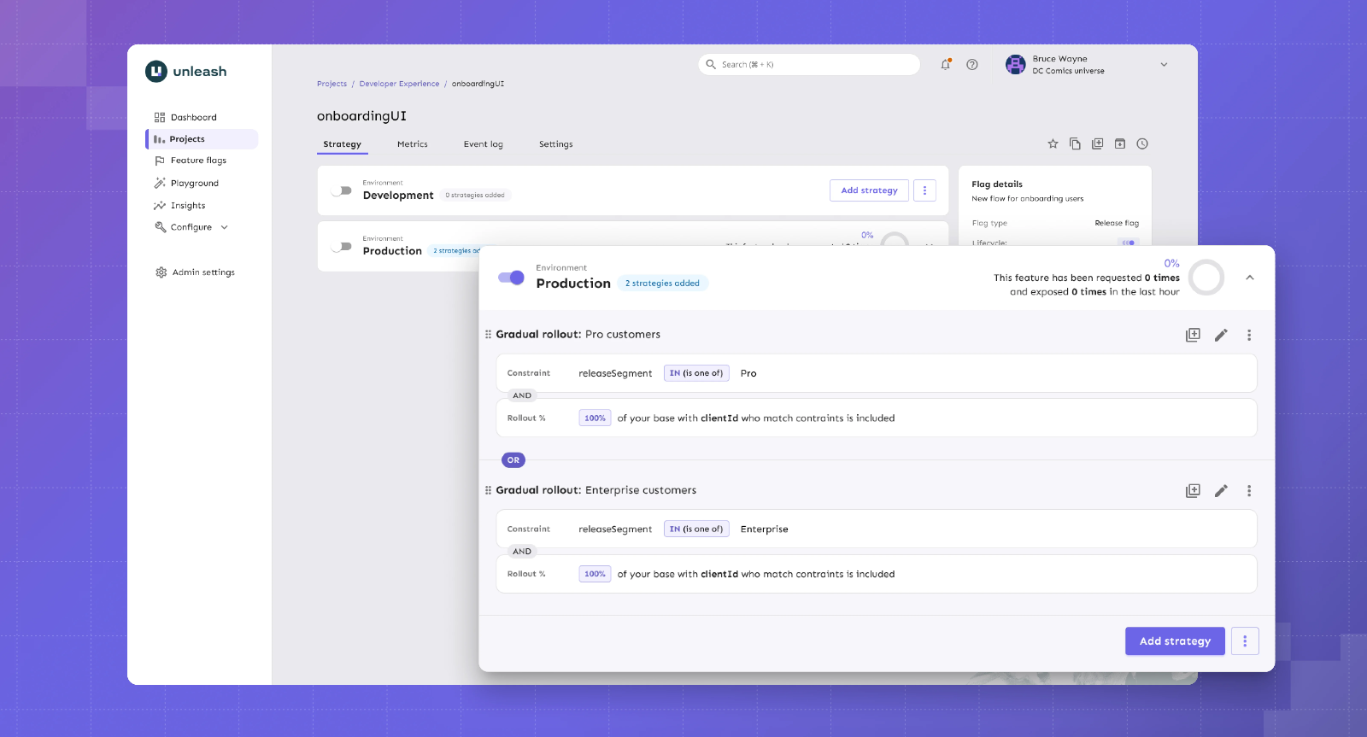
Source
What is Unleash?
Unleash is the largest and longest-running open-source feature flag platform. With 13,300+ GitHub stars and 11 years of history, it’s an incumbent in this category, but the company built its reputation around enterprise governance.
GrowthBook combines experimentation with strong governance. However, Unleash has built its reputation specifically around compliance-first workflows. You can expect features like change request approvals with 4-eyes review and FedRAMP-ready infrastructure. If your feature flag changes need to go through the same compliance process as a production database migration, Unleash was designed for that workflow.
Supported SDKs
Unleash offers 17 official SDKs plus 15+ community-contributed SDKs. Official SDKs include the following:
Server-side SDKs:
- Go
- Java
- Node.js
- PHP
- Python
- Ruby
- Rust
- .NET
Client-side SDKs:
- Android
- Flutter (proxy)
- iOS (proxy)
- JavaScript (browser)
- React (proxy)
- Svelte (proxy)
- Vue (proxy)
Community SDKs:
- Angular - TypeScript
- Clojure
- C++
- ColdBox - CFML
- Dart
- Elixir
- Haskell
- Kotlin
- NestJS - Node.js
- PHP
- PHP - Symfony
- Solid
Unleash also supports OpenFeature providers, allowing you to adopt the vendor-neutral standard.
Key capabilities
- Feature flags with advanced targeting: Create feature flags with custom activation strategies to give your team precise control over which users or groups see a feature.
- Enterprise governance: Manage change requests with 4-eyes approval, granular role-based access control (RBAC), and full audit logging to ensure accountability and security.
- Compliance features: You get support for air-gapped deployments, FedRAMP compliance, and GDPR/Schrems II privacy-by-design, making Unleash suitable for regulated industries.
- Impact Metrics (Beta): It provides real-time visibility into metrics such as error rates, adoption, latency, and infrastructure costs. So, it allows teams to incorporate these metrics directly into rollout decisions.
- MCP Server: Integrates with AI coding assistants such as Claude Code, Cursor, and Windsurf, enabling developers to manage feature flags directly from their IDE.
Pros of Unleash
- The platform offers one of the largest sets of SDKs, making it convenient for engineers and developers.
- Users appreciate that the platform uses an API-first approach that lets them automate aspects like provisioning and configuration. As a result, they can also integrate with the tools they need to ship features safely and faster.
- Many users report that because the open-source version is available as a self-hosted option, they’ve been able to replace homegrown solutions without risking non-compliance.
Cons of Unleash
- You can deploy a feature behind a flag, but you can’t measure whether it worked, at least not without integrating a separate tool like GrowthBook. If your team expects to run experiments, this gap will slow you down from day one.
- You don’t get warehouse-native integrations and no native analytics connections (Amplitude, Mixpanel, Segment). For data-driven teams, the lack of any analytics layer is a real limitation because you can’t really tell which user saw the old or new version of a feature, making it harder to measure impact.
- $75/seat/month pricing with a 5-seat minimum can add up quickly. The lack of free viewer-only seats can result in an expensive bill over a period.
- The free self-hosted version is limited to 1 project and 2 environments, which restricts how far you can go before hitting the paywall.
- Unleash doesn’t store user identities or traits server-side. Every flag evaluation requires full context at runtime, which can increase latency in microservice architectures where trait data spans multiple services.
- Unleash’s OSS Edge is sunsetting on December 31, 2026. After that date, self-hosters at scale will need Enterprise Edge for the same edge evaluation architecture, which adds a paid dependency to what was previously a fully open-source deployment.
Pricing
- No free SaaS plan (self-hosted OSS is free with 1 project and 2 environment limits), but you can try the hosted version free for 14 days.
- Pay-as-you-go ($75/seat/month): No long-term commitment, and they do host Unleash Enterprise for you. But this option is only available on the cloud-based model.
- Enterprise Self-Hosted (Custom, annual): Billed annually, but you get a cloud, self-hosted, or hybrid option.
Ratings and reviews
G2: 4.7/5 (122 reviews): Unleash is rated the "Easiest Feature Management system to use" on G2. Most users praise its flexible rollout capabilities, ease of use, clear UI, and the ability for both developers and product managers to manage flags without friction. That said, the initial learning curve can be a barrier for non-technical teams.
Who is Unleash best for?
Unleash is a good option for large enterprises in regulated industries such as finance and AI, only if they need compliance-specific tooling like FedRAMP-ready deployments and ServiceNow integration.
It’s also a solid pick for teams that need pure feature flag management at scale and are comfortable integrating a separate tool for experimentation and analytics.
3. Flagsmith

Source
What is Flagsmith?
Flagsmith is an open-source feature flag and remote configuration platform that’s bootstrapped. That’s one of the reasons the platform is open source and caters to solo developers, mid-market companies, and enterprise organizations.
The software combines feature toggles with remote configurations to help engineering teams easily create, configure, and manage features for individual segments, users, and development environments. Additionally, Flagsmith supports phased rollouts through gradual feature deployments, canary deployments, A/B testing, and multivariate testing.
Supported SDKs
Flagsmith covers the major languages, such as:
Client-side SDKs:
- Javascript
- Android/Kotlin
- iOS/Swift
- React
- Next.js and SSR
- Flutter
Server-side SDKs:
- Python
- Java
- NET
- Node.js
- Ruby
- PHP
- Go
- Rust
- Elixir
Key capabilities
- Feature flags & remote config: Manage unlimited feature flags and key-value configurations across environments, allowing teams to control feature rollouts and dynamically adjust application behavior without redeploying.
- User targeting & segmentation: Target features to specific users, segments, or percentages of your audience, enabling controlled rollouts and safer experimentation.
- A/B and multivariate testing: Run experiments and test multiple feature variations, helping teams make data-driven decisions on feature impact.
- Role-based access and audit logs: Define user roles, manage permissions, and track all changes, ensuring security, compliance, and accountability across your team.
- Multi-platform SDKs and real-time updates: Support for multiple languages and frameworks with OpenFeature compatibility. Plus, you get instant flag updates via Edge API, so your app experiences consistent behavior across environments.
Pros of Flagsmith
- Multiple reviewers confirm that the platform is easy to get started with and use. And both developers and non-technical team members can navigate the UI without a training session.
- Remote configuration alongside flags lets you manage feature behavior and visibility in one place.
- The platform also received high ratings for customer support. Several users praise how responsive and knowledgeable the team is.
Cons of Flagsmith
- There’s no built-in experimentation stats engine. Flagsmith handles bucketing (splitting users into variants), but you need an analytics partner like Amplitude or Mixpanel to determine which variant actually won.
- It’s not warehouse-native by default, so your experiment data flows through third-party analytics integrations, not your data warehouse.
- Important features like on-premises deployment or SSO are behind steep enterprise pricing, which isn’t ideal for small teams.
- While Flagsmith has added integrations (including Datadog, Amplitude, Segment, Jira, and Slack, among 15+ total), some users report gaps in the on-prem version compared to the cloud offering.
Pricing
- Free: 50,000 requests/month with unlimited flags and environments
- Start-Up ($45/month): 1M requests/month, 3 team members
- Scale-Up ($200/month): Unlimited requests, 10 team members
- Enterprise (Custom): Cloud, Private cloud, or on-premise; Enterprise SLA
Who is Flagsmith best for?
Flagsmith is a good fit for mid-market engineering teams and enterprises that want feature flags and remote configuration in a single tool, with native integrations with their existing analytics stack. If you’re already using Amplitude, Mixpanel, or Segment and want flag events to flow into those platforms without custom instrumentation, Flagsmith makes that easy.
It’s not the right fit if you need built-in statistical experimentation or you want capabilities beyond feature flagging.
Ratings and reviews
G2: 4.8/5 (37 reviews): Users praise UI simplicity, customer support, and the low barrier to entry as a non-technical user. But the lack of a built-in statistical engine makes it difficult for data-driven teams who want to run more advanced experiments without a separate analytics tool.
4. PostHog

Source
What is PostHog?
PostHog is an all-in-one product analytics tool that includes feature flags as one part of its entire product suite. The platform takes the opposite approach from every other tool on this list. Instead of doing one thing well, it tries to do everything in one place: product analytics, session replay, feature flags, A/B testing, error tracking, surveys, and a customer data platform under a single SDK.
The product is mostly catered towards data and product teams as opposed to engineering teams. And that’s why its “Product OS” is bundled with different tools to help you understand how users get value from your product.
Supported SDKs
Posthog offers SDKs in multiple languages, including the following:
- Capacitor
- NET
- Android
- Flutter
- iOS
- Go
- Elixir
- Java
- JavaScript web
- Next.js
- Node.js
- PHP
- React Router
- React
- Python
- Ruby
- Rust
- Unity
- React Native
The advantage is that a single SDK handles flags, analytics, session replay, and experiments, so you don’t need separate instrumentation per tool.
Key capabilities
- Feature Flags: Control which features are active for which users, with percentage-based rollouts and targeting, enabling safe, incremental releases. It offers sub-50ms latency for local evaluation.
- Product Analytics: You can track user behavior, funnels, retention, and engagement metrics in one place to help you make better product-related decisions.
- Session Replay: You can record and replay user sessions, which helps your teams debug issues and understand user behavior.
- Experimentation: Run experiments and analyze feature impact directly within the platform so that your team can measure changes without external tools.
- Managed Warehouse & Integrations: Connect to your data warehouse on platforms like BigQuery, Snowflake, and 120+ other sources via APIs and webhooks. It lets you centralize data for analytics, flag evaluation, and product insights. But your data lives in Posthog’s system first.
Pros of Posthog
- Many users say that having qualitative and quantitative tools within the same platform helps them get a better picture of how users use their products.
- You can replace Mixpanel, Hotjar, and a separate A/B testing tool with a single platform and a single SDK. For teams tired of managing (and paying for) 3 different analytics products, it helps them consolidate their tech stack.
- 98% of PostHog customers use the free tier. For early-stage teams, that means real analytics, flags, and session replay at zero cost while you figure out what your product needs.
- The platform offers flexibility in handling data and building custom flows for your pipeline, which is useful for analyzing product analytics.
Cons of Posthog
- It’s not warehouse-native. PostHog stores your data in its own system and offers warehouse connections for export. If your team has invested in a data warehouse as the source of truth, PostHog creates a second one.
- The experimentation stats engine is basic. You don’t get advanced capabilities like CUPED variance reduction or sequential testing. If your team runs experimentation as a core discipline, you’ll hit the ceiling.
- Several users report that the learning curve can be quite steep, especially if you’re from a non-technical background. That’s why some teams take months to implement it.
- Usage-based pricing can get expensive at scale. As your event volume and flag requests increase, so do your costs, which is a concern if you have a high-volume product or are growing faster.
- The UI is overwhelming for new users. Multiple users describe the dashboard as difficult to navigate initially.
Pricing
- Free: 1M analytics events/month, 1M flag requests, 5K session replays, and more.
- Pay-as-you-go: Usage-based with volume discounts at scale. But base pricing starts at $0.0001 per flag request, $0.00005 per event for analytics, and $0.00006 per event for LLM analytics.
- Self-Hosted (Free): The platform uses an MIT license so that you can host it yourself.
Who is PostHog best for?
Developer and product teams that want one platform for product analytics, feature flags, basic experiments, and session replay. It’s a particularly strong choice for early-stage companies that can take advantage of the generous free tier to consolidate their tooling before they need advanced experimentation.
It’s not the right fit for data teams that need advanced statistics, teams with strict warehouse-native requirements, or enterprises in regulated industries. And in cases where the company needs to scale their feature flagging usage, they tend to look for specialized solutions.
Ratings and reviews
G2: 4.5/5 (1,045 reviews): Users consistently praise ease of setup, the breadth of the feature set, and the all-in-one convenience. The fact that you get qualitative insights within the same platform means you don’t have to set up separate tools and have everything you need to measure product analytics. That said, the overwhelming UI, pricing concerns, lack of robust experimentation features, and the product’s complexity can be hard to wrangle in the long run.
5. Flipt

Source
What is Flipt?
Flipt is an open-source feature flagging platform that treats feature flags the same way your team treats application code. They’re stored in Git, reviewed in pull requests, and deployed through CI/CD, just as you do with your app’s code.
The platform has been written in Go and compiled to a single binary with zero external dependencies. As a result, Flipt is architecturally minimal by design, you don’t require a database for the open-source version.
The project has 4,700+ GitHub stars and works with GitHub, GitLab, Bitbucket, Azure DevOps, and Gitea.
Supported SDKs
Flipt previously took a standards-first approach through OpenFeature. But with the launch of V2, they’re still working on updating their OpenFeature providers to support its new “environments” concept. If you’re adopting Flipt today and relying on OpenFeature for vendor portability, you may run into a lack of flagging capabilities until those providers catch up.
You get REST and gRPC APIs for custom integrations.
Client-side SDKs:
- Node/TypeScript
- Go
- Python
- Rust
- Java
- PHP
- C#
Server-side SDKs:
- JavaScript
- React
- Python
- Ruby
- Go
- Java
- Dart
- C#
- Swift Android
Key capabilities
- Git-native feature flags: You can manage feature flags through familiar Git workflows, where UI changes automatically generate reviewable commits. This ensures auditability and seamlessly integrates flag management into your code review process.
- Instant rollouts and rollbacks: Flag changes take effect in milliseconds via streaming updates, allowing teams to deploy features safely and revert quickly if issues arise.
- Self-hosted, single-binary deployment: You can run Flipt on your own infrastructure with zero dependencies. As a result, it provides full control over data and operational simplicity.
- Secrets and security management: You get a built-in secrets integration and enterprise-grade RBAC with audit logs that protect sensitive configuration and maintain governance across teams.
Pros of Flipt
- Every flag change goes through the same PR review and CI/CD process as your application code. That means your audit trail is built into Git and is searchable and revertible with git revert.
- The open-source version is 100% free with no paid tiers. If you need to make the case internally that this tool will never generate a surprise invoice, Flipt is the cleanest answer.
- You’ll spend less time on infrastructure compared to other feature flagging tools. It uses a single binary approach so that you can deploy flags without heavy infrastructure, and memory usage stays under 50 MB (even for 1000+ flags).
Cons of Flipt
- It doesn’t offer any A/B testing or experimentation capabilities. Flipt is purely a flag evaluation engine. So, measuring outcomes requires an entirely separate tool and pipeline.
- There are no analytics integrations, so you’ll have to build your own data pipeline for flag events.
- The UI is minimal and developer-focused. Product managers and non-technical team members will struggle without Git and CLI knowledge.
- As of August 2025, the platform no longer offers a Cloud version. If you prefer a simpler SaaS setup, this platform isn’t right for you.
Pricing
- Open Source (Free): 100% open source and unlimited flags that are Git-native.
- Pro Monthly ($200/month): Managed DB, secrets management, GPG signing, and GitHub/GitLab/BitBucket/Azure DevOps integration.
- Custom: Only for enterprises that need advanced governance features like RBAC and audit logging.
Who is Flipt best for?
IFlipt is best for DevOps and infrastructure teams that live in Git and want feature flags to follow the same workflow as every other piece of infrastructure they manage. If you view flags as a deployment primitive, not a product management tool, and you want the smallest possible operational surface area, you can consider it.
It’s not the right fit if you need experimentation, analytics, a polished UI for non-developers, or managed hosting.
Ratings and reviews
Not listed on G2, Capterra, or TrustRadius. It has a very limited community ecosystem (as of March 2026).
6. FeatureHub
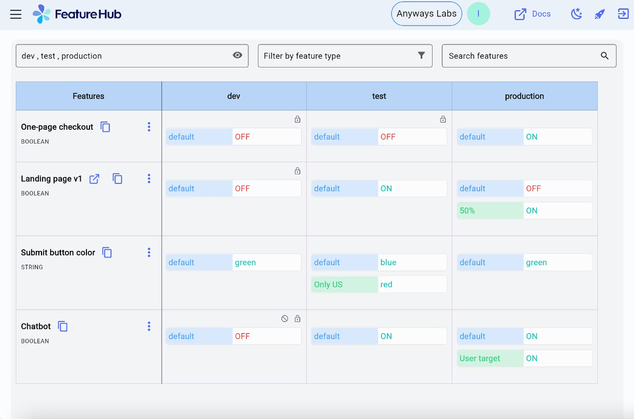
Source
What is FeatureHub?
FeatureHub is a cloud-native open-source platform for feature flags and remote configuration. It’s smaller and more specialized compared to other feature flagging tools. You can think of it as the lightweight, Kubernetes-native option for teams that want flag management without the weight of a full experimentation or analytics platform.
The architecture reflects that philosophy. FeatureHub uses NATS for real-time cloud-native messaging and partners with Fastly to serve feature flags from edge locations globally. When a flag changes, your SDKs get the update via Server-Sent Events.
Supported SDKs
Client-side SDKs:
- JavaScript (includes React, Angular, SolidJS)
- Dart / Flutter
- Swift
- Ruby (for client use in Rails/Sinatra apps)
Server-side SDKs:
- Java (Jersey, SpringBoot, Quarkus)
- C# / .NET
- Go
- Python
- Ruby (for server-side)
- JavaScript / Node.js
- Dart / Flutter
Key capabilities
- Feature flags and runtime control: Manage feature flags and application behavior at runtime without redeploying code. The difference is that you get a runtime control plane within a cloud-native, edge-first architecture (Docker and Kubernetes).
- Governance and audit trails: You get built-in granular permissions, role-based access control, and full audit history to ensure compliance and accountability, even in regulated environments.
- Real-time streaming (SSE): Server-side SDKs receive updates instantly via Server-Sent Events, ensuring global applications reflect flag changes immediately.
- Polling and one-off GET requests: Your client-side SDKs can fetch flag states on demand or at configurable intervals, which gives you additional flexibility for browser and mobile apps.
Pros of FeatureHub
- Your self-hosted deployment has no artificial limits, so you get unlimited flags and users at zero cost. You won’t hit a paywall that forces an upgrade just because you added a staging environment.
- If your infrastructure runs on Kubernetes, FeatureHub fits natively. It offers Docker, Helm charts, and NATS messaging so you’re working with the same tooling your platform team already manages.
- The platform’s new partnership with Fastly means that flag changes reach your SDKs in real time via Fastly CDN edge caching and Server-Sent Events. For globally distributed applications, that means low-latency flag delivery without polling or stale caches.
Cons of FeatureHub
- FeatureHub supports percentage rollouts and multivariate flags, but you can’t analyze outcomes natively. If you want those insights, you’ll need to export the data and analyze it elsewhere.
- Google Analytics is the only analytics integration as of March 2026. If your team relies on Amplitude, Mixpanel, Segment, or your data warehouse for product metrics, there’s no native connection. You’ll have to build that pipeline yourself through Webhooks.
- There’s no feature for flag lifecycle management or staleness detection. As your flag count grows, tracking which flags are still active and which should be cleaned up is entirely manual.
Pricing
FeatureHub offers only one plan for its managed cloud offering. It costs $4.99 per user per month and bills API requests separately on a pay-as-you-go basis:
- Streaming: $0.38 per 10,000 requests
- REST: $0.35 per 10,000 requests
- Test: $0.33 per 10,000 requests
You can try it for free for 30 days.
Who is FeatureHub best for?
FeatureHub is ideal for cloud-native teams running on Kubernetes that want lightweight, self-hosted flag management with real-time streaming. Also, they wouldn’t require built-in experimentation or deep analytics integrations for their workflows.
Ratings and reviews
There are no publicly available reviews on platforms like G2, TrustRadius, or SaaSworthy.
7. FeatBit
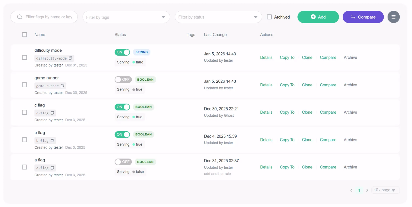
Source
What is FeatBit?
FeatBit is an MIT-licensed feature flag service founded in 2021, built primarily in C#. The platform supports traditional deployment pipelines as well as AI-native workflows, so you can control feature rollouts and experiments without using multiple tools.
The platform itself is an AI-native feature flag platform. This means it can guide release and experimentation decisions using AI agents, even if your team doesn’t have dedicated data scientists.
It also supports self-hosting on Kubernetes, Docker Compose, and in the cloud.
Supporting SDKs
FeatBit provides 9 client-side and server-side SDKs for a wide range of platforms:
- Backend: Node.js, Python, Java, Go, C#/.NET, Ruby, PHP
- Frontend / Client: JavaScript, React, Flutter, Swift, Kotlin
- Edge & other platforms: APIs and SDKs for integration into custom environments
Key capabilities
- Feature flags and remote configuration: Toggle features and manage key-value configurations dynamically across environments. You do get advanced segmentation and targeting, but limited experimentation capabilities.
- AI-guided release decisions: Automate experiments and flag evaluations using AI agents to optimize rollouts.
- AI Copilot: It integrates with coding workflows and developer tools via an MCP server and AI agents. As a result, it can answer queries or suggest actions related to feature flag workflows or rollouts.
- Featbit CLI and developer tools: You get a dedicated command-line interface for managing flags, which integrates with your workflows.
Pros of Featbit
- Your entire team can use FeatBit without a single licensing conversation. Unlimited flags, unlimited seats, no per-environment charges. If you’ve been burned by per-seat pricing, you can consider it.
- If you’re an ASP.NET Core team, FeatBit’s native .NET SDK is arguably the strongest open-source feature flag option for your stack. The C# foundation makes integration feel natural rather than bolted-on.
- The simplified standalone deployment mode (PostgreSQL only) means you can get FeatBit running without managing Kafka or ClickHouse. You don’t have to deal with additional operational overhead if you’re a smaller team.
Cons of Featbit
- The A/B testing will tell you whether a variant is statistically significant, but that’s about it. You can’t conduct complex experimental analysis — for example, Bayesian analysis or CUPED.
- Experiment data doesn’t connect to your data warehouse. You’ll need to export results to Datadog, Amplitude, Grafana, or another tool for deeper analysis.
- While FeatBit’s AI-guided release and experimentation capabilities reduce the need for a dedicated analytics team, they may require teams to trust AI recommendations over manual control. If you’re in a regulated industry, it could pose security and compliance issues.
Pricing
Featbit offers separate pricing plans for cloud and self-hosted infrastructure.
Online infra:
- Free: Up to 1,000 MAU across all connected SDKs.
- Pro: $45 per month for up to 15,000 MAU.
- Growth: $149 per month for up to 80,000 MAU.
- Enterprise: Starts from $3,999 per year for scalable MAU and enterprise features like dedicated SLA and support.
Self-host:
- Foundation: Free for the fully open-source platform.
- Enterprise: It starts from $3,999 per year. You get additional features, such as approval workflows and auto-sync agents.
- Enterprise Premium: You need to contact the team for a quote.
Who is Featbit best for?
Featbit works well for cost-conscious .NET teams that want feature flags with basic built-in A/B testing and zero licensing costs. If you’re running ASP.NET Core and don’t need advanced statistics, it gives you more out of the box than any other tool at this price point.
Ratings and reviews
It’s not listed on any major review platform as of March 2026.
8. Flipper

Source
What is Flipper?
Flipper is the feature flag tool the Ruby community has used for over a decade. It was created by Ruby veteran Johnny Nunemaker (formerly of GitHub) and maintained by Fewer & Faster.
Flipper does one thing and does it well: simple, performant feature flags for Ruby applications. It can be used for a variety of use cases beyond decoupling deployment from release. Engineering teams can also use the feature flags for internal tools, circuit breakers, backup provider cutovers, and temporarily blocking bad actors.
Supporting SDKs
- Ruby: Primary SDK via the Flipper gem.
- JavaScript: For frontend and Node.js environments.
- Adapters: ActiveRecord, Sequel, Redis, Mongo, AS::CacheStore, Moneta, and others for backend storage integration.
- API and CLI: REST API and CLI for custom workflows and automation.
Key capabilities
- Feature flags with flexible gate types: Toggle features on or off for individual users, groups (like beta testers or power users), or a percentage of users. Expression-based rules let you target users based on properties such as plan type, country, or account age.
- Audit history and Slack notifications: Every flag change is logged with timestamps and who made it across all environments. Slack integration pushes real-time notifications when flags change, so your team stays in sync.
- Flag lifecycle management: You can assign feature owners to each flag and track when each flag was last evaluated in each environment to determine when it’s safe to remove. You can also use tags to categorize flags by type (temporary, circuit breaker, etc.) or application area.
- Local-first resilience with adapter-based storage: Flag evaluations happen locally within your application, so performance is unaffected, and flags keep working even if Flipper Cloud goes offline.
Pros of Flipper
- If you’re on Rails, you can adopt it quite quickly. All you have to do is add the gem and run a migration to start managing flags.
- The platform is quite flexible and easy to use. It can support custom use cases, such as creating actor identifiers and setting up analytics event tracking.
Cons of Flipper
- It’s Ruby only, and TypeScript support is experimental. If your architecture includes Python services, Go microservices, or mobile apps, it’s not the right platform for you.
- There are no A/B testing or experimentation features. You can enable a feature for 50% of users, but you can’t measure whether it made a difference. For actual experimental analysis, you’ll need a completely separate tool and workflow.
- Every flag is Boolean-only. If you need multivariate experiments (show 3 different checkout flows to different segments), you’re managing separate flags for each variant.
Pricing
- Open-Source Gem (Free): Only 5 flags with two members are allowed on the plan.
- Cloud Bronze: $49 per month for up to 10 users, unlimited flags, one-day analytics retention period, and one custom environment.
- Cloud Silver: $149 per month for up to 25 users, one-week analytics retention period, and two custom environments.
- Cloud Gold: 50 seats for up to 50 users, one-month analytics retention period, and advanced permissioning capabilities.
Who is Flipper best for?
Rails developers and Ruby-first teams that want the simplest, most ergonomic feature flag experience available for their stack. If you don’t need experimentation, multi-language support, or analytics — and you just want flags that work beautifully in Rails — Flipper has been the answer for over a decade.
Ratings and reviews
They’re not listed on G2, Capterra, or TrustRadius. Most of the community feedback lives in developer blogs, Ruby forums, and GitHub, and it’s mostly positive because of its ease of integration and reliability.
Which open-source feature flag platform is right for you?
Here’s a quick refresher to decide which one’s the best choice for your needs:
- Choose GrowthBook if you want the most complete, enterprise-class, open-source feature flagging platform: 24+ SDKs with sub-millisecond local evaluation, Safe Rollouts with warehouse-connected guardrail metrics, SOC 2 Type II and ISO 27001 compliance, and caching at every layer of your architecture. And when you’re ready to measure impact, the built-in experimentation engine (Bayesian, frequentist, CUPED, sequential testing, bandits) means you never have to rip out your flagging infrastructure to add A/B testing.
- Choose Unleash if enterprise governance and compliance are non-negotiable. You get features like change request approvals, audit logging, ServiceNow integration, and FedRAMP support, which make it the default for regulated industries where flag changes require the same rigor as production database migrations.
- Choose Flagsmith if you want the fastest path to a working flag with remote configuration and native analytics integrations. It’s ideal for solo developers and mid-market teams that prioritize safety and speed over experimentation.
- Choose PostHog if you’d rather consolidate analytics, flags, experiments, and session replay into one platform than optimize any single capability. The generous free tier and integrated analytics make it a strong fit for early-stage teams that want breadth over depth.
- Choose Flipt if your team manages everything in Git and wants flag changes to go through the same PR and CI/CD workflow as application code.
- Choose FeatureHub if you’re running on Kubernetes and want lightweight, cloud-native flag management with real-time streaming.
- Choose FeatBit if you’re a .NET/C# team that wants feature flags with basic built-in A/B testing at no licensing cost.
- Choose Flipper if you’re a Rails team that wants the simplest, most ergonomic feature flag experience available for Ruby.
Avoid vendor lock-in with the right open-source feature flagging platform
Choosing an open-source platform for your feature flagging needs doesn’t have to be overly complicated. But you do need to know why you’re moving to a full-fledged platform and how it fits into your tech stack.
The right platform can change how your team ships features and iterates with confidence. The best open-source options give you safe deployments, sophisticated targeting, warehouse-connected guardrail metrics, and the flexibility to cache and extend the platform to fit your architecture.
The difference is that the platform was built with experimentation in mind — and feature flags act as the core delivery mechanism for this purpose. If that’s a core use case for your organization, it’s time to make the switch.
Learn more about how GrowthBook compares to PostHog, LaunchDarkly, and many others.
Start for free or book a demo to see how GrowthBook can help you deploy features at scale with a more data-driven approach.
See GrowthBook's flags in action
Join a live demo to see open-source feature flags, targeting, and experiment analysis in one walkthrough.
Pick a Demo Date
How Fanatics made experimentation a strategic growth driver
Ten years ago, experimentation at Fanatics was a boutique CRO team running about 10 tests in a month, mostly conversion nudges. Today, they run close to 100 experiments a month across a multi-billion dollar e-commerce business with 60 million monthly visits and roughly 900 sites spanning every major sports league.
The impact is staggering. Experimentation consistently delivers about 8% of total annual growth at Fanatics. When you are a $3B business, 8% means hundreds of millions in growth, year after year.
Medha Umarji, VP of growth and experimentation at Fanatics, joined me on The Experimentation Edge to share how they built this engine. The story is not about a single tool or methodology. It is about culture, infrastructure, and a relentless commitment to learning from every test they run.
It starts at the top: a CEO who lives the data culture
The most common barrier to scaling experimentation is not technical. It is cultural. Teams struggle to get leadership buy-in, fight to justify test cycles, and spend more time selling the idea of testing than actually testing.
Fanatics does not have that problem. Their CEO, CPO, and the entire C-suite are actively engaged in experiment outcomes. But what makes Fanatics unusual is not just executive support. It is executive humility.
"Our CEO is so data-driven," Medha told me. "He literally consumes Excel spreadsheets. He does not shy away from data on the slides. He wants to see everything. And he will question everything." More importantly, he is openly willing to have his mind changed when the data contradicts his intuition.
That humility at the top cascades through the entire organization. When the CEO demonstrates that his intuition isn’t what matters, it’s the data. He is leading by example and sets the tone for everyone else. As Medha put it, "that humility is very much a part of the culture here."
The result is a fundamental shift in how teams approach new initiatives. The conversation at Fanatics moved from "why should we test this?" to "how do we test this?" When people default to asking how to measure something rather than whether they should measure it at all, you know experimentation has become strategic.
Building the learning infrastructure: the experimentation wiki
Culture gets you buy-in. Infrastructure turns that buy-in into compounding returns.
Early on, Fanatics had the same problem most experimentation teams face: test results lived in scattered PowerPoints and Word documents buried in shared drives. Finding what you had already learned was almost as hard as learning it in the first place.
So they built a wiki. Not a passive knowledge base, but a structured system where every test result lives alongside causal interpretations, screenshots, video recordings of the experience, and a detailed next-steps section.
The next-steps section is where the magic happens. Those recommendations auto-feed a JIRA backlog, creating a flywheel that keeps the experimentation engine running without waiting on new engineering work. The features are already built from previous tests. The team fills roadmap bandwidth gaps with iterations sourced directly from the wiki.
"It has sort of become our growth engine," Medha said. And she means that literally. The wiki does not just store results. It generates the next wave of experiments.
Meta-analysis: turning individual tests into institutional knowledge
A single test tells you what happened. A pattern across tests tells you why.
Medha pushes her team to build a meta-analysis table after running 3 or more tests on the same feature. Three messaging variants, 3 price points, 3 layout treatments, all summarized in one consumable view. Stakeholders can skip individual test briefs and see the pattern at a glance.
This practice converts isolated experiments into institutional knowledge. Instead of each test existing as a standalone result, the meta-analysis reveals which variables actually matter and which ones are noise. It is the difference between having a pile of test results and having a learning program.
The wiki is now also feeding AI tools like Glean and Claude, enabling self-serve analysis across the entire test history. Teams can ask questions about what Fanatics has already learned about a feature without reading every individual brief. The institutional knowledge is becoming searchable and composable.
Going beyond surface metrics: the ads experiment
Rigor at Fanatics goes deeper than statistical significance. Medha shared a story that illustrates exactly how.
The team tested removing ads from their product grid pages. Everyone wanted the ads gone. They cluttered the experience and made the site look less polished. The first test run returned a positive result at 95% statistical significance. Revenue was up. The team celebrated.
But at Fanatics, a top-line win is not the end of the analysis. It is the beginning. The team traces every positive result through a chain of micro-metrics: Did users scroll more? Were more products viewed? Did grid-to-cart conversion increase? If the top-line metric moved, something in the user behavior should have moved too.
In this case, the causal chain did not hold up. The micro-metrics were not moving in ways that explained the revenue lift. So they did something most teams would not do: they turned the test off and reran it.
The second run was flat. A textbook false positive, the 1-in-20 that a 95% confidence level tells you to expect. They had tested this same change 6 to 8 times over the years, and the result was always the same: flat.
The customer insight was counterintuitive. Even though the website looks cleaner without ads, customers simply gloss over them. Banner blindness is real. The ads were not degrading the measured experience.
The lesson is clear: a single metric is not enough to declare a win. If you cannot trace the causal chain from the user behavior change to the top-line result, you do not have a real finding. You have a number. Replication and guardrail metrics are how you tell the difference.
Risk avoidance: the underrated half of experimentation
Most teams measure experimentation success by the wins they ship. Medha argues the bigger value comes from the losses they prevent.
"Your odds of winning at roulette or poker are probably higher than your odds at winning at experimentation," she told me. And the data backs her up. Most experiments are inconclusive or negative. Only about 10-20% produce a measurable win.
But think about what that means in practice. If you are running 10 experiments and 2 are winners, a few are flat, and 1 or 2 are losers, simply catching the losers before they ship can double your net growth impact. The winners add value. Avoiding the losers preserves it.
This is where Fanatics built their "do no harm" framework. For changes that are hard to measure with traditional A/B testing metrics, like branding plays, customer sentiment improvements, or post-purchase experience changes, they use non-inferiority guardrails. As long as primary KPIs are not hurt, teams can ship changes supported by user research rather than conversion lifts.
The danger is assuming a change will "do no harm" without testing it. Humans are terrible at guessing what will have an impact and what will not. A change that seems obviously harmless can quietly erode conversion, and you will never know because your overall business growth masks the damage. These are the silent killers: bad changes hidden by a growing top line. You never know what your growth could be if you were catching every loser.
Medha says quantifying avoided risk is "the next frontier" for her team. It is an under-quantified, under-appreciated dimension of experimentation value, and one that more teams should be tracking.
What other teams can learn from Fanatics
Fanatics did not build a world-class experimentation program overnight. It took a decade. But the principles behind their success are applicable at any scale.
Start with leadership buy-in rooted in humility, not just support. Build infrastructure that turns test results into a self-sustaining backlog. Invest in meta-analysis so individual tests compound into institutional knowledge. Go beyond surface metrics and trace the causal chain before declaring wins. And measure the value of risk avoidance, not just the value of wins shipped.
Medha's advice for teams just getting started: find the teams already inclined toward data, build wins with them, and keep the barrier low. Do not gate-keep rigor so tightly that nobody adopts. You can always raise the bar once the culture is in place.
Listen to my conversation with Medha on The Experimentation Edge podcast. And if you are building your own experimentation program, GrowthBook gives you the platform to run, analyze, and learn from every experiment at scale.
12 common feature flag mistakes to avoid
Feature flags almost always start as a matter of convenience. Maybe you’d like to control a feature’s release, or reduce the risk associated with every deployment. But the ones you ship today keep running tomorrow, and the ones you ship next quarter run alongside them.
Next thing you know, you’re operating a distributed system inside your distributed system—one with its own state, its own consistency problems, and its own failure modes.
The trouble is that most of these failures are quiet. And you won’t know until they do real damage to your infrastructure.
In this article, we’ll walk you through 12 feature flagging mistakes and how you can avoid them irrespective of your team size and usage.
Why feature flags fail in real-world systems
Like any other tool, feature flags are prone to incidents because of how they’re used in the first place. If you look at public postmortems from engineering teams that run thousands of flags, the damage traces back to how a flag was created or managed.
Now think about how you treat a feature flag. It gets a pull request, a Slack emoji, and a long, quiet life nobody tracks. That asymmetry is where things break down. At 10 flags, you carry the full picture in your head. At 100, you rely on a spreadsheet and good intentions. At 1,000, ownership becomes tribal knowledge, and stale flags pile up faster than anyone can clean them.
It’s also why companies like Uber built Piranha, a tool specifically designed to retire more than 2,000 stale flags. Its teams realized that manual cleanup processes could never keep up with the pace at which flags were created.
You don’t know what you don’t know. So, incidents also happen because you’re not sure what problems flags can create in the first place. Unless you know the pitfalls, it’s hard to implement the right governance measures to prevent that.
12 common feature flag mistakes that reduce its efficacy
Here are some of the most common mistakes engineering teams make while using feature flags. These mistakes fall into three broader categories, which include:
- Implementation mistakes: These issues live in your code and are introduced when you create the flags themselves. They usually stay invisible until something breaks in production.
- Operational mistakes: These are process gaps that widen over time and turn manageable flag counts into unmanageable debt.
- Strategic mistakes: These are the larger missed opportunities because it includes the ways your flag practice could generate more value but doesn't, because nobody designed for it.
Implementation mistakes with feature flagging
1. Reusing feature flags
You shipped a flag six months ago. The feature is live, everyone’s happy, and the flag name is just sitting there in the codebase. So when you’re adding a toggle to a new feature, you might think about reusing the name. But that’s a bad idea.
Knight Capital learned this in the most expensive way possible. In 2012, an engineer repurposed a flag name still tied to an obsolete trading algorithm. The deployment activated the old code path instead of the new one, and within 45 minutes, the firm lost $460 million.
How to avoid it: Treat flag names as immutable. Once you’ve deployed a flag, retire the name after you retire the flag. If you’re using a feature flagging platform like GrowthBook, it enforces this with regex-based naming validation that catches duplications before they reach production.
2. Using client-side flags for security
You use a feature flag to gate access to premium features or admin functionality on the client side. But the problem is that client-side flags are visible to users. Anyone with browser DevTools can:
- Inspect the SDK payload and see every flag and its rules
- Figure out exactly what’s being gated
- Modify the local flag state
- Call your API directly to bypass it
Feature flags control visibility, not access. They decide what users see—not what they’re authorized to do.
How to avoid it: Keep your authorization logic server-side. Use feature flags for UI presentation but enforce actual access control through your backend. For an additional layer of protection, GrowthBook supports encrypted SDK payloads that obfuscate client-side flag configurations. So it makes it much harder to reverse-engineer your flag rules.
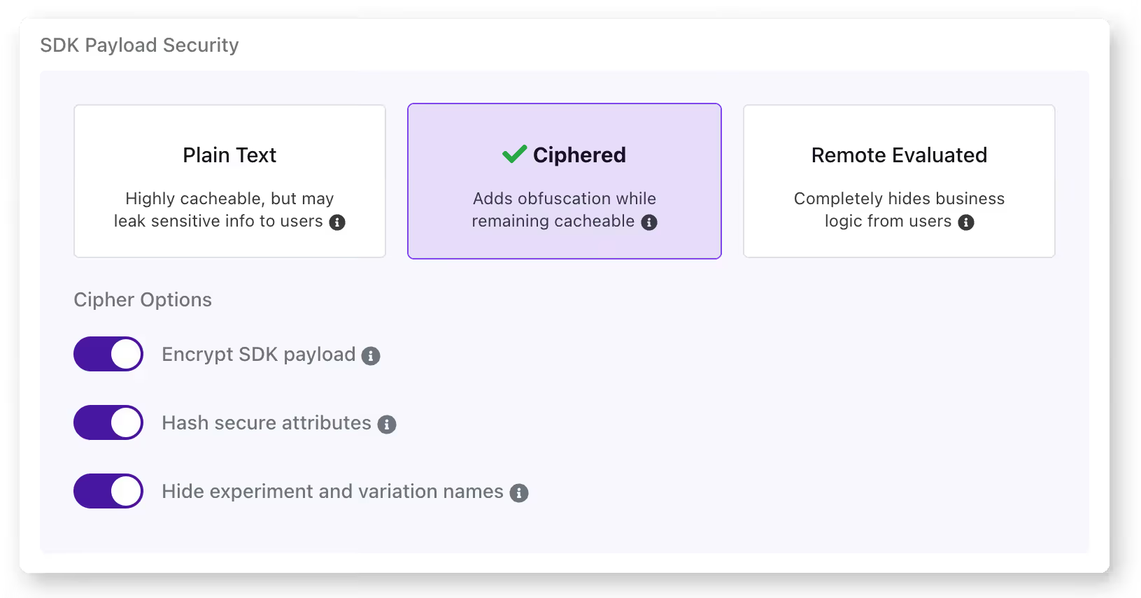
3. Not testing all flag states
Your CI/CD pipeline tests your application with the current production flag configuration. But does it test what happens when the new flag is turned on or off? If you’re only testing one state, you’re assuming the other works, and that assumption may not always hold up in reality.
That’s how Slack dealt with a 6-hour outage back in 2020. When its team rolled out a feature flag, it triggered a performance bug. Even though they caught the bug and rolled back within 3 minutes, the rollback left a stale HAProxy state that caused the outage.
How to avoid it: You can avoid this by testing the current production state, the new state you’re rolling out, and the rollback state for every flag you deploy. GrowthBook offers a simulation tool that lets you see how different rules impact what users see and you can even test it in different states.
That said, it’s a simulation of what user see, not how the flag will behave so you need to run an actual experiment for that purpose.
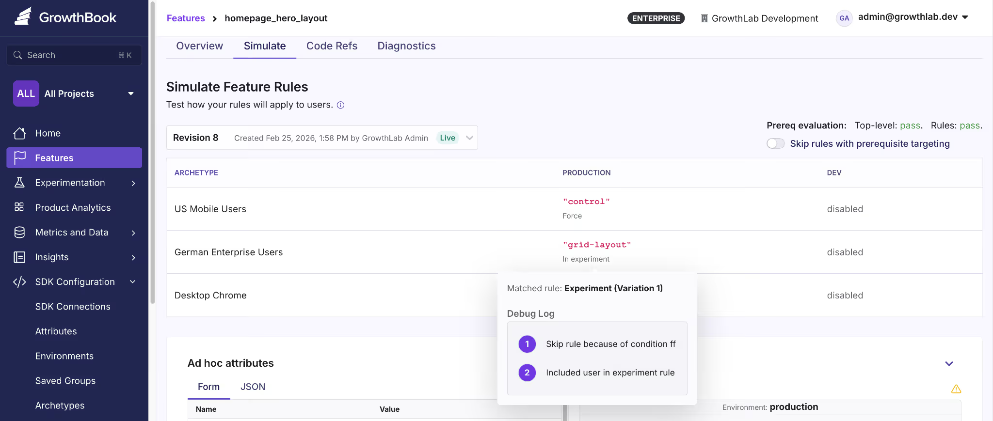
4. Overloading a single flag with too much logic
Let’s say you created a flag called new-dashboard. It was meant as a toggle for the new UI. But over time, your product team could’ve asked you to display the new analytics panel if the user is in the Enterprise tier. Now the flag controls two behaviors and you can’t change one without risking the other.
Even if you have 10 flags with clean boolean logic, you’ve already created 1,024 possible code paths. Overloading every single one of those with complex logic complicates this.
How to avoid it: Apply the same single-responsibility principle you’d use for any function or class. If a feature requires multiple independent toggles, create separate flags and use prerequisite flags to define their dependencies.
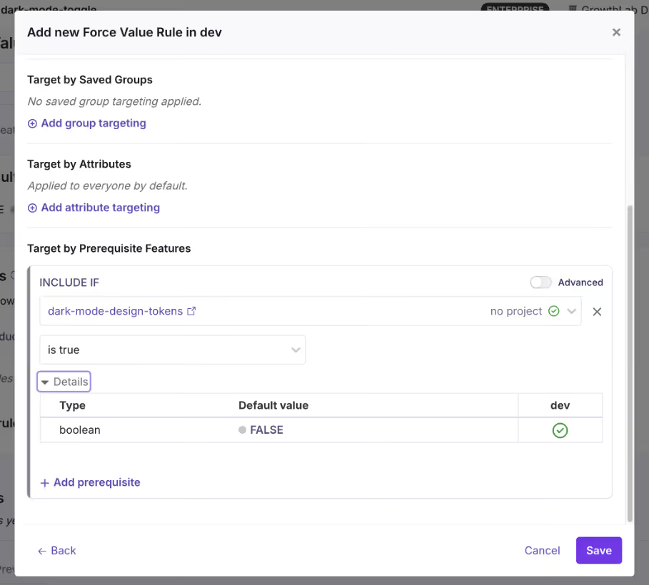
Operational mistakes with feature flagging
5. Letting flags become zombie flags
A zombie flag is a flag that’s still in your codebase but no longer serves any useful purpose. It increases your technical debt and the problem doesn’t stop there. Every zombie flag adds a conditional branch that your team has to debug or manage in the future. That’s why you need the right governance measures in place to stop flags from accumulating in the first place.
How to avoid it: The simplest way is to define the flag type and the time it should be live. For example, if it’s a release toggle, set a calendar reminder or Jira ticket to clean it up after 30 days.
Or use a feature flagging platform that offers stale feature flag detection. For instance, GrowthBook identifies stale flags automatically, and when you use it with Code References, you’ll know where these flags are present—making cleanup easier.

6. Poor naming conventions
Compare these two lists:
// Typical naming convention
gb.isOn("ff-123")
gb.isOn("test")
gb.isOn("experiment_2")
gb.isOn("new-thing")
// Self-documenting
gb.isOn("new-checkout-flow")
gb.isOn("holiday-2024-promo-banner")
gb.isOn("pricing-page-v2-experiment")
gb.isOn("premium-analytics-entitlement")The first set is vague at best. If something goes wrong, you’ll spend too much time wading through your commit history and Slack threads to figure out what it means. The second one, however, tells you why the flag was made and for which rollout or experiment.
How to avoid it: Establish a naming convention early and enforce it. A good pattern includes the feature area, intent, and optionally a timestamp or version:
{feature-area}-{description}-{type}So: checkout-redesign-release, pricing-page-v2-experiment, eu-compliance-widget-killswitch. GrowthBook lets you enforce naming patterns with regex validation. If you accidentally reuse an older flag’s name, it’ll reject it and force you to create another one.
7. No ownership or lifecycle management
If you don’t require your team to own a flag when they create or use it, you’ll end up with a codebase full of decisions nobody can explain. It makes the cleanup and auditing process almost impossible because no one has the necessary context for the flag’s purpose and usage.
Without it, you can’t answer basic questions:
- Who do you page when this flag behaves unexpectedly?
- Who decides when it’s safe to retire?
- Who’s accountable if it causes an incident?
How to avoid it: Assign an owner to every flag when it’s being created. It has to be an individual so there’s a clear line of accountability when they move out of the role—and someone else steps in. GrowthBook supports flag-level ownership and project-based organization, so you can filter by owner and quickly see who’s responsible for what.
8. Ignoring rollback procedures
Most teams think about rollback as “just turn the flag off.” And for simple boolean flags, that might work. But you also need to remember that flags don’t exist in isolation. A rollout can trigger side effects that don’t reverse when you roll it back.
How to avoid it: For every flag rollout, document what happens beyond the flag itself. Ask:
- Does this rollout trigger any irreversible writes?
- Will caches, queues, or third-party integrations retain state from the rolled-out version?
- Does the rollback path need its own deployment, or is flipping the flag truly enough?
This is where testing comes into the picture. But also, you should have a way to gradually roll out features so that when you see an inkling of something problematic, you can roll back before the blast radius expands.
For instance, GrowthBook offers a Feature Diagnostics that lets you inspect how flags are actually evaluated in production. As a result, you can verify what’s actually happening or has happened in one place.

Strategic mistakes with feature flagging
9. Treating feature flags as a short-term tool only
Most teams adopt feature flags for one reason: safer releases. And that’s a perfectly good reason. But that’s never the end of it. If you only think of flags as temporary release wrappers, you never build the governance or engineering mindset you need to sustain them at scale.
Over time, you’ll end up with thousands of ad hoc flags that become a pain to manage or even clean up because nobody designed a system to handle them. That’s why you need to treat feature flags as a critical part of your code’s infrastructure.
How to avoid it: Build a governance system that acts like you’ll be managing 100 flags in a week, even if you’re not right now. GrowthBook gives you the scaffolding for this. Here are a few ways it does that:
- Force naming conventions through regex validation
- Allow flag and project-level ownership
- Provides the ability to schedule flags to roll out and back
- Build approval workflows to control who can deploy flags
- Create kill switches that work as long-lived flags

10. Lack of observability and metrics
Unless you have observability tied to your flags, you’re flying blind. Most engineering teams monitor infrastructure metrics like error rates but don’t connect the flag’s state to the product’s metrics. Let’s say there’s a 5% drop in a payment feature’s performance, you won’t notice it in real time.
How to avoid it: Tie your flags to the metrics that matter. Every flag rollout should have at least one success metric and one guardrail metric defined before you flip the switch. GrowthBook’s Safe Rollouts does this natively. You can select the guardrail metrics and the platform monitors behavior in real time.
You can even set the rollout cadence using Ramp Schedules where you can define the percentage thresholds and the platform handles the increments automatically. And because the platform is warehouse-native, it analyzes your metrics directly in your data warehouse—reducing latency.
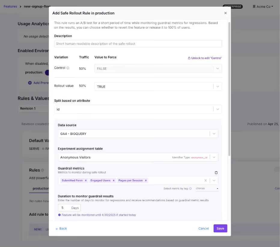
11. No segmentation or controlled rollouts
Gone are the days when Big Bang deployments were the only way to release a feature or system. You no longer have to wait with bated breath for every deployment, because controlled rollouts let you test a deployment with a small segment of users before rolling the feature out completely.
You start with 5% of traffic, monitor the results, and expand gradually. If something goes wrong, you’ve affected a fraction of your users instead of all of them.
How to avoid it: Use percentage-based rollouts as the default for every flag, and use targeting rules to control who sees the feature, not just how many.
GrowthBook supports attribute-based targeting with AND/OR logic, where you can segment by geography, subscription tier, device type, company ID, or any custom attribute you define. You can use that with Saved Groups for reusable audience segments and percentage rollouts with deterministic hashing, so the same user always gets the same experience.

12. Not connecting feature flags to experimentation
This problem stems from a lack of observability. You already have the delivery mechanism and the underlying infrastructure in place to experiment. But many engineering teams still don’t measure performance using this system.
They ship the feature, confirm it doesn’t break anything, and move on. But they never ask: “Did it actually improve anything?”
How to avoid it: When you create a flag for a new feature, ask whether it’s also a candidate for an experiment. If so, attach metrics to the flag and measure the difference between the old and new experiences. Many engineering teams call these “do no harm experiments” where you’re not running a full-blown experiment. But you’re attaching a few guardrail metrics to every rollout to see if a release affects something that matters.
Alternatively, if you’re already running experiments, start using feature flags to make the process easier.
GrowthBook makes this simpler by keeping feature flags and experiments on the same platform. You can turn any feature flag into an experiment with a few clicks by just:
- Assign users to control and variation groups
- Defining success metrics
- Using the GrowthBook’s stats engine for analysis
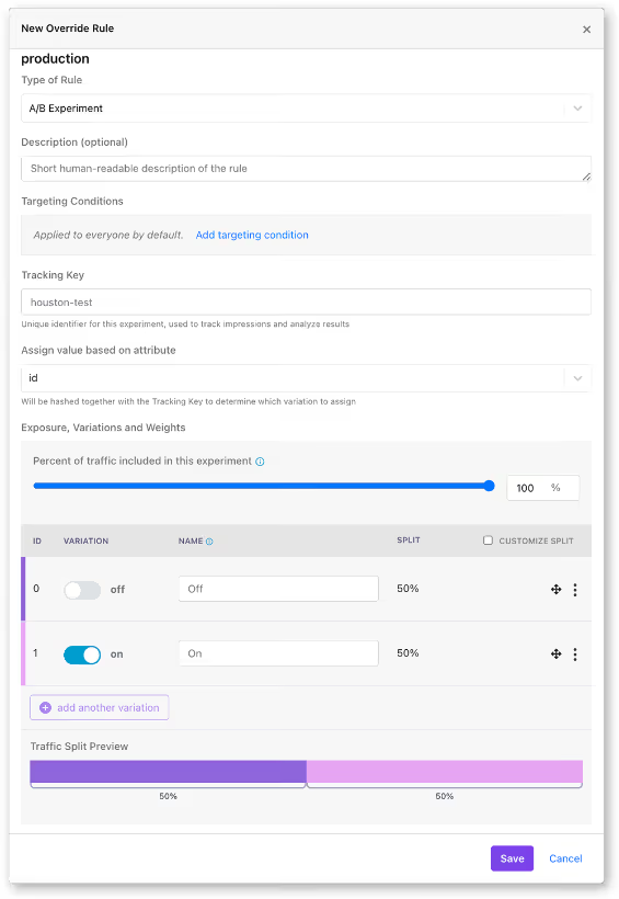
How lack of proper feature flagging practices can break the system at scale
At 20 flags, these mistakes are minor inconveniences. But at 200 flags, they’re systemic risks.
When you start implementing feature flags at scale, it turns them from a simple coding tool to a critical part of your coding infrastructure. At that level, even small mistakes can balloon into complicated (and expensive) incidents if you don’t manage them well.
Facebook’s 2021 outage is one example of this pattern. During routine maintenance, an engineer issued a command to assess backbone capacity via a functional global ops flag.
Unfortunately, it unintentionally severed all connections between Facebook’s data centers. Even though the internal audit system should’ve blocked the command, a bug allowed it through. The 6-hour outage resulted in a $100 million revenue loss and affected 3.5 billion users.
That’s why you need to implement these best practices carefully because the incidents don’t scale linearly. If you’d like to learn how to build the right feature flagging infrastructure at scale, check out this guide.
Related: Learn more about release management best practices to follow.
Where most teams go wrong with feature flags
You don’t experience high-risk incidents because of feature flags themselves. But rather because of how you use them.
Ultimately, feature flags are a distributed system that’s constantly growing within your infrastructure. That’s why you need the same discipline you apply to any other production infrastructure. Measures like feature flag governance and observability are table stakes today—and the only way to prevent technical debt in the long run.
If you’re looking for a feature flagging platform that operationalizes this line of thinking, try out GrowthBook for free.
.avif)
A practitioner's guide to treatment effects in experimentation: ATE, CATE, ITT, LATE & ATT explained
A practitioner's guide to the treatment effects hiding behind your experiment’s number — ATE, CATE, ITT, LATE, ATT — with the vocabulary for telling them apart.
What treatment effect is your experiment actually measuring?
Your junior data analyst reports from the free trial experiment: customers who activated the trial ordered +2.0 more times per month than those who didn't.
Your senior data scientist investigates the same data and reports: the Average Treatment Effect of the trial offer is +0.9 orders per month per customer.
Same experiment, two numbers. Which one goes in the deck?
Both sound reasonable on the surface. Only one of them is a fair answer to a well-defined question. The other conflates the effect of the offer with the pre-existing differences between customers who engage with offers and customers who don't.
Every experiment looks like a single number on a dashboard, but the same data can be summarized in more than one way. The number you see depends on who you're averaging across, what you actually randomized, and whether you count the customers who ignored the treatment. This piece walks through those choices using a framework called potential outcomes, and gives you the vocabulary for asking which number actually answers your business question.
Two customers, two treatment effects
You run a food delivery platform. There's a subscription: pay a monthly fee, get free delivery on every order. It pays for itself at around two orders per month, but take-up is poor. Most customers don't find it, or they just don't want yet another subscription to manage. To enlist them, you run a 30-day free trial. The outcome you care about is each customer's monthly order frequency: the number of deliveries they place in a month.
Think about two customers in your sample. Adiya orders four or five times a month. She's a high-frequency customer who knows the app inside out; she'd probably try the subscription on her own eventually. Marco orders once or twice a month. He doesn't explore features beyond what he needs.
If the free trial landed in front of them, what would happen?
Adiya is already ordering a lot, and free delivery wouldn't meaningfully change her habits. Her frequency goes up by about +0.5. Marco is different. He'd never bother with the subscription on his own, but if the trial shows up in the app, he tries it, and discovers that free delivery feels better than he expected. He starts ordering more often. His frequency goes up by +1.5.
Same offer, very different effects.
Two potential outcomes per customer
Look carefully at what we just said about Adiya. Her frequency goes up by +0.5 "if the trial lands in her app." That's a statement about a hypothetical. It implies there are two versions of Adiya's purchasing behavior: one where she receives the trial offer, and one where she doesn't. Each version produces a different order frequency.
Adiya's two versions: about 4.5 orders per month without the offer, about 5 with it. Marco's two versions: about 1.5 without, about 3 with. The difference between the two versions is the effect of the trial on that customer.
These two versions are called potential outcomes. We label them Y(0) for "without the offer" and Y(1) for "with the offer." For each customer, Y(1) − Y(0) is the effect of the offer on them.
In the real world, each customer only lives one of their two versions. If Adiya is offered the trial, we observe her Y(1); her Y(0), the world where she wasn't offered, never happens. We can never compute her individual Y(1) − Y(0). This is the fundamental problem of causal inference (Holland, 1986): you never see both potential outcomes for the same customer, so you can never measure directly a causal effect for any individual.
What you can do, and what the rest of this post is about, is measure averages across many customers. Randomization is what makes those averages fair to compare.
Picturing potential outcomes
Now let's visualize Adiya and Marco alongside 18 other customers.
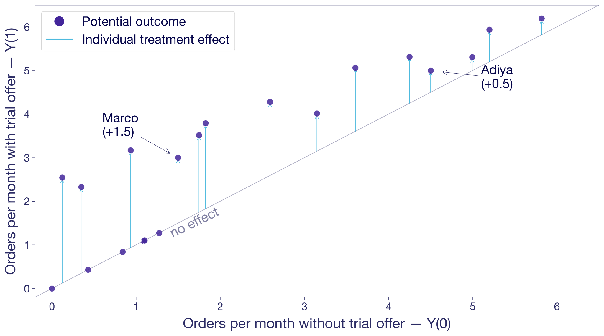
Each dot is a customer. The x-axis is their Y(0), their frequency without the trial offer. The y-axis is Y(1), their frequency with the offer. A dot on the 45-degree line means the offer changes nothing for that customer. A dot above the line means the offer moves them to order more. The vertical distance from the line is that customer's treatment effect.
Adiya sits a little above the diagonal, +0.5. Marco sits noticeably higher, +1.5. Most other customers are in the same ballpark. A few sit right on the line because the offer did nothing for them.
This is the hypothetical view from the previous section: both potential outcomes for every customer, side by side. In the real world, you only ever see one outcome per customer.
What could this look like with a larger sample? The next figure shows the same hypothetical pairs of potential outcomes for 10,000 customers. The cloud tells you something the 20-customer version couldn't. Most customers sit above the 45-degree line, so the offer works for most of them. But the vertical distance varies wildly from customer to customer. Some customers float more than two orders above the diagonal, others sit right on it. The free trial's effect isn't a single number. It's almost as many different numbers as there are customers.
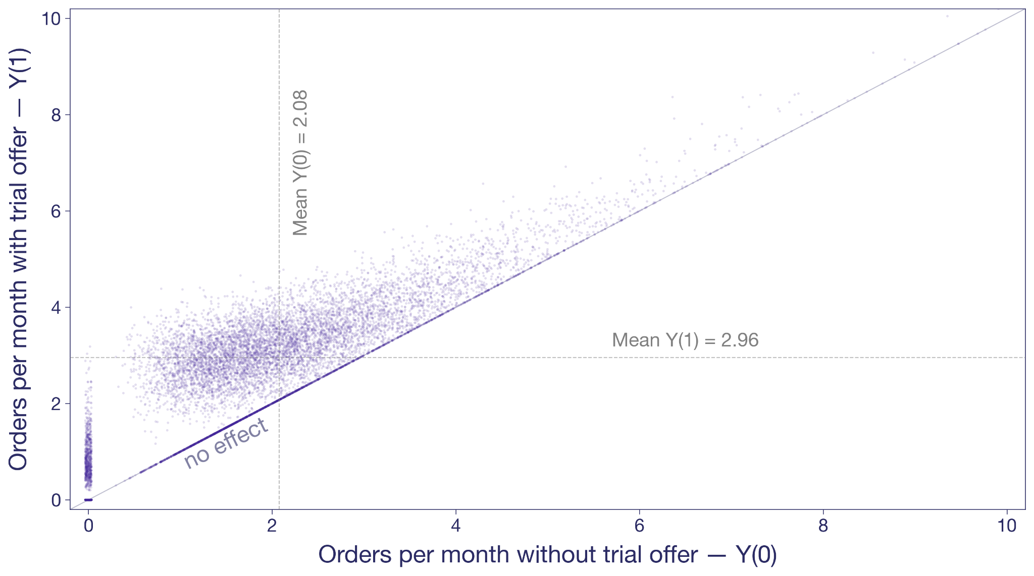
The dashed gray lines mark the averages. Without the offer, this population would order about two times per month. With it, almost three. That's the level we'll come back to.
Measure lift more precisely
See how variance reduction techniques tighten your treatment effect estimates so smaller effects become detectable.
Explore Variance ReductionSelection bias: mistaking intent for treatment effect
Before we get to randomization, look at what happens when you try to measure the effect the obvious way, without randomization.
A junior analyst looks at customers who were offered the trial and splits them into two groups: activators who took it up, and non-activators who didn't. He compares their orders. Activators averaged +2.0 orders per month more than non-activators.
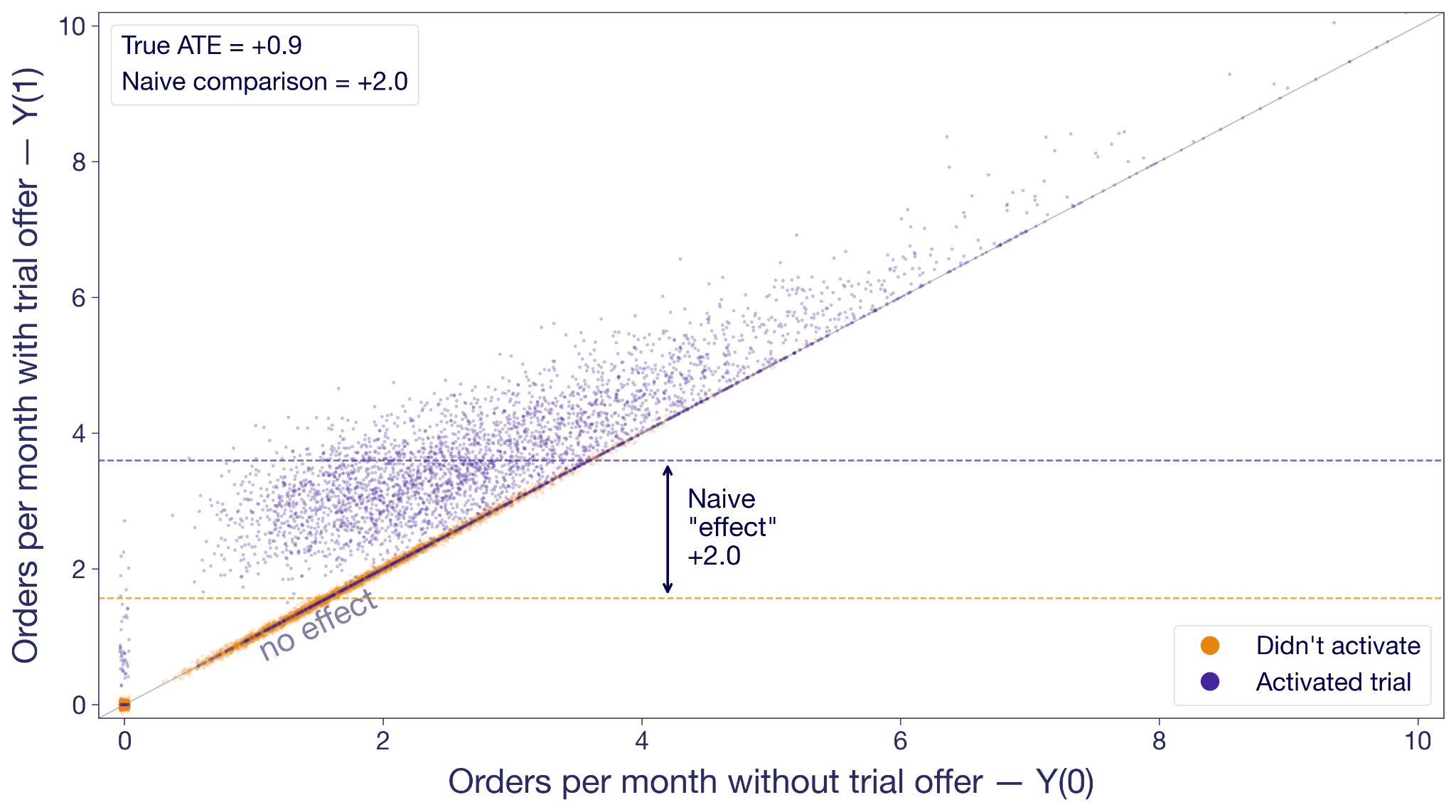
Activators are in purple; non-activators are in orange. The non-activators cluster along the 45-degree line because the offer didn't change their behavior; they never engaged with it. Many activators float above the diagonal, most of them noticeably higher.
But look at where each group sits on the x-axis. Non-activators are concentrated on the low end. These are the customers who would not order much regardless. Activators skew toward higher no-trial order rates. They are more engaged anyway.
The junior analyst's +2.0 isn't the effect of the trial offer. It's the effect of the offer on activators plus the baseline difference in order intent. He's conflating two things at once: the effect of the offer, and the fundamental difference in intent between customers who engage with offers and customers who don't. This is called selection bias, and in this analysis it's inflating the estimate by more than a factor of two.
Why randomization fixes the bias
Random assignment breaks the selection bias. Instead of splitting customers by a decision they made in response to the experiment, you split them before they've decided anything.
Offer the trial to a random half of your customers and hold it back from the other half. Now you can expect the groups to have the exact same baseline intent, because the only thing that made them different was chance. By chance alone, you now observe Y(0)'s in the control group, and Y(1)'s in the treatment group.
Now the comparison is fair. Any difference in outcomes between the groups has to come from the offer itself, because the offer is the only thing the groups differ on.
The fundamental problem still applies to individuals: you'll never see both of Adiya's potential outcomes. Randomization solves the group version of it: treatment and control are balanced on everything except the offer, which means you can fairly attribute the difference in their averages to the trial offer.
The Average Treatment Effect (ATE)
Let's take a small slice to see the magic of randomization concretely. Here are ten customers from the experiment. For each we've drawn both potential outcomes and noted which variation they were randomly assigned to. In reality you only see the outcome under their assignment. The rest are "?".
The true average effect across these ten, if you could see everything, is +0.9 orders per month. In the experiment you only see one outcome per customer, but you can take the mean of what you do see in each variation. The observed treatment-group mean is 3.0; the observed control-group mean is 2.0. The difference is +1.0, close to the true effect. With such a small sample, luck can drive the estimate in either direction. But in expectation, they're the same.
Under random assignment, the difference in observed means is an estimate of the average of those individual effects. Therefore, it is called an estimate of the Average Treatment Effect (ATE).
What is the Average Treatment Effect (ATE)?
The ATE is the average of Y(1) − Y(0) across all customers in your experiment. You can never compute it directly because you never have both potential outcomes for any one customer. But under random assignment, the difference in observed group means is an unbiased estimator of the ATE.
The ATE is what a standard A/B test is designed to estimate. Multiply it by your customer base and you have the business case to deploy.
Why the ATE isn't the full story
The ATE is by definition an average. Like any average, it hides the shape of the distribution behind it.
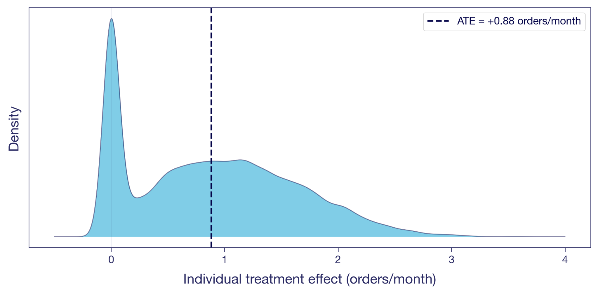
Here's the distribution of the individual treatment effects illustrated in the scatter plot above. A visible chunk of customers sit at exactly zero: the offer did nothing for them, the dots that sat on the diagonal earlier. Many others have a positive effect. A few gain more than two orders a month. The ATE of +0.9, marked as the dashed line, is the mean of this whole distribution.
Two customers at the same Y(0) can have very different individual effects, and two customers with the same individual effect can be at very different Y(0)s. The ATE collapses all of that variation into one number.
The Conditional Average Treatment Effect (CATE)
A nice average. Is that really all there is? Nothing more to say about the offer?
Back to Adiya and Marco. Her effect is +0.5, his is +1.5. The ATE of +0.9 falls between them, but it doesn't really describe either of them. It's an artifact of mixing two very different customer types into a single number.
Figure 4 shows the spread, but nothing about who sits where on it. To dig further, we can split the sample into subgroups we believe respond differently. For example, take the same 10,000 customers from Figure 2 and split them by their order frequency in the three months before the experiment. Split at the median, and you get two groups: low-frequency customers (the Marcos) and high-frequency customers (the Adiyas).
The average effect within each subgroup has a name of its own: the Conditional Average Treatment Effect, or CATE. Every dimension split in your experiment scorecard is a CATE.
What is the Conditional Average Treatment Effect (CATE)?
A CATE is the ATE conditional on one or more characteristics. It's the answer to "what's the treatment effect for customers who look like this?", where "this" can range from a broad subgroup to a specific individual.
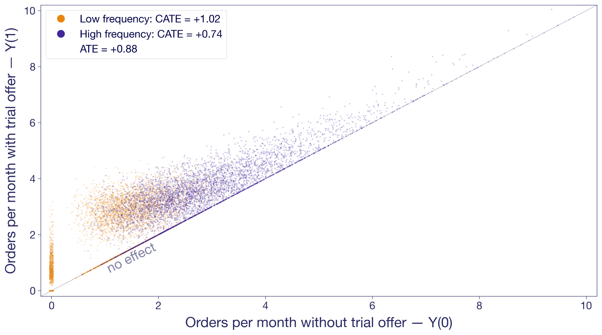
The orange cloud floats higher above the diagonal than the purple. Low-frequency customers' CATE is +1.0 orders per month. High-frequency customers come in at +0.7. The overall ATE of +0.9 is the weighted average of the two.
In this experiment, low-frequency customers benefit most from the offer, yet Figure 3 shows many of them never activate. The hint here is that there could be potential in these low-frequency non-activators that never gets unlocked. Combining the pre-experiment split with activation gives you four informal segments (high/low frequency × activated/didn't) and a richer targeting picture — though note activation is only observable after the fact, while frequency is targetable upfront. Capturing the low-frequency potential probably requires upgrading the offer for that group: more visible placement, a longer trial window, messaging that emphasizes no commitment. When CATEs vary like this, the treatment has heterogeneous (different) treatment effects on different types of customers; for more on surfacing and acting on them, see Your experiment lift is an average — which users actually benefited?
The Intention-to-Treat effect (ITT)
Something keeps nagging from Figure 3. The experiment offered the trial to a random half of customers. About 40% of them activated; the other 60% didn't bother. The ATE estimation uses all of them, while most of them obviously aren't affected. Is this really all we can muster?
The experiment randomized the offer, not the trial experience itself. Customers decided on their own whether to activate. The +0.9 is therefore the effect of being offered the trial, averaged across everyone who received the offer, activators and non-activators alike.
The question the junior analyst is trying to answer is: what's the effect of actually trialing? The +0.9 doesn't answer that question. It's the Intention-to-Treat effect, or ITT: the effect of the assignment, regardless of whether the assigned customer actually took up the treatment. When only some of the assigned take it up — partial compliance — the ITT dilutes toward zero as the non-takers pull the average down. When everyone assigned takes it up, ITT equals the effect of the treatment itself on everyone.
What is the Intention-to-Treat effect (ITT)?
The ITT is the effect of assignment, not of actually receiving the treatment. It includes customers assigned to treatment who never took it up — in our case, the 60% who dismissed it. When everyone assigned complies, ITT equals the effect of the treatment itself; when compliance is partial, the ITT dilutes. In experiments, this is relevant when what you consider treatment is not what you can assign directly, and take-up is thus voluntary.
The ITT is an honest number for the thing the experiment actually varied. But it isn't always the number the business needs. They might want the effect of the trial on customers who actually used it: the Marcos who changed their habits, not the ones who didn't bother.
The Local Average Treatment Effect (LATE)
Under some assumptions¹, you can get at it without running anything new. Divide the ITT by the activation rate, and the ratio estimates the Local Average Treatment Effect (LATE): the effect on compliers, customers who activated because the offer moved them to. In our experiment, LATE ≈ 0.9 / 0.4 ≈ +2.3 orders per month. Much bigger than the ITT, because the ITT averaged in zeros from everyone the offer didn't move. That could be part of the story too.
What is the Local Average Treatment Effect (LATE)?
The LATE is the average treatment effect on compliers: customers who took up the treatment because of their assignment, but wouldn't have on their own. It excludes always-takers (who'd take it regardless) and never-takers (who'd never take it). LATE is identified from experimental data using instrumental variables, when assignment is random and only affects outcomes through take-up.
Proper LATE estimation uses instrumental variables, which most experimentation platforms don't provide out of the box. The ratio formula above gives you a point estimate; IV gives you confidence intervals too.
For most practitioners, the takeaway is simpler. Your A/B test gives you an ATE of the thing you randomized. That's often the most actionable number for a ship decision, because it bakes in the drop-off: no matter how persuasive the prompt, some customers won't bother. If what you really care about is something downstream — the effect of actually trialling, not just being offered the trial — your ATE is an ITT of that downstream thing. LATE strips out the dilution and tells you the effect on the customers the offer actually moved. That is useful when you're decomposing the mechanism, less so for sizing the launch.
Five estimands at a glance
We've covered four estimands rooted in randomization — ATE, CATE, ITT, LATE. The table below adds a fifth, ATT, that you'll meet when randomization isn't on the table.
ATT, the Average Treatment Effect on the Treated, is the version you'll meet the moment you can't randomize — observational studies, geo experiments, marketing campaigns deployed without a control. The randomization that gives the ATE its meaning is unavailable, and analysts fall back on identifying the effect specifically on the units that ended up treated.
What is the Average Treatment Effect on the Treated (ATT)?
The ATT is the average of Y(1) − Y(0) restricted to units that actually received the treatment. Under random assignment, ATT and ATE coincide because the treated and control groups look alike in expectation. Outside randomization — matching, difference-in-differences, synthetic control, GeoLift — that equivalence breaks, and the ATT is what those methods are designed to estimate.
Which treatment effect goes in the deck?
Your junior analyst had +2.0. Your senior data scientist had +0.9. We now have a vocabulary for what each one is, and what each one isn't.
The junior analyst's +2.0 isn't on the list. He compared the orders of customers who activated the trial with those who didn't, inside the treatment group, and reported the difference as the trial's effect. That's a biased comparison of two subpopulations with different baselines. Easy to compute, easy to misinterpret, and more common than it should be.
The senior data scientist's +0.9 is an ATE in the offer framing, and at the same time an ITT in the trial-experience framing. It's the effect of the thing the experiment actually varied. It isn't the effect of the trial itself on customers who used it, and if the launch discussion treats it that way, that's when you come in.
The point isn't to use more jargon with your stakeholders. It's to think more clearly yourself about what a number represents, and to frame the discussion around that.
When you absolutely, positively need to know exactly what your experiment measured — accept no substitutes.
References
Holland, P. W. (1986). "Statistics and Causal Inference." Journal of the American Statistical Association, 81(396), 945–960.
Imbens, G. W., & Angrist, J. D. (1994). "Identification and Estimation of Local Average Treatment Effects." Econometrica, 62(2), 467–475.
¹ Formally, the Wald estimator (ITT ÷ activation rate) identifies LATE under two key assumptions. Monotonicity: assignment (offer) doesn't make anyone less likely to take up treatment (trial). In our setup this is automatic because the trial is only available through the offer. Exclusion restriction: the offer affects orders only via activation, not directly; seeing the offer doesn't itself motivate orders. These sit on top of the usual random-assignment setup.
Measure effects that last
Watch Ronny Kohavi explain how to design experiments that capture long-term impact, not just the first-week lift.
Watch the Experiment Design Session
Chasing velocity in A/B testing: why more experiments can mean less learning
TL;DR: Experiment velocity is a useful diagnostic, not a goal. The moment you make it a KPI, teams start optimizing for the count instead of the learning, and the program quietly drifts toward trivial tests that answer trivial questions. The healthier target is the rate at which you learn, which usually requires a portfolio of easy, medium, and hard experiments.
There is a particular kind of dysfunction that only shows up in experimentation programs that are working well. The team has the tooling. The events and data pipelines are working, metrics and results are trustworthy. Experiments ship every week. By every visible measure, the program is mature. But the experiments themselves keep getting smaller, the hypotheses keep getting safer, and the insights keep getting shallower. The program is producing more experiments than ever and somehow learning less. This is what happens when velocity stops being a diagnostic and starts being the goal.
It is a quiet failure mode, which is part of why it persists. Nothing breaks. No one misses a deadline, and the dashboards still tell a flattering story. The shift from "what is the most valuable thing to learn?" to "what is the fastest thing we can test?" happens one prioritization meeting at a time, and by the time anyone notices, it has become the way the team works. The trap is not that velocity is a bad thing to care about. It is that velocity, treated as the main metric, will reliably get you a program that runs more experiments and understands its users less.
Why experiment velocity became the main metric
Experimentation maturity is usually described in terms of throughput. The popular crawl, walk, run framework puts a handful of experiments at one end and thousands at the other, with every feature change running as an A/B test at the top tier. It is easy to extrapolate: if the most advanced teams run the most experiments, then running more experiments must be how you become advanced.
Teams that hit the “fly” level have done a lot right. They launch features behind a feature flag. They have the data piped so the marginal cost of an additional experiment is close to zero. They trust their experimentation platform and know how to interpret results. Culturally, they are more comfortable learning from users than arguing in planning meetings. Throughput matters.
If your team can only launch one experiment a quarter, you have a velocity problem. But it does not follow that maximizing the number of experiments is the right objective forever. That is where teams get into trouble.
The problem with velocity as a KPI
Velocity is a proxy for the real goal, which is learning what your users want from your product. A team running a lot of experiments looks like a team asking lots of questions, challenging assumptions, and replacing opinion with evidence. More tests, more learning. The logic is not wrong. It is just incomplete.
The moment a proxy becomes a target, people optimize for the measurement instead of the thing the measurement was supposed to represent. This is Goodhart’s law. When a measure becomes a target, it stops being a good measure.
Experiment velocity is a textbook example. If leaders say “we want to learn faster,” teams build better systems, reduce friction, and ask sharper questions. If leaders say “we need to run more experiments this quarter,” the behavior changes. Teams look for the fastest path to a count, not the fastest path to insight.
That makes the metric easy to game. A team can inflate velocity by prioritizing simple tests over difficult, high-value ones, or by launching half-formed tests just to show they are testing. From the dashboard, this looks like progress. In reality, the organization may be learning less.
The irony is that this produces the opposite of what leaders wanted. The original goal was faster learning and a better-performing product. Setting velocity as the headline KPI lowers the quality of that learning. Teams become more active but less ambitious. They generate fewer durable insights. The program optimizes for motion rather than understanding.
The hidden cost is shallower learning
Trivial experiments answer trivial questions. A button-color test tells you which variant got more clicks. It rarely tells you anything about your users, their motivations, or the constraints in your product.
A harder experiment often teaches something more generalizable. Suppose you move the paywall later in onboarding, and conversion to paid goes up. That result is not just about one UI sequence. It challenges an institutional belief about when users are ready for purchasing. It suggests users need more confidence before being asked to commit. It can influence pricing, packaging, and other related projects.
That is a qualitatively different kind of learning. The best experimentation programs do not just produce winners. They produce insight. They learn from experiments that fail and use those learnings to drive future iterations. They help an organization understand which assumptions were wrong. Chasing easy velocity sacrifices that deeper layer.
That same lesson shows up in JPMorgan Chase's experimentation program, where Kevin Yang argues that losing tests create much of the real value by stopping bad ideas before they scale.
Think like a portfolio manager
The fix is not to reject velocity. It is to stop treating velocity as the only mark of success. A healthy experimentation program runs a portfolio.
Some experiments should be fast and cheap. These iterative tests improve local conversion points, clarify messaging, and tune workflows. They keep momentum high and help teams build instincts.
Some should be medium-scope bets. A bigger design change, a more consequential workflow adjustment, a new targeting rule.
Some should be hard. These force you to instrument something new, redesign a key system, or challenge an assumption that has been sitting untouched for years.
If your portfolio only contains the first category, you are under-reaching. If it only contains the third, you are overloading the system. The right balance depends on team maturity, traffic, engineering capacity, and risk tolerance. But balance is the point. Not every experiment should be bold. Not every experiment should be easy.
What to measure instead of raw velocity
If you want teams to behave differently, measure differently. Velocity should still be measured, as it is a useful operational signal, but it should be used alongside other, harder to quantify measures:
• How many strategically important surfaces are actually being tested?
• What percentage of experiments target known bottlenecks in activation, retention, or monetization?
• Did the experiment teach us something reusable, even if the variant did not win?
• Are hypotheses clear and well-structured? Are they trying to understand user behaviour?
• Did the team define guardrails and power the test appropriately?
Experiment quality is not about launching tests. It is about designing them well enough that the result is trustworthy and useful.
Questions for experiment review
One practical fix is to change the review conversation. Instead of asking only “how many experiments did we run,” ask:
• What important question did this experiment answer?
• What assumption was being challenged?
• What did we learn that changes future roadmap decisions?
• What meaningful experiment are we currently avoiding because it is hard?
That last question is especially useful. Every mature product org has a backlog of experiments it is quietly avoiding. They are hard to instrument. They cross team boundaries. They touch pricing, relevance, or onboarding logic and feel risky. Those are often exactly the areas leaders should pay attention to.
Conclusion: velocity matters, but it is not the goal
The mission is to increase the rate at which your organization learns important truths about users, products, and business tradeoffs.
Sometimes that means running more experiments because your current process is too slow. Sometimes it means resisting the urge to inflate the count and putting real effort into the experiments that are harder, riskier, and more consequential.
A mature experimentation culture does not ask only “how can we run more tests?” It asks, “how can we run more of the right tests?” That is a much better optimization target. If you are building toward that kind of program, GrowthBook gives you the feature flagging, metric definitions, and analysis layer to make harder experiments easier to run.
.avif)
What makes experimentation unique at Chess.com
Chess.com has users who cannot move a pawn and users who play at FIDE competitive ratings. Both groups open the same app. For anyone running an experimentation program, that kind of skill variance changes almost every decision you make.
On the latest episode of The Experimentation Edge, I sat down with Nafis Shaikh, Director of Product Management at Chess.com, to talk about how his team designs experiments for a 10 million daily active user base that spans absolute beginners and rated competitors. Chess.com ran 400 experiments in 2024 and has set a goal of 1,000 in 2025, already 195 deep in Q1. The scale is impressive, but what makes their program genuinely different isn't the volume. It's what they've had to learn about designing for users whose needs pull in opposite directions, and their willingness to push past surface-level test results into something more useful.
Here's what stood out.
One product, wildly different users
Chess.com turned 20 last year. For most of its history, the product was built by Chess players for Chess players, which worked because the user base was relatively homogeneous. Starting in 2020, the population exploded. Today the app serves roughly 10 million daily active users, and the demographic spread inside that number is extreme.
Some users have never played Chess in their lives. They don't know how the pieces move. They don't know what a pin is. At the other end of the spectrum, Chess.com has FIDE-rated competitive players, people with tournament histories and formal ratings who are using the product to prepare for real games.
This is where one-size-fits-all quietly falls apart. Nafis gave a specific example: the app has an AI coach that talks to users during play, explaining what's happening and offering tips. The way the coach speaks to a rated player is, and has to be, completely different from how it speaks to someone who just learned how the knight moves. Throw advanced concepts at a beginner and you confuse them and make the experience worse. Dumb down the feedback for an expert and it's worthless.
For an experimentation program, this has a concrete implication: every test needs to think about skill segments, not just aggregate results. A feature that lifts engagement overall might be destroying the experience for 20% of users while thrilling another 20%. If you're only looking at the average, you miss it. You also pick the wrong winner.
A four-dimension framework for deciding what to measure
Nafis organizes every metric he cares about across four dimensions, and the order matters:
- Inflows. How effectively does the product bring new users in?
- Engagement. Once they're here, do they do the core thing? For Chess.com that means playing games, doing puzzles, using the coach.
- Retention. Do they come back? Measured at D1, D7, and D30, with weekly active users segmented into new, current, and returning cohorts.
- Monetization. Do they start a trial, and do they end up paying for the subscription?
The order is deliberate. Nafis is explicit that most products cannot short-circuit to revenue. "You actually have to give people a really solid product that they find value in. They'll come back and use the product more often. And when that tipping point hits, they're more likely to pay for your product because they've found the value in it."
Inside Chess.com this shows up as a deliberate division of labor. The monetization team optimizes monetization metrics. The gameplay team optimizes the core experience. These groups do not get confused about who owns what, and, crucially, the gameplay team isn't pressured to justify every experiment through a revenue lens. The bet is that a better core experience eventually lifts everything downstream.
If you're setting up an experimentation program, this is worth copying. Deciding which metrics each team owns, and which ones they explicitly do not, removes a huge source of noise from experiment results.
Going beyond "Did the KPI move?"
The part of our conversation that stuck with me most was Nafis's push to evolve how Chess.com treats experiment results.
A lot of experimentation programs live at the level of "we ran test X, metric Y moved Z%." That's fine. It's necessary. But it's not enough. Nafis calls the next question "so what?" What does this result actually say about how users behave? What were they doing in the control condition that makes them respond this way to the treatment? What does the side effect in that other metric tell you about the kind of user this feature attracts?
He also has strong feelings about write-ups. A result that ships as "yeah, this improves retention" is not worth much. The pattern Chess.com is moving toward is narrative: we launched this specific feature on this date, we saw this lift at this step of the funnel, it carried through to this downstream behavior, and here is what we now believe about our users that we did not believe before.
That discipline is what turns a test count into organizational learning. 1,000 experiments per year is a meaningless number if the team cannot tell you what it learned from them. The writing is where the learning gets captured.
Key learning: Chess.com users prefer to celebrate their wins
Now for the specific experiment that made me laugh out loud on the recording.
Chess.com has a feature called Game Review. After a game ends, the coach walks you through each of your moves and explains where you played well, where you blundered, and where you could have done something different. Game Review is Chess.com's freemium hook: everyone gets one free per day, and if you want more, you need a subscription. It's a huge driver of paid conversions.
The original design assumed something that felt obvious. When a player loses, they want to understand what went wrong. So the entry point to Game Review led with the things they had done poorly: here are your blunders, here are your misses, let's figure out what to fix.
Then the team looked at the data. 80% of Game Reviews were happening on wins.
Think about that for a second. Four out of five times a user reached for Game Review, they weren't trying to debug a loss. They were savoring a victory. The feature was introducing itself with a list of their mistakes, and people were opening it anyway, because what they actually wanted to see was the game where they won.
So they ran a test. Same feature. Same analysis engine. Same subscription gate. The only thing that changed was the entry point: instead of leading with "here are your blunders and misses," they led with "here are the good moves you made."
Game Review starts jumped 25%. Subscription conversions went up meaningfully. Same product, completely different framing, significant lift on the metric that actually pays the bills.
Nafis said he was "somewhat dumbfounded" by the magnitude, but the lesson lines up with something he has seen across every game he has worked on at Zynga, Prodigy, and now Chess.com: "People just want to feel good. Focus on the things that make people feel better about themselves. The world's a hard place and people have difficult lives, and when you come to play a game that's supposed to be enjoyable, focus on the things that are enjoyable."
If you are running any consumer-facing product, this is a test worth trying yourself. Look at every surface where you currently lead with user failure: error states, empty states, review flows, retry prompts, churn emails. Ask whether the default framing could be flipped to celebrate what the user got right instead. Then put the reframe in a test. You will probably be surprised.
Listen to the full episode
Chess.com's program isn't unique because of its size or tooling. It's unique because of two things: a user base whose skill range forces segment-level thinking on every test, and a team that refuses to stop at "the metric moved." That combination is what turns a test count into genuine understanding.
You can hear my full conversation with Nafis Shaikh, including why experimentation velocity is itself a productivity metric and the strange challenge of measuring whether users are actually listening to an audio coach, on this episode of The Experimentation Edge.
Listen to the full episode: The Experimentation Edge with Nafis Shaikh, Chess.com

What I learned from Khan Academy about A/B testing AI
Every team building on top of LLMs faces the same fundamental question: how do you know if your AI feature is actually good? For some products, the answer is straightforward. For others, it requires inventing an entirely new way to measure quality. Khan Academy's journey to A/B testing their AI tutor, Khanmigo, is one of the best examples I've seen of a team solving this hard measurement problem and then using experimentation to dramatically accelerate how fast they improve their product.
Dr. Kelli Hill, Head of Data at Khan Academy, recently joined us for a GrowthBook webinar to walk through their three-year journey from vibes-based prompt testing to rigorous A/B testing of GenAI features in production. Here's what stood out.
Sometimes measuring AI impact is easy
Sometimes the impact of AI on a product is straightforward to measure. When Typeform introduced an AI-powered form builder, their Chief Product and Technology Officer Alex Bass told us on The Experimentation Edge that it doubled their activation rate, the percentage of users who go from signing up all the way through to publishing a form and collecting data. Out of roughly 50 experiments Typeform ran, nothing else came close to that kind of impact.
In cases like Typeform, the metrics are clear. A user either publishes a form or they don't. The signal is clear and happens quickly. And you can measure it with the same metrics you were already tracking.
What happens when the output is harder to evaluate
Khan Academy faced a fundamentally different challenge. Khanmigo is a generative AI-powered tutor that helps students work through math and other subjects. It's not a chatbot for entertainment. It's an educational tool used by students in classrooms. The bar is high: Khanmigo needs to be accurate, it needs to actually teach (not just give answers), and its tutoring quality needs to be measurable at scale.
That last part is the hard part. The same prompt can produce a dozen different responses. The underlying model changes regularly. A response that looks polished might actually reflect poor tutoring practice. And with nearly 200 million registered users and roughly a million daily active users on Khan Academy, they needed measurement that could operate at massive scale.
When Khanmigo first launched, the team had no way to rigorously evaluate quality. They started where everyone starts: reading outputs and making gut judgments. Kelli described their earliest eval work as "vibes-based prompt engineering" in Slack threads. It was useful for building intuition, but it didn't scale, it wasn't repeatable, and it couldn't tell them whether a change actually improved anything.
Turning something hard to measure into a real metric
The breakthrough was deciding to measure cognitive engagement, a construct from learning science research. Khan Academy adapted the ICAP framework (Interactive, Constructive, Active, Passive) published by Chi and Wylie in 2014. The original framework was designed for classrooms, so the team adapted it for AI tutoring interactions, focusing on questions like: who has the agency in help requests? How is the student processing Khanmigo's feedback? Who's driving the ownership of the learning?

The key insight was that cognitive engagement isn't just an abstract academic concept. Khan Academy's prior efficacy research had already demonstrated that students who are more cognitively engaged on the platform get more skills to proficient, and that increased proficiency on Khan Academy transfers to higher scores on third-party assessments. So if they could measure cognitive engagement in Khanmigo conversations, they'd have a metric that actually predicted real learning outcomes.
Building the metric was the hardest part. Kelli was emphatic about this. The team defined a rubric, brought in subject matter experts, and had those experts hand-label student chat transcripts. They iterated on the rubric until they achieved 85% inter-rater agreement on a test dataset. Then they used the agreed-upon labels to create a ground truth dataset.
With ground truth in hand, they built an LLM-as-judge: an AI system that could automatically label transcripts using the same rubric. They fed the judge examples from the ground truth data, iterated on the prompt until the LLM judge's labels matched the human experts with high accuracy, and then scaled it. Today, they process about 20% of Khanmigo's chat data every night through this pipeline, feeding results into dashboards that the team monitors continuously.
Why this unlocked A/B testing for GenAI
Once Khan Academy had a reliable metric, they could finally do what they couldn't before: run controlled experiments on Khanmigo and measure whether changes actually improved tutoring quality.
Khan Academy uses GrowthBook for both feature flags and experimentation, self-hosted on top of their existing BigQuery data warehouse. They built additional infrastructure to randomize not just at the user level, but at the individual chat thread level, so each new Khanmigo conversation could be independently assigned to a treatment. This was critical because the unit of analysis for tutoring quality is a conversation, not a user.
The experiments they run aren't typical feature tests. They're testing different versions of a prompt, changes to system instructions, and even head-to-head model comparisons (Gemini vs. OpenAI models, for example). Kelli described it as "hill climbing": making very small, deliberate changes, sometimes just a single sentence in a prompt, and measuring whether cognitive engagement moves.
Their primary metrics are cognitive engagement and performance (are students getting more skills to proficient?). Their secondary and guardrail metrics include non-desirable behaviors (like giving the answer away), thread length, verbosity, and response latency. This layered approach ensures they're not accidentally improving one dimension while degrading another.
From speed bump to safety net
One of the most striking things Kelli shared was how the culture around experimentation shifted at Khan Academy. Before they had this infrastructure in place, experimentation was sometimes perceived as a speed bump, an extra hurdle before shipping. That's a common tension in product organizations.
But with GenAI, the calculus changed. LLM outputs are non-deterministic. A small prompt change can shift output dramatically. A response that looks better to a human reviewer might not reflect better tutoring. The AI tutor quality team at Khan Academy became the heaviest users of GrowthBook specifically because they realized that without A/B testing, they were relying on intuition in a domain where intuition consistently fails.
Kelli put it directly: experimentation went from being perceived as something that slows down shipping to being "a safety net" for understanding how changes actually perform across millions of users and prompts. The team now sees it as essential infrastructure, not overhead.
What this means for teams building on LLMs
Khan Academy's journey illustrates a pattern that applies broadly. If you're building AI features, your path to effective experimentation runs through measurement. Sometimes you'll have a Typeform situation where existing metrics already capture the impact. But often, especially when the AI's output is complex or subjective, you'll need to invest in building new evaluation frameworks first.
The process Khan Academy followed is replicable: define a rubric grounded in domain expertise, get humans to agree on labels, build a ground truth dataset, train an LLM-as-judge, validate it, and scale it. It's not fast. Kelli described a three-year evolution from vibes testing to production A/B testing. But once you have that metric in place, the standard toolkit of A/B testing becomes incredibly powerful for improving AI features.
If you want to hear the full story, you can watch the webinar recording or or read the Khan Academy research paper. And if you're looking for an experimentation platform that can handle GenAI testing at scale, give GrowthBook a try.
Designing A/B testing experiments for long-term growth
Ronny Kohavi — Stanford PhD, Ex-VP and Technical Fellow at Airbnb, formerly Microsoft and Amazon — is one of the top cited researchers in Computer Science and a leading voice in experimentation. He recently joined Luke Sonnet, Head of Experimentation at GrowthBook, for a webinar sharing best practices, mistakes to avoid, and surprising insights into how often experiments actually succeed. Watch Designing Experiments for Long-Term Growth on demand.
This article covers the key principles Ronny and Luke shared for designing experiments that drive long-term growth — from understanding the importance of experimentation, why you shouldn’t ship on flat results, the key metrics you should track, and how to create a shipping criteria framework. Whether you're just getting started with experimentation or looking to sharpen how your team makes decisions, these are the foundational concepts that separate programs that deliver real impact.
In science, randomized controlled experiments are the gold standard, sitting at the top of the hierarchy of evidence. A/B tests are the online equivalent and the most reliable tools teams have for determining whether a change actually has an effect — whether that's a new feature, a UI change, a pricing change, or a backend optimization.
The problem is that most teams haven't done the harder work first: agreeing on what success actually looks like before the data comes in. Without that foundation, even a well-run experiment produces a result nobody knows how to act on.
Stop guessing: embrace the high failure rate
Humans are systematically bad at predicting what will work and assessing the value of ideas. You cannot reliably judge which ideas are valuable before testing and will be wrong far more often than most teams expect. An effective experimentation program is critical for focusing effort toward what actually works.
Here is some surprising success rate data from across the industry:
Microsoft's 33% success rate stands out, but this came at a cost. Significant upfront work went into scoping and refining ideas before they ever entered an experiment, which directly impacted that number.
The median organization sees roughly 10% of experiments move the metrics they were designed to improve. Given this success rate, we can compute the False Positive Risk (FPR) — the probability that a statistically significant result is actually a false positive. At a 10% success rate with standard thresholds (𝛼=0.05, 80% power), that risk is around 22%, meaning roughly 1 in 5 'successful' experiments are actually false positives. Most teams assume p < 0.05 means they will rarely make mistakes, but the math shows otherwise.
The most impactful teams are the ones with the infrastructure to test fast and realign priorities based on evidence. A $120M improvement at Bing sat in the backlog for months because nobody thought it was worth testing. At Airbnb, the biggest win was a one-line code change. Neither of these could have been predicted. Both required running the experiment.
The importance of building and aligning on A/B testing key metrics
An experimentation program is only as good as the metrics it optimizes for. These metrics include:
- Success or goal metrics: Defines why an organization or product exists and what success looks like (stock price, revenue, market share, etc.) These are the real objectives, but are not easy to move or measure in the short term.
- Driver metrics: Short-term metrics that are the signals believed to predict movement in success metrics. These are what you actually measure to signal success.
- Overall Evaluation Criterion (OEC): The weighted combination the organization agrees to optimize for, typically composed of a few success and driver metrics. Defining a good OEC is one of the hardest and most important things an experimentation program does.
What goes wrong without a good OEC
Real-world scenarios from search engines (Bing, Google) and booking sites (Airbnb, VRBO) illustrate how badly things can go wrong with poor OECs, despite well-meaning intentions.
The search engine example
At Bing, naively using queries per user as the OEC would have led to very poor decisions. The example he gave was a ranking bug that returned terrible search results. This increased queries by 10% due to users reformulating queries several times and increased ad revenue by 30%. The short-term metrics look great, but the product is broken.
More optimal metrics to track here would be to minimize queries per session (users should be able to find answers quickly) and maximize sessions per user (repeat usage indicates high value). Bing has a suite of metrics they actually track, including sessions per user, queries per user, time to success, revenue per user, and more. We'll cover a framework for identifying and aligning on good OECs later in the article.
A booking site example
Similarly, a booking platform such as Airbnb that ignores satisfaction signals like user rating and instead optimizes purely for conversion rate is optimizing for the wrong thing. If users book listings they end up hating, they don't return.
A better OEC would also include a measure of satisfaction, such as the user's star rating, so you can build machine learning models that predict whether this user will book a listing they love and rate five stars. Deciding on the trade-off between multiple metrics, such as revenue and user satisfaction, is a key business decision.
The flat result trap: the most expensive mistake in product
Getting your OECs right is important, but only if you're willing to act on what the data actually tells you. A flat result means an experiment didn't produce a statistically significant improvement in the OEC. Shipping flat means deploying that feature anyway. It was discussed that this is a decision error in nearly every case.
One example from Bing was a major effort with ~100 engineers to introduce a third pane to the search window. The experiments failed to show value, but it shipped to all users anyway because it was determined to be a strategic business move. A year later after countless additional experiments failed to show value, the 3rd pane was rolled back at significant costs to Bing.
Had Bing acted on what the data told them to begin with, they could have failed much faster, avoiding months of sunk cost and instead redirected their engineering resources toward something that actually moved the needle.
Debunked: common justifications for shipping flat
Ronny shared the four primary reasons he has seen teams use to rationalize the decision to ship flat and dives into the real implications of each.
Justification #1: it’s flat, we’re not hurting the users or business
A flat result doesn't mean no effect exists. All it tells you is “we didn’t find enough evidence of an effect.” The experiment could simply be underpowered. "Not statistically significantly worse" is not the same as safe to ship. The true effect could still be negative.
Justification #2: team morale depends on shipping:
Shipping a flat feature to protect morale means celebrating shipping rather than actually moving goal metrics, which can also complicate the codebase and require maintenance costs. The culture should be results-oriented and simply recognize that many ideas fail. Hold a learning review, share what was discovered, and move on. Failures that generate learning are worth celebrating.
Justification #3: it’s an enabler for future work:
You can cut through this justification with one question: if we ship this and deprecate the old version, would we ever roll it back? At Bing, the answer was yes. Every flat enabler that ships becomes code that must be maintained and a foundation you'll keep building on even when the follow-on value never arrives.
Justification #4: it’s strategic:
Strategic conviction is not a substitute for evidence, and as the data shows, even small changes are hard to predict correctly. Set a vision, but move toward it in small, testable steps. Test a meaningful component first, get data, then adjust.
A framework for making better experimentation decisions
With the importance of good metrics and understanding of what can go wrong without them clearly laid out, the conversation then shifts to a practical approach for building a decision framework that connects short-term measurements to long-term goals without overcomplicating the process.
Bridging short-term experimentation metrics to long-term goals
The messy reality is that most measurable short-term metrics don’t align 1:1 with business goals, so we must instead build frameworks to do so.
Start by identifying your long-term goals and what you can actually measure. From there, identify the short-term metrics that are the strongest indicators of those long-term goals. These are the signals that move in the right direction when the product or business is genuinely improving.
Once you've identified the right metrics, put guardrails in place. Guardrails are secondary metrics you monitor to ensure that improving your primary metric isn't coming at the expense of something else that matters, such as revenue, retention, or user satisfaction. They don't have to move, but they can't go backward.
A word of caution: overcomplicating things and tracking too many metrics can make it difficult to act. Before running an experiment, think critically about what you would do if your metrics told conflicting stories afterward. This exercise forces clarity around prioritization and how you make business decisions around tradeoffs. The goal is to identify the key signals you can build a decision framework around so you know exactly how you'll act on them.
A real-world shipping example: LLM chatbots
An example that highlights this concept is an AI chatbot company. They can't measure customer lifetime value in a two-week experiment. Instead, they’ll need to look at the short-term metrics that signal value, such as distinct sessions per user, topic breadth, short-term subscription conversion, and how often responses are copied externally. Build a framework connecting these to the long-term goal, validate against historical data, and you have an OEC you can actually experiment on.
But throwing all of these metrics into your results dashboard can complicate the picture. If some results are flat or vaguely negative, while others are statsig negative, and others are statsig positive, then how do you make a shipping decision?
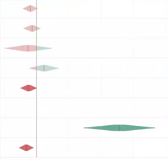
This is exactly where clearly defined shipping criteria earns its value.
Shipping criteria: enabling independent shipping decisions at scale
Translate your metrics into explicit shipping criteria that are determined prior to an experiment launching. This is a decision framework that enables independent shipping decisions and eliminates bias from decision-making during the evaluation phase.
Some decisions are very straightforward, such as the example below. With the revenue change being equal, you would choose the latter with higher Daily Active Users.
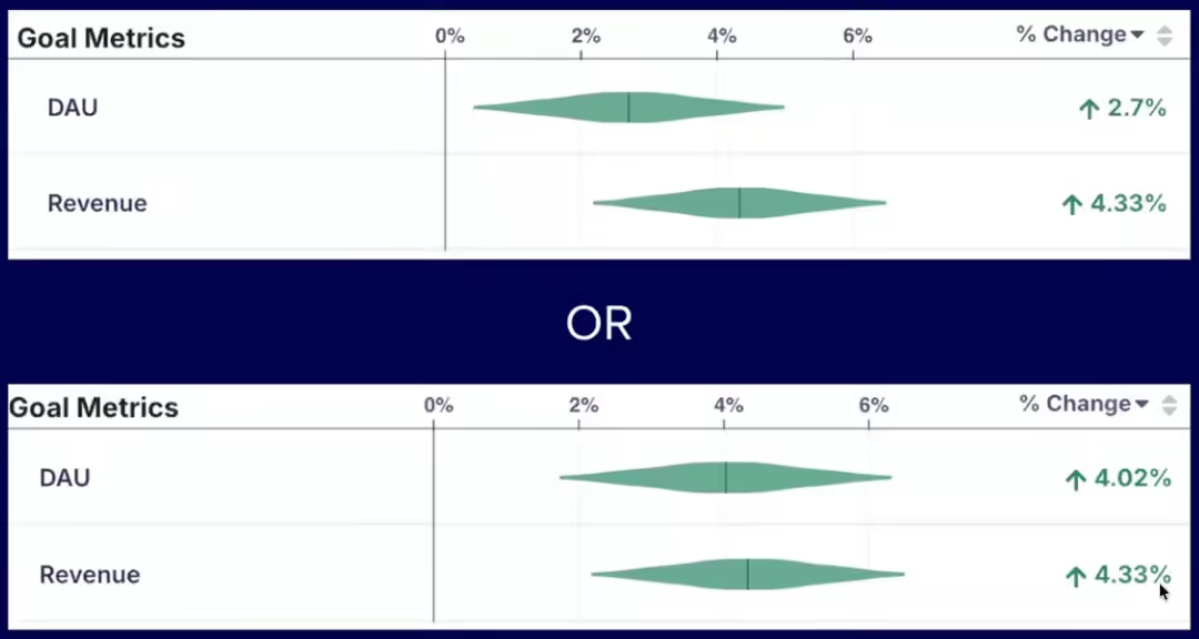
However, a clearly defined framework for shipping criteria becomes increasingly necessary in situations where metrics conflict, such as in the example below, where DAU is higher in the first experiment, but revenue is higher in the second. In this situation, you need to understand the tradeoff between these metrics that you’re willing to accept when shipping.
This approach encodes your decision-makers' preferences into a repeatable framework so shipping decisions are consistent, defensible, and free from bias.
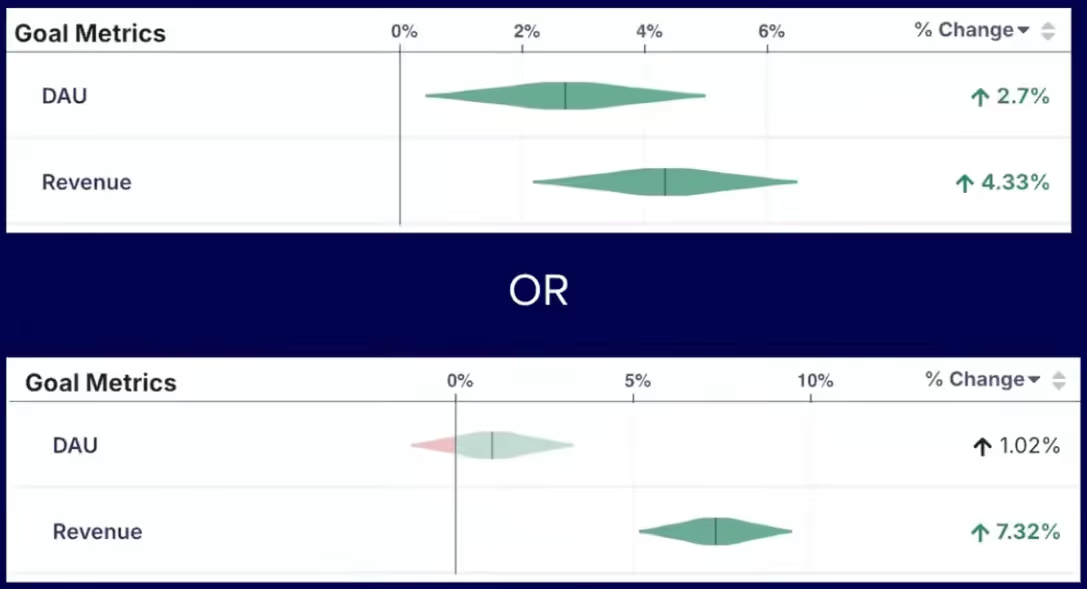
Luke’s Twitter example
An example from Twitter highlights how this works in practice. Daily Active Users (DAU) was a key metric for Twitter, but they wanted to make sure that people were using the product repeatedly and over time to see that they're getting value out of it in a wide variety of applications. Some of the measured indicators included tweets created, likes, and other forms of engagement. They used the decision framework below to determine when to ship:
- If DAU is up and stat sig → ship
- If DAU is negative → rollback
- If DAU is up, not stat sig and no guardrails are negative:
- If engagement metrics are up (tweets created, likes, etc.) → ship
- Otherwise → experiment review
- Murky results → rollback
This type of framework scales. It forces tradeoffs to be agreed on before you're under pressure from a live result.
A key note to remember is that your metric models will likely drift over time. This is something teams need to revisit regularly as their product and business evolves. The metrics that predicted success a few months ago may not be the right ones today.
Closing: shift the experimentation culture
Ronny and Luke close with a shared belief: the teams that win at experimentation aren’t always the ones with the most resources or sophisticated tools, but the ones that have built a culture around learning.
The most important piece of advice is to shift the organizational mindset from celebrating shipping to celebrating learning. Most ideas will fail. The teams that internalize this stop treating failed experiments as something to hide and start treating them as the mechanism by which they get smarter and faster over time.
That cultural shift is supported by the practical framework Luke outlined. When you have clearly defined metrics, explicit shipping criteria, and a shared understanding of your tradeoffs, experimentation becomes the foundation for confident, independent decision-making at scale.
Key takeaways
- Most experiments fail. The median industry success rate is ~10%, meaning you will be wrong far more often than you expect. An effective experimentation program is how you find what actually works.
- False positive risk is higher than most teams realize. At a 10% success rate, roughly 1 in 5 "winning" experiments are actually false positives, even when running at p < 0.05.
- Your experimentation program is only as good as the metrics it optimizes for. Poorly defined OECs lead to decisions that look good on paper, but break the product.
- Shipping flat is a decision error in nearly every case. "Not statistically significantly worse" is not the same as safe to ship. The true effect could be negative and the code will have maintenance costs.
- Short-term metrics rarely align 1:1 with long-term business goals. Build an explicit framework connecting the two and put guardrails in place to protect what actually matters.
- Define your shipping criteria before the experiment runs, not after. This eliminates bias, enables independent decision-making, and forces tradeoffs to be agreed on in advance.
- Shift the culture from celebrating shipping to celebrating learning. The teams that win at experimentation are the ones that treat failed experiments as the mechanism by which they get smarter.
Want to go deeper? Ronny teaches two online courses on Maven
Accelerating Innovation with A/B Testing: Ronny’s flagship course and recommended starting point for most practitioners
Advanced Topics in A/B Testing: A follow-on to Accelerating Innovation with A/B Testing for practitioners with a solid foundation in p-values, statistical power, and OEC design
How Fyxer ran 541 A/B tests and grew from 1m to 35m ARR in 1 year
How Fyxer used AI coding and GrowthBook to run 541 experiments in 1 year
Something remarkable is happening at Fyxer. The AI email assistant grew from $1M to $35M in annual recurring revenue last year. This year, they’re targeting $100M to $150M. Behind that trajectory is a company-wide culture of experimentation that produced 541 experiments in twelve months, more than two per working day. The growth engineering team alone, just four people led by Kameron Tanseli, accounted for 360 of those.
The story of how they did it comes down to two things: the right mindset and an AI-first approach to experimentation. The mindset meant treating every product change as a hypothesis to validate, not a feature to ship. The AI-first approach meant using tools like Cursor, Claude, and GrowthBook to compress the entire experimentation loop, from research to development to analysis, so a small team could operate at a scale that would have been impossible even two years ago.
Kameron joined Fyxer when the company had $1M in ARR. He brought a discipline he’d honed across B2C healthtech, B2B SaaS, and now prosumer AI: measure everything, share everything, and learn as fast as possible. One of his first moves was creating a public Slack channel where every experiment result, win, and loss was visible to the entire company. The founders loved it. It became the company’s central nervous system for understanding what was working and what wasn’t.
Kameron recently joined The Experimentation Edge podcast to share the full story. Below are the key takeaways, but the real unlock came when they combined that learning culture with AI-powered development. That combination made 541 experiments possible across the company, and turned a high volume of losses into the wins that turbo-charged Fyxer’s trajectory.
The growth engineering mindset: why learning speed beats intuition
Here’s something Kameron will tell you openly: he’s bad at his job for the first few months every time he starts somewhere new. And it’s not just him. It’s everyone in growth.
When Kameron joined Fyxer, his instincts were calibrated to B2C healthtech, his previous role. He defaulted to discount-heavy messaging, pricing-focused copy, and the kind of urgency-driven language that works for consumer subscription boxes. At a B2B SaaS company selling an AI productivity tool to professionals, none of it landed. The only way to close that gap was to get experiments in front of real users and let the data teach him what his intuition couldn’t.
This is the core of the growth engineering mindset at Fyxer: A/B testing isn’t just an optimization tool. It’s a learning tool. And when you’re new to a product, a market, or a customer base, it’s the fastest way to develop the intuition you don’t have yet.
The numbers back this up. Fyxer’s win rate in GrowthBook is 25%. That means 75% of their experiment ideas failed. If they had shipped every idea to 100% of users without testing, the cumulative damage would have been severe. A 50/50 test, even with imperfect sample sizes, beats shipping blind every time.
Kameron pushes back hard on the common startup objection that “we’re not big enough to A/B test yet.” His view: you may not be able to detect 5% lifts, but you can detect 20% or 30% effects, and at a startup, those are exactly the kinds of changes you should be testing. Pricing models, usage limits, core product flows. The risk of getting those wrong without testing is far greater than the cost of running an imperfect experiment.
A key element of Fyxer’s approach is how they think about iteration. Rather than waiting for a fully polished feature, they ship the core experience and then immediately run experiments to improve adoption and engagement. As Kameron puts it, almost nobody uses your new feature on day one. The real work starts after launch, when you test messaging, onboarding flows, and nudges to find what actually drives usage. This iterative approach was central to their PLG breakthroughs later in the year.
Kameron uses a simple framework to evaluate which features could drive viral growth. First, he identifies the actions users are already repeating within the product. Then he asks: every time a user sends an email, schedules a meeting, or triggers a confirmation, is there a way to use that touchpoint to introduce Fyxer to someone new? When the answer is yes, the team builds and tests a loop around it.
Not every loop works. Fyxer has a scheduling feature, similar to Calendly, and Kameron hypothesized that sending booking confirmations could drive recipients back to Fyxer to sign up. In theory, it was a clean growth loop. In practice, users pushed back immediately. Fyxer’s entire value proposition is reducing inbox noise, and here they were adding another email on top of the Google Calendar and Outlook invites that people have already received. They killed the experiment and pivoted to a different approach. That willingness to test assumptions, even ones that look great on a whiteboard, is what separates a growth-minded team from one that ships on conviction alone.
Using AI to scale experimentation from weeks to hours
The mindset gets you to the right experiments. AI is what lets a team of four run them at startup speed.
Fyxer’s experimentation stack is built around a few key tools, with Claude as the central hub. The growth team shares Claude's skills across the team, so common workflows, like turning a GrowthBook experiment result into a Slack post or generating a hypothesis from a data analysis, are reusable and consistent. They’ve connected Claude to their internal systems through MCP integrations, including GrowthBook’s API, so experiment data flows directly into their AI workflows.
For development, they use Cursor across the full stack. But the real unlock has been Cursor’s desktop mode with virtual environments. Here’s why that matters: traditionally, even a simple experiment requires a developer to write the code, pull it down locally, run the app, and manually check that the new upsell panel or copy change looks right. With Cursor desktop, the tool runs the app in a virtual environment and shows Kameron a video of what the experiment will look like. He reviews it, signs off, and moves on, without ever pulling down the code himself.
This means he can run five or six experiments in parallel, as long as they’re relatively contained changes. For even simpler experiments, like backend configuration changes or one-line feature flag adjustments, they use Claude Opus, Codex, and Tembo to one-shot the implementation entirely.
The AI acceleration extends beyond development. On the data side, Fyxer uses Dot, an AI data analyst that connects to their BigQuery warehouse and lives in Slack. The data team documented their table schemas, columns, and relationships, and Dot uses that context to answer complex questions — segmentation analysis, survival curves, custom queries — from anyone on the team. Non-technical stakeholders can get answers in seconds without waiting for the data team, which unlocked a bottleneck that plagues almost every growing company.
The experimentation lifecycle itself is increasingly automated. Cursor automations fire when PRs are opened, daily jobs check for stale experiment code that should be cleaned up, and product release docs are generated automatically. When a key metric dips unexpectedly, the data team uses the GrowthBook API combined with Claude to cross-reference recent experiment launches and diagnose whether an experiment caused the problem.
The net effect: AI compresses the entire experimentation loop. Research that took days happens in hours. Development that took a week happens in an afternoon. Analysis that requires a data scientist can be done by anyone on the team through Slack. That’s how four engineers run 360 experiments in a year.
What 541 experiments actually produced
Volume without results is just busywork. Here’s what Fyxer’s experimentation program actually delivered:
- Increasing free-to-paid conversion from 5% to 35% by adding a credit card gate before the free trial
- 2.3x-ing the share of paying customers on annual plans, which now accounts for 50% of subscribers
- Increasing the trial start rate for personal email users by 65% by segmenting trial lengths based on signup type
- Creating a referral growth loop in which 33% of invites are accepted
None of these were obvious in advance. The credit card gate, for example, contradicts conventional wisdom about reducing friction in signup flows. But Kameron noticed that many AI apps were already asking for credit cards upfront, and Fyxer’s users had high intent because they were connecting their email. They also made the paywall optional during the experiment, drawing design inspiration from Canva’s checkout flow by showing users a clear timeline: what happens today, in 5 days, and in 7 days. The result was essentially free revenue on existing traffic.
The annual plan shift followed a similar pattern. The original UI defaulted to monthly billing with a modest 8% annual discount. Kameron tested defaulting to the yearly plan, increasing the discount to 25%, and displaying the effective monthly price. It’s the kind of change that takes a few hours to implement and test, but has a massive compounding effect on retention and cash flow. E-commerce team Box ran a comparable pricing-framing test, surfacing a cheaper plan only in the cancellation flow—they call the resulting retention lift the “wine effect.”
That’s the compounding advantage of high-velocity experimentation: you find the counterintuitive wins that your competitors are leaving on the table because they’re still debating whether to test.
Where Fyxer’s growth team is headed next
Fyxer is scaling its growth engineering team from 6 to 13 this year, aiming to run 1,000 experiments. But the real multiplier isn’t headcount. It’s a continued investment in AI-powered developer performance: more reusable skills, more automated workflows, and tighter integration between their experimentation platform and their AI tooling.
Their revenue target of $100M to $150M ARR would represent another 3–4x leap. If the pattern holds, that growth won’t come from a single breakthrough. It will come from the compounding effect of hundreds of experiments, most of which will fail, but the ones that win will change the trajectory of the business.
Key takeaways for AI-powered experimentation
- You don’t need to be big to experiment. You need to be disciplined about testing the highest-risk items.
- A/B testing at a startup is primarily a learning tool. It’s how you build customer intuition fast, especially when you’re new to a market.
- AI doesn’t just make development faster. It compresses the entire experimentation loop, from hypothesis to analysis, making high-velocity testing possible with a small team.
- A 25% win rate is a feature, not a bug. It means you’re testing bold ideas and catching the failures before they ship to everyone.
- The combination of the right mindset and an AI-first approach to tooling is a genuine competitive advantage, and one that’s accessible to any team willing to invest in both.
Want to hear the full conversation? Watch Kameron’s episode on The Experimentation Edge podcast, where he goes deeper on Fyxer’s growth loops, AI tooling stack, and advice for growth engineers starting at a new company.
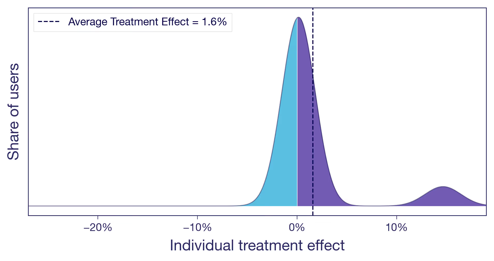
Your experiment lift is an average — which users actually benefited?
The case for looking beyond the Average Treatment Effect
One number, many stories
You moved the recommendations carousel higher on the product page. After two weeks, the experiment comes back: +1.6% on conversion rate. Stakeholders are happy. You ship. You celebrate. You move on.
That workflow is fine. The Average Treatment Effect (ATE) is the right first thing to look at. It's what experiments in GrowthBook are typically designed to estimate. If you're going to act on a single number, that's probably the one. But if you stop there, you are leaving money on the table.
What is the Average Treatment Effect (ATE)?
The ATE is the difference in average outcome between users in the treatment group and users in the control group. It's the standard summary statistic from a randomized experiment — and the right first number to look at. But it summarises across all individual responses in your experimental sample.
That 1.6% is an average. Your user base includes many different types of people: varying usage patterns, needs, and baseline behaviors. You already know this. You probably already segment users for marketing and personalization, or you wish you did. Yet when the experiment result comes back, all of that diversity collapses into a single number.
The question is: what is that single number hiding? In this post, we look at what the average treatment effect actually represents, why the same average can mask very different realities, and what that means for how you act on your results.
What the Average Treatment Effect (ATE) really means
The average treatment effect is exactly that — an average. Behind it sits a distribution of individual responses: some users who gained a lot, some who barely noticed, some who were actively put off by the change. It is a summary across your entire experiment sample, not necessarily the effect on any particular user. If your metric is binary — the user converts, or they don't — nobody converted 1.6% more times. Some users were pushed over the edge and converted when they otherwise wouldn't have. Others were unaffected. Some may have been put off by the change and thus did not convert. What you observe as +1.6% is the net result after all of these individual responses are averaged together.
You cannot observe any individual user's treatment effect — that's the fundamental problem of causal inference. You only ever see what actually happened to a user, never what would have happened without the treatment. But the underlying distribution of those individual effects is real. The average effect tells you where the center is, but it tells you nothing about the rest.
Why the same experiment result can hide very different realities
To see why this matters, consider three scenarios — all with the same average effect of +1.6%. The distributions below are conceptual illustrations of what might be hiding behind that average. But the question of which one you're in is very real.
Scenario (a): Nearly everyone benefits a little
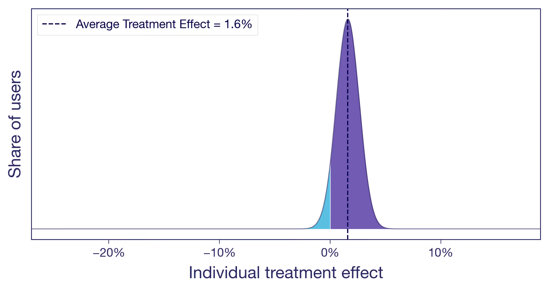
Think of a pure copy change: rewording a headline on a product page. There's no structural change, no new functionality. The tweak lands roughly the same way for everyone (not all copy changes do, of course, but this one did). A small, diffuse lift. This is what most people implicitly picture when they hear "1.6% lift." It's also the easy case. When the effect is similar for most users, the average tells the whole story, and you can act on it with confidence.
Scenario (b): One subgroup drives the entire effect
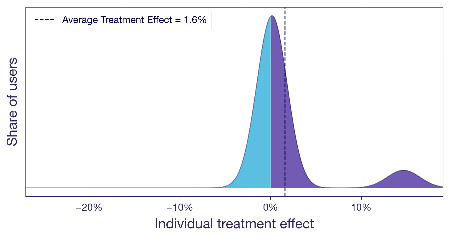
Let's take the carousel for another spin. You moved it higher on the product page. Two types of users now have very different experiences. Browsers, the ones who enjoy discovering new products, engage with the carousel and convert more. Searchers, users who came for a specific item, now have to scroll past content they never asked for. Slightly annoying. The browsers see a meaningful positive effect. The searchers see zero or slightly negative. Most users barely notice. The +1.6% average is real, but it's driven by a single user type, and you are shipping the change to everyone.
Scenario (c): Winners and losers
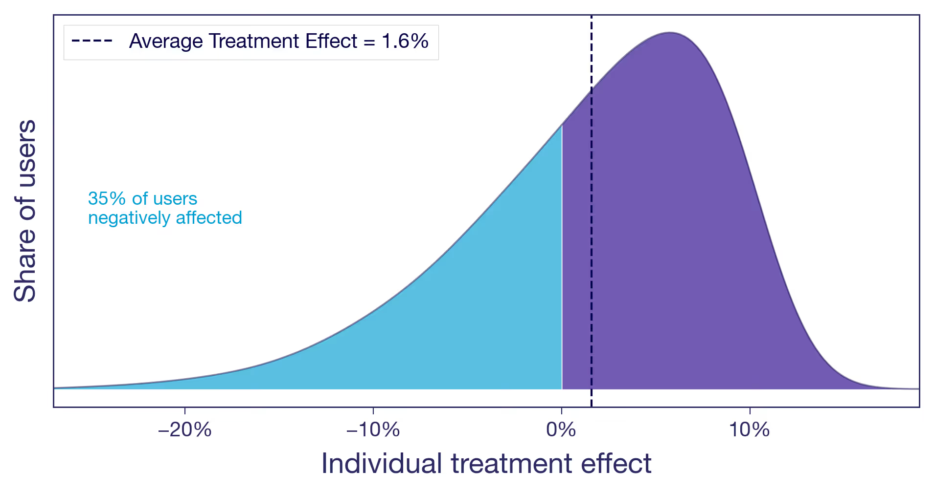
You raised the free shipping threshold from $25 to $50. Users who were comfortable buying one or two small items with free shipping now face a delivery charge that feels offensive. Some abandon their carts. Some find the same items as a competitor. Meanwhile, users with larger baskets add a few extra items to clear the new threshold, pushing average order value up. The overall effect is positive, but a sizeable share of users are notably worse off.
The bottom line: from the average effect alone, you cannot tell which of these scenarios you are in. The decision to ship looks the same in all three cases. The implications are very different.¹
Why experiment results vary across user segments — and why it matters
This isn't an academic exercise. The scenario you are in changes what you should do next.
Is the signal real? An effect driven entirely by one segment is either a discovery or a warning sign. If the subgroup is large and the effect is real, you may have found something worth doubling down on. If the group is small and their effect is noisy, your positive result may not replicate.
Why, not just what? Understanding who benefits also generates hypotheses about why the treatment works. That's how you build on experiment results rather than just collecting them. A team that knows the carousel helped browsers but irritated searchers can design a better version: show it on category pages, suppress it on search results. A team that only sees +1.6% moves on to the next test.
Will it last? Your experiment ran at a specific point in time, on the users who happened to be active during that window. If the effect is similar for all your users, it is more likely to hold as your user base evolves. If it's concentrated in one segment, the result is only as durable as that segment's share of your traffic. If the lift came from a seasonal cohort of holiday shoppers, it may not survive into Q1. What will your user base look like next quarter, or next year? An effect that's similar across users and one that's concentrated in one particular segment ages very differently.
From average results to individual insights in experimentation
You don't have to use fancy machine-learning frameworks to start asking these questions. The simplest version is to look at your experiment results across dimensions you already have: geography, platform, user tenure, and purchase frequency. In GrowthBook, that's what dimension splits are for. From a different angle, quantile treatment effects let you compare different percentiles of the outcome distribution across variants — for example, did the free shipping change hurt users at the low end of spend while benefiting those at the top? And with Experiment Dashboards, you can make these breakdowns a default part of every experiment readout, so looking beyond the average becomes standard procedure.
For teams willing to go further, more advanced methods can produce effect estimates at the individual level — the closest you'll get to making those conceptual distributions real.
And once you know the effect varies by segment, you don't have to ship the same experience to everyone. Most experimentation platforms, GrowthBook included, let you target features to specific user segments. The experiment told you who benefits. Targeting lets you act on it.
Slicing data post-hoc does come with real statistical risks, but there are well-established ways to handle them. The next post in this series covers how to navigate these waters: how to slice your experiment data, what to watch out for, and how to tell a real finding from a lucky split.
In the meantime, explore dimension splits and think about what dimensions might be interesting in your experiments. And next time you're building a feature, think about how your different users might respond to it, and who might not like it at all.
As always, beware and have fun!
This is part of a series on treatment effect heterogeneity. The next post is about how to uncover the different ways users respond to the same treatment, without fooling yourself.
¹ This idea is developed more formally by Gelman, Hullman, and Kennedy (2024) as "causal quartets" — different data-generating processes that produce identical average effects. The American Statistician, 78(3), 267–272.

What is A/B testing? The complete guide for product and engineering teams
A/B testing is simple in concept. Split your users, show them different experiences, and measure what happens.
In practice, A/B testing for product teams is rarely that clean. Real products have real constraints in tracking, assignment, and metric definition, quickly making a straightforward test complicated.
While low-velocity teams can absorb slow, isolated mistakes, high-volume experimentation at scale requires mastering the fundamentals, as flaws compound leading to bad, high-confidence product decisions. Fortunately, these failure modes are well-understood and avoidable.
What is A/B testing
A/B testing, sometimes called split testing, is a randomized experiment in which multiple versions of something are shown to different groups simultaneously. Each group is measured against a defined metric to determine which performs better.
By randomly assigning units to each version, you control for external factors like seasonality, changes in traffic mix, and broader market conditions, so any difference in outcomes can be attributed to your change and nothing else.
What does A/B testing look like in practice
In product development, an A/B test runs alongside your normal release process. Rather than shipping a change to everyone at once, you expose a subset of your users to the new experience while the rest continue seeing the existing one. Both groups run simultaneously, and you measure the difference.
- Define a hypothesis including the metric you're testing against.
- Randomly split your audience into groups, each exposed to a different version.
- Analyze the difference between groups using a statistical framework.
- Ship the winning variant, or go back to the drawing board with what you learned.
Without that structure, you're left comparing against historical data. Consider a team that ships a new feature and watches new signups drop 8% over the following two weeks. They blame the release and roll it back, but sales stay flat. It turns out it was a seasonal dip that would have happened regardless of what was shipped, and now the team has spent a week in firefighting mode reverting a change that had nothing to do with the decline.
Or consider a team deciding between two redesigns of the same checkout flow. Rather than debating which one to ship, they test both against the current experience simultaneously. One variant performs similarly to the control. The other increases completed purchases by 12%. Without the test, that call comes down to whoever argues most convincingly in the design review.
Why does A/B testing matter
For product teams, the value of A/B testing isn't just finding winning variants. It's making consequential decisions about how your product works based on what users actually do, rather than what your team thinks they'll do.
It's also one of the few tools that gives teams the ability to push back on the HiPPO (the highest paid person's opinion) with something more than a gut feeling of their own. When the data says otherwise, it says so for everyone in the room.
The critical difference: A/B testing vs gut/intuition
Without A/B testing, product decisions tend to default to a familiar set of inputs:
- HiPPO (Highest Paid Person's Opinion). The person with the most seniority in the room has the most influence over what ships. Experience and instinct have value, but they're not a substitute for knowing what your users actually do
- Best practices that may not apply to your audience. What worked for another product, in another market, with a different user base is a starting point at best. Your users are not their users.
- Assumptions about user behavior. Intuition about how users will respond to a change is useful for generating hypotheses, but assumptions are often wrong.
- Competitor copying without context. You can see what your competitors ship, but you can't see whether it worked or what they had to give up to get there.
With A/B testing, product decisions are grounded in more reliable inputs:
- Actual user behavior from your specific audience. Benchmarks and case studies tell you what worked somewhere else. This tells you what works for your users, in your product.
- Statistically validated results. Results you can trust, reproduce, and build on rather than ones you have to take on faith.
- Measurable business impact. You can tie the outcome of an experiment directly to the metrics the business cares about, whether that's retention, revenue, or engagement.
- Continuous learning. Every experiment, whether it wins or loses, tells you something about how your users behave.
What are the benefits of A/B testing in 2026
For modern product teams, the benefits of A/B testing go well beyond finding a winning variant. In 2026, with AI accelerating the pace of product development and raising the bar for what teams can ship, the cost of making bad product decisions has never been higher. Done consistently and rigorously, experimentation touches how teams make decisions, allocate resources, and understand their users.
1. Get more value from your existing traffic
Customer acquisition costs have climbed as high as 60% since 2023.
- Paid channels are getting more expensive as competition for inventory increases and AI-driven bidding pushes auction prices up.
- Organic search is delivering fewer clicks as LLMs answer queries before users leave the results page.
- Social platforms are increasingly designed to keep users on-platform rather than send them to yours.
Getting more value out of the traffic you already have is increasingly a business necessity, and A/B testing is how you do it systematically.
2. Reduce the risk of rolling out major changes
Every product change carries risk. A change can perform worse than expected for a variety of reasons: a bug that only surfaces under certain conditions, user behavior that didn't match your assumptions, or a change that worked well for one segment while degrading the experience for another. Without feature experimentation, you find out about these issues after the fact, when it has already reached your entire user base.
By feature flagging and exposing a change to a subset of users first, you limit the damage if something goes wrong. A variant that damages an important metric affects 10% of your traffic, not 100%. If it performs well, you can roll it out knowing what to expect. If it doesn't, you can roll it back before most of your users ever see it.
3. Speed up product decision making
Product decisions are slow when they rely on opinion. Design reviews stretch into hours as stakeholders debate, and the person with the most seniority often wins, not because they're right, but because they're the loudest voice in the room.
Product experimentation changes how those conversations go. When you have data on how users actually behaved, the debate shifts from “I think" to "here's what we know." As one PM put it: "A/B testing turned our three-hour design debates into 30-minute data reviews."
That speed compounds over time. Teams that can make and validate product decisions faster than their competitors ship more, learn more, and course-correct before small mistakes become expensive ones.
4. Develop a deeper understanding of your users
Every experiment tells you something about your users, whether it wins or loses. A variant that underperforms is still evidence. It tells you what your users don't respond to, which is often just as useful as knowing what they do.
Over time, that body of evidence becomes more valuable than any single test result. Teams that maintain a searchable archive of past experiments (GrowthBook does this automatically) stop asking "Didn't we already test this?" and start forming better hypotheses from the outset. This process builds a richer understanding of their users and how they actually behave, leading to better prioritization as the most impactful initiatives become clearer.
5. Uncover surprising insights
Not every valuable idea looks valuable before it's tested. A Microsoft engineer once ran a quick A/B test on a low-priority change to how Bing displayed ad headlines (an idea that had sat untouched for over six months). The test showed a 12% increase in revenue, which translated to more than $100 million annually in the US alone. It turned out to be the best revenue-generating idea in Bing's history and it almost never got tested at all.
These insights only surface when you have an A/B testing framework that makes it easy to ship any product change as a controlled experiment.
6. Build a competitive advantage
The teams that consistently outperform their competitors aren't necessarily the ones with the best ideas. They're the ones who can validate ideas faster and learn from failures.
Netflix is a well-documented example. The company runs experiments across virtually every aspect of its product, optimizing everything from thumbnails to recommendation algorithms to ensure that data (rather than opinion) drives decisions. That commitment to experimentation at scale is part of what allows a company of that size to keep iterating as fast as it does.
The more consistently you test, the better your decisions get, and the harder it is for competitors to close that advantage.
Who should use A/B testing (and who shouldn’t)
Most teams can benefit from A/B testing in some form. But the teams that get the most out of it tend to share a few things in common: enough volume to reach statistically meaningful results, the technical infrastructure to instrument changes correctly, and decisions that are frequent enough to make a testing practice worthwhile.
Product teams
Product teams should run experiments to make confident decisions about what to build and how to build it. Does this feature change improve engagement? Does this new experience keep users on the platform longer? Experimentation answers those questions before a change is fully committed. Smaller tests can also validate hypotheses early, before significant product development investment is made, informing broader product strategy along the way. It also gives product teams a clearer read on the actual impact of their work, which is often harder to measure than it looks.
Engineering teams
Engineering and dev teams should run experiments to ship changes with confidence and get direct visibility into the impact of their work on product outcomes, not just system performance. Does this algorithm change actually improve the metric it was designed to improve? Does this infrastructure change affect user behavior in ways that weren't anticipated? Rather than shipping to everyone at once, changes can be rolled out to a subset of users first, catching unexpected behavior before it reaches your entire user base.
Growth and marketing teams
Growth and marketing teams should run experiments to validate what actually resonates with their audience before committing to a direction. Does this landing page copy increase signups? Does this email subject line improve open rates? The feedback loops are short, and the metrics are clear, making experimentation a natural fit for fast iteration.
Design teams
Design teams should run experiments to resolve design debates with data (rather than opinion alone) and validate changes before they're fully built. Does this layout change make the key action more obvious? Does this navigation pattern reduce friction or just introduce unfamiliarity? A/B testing gives design teams a way to move forward on contested decisions without waiting for consensus.
When NOT to use A/B testing
A/B testing isn't the right tool in every situation. There are a few conditions where it will either produce unreliable results or simply isn't worth the investment.
- Product is too early stage. If you're still searching for product-market fit, optimizing individual features is a distraction. The priority at that stage is to learn whether the core product solves a real problem, which requires qualitative research and iteration, not controlled experiments.
- Not enough units. A/B testing requires enough users moving through the experience you're testing to produce statistically meaningful results within a reasonable timeframe. If your sample size is too small, you'll either run tests for months or make decisions based on underpowered results that don't hold up.
- Decisions with an obvious right answer. Some changes don't need a test. Accessibility improvements, critical bug fixes, and security patches should be shipped because they're the right thing to do for your users, not because an experiment validated them. Testing these changes introduces unnecessary delay and in some cases raises ethical questions about deliberately exposing a subset of users to an inferior or broken experience. However, it can still be valuable to run non-inferiority tests to ensure changes don’t introduce new issues that affect the customer experience.
- No internal alignment. A/B testing only produces value if the results get acted on. If your team can't agree on what success looks like before the experiment starts, or if stakeholders routinely override data-driven conclusions with opinion, the infrastructure of experimentation exists without the culture to support it. The tool is only as useful as the organization's willingness to trust and act on what it finds. Getting alignment on the OEC, Overall Evaluation Criteria, is usually a critical first step. If your teams can’t agree on a north star metric, then it's very difficult to grow the business effectively.
- Significant brand changes. A/B testing works well for changes with measurable behavioral outcomes, but brand identity isn't that kind of decision. Testing radically different brand expressions simultaneously means that different users see different versions of who you are, creating inconsistency that's difficult to undo. For changes to core brand messaging, tone, or visual identity, market research and qualitative methods are better inputs than a randomized experiment.
- Regulated industries with constraints on user treatment. In some industries, randomly assigning users to different experiences raises legal or ethical issues. Healthcare, financial services and edtech are all industries where A/B testing requires additional thought. For example, you don’t want half the students in a class to have one learning experience and the other half having another. This could be very hard on the teacher and students. Data privacy is also extremely important in these industries. This doesn’t mean these industries can’t run A/B testing. It just means they need to be more thoughtful about their experiment design. (GrowthBook's self-hosting and privacy-first architecture is specifically designed for teams operating in regulated environments), but they do mean the standard experimentation framework needs to be adapted before it can be applied safely.
Pick metrics before you test
Choose one primary outcome and the guardrail metrics that tell you when a winning variant is hurting something else.
Read the KPI PlaybookWhat can you A/B test?
Most teams start experimenting with the most visible parts of their product and stop there. The reality is that if a change can be measured and randomly assigned, it can be tested. That applies as much to a ranking algorithm or a model prompt as it does to a button label or a checkout flow, and the most sophisticated experimentation programs treat almost every product change as a candidate for a controlled experiment.
User-facing product experiences
Changes to what users see and interact with directly are often the easiest to instrument, the most straightforward to design a clean experiment around, and the most immediately connected to the metrics product teams care about.
Copy and messaging
The words you use to describe your product, explain a feature, or prompt an action affect how users respond in ways that are hard to predict without testing. This includes headlines, body copy, error messages, empty states, and tooltips. Copy that works well in one context often fails in another, which makes experimentation more reliable than intuition.
Visual design elements
Colors, typography, imagery, iconography, and visual hierarchy all affect how users perceive and engage with a product. These elements are worth testing on high-traffic acquisition surfaces where visual choices directly affect first impressions and conversion.
Social proof and rust signals
The placement, format, and type of social proof affects how users evaluate whether to take action. Testimonials, review counts, trust badges, and case study callouts are all worth testing at high-stakes moments in the user journey, like pricing pages or checkout flows, where trust is a meaningful factor in the decision.
Calls to action
Button text, placement, size, and visual weight all affect whether users take the action you want. The difference between "Start free trial" and "Get started" may seem trivial, but it can produce measurable differences in click-through and conversion rates.
Forms and data collection
The number of fields, their order, their labels, and how validation errors are presented all affect completion rates. For teams with signup flows, checkout processes, or any other form-gated experience, this is a productive area for experimentation.
Layout and navigation
How you organize and present information affects how users move through a product and what they do next. Single versus multi-column layouts, card versus list views, menu structure, and the placement of key actions relative to supporting content are structural decisions that are harder to get right through intuition alone.
Onboarding flows
What happens in a user's first few sessions shapes everything that comes after. Changes to the number of steps, the order of actions, or the point at which users are asked to commit to something can have measurable downstream effects on activation and retention metrics.
Pricing and packaging display
How you present pricing affects conversion without changing the underlying price. Tier ordering, anchoring, and the framing of free versus paid features are all worth testing for any team with a monetization surface, though the effects can take time to manifest.
Backend and infrastructure
The most impactful experiments a product team can run are often invisible to users. A change to a ranking algorithm or a model prompt can affect user behavior just as much as a redesigned interface, and without a controlled experiment, the effect is nearly impossible to isolate.
Infrastructure and performance
Performance improvements are generally good for users, but testing them as controlled experiments lets you quantify exactly how much they matter for the metrics you care about. Knowing which specific infrastructure investments moved conversion by 3% and which didn't gives teams a more reliable basis for deciding where to invest next.
Default settings and configurations
Most users never change defaults, which means the state you ship with has an outsized effect on how a feature gets used. Testing different default configurations is low-cost to implement and can meaningfully affect adoption and engagement.
Notification timing and content
Both the notification you send and what it says affect whether users engage with it. Testing send timing, message length, and the specific action you're prompting can improve open rates and click-through without increasing notification volume.
Product features and functionality
Beyond how a feature looks, you can test how it behaves. The results often reveal that users interact with the functionality in ways that don't align with the original design assumptions, which is useful information regardless of which variant wins.
Search and discovery
Search ranking, autocomplete behavior, and filtering defaults all affect whether users find what they're looking for. Search is often a high-intent surface where small improvements in relevance or presentation directly affect conversion or engagement.
Algorithms and ranking
Ranking and recommendation algorithms affect every user simultaneously, which makes them worth testing carefully. Small changes to the underlying logic can produce meaningful differences in engagement and retention that aren't visible until you measure them.
AI and ML models
AI and ML models are particularly hard to evaluate without controlled experiments. A model that scores better on benchmarks doesn't always perform better in production, which makes A/B testing AI the only way to know for sure. Performance, quality and speed are all important to test. Slight changes in system prompts also require in-depth testing.
Growth and acquisition surfaces
Growth and acquisition surfaces are where most teams first encounter A/B testing, and for good reason. The metrics are clear, the feedback loops are short, and the tests are relatively cheap to run compared to changes deeper in the product.
Email campaigns
Subject lines, send timing, message length, preview text, and calls to action all affect whether users open, click, and convert. Email is one of the more forgiving surfaces for experimentation because tests are cheap to run and results come in quickly, making it a good starting point before moving into more complex product surfaces.
Paid ads
Ad creative, copy, targeting parameters, and landing page destinations all affect cost per acquisition and return on ad spend. Testing these systematically rather than relying on platform optimization alone gives teams more control over what's actually driving performance and makes it easier to apply what you learn across campaigns.
Landing pages
Landing pages connect acquisition and product, which makes them worth testing carefully. Headline copy, hero imagery, social proof placement, form length, and page structure all affect conversion, and improvements here affect the efficiency of every upstream acquisition channel.
Mobile app stores (ASO)
App store listings are a testable surface that many teams overlook. Screenshots, preview videos, descriptions, and icon design all affect install rates, and both the App Store and Google Play offer native tools for running controlled tests on these elements.
Internal tools and systems
Most teams think of A/B testing as something you do on user-facing surfaces. Internal tooling is worth the same rigor. The workflows your team uses, the interfaces they navigate, and the systems that handle billing and support all affect business outcomes in measurable, improvable ways.
Billing systems
When and how you charge users affects conversion, retention, and revenue in ways that aren't always intuitive. Credit charging timing, trial length, grace periods, and dunning flows are all worth testing, and the effects can be substantial even when the changes seem minor.
Customer success
The interfaces and workflows your support team uses directly affect both resolution times and the experience customers receive on the other end. Testing different queue structures, response templates, or escalation flows can surface improvements that are invisible from the outside but meaningful to the people doing the work and the customers they're helping.
Dashboard and reporting Iinterfaces
How data is presented to internal users affects the decisions they make. Testing different visualizations, metric groupings, or alert thresholds can improve how quickly teams identify issues and act on them.
Internal search and navigation
How employees find information and move through internal tools affects productivity in ways that are easy to underestimate. Testing search ranking, navigation structure, and information hierarchy in internal tools follows the same principles as product experimentation, just with a different user base.
Workflow and prrocess design
Internal processes are testable too. Whether it's the order of steps in an approval flow, the default assignee for a task, or the trigger conditions for an automated action, small changes to how work moves through a system can have measurable effects on speed and accuracy.
Different types of A/B tests
Not all experiments are structured the same way. The standard A/B test is the right tool for most situations, but there are different types of A/B tests for different situations.
A/A test
An A/A test runs two identical variants against each other. The purpose isn't to find a winner but to confirm your experimentation infrastructure is working correctly. You should test a number of metrics to confirm data is flowing correctly, that you're seeing an equal number of users assigned to each test. You should expect 1 out of 20 tests to show a statistically significant result with a 95% confidence interval.
A/B/n test
An A/B/n test extends the standard A/B test to include multiple variants tested simultaneously against a single control. You evaluate several hypotheses in one experiment rather than running them sequentially. Each additional variant requires more units to reach significance, so population requirements scale with the number of variants. If you have enough traffic, multiple variant tests are a great way to accelerate learning.
Multivariate test
A multivariate test changes multiple elements simultaneously and tests combinations of them. If you're testing two headlines and two button colors, a multivariate test runs all four combinations to understand not just which elements perform better individually, but how they interact. The tradeoff is that you need considerably more traffic than a standard A/B test, because the population is split across every combination.
Holdouts
A holdout test withholds a feature from a group of users after it has been fully rolled out to everyone else. The holdout group continues to see the old experience, which lets you measure the long-term effect on retention and engagement that takes time to manifest. A new onboarding flow might look neutral in a two-week test but show meaningful differences in retention at 90 days. Holdouts are also useful for measuring the cumulative effect of many experiments running simultaneously. By comparing the holdout group to the fully treated population over 3–6 months, you can measure the combined effect of all your experiments. Learn more about what a holdout actually measures.
Statistical approaches to A/B testing
Most modern experimentation platforms, like GrowthBook, give you a choice between Bayesian and frequentist statistics. Both are good options but understanding the differences can help you decide which approach is best for you.
Bayesian statistics
Bayesian statistics handles hypothesis testing by expressing results as probabilities. Instead of a binary significant/not-significant decision, you get a probability distribution: what's the chance variant B is better than variant A, and by how much? This makes results easier to interpret and communicate to non-technical stakeholders. Bayesian methods can also incorporate prior beliefs about the metric being tested, helping avoid over-interpreting results from small samples.
Benefits of Bayesian statistics
- Results are expressed as probabilities that are intuitive to act on, like, "There's a 92% chance variant B is best.”
- The probability distribution shows the full range of likely outcomes, not just a point estimate.
- Probabilities are well-suited for communicating results to non-technical stakeholders.
- Using informed priors can help reduce uncertainty in smaller samples.
Drawbacks of Bayesian statistics
- Poorly calibrated priors can skew results, particularly with small sample sizes.
- Not immune to peeking; stopping rules should be defined upfront and followed.
Frequentist statistics
Frequentist statistics is the more traditional approach to hypothesis testing. It calculates the probability of observing your results if there were no real difference between variants. That probability is the p-value, which is compared against a predetermined significance threshold, typically 0.05.
Benefits of frequentist statistics
- Widely understood, with transparent math and familiar outputs.
- Results are easy to audit or present in contexts where frequentist methods are the established standard.
- Sequential testing can be used for continuous monitoring without inflating false positive rates.
- A good fit when your team is more comfortable with p-values and confidence intervals.
Drawbacks of frequentist statistics
- The binary nature of significance decisions can lead to misinterpretation. Teams also frequently misread “not significant" as "no effect" rather than "insufficient evidence to detect an effect."
- Without sequential testing enabled, results are only valid if you don't peek before reaching a pre-determined sample size.
Concepts shared by both bayesian and Frequentist statistics
Despite their differences, Bayesian and frequentist statistics share many common concepts:
- CUPED Compatible: CUPED uses pre-experiment data to reduce noise in metric estimates, allowing you to detect an effect faster with the same sample size.
- Random Assignments: Random assignment is what makes an experiment causal. Violations (users assigned to multiple variants, or assignment correlated with the metric) can invalidate results regardless of which framework you use.
- Statistical Significance and Confidence Level: Both approaches use a threshold to determine when a result is reliable enough to act on. In frequentist statistics this is the significance level, while in Bayesian statistics it's expressed as a probability threshold. In both cases, set the threshold before the experiment starts.
- Statistical Power and Sample Size: Power is the probability of detecting a real effect when one exists. Most teams aim for 80% as a minimum. Before starting an experiment, both approaches require a power analysis to determine the sample size you need to detect the effect you're looking for. Without one, you risk either stopping too early and acting on noise, or running longer than necessary. While not as prevalent in Bayesian statistics, if you have a stopping criteria, then computing your power to detect that stopping criteria is still valuable.
- Peeking and False Positive Risk: Both approaches are susceptible to inflated false positive rates if you stop early based on favorable results. (GrowthBook's frequentist stats engine enables sequential testing to safely allow early stopping.)
Which statistical approach should you use?
Use Bayesian when you want probability-based results or have well-established priors that can reduce uncertainty in smaller samples.
Use Frequentist when results need to meet an established statistical standard, or when you want to enable sequential testing.
Step-by-step A/B testing process
How you plan and run a test determines whether the results can actually be trusted. Here’s the step-by-step process from developing a hypothesis all the way through to implementing a winning variant.
Step 1: research and identify opportunities
Good experiments start with a clear understanding of where the opportunity is. For product development teams, that usually means looking at where users drop off, where engagement is lower than expected, or where there's a meaningful gap between how a feature was designed to be used and how it's actually used.
Start with quantitative data like funnel drop-off rates, feature adoption rates to identify potential opportunities, then use qualitative data like user interviews, support tickets, and session recordings to better understand the situation.
How to prioritize experiments
Not every problem is worth testing. The best starting point is your team's current roadmap and goals. If you're focused on improving activation this quarter, test things that affect activation. Experiments that don't connect to what your team is actively solving are a distraction, however interesting the hypothesis.
Before committing, use an objective scoring system or prioritization framework like ICE to evaluate each opportunity:
- Impact: How much could this improve the metrics your team cares about?
- Confidence: How sure are you it will work, based on the data and research you have?
- Ease: How much engineering effort does it require to implement and instrument?
Step 2: form a strong hypothesis
A good hypothesis forces you to be specific about what you're changing, why you expect it to work, and how you'll know if it did.
A weak hypothesis sounds like: "Let's try a shorter onboarding flow."
A strong one sounds like: "Reducing the onboarding flow from five steps to three will increase 7-day activation because users are dropping off at step three."
Here are a few more examples for weak and strong hypotheses.
| Weak Hypothesis | Strong Hypothesis |
| The recommendation widget will increase sales. | Adding a personalized recommendation widget below the product description will increase average order value because users who see relevant product suggestions will add more items to their cart before checkout. |
| We will surface errors more clearly. | Replacing generic error messages with specific guidance on how to fix the issue will increase form completion rates, because users currently abandon forms at the error state without understanding what went wrong. |
| We think the pricing page is confusing. | Replacing the feature comparison table with a use-case based pricing guide will increase trial conversion, because users in exit surveys say they can't determine which plan is right for them. |
| Dark mode would probably improve engagement. | Adding a dark mode option to the dashboard will increase daily active usage among power users because power users spend more than 4 hours per day in the product and have requested this feature in support tickets. |
Use this structure as a starting point for writing your own hypotheses:
[Specific change] will cause [measurable effect] because [reasoning based on research].
Step 3: design your experiment
Most of the work in running a good experiment happens before you launch. The decisions you make at the experimental design stage will determine how useful your experiment is.
Define your measurement criteria
Before you build anything, be clear on what you're measuring and why. Your primary metric should flow directly from your hypothesis. It's the specific effect you expect to see. If your hypothesis is that reducing onboarding steps will improve 7-day activation, then 7-day activation is your primary metric.
- Primary Metric: The single metric that determines whether the variant wins or loses, defined before the test starts and tied directly to your hypothesis.
- Secondary Metrics: Metrics that you’re not specifically trying to improve but may help you further understand your experiment's impact including related metrics and lagging indicators.
- Guardrail Metrics: Metrics that you’re specifically not trying to hurt.
Here’s what each metric might be for our onboarding experiment example.
| Hypothesis | Reducing the onboarding flow from five steps to three will increase 7-day activation rate by 15%, because users are dropping off at step three. |
| Primary Metric | 7-day activation |
| Secondary Metrics | 30-day retention rate Time to complete onboarding flow Number of core features activated within 7 days |
| Guardrail Metrics | Invited users (The number of referrals should at least stay the same compared with the control) Support tickets related to onboarding confusion Error rate on onboarding steps |
Calculate your required sample size
The best way to ensure good decision making with experiments is to know how much data you need up front. Running an experiment without a sample size calculation is one way to end up not knowing if you can trust your results or when to end an experiment. Most modern experimentation platforms include a power calculator. You'll need four inputs:
- Baseline Metric Value: Your current metric value, from your recent historical data. For conversion rates, this is a percentage; for continuous metrics like revenue or session duration, it's an average. In GrowthBook, we can compute this for you on historical data filtered down to your likely experiment population.
- Minimum Meaningful Effect: The smallest improvement worth shipping for; in other words, you don’t care to detect a smaller effect, because it wouldn’t be worth the extra sample size to ship.
- Confidence Level: Typically 95%
- Statistical Power: Typically 80%, meaning a 20% chance of missing a real effect.
The calculator will tell you how many units you need per variant. Divide by your average daily volume of that unit to get your required duration. That might be daily active users, daily email sends, or accounts, depending on what you're randomizing on. Make sure you're calculating based only on the population that meets your targeting criteria, not your total user base.
Many tests should run for at least two full business cycles, typically two weeks minimum, to account for day-of-week behavior patterns even if you reach your sample size sooner.
Designing for trustworthy results
Experiment implementation is a crucial part of running a clean causal experiment and learning what you actually set out to learn.
- Test one feature at a time so results can be attributed to a specific cause.
- Ensure random, equal traffic distribution between variants.
- Keep everything else identical between versions.
- Think upfront about which user segments might respond differently to the change and whether they should be tested separately.
- Account for novelty effect. Users sometimes behave differently simply because something is new, which can cause early results to look better than they are.
- Document the experiment in your log before launch, including hypothesis, metrics, targeting criteria, implementation details, and expected end date.
Step 4: set up your experiment and falidate the implementation
Before you launch your experiment, validate that your experiment is configured correctly. Problems caught here are easy to fix. Problems caught after two weeks of bad data are not.
- Confirm the events you need are firing correctly and consistently across platforms and devices.
- Run an A/A test if you're setting up a new experimentation platform or making changes to your assignment logic.
- Check that both variants are free from bugs and function as expected.
Step 5: launch and monitor
Once your experiment is live, your job is mostly to leave it alone. The temptation to check results early is real, especially when there's pressure to ship, but acting on interim results is one of the most common ways teams produce conclusions they can't trust.
Monitor only for:
- Technical Errors or Bugs: If something is broken, stop the test and fix it.
- Guardrail Metric Violations: If an important metric is getting meaningfully worse, it may be worth stopping early regardless of significance.
- Sample Ratio Mismatch: An uneven traffic split is a signal that something is wrong with your assignment logic.
Everything else can wait until the test reaches its required sample size. If you need the flexibility to act on results before that point, enable sequential testing.
Step 6: analyze results properly
When your experiment reaches its required sample size, resist the urge to declare a winner immediately. Good analysis goes beyond the binary question of whether the variant beats the control.
Some metrics require additional waiting time even after the experiment ends. For example, if you're measuring 7-day activation, you need to wait seven days after the last user was exposed before you can analyze that metric. Build this into your timeline upfront.
When it’s time to analyze the results:
- Confirm the experiment ran as designed and reached the sample size needed to power it properly.
- Check the confidence level against your predetermined threshold. A result that doesn't reach 95% confidence isn't automatically worthless. If a variant shows a 70% chance of being best with no meaningful guardrail violations and low implementation cost, many teams will ship it.
- Verify there was no sample ratio mismatch that could invalidate the results.
- Check secondary and guardrail metrics to confirm the variant didn't improve the primary metric while quietly harming something else.
- Analyze results by key segments to check whether the overall result is hiding meaningful differences between groups.
- Look at practical significance along with statistical significance. Statistical significance on its own doesn't tell you if this was a big win or a small win; you can learn a lot about what worked or didn't by looking at the lift directly, and considering how it compares to the cost of building and maintaining this feature.
- Document regardless of outcome. Losses are often where the most learning happens. Take the time to try to learn why your users behaved in a way you didn't expect.
Step 7: implement and iterate
Every experiment produces an outcome worth acting on, even when your hypothesis is proven wrong.
- If your new variant wins, fully implement it and monitor post-launch performance. Use what you learned to sharpen the next hypothesis, a winning experiment often reveals opportunities for further improvement.
- If your new variant loses, roll back to your control. A losing experiment is still valuable. Analyze why your hypothesis was wrong, what the data suggests about user behavior, and whether a different approach is worth testing. Document the result so the same test doesn't get run again six months later by a different team.
- If the result is inconclusive, iterate a few times with a learning mindset. An inconclusive result usually means one of three things: the sample size wasn't large enough, the effect is smaller than your minimum detectable effect, or there genuinely isn't a meaningful difference between the variants.
Advanced A/B testing strategies
Once the fundamentals are in place, these advanced techniques can create additional value as your program matures and the questions you're trying to answer get harder.
CUPED
CUPED (Controlled-experiment using pre-experiment data) is a variance reduction technique that uses pre-experiment metric data to improve the accuracy of your results. By accounting for pre-existing differences between users before the experiment starts, it reduces the noise in your estimates, meaning you can detect smaller effects with the same traffic, or reach the same level of confidence faster.
GrowthBook's implementation extends CUPED with post-stratification, which uses user attributes like country or plan tier to further reduce variance by isolating the treatment effect from natural differences between groups. The more correlated your pre-experiment data and attributes are with the metric you're measuring, the more variance reduction you'll see.
The main requirement is that you have pre-experiment data for the metric you're testing. It works best for metrics that are frequently observed (engagement rates, session counts, revenue) and is less effective for new users or rare events where there's little pre-experiment history to draw on.
Example: Netflix reported CUPED reduced variance by roughly 40% for some key engagement metrics. Microsoft reported it was equivalent to adding 20% more traffic for a majority of metrics on one product team.
Quantile testing
Most A/B tests compare means across variants, which works well when the effect is evenly distributed across users. Quantile testing compares percentiles instead, making it the right tool when you care about what's happening at the extremes. A change that improves average page load time by 50ms might look neutral on a mean test while actually fixing a severe performance problem affecting your slowest 1% of users.
The main consideration is sample size. Extreme quantiles (P99, P99.9) require large samples to produce reliable estimates. It also works best when you have a clear hypothesis about which part of the distribution you're trying to move.
Example: An engineering team testing a backend optimization uses a P99 latency metric to confirm the change reduced worst-case load times by 7ms, even though the mean improvement was too small to detect.
Multi-armed bandits
A multi-armed bandit is an adaptive experiment that shifts traffic toward better-performing variants as data comes in, rather than maintaining a fixed split throughout. Unlike a standard A/B test, which waits until the end to declare a winner, a bandit continuously reallocates traffic based on which variant is performing best on a single decision metric. GrowthBook uses Thompson sampling, a Bayesian algorithm that balances exploration (testing all variants) with exploitation (sending more traffic to the best performer).
Bandits work best when you have a clear single metric to optimize, five or more variants to test, and care more about minimizing exposure to poor-performing variants than understanding why each one performed the way it did. They're less suited to situations with long feedback loops, multiple goal metrics, or where statistical rigor matters more than speed.
Example: An ecommerce team testing five different product page layouts uses a bandit to automatically shift traffic toward the best-performing variant. This allows them to quickly capitalize on a winner during time-sensitive, days-long promotions like a Black Friday sale, while also reducing the number of users exposed to lower-converting layouts.
Cluster experiments
Most experiments randomize at the user level, but some products require randomization at a coarser level of granularity. In B2B software, for example, you might need everyone at a company to see the same experience. Showing different variants to different users within the same organization would create confusion and contaminate results. Cluster experiments solve this by randomizing at the group level (the organization, the school, the household) while still analyzing outcomes at the individual level.
The main challenge is that cluster-level randomization reduces your effective sample size. You're randomizing across a smaller number of clusters than individual users, which means you need more clusters to reach significance. GrowthBook supports cluster experiments natively, handling the statistical complexity of analyzing at a different level than you randomize through its statistics engine.
Example: A B2B SaaS team testing a new dashboard layout randomizes at the organization level so every user within a company sees the same variant, then analyzes individual user engagement to measure impact.
Full-funnel testing
Most experiments measure a single metric at a single point in the user journey. Full-funnel testing measures the effect of a change across multiple stages, from initial conversion through to retention, revenue, and long-term engagement. This matters because a change that looks positive at the top of the funnel can have neutral or negative downstream effects that a single-metric test would miss entirely.
The main requirement is having metrics instrumented across the full user journey and enough traffic to detect meaningful differences at each stage. It also requires patience — downstream metrics like 30-day retention take time to manifest, which means full-funnel tests run longer than standard conversion tests.
Example: A team testing 7-day versus 14-day free trial lengths measures not just trial starts but 30-day conversion to paid, finding that the longer trial increased signups but reduced urgency to convert, producing a net negative revenue impact.
Long-term holdouts
Individual experiments measure the impact of a single change. Long-term holdouts measure the cumulative impact of all your changes over time. A small group of users is withheld from new features and experiments for an extended period, typically a quarter, while the rest of the product moves forward. Comparing the holdout group to the general population reveals the true long-term value of everything you shipped, including any unexpected interactions between features that individual tests couldn't detect.
The main tradeoff is that a small percentage of users (typically around 5%) experience a degraded product for the duration.
Example: A product team runs a quarterly holdout and discovers that the cumulative lift from five experiments, each with a 1% lift, is only 3% relative to the holdout group because of diminishing returns.
Incorporating research
A/B tests tell you what happened, but they can’t tell you why. Combining quantitative experiment results with supplemental research (user interviews, session recordings, surveys, usability testing) gives you both. A variant that wins on conversion but generates support tickets is a signal worth investigating. A variant that loses might reveal through user interviews that the hypothesis was right but the execution was wrong.
Supplemental research is most valuable at two points: before an experiment, to sharpen the hypothesis, and after an inconclusive or surprising result, to understand what the data couldn't tell you and you help generate your next hypothesis.
Example: A team runs an experiment on a new onboarding flow that produces an inconclusive result. User interviews reveal that users understood the new flow better but felt uncertain about committing without seeing the product first, leading to a new hypothesis worth testing.
Common A/B testing mistakes (and how to avoid them)
Every experimentation program can make mistakes. Learning to recognize common experimentation pitfalls is the first step to not repeating them.
1. Running experiments without big enough samples
An underpowered experiment is one that doesn't have enough units to reliably detect the effect you're looking for. It happens when teams skip the power analysis and launch tests without knowing whether their population size or expected traffic is sufficient. Without enough data, you'll either get an inconclusive result or one that looks real but isn't stable enough to act on.
Example: Running tests on pages with fewer than 1,000 visitors per week.
Solution: Focus on the highest-traffic pages or make bolder changes that require smaller samples to detect.
2. Testing changes that are too small
A change that's too small to produce a detectable effect is a change that's too small to test. It happens when teams focus on incremental tweaks (like a slightly different button shade or a minor copy change) rather than changes that are likely to meaningfully affect user behavior. When these tests do reach significance, the effect size is often too small to justify implementing, and every underpowered test on a trivial change is a test you didn't run on something that could actually move your metrics.
Example: Testing the order of navigation menu dropdowns when users don't understand what your product does.
Solution: Match the boldness to your traffic volume. Smaller sample sizes need bigger swings.
3. Stopping tests early
Stopping a test before it reaches its required sample size is one of the most common ways teams produce results they can't trust. It happens when interim results look promising, and there's pressure to ship. The numbers seem to confirm the hypothesis, so stopping feels justified. The problem is that early data is noisier than final data, and a result that looks significant at day five may look very different at day twenty. Stopping early inflates your false positive rate, meaning you'll ship changes that don't actually work.
Example: Ending tests as soon as the p-value hits 0.05.
Solution: Predetermine the sample size and duration, and stick to them. If you need the flexibility to monitor continuously, enable sequential testing.
4. Ignoring external factors
External factors are events or conditions outside your product that affect user behavior during an experiment. It happens when teams run tests during atypical periods like a seasonal sale, a major product launch, or a news cycle, without accounting for how those conditions might skew results. A winning variant during an unusual period may reflect the context more than the change itself, and applying those results year-round can lead to poor decisions.
Example: Testing during Black Friday and assuming results can be replicated year-round.
Solution: Note external factors and retest important changes during normal periods before permanently implementing them.
5. Shopping metrics for significant results
Metric shopping is when teams run an experiment against many metrics and report whichever ones show significance after the fact. It happens when teams don't define their primary metric before the experiment starts, leaving the door open to interpret results selectively once the data comes in. The more metrics you test, the more likely you are to find a false positive by chance, and a result that emerges from fishing through metrics is not a result you can act on confidently.
Example: Testing 20 metrics, hoping one shows significance.
Solution: Choose your primary metric before starting. Treat others as directional insights rather than stable conclusions.
6. Shipping a winner without checking segment performance
Aggregate results can hide meaningful differences in how different groups of users respond to a change. It happens when teams declare a winner based on overall performance without breaking results down by segment. A new checkout flow might increase conversion overall but frustrate returning users who've built habits around the old one, or perform well on desktop while degrading the experience on mobile. Shipping without checking may help some users at the expense of others.
Example: The overall winner performs worse for important segments.
Solution: Always analyze results by key segments, like new versus returning users or mobile versus desktop, before implementing.
7. Ignoring implementation cost
Not all winning variants are worth shipping. It happens when teams evaluate experimental outcomes purely by metric lift, without accounting for the actual cost of building and maintaining the change. A variant that requires significant refactoring, introduces dependencies on other systems, or creates an ongoing maintenance burden may not be worth implementing even if the results are strong. The lift needs to justify not just the initial build but the long-term cost of owning the change.
Example: A lead categorization model can improve onboarding success, but implementing it requires rebuilding the underlying data model and all downstream dependencies.
Solution: Factor implementation cost into your hypothesis prioritization.
8. Optimizing for short-term metrics
A test can show an increase in conversion while masking longer-term damage. It happens when teams optimize for metrics that look good in a two-week experiment window without considering what happens to users afterward. Dark patterns that trick users into taking actions they might not otherwise take can boost immediate conversion rates while increasing refund rates, reducing retention, and eroding brand trust over time. A confused user and a genuinely converted user can look identical in the short term.
Example: An edtech team test that shortened a mandatory course tutorial showed a 20% gain in time-to-first-lesson completion, but a 7% decrease in the final exam pass rate.
Solution: Use guardrail metrics to catch downstream damage. If a winning variant hurts retention or drives up support volume, it's not a real win.
9. Running one test and moving on
Experimentation compounds over time, but only if teams treat it as a continuous practice rather than a series of isolated events. The mistake happens when shipping a winner feels like the finish line. The variant performed better, the change ships, and the team moves on to the next project without asking what they learned or what to test next. A single experiment answers a single question, but the real magic comes from using that answer to sharpen the next hypothesis, and the next one after that.
Example: A new recommendation algorithm that increases platform engagement, but no one investigates which content types drove the increase to further refine it.
Solution: Create a regular testing cadence with iteration built in.
10. Not documenting results
Without a record of what was tested, what the hypothesis was, and what the outcome was, institutional knowledge disappears when people leave, and teams waste time re-running experiments that have already been answered. It happens when documentation is treated as an afterthought rather than part of the process.
Example: A variant everyone was confident would win loses. A few months later, a different team has the same idea and runs the same test.
Solution: Maintain a searchable experiment archive and share learnings broadly.
How to build a culture of experimentation
Winning a single A/B test is straightforward. The harder work is building an organization where evidence, not opinion, drives decisions consistently across teams, product areas, and levels of seniority.
An experimentation culture means controlled experiments are the default way of resolving uncertainty. Companies with a strong experimentation culture, recognize that their win rate is only 20% and that they are terrible at predicting which features will win or lose. That insight creates humility and a determination to test everything. They recognize that the results of a test carry more weight than the instinct of the most senior person in the room, and losing an experiment is treated as useful information rather than a failure.
What a strong experimentation culture looks like in practice
In his book Experimentation Works, Harvard Business School Professor Stefan Thomke identifies seven attributes that characterize organizations where experimentation is genuinely embedded. They're worth understanding not as a checklist but as a description of what the mature state actually looks like.
- A Learning Mindset: Experimentation is treated as a continuous process, not a one-time validation. Most experiments won't produce dramatic results, and teams that have internalized this don't treat inconclusive results as wasted effort. They treat them as the cost of learning.
- Rewards Consistent With Values: Teams are rewarded for running good experiments, not just winning ones. When compensation is tied to metrics that make experimentation difficult, or when people are punished for null results, the culture quietly dies regardless of what leadership says about it.
- Humility: In a true experimentation organization, even the most senior person's assumptions get tested. Leadership's job shifts from making top-down calls to creating the conditions for good experiments and accepting what they find.
- Experiments Have Integrity: Strict guidelines govern how experiments are designed and run. This means pre-registered hypotheses, appropriate sample sizes, and agreed-upon metrics before the experiment starts, not after the results come in.
- Tools are Trusted: Experimentation only works if people trust what it produces. If teams routinely question the validity of results or find workarounds to avoid acting on them, the infrastructure exists, but the culture doesn't.
- Exploration and Exploitation are Balanced: There's an inherent tension between running experiments to learn and shipping product to grow. Organizations that only exploit what they already know stop learning. Organizations that only explore never ship. Senior leadership has to manage that balance deliberately.
- Leadership Actively Promotes It: Companies tend to become less innovative as they grow, as the distance between senior leadership and the teams doing the work increases. Experimentation cultures require leaders who actively champion the practice, not just endorse it in all-hands presentations.
Where does your team sit on the experimentation maturity model?
Thomke and his colleagues describe five stages of experimentation maturity. These are a great way to honestly assess where your organization is and what it would take to move forward.
Stage 1: awareness
At the awareness stage, leadership values experimentation, but no processes, tools, or infrastructure in place. Decisions are still mostly based on experience and intuition. If your team occasionally runs an experiment when a decision is particularly contested, this is probably where you are.
Stage 2: belief
At the belief stage, leadership accepts that a more disciplined approach is needed and starts investing in tools and dedicated teams. The impact on day-to-day decision-making is still minimal, but the direction is set.
Stage 3: commitment
At the commitment stage, experimentation becomes core to how the team operates. Some product decisions and roadmap calls now require data from experiments, and the impact on business outcomes is becoming measurable.
Stage 4: diffusion
At the diffusion stage, large-scale experimentation is recognized as necessary, and formal standards are rolled out across the organization, supported by tooling and training. Individual teams are no longer the bottleneck.
Stage 5: embeddedness
At the embeddedness stage, experimentation is fully democratized. Teams design and run their own experiments without central oversight, results are shared automatically across the organization, and the institutional memory of past experiments actively informs new ones.
When Harvard Business School's Baker Research Services compared the stock performance of companies with strong experimentation cultures against the S&P 500 over ten years, those companies outperformed the index by a wide margin. The group included Amazon, Etsy, Facebook, Google, Microsoft, Booking Holdings, and Netflix, organizations that had spent years building the infrastructure and culture for large-scale experimentation.
The future of A/B testing
Experimentation is evolving fast. The tools and techniques available today look very different from what existed five years ago, and the next five years will likely bring even more significant shifts. A few trends worth paying attention to:
AI-powered testing
AI coding tools are accelerating development velocity in ways that are changing how product teams need to think about experimentation. When engineers can ship features faster, the volume of changes hitting production increases. More features shipping faster means more opportunities for something to hurt retention, conversion, or engagement before anyone catches it. Gradual rollouts and a rigorous experimentation practice matter more as shipping velocity increases.
There's also an entirely new category of things to test. Teams building AI-powered features like recommendation systems, content generation tools, and AI tutors face a challenge that standard A/B testing wasn't designed for. LLMs are non-deterministic: the same input doesn't always produce the same output, and measuring quality requires different metrics than measuring clicks or conversions. Testing whether one model prompt produces better learning outcomes than another requires an experimentation platform that can handle that kind of measurement.
GrowthBook's approach is to accelerate every step of the experimentation lifecycle from directly within the tools developers already use. AI integrations built into the platform include automatic results summaries, hypothesis validation before a test launches, similar experiment detection using vector embeddings, metric definition generation, and SQL generation for data exploration. MCP integration lets you connect your own tools and agents directly to GrowthBook via the MCP server.
Learn more about how to test AI with this practical guide.
Real-time personalization
Traditional A/B testing delivers the same experience to everyone in a variant. The next evolution is moving beyond fixed variants toward delivering the optimal experience for each individual user in real time, based on their behavior, context, and predicted response. Multi-armed bandits are an early version of this idea, but the direction is toward much more granular personalization.
Causal inference
As experimentation programs mature, teams are increasingly using advanced statistical methods to understand cause and effect more precisely, particularly in situations where traditional randomized experiments are difficult or impossible to run. Techniques like difference-in-differences, synthetic control, and instrumental variables are becoming more accessible to product and data teams.
Cross-channel orchestration
Many experimentation programs are siloed by channel. A web team runs web experiments, a mobile team runs mobile experiments, and the combined effect of changes across both is rarely measured. The direction is toward experimentation infrastructure that can orchestrate and measure tests across web, mobile, email, and other touch points simultaneously.
Privacy-first experimentation
Privacy regulations and the deprecation of third-party tracking are forcing experimentation platforms to adapt. The approaches gaining traction are those that minimize data movement, work with aggregated rather than individual-level data, and can operate within strict compliance requirements. Platforms that support self-hosting are well-positioned for this shift.
How to get started with A/B testing
Getting started with A/B testing doesn't require a mature experimentation platform or a dedicated data science team, but the setup decisions you make early will either accelerate or constrain your program as it grows.
Get your instrumentation right
Before you can run reliable experiments, you need confidence that the metrics you care about are being tracked correctly and consistently. This means checking that your event logging is complete, that events fire consistently across platforms and devices, and that your data pipeline is reliable.
Skipping this step is one of the most common reasons early experimentation programs produce results no one trusts. A test result is only as good as the data behind it, and discovering instrumentation gaps after a test has run is a frustrating way to learn that lesson.
Start with one test
Pick a high-traffic surface where you have a clear hypothesis and a metric you can measure. Don't start with the most complex change or the most ambitious idea. Start with something where the feedback loop is short, the instrumentation is straightforward, and you have a reasonable chance of seeing a result. Early wins help build organizational buy-in. Run the test for long enough to reach your required sample size, analyze the results honestly, and document what you learned regardless of the outcome.
Chances are, your team already has hypotheses worth testing. Look at support tickets, session recordings, and drop-off points in your funnel. If you want external inspiration, resources like GoodUI.org and the Baymard Institute publish evidence-based UX patterns that can serve as a starting point for simple but effective test ideas.
Find a leadership sponsor
Experimentation programs that stick have a senior champion: someone with enough organizational influence to protect the team's time, push back when results are inconvenient, and make the case for investing in the infrastructure. Without one, a single bad test result or a quarter of inconclusive experiments is enough to kill the program before it gets traction.
It’s ok if your sponsor isn’t technical, but they need to believe that making decisions based on evidence is worth the investment, and be willing to say so publicly when the HiPPO in the room disagrees with the data.
Go deeper
One of the most useful things you can do early is learn from teams that have already built mature experimentation programs.
- Trustworthy Online Controlled Experiments by Ronny Kohavi, Diane Tang, and Ya Xu: The most rigorous and practical book on running experiments at scale, written by the people who built experimentation programs at Microsoft, Google, and LinkedIn.
- Experimentation Works by Stefan Thomke: This book takes a broader look at building an experimentation culture, grounded in research across dozens of organizations.
- GrowthBook Docs: Detailed guides covering everything from getting started to advanced statistical methods, with a practical guide to scaling experimentation at your company.
Join the community
Having access to people who have already solved the problems you're facing is one of the most underrated resources in experimentation, and the experimentation community loves to share knowledge and help each other out.
- Trustworthy A/B Patterns: GrowthBook is partnering with industry pioneers Ronny Kohavi, Lukas Vermeer, and Jakub Linowski to offer e-commerce companies with over 1 million monthly active users free expert assistance in designing and executing high-impact A/B tests in exchange for the right to publish the results.
- GrowthBook Slack: A free Slack community where you can ask questions, share learnings, and connect with other teams running experiments from those just getting started to those running robust programs at scale.
- Test & Learn Community: A free community of over 2,000 practitioners across experimentation, product, analytics, and research. Members meet regularly on Zoom to discuss topics, hear from industry leaders, and help each other solve real problems.
How to choose an A/B testing platform
The experimentation platform you choose now will shape your experimentation program for years to come. It determines what you can test, how fast you can move, and how much you can trust your results. And because experimentation infrastructure becomes deeply embedded in your codebase and data pipelines over time, switching platforms is expensive and disruptive enough that most teams avoid it, so it's worth getting right the first time.
Technical fit and developer experience
The platform needs to work with how your team already builds. A tool that requires significant engineering lift to integrate, or doesn't support your tech stack, will create friction from day one and limit who can actually run experiments.
- Target Use Cases: Was this platform built for product and engineering teams or marketing-led CRO? The answer shapes everything from the SDK architecture to the statistical methods available, and a tool designed for visual editing and landing page optimization will quickly run into issues testing algorithms or server-side features.
- SDK Coverage: The platform needs to integrate cleanly into how your team already builds, without requiring significant backend engineering every time a new test is created. Look for SDKs that evaluate locally with no network requests (keeping performance impact minimal and ensuring experiments work regardless of connectivity), and that cover your full stack. GrowthBook offers 24+ SDKs covering frontend, backend, mobile, and edge environments, working with virtually any stack.
- Feature Flag Integration: The best experimentation platforms combine feature flags and experiments in a single tool. This lets you use the same flag to run an experiment, do a phased rollout, and kill a change if something goes wrong, without switching between systems.
- Integration Complexity: How long does it take to instrument your first experiment? A good platform should have clear documentation and a quick-start path that doesn't require backend engineering for every new test.
- Scalability: Can it handle your traffic volume without degrading performance or requiring you to limit how much of your user base is exposed to experiments?
- Environment and Release Management: Does it support separate staging and production environments, and can you roll out changes incrementally without redeploying code?
- AI and MCP integration: Does the platform support AI-assisted workflows so your team can work smarter and faster, or support MCP so you can integrate your own tools and agents?
Statistical rigor and data ownership
The platform needs to produce results you can actually trust, and that means being transparent about how the statistics work.
- Statistical Transparency: Can you see the methodology behind the results? Look for platforms that support both Bayesian and frequentist approaches, publish their stats engine openly, and don't hide their calculations behind proprietary black boxes.
- Warehouse-Native Analysis: The best platforms let you analyze data directly in your existing warehouse (Snowflake, BigQuery, Redshift, Databricks) rather than requiring you to send data to a third-party system. This means your experiment data lives alongside your product data, you define metrics using SQL you control, and there's no duplicate data pipeline to maintain.
- Managed Warehouse: If you don’t have your own data warehouse, some vendors offer a pre-configured data warehouse. This allows you to start out from day 1 with an industry-standard data warehouse without setting one up or creating your own data pipelines.
- Metrics Definition and Governance: Who defines the metrics and how? Look for platforms that let your data team define metrics centrally using your own data definitions, rather than forcing you to redefine them inside the tool.
- Data Ownership: When you stop using the platform, do you keep your experiment history and learnings? Proprietary platforms that hold your data hostage create switching costs that go beyond the tool itself.
- Targeting and Segmentation: Can you randomize at the level that makes sense for your product (user, account, organization, session) and analyze results by segment without the platform limiting how you slice the data?
Security, compliance, and deployment options
Security and compliance requirements vary widely across industries, but the cost of getting this wrong is high regardless. Data residency issues, compliance violations, and PII exposure can all stem from choosing a platform that wasn't built with these constraints in mind.
- Self-Hosting: Can you run the platform on your own infrastructure? Cloud-only platforms create data residency issues for teams with strict compliance requirements and require you to send user data to a third-party system. Self-hosting gives you full control over where your data lives.
- Privacy and PII handling: Does the platform require you to send personally identifiable information to its servers to run experiments? Look for platforms that assign experiments locally, with no user data leaving your infrastructure.
- Open Source vs Proprietary: Open-source platforms allow you to audit the code, customize the platform to your needs, and avoid vendor lock-in, but they require engineering resources for maintenance.
- Compliance and Regulatory Requirements: If you operate in healthcare, financial services, education or other regulated industries, the platform you choose should support your compliance requirements out of the box.
Accessibility and collaboration
Experimentation only scales when the whole team can participate. A platform that creates friction for non-technical users will limit how often experiments get run and who benefits from the results.
- Ease of Use for Non-Technical Teams: Can a product manager set up and launch an experiment without engineering support? Look for intuitive interfaces, clear result summaries, and workflows that don't require SQL or statistics knowledge to navigate.
- Result Sharing and Reporting: How easy is it to share experiment results with stakeholders? Look for shareable dashboards, exportable reports, and result summaries that translate statistical outcomes into plain language.
- Experiment Documentation: Does the platform make it easy to document hypotheses, decisions, and learnings in a way that's searchable and accessible to the whole team? A searchable experiment archive is one of the most valuable things an experimentation program can build over time.
- Permissions and Governance: As your program grows, you need the ability to control who can create, approve, and ship experiments. Look for role-based permissions and approval workflows that you can tailor to how your organization actually operates.
Pricing and total cost of ownership
With experimentation platforms, the sticker price is rarely the full cost. How a platform charges you shapes how much you can experiment, and the wrong pricing model can quietly constrain your program as it grows.
- Pricing Model: Does the platform charge per event or based on traffic volume? These models create a direct conflict between running more experiments and controlling costs, often forcing teams to test on a fraction of their traffic to avoid overage fees. Look for predictable pricing that doesn't penalize you for growing.
- Build vs Buy: Are you better off building or buying an experimentation platform? Building an in-house solution gives you full control but most companies underestimate the complexity and risks of doing so. Most teams underestimate this cost until they're already committed, and the opportunity cost of those engineers not working on the product is rarely factored in.
- Modular vs All-in-one Pricing: Some platforms charge separately for server-side, client-side, and feature flag capabilities. What starts as one tool quickly becomes multiple SKUs with compounding costs.
- Switching Costs: What happens if you outgrow the platform or want to move? Proprietary data formats, locked-in experiment history, and deep SDK integrations all make switching painful. Factor this into your evaluation upfront rather than after you've committed.
Why GrowthBook for A/B Testing & Experimentation
GrowthBook is the warehouse-native feature flagging, experimentation, and product analytics platform built for product and engineering teams. It's used by over 3000 companies, from early-stage startups running their first experiments to enterprises processing billions of feature flag evaluations per day. Here’s why you should consider using GrowthBook:
- No per-traffic or per-event pricing, so you can run experiments on as much of your traffic as you want without watching costs balloon. Learn more about GrowthBook pricing.
- Analysis runs directly on your existing data warehouse (Snowflake, BigQuery, Redshift, Databricks), with no need to send data to a third-party system.
- The platform is open source, your data stays yours, and you can self-host if you need full control.
- Feature flags and experimentation are unified in a single platform, so you're not juggling separate tools for rollouts and tests.
- The stats engine supports both Bayesian and frequentist approaches, CUPED, post-stratification, sequential testing, and advanced techniques like cluster experiments and holdouts.
- Built-in tools for experimentation culture and deep insights: a searchable experiment archive, shareable dashboards, and an interface designed for the whole team, not just data scientists.
- With 24+ SDKs covering frontend, backend, mobile, and edge environments, it works with virtually any stack.
You can start for free and scale from there. The free tier gives you everything you need to run your first experiments, while the Enterprise plan adds advanced features like holdouts and the governance tools that mature programs need.
Start A/B testing the right way
A/B testing doesn't replace judgment, but it gives judgment something solid to work with. The teams that get the most out of it aren't running the most experiments. They're asking sharper questions, defining better metrics, and building enough rigor into their process that results can actually be trusted.
That's harder to build than it sounds. But the organizations that do it stop having the same arguments about what to ship. They stop reverting changes based on noise. They stop leaving product decisions to whoever made the most compelling case in the last meeting.
In 2026, the companies pulling ahead are the ones replacing guesswork with evidence.
Get started with GrowthBook for free or book a demo today.
Go from first test to 541
See how Fyxer's growth team of four scaled to 541 A/B tests in a year and grew from $1M to $35M ARR.
Read the Fyxer Story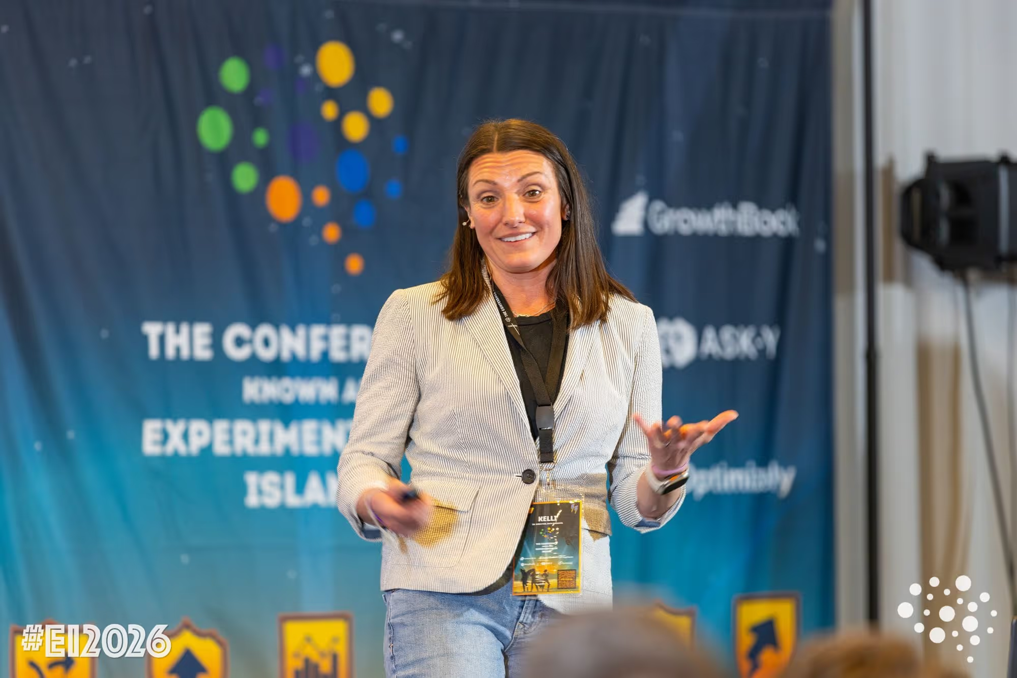
How Khan Academy optimizes AI tutoring with experimentation
Kelli Hill gave a standout presentation at The Conference known as Experimentation Island on February 24, 2026, walking the audience through Khan Academy's evolution from intuition-based testing to running A/B tests on generative AI features in production. If you missed it, the good news is Kelli will be joining us for a webinar on April 16, 2026. I'd highly encourage you to register here. Below are my key takeaways from her talk.
A quick word on Khan Academy
Khan Academy is a nonprofit with a mission to provide a free, world-class education for anyone, anywhere. They have nearly 200 million registered users and have logged over 63 billion learning minutes on their platform. In 2023, they launched Khanmigo, a generative AI-powered tutor and teaching assistant built on top of their massive library of exercises, articles, and instructional content. Khanmigo is the focus of much of their current experimentation work, and the context for everything Kelli shared.
From homegrown to a real experimentation stack
Khan Academy has been running experiments since 2011, when they built their first in-house platform on Google App Engine. At their peak, they had hundreds of A/B tests running simultaneously. But over time, the homegrown system slowed down, and when they rewrote their entire backend in 2019 (a million lines of code, migrating off Python 2), they made a deliberate decision not to port their old experimentation tooling.
Instead, they evaluated what was available. Building a new platform in-house was tempting, but they recognized that experimentation infrastructure wasn't their core competency. Buying an enterprise solution would have required downsampling their data, which was a non-starter. They ultimately chose GrowthBook, self-hosting it and connecting it to their existing data warehouse and eventing pipelines. Their chief architect's top priority was that the tool not slow down a site serving a million daily active users, and GrowthBook delivered on that.
The lesson here is one we see repeatedly: organizations that try to build their own experimentation platform almost always end up spending more than expected, moving slower than they'd like, and eventually switching to something purpose-built. Khan Academy's journey is a textbook case of making that transition well.
How evals evolved from vibes to automated A/B testing
The most fascinating part of Kelli's talk was the four-phase journey Khan Academy went through to figure out how to measure AI quality. When you're building an AI tutor, you can't just measure click-through rates. The goals are harder:
- Increased cognitive engagement
- An increase in skills on their way to proficiency
- Measurable learning gains on external assessments.
And LLMs make measurement even harder because they're non-deterministic. The same prompt can produce wildly different outputs each time.
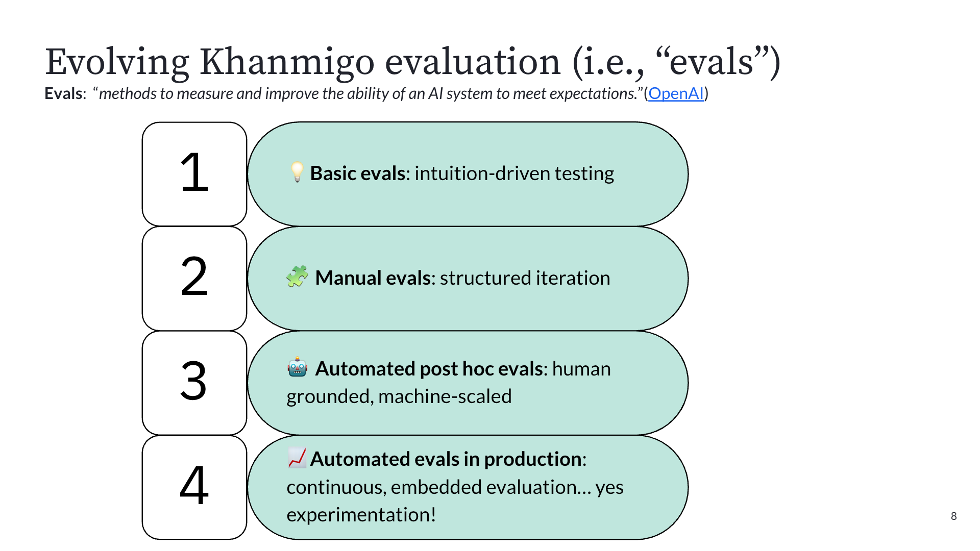
Phase 1: Intuition-driven testing. In September 2022, before ChatGPT had even launched publicly, OpenAI gave Khan Academy early access to GPT-4 via Slack. The team's first experiments were literally typing prompts into Slack and reading the outputs. They quickly discovered problems (GPT-4 confidently told a user that 9 + 5 = 15, then gave the correct answer ten minutes later). Good enough for building intuition about how LLMs behave, but not for building a product.
Phase 2: Structured manual testing. With a deadline to launch alongside GPT-4's public announcement in March 2023, they built an internal prompt playground for more repeatable testing. Faster than Slack, but still relied on humans to read outputs and judge quality.
Phase 3: Automated post-hoc evals. This is where things got serious. They assembled a team of PhDs in education to define what good tutoring actually looks like, then had human raters apply that rubric to chat transcripts, targeting 85% inter-rater agreement. Once they had that ground-truth dataset, they used it to train an LLM-as-judge to label transcripts at scale. The key insight: many teams spin up LLM-as-judge systems with no ground truth, resulting in unreliable results. Khan Academy invested in the hard work of human annotation first. Once the machine matched human accuracy, they scaled it to process thousands of interactions nightly.
Phase 4: A/B testing in production. With reliable automated evals in place, they could finally run controlled experiments on prompt changes, system instructions, and even entire model swaps, all measured against metrics like cognitive engagement, item performance, undesirable tutoring behaviors (like giving away answers), and latency as a guardrail. This is the stage they're in now, with 64 completed experiments, 29 running, and 13 queued as of February 2026.
The takeaway: as AI products mature, your evaluation methods need to mature with them. You can't skip straight to production A/B testing without the foundation of knowing what "good" looks like.
The math agent story: what iterative AI experimentation actually looks like
Kelli shared a concrete example that perfectly illustrates how A/B testing enables teams to "hill climb" toward better AI quality. The problem: Khanmigo had a math agent, essentially a calculator it could call to verify computations. Great for accuracy, but it added latency that was painful in classroom settings.
Here's how the iterations played out:
Iteration 1: Remove the math agent entirely. Latency improved, but math errors doubled. Rolled back immediately.
Iteration 2: Switch to GPT-5. Latency decreased, but math accuracy still suffered. Rolled back.
Iteration 3: Optimize the math agent's prompts. They tightened the system instructions to be more efficient. Latency dropped by three seconds, and math accuracy held. A real win.
Iteration 4: Give the math agent a faster model. Reduced latency by another 300 milliseconds with stable accuracy.
Iteration 5: Time-box the math agent's execution. Further latency reduction, accuracy still stable.
Without A/B testing, the team might have shipped Iteration 1 or 2 and unknowingly degraded the learning experience. The experiments gave them the confidence to reject changes that looked good on one metric but failed on the one that mattered most. This is what "hill climbing" looks like in practice: hypothesis, test, measure, iterate. No single change was transformative. The cumulative effect was.
From speed bump to safety net: the cultural shift
Perhaps the most important takeaway from Kelli's talk was about culture. Before Khanmigo, experimentation at Khan Academy was seen as a speed bump. Product teams wanted to ship based on strong founder intuition and internal conviction. Running an A/B test felt like an obstacle to velocity.
Generative AI changed that completely. LLMs are unpredictable enough that even small changes to prompts or system instructions can produce dramatically different outputs. Teams quickly learned that shipping without testing was genuinely risky. The same engineers who once resisted experimentation now actively request it.
Experimentation went from being perceived as something that slows you down to being the safety net that gives teams the confidence to move fast. That cultural transformation, more than any individual experiment result, may be the most valuable outcome of Khan Academy's journey.
Want to hear the full story from Kelli? She'll be joining us for a live webinar on April 16, 2026, where she'll share this full story.
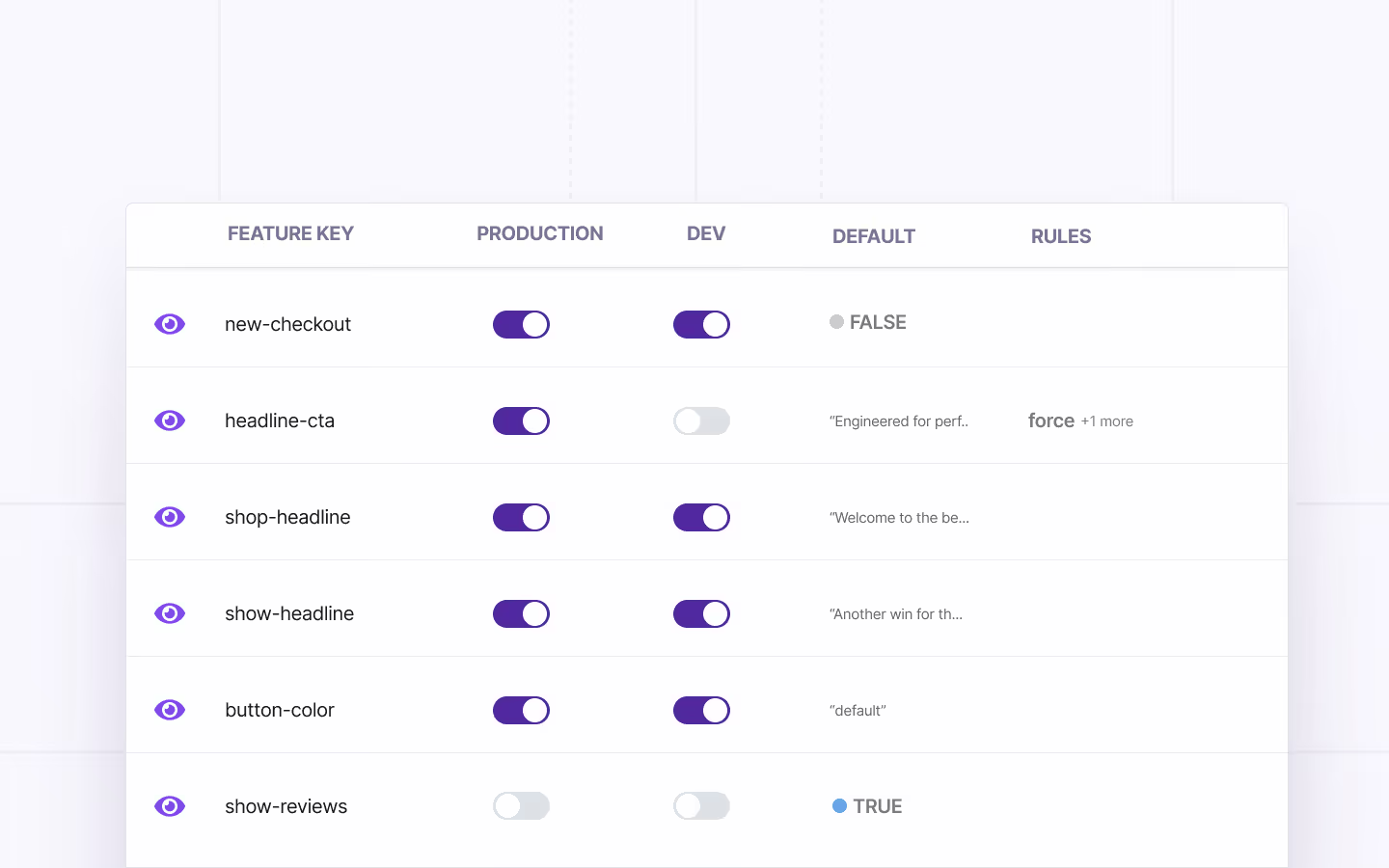
Feature Flags 101: The Ultimate Guide for Product and Engineering Teams
It’s Friday, quarter to 5:00 PM. Your team deploys a major checkout redesign to production. Within minutes, its error rates start spiking.
Your Slack’s on fire and your CEO is asking a ton of questions. Next thing you know, you’re staring down a long night of reverting commits and explaining what happened.
Now imagine the same scenario with one change. You disable the feature in 10 seconds with a single click, without redeploying code.
That’s the difference between deploying code and deploying code behind a feature flag.
In this guide, we’ll cover what feature flags are and how product and engineering teams can use them successfully.
What are feature flags?
A feature flag is a conditional mechanism in your code that lets you toggle application behavior at runtime, without deploying new code.
You wrap a feature in a flag, deploy it in an “off” state, and turn it on when you’re ready. If something goes wrong, you turn it off, which rolls back the deployed feature.
Feature flags are also referred to as feature toggles or feature switches, but they all describe the same mechanism. At their simplest, feature flags are if/else blocks that check a configuration value to decide which code path runs:
You deploy this code with the feature turned off. So, everyone sees the legacy checkout. When you’re ready, you flip the flag to deploy the feature and flip it back off again if something goes wrong or you’re done testing it.
How do feature flags work?
Feature flag systems have three main components that work together to give you complete control over your features:
- Flag Configuration
- Flag Delivery
- Flag Evaluation

1. Flag configuration
Flag configuration is where you define your flags and the rules that govern them. That can be as simple as a config file or as sophisticated as a dedicated feature management platform with a user interface (UI), audit logs, and role-based access.
Here’s an example configuration for a new-checkout flag:
This config enables the new checkout only for beta testers, so you can test the new flow with a small set of users before rolling out the final version.
Note: If you’re wondering why you can’t set environment variables for this, it’s because those variables require redeployment to change. Flags don’t.
2. Flag delivery
Once you’ve defined your flags, the configuration needs to reach your application. This can be through an included file at build time, API calls, streaming updates, or a mix of all three.
The method you choose decides how fast the changes propagate. That’s why platforms like GrowthBook deliver via server-sent events (SSE) to push changes immediately. The changes come through within milliseconds.
3. Flag evaluation
The final component is where your application actually resolves a flag’s value. The SDK (or your custom code) takes the user’s attributes and evaluates them against the flag’s rules. Based on that, the SDK returns the appropriate value.
In this example, the beta user’s attributes match the rule. So, the flag evaluates to true, and the new checkout renders. If it doesn’t, the flag falls back to the default value of false.
Note: When a flag is disabled (not just set to false, but turned off entirely), most platforms—including GrowthBook—evaluate it as null rather than false. Here, the fallback value will be used if you’ve added one. The boolean one won’t give you an error, it’ll render as false.
What are the types of feature flags?
All feature flags don’t serve the same purpose. And they aren’t meant to live for the same period either.
We can categorize feature flags across three axes:
- Their time span
- Their purpose
- Their scope
- Their value type
Here are the types of feature flags:
By time span
There are two types of feature flags based on when or if you retire them:
- Short-lived flags: These toggles exist for days to weeks. You create them for a specific purpose—for instance, to ship a feature or run a test, and then remove them when you’re done. These flags are often the source of technical debt because people tend to forget to clean them up.
- Long-lived flags: These flags live in your codebase for months or permanently. They’re part of your app’s ongoing behavior. For example, you might need a kill switch to turn off a part of the app or an entitlement flag to control which users see certain features.
By purpose
Feature flags can be classified into five types based on usage:
1. Release flags
You can use release flags to control the rollout of new features during the release process.
return <LegacyCheckout />;
A typical lifecycle looks like this:
- Create the flag
- Test with internal users
- Run a progressive rollout (5%, 25%, 50%, 100%)
- Confirm everything is stable
- Remove the flag and the old code path entirely
Most release flags should live for 2 to 8 weeks. If yours has been around longer, it’s time to clean up. Platforms like GrowthBook include stale feature flag detection to surface flags that haven't been evaluated recently, so you know which ones are overdue for cleanup.
2. Experiment flags
You should use experiment flags to assign users to variations for A/B testing. The main difference is that consistent assignment matters because the same user should always see the same variation for both UX consistency and accurate measurement. Platforms like GrowthBook handle this automatically by hashing the user's ID, so assignment is stable without any extra work on your end.
For A/B testing, it’s also very important to ensure that users are randomly being assigned to both the control and variant groups.
Typically, you’ll leave these on for as long as your experiments run—usually 2 to 6 weeks. But it depends on your traffic volume and the level of statistical power required. Once you’ve shipped the winning variant, remove the flag.
3. Operational flags
Operational flags control system behavior and provide emergency shutoffs. Think about cases like circuit breakers, graceful degradation under load, and runtime configuration changes that don’t warrant a full deployment.
These flags are mostly permanent in nature. You can trigger them manually during incidents or automatically through monitoring or feature flagging systems. A kill switch is an excellent example of such a flag.
4. Permission or entitlement flags
Permission flags control feature access based on subscription tier, user role, geography, or account status. These depend on the business logic and aren’t necessarily used for development or testing purposes.
A permission flag evaluates the user’s attributes (like their plan tier) to determine access, but your application database remains the source of truth for those attributes. It doesn’t mean that the flag stores data, it just evaluates conditions.
A warehouse-native platform like GrowthBook can evaluate these attributes directly from your existing data without requiring data duplication or schema changes. Your warehouse is already the source of truth for plan tiers and user roles so you don’t have to bring them into another platform again.
Tip: Always evaluate entitlement flags server-side using verified data. If you do this client-side, the user can inspect your flag configuration in the browser’s dev tools and potentially change it to bypass controls.
5. Development flags
Development flags are usually used to turn a feature on or off to test and debug code. These are short-lived, and you should turn them off after completing the QA or testing process.
By scope
Depending on the scope, you can categorize it into two types:
- System-level flags: These flags affect your entire application uniformly. A kill switch that disables a service for all users, or a config flag that changes your cache TTL globally. These don’t care who the user is—they’re binary for the whole system.
- User-level flags: These flags evaluate differently per user based on their attributes—for example, user ID, plan tier, geography, device type, or behavioral signals. User-level flags are used in targeting, rollout, and experimentation because these are based on user attributes. Let’s say you’re launching a 10% rollout, you’re hashing user IDs to consistently assign each person to a cohort.
By value type
Value types describe what a flag returns. Most flags start as simple booleans, but as your use cases mature, you'll reach for more advanced types, such as:
- Boolean flags: These flags return true or false. This is the default for most feature flags, such as on/off toggles and kill switches. If you’re wrapping a feature in a flag for the first time, this is where you start.
- String flags: These flags return a text value. Use these when you need to serve different variations of content like button text in an A/B test ("Buy Now" vs. "Add to Cart"), or a theme identifier ("dark" vs. "light").
- Number flags: These flags return a numeric value. They’re useful for tuning runtime parameters such as cache TTLs, rate limits, pagination sizes, and retry counts without redeploying.
- JSON flags: These flags return structured data. A single JSON flag can control an entire component's behavior. For instance, returning { "layout": "grid", "rows": 10, "showFilters": true } to configure a UI layout without deploying new code. They’re also useful for complex experiment variations where each variant needs multiple parameters, or for configuration bundles that you want to manage as a single unit.
Who uses feature flags and for what purpose?
Even though feature flags started out as a developer practice, they’re no longer limited to the engineering team. If you implement them, even non-technical users can work with them.
Here’s how that works:
Technical teams
- Developers and engineers: Development teams implement feature flags in code, manage rollouts, and use kill switches during incidents. The goal is to deploy with confidence by making every release reversible. They’re also responsible for maintaining and cleaning up unused or old flags.
- QA and testing: These teams use flags to validate features in production with real data, traffic patterns, and third-party integrations. Since staging environments can never fully replicate those conditions, feature flags allow them to get a sense of what will actually happen when the feature is live.
- DevOps and site reliability engineering (SRE): These teams rely on operational flags for circuit breakers, infrastructure migrations, and system configuration changes. For instance, if a service degrades, they can disable non-critical features to preserve core functionality.
- Data analysts: Analysts use flags to launch experiments, create targeting rules (who will be part of the experiment), and then randomly assign users to a variation. When a feature is launched as an experiment, analysts get clean and randomized data in their warehouse. For example, assignment records alongside behavioral events without having to add experimentation individually."
- Security and compliance: These teams audit flag changes to maintain a record of who released what, to whom, and when. Features like approval workflows and audit logs matter the most so that they can access that information. Also, if new regulatory requirements take effect, they can disable non-compliant features immediately.
Business and GTM teams
- Product managers: Product teams use feature flags to control release timing and manage beta programs. Feature flags give product managers autonomy to ship code when the business is ready, not just when the code is. They also help data science teams with experimentation—for example, when they need to test how features perform with different audiences.
- Marketing: Typically, product marketing teams use flags to time feature releases to campaigns or run promotional experiments. Personalization is another key use case where they offer curated experiences based on audience (user attributes).
Note: While feature flags help non-technical users time feature releases, it doesn’t mean every feature flagging platform is intuitive enough to use. Consider using a platform like GrowthBook that lets non-technical team members create and manage feature flags without writing code or filing engineering tickets.
What are the benefits of using feature flags?
Most product and engineering teams adopt feature flags to address a specific problem. Usually, it’s a painful deployment that went sideways. But there are several benefits of using feature flags, including:
Decouple deployment from release
Feature flags break the assumption that deploying code means releasing a feature. Your main branch can contain unreleased features safely wrapped in flags. And engineers can merge continuously without worrying about exposing incomplete work.
In short, your engineering team can deploy 10 times a day while releasing features weekly or whatever cadence the business needs.This is particularly beneficial when different teams are contributing to a feature. For example, if the back-end team delivers new functionality ahead of the front-end team, they check that code in behind a feature flag instead of keeping it in a branch.
Enable instant rollbacks
When things go wrong (and they will, usually at the worst possible time), you can disable a feature immediately. You don’t have to deploy new code or revert commits. As a result, you also recover from incidents much faster. Without a feature flag, engineering teams are often forced to create a new build that removes buggy code while keeping stable features that were included in the previous build. This can be a painful, time-consuming process, especially if the bug is hurting the live customer experience.
In fact, the State of DevOps 2024 report found that only 19% of engineering organizations recover from failed deployments in less than an hour. These “elite” teams tend to focus on continuous delivery practices, which are usually enabled by feature flags.
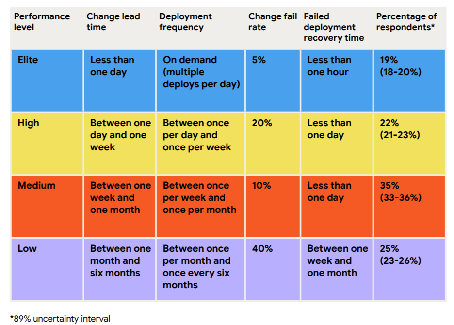
Reduce risk with progressive rollouts
Instead of releasing to everyone at once, you can start small. First, roll out to 5% of users and monitor key metrics like error rates and performance. If everything looks good, gradually increase to 25%, then 50%, then 100%. If issues arise, the blast radius is limited to a small subset of users. Learn more about how to use feature flags to reduce risk in deployment.
Test in production safely
Staging environments never perfectly mirror production. They lack real user behavior, real data volumes, and real traffic patterns, and you can’t make decisions if you’re testing in it.
For instance, if you’re testing a new payment processor integration, the staging environment can’t replicate the complexity of real payment flows or peak traffic loads. But if you use feature flags, you can test it with real user transactions, which gives you concrete data on what’s working (and not).
Increase team velocity
When you start using feature flags, velocity is a second-order benefit that you’ll experience eventually. Nobody’s waiting on shared release windows anymore, so they deploy code when it makes sense for them. So, teams ship faster and with more confidence in the long run.
In fact, according to research from DORA, higher deployment frequency correlates with higher software quality and stability. And it all comes down to feature flags that enable continuous delivery.
Enable trunk-based development
Long-lived feature branches are a tax on your engineering team. They diverge from the main branch and accumulate merge conflicts over time, which causes more issues the longer they live.
That’s why sophisticated engineering teams have started adopting trunk-based development.
In this method, they merge incomplete code to main behind a flag where it’s deployed but never executed. So you get the benefit of continuous integration without the risk of shipping unfinished features to users.
Build a foundation for experimentation
Once you can control who sees what, the next question is: which version is actually better?
Feature flags give you the ability to test that. While they act as the delivery mechanism, experiments act as the measurement layer.
Together, they move your team from “We shipped it and hope it works” to “We shipped it, measured it, and know it works.”
What are the use cases of feature flags?
Here are the most common use cases of feature flags for product and engineering teams:
Release management
You wrap a new feature in a flag, deploy it to production in an off-state, and progressively roll it out. You can use it for:
- Internal dogfooding with your team
- Beta access for a select group of users
- 5% canary release to catch issues early
- Gradual ramp to 25%, 50%, 100%
At each stage, you monitor metrics and can halt or roll back if problems appear. This transforms launches from high-stakes events into controlled, iterative processes.
For a full framework, see our guide to release management best practices.
Kill switches and operational control
Sometimes the most important thing a feature flag does is turn something off. It’s usually used when incidents happen, and you need to respond quickly. This drastically reduces your mean time to recovery (MTTR).
Infrastructure migrations
Big-bang deployments are becoming a thing of the past. You don’t need a whole ceremony to move from one database to another.
Let’s say you’re migrating from PostgreSQL to CockroachDB. All you have to do is route 1% of read queries to the new database and monitor its performance. If everything looks good, ramp up to 10% and so on and so forth until it’s complete.
A/B testing and experimentation
Feature flags are the natural foundation for experimentation. Once you can consistently assign users to different feature variations, you can measure which version performs better with statistical rigor.
This is becoming especially relevant for teams building AI and GenAI features. When your recommendation engine uses a large language model (LLM) or your search results rely on an embedding model, you can’t just eyeball whether the new version is better.
You need controlled experiments with guardrail metrics and feature flags that provide the infrastructure to run them in production safely.
Personalization and targeting
Feature flags let you deliver different experiences based on user attributes, geography, device type, or behavioral signals. You don’t need to maintain separate codebases for each attribute because the targeting rules handle the variation.
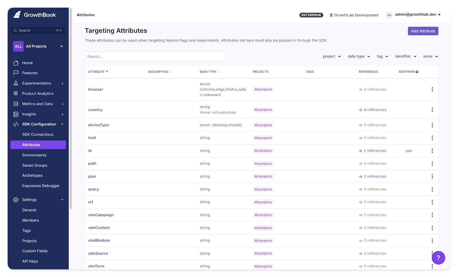
Target users based on specific attributes in GrowthBook
Entitlements and access control
If you run a multi-tier SaaS product, feature flags can manage which plans can access certain features. For example, you can automatically offer a premium integration for Enterprise users when they upgrade.
Also, if you need control over your data, use a feature flag platform that’s self-hosted or air-gapped. So, your flag evaluation data never leaves your network and ensures you’re compliant with regulations like HIPAA, GDPR, and SOC 2.
Refactoring code
Feature flags reduce the risk of large-scale refactors by letting you run old and new implementations side by side. Route 5% of traffic to the refactored code path, compare outputs and performance against the original, and gradually shift over once you’re confident.
This is especially useful during monolith-to-microservices migrations, where you can flag-control which service handles each request and roll back individual routes without reverting the entire migration.
Compliance and regulatory control
Regulatory requirements change, sometimes quickly. Feature flags let you respond without waiting for a development cycle.
When a new data protection rule takes effect, you can disable a non-compliant feature across affected jurisdictions immediately. When your compliance team needs a four-eyes approval process for production changes, approval workflows on flag modifications implement that principle directly.
What advanced feature flagging strategies can you use?
Once you’re comfortable with basic on/off flags, you’ll quickly run into situations where a simple toggle isn’t enough. You need to roll out to a specific percentage of users. Or target enterprise accounts in a particular region.
These strategies build on each other. Here are a few examples:
Percentage rollouts with persistent assignment
Percentage rollouts let you gradually release a feature to a random sample of users—5%, then 25%, then 50%—while monitoring for issues at each stage. The critical detail is persistent assignment.
When a user lands in the 10% cohort, they need to stay there as you ramp up to 50% and eventually 100%. Most platforms handle this by hashing the user’s ID against the flag key, which produces a consistent, deterministic assignment without storing state.
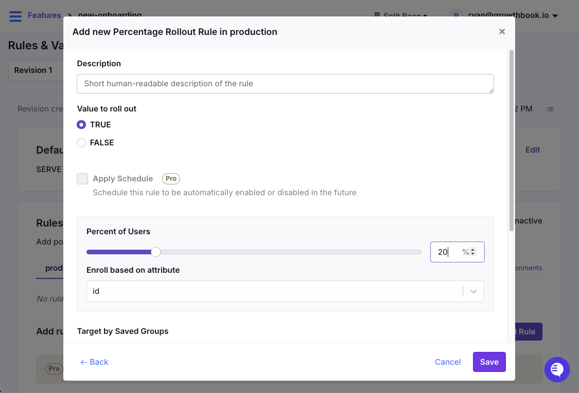
Release features using percentage rollouts in GrowthBook
Use percentage rollouts when you’re releasing a new feature and want to limit your blast radius. If something breaks at 5%, you’ve affected 5% of users.
Force rules and complex targeting
Force rules let you target specific user segments based on combinations of attributes. For example, geography, device type, account age, company name, subscription tier, or any custom property you pass to your SDK.
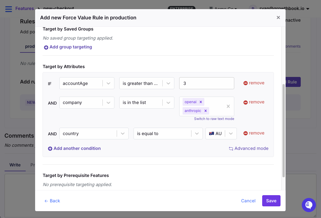
Target specific user segments using Force Rules in GrowthBook
For example, you might want to enable a feature for enterprise accounts in Australia with an account age of greater than three months. Or certain tax rules might only apply in a few countries.
Safe rollouts with guardrail metrics
A safe rollout combines a percentage rollout with automatic metric monitoring. You define guardrail metrics like page load time, click rate, conversion rate, error rate, revenue per user, or whatever matters for this feature. And the system watches them as you ramp up.
If guardrails breach your thresholds, the rollout automatically reverses. The feature goes back to 0% while you investigate.
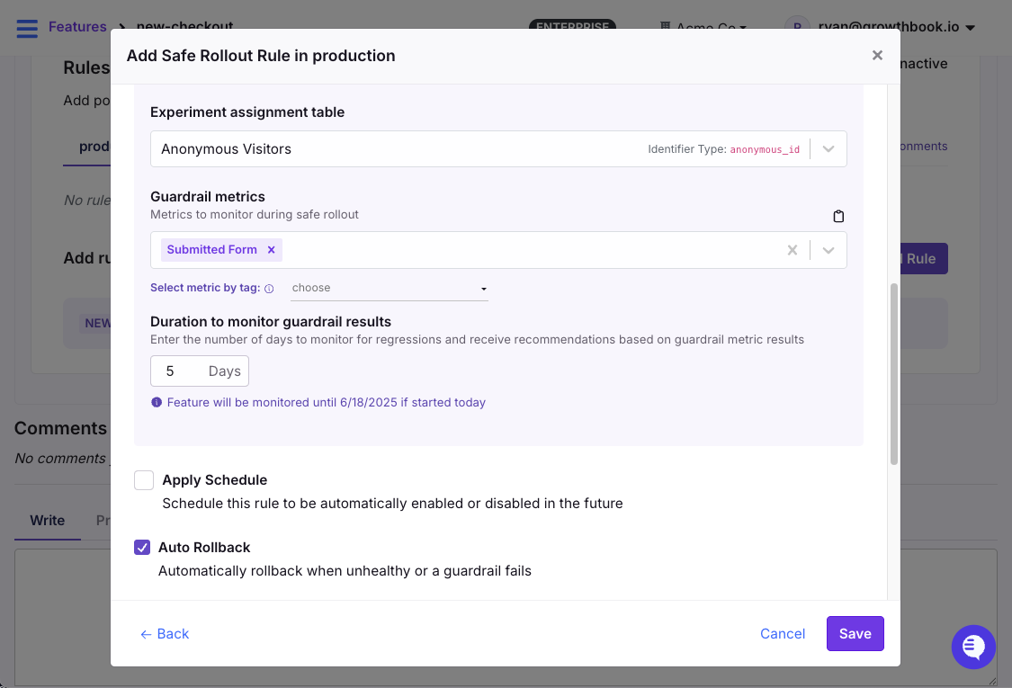
Monitor metrics in real time when using percentage rollouts in GrowthBook
Multi-environment flag management
Your new checkout feature might need to be:
- Always on in development (so your team can build against it)
- 50% rollout in staging (to test the progressive rollout logic itself)
- Off in production (not ready for customers yet)
This is where the relationship between projects, environments, and SDK connections matters. In GrowthBook, projects are the top-level organizational units (e.g., your mobile app vs. your web app).
Within each project, you have environments (production, staging, development). Each flag can have different values and rules per environment, and the SDK connection determines which flags your application actually receives.
When should a company adopt feature flags?
The short answer is earlier than you think. Most teams wait until they’ve been burned by a botched deployment or a release that broke critical functionality. By that time, everything you do is reactive in nature—and you’re retrofitting them into a codebase that’s already complex.
If you’re seeing these signals, it’s definitely time to adopt feature flags:
- Every deployment feels high-stakes: Everyone’s on Slack watching dashboards, ready to hit rollback. If deploying makes your team nervous, you have a release process problem that flags can solve.
- Rollbacks take hours to complete: If your recovery time is measured in hours, a single toggle would have saved you time.
- Multiple teams are blocked on release windows: “We can’t ship until Backend deploys” shouldn’t be a weekly conversation. Using feature flags helps you decouple these dependencies.
- You can’t test with real production traffic: If you don’t have a way to expose features to real users in a controlled way before launching them, you’re guessing.
- Product decisions are based on opinions: You want to run A/B tests but lack the infrastructure to do so. In these cases, feature flags act as the delivery mechanism to make experimentation possible.
- You’re growing the engineering team: As your team grows, so does its deployment complexity. It’s easier to coordinate releases with two engineers, but when you add more to the mix, the room for errors increases.
- You deploy more than once a week (or want to): High-frequency deployment without feature flags is high-frequency risk. Flags make it safe.
If you checked 2+ of the above criteria, feature flags will immediately improve your workflow.
When should you not use feature flags?
Knowing when not to use a flag is just as important as knowing when to use it. Here are a few reasons why you shouldn’t:
- Don’t use flags for static configuration: If changing the value requires a full restart, it belongs in your config, not your flag system. Feature flags are for runtime decisions, so mixing the two adds unnecessary complexity.
- Don’t use flags for secrets or sensitive data: You should never pass personally identifiable data (PII), API keys, or tokens through your feature flag system. This is especially critical for client-side applications because your configurations and targeting rules can be sent to the user’s browser, where anyone can inspect them. If you need to target based on sensitive attributes like email addresses, evaluate the flag server-side using verified data, or use hashed and anonymized attributes for client-side evaluation.
- Don’t use flags for core business logic: If your subscription tier logic or pricing rules permanently live inside a feature flag, your core business functionality now depends on the availability of an external flag service. Once an experiment or rollout is complete, migrate the winning variant into your application code or a dedicated entitlement service.
- Be cautious if your app traffic is low: Feature flags for simple on/off releases work at any scale. But if you’re planning to run A/B tests and your app has 100 users a month, you won’t reach statistical significance in any reasonable timeframe. The flag infrastructure still has value for release management and kill switches—just don’t expect experimentation to pay off until your traffic can support it.
- Don’t adopt flags without clear processes: Unless and until you have the right processes—for example, naming conventions, ownership docs, governance controls, and cleanup processes in place, don’t use flags. Otherwise, you’ll end up with too much technical debt in the long run.
What are the best practices for using feature flags?
To avoid spending months cleaning up avoidable issues, follow these best practices:
Use clear, descriptive names
Six months from now, nobody will remember what ff-123 or test-flag means. So, choose a clear naming convention and stick to it. For example, {feature-name}-{type} works well (checkout-redesign-release, cta-color-experiment).
Note: Platforms like GrowthBook let you enforce naming patterns with regex validation to prevent duplication and enforce governance.
Clean up old flags ruthlessly
Every flag in your codebase adds a conditional branch. For instance, 10 flags create 1,024 possible code paths, but 20 flags create over a million. These create blind spots, so after you roll out a feature, do the following:
- Remove the flag check from your code
- Remove the old code path entirely
- Delete the flag from your management platform
- Document why it was removed
Turn it into a team ritual and also implement monthly or quarterly cleanup rituals to reduce technical debt. If you’re using a platform like GrowthBook, it’ll automatically detect stale flags and show you where these flags live in your codebase.
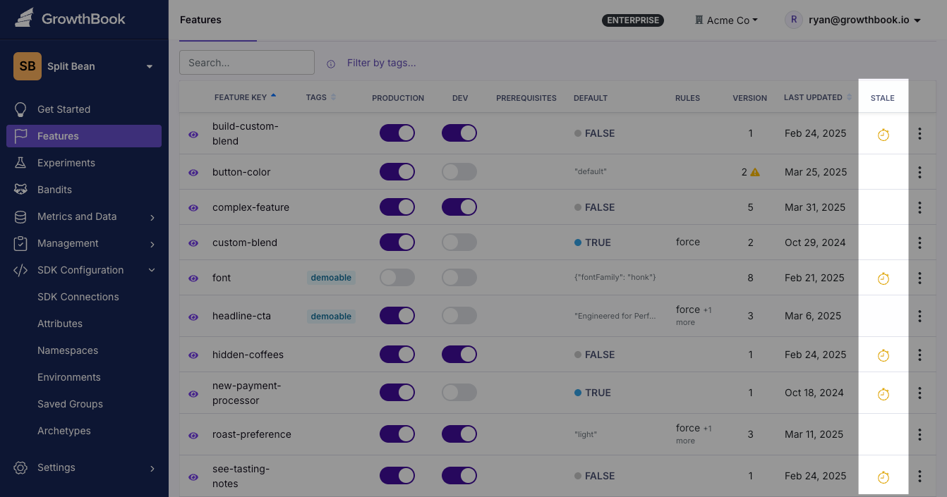
Remove old flags with automatic staleness detection in GrowthBook
Set expiration dates on temporary flags
It’s easy for seemingly temporary flags to become permanent. If there’s no clear deadline to clean it up, it’ll continue to sit in your codebase unnoticed—while its cleanup gets deprioritized sprint after sprint.
That’s why we recommend setting a calendar reminder for 30 or 60 days whenever you create a new flag. Better yet, create a Jira ticket or GitHub issue linked to the flag due two weeks after the target completion date.
Note: GrowthBook also supports flag scheduling, so you can set flags to automatically enable or disable at a specific date and time. This is useful for both feature launches and scheduled cleanup. If you prefer creating a Jira ticket, our Jira integration lets you link flags directly to tickets, so you can track these cleanup tasks within your existing workflow.
Start small with your rollouts
It’s easy to skip steps when you’re confident about a feature. Resist the urge and default to a progressive delivery method.
Start with your internal team, then 1% of the traffic, then 10%, and so on. Continuously monitor changes or unusual behavior at each step—and only remove the flag when you confirm stability.
Monitor business metrics too
A feature can do everything right. It can have zero errors or sub-100ms response times, but it can still tank your conversion rate.
When you set up monitoring for a rollout, watch both layers:
- Technical guardrails: Error rate, response time (p95 and p99), resource usage, API failures
- Business guardrails: Conversion rate, revenue per user, support ticket volume
If a new feature is technically flawless but users keep raising tickets right after launch, something’s wrong. You’ll have to look under the hood to understand what happened.
Document flag purpose and ownership
You don’t want to be rummaging through hundreds of Slack threads or Jira tickets to find out what a flag does. At a minimum, every flag should have:
- What it controls (one sentence)
- Who owns it (team or individual)
- Expected cleanup date
- What metrics indicate a problem
- Rollback procedure (usually “set to 0%” or “disable“)
Template:
Flag: new-checkout-flow
Purpose: Progressive rollout of redesigned checkout experience
Owner: @growth-team (Primary: @jane)
Created: 2026-01-15
Expected cleanup: 2026-03-01
Rollback procedure: Set to 0% immediately if conversion drops >5%
Success metrics:
- Checkout completion rate improves by 3%+
- P95 checkout latency stays under 2s
- Support tickets don’t increase
Current status: 25% rollout, monitoring for 1 week before increasing
Use role-based access control
Role-based access control (RBAC) allows you to control which user can access specific flags. Use RBAC to define roles that map to your risk model, including who can:
- Create flags
- Modify targeting rules
- Approve changes to production
- Publish
When you combine RBAC with four-eyes approval workflows and audit logs, you’ll have everything you need to remain compliant.
Understand how feature flags affect performance
Feature flags add an evaluation step to every request, so you need to know where that evaluation happens and what it costs. Most modern SDKs run flag evaluations locally, including GrowthBook.
On client-side implementations, the SDK initializes asynchronously, which means users may briefly see the default experience before flags are evaluated: a “flicker.” You can mitigate this through server-side rendering and anti-flicker support.
Similarly, if you have hundreds of flags with complex targeting rules, it can bloat the initial SDK payload. Within GrowthBook, you can use project-scoping so each SDK connection receives only the relevant flags, and use Saved Groups to reference large ID lists rather than inlining them.
What mistakes to avoid while using feature flags?
Here are the most common ways teams shoot themselves in the foot (and how to avoid it):
Reusing flag names
In 2012, Knight Capital dealt with a software glitch that bankrupted the company. When an engineer reused the name of a deprecated feature flag to launch a new feature, the app ran trades based on an old functionality. This happened because the old flag’s code was still present in an unpatched server and this mistake eventually cost the company $440 million, leading to its closure within a week.
It was one of the biggest coding errors we’ve ever seen. That’s why we recommend creating new flags for every feature you roll out. It takes 30 seconds, and you avoid the risk of activating code paths you or your team has forgotten about.
Using client-side flags for security
Feature flags control what to show. They don’t control who has permission. This distinction matters for client-side applications where flag values are visible in browser dev tools.
If you’re doing anything involving money, data access, permission, or privileged APIs, you’re better off using server-side flags to do it.
Ignoring rollback procedures
Typically, rollbacks seem simple. You flip the flag back to off, and the problem is solved. But sometimes it’s not that simple. In 2020, Slack experienced an outage because a feature flag rollout triggered a performance bug. Even though the team rolled back the feature in 3 minutes, it left a stale HAProxy state that led to a six-hour outage.
Before rolling back a flag, you should know:
- What metrics indicate a problem
- Who has permission to roll back
- What the downstream effects of rollback might be
- Whether the rollback itself has been tested
Not testing both flag states
Your Continuous Integration and Continuous Delivery (CI/CD) pipeline probably tests your application with your current production flag configuration. But does it test with the new flag turned on? Does it test with the new flag turned off again (the rollback scenario)?
If you only test one state, you’re assuming the other works. So, test three configurations:
- Current production state
- Intended release state
- Rollback state
If you can’t test all three in Continuous Integration (CI), at least smoke test the rollback in staging before you push the flag live.
How to use feature flags for experimentation
Most teams start with feature flags for release safety. But once you can control who sees what, a natural question follows: which version is actually better?
Without experimentation, you’re essentially shipping features based on intuition. For instance, you might think a signup form could be cleaner with fewer fields. But only a real test can tell you if there’s an uptick or fall in conversions. Feature flags give you the ability to run these tests easily.
How it works
In GrowthBook, an experiment is a rule you add to an existing feature flag. You don’t need to migrate SDKs or add new code.
Users are randomly assigned to a variation and their assignment is stable—they always see the same version. GrowthBook tracks which variation each user saw, then joins that with your existing analytics events (purchases, signups, clicks) to calculate which version performed best.
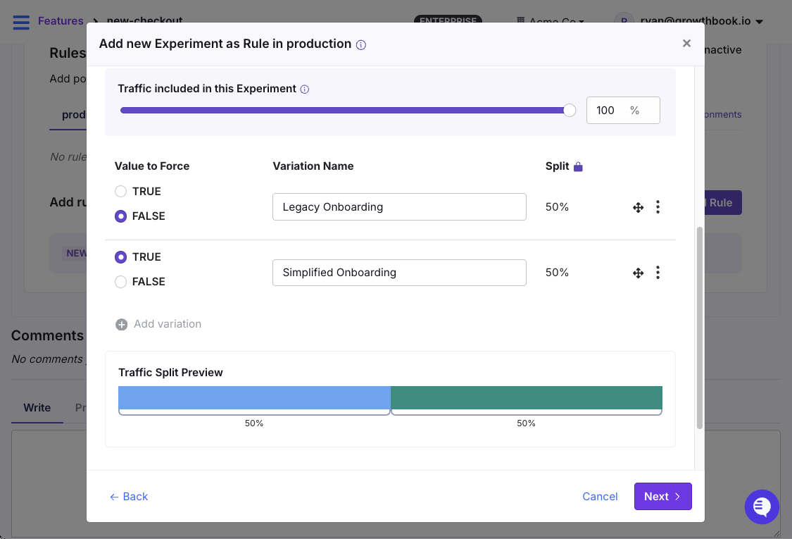
Run experiments using feature flags as the mechanism
The progression from flag to experiment typically looks like this:
- Simple toggle: Feature is on or off for everyone
- Percentage rollout: Feature reaches a growing slice of users
- Safe rollout: Percentage rollout with guardrail monitoring and auto-rollback
- Full A/B test: Controlled experiment with statistical analysis and winner selection
By the time you reach step 4, you already know the feature doesn’t break anything. Now you’re asking a different question: does it actually improve anything?
GrowthBook's warehouse-native approach
Most experimentation platforms require you to export data to their system, send tracking events to their infrastructure, or download results and crunch them in spreadsheets. All of these create data silos and increase costs.
That’s why GrowthBook connects directly to your existing data warehouse. You can integrate with platforms like Snowflake, BigQuery, Redshift, or Databricks and run the analysis there. Your data never leaves your infrastructure, which simplifies SOC 2, GDPR, and HIPAA compliance significantly.
And because it has access to your full warehouse, you can segment experiment results by any dimension you already track. For example, LTV cohort, acquisition channel, device type.
Should you build or buy a feature flagging tool?
The answer depends on your organization’s size and needs. Here’s an easy framework to help you decide:
When to build your own feature flag tool
Building makes sense when your needs are genuinely simple:
- You need fewer than 10–20 simple on/off flags.
- You have strict compliance requirements preventing any third-party services.
- You have dedicated engineering time for ongoing maintenance.
- You only need basic on/off functionality without targeting or experimentation.
- You want full control and have the resources to maintain it.
A config file or a database table can work fine at this scale. But in our experience, before you know it, you’ll be building dashboards and complex functionality just to maintain the flags.
When to use a feature flagging platform
A platform pays for itself quickly once any of these apply:
- You need targeting beyond simple on/off (user segments, percentages, complex conditions).
- You want experimentation and A/B testing capabilities.
- You’d rather spend engineering time on your product than on internal infrastructure.
- Non-engineers (PMs, marketing, data analysts) need to manage flags.
- You require audit logs, role-based access, or compliance features.
- You want debugging tools, flag lifecycle management, or third-party integrations.
- You plan to scale flag usage across multiple teams and services.
Note: If you need to run experiments, it’s always better to go with a feature flagging platform. It’ll give you full control over what’s being tested, and you can be sure of its statistical rigor. For instance, GrowthBook includes a suite of developer tools for testing and debugging feature flags. The DevTools Chrome Extension lets you inspect flag evaluations and simulate different user attributes directly in your browser.
How to create feature flags in GrowthBook
GrowthBook supports 24+ languages and frameworks. But here’s how to implement your first feature flag in under 10 minutes using React:
1. Get your SDK client key
Go to SDK Configuration in GrowthBook, create a new SDK Connection, and copy the Client Key (it starts with sdk-).
2. Install the SDK
3. Wrap your app with GrowthBook provider
4. Create a flag in GrowthBook
In GrowthBook’s dashboard:
- Navigate to Features → Add Feature
- Set a unique feature key: new-onboarding
- Choose value type: boolean
- Default value is false (off by default)
Your flag is now live.
5. Use the flag in your code
That’s it. The flag defaults to false, so everyone sees the classic onboarding. Toggle it to true in the dashboard, and the new version appears instantly. Toggle it back, and you’ve rolled back in seconds.
From here, you can add targeting rules, percentage rollouts, safe rollouts with guardrail metrics, or full A/B experiments within the same dashboard, without changing your code.
Ready to start? Try GrowthBook Cloud free, or check out the documentation for integration guides across all 24+ SDKs. For self-hosting, the GitHub repo has everything you need.
Frequently asked questions
1. What is the difference between feature flags and feature management?
Feature flags are the technical mechanism—the if/else statements in your code that check configuration values. Feature management is the broader practice of using flags strategically across the software lifecycle, including targeting rules, progressive rollouts, experimentation, governance, and lifecycle management.
2. What is the difference between feature flags and feature toggles?
“Feature flags” and “feature toggles” are synonyms for the same concept. You’ll also see “feature switches,” “feature flippers,” and “feature gates.”
3. What is the difference between feature flags and experiments?
Feature flags control who sees what. Experiments measure which version performs better. So, flags act as the delivery mechanism to run your experiments, and experiments give you the measurement layer to see the results.
4. What is the difference between feature flags and branches?
Git branches manage code versions during development, while feature flags manage feature visibility in production. With branches alone, you can’t deploy a feature until the branch merges and deploys. But with feature flags, the code merges to main immediately, but the flag keeps it hidden until you’re ready to release.
5. What is feature testing?
Feature testing means validating that a feature works correctly before releasing it broadly. With feature flags, you can enable a feature only for QA accounts or internal users and test it in production with real data and traffic patterns.
6. How do feature flags help with continuous delivery?
Feature flags separate deployment from release, so you can merge code continuously and deploy multiple times a day with new features safely wrapped in flags. Without them, you can’t deploy continuously because the feature itself might be incomplete or unvalidated. Learn more about feature flags and continuous delivery.
7. What is progressive delivery, and how do feature flags enable it?
Progressive delivery is the practice of gradually releasing features to larger user segments while monitoring for issues at each stage. Instead of a binary release (off for everyone, then on for everyone), you incrementally increase exposure. For example, releasing it to the internal team first, then 5% of real users, until you reach 100% of users.
8. How do feature flags differ from configuration files?
Configuration files are static. If you have to change them, you’ll have to redeploy the code or restart the whole service. But feature flags evaluate at runtime. You have to flip a switch to ensure your changes propagate to your application within seconds via streaming updates.
9. How can you deploy and manage feature flags at scale?
To deploy flags at scale, you need the following features and capabilities:
- Centralized feature flag management across all services
- SDKs for every language in your stack
- Streaming updates where changes propagate instantly
- Governance controls like audit logs, RBAC, and approval workflows
- Lifecycle management, such as stale flag detection, ownership tracking, and enforcement of cleanup cadence
10. What are client-side feature flags?
Client-side flags evaluate in the browser or mobile app rather than on your server. They’re useful for UI experiments, frontend rollouts, and A/B tests on visual elements. They’re usually visible to users, so don’t use them for PII, sensitive data, or access control.
11. What are the benefits of an open source feature flag platform?
Here’s why open source feature flag platforms are the better choice today:
- You can inspect exactly how flags are evaluated, how experiments are analyzed, and how your data is processed. Plus, you can audit security practices before deploying to production.
- You can fork the codebase if the project changes direction. You can also self-host indefinitely without an ongoing vendor relationship.
- You can deploy the app within your own infrastructure. This is critical for regulations like HIPAA, FedRAMP, SOC 2, and GDPR.
- With open source platforms, you pay for the infrastructure you choose, so you don’t rely on the vendor’s infrastructure pricing.
You can take advantage of OpenFeature, a Cloud Native Computing Foundation (CNCF) incubating project that creates a vendor-agnostic API standard for feature flagging.
Learn more about the 8 best open source feature flagging platforms.
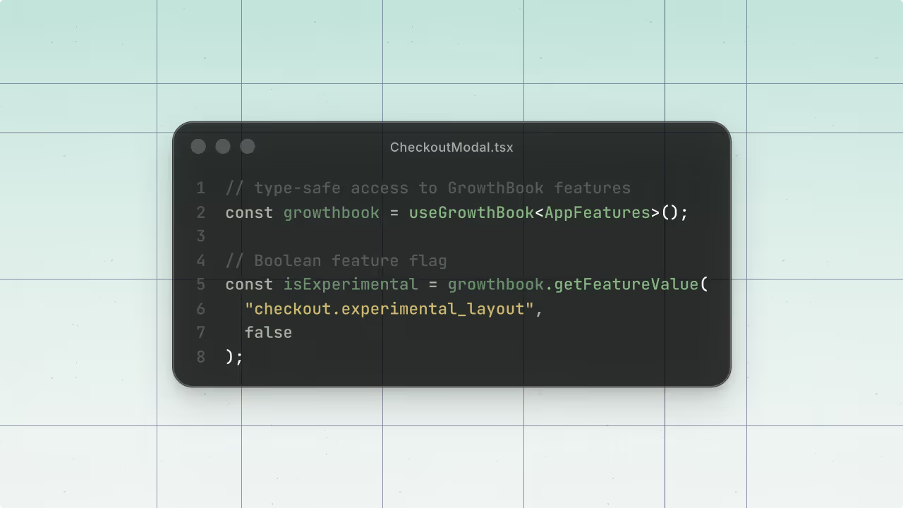
Your React feature flags are probably broken (here's how to fix them with TypeScript)
Your checkout component renders perfectly. The layout looks right, the tax rate loads, the payment methods appear. Everything passes your visual check — and then you deploy, and users get the experimental beta layout when they shouldn't.
The bug? A feature flag with the value "false" — a string, not a boolean. In JavaScript, a non-empty string is truthy. So the flag that was supposed to disable the experimental UI was quietly enabling it for every single user. TypeScript had no idea, because it had no idea your feature flags existed at all.
This is the quiet danger of untyped feature flags. They fail silently, they're hard to reproduce in tests, and they tend to surface at the worst possible moment. Here's how to close that gap with generated TypeScript types — and a few additional best practices that make your flags easier to maintain as your codebase grows.
Why TypeScript doesn't save you (by default)
Most React developers working with feature flags write something like this:
const { isExperimental, taxRate, headline, paymentMethods } = useGrowthBook();
This looks reasonable. But TypeScript has no way of knowing:
- Whether
isExperimentalis a real flag name in GrowthBook - Whether it should be a boolean, a string, or a number
- Whether your fallback value type matches the default defined in your dashboard
Without type definitions, the SDK treats everything as any. You can pass a string where a boolean belongs, misspell a flag name, or reference a flag that's been deleted — and your code compiles without complaint. The result is a whole category of bugs that are genuinely hard to catch: everything looks fine at the TypeScript layer, but the runtime behavior is wrong.
The fix: generated type definitions for your feature flags
The solution is to give the GrowthBook React SDK a TypeScript interface that describes all your flags — their names and their value types — so the compiler can enforce correctness for you.
GrowthBook provides a CLI tool to generate these types. But if you're using Cursor or another AI-assisted editor with MCP support, there's an even faster path: you can generate the types directly through GrowthBook's MCP server without leaving your editor.
Either way, the result is a file called app-features.ts that contains a complete TypeScript interface for every flag in your GrowthBook account:
export interface AppFeatures { checkout_experimental_layout: boolean; headline: string; shipping_tax: number; payment_methods: string[];}Every flag. Every type. Automatically generated from your actual GrowthBook configuration — not hand-written and left to drift.
Using the flag types in your component
Once you have app-features.ts, import it and pass it to the useGrowthBook hook as a generic type parameter:
import { AppFeatures } from './appfeatures';import { useGrowthBook } from '@growthbook/growthbook-react'; const gb = useGrowthBook<AppFeatures>();That one change unlocks the full power of TypeScript's type checker against your feature flags. The moment you do this, errors that were previously invisible become immediately visible — right in your editor, before you run anything.
The errors you'll actually see
When we applied types to a real checkout component with four flags, TypeScript surfaced several problems immediately:
Wrong flag name. The component was using isExperimental as a flag key. The actual flag in GrowthBook is checkout.experimental_layout. Without types, this compiled and ran fine — it just returned the fallback value every time, silently. With types, it's a compiler error on the spot.
Wrong value type. The fallback for checkout.experimental_layout was "false" — a string. The actual flag type is boolean. This is the bug from the opening: because "false" is a truthy string, the experimental layout was enabled for every user. TypeScript catches this the moment you add the type definition.
Mismatched default values. The component assumed payment_methods defaulted to just credit card. The actual default in GrowthBook includes Bitcoin. With the MCP server, you can verify that your fallback values match your GrowthBook defaults directly in the editor — and even have the agent update the code for you.
These aren't hypothetical bugs. They're the kind of thing that gets deployed on a Friday.
Keeping flag types in sync
Generating types once is useful. Keeping them current is what makes this a real system.
When you generate types via the GrowthBook CLI or MCP server, it also adds a script to your package.json:
"scripts": { "generate-flag-types": "growthbook generate-types"}Run this any time you add, remove, or change a flag in GrowthBook. It takes seconds and ensures your TypeScript definitions never drift from your actual configuration. A good practice: add it to your CI pipeline, or at minimum to your pre-release checklist. Stale type definitions are better than none, but fresh ones are what give you the full safety guarantee.
Three more feature-flag best practices worth adding
Type safety solves the hardest category of feature flag bugs, but there are a few additional practices that will save you headaches as your flag usage grows.
Handle loading states explicitly
When your app initializes, GrowthBook fetches flag values from the server. During this brief window, the SDK relies on local fallback values. If not handled explicitly, this can result in a "flash of unstyled content" (FOUC) where users see the wrong UI state for a split second.
To solve this, the GrowthBook React SDK provides the <FeaturesReady> helper component. It allows you to render a loading state until your features are fully loaded:
<FeaturesReady timeout={500} fallback={<LoadingSpinner/>}> <ComponentThatUsesFeatures/></FeaturesReady>Don't skip this. While loading is often near-instant in development, the "flash" becomes painfully obvious for production users on slower connections
Use descriptive, consistent flag names
Flag names like ff-123 or new-ui become unmaintainable fast. When you have 50 flags, you need to know at a glance what each one controls, which team owns it, and whether it's still active.
A naming convention that works well: {scope}-{description}-{date}
- Example:
checkout-experimental-layout-2025-03,pricing-annual-discount-enabled-2026-01,onboarding-video-modal-shown-2026-02.
It's more characters, but it's searchable, scannable, and self-documenting.
Paired with TypeScript autocomplete (which you now have), good naming means you can find the right flag in seconds rather than hunting through a dashboard.
Know what client-side flags can and can't do
Feature flags evaluated in the browser are visible to users — anyone with DevTools can inspect the flag values your app receives. This is fine for UI experiments and gradual rollouts, but it means you should never use client-side feature flags to gate access to sensitive features or enforce permissions.
For anything security-sensitive — premium features, admin capabilities, access control — validate on the server. Client-side flags are for experience control, not authorization.
Client Side Feature Flagging
Understand the advantages and pitfalls of client-side flagging and how to avoid many of the issues.
GrowthBook BlogGraham McNicoll
Getting started
If you're using GrowthBook with React, here's the short path to type-safe flags:
- Generate your types using the GrowthBook CLI (
npx growthbook features generate-types) or through the MCP server in Cursor - Import and apply the types to your
useGrowthBookhook - Fix the errors TypeScript surfaces — treat each one as a bug caught before production
- Add loading state handling so users don't see flashes of the wrong UI
- Standardize your flag naming convention before your flag count grows
- Add the generation script to package.json and run it whenever your flags change
The type setup takes under 10 minutes. The bugs it prevents can take hours to diagnose after the fact — and the ones that reach users can take down conversions quietly for days before anyone notices.
GrowthBook has full documentation on TypeScript type generation for React and every other supported SDK. If you run into questions, the GrowthBook Slack community is active and helpful for anything experimentation-related.

Ready to ship faster?
No credit card required. Start with feature flags, experimentation, and product analytics — free.